The Los Angeles Angels logo is one of those marks in professional baseball that people recognize instantly, even if they’re not die-hard fans. It’s a red “A” with a halo on top. Simple. Clean. And it carries decades of franchise history packed into a single character.
The Angels franchise has been around since 1961, starting as Gene Autry’s expansion team. Since then, the team has gone through four official name changes and ten different logos. The current version, a combination mark built around that haloed letter, was introduced in 2005 and slightly refined in 2016. It sits comfortably among the most recognized baseball team logos in the MLB.
What makes this logo interesting from a design standpoint is how much it communicates with so few elements. No mascots, no elaborate crests. Just a letter, a ring, and a color scheme that hits hard.
What Is the Los Angeles Angels Logo?
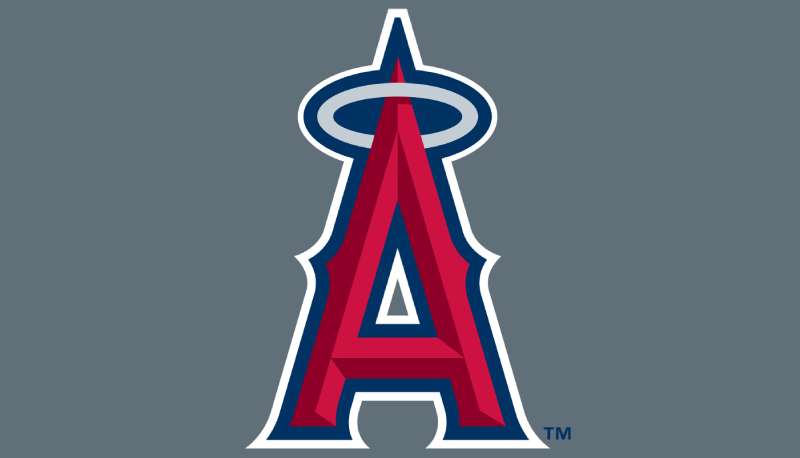
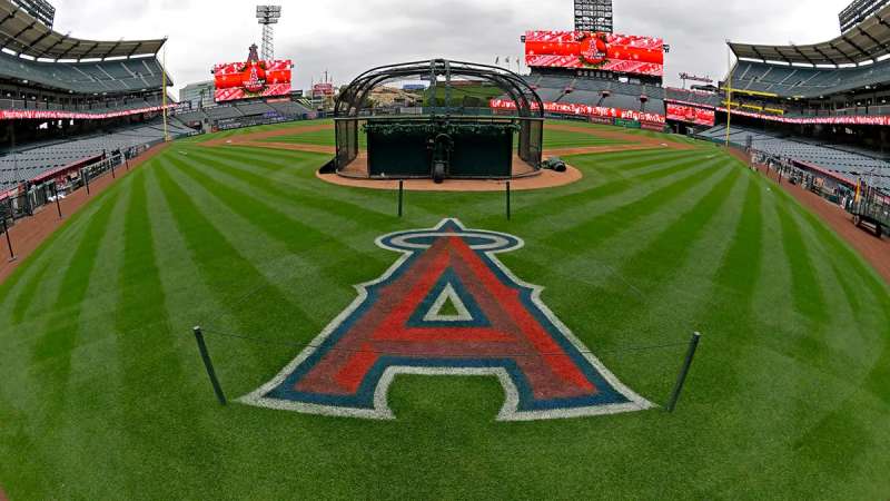
The Los Angeles Angels logo is a combination mark featuring a stylized red letter “A” with a silver halo positioned at its peak, outlined in midnight blue. Introduced in 2005 following the team’s rebrand under owner Arte Moreno, the design was created in partnership with Major League Baseball Properties.
Key attributes of the current logo:
- Design Type: Combination mark (letterform with symbolic element)
- Primary Elements: Uppercase “A” in a custom block serif style, silver halo ring threaded through the letter’s apex, midnight blue outline
- Official Introduction Date: 2005 (refined in 2016 when “of Anaheim” was officially dropped from the team name)
- Designer/Agency: Developed with Major League Baseball Properties. The earlier “Big A” letterform traces back to the franchise’s in-house design evolution
- Trademark Status: Registered trademark of Angels Baseball LP, protected under MLB intellectual property guidelines
- Color Palette: Red (#BA0021), Midnight Blue (#003263), Maroon (#862633), Silver (#C4CED4), White (#FFFFFF)
- Usage Context: Game-day uniforms, caps, helmets, Angel Stadium signage, digital platforms, licensed merchandise, and all official team communications
How Has the Los Angeles Angels Logo Evolved Over Time?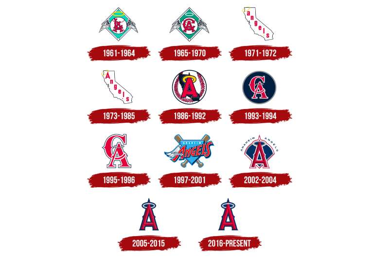
The Angels have cycled through ten logos across six decades, each one reflecting a different chapter of the franchise. Name changes drove most of these updates. The team went from Los Angeles to California to Anaheim and back to Los Angeles again, and the logos had to keep up.
That said, certain threads run through every version. The halo has been present since day one. Baseball imagery dominated the early years. And the color red has been a constant since the late 1990s.
Original Los Angeles Angels Logo (1961-1964)
- Years Active: 1961-1964
- Design Description: A turquoise (green) diamond shape in a white outline, with a red-and-white baseball at center. The baseball had wings extending outward and a gold halo above. The letters “LA” were interlocked on the ball
- Color Scheme: Turquoise green, white, red, gold
- Designer: In-house, inspired by the Pacific Coast League Los Angeles Angels who used a similar interlocking “LA” from 1912
- Context: Gene Autry bought the naming rights from Dodgers owner Walter O’Malley for $350,000. The original logo paid tribute to the PCL heritage. It was the first MLB expansion team logo to reference a predecessor franchise so directly
- Cultural Significance: Established the halo as the defining motif of the franchise. That gold ring above the baseball would stick around for every logo that followed, in one form or another
California Angels “CA” Logo (1965-1970)
- Years Active: 1965-1970
- Design Description: Nearly identical to the first logo but with “CA” replacing “LA” on the baseball. The diamond background shifted to a darker green, and the halo changed from gold to white
- Color Scheme: Dark green, white, red
- Key Changes from Previous: Letter swap from “LA” to “CA” to match the new California Angels name, adopted in September 1965 ahead of the move to Anaheim
- Context: The team was leaving Dodger Stadium (which they called Chavez Ravine) and moving to a new home in Anaheim. The name change to “California” was meant to represent the whole state, not just LA
California State Outline Logo (1971-1972)
- Years Active: 1971-1972
- Design Description: A white outline of the state of California with “angels” written diagonally in lowercase red letters. A gold halo hung off the top-left edge of the state, and a gold star marked Anaheim’s location
- Color Scheme: White, red, gold
- Key Changes from Previous: Complete departure from the winged baseball concept. First logo to use the state’s geographic shape as a design element
- Cultural Significance: This was a bold move. Using the state outline made the logo feel more like a regional identity marker than a traditional sports mark
Revised California Logo (1973-1985)
- Years Active: 1973-1985
- Design Description: Same California outline concept but with “Angels” now capitalized. The gold halo hung from the capital “A” instead of the state’s edge. The Anaheim star changed from gold to red
- Color Scheme: White, red, gold
- Designer: In-house modification
- Context: This version carried the team through Nolan Ryan’s years (1972-1979) and the 1986 ALCS run. It became one of the most nostalgic logos for longtime California Angels fans
Big A Baseball Logo (1986-1992)
- Years Active: 1986-1992
- Design Description: A white baseball with red seams served as the backdrop. A dark blue silhouette of California sat behind a red “A” with a gold halo. A gold star still marked Anaheim
- Color Scheme: Dark blue, red, gold, white
- Key Changes from Previous: Reintroduced the baseball imagery that had been absent since 1970. Combined the state outline with a prominent letter “A” for the first time
- Cultural Significance: The “Big A” concept started here, and it would eventually become the franchise’s most recognizable design element
Interlocking “CA” Revival (1993-1996)
- Years Active: 1993-1996
- Design Description: A solid dark blue circle with a thin silver outline. Inside sat a red interlocking “CA” monogram in a wishbone style, with white outlines. The halo returned in silver atop the “A”
- Color Scheme: Dark blue, red, silver, white
- Context: The Big A scoreboard was removed from the parking lot in 1992 during stadium renovations, and the team went back to the interlocking “CA” design, similar to what they used in the mid-1960s
Disney-Era Anaheim Angels Logo (1997-2001)
- Years Active: 1997-2001
- Design Description: A cartoonish “ANGELS” script with a wing on the “A,” placed over a periwinkle home plate shape with crossed bats. “ANAHEIM” appeared in white above. Very much inspired by the Disney movie “Angels in the Outfield”
- Color Scheme: Navy, periwinkle, medium blue, red, gold, bronze
- Designer: Walt Disney Company creative team
- Context: Disney purchased the team in 1996 and rebranded everything. They renamed the club the Anaheim Angels and overhauled the visual identity
- Cultural Significance: This is the most divisive logo in franchise history. Some fans loved the playful Disney touch. Others felt it didn’t belong on a professional baseball team. The periwinkle color was, well, a choice
World Series-Era Logo (2002-2004)
- Years Active: 2002-2004
- Design Description: A dark blue geometric crest with an arched top and pointed bottom. A red “A” in wishbone style sat at center with a silver halo. “Anaheim Angels” arched above in a modern sans-serif font
- Color Scheme: Dark blue, red, silver, white
- Key Changes from Previous: Dropped the cartoonish Disney aesthetic entirely. Returned to darker, more traditional tones
- Cultural Significance: This is the logo that was on the jerseys when the Angels won their only World Series in 2002, beating the San Francisco Giants in seven games. The Rally Monkey era. Took me a while to realize how much that one championship run cemented this particular shade of navy blue in fans’ memories
Current Logo (2005-Present)
- Years Active: 2005-present (minor refinement in 2016)
- Design Description: A standalone red “A” in a two-toned style with a midnight blue outline and a silver halo threaded through the apex. No background shape, no wordmark, no crest
- Color Scheme: Red (#BA0021), Midnight Blue (#003263), Maroon (#862633), Silver (#C4CED4)
- Designer: Created with MLB Properties; the letterform approximates the Bruce Double Pica typeface
- Context: Arte Moreno bought the team in 2003 and renamed it the Los Angeles Angels of Anaheim in 2005. The logo was simplified to remove all Anaheim references. In 2016, the team officially became just the Los Angeles Angels again, and the logo got a minor cleanup of its contours
- Key Changes from Previous: Removed the dark blue crest background and “Anaheim Angels” text. The “A” stands completely on its own
- Cultural Significance: This is the logo that’s been on Mike Trout’s and Shohei Ohtani’s caps. It’s stripped down to the absolute basics, and that’s exactly what makes it work. The sharp serifs and triangular spikes on the letterform give it an aggressive edge that most people don’t consciously notice
What Do the Design Elements of the Los Angeles Angels Logo Mean?
Every piece of this logo carries meaning, even if it looks deceptively simple. The “A” represents both “Angels” and “Anaheim,” the city where the team actually plays. The halo is the most obvious symbolic element, tying the visual identity directly to the team name.
But look closer. The letter has pointed, almost blade-like serifs. There are triangular protrusions on the sides that give the whole thing an aggressive, architectural quality. It’s not soft or angelic at all, which is kind of the point.
Why Did the Angels Choose These Specific Colors?
The current palette is built around three primary colors, each with a defined role.
Red (#BA0021, Pantone PMS 200 C) is the dominant color. In color psychology, red signals energy, aggression, and passion. It’s the most common color in baseball branding for a reason. The Angels committed to red as their primary identity color in 2002, moving away from the navy-dominant schemes of previous decades.
Midnight Blue (#003263, Pantone PMS 2955 C) serves as the outline and secondary color. Blue adds trustworthiness and stability to the mark. It grounds the red and prevents the logo from feeling one-dimensional. You can see how similar uses of deep blue work in other red logos across sports.
Silver (#C4CED4, Pantone PMS 538 C) appears in the halo and adds a metallic, premium quality. The maroon (#862633, Pantone PMS 202 C) creates depth within the “A” through a gradient effect, making the letterform look three-dimensional.
What Typography Style Is Used in the Angels Logo?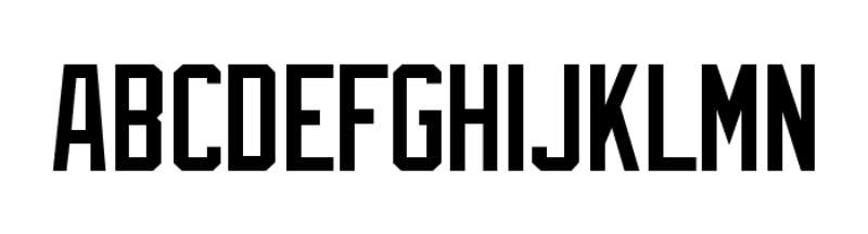
The “A” in the current logo approximates the Bruce Double Pica typeface, designed by Iza W and published by Intellecta Design. It’s a serif font with heavy block characteristics.
The letterform has sharp, pointed serifs at its base and triangular extensions on its mid-section. These aren’t just decorative. They make the “A” feel sturdy and a little bit menacing, which works well for a sports team trying to project strength.
Earlier logos used completely different typography approaches. The Disney-era script was loose and whimsical. The 1970s California logos used clean lowercase lettering. The current approach is probably the most readable and the most aggressive the franchise has ever gone with its lettering.
What Are the Hidden Meanings in the Angels Logo?
The halo is the obvious one, but the way it’s integrated is clever. It’s not floating above the letter. It’s actually threaded through the apex of the “A,” making it structurally part of the letterform rather than a separate decorative element.
The sharp triangular points on the sides of the “A” echo the wings from the original 1961 logo. Whether that was intentional or not, longtime fans see the connection.
And here’s something most people miss: the two-toned red creates a shadow effect that suggests depth and movement. The letter appears to be lit from one side. It’s a small detail that separates this from a flat, basic lettermark.
How Does the Los Angeles Angels Logo Compare to Competitor Logos?
In the American League West, the Angels logo holds its own as one of the cleaner marks. Compare it to the Houston Astros logo, which uses a star inside an “H” with much more complexity. Or the Seattle Mariners logo with its compass-needle “S.”
The Angels’ approach is more stripped-back. One letter. One symbol. Two main colors. That puts it closer to the New York Yankees logo philosophy of keeping it dead simple.
Across the freeway, the Los Angeles Dodgers logo takes a totally different approach with a scripted wordmark. Having two LA-area teams with such different logo strategies actually works. There’s no confusion between the two brands.
Among blue logos and red-heavy marks throughout MLB, the Angels stand out because of the halo. No other team in professional sports uses anything like it. That single element gives the logo 100% of its distinctiveness.
What Are the Technical Specifications of the Los Angeles Angels Logo?
Official Color Codes
- Red (Primary): Hex #BA0021 | RGB (186, 0, 33) | CMYK (18, 100, 99, 10) | Pantone PMS 200 C
- Midnight Blue: Hex #003263 | RGB (0, 50, 99) | CMYK (100, 86, 34, 25) | Pantone PMS 2955 C
- Maroon: Hex #862633 | RGB (134, 38, 51) | CMYK (31, 94, 73, 31) | Pantone PMS 202 C
- Silver: Hex #C4CED4 | RGB (196, 206, 212) | CMYK (23, 13, 12, 0) | Pantone PMS 538 C
- White: Hex #FFFFFF | RGB (255, 255, 255) | CMYK (0, 0, 0, 0)
Dimensions and Proportions
The logo maintains a roughly square aspect ratio when the halo is included. The “A” itself is slightly taller than it is wide. MLB’s trademark guidelines dictate minimum clear space around the mark, typically equal to the width of the halo ring on all sides.
Minimum reproduction size for print is generally around 0.5 inches in height to keep the halo legible. For digital use, the vector graphics version scales to any size without quality loss. Raster versions should maintain at least 72 DPI for screen and 300 DPI for print.
The logo must always appear on backgrounds that provide enough contrast for the midnight blue outline to remain visible. On dark backgrounds, a white outline variant is permitted per the team’s brand guidelines.
What Cultural Impact Has the Los Angeles Angels Logo Had?
The halo is everywhere in Southern California baseball culture. Fans wear the cap logo to games at Angel Stadium, and you’ll spot it all over Orange County. It’s become shorthand for Anaheim sports in general.
The 2002 World Series win did the most heavy lifting for the logo’s cultural status. That championship, combined with the Rally Monkey phenomenon, turned the haloed “A” into a symbol of one of baseball’s greatest underdog stories.
Players like Mike Trout wore this logo for over a decade, further cementing it. When Shohei Ohtani was doing things no one had seen since Babe Ruth, he was doing them under this mark. That kind of association gives a logo staying power that no redesign can manufacture.
The halo motif also crosses over into fan culture in ways other team symbols don’t. Fans bring inflatable halos to games. The “Light the Halo” tradition after home wins at Angel Stadium ties the logo directly to the game experience. Not many MLB logos have that kind of built-in ritual.
How Does the Los Angeles Angels Logo Fit Into the Overall Brand Identity?
The logo is just one piece of a broader system. The Angels’ brand style guide connects the primary mark to a full suite of assets: the wordmark, the cap logo, the jersey script, the alternate marks, and the stadium branding.
Everything ties back to red and midnight blue. The uniforms use “Angels” in a scripted font across the chest, while the cap carries the haloed “A.” The consistency across touchpoints is strong. You can see the Angels’ identity system at work from the scoreboard down to the ticket stubs.
The team’s related entities include Angel Stadium of Anaheim (the Big A), the Rally Monkey mascot, and the “Light the Halo” post-win celebration. All of these feed into the same visual language. The color palette stays locked across merchandise, social media, broadcast graphics, and in-stadium signage.
Compared to other MLB brand systems, the Angels keep things relatively tight. There aren’t a dozen alternate logos floating around. The core mark does most of the work, and the supporting elements stay in their lane.
How Should the Los Angeles Angels Logo Be Used?
Official usage guidelines:
- The logo must not be rotated, stretched, skewed, or recolored outside of approved color variants
- Minimum clear space must be maintained around the mark at all times
- The halo must never be separated from the “A” or used as a standalone element without explicit approval
- On merchandise, the logo must appear as provided in the official asset library. No custom redrawing is allowed
Where to access official logos:
Licensed partners can obtain official logo files through MLB Properties. Fan and media use is governed by MLB’s trademark policy. The team’s official website (mlb.com/angels) provides approved imagery for editorial and news coverage.
Licensing information:
The Los Angeles Angels logo is the property of Angels Baseball LP. All commercial use requires a license through Major League Baseball Properties. Unauthorized reproduction on merchandise, apparel, or digital products is subject to trademark enforcement.
Trademark protection:
The haloed “A” mark, the Angels wordmark, and all associated logos are registered trademarks. MLB actively monitors and enforces against counterfeit merchandise and unauthorized digital use. If you’re a designer working on anything Angels-related, you need to go through official licensing channels. No exceptions, no matter how small the project.
FAQ on The Los Angeles Angels Logo
What does the Los Angeles Angels logo look like?
The current Angels logo is a red letter “A” with a silver halo threaded through its top, outlined in midnight blue. No background, no crest. It’s a combination mark that works on caps, jerseys, and web design assets equally well.
When was the current Angels logo introduced?
The haloed “A” debuted in 2005 when Arte Moreno renamed the franchise the Los Angeles Angels of Anaheim. A minor refinement happened in 2016 after “of Anaheim” was officially dropped. The core design hasn’t changed since.
How many logos have the Angels had?
Ten total since joining the American League in 1961. Each name change brought a new logo. From the original winged baseball to the California state outline to the Disney-era script, they’ve covered a lot of ground before landing on today’s stripped-back mark.
What font is used in the Angels logo?
The “A” approximates Bruce Double Pica, a block serif published by Intellecta Design. It has sharp, pointed serifs and triangular side extensions. Some sources also cite Quiet The Thief Thin as a close match for the wider display font family.
What are the official colors of the Angels logo?
Red (#BA0021), midnight blue (#003263), maroon (#862633), silver (#C4CED4), and white. The red dominates. Blue provides the outline. Silver lives in the halo. Maroon adds depth through shading on the letterform.
What does the halo in the Angels logo represent?
It’s a direct reference to the team name. “Angels” comes from Los Angeles, which translates to “The Angels” in Spanish. The halo has appeared on every single franchise logo since 1961. It’s the one design element that never left.
Who designed the current Angels logo?
It was developed with Major League Baseball Properties during the 2005 rebrand. The design built on the “Big A” concept that the franchise had used in various forms since the 1986 California Angels era. No single designer gets public credit.
Did Disney change the Angels logo?
Yes. When the Walt Disney Company bought the team in 1996, they overhauled everything. The new Anaheim Angels logo featured a cartoonish script with a wing on the “A,” periwinkle coloring, and crossed bats. It looked straight out of “Angels in the Outfield.”
Can I use the Angels logo for personal projects?
Not commercially. The haloed “A” is a registered trademark of Angels Baseball LP. All commercial use requires licensing through MLB Properties. Editorial and news use follows MLB’s media guidelines. Personal fan use on non-commercial items generally gets a pass, but check the rules.
How does the Angels logo compare to the Dodgers logo?
Completely different approaches. The Angels use a single letterform with a symbol. The Dodgers use a scripted wordmark. Both represent LA baseball, but there’s zero visual overlap. That kind of variety between crosstown rivals actually strengthens both brands.
Conclusion
The Los Angeles Angels logo has survived four name changes, ten redesigns, and a Disney takeover. That haloed “A” still stands. It works because it follows solid logo design principles: keep it simple, make it memorable, tie it to meaning.
From the 1961 winged baseball to today’s bold red lettermark, the franchise’s visual identity tells the story of a team that kept refining until it got things right.
The halo stays. It’s been there since Gene Autry’s expansion team first took the field at Wrigley Field in Los Angeles.
Whether you’re studying graphic design principles or just picking out a cap at Angel Stadium, this logo does exactly what a good sports emblem should. It identifies. It connects. And it holds up after two decades without needing a refresh.

Renowned for his expertise in logo design and visual branding, Bogdan has developed a multitude of logos for various clients.
His skills extend to creating posters, vector illustrations, business cards, and brochures. Additionally, Bogdan's UI kits were featured on marketplaces like Visual Hierarchy and UI8.
He also wrote in the past years on sites like Design Your Way, WebDesignerDepot, WPDean, Designmodo, Speckyboy, Slider Revolution, and more.
- The Windsurf Logo History, Colors, Font, And Meaning - 10 October 2026
- How to Remove Background From Product Photos (No Photoshop) - 10 October 2026
- How Designers can Build a Stronger Online Creative Identity - 9 October 2026

Bogdan Sandu is a seasoned designer who has been designing websites since 2008. Renowned for his expertise in logo design and visual branding, Bogdan has developed a multitude of logos for various clients. His skills extend to creating posters, vector illustrations, business cards, and brochures. Additionally, Bogdan's UI kits were featured on marketplaces like Visual Hierarchy and UI8. He also wrote in the past years on sites like Design Your Way, WebDesignerDepot, WPDean, Designmodo, Speckyboy, Slider Revolution, and more.
You Might Also Like