


Every MLB cap tells a story before the first pitch is thrown. Baseball team logos serve as visual battlegrounds where tradition meets innovation, where simple letters become cultural symbols that unite millions of fans across generations.
These athletic emblems carry more weight than their designers ever imagined. From the Yankees’ legendary interlocking NY to the Cardinals’ timeless birds on bat, each logo represents decades of triumph, heartbreak, and unwavering loyalty.
Team branding in professional baseball isn’t just about pretty pictures. These franchise identities drive billions in merchandise revenue while creating emotional connections that last lifetimes. The difference between iconic and forgettable often determines a team’s cultural impact.
This comprehensive guide examines all 30 MLB team logos through their design elements, color schemes, historical evolution, and cultural significance. You’ll discover how typography choices reflect regional identity, why certain color combinations create instant recognition, and which design principles separate legendary logos from mediocre ones.
Baseball Team Logos
| Team Entity | Primary Logo Attribute | Visual Element Value | Semantic Context |
|---|---|---|---|
| Arizona Diamondbacks | Snake symbolism | Diamond-pattern serpent head | Desert predator, venomous threat |
| Atlanta Braves | Native American heritage | Tomahawk weapon icon | Warrior spirit, traditional tool |
| Baltimore Orioles | State bird representation | Stylized orange-black oriole | Local wildlife, Maryland identity |
| Boston Red Sox | Typography-based identity | Stylized “B” letterform | Minimalist city abbreviation |
| Chicago Cubs | Bear cub symbolism | Circular “C” with bear mascot | Youth, playfulness, Chicago identity |
| Chicago White Sox | Gothic letterform design | Old English “SOX” text | Traditional craftsmanship, heritage |
| Cincinnati Reds | Monochromatic branding | Wishbone “C” letterform | Luck symbolism, team color focus |
| Cleveland Guardians | Architectural monument | Art Deco guardian statues | City protection, civic pride |
| Colorado Rockies | Mountain geography | Purple mountain peak design | Elevation, natural majesty |
| Detroit Tigers | Predator symbolism | Gothic “D” with tiger motif | Industrial strength, fierce competition |
| Houston Astros | Space exploration theme | Star burst with “H” center | NASA association, cosmic ambition |
| Kansas City Royals | Monarchical symbolism | Crown with “KC” initials | Noble authority, regional pride |
| Los Angeles Angels | Religious iconography | Stylized “A” with halo | Divine protection, spiritual guidance |
| Los Angeles Dodgers | Script typography | Cursive “Dodgers” wordmark | Classic Americana, Brooklyn heritage |
| Miami Marlins | Marine life symbolism | Stylized marlin fish silhouette | Coastal lifestyle, sport fishing |
| Milwaukee Brewers | Industrial craft heritage | Baseball glove “MB” design | Blue-collar craftsmanship, brewing tradition |
| Minnesota Twins | Twin cities reference | “TC” interlocking letters | Dual identity, metropolitan unity |
| New York Mets | Metropolitan symbolism | Stylized “NY” with bridge | Urban sophistication, city connectivity |
| New York Yankees | Interlocking monogram | Classic “NY” letterform | Timeless elegance, championship tradition |
| Oakland Athletics | Minimalist letterform | Stylized “A” with apostrophe | Athletic performance, streamlined identity |
| Philadelphia Phillies | Liberty bell heritage | Stylized “P” with bell motif | Revolutionary history, freedom symbolism |
| Pittsburgh Pirates | Maritime rebellion theme | Pirate head with bandana | Outlaw spirit, river city heritage |
| San Diego Padres | Religious mission heritage | Interlocking “SD” letters | Spanish colonial history, spiritual guidance |
| San Francisco Giants | Scale and grandeur | Serif “SF” letterform | Monumental achievement, bay area pride |
| Seattle Mariners | Nautical compass theme | Compass rose with “S” center | Maritime navigation, Pacific exploration |
| St. Louis Cardinals | State bird symbolism | Cardinal bird on branch | Regional wildlife, natural elegance |
| Tampa Bay Rays | Solar radiation theme | Burst pattern with team name | Sunshine state identity, energy emission |
| Texas Rangers | Law enforcement heritage | Stylized “T” with star | Frontier justice, lone star state |
| Toronto Blue Jays | Canadian bird symbolism | Blue jay head profile | National wildlife, blue collar work ethic |
| Washington Nationals | Capital city identity | Curved “W” with flag motif | Political power center, patriotic pride |
Arizona Diamondbacks Logo

The Arizona Diamondbacks display one of baseball’s most distinctive snake-themed emblems. Their primary logo features a stylized “A” that doubles as a diamondback rattlesnake head.
Logo Design Elements
- Iconic “A” with negative space shaped like serpent’s head
- Angular, geometric lines mimicking diamond patterns
- Recent updates added diamondback patterning within the letter
Color Scheme & Symbolism
Primary colors: Sedona red, black, and Sonoran sand with turquoise accents
- Red reflects Arizona’s red rock formations
- Sand evokes Sonoran Desert landscape
- Black provides bold contrast against desert palette
- References Arizona’s state reptile and desert ecosystem
Historical Evolution
- Originally launched with purple and turquoise (1998)
- Switched to red, black, and sand (2007)
- 2024 updates brought back turquoise as accent color
Brand Recognition Impact
- Instantly recognizable dual-purpose “A”/snake head design
- Creates memorable merchandise appeal
- Differentiates from traditional baseball imagery
Typography & Layout
Sharp, angular construction mimicking diamond patterns. Clean alignment while incorporating organic snake characteristics through negative space.
Atlanta Braves Logo

The Atlanta Braves showcase classic script lettering paired with Native American tomahawk imagery. Their elegant cursive “A” has anchored franchise identity since the 1980s.
Logo Design Elements
- Primary mark: flowing script “A” with exaggerated terminals
- Tomahawk symbol appears on alternate logos
- Features traditional red, navy, yellow coloring with detailed feathers
Color Scheme & Symbolism
Primary colors: Navy blue, red, and white
- Navy provides professional stability
- Red adds energy and passion
- Connects to American tradition and team heritage
Historical Evolution
- Script “A” debuted 1987, underwent subtle refinements
- Earlier versions featured elaborate tomahawk integration
- Modern versions emphasize letterform elegance
Regional & Cultural Context
Originally from Boston (1871), then Milwaukee. Maintained Native American themes throughout relocations to Atlanta.
Brand Recognition Impact
Among baseball’s most controversial yet recognizable marks. Script “A” carries significant brand equity.
Typography & Layout
Masterful typography with flowing strokes. Creates visual hierarchy without overwhelming other elements.
Baltimore Orioles Logo

The Baltimore Orioles feature a cheerful cartoon oriole that captures Maryland’s state bird in team colors. This friendly mascot approach distinguishes them from more serious MLB branding.
Logo Design Elements
- Stylized orange and black oriole wearing baseball cap
- Confident expression and athletic stance
- Approachable, family-friendly mascot design
Color Scheme & Symbolism
Primary colors: Orange and black mirror actual Baltimore oriole plumage
- Creates immediate regional connection
- Provides high visibility on uniforms and merchandise
- Natural color palette
Historical Evolution
Franchise alternated between realistic and cartoon bird representations. Current cartoon version (reintroduced 2019) recalls successful 1960s-1970s designs.
Brand Recognition Impact
- Creates strong emotional connection with families
- Distinctive orange coloring ensures visibility
- Appeals to younger fans
Typography & Layout
Supporting wordmarks use bold, condensed fonts complementing the bird’s friendly nature.
Boston Red Sox Logo
Boston’s iconic red socks emblem represents baseball’s most literal team-name translation. This simple design captures franchise blue-collar heritage and New England pride.
Logo Design Elements
- Two red baseball socks positioned naturally
- Clean lines and authentic athletic proportions
- Easy reproduction across media formats
Color Scheme & Symbolism
Primary colors: Red, navy blue, and white
- Red references original “Red Stockings” uniform
- Navy provides sophisticated accent
- Forms classic American palette
Historical Evolution
Sock imagery dates to “Red Stockings” name (1900s). Various treatments surrounded the socks, but core element remains unchanged.
Brand Recognition Impact
Among sport’s most recognizable symbols worldwide. Red “B” cap logo rivals socks for recognition.
Typography & Layout
Traditional serif fonts echo baseball’s classic era. Perfect balance across applications.
Chicago Cubs Logo
The Chicago Cubs display baseball’s most recognizable letter-in-circle design. Their blue “C” enclosing red “UBS” creates instant recognition through bold simplicity.
Logo Design Elements
- Circular blue badge contains large “C” with “UBS” inside
- Clean, geometric construction
- Ensures legibility at any size
Color Scheme & Symbolism
Primary colors: Royal blue, red, and white
- Blue suggests reliability and tradition
- Red adds energy and passion
- Patriotic combination resonates with Chicago pride
Historical Evolution
Circular “C” emerged early in team history. Refinements focused on letter proportions and color relationships.
Brand Recognition Impact
Consistently ranked among sports’ greatest logos. Simple geometric approach creates versatile branding opportunities.
Typography & Layout
Perfect typography elements with balanced proportions. Interior letterforms maintain proximity without crowding.
Chicago White Sox Logo

The White Sox present Gothic-inspired lettering creating baseball’s most distinctive wordmark. Their diagonal “Sox” script exudes attitude and urban sophistication.
Logo Design Elements
- Three letters arranged at different heights
- Gothic letterforms with decorative serifs
- Angular construction suggests tradition and edginess
Color Scheme & Symbolism
Primary colors: Black, silver, and white
- Black conveys power and sophistication
- Silver adds contemporary flair
- Separates from traditional baseball aesthetics
Historical Evolution
Gothic script developed over decades of letterform experimentation. Current version emphasizes readability while maintaining decorative character.
Brand Recognition Impact
Unique diagonal arrangement and Gothic styling within MLB. Strong merchandise appeal.
Typography & Layout
Expert kerning maintains readability despite decorative flourishes. Creates rhythm and visual interest.
Cincinnati Reds Logo

The Cincinnati Reds showcase a wishbone “C” design that perfectly frames their team name. This classic approach emphasizes city identity and team heritage.
Logo Design Elements
- Distinctive wishbone-shaped “C” contains “REDS”
- Curved terminals and open construction
- Welcoming, traditional baseball aesthetic
Color Scheme & Symbolism
Primary colors: Red, black, and white
- Red connects to team name
- Symbolizes energy and passion
- Creates bold visibility
Historical Evolution
Wishbone “C” appeared in various forms throughout history. Modern versions refined proportions while maintaining distinctive shape.
Brand Recognition Impact
Wishbone shape differentiates within MLB’s many “C” logos. Strong red coloring ensures visibility.
Typography & Layout
Bold sans-serif font maintains clarity within “C” frame. Creates readable unity.
Cleveland Guardians Logo
The Cleveland Guardians feature Art Deco-inspired wing designs honoring the city’s Guardian statues. This sophisticated approach creates modern baseball branding with civic connections.
Logo Design Elements
- Stylized wings flank central “G” and baseball
- Creates symmetry and movement
- Echo Art Deco details of Cleveland’s Guardian sculptures
Color Scheme & Symbolism
Primary colors: Navy blue, red, and white
- Forms patriotic palette
- Navy suggests reliability and strength
- Connects to civic pride
Historical Evolution
Introduced 2021 as franchise rebrand from Indians. Guardian theme draws from Lorain-Carnegie Bridge sculptures.
Brand Recognition Impact
Fresh branding creates new merchandise opportunities while honoring local landmarks. Wing motif provides distinctive visual identity.
Typography & Layout
Central “G” demonstrates strong logo design principles with clear focal point. Wings provide variety without overwhelming.
Colorado Rockies Logo
The Colorado Rockies mountain logo captures the state’s majestic landscape through purple peaks and silver accents. This geographic approach creates immediate regional identification.
Logo Design Elements
- Stylized mountain silhouettes form primary mark
- Baseball incorporated into design
- Geometric shapes suggest natural grandeur
Color Scheme & Symbolism
Primary colors: Purple, black, and silver
- Purple represents mountain majesty and sunset colors
- Silver suggests snow-capped peaks
- Creates unique MLB palette
Historical Evolution
Mountain theme appeared at 1993 founding. Various treatments refined shapes and colors while maintaining geographic concept.
Brand Recognition Impact
Purple coloring creates immediate MLB differentiation. Mountain imagery appeals to outdoor-oriented market.
Typography & Layout
Condensed letterforms echo mountain verticality. Effective white space defines mountain shapes.
Detroit Tigers Logo
Detroit’s Old English “D” represents sport’s most traditional letterform. This historic design connects franchise to city heritage and baseball’s classic era.
Logo Design Elements
- Ornate “D” with elaborate serifs
- Decorative flourishes typical of Old English typeface
- Reflects traditional craftsmanship
Color Scheme & Symbolism
Primary colors: Navy blue and orange
- Navy suggests tradition and reliability
- Orange adds energy honoring tiger theme
- Creates bold contrast
Historical Evolution
Old English “D” remained consistent since early 1900s. Minor refinements focused on proportion while preserving character.
Brand Recognition Impact
Among most respected logos in professional sports. Creates tremendous brand equity across generations.
Typography & Layout
Exemplifies masterful typographic hierarchy with elegant detail work. Every element contributes to overall harmony.
Houston Astros Logo
The Houston Astros star logo celebrates the city’s space industry heritage. Their “H” over star design creates immediate NASA and astronaut achievement association.
Logo Design Elements
- Geometric star forms base with “H” displayed above
- Clean, modern lines suggest technological precision
- Appropriate for Space City identity
Color Scheme & Symbolism
Primary colors: Navy blue, orange, and white
- Navy suggests deep cosmos
- Orange provides energy reminiscent of space suit details
- Creates space-age appeal
Historical Evolution
Space themes appeared throughout franchise history. Current design emphasizes clean geometry and technological sophistication.
Brand Recognition Impact
Space theme differentiates from traditional baseball imagery. Star symbolism creates excellence associations.
Typography & Layout
“H” demonstrates strong grid systems integration. Clean geometry reflects space-age design principles.
Kansas City Royals Logo
The Kansas City Royals crown design embodies regal themes through sophisticated heraldic imagery. Their “KC” within crown creates royal association and civic pride.
Logo Design Elements
- Stylized crown tops “KC” monogram
- Hierarchical design suggesting nobility
- Clean lines maintain readability with elegance
Color Scheme & Symbolism
Primary colors: Royal blue, gold, and white
- Blue suggests nobility and reliability
- Gold adds prestige and championship symbolism
- Authentic regal palette
Historical Evolution
Royal themes appeared at 1969 founding. Various crown treatments refined balance between athletic functionality and regal symbolism.
Brand Recognition Impact
Unique royal theme creates clear MLB differentiation. Crown imagery provides championship messaging.
Typography & Layout
“KC” monogram uses clean font selection balancing with crown elements. Creates golden ratio relationships.
Los Angeles Angels Logo
The Los Angeles Angels halo logo combines religious symbolism with geographic identity. Their “A” with halo creates unique spiritual connection within professional baseball.
Logo Design Elements
- Stylized “A” supports floating halo
- Vertical composition suggests aspiration
- Clean geometry maintains modern appeal
Color Scheme & Symbolism
Primary colors: Red and white
- Red provides energy and passion
- White suggests purity and heavenly connection
- Clean, spiritual palette
Historical Evolution
Angel themes appeared throughout franchise history. Current design emphasizes simplicity while maintaining angel reference.
Brand Recognition Impact
Religious symbolism creates unique sports positioning. Halo provides instant recognition and positive associations.
Typography & Layout
“A” demonstrates excellent baseline relationships. Vertical composition creates upward movement.
Los Angeles Dodgers Logo
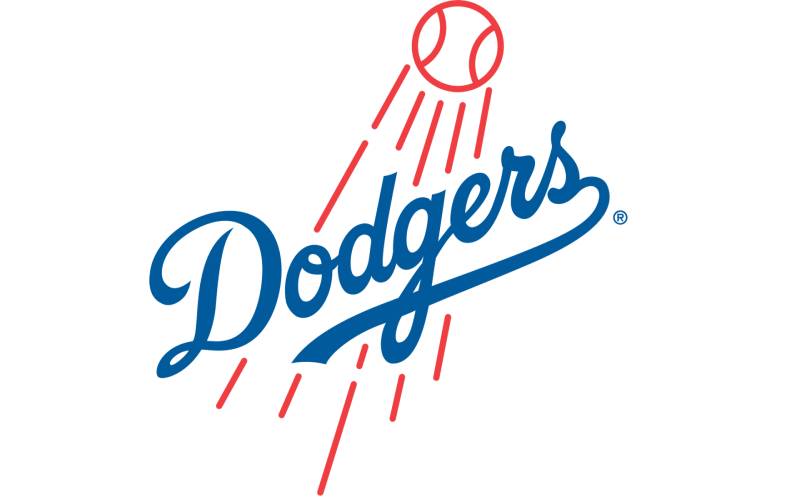
The Los Angeles Dodgers script represents baseball’s most elegant wordmark. This flowing cursive creates immediate classic appeal and sophisticated brand identity.
Logo Design Elements
- Diagonal script lettering flows gracefully
- Each letter connects smoothly
- Suggests speed and dynamic movement
Color Scheme & Symbolism
Primary colors: Blue and white
- Blue suggests reliability and tradition
- White provides clean contrast
- Timeless sophistication
Historical Evolution
Script design originated in Brooklyn (1930s) by designer Lon Keller. Move to Los Angeles maintained treatment with minor refinements.
Brand Recognition Impact
Consistently ranked among world’s greatest sports logos. Creates tremendous global recognition.
Typography & Layout
Diagonal arrangement creates perfect movement. Expert tracking maintains readability with fluid connection.
Miami Marlins Logo
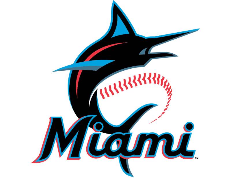
The Miami Marlins marlin logo captures South Florida energy through dynamic fish imagery and vibrant colors. This tropical approach creates immediate regional connection.
Logo Design Elements
- Leaping marlin creates dynamic action
- “Miami” wordmark provides geographic identification
- Natural curves suggest movement and power
Color Scheme & Symbolism
Primary colors: Blue, orange, red, and black
- Reflects Miami’s multicultural energy
- Ocean environment and Latin influences
- Vibrant tropical palette
Historical Evolution
Franchise underwent major rebranding from Florida-wide to Miami-specific focus. Current design emphasizes local connection.
Brand Recognition Impact
Tropical colors differentiate within MLB’s conservative palette. Appeals to diverse, youth-oriented market.
Typography & Layout
Modern sans-serif fonts complement marlin’s energy. Color relationships create strong contrast.
Milwaukee Brewers Logo
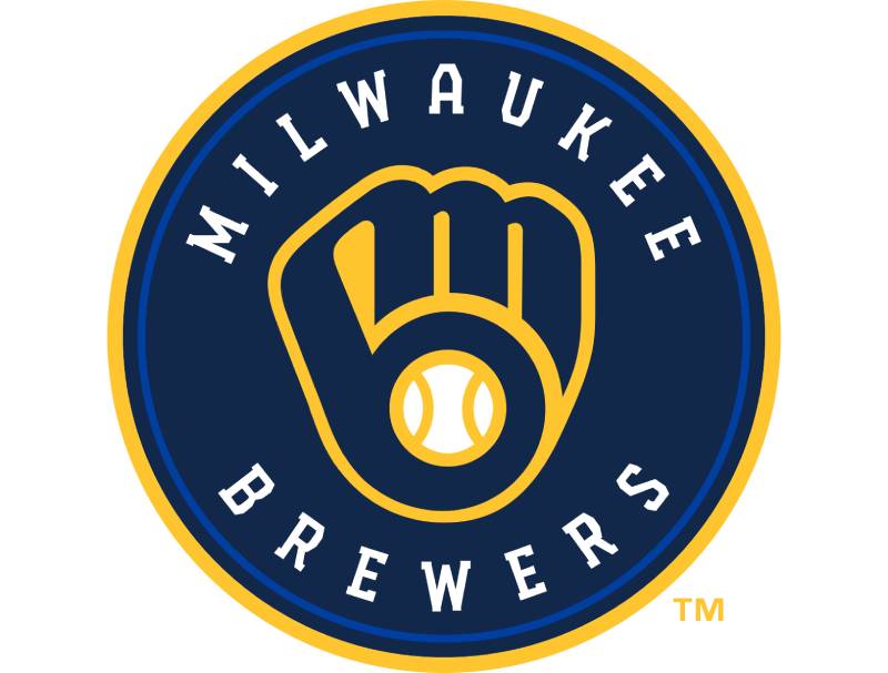
The Milwaukee Brewers ball-in-glove logo creates baseball’s most clever dual-image design. This ingenious approach combines baseball equipment with hidden “M” and “B” letterforms.
Logo Design Elements
- Baseball glove holds baseball
- Negative space reveals “MB” letterforms
- Requires close inspection to discover letters
Color Scheme & Symbolism
Primary colors: Navy blue and gold
- Blue suggests reliability and tradition
- Gold reflects beer industry heritage
- Sophisticated brewing palette
Historical Evolution
Ball-in-glove concept appeared 1970s, returned 1990s. Replaced various “MB” treatments and beer-themed imagery.
Brand Recognition Impact
Hidden letter concept creates memorable interaction. Fans enjoy discovering dual-image, creating word-of-mouth marketing.
Typography & Layout
Masterful negative space manipulation creates readable letterforms. Shows advanced Gestalt principles understanding.
Minnesota Twins Logo
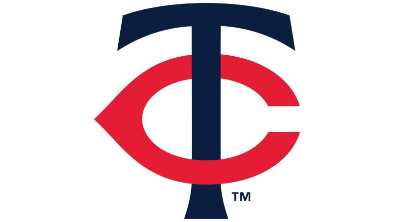
The Minnesota Twins “TC” logo honors Twin Cities through simple letterform design. This straightforward approach emphasizes local connection and geographic identity.
Logo Design Elements
- Interlocking “T” and “C” create unified monogram
- Represents team name and city identity
- Clean, geometric letterforms
Color Scheme & Symbolism
Primary colors: Navy blue, red, and white
- Forms classic American palette
- Suggests patriotic values
- Traditional baseball aesthetics
Historical Evolution
“TC” concept appeared early in franchise history. Refinements focused on letter relationships and visual balance.
Brand Recognition Impact
Simple letterform creates versatile branding opportunities. Works effectively while maintaining local connection.
Typography & Layout
Interlocking letters demonstrate excellent kerning and spatial relationships. Creates unity without sacrificing readability.
New York Mets Logo
The New York Mets circular logo features city skyline imagery capturing New York’s urban landscape. This geographic approach creates metropolitan connection and civic pride.
Logo Design Elements
- “Mets” wordmark curves over stylized skyline
- Bridge elements included
- Traditional baseball badge appearance
Color Scheme & Symbolism
Primary colors: Blue and orange honor former NY teams (Dodgers/Giants)
- Creates unique MLB identity
- Respects local baseball heritage
- Distinctive color combination
Historical Evolution
Circular skyline concept appeared at 1962 founding. Minor refinements updated skyline while maintaining metropolitan theme.
Brand Recognition Impact
Unique orange and blue creates instant recognition. Skyline connects to NYC’s global brand identity.
Typography & Layout
Curved “Mets” follows rule of thirds. Skyline creates visual hierarchy without overwhelming wordmark.
New York Yankees Logo
The New York Yankees interlocking “NY” represents sport’s most iconic monogram. This classic letterform creates immediate global recognition and timeless appeal.
Logo Design Elements
- Interlocking “N” and “Y” create unified monogram
- Perfect geometric relationships
- Letters share strokes while maintaining character
Color Scheme & Symbolism
Primary colors: Navy blue and white
- Navy suggests tradition, reliability, sophistication
- White provides clean contrast
- Ultimate classic palette
Historical Evolution
Interlocking “NY” appeared 1909, remained virtually unchanged. Creates unmatched brand equity across generations.
Brand Recognition Impact
Arguably world’s most recognizable sports logo. Transcends baseball to become global cultural symbol.
Typography & Layout
Perfect typography elements balance. Expert font spacing creates optical perfection.
Oakland Athletics Logo
The Oakland Athletics “A’s” logo features simple letterform emphasizing athletic performance over decoration. This clean approach reflects California’s modern design sensibilities.
Logo Design Elements
- Clean, geometric “A” creates primary identification
- Various treatments emphasize different letter aspects
- Serif to sans-serif approaches depending on needs
Color Scheme & Symbolism
Primary colors: Green and gold
- Green suggests California environment and Irish heritage
- Gold adds premium quality and sunshine
- Unique MLB palette
Historical Evolution
“A’s” concept appeared across multiple cities (Philadelphia, Kansas City, Oakland). Each location maintained core identity.
Brand Recognition Impact
Simple letterform creates versatile branding. Unique color combination ensures visibility.
Typography & Layout
Demonstrates minimalist design principles. Shows understanding of scale and proportion.
Philadelphia Phillies Logo
The Philadelphia Phillies “P” logo connects team identity to city heritage through classic letterform. This traditional approach emphasizes baseball history and civic pride.
Logo Design Elements
- Stylized “P” serves as primary identification
- Various decorative treatments depending on application
- Balances traditional serif with modern readability
Color Scheme & Symbolism
Primary colors: Red, white, and blue
- Patriotic palette appropriate for America’s birthplace
- Red provides energy and passion
- Blue suggests reliability and tradition
Historical Evolution
“P” concept appeared throughout franchise history with various stylistic treatments. Modern versions balance tradition with contemporary requirements.
Brand Recognition Impact
Simple letterform provides flexible foundation. Patriotic colors connect to Philadelphia’s historical significance.
Typography & Layout
Demonstrates classic serif font principles. Traditional design creates timeless appeal.
Pittsburgh Pirates Logo
The Pittsburgh Pirates “P” logo reflects industrial heritage through bold letterform design. This approach connects baseball identity to regional working-class pride.
Logo Design Elements
- Distinctive “P” uses unique serif treatment
- Suggests tradition and strength
- Confident appearance appropriate for pirate theme
Color Scheme & Symbolism
Primary colors: Black and gold
- Black suggests power and determination
- Gold adds premium quality
- Pittsburgh’s city colors
Historical Evolution
“P” underwent various treatments throughout history. Current design balances baseball aesthetics with civic identity.
Brand Recognition Impact
Unique color combination creates MLB differentiation. Industrial palette appeals to blue-collar fan base.
Typography & Layout
Shows expert typography balance. Strong geometric construction creates confident presence.
San Diego Padres Logo
The San Diego Padres interlocking “SD” logo connects team to city heritage through clean letterform design. This approach emphasizes local connection and contemporary appeal.
Logo Design Elements
- Interlocking “S” and “D” create unified monogram
- Smooth connection points
- Balances geometric precision with natural flow
Color Scheme & Symbolism
Primary colors: Brown, gold, and white
- Brown suggests natural elements and Franciscan heritage
- Gold adds warmth and premium quality
- Earthy, California palette
Historical Evolution
“SD” concept appeared in various forms throughout history. Current treatment emphasizes clean geometry while maintaining Spanish colonial heritage.
Brand Recognition Impact
Unique brown and gold creates memorable differentiation. Earthy palette appeals to environmentally-conscious market.
Typography & Layout
Interlocking letters demonstrate excellent spatial relationships and color theory application.
San Francisco Giants Logo
The San Francisco Giants showcase interlocking “SF” monogram representing baseball’s most elegant letterform treatment. This sophisticated approach creates timeless civic pride.
Logo Design Elements
Primary logo: White baseball with orange stitching and diagonal “Giants” script Secondary: Interlocking “SF” monogram with serif typography
- Perfect geometric relationships
- Letters share strokes while maintaining character
- Creates unified yet readable design
Color Scheme & Symbolism
Primary colors: Orange, black, and cream
- Orange represents California sunshine and innovation
- Black adds metropolitan sophistication
- Cream provides classic tradition and premium quality
Historical Evolution
- Began as New York Giants (1883) with “NY” treatments
- 1958 move to San Francisco introduced baseball-and-script concept
- Both designs underwent subtle refinements while maintaining recognition
Regional & Cultural Context
Sophisticated urban culture demands elegant, refined approaches. Connects East Coast tradition to West Coast innovation and artistic sensibility.
Brand Recognition Impact
Orange and black creates unique visual identity within MLB. Sophisticated treatment appeals to educated, culturally aware demographics.
Typography & Layout
“SF” demonstrates masterful kerning and letter relationships. Perfect geometric proportions create timeless appeal transcending baseball to become civic symbol.
Seattle Mariners Logo
The Seattle Mariners compass logo captures Pacific Northwest maritime heritage through nautical design elements. This sophisticated approach connects team identity to regional seafaring culture.
Logo Design Elements
- Compass rose design incorporates team colors
- Circular format includes directional elements
- Suggests navigation and adventure
Color Scheme & Symbolism
Primary colors: Navy blue, teal, and silver
- Navy suggests ocean depth and reliability
- Teal reflects Pacific waters
- Silver adds modern sophistication
Historical Evolution
Various nautical themes throughout franchise history, including trident imagery. Current compass design emphasizes navigation while maintaining maritime connection.
Brand Recognition Impact
Unique compass imagery differentiates from traditional baseball symbols. Appeals to Pacific Northwest’s outdoor recreation culture.
Typography & Layout
Compass elements demonstrate excellent radial balance and geometric precision. Maritime themes create natural storytelling opportunities.
St. Louis Cardinals Logo
The St. Louis Cardinals “Birds on Bat” logo represents baseball’s most elegant wildlife integration. Two cardinals perched on baseball bat create timeless imagery connecting team name to visual representation.
Logo Design Elements
- Two realistic cardinal birds perch naturally on wooden bat
- Balances wildlife accuracy with athletic functionality
- Creates sophisticated sports imagery
Color Scheme & Symbolism
Primary colors: Red, navy blue, and white
- Red connects to cardinal plumage and symbolizes passion
- Navy provides professional stability
- Classic American palette
Historical Evolution
“Birds on Bat” debuted 1922, inspired by Branch Rickey and local church decorations. Design remained virtually unchanged for over 100 years.
Brand Recognition Impact
Consistently ranked among sports’ greatest logos worldwide. Creates tremendous merchandise appeal and connects multiple generations.
Typography & Layout
Bird placement demonstrates perfect understanding of design elements and natural movement. Creates unity between athletic and natural elements.
Tampa Bay Rays Logo
The Tampa Bay Rays sunburst logo captures Florida sunshine through dynamic radiating design. This energetic approach reflects regional climate and team name evolution.
Logo Design Elements
- Radiating lines create sunburst effect
- “RAYS” wordmark integrated into design
- Geometric rays suggest sunshine and energy
Color Scheme & Symbolism
Primary colors: Navy blue and light blue
- Blues suggest ocean and sky
- Creates sophisticated alternative to Florida orange themes
- Coastal palette
Historical Evolution
Evolved from “Devil Rays” to “Rays” (2008), shifting from marine life to sunshine themes. Reflected broader appeal and positive association goals.
Brand Recognition Impact
Unique sunburst treatment creates MLB differentiation. Provides natural energy and optimism associations.
Typography & Layout
Radiating lines create dynamic movement while maintaining visual hierarchy. Demonstrates effective emphasis through repetition.
Texas Rangers Logo
The Texas Rangers “T” logo incorporates state identity through bold letterform and regional symbolism. This straightforward approach emphasizes team name and geographic pride.
Logo Design Elements
- Stylized “T” serves as primary identification
- Various treatments incorporate Texas-specific elements
- Bold, confident construction appropriate for state identity
Color Scheme & Symbolism
Primary colors: Red, white, and blue
- Creates patriotic Texas palette
- Connects to state flag imagery
- American baseball tradition
Historical Evolution
“T” concept appeared in various forms throughout franchise history. Different treatments emphasized Texas identity while maintaining letterform recognition.
Brand Recognition Impact
Simple letterform creates flexible branding opportunities across Texas’s diverse markets. State connection provides natural fan loyalty.
Typography & Layout
“T” demonstrates strong geometric construction with clear baseline relationships. Bold proportions create confident brand presence.
Toronto Blue Jays Logo
The Toronto Blue Jays logo features Canada’s national bird with maple leaf elements. This design creates immediate Canadian connection while honoring team name and national identity.
Logo Design Elements
- Stylized blue jay incorporates maple leaf details
- Confident athletic stance
- Balances natural accuracy with sports functionality
Color Scheme & Symbolism
Primary colors: Blue, red, and white
- Creates Canadian flag palette
- Blue connects to team name and jay plumage
- Red provides energy and national pride
Historical Evolution
Various blue jay treatments evolved throughout franchise history. Current design emphasizes bird accuracy and Canadian symbolism through integrated maple leaf elements.
Brand Recognition Impact
Unique Canadian connection creates natural MLB differentiation. Maple leaf symbolism provides instant national recognition and pride.
Typography & Layout
Bird design demonstrates effective color psychology and natural movement. Maple leaf integration shows sophisticated symbolic understanding.
Washington Nationals Logo
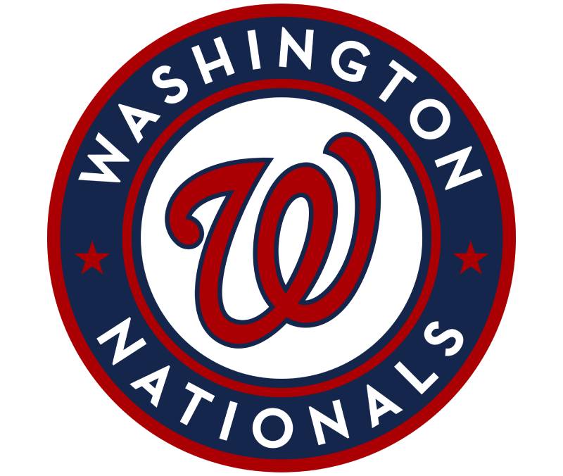
The Washington Nationals curly “W” creates one of baseball’s most distinctive letterforms. This unique approach differentiates franchise while connecting to nation’s capital identity.
Logo Design Elements
- Decorative “W” features distinctive curl elements
- Creates memorable character
- Balances traditional serif principles with unique flourish
Color Scheme & Symbolism
Primary colors: Red, white, and blue
- Creates patriotic capital palette
- Connects to American flag imagery
- Reflects Washington D.C.’s government significance
Historical Evolution
Curly “W” appeared when franchise moved from Montreal to Washington (2005). Created new D.C. identity while establishing unique visual character.
Brand Recognition Impact
Unique curl treatment creates instant differentiation from other “W” logos. Despite pharmacy comparisons, maintains strong baseball identity.
Typography & Layout
“W” demonstrates creative typography elements adaptation with flourish integration. Curl creates memorable focal point while maintaining readability.
FAQ on Baseball Team Logos
Which MLB team has the most iconic logo?
The New York Yankees interlocking “NY” ranks as baseball’s most iconic logo globally. This design has remained virtually unchanged since 1909, creating unmatched brand recognition that transcends sports to become a cultural symbol worn worldwide.
How often do baseball teams change their logos?
Most MLB franchises update their team logos every 15-25 years for modernization. Conservative teams like the Yankees and Cardinals rarely change, while others rebrand more frequently to refresh their athletic branding and appeal to new generations.
What makes a baseball logo design successful?
Successful logos combine simplicity, regional relevance, and memorable imagery. The best baseball emblems use clean typography, distinctive color schemes, and symbols that connect emotionally with fans while maintaining versatility across merchandise applications.
Why do teams use animal mascots in their logos?
Animal imagery creates instant emotional connection and regional identity. Teams like the Tigers, Cardinals, and Orioles use mascot graphics because animals represent strength, loyalty, and local wildlife, making them powerful symbols for team identity and fan merchandise.
Which baseball team logos use the most colors?
The Miami Marlins utilize the most vibrant color palette with blue, orange, red, and black combinations. Most MLB teams prefer 2-3 colors for cleaner reproduction and stronger brand recognition across uniform designs and team merchandise applications.
What typography styles work best for baseball logos?
Classic serif fonts and script lettering dominate successful baseball team logos. Teams favor traditional typefaces that convey heritage and reliability, though some modern franchises experiment with contemporary sans-serif treatments for younger appeal.
How do regional cultures influence logo designs?
Franchise logos reflect local geography, history, and cultural values. The Cardinals reference Missouri’s state bird, while the Giants’ colors represent San Francisco’s fog and sunsets. Regional symbolism creates deeper fan connections beyond simple athletic identification.
What role does color psychology play in team branding?
Colors trigger emotional responses that strengthen team branding. Red conveys passion and energy, blue suggests reliability and tradition, while unique combinations like the Athletics’ green and gold create distinctive recognition in crowded sports marketing environments.
Which logos have undergone the most dramatic changes?
The Arizona Diamondbacks shifted from purple and turquoise to red and black, then back to incorporating turquoise. The Miami Marlins completely rebranded from Florida-wide identity to Miami-specific focus, changing colors, imagery, and overall franchise identity multiple times.
How do trademark laws affect baseball logo usage?
MLB teams hold strict trademark protection over their logos, preventing unauthorized commercial use. Personal, non-commercial usage like fan art receives more tolerance, but merchandise, business applications, and promotional materials require explicit licensing agreements with individual franchises.
Conclusion
Baseball team logos represent far more than simple graphic design exercises. These visual symbols forge emotional connections that span generations, transforming casual fans into lifelong devotees through carefully crafted imagery and thoughtful color psychology.
The most successful franchise identities balance tradition with innovation. Teams like the Cardinals maintain century-old designs while others like the Guardians embrace complete rebranding to reflect evolving cultural values and regional pride.
Sports branding continues evolving as teams recognize logos’ power in merchandise sales and global recognition. Modern designers must consider digital applications, social media presence, and international appeal while respecting baseball heritage.
Understanding logo design principles reveals why certain emblems achieve iconic status. Effective team insignia combine memorable imagery, appropriate color schemes, and cultural resonance that transcends sport itself.
These athletic symbols will continue adapting to new generations while preserving the timeless appeal that makes baseball America’s pastime. Great logos endure because they capture something deeper than winning records.

Renowned for his expertise in logo design and visual branding, Bogdan has developed a multitude of logos for various clients.
His skills extend to creating posters, vector illustrations, business cards, and brochures. Additionally, Bogdan's UI kits were featured on marketplaces like Visual Hierarchy and UI8.
He also wrote in the past years on sites like Design Your Way, WebDesignerDepot, WPDean, Designmodo, Speckyboy, Slider Revolution, and more.
- The Windsurf Logo History, Colors, Font, And Meaning - 10 October 2026
- How to Remove Background From Product Photos (No Photoshop) - 10 October 2026
- How Designers can Build a Stronger Online Creative Identity - 9 October 2026

Bogdan Sandu is a seasoned designer who has been designing websites since 2008. Renowned for his expertise in logo design and visual branding, Bogdan has developed a multitude of logos for various clients. His skills extend to creating posters, vector illustrations, business cards, and brochures. Additionally, Bogdan's UI kits were featured on marketplaces like Visual Hierarchy and UI8. He also wrote in the past years on sites like Design Your Way, WebDesignerDepot, WPDean, Designmodo, Speckyboy, Slider Revolution, and more.
You Might Also Like


