The Milwaukee Brewers Logo History, Colors, Font, and Meaning

Drenched in hues of navy, royal, and a golden sunrise, the Milwaukee Brewers logo is more than a mere emblem. It’s a tapestry woven from decades of baseball heroics, communal spirit, and design ingenuity—a symbol that unites fans and embodies a city’s heart.
This insignia doesn’t just rest on caps and jerseys; it pulsates with the lifeblood of Major League Baseball’s rich heritage.
In this exploration, we delve into an icon transcending sports memorabilia, touching upon the emblem’s evolution and the saga behind its celebrated ball and glove design.
Experiencing the interplay of sports team branding and regional identity, readers will unearth the vignettes etched within every stitch of the Brewers logo contortions.
By the final word, a revelation awaits: how a mere mark communicates the legacy of the Milwaukee Brewers and its emblematic resonance across the American Family Field, shedding light on the craft that underpins professional baseball logos.
With a masterstroke revealing the Brewers insignia’s place in MLB lore, the canvas of a team’s soul is unveiled for aficionados and novices alike.
The Meaning Behind the Milwaukee Brewers Logo
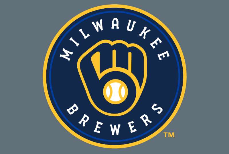
When you gaze upon the Milwaukee Brewers logo, you might think, “Hey, it’s just a neat design!” But, like most iconic emblems, there’s more to it than meets the eye. Dive in with me.
The Hidden Ball and Glove
The most recognizable aspect, the ball and glove, isn’t just about baseball. The glove is formed using a lowercase ‘m’ and ‘b’ which, you guessed it, stands for Milwaukee Brewers.
How cool is that? So it’s like they’ve slipped a little secret handshake into their brand. A nod to those in the know.
Beer and Brewing
Milwaukee has deep roots in brewing. So when you look at their logo, remember that it isn’t only about baseball but also a homage to the city’s rich beer history.
The History of the Milwaukee Brewers Logo
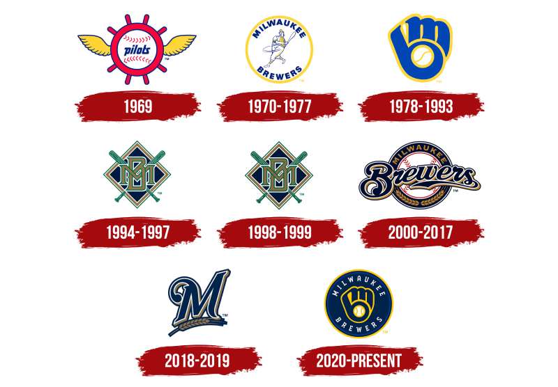
Let’s hop into our time machine for a minute.
Origins: Stepping onto the Field
The team’s initial logos weren’t that flashy. It was simple, with a barrel man character holding a bat. The tie to brewing? Well, the barrel. Clearly, beer was on their minds from day one.
Evolution: Keeping it Fresh
Over the years, the logo underwent various changes. The barrel man gave way to the ball and glove design we’re gushing over. This shift wasn’t just about looking cool but aligning more with baseball while still winking at Milwaukee’s beer history.
The Colors of the Milwaukee Brewers Logo

Colors aren’t random. Nope. They convey emotions, stories, and so much more.
Navy Blue
This isn’t just any blue. It’s deep. It symbolizes strength, trust, and determination. Quite fitting for a baseball team, right?
Yellow
Ah, the vibrant splash of yellow. It’s all about energy, brightness, and happiness. Plus, if you ask me, it kinda reminds you of a chilled, frothy beer. Cheers to that!
The Font Used in the Milwaukee Brewers Logo
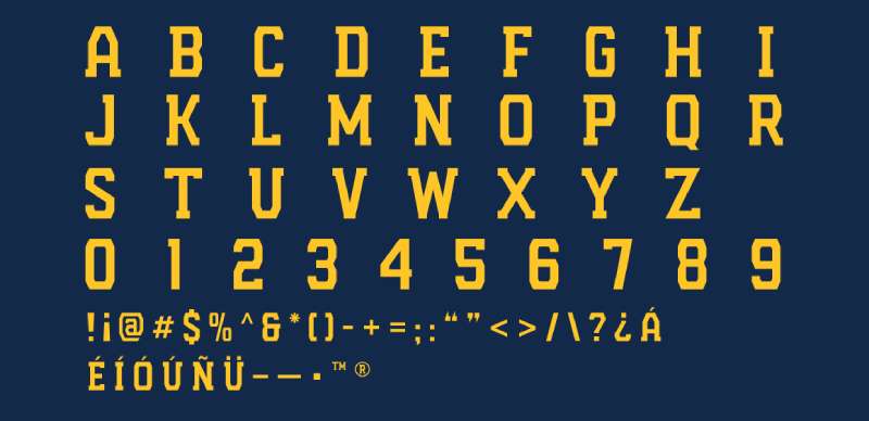
Ever wondered about those letters? Well, me too!
Unique Yet Familiar
The font in the logo has a sporty flair, suggesting movement and dynamism. It’s bold, signaling the strength and resilience of the team. But it isn’t just any font you’d find on a computer. It’s been tailored, adjusted, and made just right for the Brewers.
Influence on Pop Culture
With such an iconic emblem, it’s no surprise that the Brewers’ logo has made waves beyond baseball.
Fashion Statements
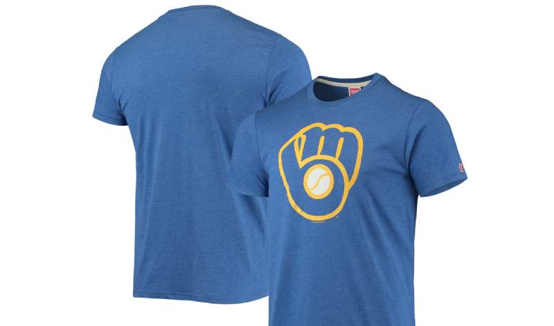
From caps to tees, the logo’s unique design makes it a popular choice for fans and fashionistas alike. It’s become a symbol of pride, not just for the team but for the city of Milwaukee.
Tattoos and Art
Yep, some fans have gone that extra mile and inked the logo on them. Beyond tattoos, the design has inspired various artworks, both digital and traditional.
Global Recognition and Appeal
Even if you aren’t from Milwaukee or the U.S., there’s a chance you’ve seen the logo. Why?
Universal Design Elements
The ball, glove, colors, and even the font have a universal appeal. It’s not just about baseball or beer but the unity of community, the thrill of the game, and the passion for a city. People from all over can relate to that.
Spreading Through Merch
You’ll find Milwaukee Brewers merch all over the globe. From a cap in Tokyo to a tee in Paris, the logo travels, bringing its unique story to every corner of the world.
FAQ On The Milwaukee Brewers Logo
What inspired the design of the Milwaukee Brewers logo?
The iconic Milwaukee Brewers ball and glove logo, conceptualized by Tom Meindel, was inspired by the fundamental elements of baseball—a mitt, a ball, and the simple joy of the game.
It ingeniously blends the letters ‘M’ and ‘B’, embodying Milwaukee’s deep-rooted affinity for America’s pastime.
How has the Milwaukee Brewers logo evolved over the years?
Beginning with a simple “MB” script, the logo evolved into the legendary glove design in 1978, revered for its clever letter integration.
It underwent modernization in 2000, then circled back with nods to classic aesthetics and updated tones of navy blue and gold for Milwaukee’s timeless character.
What do the colors in the Milwaukee Brewers logo represent?
The Brewers’ palette features navy blue for professionalism, gold for excellence and a legacy of success, and occasionally, royal blue for vibrancy. These colors unite to reflect the team’s spirit and commitment while resonating with Milwaukee’s cultural zest and heritage.
Can I use the Milwaukee Brewers logo on merchandise?
Usage is strictly governed by trademark laws; proprietorial rights are reserved for official use. Unauthorized reproductions skirt legal boundaries, with exceptions for personal, non-commercial DIY crafts.
Always seek permission for merchandise with the Milwaukee Brewers logo, ensuring alignment with licensing agreements and sports branding guidelines.
Why did the Milwaukee Brewers return to the original logo?
Nostalgia swayed the Brewers back to their original glove logo due to overwhelming fan affection and demand. The retro Milwaukee Brewers logo represents the franchise’s historic moments, reconnecting with a golden era cherished amongst a sea of fans, players, and stakeholders within the Major League Baseball community.
Are there special edition logos for the Milwaukee Brewers?
Certainly, special occasions bring out limited-run emblems. Think postseason campaigns, anniversaries, or community events—a diverse set of logos echo through Milwaukee Brewers’ time and space, creating memorabilia that captures the hearts of collectors and die-hard fans alike.
Is the glove the only element used in the Milwaukee Brewers logo?
The glove bounds, but doesn’t limit, the Brewers’ iconography. Bernie Brewer, the club’s mustachioed mascot, graces many a merchandise permutation.
Throw in wheat motifs, stitching on a baseball, or even the state of Wisconsin itself—the elements converge, narrating the Brewers’ tale far beyond the mitt.
How does the Milwaukee Brewers logo reflect the city of Milwaukee?
The Brewers logo mirrors Milwaukee’s gritty, industrious ethos, while tipping its cap to community spirit. The city’s brewing legacy subtly permeates the emblems and patterns, be it through color choices, retro vibes, or the unifying force that draws citizens into the embrace of American Family Field.
Will the Milwaukee Brewers logo change again in the future?
In a world where branding spins at the drop of a dime, change is inevitable. However, Milwaukee’s attachment to its glove symbol ranks sacrosanct.
Future iterations will surely balance sports logo evolution with the undying love for the ball and glove—a visual harmony that whispers baseball in Milwaukee’s ears.
How does the Milwaukee Brewers logo impact team identity and culture?
The emblem burgeons as more than fabric fodder; it’s a cultural cornerstone, impacting identity indelibly. Players don silhouettes of pride while fans brandish caps emblazoned with passion.
Unseen, it orchestrates unity, curating a cultural cadence synonymous with the heartbeat of Milwaukee and the global tapestry of Major League Baseball.
Conclusion
In the grand tableau of Major League Baseball, each stitch of the Milwaukee Brewers logo heralds a legacy. Like an artistic alchemy, it merges history with modernity, capturing hearts from the stands of American Family Field to the streets of Milwaukee. With each curve and color choice, it bespeaks volumes of baseball sagas and communal fervor.
As the final chapter of this logo narrative folds, consider the Brewers insignia not merely a visual token, but a beacon. It’s a masterful symphony of design elements, a nod to the hardy spirit of Milwaukee, and a banner under which fans unite. Embrace it as both a remembrance of yesteryears and the anticipation of future glories, woven intricately into the fabric of the city. For every cap tilted in a sun-soaked game, there lies within a world – a microcosm shaped by a glove, a ball, and the immutable colors of conviction and camaraderie.
- What marvels await as the logo evolves?
- How will legacy and innovation blend in its next iteration?
These are stories yet to be told, in the emblematic journey of the Milwaukee Brewers.
If you liked this article about the Milwaukee Brewers logo, you should check out this article about the Cleveland Indians logo.
There are also similar articles discussing the Atlanta Braves logo, the Chicago Cubs logo, the Minnesota Twins logo, and the New York Mets logo.
And let’s not forget about articles on the Washington Nationals logo, the Texas Rangers logo, the Baltimore Orioles logo, and the San Francisco Giants logo.


