The Minnesota Twins logo is one of the most recognizable marks in Major League Baseball, and it has been since the franchise packed up and left Washington, D.C. back in 1961. It carries the weight of two cities, a Mississippi River handshake, and more than six decades of baseball history in the Upper Midwest.
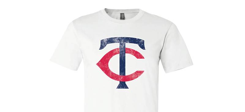
What makes this logo interesting is how it refuses to pick sides. Minneapolis or St. Paul? Both. The interlocking “TC” on the cap has quietly become one of the most beloved marks in professional sports, even though neither letter appears in the team’s actual name. That is by design.
The franchise was founded in 1901 as the Washington Senators before relocating to Minnesota. Since then, the team has gone through roughly a dozen logo variations, with the most recent full rebrand happening ahead of the 2023 season. Designer Matthew Wolff, a Minneapolis native, led that effort.
What Is the Minnesota Twins Logo?
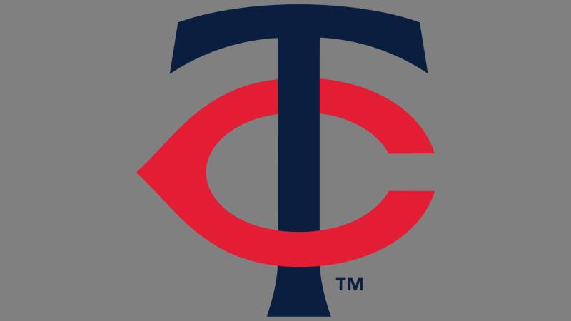
The Minnesota Twins logo is a combination mark featuring an interlocking navy blue “T” and scarlet red “C” representing the Twin Cities of Minneapolis and St. Paul. The current version was refined by designer Matthew Wolff and introduced for the 2023 season as part of a complete brand refresh.
Here is a breakdown of the logo’s core attributes:
- Design Type: Combination mark (interlocking letterform with wordmark variations)
- Primary Elements: Interlocking “TC” monogram, “Twins” script wordmark, Minnie and Paul handshake illustration, navy “M” with red North Star
- Official Introduction Date: November 18, 2022 (for 2023 season debut)
- Designer: Matthew Wolff (creative lead), with typography by Jeremy Nelson, under creative direction from Kevin Hughes
- Trademark Status: Registered trademark of the Minnesota Twins, licensed through MLB
- Color Palette: Twins Navy (#002B5C), Scarlet Red (#D31145), Kasota Gold (#B9975B), White (#FFFFFF)
- Usage Context: Game uniforms, caps, merchandise, Target Field signage, digital platforms, broadcast graphics, and all official team communications
How Has the Minnesota Twins Logo Evolved Over Time?
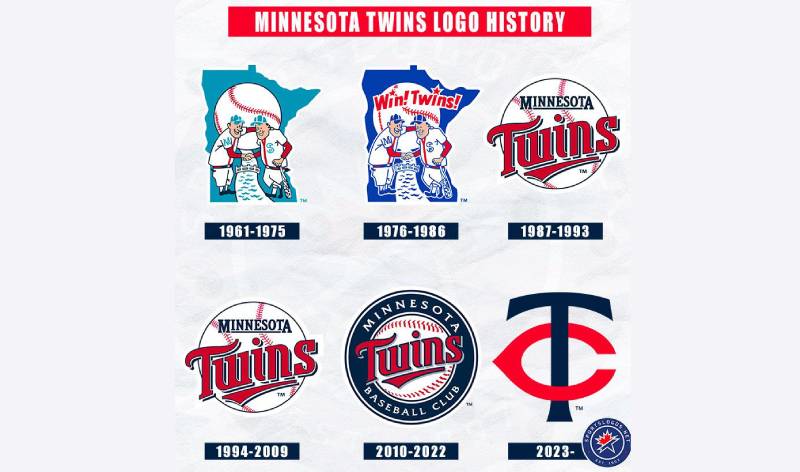
The Minnesota Twins logo has gone through roughly five major design phases since 1961, plus smaller tweaks within each era. The franchise started with the Minnie and Paul handshake illustration, shifted to a baseball-centric wordmark in 1987, and returned to its roots with a refined “TC” in 2023.
The full timeline shows a team that keeps circling back to its original identity. And honestly, that says a lot about how strong Ray Barton’s initial concept was.
Original Minnesota Twins Logo (1961-1986)
- Years Active: 1961-1986
- Design Description: Two baseball players, nicknamed “Minnie” (representing Minneapolis) and “Paul” (representing St. Paul), shaking hands across the Mississippi River. The figures wear uniforms with “M” and “STP” on them. Behind them sits a light blue silhouette of the state of Minnesota with a white baseball.
- Color Scheme: Red, light blue, white, flesh tones
- Designer: Ray Barton, a local illustrator who was paid just $15 for the work
- Context: Created when the Washington Senators relocated to Minnesota. Owner Calvin Griffith needed a mark that honored both Minneapolis and St. Paul without favoring either city. Barton’s illustration was originally intended for paper cups at Metropolitan Stadium concessions.
- Key Changes from Previous: Complete departure from the Washington Senators’ simple “W” lettermark
- Cultural Significance: Became the visual identity of the franchise’s new beginning. The handshake represented unity between two rival cities, and the “TC” cap logo debuted alongside it. A 46-foot neon version of this logo now stands at Target Field.
Wordmark Era Logo (1987-2009)
- Years Active: 1987-2009
- Design Description: A red scripted “Twins” wordmark with “win” underlined, set on top of a white baseball with red stitching. “Minnesota” appeared above in blue block letters. The Minnie and Paul characters were dropped from the primary mark.
- Color Scheme: Red, navy blue, white
- Designer: Not publicly credited to a single designer
- Context: The franchise wanted a fresh start. The block “M” replaced “TC” on caps, and the team leaned into a more modern, streamlined look. This was the era of Kirby Puckett and two World Series titles (1987 and 1991).
- Key Changes from Previous: Minnie and Paul removed from primary logo. Script wordmark replaced illustrated characters. Cap switched from “TC” to “M.”
- Cultural Significance: Fans associate this look with the team’s championship years. The underlined “win” in “Twins” became a clever bit of visual storytelling that fans grew to love.
Target Field Era Logo (2010-2022)
- Years Active: 2010-2022
- Design Description: An updated version of the 1987 wordmark, now enclosed in a navy blue circle reading “Minnesota Baseball Club.” The Minnie and Paul logo returned as an alternate mark. The “TC” came back as the primary cap logo. Gold trim was added to several elements.
- Color Scheme: Navy blue, red, gold, white
- Designer: In-house and MLB brand team
- Context: The move to Target Field gave the Twins a reason to refresh. The return of “TC” on caps was partly a tribute to former owner Calvin Griffith, who died in 1999. The team wanted to reconnect with its original Twin Cities identity.
- Key Changes from Previous: Circular badge format. Gold accents added. “TC” returned to caps. Minnie and Paul reinstated as an alternate.
- Cultural Significance: This era bridged the old and new. Target Field itself features the massive neon Minnie and Paul sign that lights up after home runs. Fans overwhelmingly preferred the “TC” over the block “M.”
Current Minnesota Twins Logo (2023-Present)
- Years Active: 2023-present
- Design Description: A refined “TC” monogram with corrected symmetry and balanced serifs. The secondary mark features a navy “M” topped with a red North Star. A new “Twin Cities” script appears on alternate jerseys. The primary logo retains the baseball enclosure with “Minnesota Baseball Club” text.
- Color Scheme: Twins Navy (#002B5C), Scarlet Red (#D31145), Kasota Gold (#B9975B), White, Cream
- Designer: Matthew Wolff (lead designer), Jeremy Nelson (typographer), Kevin Hughes (creative director)
- Context: The first complete brand overhaul since 1987. Wolff began the project in early 2020, but COVID-19 pushed the debut to 2023. Unveiled at the Mall of America, built on the former site of Metropolitan Stadium.
- Key Changes from Previous: “TC” rebalanced with corrected center alignment. The “C” was made smaller. Blue was darkened. Serif endings on the “T” were updated. New “M” with North Star replaced the old cursive “M.” Gold trim was reduced.
- Cultural Significance: The North Star motif connects the Twins to a broader Minnesota identity shared with the Timberwolves and other state teams. The “M” is a flipped version of the old Washington Senators “W,” a subtle nod the designer called “a happy accident.”
What Do the Design Elements of the Minnesota Twins Logo Mean?
Every piece of the Minnesota Twins logo connects back to geography, history, or regional pride. The “TC” stands for Twin Cities. The Minnie and Paul figures represent Minneapolis and St. Paul. The North Star on the “M” cap ties into Minnesota’s state identity as “The North Star State.”
Nothing in this mark is accidental. Even the old cursive “M” that got retired in 2023 had its own story. But the current suite of logos tells a more cohesive one.
Why Did the Minnesota Twins Choose These Specific Colors?
The Twins’ color palette carries specific meaning for each shade.
Twins Navy (Hex: #002B5C, Pantone PMS 289 C) serves as the primary color. It signals authority and stability. The 2023 rebrand darkened this shade from previous versions to create stronger contrast and separate the Twins from the dozens of other red-white-and-blue MLB teams.
Scarlet Red (Hex: #D31145, Pantone PMS 200 C) adds energy and ties back to the franchise’s history dating to its Washington Senators days. Red has been part of the team’s identity since 1901. The psychological impact of red in sports branding triggers feelings of intensity and competition.
Kasota Gold (Hex: #B9975B, Pantone PMS 465 C) is named after Kasota stone, a limestone found in southern Minnesota that was used in many of the state’s historic buildings. This color grounds the identity in something physically Minnesotan.
White (Hex: #FFFFFF) provides balance and breathing room across all applications.
What Typography Style Is Used in the Minnesota Twins Logo?
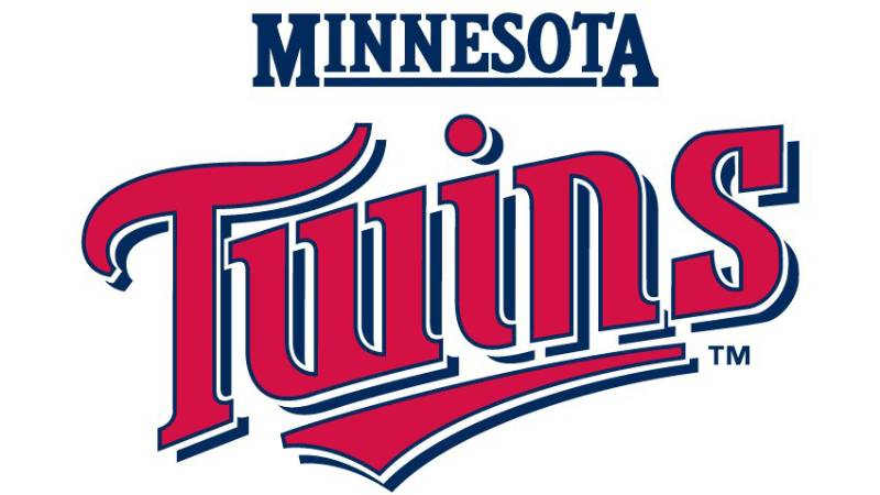
The Twins use a custom serif typeface for the “TC” monogram and a modified script for the “Twins” wordmark. Jeremy Nelson developed the custom lettering alongside Matthew Wolff during the 2023 rebrand.
The serifs on the “T” give the mark a classic, established feel. Took them a while to land on exactly how those serifs should look, too. The team ran focus groups and went back and forth on small details most fans would never notice.
The “Twins” script keeps a hand-lettered quality that connects it to vintage baseball lettering traditions. The “Minnesota” block wordmark on road jerseys uses a clean, structured approach that reads well from a distance. That matters when you are sitting in the upper deck at Target Field.
What Are the Hidden Meanings in the Minnesota Twins Logo?
The “M” on the road cap is actually the old Washington Senators “W” flipped upside down. Designer Matthew Wolff called this “a happy accident,” but it serves as a quiet link between the franchise’s two homes.
The crossed pennant sleeve patch features “M” and “STP” on separate flags, pulled directly from the jerseys worn by Minnie and Paul in the original 1961 logo. Most fans do not catch that one.
The Minnie and Paul handshake itself represents more than just two cities. It was a political gesture. Calvin Griffith could not afford to alienate either Minneapolis or St. Paul when he moved the franchise west. So the handshake became a visual promise of inclusion.
How Does the Minnesota Twins Logo Compare to Competitor Logos?
The Twins sit in a tricky spot visually. The American League Central has some strong marks to compete with. The Chicago White Sox logo is a clean, bold wordmark. The Detroit Tigers logo has that old English “D” that is hard to beat for pure recognition.
But the “TC” does something most baseball team logos do not. It represents a metro area rather than a single city. That makes it unique across all of MLB.
Compared to division rivals like the Kansas City Royals logo or the Cleveland Guardians logo, the Twins have more visual layers to work with. The “TC” for home games, the “M” with North Star for the road, and the Minnie and Paul illustration for heritage moments. That kind of depth in a logo system is something teams like the New York Yankees or Los Angeles Dodgers have built over much longer timelines.
Where the Twins fall behind is instant readability at small sizes. A single-letter mark like Detroit’s “D” or the St. Louis Cardinals logo with its bird-on-bat reads faster than two interlocking letters. Your mileage may vary on whether that matters, but for digital and mobile applications, it is worth thinking about.
What Are the Technical Specifications of the Minnesota Twins Logo?
Official Color Codes
- Twins Navy – Hex: #002B5C | RGB: (0, 43, 92) | CMYK: (99, 85, 45, 50) | Pantone: PMS 289 C
- Scarlet Red – Hex: #D31145 | RGB: (211, 17, 69) | CMYK: (18, 100, 88, 9) | Pantone: PMS 200 C
- Kasota Gold – Hex: #B9975B | RGB: (185, 151, 91) | CMYK: (27, 38, 74, 3) | Pantone: PMS 465 C
- White – Hex: #FFFFFF | RGB: (255, 255, 255) | CMYK: (0, 0, 0, 0)
Dimensions and Proportions
The 2023 “TC” monogram was specifically rebalanced to correct asymmetries present in the original 1960s design. The “T” and “C” now interlock with proper center alignment, and the serifs are evenly distributed.
For print applications, the logo should be reproduced at no less than 0.75 inches wide to maintain legibility of the interlocking letters. Clear space around the mark should equal the height of the “C” on all sides.
The logo exists in vector format (SVG, EPS, AI) for scalable use, and in JPEG and PNG raster formats for digital applications. All official files are distributed through MLB’s brand portal.
What Cultural Impact Has the Minnesota Twins Logo Had?
The Minnie and Paul handshake is probably the most emotionally significant piece of the whole identity. That 46-foot neon sign at Target Field lights up every time a Twins player hits a home run. It has become a ritual, a moment that ties the crowd together regardless of the score.
Vintage Twins gear has seen a real surge in popularity recently. The retro Minnie and Paul mark and the old “TC” show up at streetwear shops and in fashion circles that have nothing to do with baseball. That crossover appeal is something most MLB teams would love to have.
The “TC” has also become a broader symbol for the Twin Cities metro area itself. Twins president Dave St. Peter has called it “the most popular team logo in the state of Minnesota.” And when you think about it, that is a pretty big claim in a state with the Vikings, Timberwolves, and Wild all competing for attention.
How Does the Minnesota Twins Logo Fit Into the Overall Brand Identity?
The 2023 rebrand pulled everything together in a way the franchise had not managed before. Previous eras had mismatched elements from different decades. One jersey might use 1960s lettering while another pulled from the 1987 redesign. It was a patchwork.
Now the whole system connects. The “TC” on the home cap, the “M” with North Star on the road cap, the “Twins” script on jerseys, the “Twin Cities” alternate, and the Minnie and Paul heritage mark all share the same font family and design language.
The team’s brand guidelines govern how these marks appear across Target Field signage, broadcast graphics, social media, and licensed merchandise. Kasota Gold serves as the connective thread, appearing in trim and accent roles across all touchpoints. It is the one color that is purely Minnesotan.
How Should the Minnesota Twins Logo Be Used?
If you want to use the Minnesota Twins logo for anything beyond personal, non-commercial purposes, you need to go through MLB’s licensing process. The logo, all its variations, and the team’s wordmarks are registered trademarks.
Do:
- Use official logo files from MLB’s brand asset portal
- Maintain the required clear space around the mark
- Reproduce the logo in its approved color combinations only
- Use the correct version for each context (primary “TC” for general use, “M” with North Star for Minnesota-specific applications, Minnie and Paul for heritage uses)
Don’t:
- Alter the proportions or colors of the logo
- Place the logo on backgrounds that reduce its legibility
- Combine the logo with other team marks or unofficial graphics
- Use the logo for commercial purposes without an MLB license
Official logos and brand style guide assets are accessible through the Minnesota Twins’ front office and MLB Properties for licensed partners. Fans looking for personal-use files can find approved logo images on the team’s official MLB page. For any commercial use on merchandise, apparel, or digital products, licensing agreements must be secured through MLB.
FAQ on The Minnesota Twins Logo
What does the TC stand for on the Minnesota Twins logo?
The “TC” stands for Twin Cities, representing both Minneapolis and St. Paul. When Calvin Griffith moved the franchise from Washington in 1961, he refused to put an “M” on the cap because it might seem to favor Minneapolis over St. Paul.
Who designed the original Minnesota Twins logo?
Illustrator Ray Barton created the original Minnie and Paul handshake logo in late 1960. He was paid $15 for it.
The drawing was initially meant for paper cups at Metropolitan Stadium concessions. Griffith liked it enough to make it the team’s official emblem.
When did the Minnesota Twins last change their logo?
The most recent rebrand launched for the 2023 season. Minneapolis-raised designer Matthew Wolff led the project, which started in early 2020 but got delayed by the pandemic.
It was the first complete brand overhaul since 1987.
What are the official Minnesota Twins logo colors?
The team uses Twins Navy (#002B5C), Scarlet Red (#D31145), Kasota Gold (#B9975B), and White. Kasota Gold is named after a limestone found in southern Minnesota. The 2023 update darkened the navy to stand out from other red-white-and-blue MLB teams.
What is the Minnie and Paul logo?
It shows two baseball players shaking hands across the Mississippi River. “Minnie” represents Minneapolis and “Paul” represents St. Paul.
A 46-foot neon version of this mark lights up at Target Field after every Twins home run.
Why did the Minnesota Twins add the M logo with a North Star?
The navy “M” topped with a red star represents Minnesota as the North Star State. The “M” itself is actually the old Washington Senators “W” flipped upside down. Designer Matthew Wolff called that connection a happy accident.
What font does the Minnesota Twins logo use?
The team uses a custom serif typeface for the “TC” monogram and a modified script for the “Twins” wordmark. Typographer Jeremy Nelson built the lettering during the 2023 rebrand to match across all uniform and merchandise applications.
How many logos has the Minnesota Twins franchise had?
The franchise has gone through roughly a dozen logo variations since arriving in Minnesota. Five major design phases cover the span from 1961 to today.
That does not count the earlier Washington Senators marks dating back to 1901.
Can I use the Minnesota Twins logo for my project?
Not for commercial purposes without a license. The logo and all its variations are registered trademarks managed through MLB Properties. Personal, non-commercial use is generally tolerated, but anything involving merchandise or products requires formal approval.
How does the Minnesota Twins logo compare to other MLB team logos?
The “TC” is unique because it represents a metro area instead of a single city. Most MLB team logos tie to one location.
The Twins also have more visual layers than most clubs, with separate marks for home, road, and heritage use.
Conclusion
The Minnesota Twins logo tells the story of a franchise that has always been about more than one city. From Ray Barton’s $15 illustration to Matthew Wolff’s 2023 rebrand, every version has carried that Twin Cities DNA.
The interlocking TC, the Minnie and Paul handshake, the North Star on the road cap. Each mark serves a different purpose but they all point back to the same idea.
Few MLB team identities manage to balance heritage with a modern color palette, custom lettering, and regional pride this well. The Twins got it right.

Renowned for his expertise in logo design and visual branding, Bogdan has developed a multitude of logos for various clients.
His skills extend to creating posters, vector illustrations, business cards, and brochures. Additionally, Bogdan's UI kits were featured on marketplaces like Visual Hierarchy and UI8.
He also wrote in the past years on sites like Design Your Way, WebDesignerDepot, WPDean, Designmodo, Speckyboy, Slider Revolution, and more.
- The Cursor Logo History, Colors, Font, And Meaning - 24 September 2026
- Top 7 Web Design Subscription Services That Replace Full-Time Hires - 24 September 2026
- Canva vs PowerPoint: Which Is Better for Presentations? - 22 September 2026

Bogdan Sandu is a seasoned designer who has been designing websites since 2008. Renowned for his expertise in logo design and visual branding, Bogdan has developed a multitude of logos for various clients. His skills extend to creating posters, vector illustrations, business cards, and brochures. Additionally, Bogdan's UI kits were featured on marketplaces like Visual Hierarchy and UI8. He also wrote in the past years on sites like Design Your Way, WebDesignerDepot, WPDean, Designmodo, Speckyboy, Slider Revolution, and more.
You Might Also Like