The Chicago White Sox Logo History, Colors, Font, and Meaning
Picture the piercing gaze of a titan emblazoned in monochrome glory—the Chicago White Sox logo. It’s not just a mark; it’s the banner under which legions stand, a testament to the heritage and unwavering spirit of both a team and its city.
As a graphic designer, it’s fascinating to unravel the threads that embroider this iconic symbol into the fabric of Major League Baseball’s storied tapestry.
Embark on a journey through the aesthetic and cultural arena where the logo’s black and white color scheme intersects with Chicago baseball history.
Uncover the evolution of this emblem—from its origins to the contemporary sports branding strategy that adorns merchandise and ignites the passion of the Sox fanbase.
By article’s end, the significance of a design that captivates millions will stand unveiled.
The sections to follow will delve into the logo’s design trends, graphic designers’ influences, and the powerful identity behind the South Side team emblem, ensuring an enriched appreciation for the art form that is the Chicago White Sox logo.
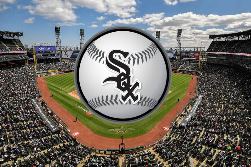
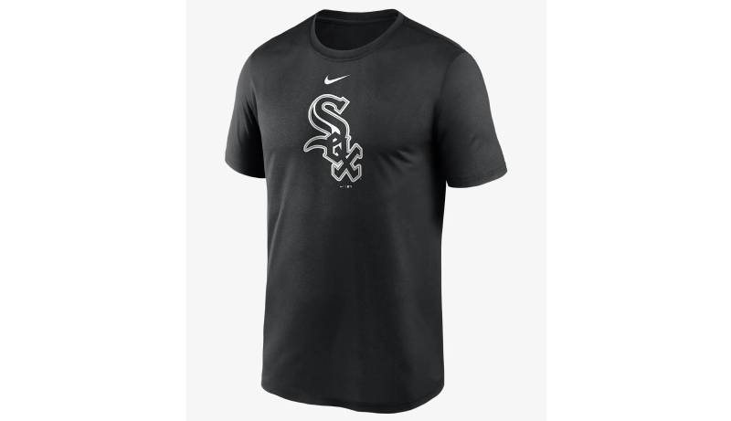
The Meaning Behind the Chicago White Sox Logo
![]()
You know, there’s always that feeling when you spot a recognizable logo, right? It’s like seeing an old friend. But sometimes, we need to dig deeper to understand the real essence behind it.
The Power of Simplicity
Every little curve, color, and shadow in a logo tells a story. But what’s rad about the Chicago White Sox logo? Its clean and simple design. It’s direct. It’s bold. But there’s more than meets the eye.
A Story Beyond Baseball
While at the surface it screams ‘baseball’, beneath those stark lines lies the pride of a city. Chicago’s deep roots in American sports and culture are well represented. It’s not just a team; it’s an identity.
The History of the Chicago White Sox Logo
![]()
History lessons can be tedious, but not this one! Hold on tight, because we’re diving deep into nostalgia lane.
An Ever-Evolving Identity
From its inception, the White Sox logo went through a roller coaster of changes. What started as a simple design morphed over the years, adapting to the times, always striving to capture the essence of the team and its home.
The Iconic Moments
There have been iconic logo variations that have stayed in the hearts of fans. Like that old-school 1970s look – you know, the one with the silhouette of a batter? Classic!
The Colors of the Chicago White Sox Logo
![]()
Colors. They aren’t just for aesthetics. They carry weight, emotions, and memories.
A Monochromatic Dream
Primarily sticking to black and white, the logo doesn’t just represent the team’s name. It signifies the contrast and harmony of a game and a city that is as complex as it is beautiful.
The Power of Subtlety
By steering clear from an overdose of colors, the White Sox logo ensures that the message is not lost in the chaos. It’s a silent yet powerful nod to elegance.
The Font Used in the Chicago White Sox Logo
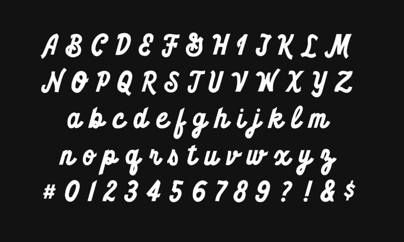
Let’s talk fonts! No, not the kinda font where wishes are thrown, but the ones that define characters – literally and metaphorically.
Vintage yet Contemporary
The typography used screams classic vibes, while also being super relevant. It bridges the gap between the old supporters and the new, tying them together.
The Boldness Factor
The font isn’t dainty. It doesn’t shy away. It stands tall, and it stands proud. Just like the team and its countless supporters.
The Evolution Over Time
Logos change, and for good reason. Adapting to new eras, rebranding for fresh vibes, or just keeping the intrigue alive, the evolution is real.
From the Beginning to Now
It’s been a ride, watching the logo evolve. From its early designs to its modern interpretations, the changes reflect growth, resilience, and innovation.
Not Just Baseball
It’s more than just a sport. The shifts in the design encompass broader cultural shifts, the dynamism of the city, and the energy of its people.
Fan Interpretations and Affection
Never underestimate the power of a dedicated fan base. Their love, their interpretations, their attachment; it’s surreal.
Tattoos and Memorabilia
Many have inked their commitment (literally!) by getting the logo tattooed. And let’s not forget those who proudly display it on jerseys, caps, and flags. It’s not just a logo; it’s a part of them.
Stories from the Stands
Ask a White Sox fan about the logo, and you’re in for tales of joy, sorrow, and unyielding support. Their perception, their love, and their memories are the intangible threads that weave the essence of the logo.
FAQ On The Chicago White Sox Logo
What’s the History Behind the Chicago White Sox Logo?
The White Sox emblem has evolved, mirroring the team’s and Major League Baseball’s transformations. Originating in the early 1900s, it underwent significant changes, notably adopting the iconic “Old English” script, symbolizing the team’s enduring legacy and Chicago’s robust sports identity.
Why Does the Chicago White Sox Logo Use Black and White?
The black and white palette reflects the team’s name—White Sox. It stands out in the MLB for its simplicity and contrast, a strategy in sports branding that emphasizes a strong, recognizable identity for the South Side team emblem, synonymous with Chicago baseball culture.
Has the Chicago White Sox Logo Always Featured the Same Design?
No, the design has varied over time, introducing elements like the Old English script and variations to the letter ‘S’. These shifts reflect the team’s history and graphic designers’ influence, capturing the spirit of the Sox while adhering to logo design trends.
Who Designed the Current Chicago White Sox Logo?
Remarkably, the current logo, adopted in the early 1990s, was the brainchild of an in-house graphic designer. It emphasizes the simple yet impactful Old English script logo, an entity within the MLB uniform patch collection that has now become a classic.
What Does the Chicago White Sox Logo Represent for Fans?
For fans, the logo is a powerful emblem of team loyalty, community, and the collective memory of World Series triumphs. It’s not just an athletic logo creation; it’s the heart of the White Sox fan base and Chicago sports culture.
Are There Alternative Versions of the Chicago White Sox Logo?
Indeed, the franchise has flirted with various alternate logos throughout its history. Each represents a chapter in the baseball logo evolution. These have included variations with baseballs and bats, and different color accents while maintaining the core brand aesthetics.
How Does the Chicago White Sox Logo Influence Merchandise Sales?
The logo is central to sports merchandise sales, dictating the aesthetics of fan gear from caps to jerseys. It’s essential in sports retail, crafting a strong visual for branding purposes, resonating with the fan base deeply associated with Chicago sports teams.
Can the Chicago White Sox Logo be Used for Personal Projects?
Use of the logo for personal projects is generally forbidden without explicit permission due to trademark laws. The logo is legally protected, and its unauthorized usage could infringe upon the intellectual property of the Major League Baseball franchise.
What Is the Significance of the Old English Script in the Chicago White Sox Logo?
The Old English script signifies a tradition, an ode to a storied past rich in baseball heritage. It projects an image of time-honored class and a nod to the historic sports logos, making it identifiable not just within Major League Baseball, but in the global sports landscape.
How Often Has the Chicago White Sox Logo Changed?
While not as frequently altered as some other team logos, the White Sox insignia has seen several iterations, especially in its early years. The evolution has settled in recent decades, with the Old English ‘Sox’ becoming a timeless image firmly rooted in Chicago’s baseball identity.
Conclusion
In the tapestry that is the Chicago White Sox logo, threads of heritage and modernity entwine. Fiercely standing as a timeless beacon within Major League Baseball, this emblem encapsulates more than just an image; it crafts identity, heralds history, and champions the fervor of Chicago’s ballgame aficionados.
- It’s not mere graphic design; it’s a storied saga woven into a visual monograph.
- From the South Side to the global stage, this logo signifies a narrative deep-rooted in baseball nostalgia and the spirit of competition.
- Both an Old English charm and the starkness of the black and white imbue it with an unforgettable presence.
As we round third and head for home in our exploration, let us embrace the legacy that the Chicago White Sox logo stands for — a marriage of classic allure and contemporary assertiveness. It’s a beacon for fans, a mantle for players, and an indelible symbol of Chicago’s rich sporting tapestry, as iconic as the city it calls home.
If you liked this article about the Chicago White Sox logo, you should check out this article about the Arizona Diamondbacks logo.
There are also similar articles discussing the Colorado Rockies logo, the Houston Astros logo, the Miami Marlins logo, and the New York Yankees logo.
And let’s not forget about articles on the Philadelphia Phillies logo, the Toronto Blue Jays logo, the Kansas City Royals logo, and the Los Angeles Dodgers logo.
Bogdan Sandu, a seasoned designer with 15 years of diverse experience, has been designing websites since 2008.
Renowned for his expertise in logo design and visual branding, Bogdan has developed a multitude of logos for various clients.
His skills extend to creating posters, vector illustrations, business cards, and brochures. Additionally, Bogdan's UI kits were featured on marketplaces like Visual Hierarchy and UI8.
Latest posts by Bogdan Sandu (see all)