The Arizona Diamondbacks logo is one of those MLB marks that tells you exactly where the team comes from before you even read the name. Built around a stylized letter “A” shaped to look like a diamondback rattlesnake’s head, it connects the franchise directly to the Sonoran Desert and everything that comes with it. The team entered Major League Baseball in 1998 as an expansion franchise, and the logo has gone through four main versions since then.
Designed originally by Phoenix-based firm Campbell Fisher Ditko (later known as Adair Greene for the initial concept work), the mark sits within a broader tradition of baseball team logos that lean heavily on regional identity. Few MLB logos pull off the trick of embedding an animal directly into a letterform this well. The current primary mark, introduced in 2012, strips the design down to just the “A” without the wordmark underneath. It’s been through color overhauls, typography changes, and structural tweaks across its roughly 27-year life.
What Is the Arizona Diamondbacks Logo?
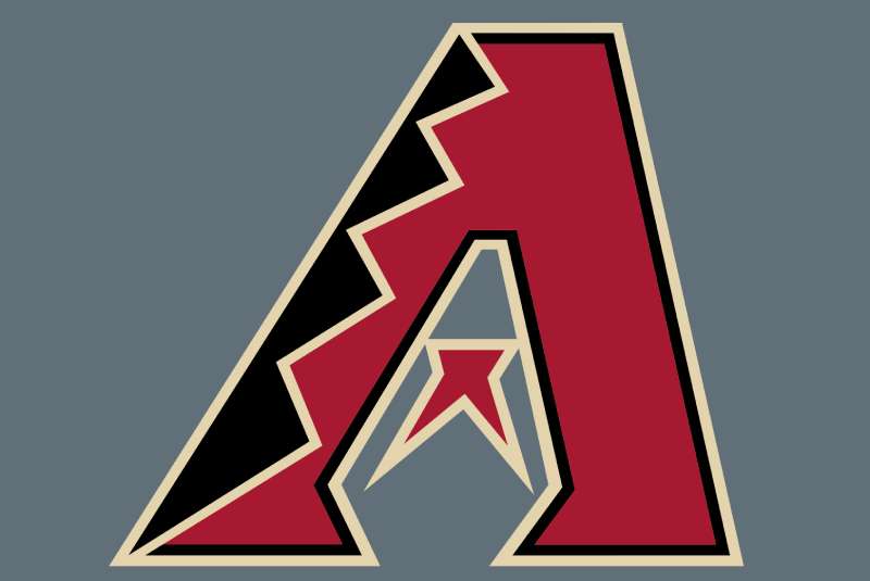
The Arizona Diamondbacks logo is a combination mark built around a stylized italic letter “A” that doubles as a diamondback rattlesnake’s head, with the crossbar replaced by a forked snake tongue. First introduced in 1998 and designed by Campbell Fisher Ditko, it represents the Western Diamondback Rattlesnake native to Arizona.
Here’s what defines it:
- Design Type: Combination mark (lettermark with embedded pictorial element)
- Primary Elements: Italic “A” letterform, snake head silhouette, forked tongue crossbar, diamond pattern texturing, half-star/tongue detail
- Official Introduction Date: 1998 (original version); current primary mark introduced 2012
- Designer/Agency: Campbell Fisher Ditko, a Phoenix-based graphic design firm also known for creating the Phoenix Suns’ “Streaking Sun” logo
- Trademark Status: Registered and renewed under AZPB Limited Partnership, with over 30 active trademarks. Registration number 2889634, originally filed December 19, 2001
- Color Palette: Sedona Red (#A71930), Sonoran Sand (#E3D4AD), Black (#000000), Sonoran Teal (#30CED8), White (#FFFFFF)
- Usage Context: Jerseys, caps, Chase Field signage, digital platforms, licensed merchandise through Fanatics, broadcast graphics, and the team’s City Connect “Serpientes” alternate uniforms
How Has the Arizona Diamondbacks Logo Evolved Over Time?
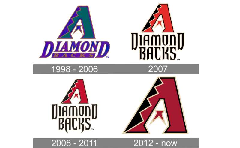
The Arizona Diamondbacks logo has gone through four major phases since 1998. It started with purple and teal, shifted to Sedona Red and black in 2007, got refined in 2008, and landed on the current streamlined “A” mark in 2012.
Each change reflected where the franchise was at that point. The early years were about standing out as a new team. The later redesigns were about growing up.
Original Arizona Diamondbacks Logo (1998-2006)
- Years Active: 1998-2006
- Design Description: A large italic “A” with diamondback rattlesnake patterning and a forked tongue replacing the crossbar. Below it sat the full wordmark “DiamondBacks” split into two visual treatments. “Diamond” appeared larger and bolder in deep purple, while “Backs” looked textured, almost sandy
- Color Scheme: Purple (Pantone 267), Turquoise (Pantone 323), Copper (Pantone 876), Black, Off-White (Pantone 9061)
- Designer: Campbell Fisher Ditko, Phoenix, Arizona
- Context: The franchise needed to build identity from scratch. Jerry Colangelo’s ownership group chose “Diamondbacks” from a public name-the-team contest after a full-page ad in the Arizona Republic. The name worked on two levels: the Western Diamondback Rattlesnake native to Arizona and the “diamond” reference to the baseball field
- Cultural Significance: Purple and teal were trendy sports colors in the mid-1990s. The Arizona turquoise specifically referenced stones native to the state, while copper acknowledged Arizona’s mining history. This logo carried the team through its 2001 World Series championship win against the New York Yankees
Redesigned Arizona Diamondbacks Logo (2007-2007)
- Years Active: 2007 (single season in this exact form)
- Design Description: The “A” lettermark remained but colors shifted completely. The wordmark below changed fonts and grew larger, with the letters “A” and “K” in “BACKS” getting extended descenders meant to look like snake fangs
- Color Scheme: Sedona Red, Black, Sonoran Sand
- Key Changes from Previous: Complete color overhaul. Purple and teal gone. The franchise ditched the 1990s palette for something that referenced Arizona’s red rock canyons and desert sand
- Context: After nine seasons (and that World Series ring), the team wanted a more mature, aggressive look. The color scheme happened to look a lot like what the Houston Astros were using at the time, and also mirrored the NHL’s Phoenix Coyotes
Refined Arizona Diamondbacks Logo (2008-2011)
- Years Active: 2008-2011
- Design Description: A refined version of the 2007 mark. The red got darker and more intense. The wordmark outline was removed, leaving clean black lettering on white. The fang-like extensions on “A” and “K” became longer
- Color Scheme: Sedona Red (deeper), Black, Sonoran Sand
- Key Changes from Previous: Subtle but meaningful. The saturation of the red was pushed harder. Lettering cleaned up. The overall impression shifted from “new look” to “established brand”
Current Arizona Diamondbacks Logo (2012-Present)
- Years Active: 2012 to present
- Design Description: The wordmark was completely removed. Just the stylized “A” with its snake head shape, forked tongue crossbar, and diamond patterning. In 2016, the accent color changed from Sonoran Sand to Sonoran Teal, adding a blue-green element back to the palette
- Color Scheme: Sedona Red (#A71930), Black (#000000), Sonoran Teal (#30CED8), White (#FFFFFF)
- Key Changes from Previous: Stripping the wordmark made the “A” stand alone. It’s a confident move. Took me a while to appreciate it, honestly, but the cleaner look works better at small sizes and on caps
- Cultural Significance: This version carried the team to their 2023 World Series appearance. The 2024 uniform refresh brought teal back as a full-time accent across all uniforms, completing a visual circle back to the franchise’s original turquoise roots
What Do the Design Elements of the Arizona Diamondbacks Logo Mean?
Every part of the Diamondbacks logo points back to Arizona. The “A” is both a letter and a snake head. The forked tongue doubles as the crossbar. The diamond pattern on the letterform references both the rattlesnake’s skin and the baseball diamond itself.
It’s a design that rewards closer inspection.
Why Did the Arizona Diamondbacks Choose These Specific Colors?
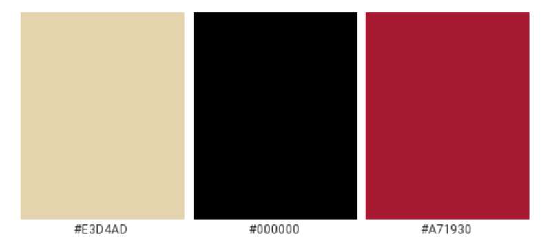
Each color in the palette pulls from Arizona geography. Sedona Red (#A71930, Pantone PMS 187 C) comes from the red rock formations near Sedona Canyon. Sonoran Sand (#E3D4AD, Pantone PMS 7500 C) mirrors the desert floor of the Sonoran Desert.
Black (#000000, Pantone PMS Black 6 C) provides contrast and weight. Sonoran Teal (#30CED8, Pantone PMS 319 C) connects to the turquoise stones mined in Arizona, which were part of the original 1998 palette.
From a color psychology standpoint, red signals aggression and energy. Black adds authority. Teal brings a distinctive edge that separates the D-backs from the many red logos across professional sports.
What Typography Style Is Used in the Arizona Diamondbacks Logo?
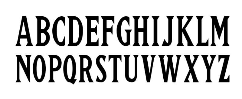
The Diamondbacks use a custom typeface with sharp, angular serifs. The letterforms lean italic, giving everything a sense of forward motion. Look at the “A” and “K” in “BACKS” on the alternate marks. Those extended descenders mimic snake fangs.
It’s a bespoke font design. You won’t find it in any commercial font library. The kerning on the wordmark versions was tight, pushing letters close together to create a compact, aggressive block of text.
What Are the Hidden Meanings in the Arizona Diamondbacks Logo?
The half-star shape inside the “A” pulls double duty. It works as the snake’s tongue when you see the letter as a snake head. But it also reads as a star sitting between two “eyes” formed by the negative space in the letter.
The diamond pattern etched into the “A” is both a nod to the rattlesnake’s skin markings and a reference to the baseball diamond. Whether the original designers at Campbell Fisher Ditko intended every one of these readings is debatable. But that’s part of what makes it stick. People keep finding new things in it.
How Does the Arizona Diamondbacks Logo Compare to Competitor Logos?
Compared to other National League West teams, the D-backs logo does something different. The Los Angeles Dodgers logo is pure wordmark. The San Francisco Giants logo leans on classic, traditional lettering.
The San Diego Padres logo went through its own identity crisis before settling on the friar swing mark. And the Colorado Rockies logo sticks with a straightforward mountain-and-baseball approach.
Arizona’s “A” sits in a unique spot. It’s a lettermark that’s also a pictorial mark. Not many NFL logos or NBA logos pull off that kind of visual trick this cleanly. Among NHL logos, maybe the Hartford Whalers’ classic mark is the closest comparison in terms of letter-within-image cleverness.
What Are the Technical Specifications of the Arizona Diamondbacks Logo?
Official Color Codes
- Sedona Red – Hex: #A71930, RGB: (167, 25, 48), CMYK: (23, 100, 83, 17), Pantone: PMS 187 C
- Sonoran Sand – Hex: #E3D4AD, RGB: (227, 212, 173), CMYK: (11, 13, 35, 0), Pantone: PMS 7500 C
- Black – Hex: #000000, RGB: (0, 0, 0), CMYK: (75, 68, 67, 90), Pantone: PMS Black 6 C
- Sonoran Teal – Hex: #30CED8, RGB: (48, 206, 216), CMYK: (63, 0, 20, 0), Pantone: PMS 319 C
- White – Hex: #FFFFFF, RGB: (255, 255, 255), CMYK: (0, 0, 0, 0)
Dimensions and Proportions
The primary “A” mark maintains a roughly square aspect ratio. MLB brand guidelines require specific clear space around the mark, typically equal to the height of the tongue element on all sides.
For print use, minimum reproduction size sits around 0.5 inches wide. The logo is distributed as vector graphics (AI and EPS formats) for scalable reproduction. Bitmap versions in JPEG and PNG are available for digital use. Higher DPI versions (300+) exist for print materials and large-format signage at Chase Field.
What Cultural Impact Has the Arizona Diamondbacks Logo Had?
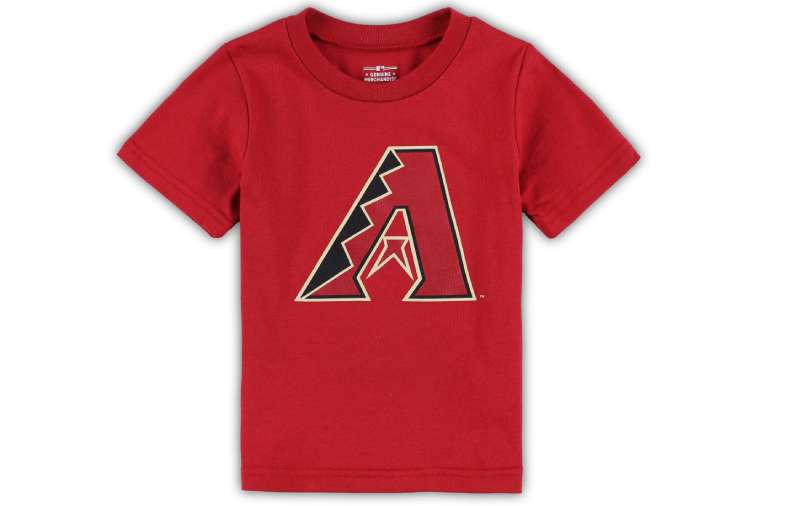
The D-backs logo became a symbol of Arizona pride almost immediately. Winning the 2001 World Series just three years after the franchise launched cemented that “A” in the minds of Phoenix-area fans forever.
The 2021 City Connect “Serpientes” uniforms pushed the brand further into cultural territory, honoring Arizona’s Hispanic community. That alternate mark, with its snake-shaped “S,” showed the franchise could stretch its visual identity without losing the core connection to rattlesnakes and the desert.
Merchandising numbers tell part of the story. Fanatics and New Era cap sales consistently place D-backs gear in the conversation alongside much older franchises. The teal-accented items especially tend to sell well, which is probably why teal came back as a full-time accent in 2024.
How Does the Arizona Diamondbacks Logo Fit Into the Overall Brand Identity?
The logo sits at the center of a brand system that includes multiple alternate marks. There’s the “db” snake head mark, the “D” snake letterform, the full wordmark, and the Serpientes City Connect identity. All of them tie back to the same core idea: Arizona, snakes, and baseball.
The color palette stays consistent across Chase Field wayfinding, broadcast graphics, social media templates, and the team’s web presence. Brand style guidelines from MLB dictate how the marks interact with league-wide branding, partner logos like Nike and Avnet, and broadcast overlays.
The whole system works because every piece of it traces back to the same story. Desert. Snake. “A.” That kind of consistency is something plenty of franchises struggle with.
How Should the Arizona Diamondbacks Logo Be Used?
All Arizona Diamondbacks logos are trademarked by AZPB Limited Partnership. You can’t use them for commercial purposes without a licensing agreement, period.
For media and editorial use, MLB provides press-ready logo files through its media relations channels. Fanatics handles official merchandise licensing. If you’re a designer working on something that involves the D-backs mark, go through MLB’s brand licensing department first.
Some basic rules: Don’t stretch or distort the logo. Don’t change the colors. Don’t place it on busy backgrounds that compromise readability. Maintain the required clear space. And don’t combine it with other team marks or modify the snake tongue element.
Official logo files, usage guidelines, and licensing contact information are available through MLB.com and the Arizona Diamondbacks’ official website. For fan and editorial use, low-resolution versions are typically acceptable under fair use, but anything commercial needs proper clearance.
FAQ on The Arizona Diamondbacks Logo
What does the Arizona Diamondbacks logo look like?
It’s a stylized italic letter “A” shaped to resemble a diamondback rattlesnake head. The crossbar is replaced by a forked snake tongue. Diamond patterning runs through the letterform, referencing both the snake’s skin and the baseball diamond.
Who designed the original Arizona Diamondbacks logo?
Campbell Fisher Ditko, a Phoenix-based design firm, created the original 1998 mark. They also designed the Phoenix Suns’ “Streaking Sun” logo. The firm understood Arizona’s visual identity better than most.
What are the official colors of the Arizona Diamondbacks logo?
Sedona Red (#A71930), Sonoran Sand (#E3D4AD), Black (#000000), Sonoran Teal (#30CED8), and White (#FFFFFF). These replaced the original purple and turquoise color scheme the team used from 1998 to 2006.
How many times has the Arizona Diamondbacks logo changed?
Four major versions. The 1998 original in purple and teal. A 2007 rebrand to Sedona Red. A 2008 refinement. And the current 2012 mark that dropped the wordmark entirely. Each version kept the core “A” snake head design element.
What does the snake mean in the Diamondbacks logo?
It represents the Western Diamondback Rattlesnake native to the Sonoran Desert. The team name itself came from a public contest. “Diamondbacks” won because it referenced both the snake and the baseball diamond, a double meaning that stuck.
Why did the Diamondbacks change from purple to red?
The 2007 color shift moved the team away from 1990s trends. Sedona Red connected the brand to Arizona’s red rock canyons. Sonoran Sand referenced the desert landscape. The new palette felt more grounded in the region’s actual geography.
What font does the Arizona Diamondbacks logo use?
The team uses a custom serif typeface with sharp angular edges and italic styling. It’s not commercially available. The extended descenders on certain letters like “A” and “K” mimic rattlesnake fangs.
Can I use the Arizona Diamondbacks logo for my project?
Not commercially. AZPB Limited Partnership holds all trademarks. MLB controls licensing. Editorial and fan use at low resolution typically falls under fair use, but anything for profit needs formal clearance through MLB’s brand department.
What is the Serpientes logo for the Diamondbacks?
It’s the 2021 City Connect alternate. “Serpientes” means snakes in Spanish. The design features a sand-colored uniform with a snake-shaped “S” in the wordmark. It honors Arizona’s Hispanic community and sold well from day one.
Where can I download the official Arizona Diamondbacks logo?
MLB.com and the D-backs’ official site provide press-ready files for media use. Fanatics handles merchandise assets. For design work, you’ll need vector files through MLB’s media relations. Low-resolution PNGs are widely available for non-commercial editorial use.
Conclusion
The Arizona Diamondbacks logo has done something few MLB expansion team marks manage. It built real recognition in under three decades. From the original purple and teal D-backs emblem to the current Sedona Red “A” with its rattlesnake detailing, every version stayed connected to the Sonoran Desert and Phoenix’s identity.
The psychology behind the shapes and the emphasis on regional symbolism gave this franchise something lasting. It works on a cap. It works on Chase Field’s scoreboard. It works at pixel size on a phone screen.
That kind of flexibility across formats is what separates good sports branding from forgettable ones. The snake “A” earned its place.

Renowned for his expertise in logo design and visual branding, Bogdan has developed a multitude of logos for various clients.
His skills extend to creating posters, vector illustrations, business cards, and brochures. Additionally, Bogdan's UI kits were featured on marketplaces like Visual Hierarchy and UI8.
He also wrote in the past years on sites like Design Your Way, WebDesignerDepot, WPDean, Designmodo, Speckyboy, Slider Revolution, and more.
- The Cursor Logo History, Colors, Font, And Meaning - 24 September 2026
- Top 7 Web Design Subscription Services That Replace Full-Time Hires - 24 September 2026
- Canva vs PowerPoint: Which Is Better for Presentations? - 22 September 2026

Bogdan Sandu is a seasoned designer who has been designing websites since 2008. Renowned for his expertise in logo design and visual branding, Bogdan has developed a multitude of logos for various clients. His skills extend to creating posters, vector illustrations, business cards, and brochures. Additionally, Bogdan's UI kits were featured on marketplaces like Visual Hierarchy and UI8. He also wrote in the past years on sites like Design Your Way, WebDesignerDepot, WPDean, Designmodo, Speckyboy, Slider Revolution, and more.
You Might Also Like