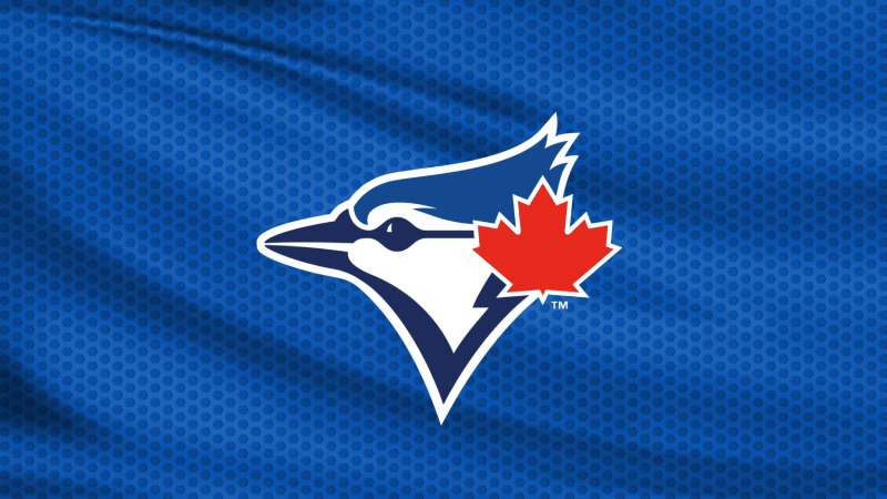
The Toronto Blue Jays logo is one of the most recognized marks in professional baseball. It features a stylized blue jay bird in profile with a red maple leaf, and it has represented Canada’s MLB team since 1977.
Few baseball team logos carry this much national symbolism. The bird and leaf combination ties the franchise directly to its country, something most American League clubs never had to think about.
The Blue Jays have gone through roughly six major logo versions over nearly five decades. But here’s what’s interesting. They kept circling back to the original concept. The 1977 design by Savage Sloan, Ltd. proved so strong that even after years of experimenting with edgier looks, the team returned to a refined version of that first mark.
Rogers Communications currently owns the franchise, and Major League Baseball’s Design Services division (led by Anne Occi) assisted with the most recent updates. The logo is registered under Rogers Blue Jays Baseball Partnership with multiple U.S. trademark registrations, the earliest dating back to first use on April 4, 1977.
What Is the Toronto Blue Jays Logo?

The Toronto Blue Jays logo is a combination mark featuring the side profile of a blue jay bird rendered in royal blue and navy blue, with a red maple leaf on the right side. It was originally designed by Savage Sloan, Ltd. in 1976 under the creative direction of Richard Walker at Labatt Brewing Company and first used in the 1977 season.
- Design Type: Combination mark (mascot-based icon with wordmark in secondary versions)
- Primary Elements: Stylized blue jay head in profile, red maple leaf, two-tone blue color treatment. The secondary/alternate version adds a circular baseball background with “TORONTO BLUE JAYS” lettering around the perimeter.
- Official Introduction Date: Fall 1976 (unveiled); first used in MLB play April 7, 1977
- Designer/Agency: Savage Sloan, Ltd. (original 1977 design), with conceptual direction from Richard Walker, Director of Creative Services at Labatt Brewing Company. Paco Belsue handled the detailed drafting. The 2004 version was designed by Brandid (Toronto). The 2012 and 2020 updates were handled by MLB Design Services under Anne Occi.
- Trademark Status: Registered by Rogers Blue Jays Baseball Partnership. Multiple U.S. registrations exist, including Registration No. 4329059 (filed November 21, 2011, registered April 30, 2013) for the full roundel design. The trademark was first used in commerce as early as March 31, 1977.
- Color Palette: Royal Blue (#134A8E), Navy Blue (#1D2D5C), Red (#E8291C), and White (#FFFFFF)
- Usage Context: Game jerseys and caps, stadium signage at Rogers Centre, official merchandise, broadcast graphics, digital platforms, spring training facilities in Dunedin, Florida, and all licensed MLB products
How Has the Toronto Blue Jays Logo Evolved Over Time?
The Blue Jays have gone through six main logo eras since 1977. The original bird-and-maple-leaf design lasted two decades before a late-1990s modernization attempt. A dramatic 2004 rebrand stripped out the red entirely, which fans never really accepted. The team finally returned to a cleaned-up version of the classic design in 2012, and simplified it further in 2020.
Original Toronto Blue Jays Logo (1977-1996)
Years Active: 1977 to 1996
The first logo showed a blue jay head in profile, facing left, set against a white baseball with red stitching. “TORONTO BLUE JAYS” wrapped around the circular border in bold red lettering with white outlines.
The bird’s head used two shades of blue. A lighter turquoise on top and a deeper royal blue below. A small red maple leaf sat on the upper right of the bird’s head.
Designer: Savage Sloan, Ltd. under the direction of Richard Walker at Labatt Brewing Company. Walker insisted on three things: the logo had to fit inside a circle (because a baseball is round), it needed red, white, and blue (globally recognized colors that also worked for Labatt’s brand), and it absolutely had to include a maple leaf.
Peter Bavasi, the club’s first General Manager, actually pushed back on the maple leaf. He wanted versions without it and cheaper two-color options. Walker held firm, and the leaf stayed.
Color Scheme: Turquoise blue (PMS 307 C), Royal blue (PMS 294 C), Red (PMS 485 C), and White
This mark carried the team through its expansion years, its first winning season in 1983, and both World Series championships in 1992 and 1993. A minor spacing adjustment happened in 1992, where some letters were compressed slightly and the “Y” and “S” were redrawn. But the overall look stayed the same.
It became one of the most beloved marks in Canadian sports history. People who grew up watching Joe Carter’s walk-off home run in 1993 still associate this exact version with peak Blue Jays baseball.
Modernized Blue Jays Logo (1997-2002)
Years Active: 1997 to 2002
Major League Properties handled this redesign, and it was… a lot. The classic circular layout got replaced by a fiercer, more angular blue jay head. The bird sat on top of a large red maple leaf outlined in dark blue.
Red suddenly took center stage, which felt odd for a team called the Blue Jays. The palette shifted to darker navy tones with black and silver accents, following the late-1990s sports branding trend where every team wanted to look tougher.
Color Scheme: Navy blue, dark blue, red, black, and silver
Key Changes: The friendly, approachable bird from 1977 got an aggressive makeover. The baseball background disappeared. The typeface became thicker and more angular. The whole thing screamed “late nineties.”
By the way, there’s a fun detail from 2003: for one season, the team used an alternate logo showing a cartoon muscular blue jay hugging a big red “T” while tossing a baseball. It had a maple leaf tattoo on its bicep. That version didn’t last long.
The “Grey Jays” Era Logo (2004-2011)
Years Active: 2004 to 2011
Brandid, a Toronto design firm, took the team in a completely different direction. They dropped the word “Blue” from the branding entirely, going with just “Jays.” The new mark featured a three-dimensional, aggressive-looking blue jay extending to the left from metallic “JAYS” lettering.
Red was gone. The color palette was navy, graphite, silver, and white. Fans called this period the “Grey Jays” era, and not with affection.
Designer: Brandid (Toronto-based firm, selected in early 2002)
Color Scheme: Navy blue, graphite, silver, white
Key Changes: No maple leaf. No red. No “Blue” in the name treatment. The typography switched to a cursive-style wordmark with a metallic finish, reflecting early-2000s branding trends.
On the field, this era overlapped with some forgettable seasons. But it also covered Jose Bautista’s 54-home-run year and Roy Halladay’s prime. Still, fans spent eight years vocally pushing for the return of blue and red.
Took me a while to realize how much the color choice affected perception. The same team, the same stadium, the same sport. But pulling red out of the mix made everything feel colder and less connected to the franchise’s identity.
Return to Classic Blue Jays Logo (2012-2019)
Years Active: 2012 to 2019
On November 18, 2011, the Blue Jays unveiled a refreshed logo that brought back pretty much everything fans had been asking for. The bird-and-leaf design returned with sharper lines and cleaner proportions. The baseball background came back. The circular “TORONTO BLUE JAYS” lettering returned.
The current version was created with assistance from MLB’s Design Services division led by Anne Occi.
Color Scheme: Royal Blue (#134A8E), Navy Blue (#1D2D5C), Red (#E8291C), White
Key Changes: Black was added for stronger accenting. The maple leaf got bigger. The lines were tighter and more refined than the 1977 original. It was a modern take on the classic, not a direct copy.
This move was both a branding decision and an emotional one. It reconnected the franchise with its championship era and coincided with renewed competitiveness on the field.
Simplified Blue Jays Logo (2020-Present)
Years Active: 2020 to present
Before the 2020 season, the Blue Jays took the individual blue jay head and made it the primary mark. The circular baseball background, the lettering, the outer ring, all of that moved to alternate/secondary status.
Just the bird. Just the leaf. Two shades of blue and the red maple leaf.
Color Scheme: Royal Blue (#134A8E), Navy Blue (#1D2D5C), Red (#E8291C), White (#FFFFFF)
This followed a broader trend across sports and corporate branding toward simplified, less detailed primary marks. Think about how many teams and companies stripped down their logos around that same time.
The full roundel design still shows up on jerseys and merchandise, but the standalone bird head is now what represents the franchise at a glance.
In 2026, the team also introduced a 50th anniversary logo. It features a large “50” with the bird tucked into the zero, rendered in the signature bright blue. Clean, simple, celebratory.
What Do the Design Elements of the Toronto Blue Jays Logo Mean?
Every piece of the Toronto Blue Jays logo connects directly to the team’s identity as Canada’s baseball club. The blue jay bird represents the team name (chosen from over 4,000 fan submissions in 1976), while the maple leaf ties the franchise to its country. The two-tone blue treatment adds depth and distinguishes the mark from flat, single-color sports logos.
What Does the Blue Jay Bird Symbolize?
The blue jay is one of Canada’s most common and recognizable birds. When the franchise held its name-the-team contest in 1976, 154 people independently suggested “Blue Jays.”
The name also worked nicely with owner Labatt Brewing Company’s flagship product, Labatt Blue. That connection wasn’t accidental.
Blue is also the traditional color of Toronto’s sports teams. The Maple Leafs (hockey), the Argonauts (football). The blue jay bird tied all of that together.
In the logo itself, the bird faces left in profile. It looks alert and forward-facing. Not cartoonish, not overly aggressive (well, except during that 2004 phase). The current version strikes a solid middle ground.
Why Did the Blue Jays Choose These Specific Colors?
Richard Walker, who directed the original design, was clear about his reasoning. Red, white, and blue are used globally and carry strong associations. Blue was right for Toronto. Blue was right for Labatt. And red plus white are the colors of the Canadian flag.
Here’s the current official color palette:
- Royal Blue – Hex: #134A8E | RGB: (19, 74, 142) | CMYK: (100, 80, 14, 2) | Pantone: PMS 4152 C. This is the dominant shade. It reads as confident and trustworthy, which is exactly what you want for a professional sports brand. Blue also carries associations with loyalty and stability through color psychology.
- Navy Blue – Hex: #1D2D5C | RGB: (29, 45, 92) | CMYK: (100, 91, 35, 28) | Pantone: PMS 534 C. The darker blue adds depth and contrast. Without it, the bird’s profile would flatten out. Using two blues together creates dimension, which is tricky to pull off in a sports logo without getting too complicated.
- Red – Hex: #E8291C | RGB: (232, 41, 28) | CMYK: (3, 97, 100, 0) | Pantone: PMS 485 C. Used for the maple leaf and accent details. Red brings energy and instantly signals the Canadian connection. It also creates a strong complementary color relationship with the blues.
- White – Hex: #FFFFFF. Serves as the background and outline color. Provides separation between elements and keeps everything readable at small sizes.
The 2004-2011 era proved what happens when you remove red from this equation. The logo lost its warmth, its Canadian identity became less obvious, and fans rejected the change almost immediately.
What Typography Style Is Used in the Blue Jays Logo?
The primary mark (since 2020) doesn’t include any text at all. Just the bird and the leaf.
But the secondary roundel version and team wordmarks use a custom typeface. It’s a glyphic serif font that closely resembles ITC Elan Bold, designed by Albert Boton. The Blue Jays version has minor modifications for legibility at different sizes.
The original 1977 lettering was a bold, slightly rounded sans-serif style in red with white outlines. Clear and readable, no fuss. The 2004 Brandid version went with a custom cursive wordmark in metallic finish, which was a big departure.
The current font strikes a nice middle ground. It’s traditional enough to feel like baseball but distinct enough that you wouldn’t confuse it with any other MLB team’s lettering.
What Are the Hidden Meanings in the Blue Jays Logo?
The maple leaf placement is the biggest deliberate choice. It sits on the bird’s head like a crest, merging team and country into one image. The Montreal Expos actually considered using a maple leaf in their logo first but rejected it, so the Blue Jays got to own that symbol in MLB.
The circular layout of the secondary mark references the shape of a baseball. Richard Walker was very specific about this during the original design process.
The two-tone blue split on the bird isn’t just decorative. It mimics how light falls on an actual blue jay’s plumage, with lighter coloring above and darker shading below. Whether every viewer picks up on that consciously is debatable, but it gives the mark a naturalistic quality that a flat, single-color bird wouldn’t have.
How Does the Toronto Blue Jays Logo Compare to Competitor Logos?
The Blue Jays logo sits in an interesting position among MLB marks. It’s one of only two logos in the league that carries national symbolism (the other being… well, there isn’t one, since the Montreal Expos became the Washington Nationals). That maple leaf does a lot of heavy lifting for brand differentiation.
Compared to division rivals, the differences are pretty sharp. The New York Yankees logo is a pure typographic mark, all letters, no illustration. The Boston Red Sox logo uses a pair of red socks as its icon, going for simplicity. The Baltimore Orioles logo also features a bird (the cartoon oriole), but it’s more playful and cartoonish compared to the Blue Jays’ sleek profile.
Among bird-themed MLB logos, the Blue Jays take a more refined approach. The St. Louis Cardinals logo places its red birds perched on a bat, while the Orioles go fully illustrated. The Blue Jays mark splits the difference: detailed enough to be interesting but clean enough to work at any size.
Looking at logos across other sports leagues, the Blue Jays hold up well against the NHL, NBA, and NFL logos in terms of instant recognizability. The two-tone blue is distinctive enough that even without text, most Canadian sports fans can identify the mark immediately.
What Are the Technical Specifications of the Toronto Blue Jays Logo?
Official Color Codes
- Royal Blue (Primary) – Hex: #134A8E | RGB: (19, 74, 142) | CMYK: (100, 80, 14, 2) | Pantone: PMS 4152 C
- Navy Blue (Secondary) – Hex: #1D2D5C | RGB: (29, 45, 92) | CMYK: (100, 91, 35, 28) | Pantone: PMS 534 C
- Red (Accent) – Hex: #E8291C | RGB: (232, 41, 28) | CMYK: (3, 97, 100, 0) | Pantone: PMS 485 C
- White – Hex: #FFFFFF | RGB: (255, 255, 255) | CMYK: (0, 0, 0, 0)
Historical Color Codes (1977-1996)
- Turquoise – Hex: #006BA6 | Pantone: PMS 307 C
- Royal Blue – Hex: #002F6C | Pantone: PMS 294 C
- Red – Hex: #DA291C | Pantone: PMS 485 C
Dimensions and Usage
The primary bird-head mark has a roughly square aspect ratio when measured from the bird’s beak to the back of the head and from the top of the maple leaf to the bottom of the throat. The full roundel (circular secondary mark) is a 1:1 circle.
MLB’s brand guidelines dictate minimum clear space around the logo, typically equal to the height of the maple leaf element on all sides. Minimum reproduction size varies by medium, but the standalone bird mark was specifically designed to remain legible at small sizes (think: favicon, social media avatar, embroidery on caps).
Official logo files are distributed through MLB’s licensing department. Teams, broadcasters, and licensed retailers access approved vector graphics files through MLB’s asset management system. The DPI requirements for print reproduction are typically 300 DPI minimum for merchandise and publications.
What Cultural Impact Has the Toronto Blue Jays Logo Had?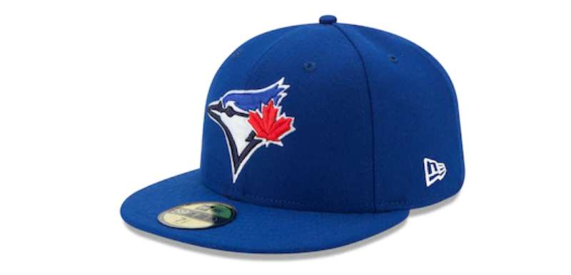
The Blue Jays logo is arguably the most recognized sports mark in Canada. It represents the only current Canadian team in Major League Baseball (since the Montreal Expos relocated to Washington in 2005). That puts a lot of weight on one bird.
During the 1992 and 1993 World Series runs, the logo became a national symbol. The Blue Jays were the first team outside the United States to win the World Series, and that original circular mark was everywhere. Caps, t-shirts, bumper stickers, you name it.
The retro versions are especially popular in streetwear and fashion circles. Vintage Blue Jays caps with the 1977-1996 design have become collector’s items. New Era regularly produces throwback editions that sell out quickly.
The logo also carries political and cultural significance as a symbol of Canadian identity in a primarily American sports league. The maple leaf isn’t just decoration. It’s a statement about where this team comes from and who it plays for.
How Does the Toronto Blue Jays Logo Fit Into the Overall Brand Identity?
The logo sits at the center of a brand system that includes uniforms, stadium design, broadcast graphics, and merchandise. Rogers Centre’s visual environment uses the same royal blue and navy palette. The team’s digital presence across social media, their website, and their app all pull from the same brand guidelines.
The bird mark connects to related brand elements like the team mascot Ace (a costumed blue jay), the team’s custom jersey font spacing and lettering, and the overall MLB licensing ecosystem.
Everything works together because the core elements, the bird, the leaf, the two blues and red, stay consistent across applications. Whether it’s printed on a cap at 2 inches wide or displayed on a jumbotron at 30 feet, the mark reads the same way.
The 2020 simplification to the standalone bird actually made this easier. Fewer elements means fewer things that can go wrong at different sizes and on different surfaces.
How Should the Toronto Blue Jays Logo Be Used?
Official Usage Guidelines
- Do: Use the official logo files provided through MLB’s licensing channels. Maintain proper clear space around the mark. Reproduce colors using the specified Pantone, CMYK, or RGB values depending on the output medium. Use vector formats for any production work.
- Don’t: Stretch, rotate, or distort the logo. Change the colors. Add effects like drop shadows or outlines that aren’t part of the official design. Place the logo on busy backgrounds that reduce legibility. Combine the mark with other team logos in a way that suggests partnership or affiliation.
Where to Access Official Logos
Licensed partners and media outlets access official logo files through MLB’s centralized brand portal. For editorial use, MLB provides approved assets to accredited media organizations. Fan use for personal, non-commercial projects (like a homemade sign for a game) generally falls under fair use, but commercial reproduction requires a license.
Trademark Protection
Rogers Blue Jays Baseball Partnership holds over 100 trademark registrations related to the team’s branding. Key registrations include:
- U.S. Registration No. 4329059 (the full roundel design with bird, baseball, maple leaf, and “TORONTO BLUE JAYS” text)
- U.S. Registration No. 5138273 and 5138274 (wordmark with maple leaf design)
- U.S. Registration No. 2,612,084 (BLUE JAYS word mark, registered 2002, first used 1977)
The trademarks cover a wide range of goods and services: clothing, headwear, jewelry, furniture, entertainment services, and more. Unauthorized commercial use of the logo can result in legal action under both U.S. and Canadian trademark law.
If you’re a designer working on anything that involves the Blue Jays mark, get proper clearance through MLB’s licensing department first. It’s not the kind of thing where you ask for forgiveness later.
FAQ on The Toronto Blue Jays Logo
What does the Toronto Blue Jays logo look like?
The current primary mark shows a stylized blue jay head in profile, rendered in royal blue and navy blue. A red maple leaf sits on the right side of the bird.
The secondary version places this bird inside a circular baseball with “TORONTO BLUE JAYS” lettering around the border.
Who designed the original Blue Jays logo?
Savage Sloan, Ltd. created the 1977 design. Richard Walker, Director of Creative Services at Labatt Brewing Company, directed the project. Paco Belsue handled the detailed drafting work.
Walker insisted on the circular shape, the maple leaf, and the red-white-blue color scheme from the start.
How many times has the Blue Jays logo changed?
The franchise has gone through roughly six major versions since 1977. The original lasted until 1996. Then came the 1997 redesign, a brief 2003 mascot logo, the 2004 Brandid rebrand, the 2012 return to classic, and the 2020 simplification.
What are the official Toronto Blue Jays colors?
Royal Blue (#134A8E), Navy Blue (#1D2D5C), Red (#E8291C), and White (#FFFFFF). These are the current team colors used across all MLB merchandise, jerseys, and digital platforms.
The original 1977 palette used a lighter turquoise blue instead of the current royal blue.
What font is used in the Blue Jays logo?
The team uses a custom glyphic serif typeface that closely resembles ITC Elan Bold by Albert Boton. The primary bird mark since 2020 has no text at all.
Jersey lettering uses a separate custom typeface specific to the Blue Jays.
Why is there a maple leaf in the Blue Jays logo?
The maple leaf represents Canada. The Blue Jays are the only current Canadian MLB team, and Walker made the leaf a non-negotiable part of the design in 1976.
The Montreal Expos had considered a maple leaf for their logo but rejected it.
What happened during the “Grey Jays” era?
From 2004 to 2011, Toronto-based firm Brandid redesigned the logo using navy, graphite, and silver. They dropped red entirely and removed “Blue” from the name treatment.
Fans pushed back for eight years. The team brought back blue and red in 2012.
Is the Toronto Blue Jays logo trademarked?
Yes. Rogers Blue Jays Baseball Partnership holds over 100 trademark registrations. The full roundel design is registered as U.S. Registration No. 4329059, with first commercial use dating to March 1977.
Where can I download the official Blue Jays logo?
Official logo files are distributed through MLB’s licensing department. Accredited media get access to approved assets for editorial use.
Commercial reproduction requires a proper license. Personal, non-commercial fan use generally falls under fair use.
What is the Blue Jays 50th anniversary logo?
Introduced for the 2026 season, it features a large “50” with the blue jay bird tucked into the zero. The numbers are thick and rounded, rendered in the team’s signature bright blue with a white outline. Clean and simple.
Conclusion
The Toronto Blue Jays logo has survived nearly five decades of redesigns, fan backlash, and branding experiments. And it keeps coming back to that same bird and maple leaf from 1977. That says something about the strength of the original concept.
What makes it work is the combination of Canadian identity and clean sports design. Two shades of blue, a red leaf, and a bird in profile. Nothing extra.
The franchise tried going darker, dropping red, removing the leaf. Fans weren’t having it. The 2012 return to the classic look proved that sometimes the best logo design principles come down to knowing what already works and refining it.
Whether it’s stitched on a New Era cap or displayed across the Rogers Centre scoreboard, this mark connects millions of fans to Canada’s baseball team. At its core, that’s all a good logo needs to do.

Renowned for his expertise in logo design and visual branding, Bogdan has developed a multitude of logos for various clients.
His skills extend to creating posters, vector illustrations, business cards, and brochures. Additionally, Bogdan's UI kits were featured on marketplaces like Visual Hierarchy and UI8.
He also wrote in the past years on sites like Design Your Way, WebDesignerDepot, WPDean, Designmodo, Speckyboy, Slider Revolution, and more.
- The Windsurf Logo History, Colors, Font, And Meaning - 10 October 2026
- How to Remove Background From Product Photos (No Photoshop) - 10 October 2026
- How Designers can Build a Stronger Online Creative Identity - 9 October 2026

Bogdan Sandu is a seasoned designer who has been designing websites since 2008. Renowned for his expertise in logo design and visual branding, Bogdan has developed a multitude of logos for various clients. His skills extend to creating posters, vector illustrations, business cards, and brochures. Additionally, Bogdan's UI kits were featured on marketplaces like Visual Hierarchy and UI8. He also wrote in the past years on sites like Design Your Way, WebDesignerDepot, WPDean, Designmodo, Speckyboy, Slider Revolution, and more.
You Might Also Like