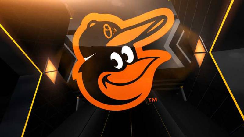
The Baltimore Orioles logo is one of the most recognized marks in professional baseball. It features a cartoon oriole bird, drawn in black, orange, and white, wearing a baseball cap. The bird is based on the Baltimore oriole, Maryland’s state bird, and has been part of the team’s identity since 1954 when the franchise relocated from St. Louis.
Among all baseball team logos, the Orioles mark holds a unique place. It has gone through more than 15 versions across seven decades. Some featured realistic birds, others cartoon characters. But the smiling bird has always been the thread connecting them all.
The current primary logo, adopted in 2019, shows a cartoonish oriole face in black and orange. It was originally introduced as an alternate mark in 2012. Jim Hartzell, a cartoonist at the Baltimore Sun, drew the original bird in 1954. Stan Walsh, the animator behind icons like the Hamm’s Bear, redesigned the bird for the 1966 season. The franchise itself dates back to 1901, starting as the Milwaukee Brewers, then the St. Louis Browns, before becoming the Orioles.
What Is the Baltimore Orioles Logo?
The Baltimore Orioles logo is a cartoon bird mascot rendered in orange, black, and white, first introduced in 1954 by Jim Hartzell and redesigned multiple times since. It represents the Baltimore oriole, Maryland’s state bird, and symbolizes the team’s deep connection to its home city.
Here is a breakdown of the logo’s main attributes:
- Design Type: Mascot-based combination mark. The primary logo centers on the cartoon bird, while secondary versions pair it with script lettering.
- Primary Elements: Cartoon oriole bird head, baseball cap detail, bold orange and black coloring. The bird’s face has a distinctive smile that fans have associated with the team for decades.
- Official Introduction Date: The current primary logo was promoted from alternate to primary status in 2019. The cartoon bird concept itself traces back to 1954.
- Designer/Agency: Jim Hartzell (original 1954 bird), Hal Decker (1964 redesign), Stan Walsh and Paul Carlson at Quartet Films (1966 cartoon bird that inspired current versions).
- Trademark Status: Registered trademark of the Baltimore Orioles and Major League Baseball. Protected under MLB licensing agreements.
- Color Palette: Orange (#DF4601), Black (#000000), White (#FFFFFF), with occasional use of Grey (#B5B6B8). Historical versions also included Green (#006747) and Yellow (#FBD872).
- Usage Context: Game-day uniforms, caps, batting helmets, merchandise, digital platforms, stadium signage at Oriole Park at Camden Yards, broadcast graphics, and licensed fan products.
How Has the Baltimore Orioles Logo Evolved Over Time?
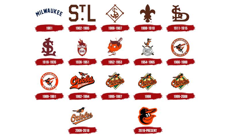
The Baltimore Orioles logo has gone through more than 15 versions since 1954. Major shifts happened in 1963, 1966, 1989, 1992, 2009, 2012, and 2019, each reflecting changes in ownership, team performance, or design trends across professional baseball.
Original Hartzell Bird (1954-1962)
Years Active: 1954 to 1962
Jim Hartzell, a cartoonist at the Baltimore Sun, sketched the first oriole bird for the franchise’s new owners. The drawing showed a smiling orange, black, and white bird perched on a baseball with “ORIOLES” written across it. Two crossed bats sat behind the ball.
It was introduced at a luncheon on January 5, 1954, right as the team moved from St. Louis to Baltimore.
This bird was simple. Friendly. Almost childlike in its appeal. It set the tone for how the franchise would approach its visual identity for decades.
The Hartzell Bird appeared on caps for all nine of those seasons. Baltimore managed only two winning records during that stretch, but the bird became beloved anyway. Fans connected with it immediately.
The Birdless Season and Decker Bird (1963-1965)
Years Active: 1963 to 1965
In 1963, GM Lee MacPhail oversaw a brand overhaul. The bird was dropped entirely from caps. Just an orange “B” remained. It was the only birdless season in franchise history.
That same year, local illustrator Hal Decker created a more aggressive-looking bird for promotional materials. This version had a fiercer expression and sharper features. It never made it onto the uniforms though.
By 1964, a new chirping bird replaced the Decker version on caps. The team won 97 games that year, finishing just two games out of first place. The bird stuck around through 1965.
The colors stayed the same: orange, black, and white. But the overall feel shifted from cute to competitive.
The Walsh Cartoon Bird (1966-1988)
Years Active: 1966 to 1988
This is the one most fans think of when they hear “Orioles logo.” And for good reason.
When Jerold Hoffberger took over as majority owner in 1965, he brought in Frank Cashen as Executive Vice President. Cashen had a background in advertising at National Brewing Company and wanted to create a more marketable bird character.
He contracted Quartet Films, a Hollywood animation studio, to design it. Stan Walsh headed the studio, though the actual drawing was done by artist Paul Carlson under Walsh’s direction. The result was a playful cartoon oriole swinging a bat, wearing cleats and a cap, set inside an orange circle with “BALTIMORE ORIOLES” around the border.
The timing could not have been better. The team won the 1966 World Series, sweeping the Dodgers. That bird became permanently linked with winning.
Over 23 seasons, this logo saw only minor tweaks. The Orioles had 19 winning seasons during this stretch, seven ALCS appearances, six pennants, and three World Series titles. They were the winningest team in baseball. The cartoon bird was there for all of it.
The Ornithologically Correct Bird (1989-2008)
Years Active: 1989 to 2008
Going into the 1990s, the Orioles removed the beloved cartoon bird and replaced it with a realistic-looking oriole. This version aimed for accuracy over personality.
The 1992 primary logo featured a realistic bird perched on script “Orioles” lettering, with “Baltimore” written inside the tail of the script. In 1995, the logo was placed in front of a yellow and green baseball diamond background.
This era coincided with the opening of Oriole Park at Camden Yards in 1992, which changed baseball stadiums forever. But on the field, results were mixed. Two ALCS losses to the Yankees and Indians, then 14 consecutive losing seasons from 1998 to 2011.
Fans started to associate this realistic bird with losing. It looked beautiful, sure. But it lacked the personality and charm of the cartoon version. Something was missing.
Simplified Bird and Cartoon Return (2009-2018)
Years Active: 2009 to 2018
In 2008, the team simplified the realistic bird, removing colors outside the traditional orange, black, white, and grey scheme. The diamond background was also dropped.
Then in 2012, to celebrate the 20th anniversary of Camden Yards, the Orioles brought back a modernized cartoon bird. This version combined elements from the original 1960s cartoon with a cleaner, updated feel.
It worked. That same year, Baltimore finished above .500 for the first time in 14 seasons and won the inaugural Wild Card Game. The cartoon bird was back, and so was winning.
This modernized bird served as an alternate cap logo from 2012 to 2018.
Current Primary Logo (2019-Present)
Years Active: 2019 to present
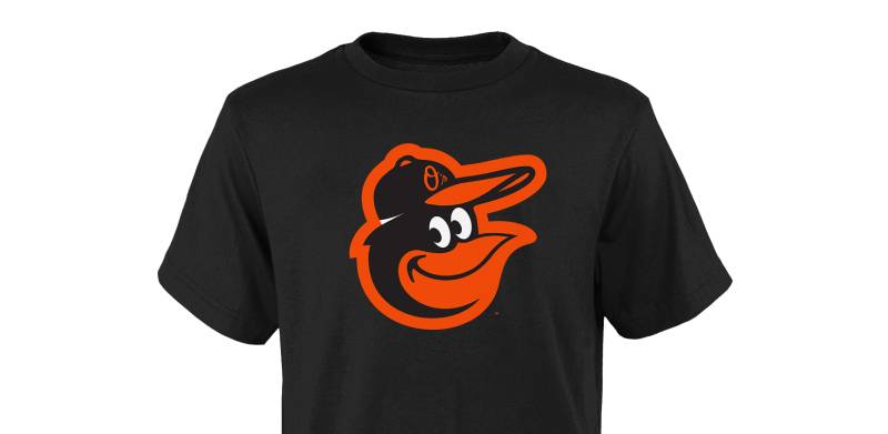
In 2019, the Orioles promoted the cartoon bird face from alternate to primary status. The design shows a smiling black and orange oriole wearing a baseball cap with the team’s “O’s” alternate logo on it.
It looks powerful in its simplicity. The black outlines are clean. The orange is bold. There is no background clutter.
This version nods directly to the Hartzell and Walsh birds while feeling completely modern. It connects the franchise’s past to its present in a way that most NFL logos and other sports marks rarely manage.
What Do the Design Elements of the Baltimore Orioles Logo Mean?
Every part of the Baltimore Orioles logo carries meaning rooted in Maryland’s identity and the franchise’s baseball history. The bird itself represents the state’s official bird. The colors tie directly to the oriole’s natural plumage. And the cartoon style reflects the team’s goal of being both competitive and approachable.
Why Did the Baltimore Orioles Choose These Specific Colors?
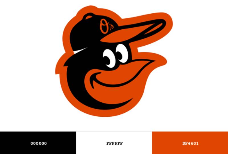
The orange comes straight from nature. Baltimore orioles (the actual birds) have striking orange and black feathers. It was a natural choice when the franchise moved to Maryland in 1954.
Here are the official color details:
- Orange: Hex #DF4601, Pantone PMS 1655 C. Represents energy, enthusiasm, and the bird’s distinctive plumage. Orange stands out sharply against most backgrounds, making it effective for both uniforms and merchandise. You can see similar choices across other orange logos in professional sports.
- Black: Hex #000000, Pantone Process Black C. Adds weight and seriousness. The black grounds the playfulness of the orange and gives the logo a sense of strength. It mirrors the dark feathers on a real Baltimore oriole’s head and wings.
- White: Hex #FFFFFF. Provides separation between elements and improves readability on dark backgrounds. Used for highlights on the bird and jersey lettering.
- Grey: Hex #B5B6B8. An accent color used sparingly in certain logo applications for shading and depth.
Historical versions also used Green (Hex #006747, Pantone PMS 342) and Yellow (Hex #FBD872, Pantone PMS 1215) in the baseball diamond background that appeared from 1995 to 2008.
Understanding color psychology helps explain why this palette works. Orange triggers feelings of excitement and warmth. Black communicates authority. Together they create a color palette that feels both fun and serious at the same time.
What Typography Style Is Used in the Baltimore Orioles Logo?
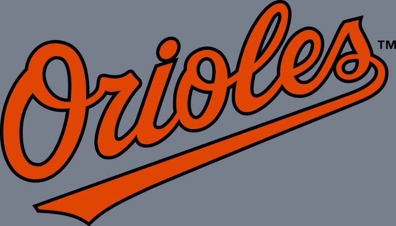
The Orioles use a custom script typeface for the “Orioles” wordmark on uniforms and secondary logos. It reads diagonally from lower-left to upper-right, with flowing cursive strokes.
The closest commercial matches include Roadhouse Script Oblique by Kimmy Design and Largelake Regular by Man’s Greback. But the team’s version is custom-built.
The lettering has thick-to-thin stroke variation, which gives it a classic baseball feel. Shadow effects add depth. It is the kind of typography you expect from a franchise with roots in the 1950s.
The jersey font is often referred to as “MLB Baltimore Orioles” in licensing circles. It handles readability well at a distance, which matters when you are watching from the upper deck at Camden Yards.
What Are the Hidden Meanings in the Baltimore Orioles Logo?
The cartoon bird’s smile is the most discussed feature. It reflects the franchise’s philosophy of being fan-friendly and approachable, even during losing seasons.
The baseball cap on the bird’s head contains the “O’s” alternate mark, which creates a logo-within-a-logo effect. Some fans have also pointed out that the bird’s posture and expression closely resemble the physical mascot that has entertained crowds since 1979.
Stan Walsh’s original 1966 design deliberately gave the bird human-like qualities: wearing shoes, swinging a bat, standing upright. That approach made the mascot relatable, almost like a teammate rather than just a symbol.
The black outlines on the current version give it a comic book quality that translates well to both print and digital applications.
How Does the Baltimore Orioles Logo Compare to Competitor Logos?
The Orioles logo sits in a specific category among MLB marks: bird-based mascot logos. It competes for attention with the St. Louis Cardinals logo, the Toronto Blue Jays logo, and to some degree the old Cleveland Indians logo (now Guardians).
What separates the Orioles is the cartoon approach. While the Cardinals use a realistic red bird and the Blue Jays lean into a stylized graphic mark, Baltimore’s bird has personality. It smiles. It wears gear. It feels alive in a way most sports logos do not.
Division rivals take different approaches entirely. The New York Yankees logo relies on pure wordmark tradition. The Boston Red Sox logo uses paired red socks. The Tampa Bay Rays logo goes with a sunburst. None of them use a character-based design.
That character quality gives the Orioles an edge in merchandising and fan engagement. Kids gravitate toward the smiling bird. It works on hats, t-shirts, plush toys, and digital graphics without losing any of its impact. You will find a similar character-driven strategy in some NBA logos and NHL logos, but in baseball, the Orioles do it best.
What Are the Technical Specifications of the Baltimore Orioles Logo?
Here are the official color codes and technical details for the Baltimore Orioles logo:
Official Color Codes
- Orange: Hex #DF4601 | RGB (223, 70, 1) | CMYK (0, 65, 87, 0) | Pantone PMS 1655 C
- Black: Hex #000000 | RGB (39, 37, 31) | CMYK (0, 0, 0, 100) | Pantone Process Black C
- White: Hex #FFFFFF | RGB (255, 255, 255) | CMYK (0, 0, 0, 0)
- Grey (accent): Hex #B5B6B8 | RGB (181, 182, 184)
Dimensions and Proportions
The primary logo maintains a roughly 1:1 aspect ratio since it focuses on the bird’s head. Clear space requirements follow MLB brand standards, which typically mandate a minimum buffer zone equal to the height of one key element (like the cap on the bird’s head) around all sides.
Minimum size recommendations for print design applications are typically 0.5 inches in height to preserve detail in the bird’s facial features. For digital use, the logo should not go below 50 pixels in height.
The logo is distributed in vector graphics formats for licensing partners, ensuring it scales cleanly from a cap embroidery to a stadium billboard. Standard file formats include SVG, EPS, and high-resolution PNG with transparency.
What Cultural Impact Has the Baltimore Orioles Logo Had?
The cartoon bird transcended baseball almost immediately after Stan Walsh’s studio introduced it in 1966. It became a symbol of Baltimore itself, not just its baseball team.
Jim Hartzell’s daily cartoons in the Baltimore Sun turned the bird into a storytelling device. A happy bird on the front page meant the Orioles won. A sad bird meant they lost. For over a decade, Baltimoreans checked the bird before they checked the box score.
The 2012 return of the cartoon bird sparked genuine excitement. Fans saw it as a statement that the franchise was reconnecting with its winning past. And the timing backed that up, because the team immediately started competing again.
You see the Orioles bird on murals across Baltimore, tattooed on arms, painted on crab shells (a very Maryland thing to do), and displayed in bars from Fells Point to Federal Hill. It represents regional pride the way few sports logos manage to do.
The logo has also influenced how other teams think about retro redesigns. Going back to a beloved older look, rather than always pushing forward, became more popular in MLB after the Orioles did it successfully.
How Does the Baltimore Orioles Logo Fit Into the Overall Brand Identity?
The Orioles maintain a tight brand system. The primary cartoon bird logo connects directly to the “O’s” alternate cap logo, the script “Orioles” wordmark, and the physical mascot that has appeared at games since 1979.
Everything runs through the same orange and black brand guidelines. The script typeface on jerseys mirrors the curves of the bird logo. The cap logo is literally embedded within the primary mark (on the bird’s cap). It all fits together without feeling forced.
Oriole Park at Camden Yards plays a role too. The ballpark’s warehouse backdrop and classic architecture align with the retro feel of the cartoon bird. It would look strange to have a hyper-modern logo in a stadium built to look timeless.
The merchandise program leans heavily on the bird’s likability. Alternate versions, including the “fun birds” introduced in 1997 for younger fans, extend the brand without diluting the primary mark. This kind of layered identity system follows solid logo design principles where every piece supports the whole.
How Should the Baltimore Orioles Logo Be Used?
The Baltimore Orioles logo is a registered trademark of Major League Baseball and the Baltimore Orioles organization. Any commercial use requires proper licensing through MLB.
Official usage guidelines include:
- Do not alter the colors. The orange, black, and white must match official specifications.
- Do not stretch, compress, rotate, or otherwise distort the logo.
- Maintain required clear space around the mark at all times.
- Do not place the logo on busy backgrounds that reduce readability.
- Do not combine the logo with other marks or text that could suggest unofficial partnerships.
Where to access official logos: Licensed versions are available through MLB’s official licensing program. Media outlets and broadcast partners receive approved files through the league’s media distribution channels.
Licensing: Any use on merchandise, promotional materials, or commercial products requires an MLB license. This applies to everything from t-shirts and hats to digital content and event branding.
Trademark protection: The Orioles and MLB actively enforce trademark rights. Unauthorized reproduction, particularly on counterfeit merchandise, is subject to legal action. The logo, the cartoon bird, and the “O’s” alternate mark are all individually protected.
Fan use in non-commercial contexts, like personal social media posts or homemade signs at games, generally falls under acceptable use. But anything sold for profit needs a license. No exceptions.
FAQ on The Baltimore Orioles Logo
What does the Baltimore Orioles logo look like?
The current logo features a smiling cartoon bird head in orange, black, and white. It wears a baseball cap showing the team’s “O’s” mark.
The design became the primary logo in 2019 after serving as an alternate since 2012. It borrows heavily from the 1960s cartoon bird era.
Who designed the original Baltimore Orioles logo?
Jim Hartzell, a cartoonist at the Baltimore Sun, sketched the first oriole bird in January 1954. His drawing showed a friendly bird perched on a baseball.
Stan Walsh and Paul Carlson at Quartet Films later created the famous 1966 cartoon version that inspired today’s mark.
Why is a bird used in the Orioles logo?
The Baltimore oriole is Maryland’s official state bird. When the franchise moved from St. Louis to Baltimore in 1954, the new owners picked the name to connect with local identity.
The bird has appeared on every logo since, except for one birdless season in 1963.
What are the official Baltimore Orioles logo colors?
Orange (Hex #DF4601), black (Hex #000000), and white (Hex #FFFFFF). Grey (#B5B6B8) appears in some applications.
The orange and black combination mirrors the real Baltimore oriole’s plumage. Earlier versions also used green and yellow.
How many times has the Baltimore Orioles logo changed?
The franchise has used more than 15 different logos since 1954. Major redesigns happened in 1963, 1966, 1989, 1992, 2009, and 2012.
Each shift reflected changes in ownership, team performance, or broader MLB team branding trends.
What font is used in the Baltimore Orioles logo?
The Orioles wordmark uses a custom script typeface. It reads diagonally with flowing cursive strokes and thick-to-thin variation.
Commercial fonts like Roadhouse Script Oblique come close. But the official version, sometimes called “MLB Baltimore Orioles,” is custom-built for the team.
When did the cartoon bird return to the Orioles logo?
A modernized cartoon bird appeared as an alternate cap logo in 2012, celebrating the 20th anniversary of Oriole Park at Camden Yards.
It became the primary logo in 2019. The team immediately started winning again after the cartoon bird came back in 2012.
What is the difference between the Orioles primary and alternate logos?
The primary logo is the cartoon bird head. Alternate versions include the scripted “Orioles” wordmark and the “O’s” cap mark.
The script lettering appears on jerseys while the bird dominates caps, helmets, and most Baltimore Orioles merchandise.
Can I use the Baltimore Orioles logo for my own project?
Not commercially. The logo is a registered trademark of Major League Baseball and the Baltimore Orioles organization.
Any use on products or promotional materials requires an MLB license. Fan use in non-commercial contexts like personal social media is generally acceptable.
Why is the Baltimore Orioles logo so popular among baseball fans?
The smiling bird has personality. Most baseball logos rely on letters or abstract marks. The Orioles bird feels like a character, not just a symbol.
Its connection to the team’s winning years in the 1960s and 1970s gives it lasting emotional weight across generations of fans.
Conclusion
The Baltimore Orioles logo is more than a cap emblem. It carries seven decades of franchise history, from the 1954 move to Baltimore through three World Series titles and the beloved return of the cartoon bird.
Few MLB team logos manage to blend nostalgia with modern appeal this well. The orange and black bird connects fans across generations.
Its evolution reflects how sports branding works best: rooted in local identity, responsive to fan sentiment, and built on a visual identity that people actually care about.
Whether on a jersey at Camden Yards or a sticker on a laptop in Fells Point, that smiling oriole means Baltimore.

Renowned for his expertise in logo design and visual branding, Bogdan has developed a multitude of logos for various clients.
His skills extend to creating posters, vector illustrations, business cards, and brochures. Additionally, Bogdan's UI kits were featured on marketplaces like Visual Hierarchy and UI8.
He also wrote in the past years on sites like Design Your Way, WebDesignerDepot, WPDean, Designmodo, Speckyboy, Slider Revolution, and more.
- The Cursor Logo History, Colors, Font, And Meaning - 24 September 2026
- Top 7 Web Design Subscription Services That Replace Full-Time Hires - 24 September 2026
- Canva vs PowerPoint: Which Is Better for Presentations? - 22 September 2026

Bogdan Sandu is a seasoned designer who has been designing websites since 2008. Renowned for his expertise in logo design and visual branding, Bogdan has developed a multitude of logos for various clients. His skills extend to creating posters, vector illustrations, business cards, and brochures. Additionally, Bogdan's UI kits were featured on marketplaces like Visual Hierarchy and UI8. He also wrote in the past years on sites like Design Your Way, WebDesignerDepot, WPDean, Designmodo, Speckyboy, Slider Revolution, and more.
You Might Also Like