The St. Louis Cardinals logo is one of the most recognized marks in professional baseball. Two red cardinal birds perched on a yellow bat with the scripted word “Cardinals” underneath. That’s the image millions of fans associate with 11 World Series titles and over a century of baseball in St. Louis, Missouri.
The franchise dates back to 1882, when Chris von der Ahe purchased the Brown Stockings and renamed them the St. Louis Browns. The current “birds on the bat” concept first appeared on uniforms in 1922, and the logo has gone through roughly nine distinct versions since then. It sits comfortably among the most enduring visual marks in all of American sports, right alongside the New York Yankees logo and a handful of other classic baseball team logos.
What Is the St. Louis Cardinals Logo?
The St. Louis Cardinals logo is a combination mark featuring two red cardinal birds perched on a yellow baseball bat, with the team name “Cardinals” written in red script below. First introduced in 1922 under general manager Branch Rickey, the design was inspired by Allie May Schmidt’s hand-painted cardboard bird cutouts and refined by her father, Edward H. Schmidt of Woodward & Tiernan Printing Co.
- Design Type: Combination mark (mascot-based illustration with scripted wordmark)
- Primary Elements: Two red cardinal birds, yellow baseball bat, “Cardinals” script lettering with a prominent “C” hooking over the bat
- Official Introduction Date: 1922 (original birds on bat); current version introduced in 1999
- Original Creator: Allie May Schmidt (concept, 1921); Edward H. Schmidt (artwork, 1922); Gary Kodner (late 1990s refinement)
- Trademark Status: Registered with the United States Patent and Trademark Office. Owned by St. Louis Cardinals, LLC. Multiple active trademark registrations cover entertainment services, merchandise, apparel, and sporting goods
- Color Palette: Cardinal Red (#C41E3A), Midnight Navy Blue (#0C2340), Yellow (#FEDB00), White (#FFFFFF)
- Usage Context: Game uniforms, caps, merchandise, stadium signage at Busch Stadium, digital platforms, broadcast graphics, licensed products across apparel, collectibles, and promotional materials
How Has the St. Louis Cardinals Logo Evolved Over Time?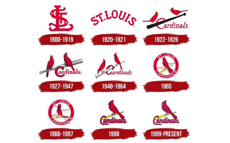
The Cardinals have used roughly nine primary logo versions since 1900. The first was a simple interlocking “SL” monogram in burgundy red.
Then in 1922, the birds appeared for the first time. Since that moment, the franchise has kept cardinal birds as the central image in nearly every version, with only brief breaks in 1927 and 1956.
Each redesign adjusted the style of the birds, the lettering, and the surrounding elements. But the core idea stayed the same. Two redbirds. One bat. The word “Cardinals.”
Original Cardinals Logo (1900-1919)
- Years Active: 1900-1919
- Design Description: A stylized interlocking “SL” monogram rendered in bold burgundy-red lines with enlarged, rounded ends
- Color Scheme: Burgundy red on white
- Designer: Unknown (team internal)
- Context: This was the franchise’s first official logo, introduced after the team formally adopted the name “Cardinals” in 1900. Sportswriter Willie McHale reportedly coined the name after overhearing a fan call the team’s uniform trim “a lovely shade of cardinal”
- Key Changes from Previous: No prior logo existed. The team previously played as the St. Louis Browns and Brown Stockings with no official emblem
- Cultural Significance: Marked the team’s shift from the Browns identity to the Cardinals name. The “SL” monogram was simple and functional, typical of early 1900s baseball branding when most clubs had minimal logo design
Arched Wordmark Logo (1920-1921)
- Years Active: 1920-1921
- Design Description: An arched “St. Louis” wordmark in red lettering across the chest of uniforms
- Color Scheme: Red on white
- Designer: Unknown
- Context: A transitional period. The team moved back to Sportsman’s Park in 1920 and this basic wordmark served as a placeholder before the birds arrived
- Key Changes from Previous: Dropped the “SL” monogram in favor of a spelled-out city name
- Cultural Significance: Short-lived and generally unremarkable. It bridged the gap between the monogram era and the legendary birds on bat design that followed
First “Birds on the Bat” Logo (1922-1926)
- Years Active: 1922-1926
- Design Description: Two simple red cardinals perched on a black bat, facing each other, with “Cardinals” lettered in red beneath. The birds were stylized and flat, not especially detailed
- Color Scheme: Red, black, white
- Designer: Edward H. Schmidt (based on Allie May Schmidt’s concept)
- Context: Branch Rickey saw Allie May Schmidt’s cardboard bird cutouts at a Ferguson Presbyterian Church meeting on February 16, 1921, and commissioned her father to produce artwork for the uniforms. The design cost $3.75 per jersey for 75 uniforms
- Key Changes from Previous: First use of bird imagery on any Cardinals uniform. Completely replaced the text-only approach
- Cultural Significance: This was a bold move for 1922 baseball. The St. Louis Post-Dispatch called it “the gaudiest bit of baseball heraldry that ever dazzled a fan’s eyes.” The design set the Cardinals apart from every other club in the league and became the template for everything that followed. A 2012 ESPN reader survey named the birds on the bat the most recognizable logo in all of baseball
World Champions Logo (1927)
- Years Active: 1927 (one season only)
- Design Description: A single, more detailed cardinal perched on a black bat, with “World Champions” text surrounding the image
- Color Scheme: Red, black, white
- Designer: Unknown (team modification)
- Context: Created to celebrate the Cardinals’ first World Series championship in 1926 against the New York Yankees
- Key Changes from Previous: Reduced from two birds to one. Added championship text. More detailed bird illustration
- Cultural Significance: The only version to explicitly reference a championship on the logo itself. It lasted just one season before the two-bird design returned
Refined Birds on Bat Logo (1928-1948)
- Years Active: 1928-1948 (with the 1922 design returning in 1929)
- Design Description: Two red cardinals with more prominent feather detail resting on a silver bat. The “C” in “Cardinals” grew bolder and featured a black outline. In 1940, the caps switched to navy blue with red bills and the interlocking “STL” in red
- Color Scheme: Red, silver/black, navy blue (caps)
- Designer: Team internal modifications
- Context: This was the Gashouse Gang era, the golden age of Cardinals baseball. World Series wins in 1931, 1934, 1942, 1944, and 1946. Stan Musial, Dizzy Dean, Joe Medwick. Radio broadcasts made the team a national brand
- Key Changes from Previous: More refined bird illustrations. Silver bat replaced the black one. Bolder, more readable typography
- Cultural Significance: This version carried the team through its most successful stretch. Radio coverage helped create “Cardinal Nation,” and the logo became a symbol recognized far beyond St. Louis
The “Sluggerbird” Era (1956)
- Years Active: 1956 (one season on jerseys; used as secondary logo on jackets through the early 1960s)
- Design Description: A single cartoon-style cardinal in a batter’s stance holding a yellow bat. The main jerseys used only a cursive “Cardinals” wordmark without any bird imagery
- Color Scheme: Red, yellow, black
- Designer: Unknown
- Context: The beginning of the Gussie Busch ownership era brought experimentation. Caps went to solid blue with a red “StL”
- Key Changes from Previous: Complete departure from the birds-on-bat tradition. The cartoon bird was anthropomorphic, a significant stylistic shift
- Cultural Significance: Widely considered one of the biggest missteps in baseball uniform history. The “Sluggerbird” lasted only a single season on game jerseys before the birds on bat returned
Circle Logo (1966-1997)
- Years Active: 1966-1997
- Design Description: A cardinal perched on a yellow bat in front of a baseball, all enclosed within a red circle reading “ST. LOUIS CARDINALS” in white letters. The bird wore a red baseball cap. Updated in 1967 with a more realistic bird illustration
- Color Scheme: Red, yellow, white, navy blue accents
- Designer: Unknown
- Context: This version lasted through three decades, covering the Bob Gibson era, the 1982 and 1985 World Series appearances, Ozzie Smith’s backflips, and the Mark McGwire home run chase
- Key Changes from Previous: Added circular framing, baseball background, and the bird wearing a cap. More realistic bird rendering than any previous version
- Cultural Significance: The longest-running single logo version. It became the image most baby boomers and Gen X fans grew up with. The circular frame gave it a badge-like quality that worked especially well on merchandise and packaging
Modernized Logo (1998)
- Years Active: 1998 (one season in this exact form)
- Design Description: Removed the circular frame and baseball background. A single red cardinal with navy blue outlines perched on a yellow bat. “Cardinals” in a sleeker red script with navy blue trim beneath. The bird had a yellow beak and white eyes
- Color Scheme: Cardinal red, navy blue, yellow, white
- Designer: Gary Kodner (consultant/refinement)
- Context: First major redesign in 30 years. Coincided with the McGwire 70-home-run season and a push to modernize the brand
- Key Changes from Previous: Stripped away the circle and baseball. Cleaner, less cluttered composition. Bolder lettering
- Cultural Significance: The transition version that set the stage for the current logo. It signaled the franchise’s willingness to update while keeping the birds-on-bat tradition intact
Current Logo (1999-Present)
- Years Active: 1999-present
- Design Description: A red cardinal bird perched on a yellow bat, facing left, with “Cardinals” in red script and navy blue outline below. The “C” slightly elongated with refined contours. White eyes, yellow beak, navy blue outlines on the bird
- Color Scheme: Cardinal Red (#C41E3A), Navy Blue (#0C2340), Yellow (#FEDB00), White (#FFFFFF)
- Designer: Gary Kodner (refinement of the 1998 version)
- Context: Minor adjustments from the 1998 version. The contours were cleaned up, the “C” tail was extended, and color values were finalized. This version has held steady through the 2006 and 2011 World Series championships
- Key Changes from Previous: Subtle refinements to eye color (white replacing yellow), beak color (yellow replacing red), and letter proportions
- Cultural Significance: The most consistent branding era in franchise history. This logo has appeared on championship merchandise, Busch Stadium signage, and broadcast graphics for over 25 years
What Do the Design Elements of the St. Louis Cardinals Logo Mean?
Every piece of the Cardinals logo ties back to the team’s name, its sport, and its roots in St. Louis. The cardinal bird is the obvious centerpiece. It’s a direct reference to the team name, which itself came from the color of the bird’s feathers, not the bird itself.
The bat underneath grounds the whole thing in baseball. And the scripted wordmark adds a layer of tradition that connects the current brand to decades of history.
Why Did the Cardinals Choose These Specific Colors?
Cardinal red came first. It’s the whole reason the team has its name. Back in 1899, the club added red trim to their uniforms, and a fan’s offhand comment about the “lovely shade of cardinal” gave sportswriter Willie McHale the idea for the name.
The red stands for energy, passion, and intensity. It’s loud on purpose. When you see it across a uniform or on a cap in a crowd, it grabs your attention immediately. Understanding color psychology helps explain why this shade works so well for a competitive sports brand.
Navy blue entered the picture much later. It showed up on caps in the 1940s and became a standard accent color. The deep blue provides grounding and contrast against the red. It carries associations with trust, stability, and confidence.
Yellow handles the bat and beak details. It’s bright enough to pop against both red and navy, adding visibility without competing for attention. As an accent, it gives the logo warmth and visual energy.
White ties everything together and provides clean separation between the other colors.
Here are the official codes:
- Cardinal Red: Hex #C41E3A | RGB (196, 30, 58) | CMYK (0, 100, 65, 15) | Pantone PMS 200 C
- Navy Blue: Hex #0C2340 | RGB (12, 35, 64) | CMYK (100, 60, 0, 56) | Pantone PMS 289 C
- Yellow: Hex #FEDB00 | RGB (254, 219, 0) | CMYK (0, 0, 100, 0) | Pantone PMS 107 C
- White: Hex #FFFFFF | RGB (255, 255, 255) | CMYK (0, 0, 0, 0)
What Typography Style Is Used in the Cardinals Logo?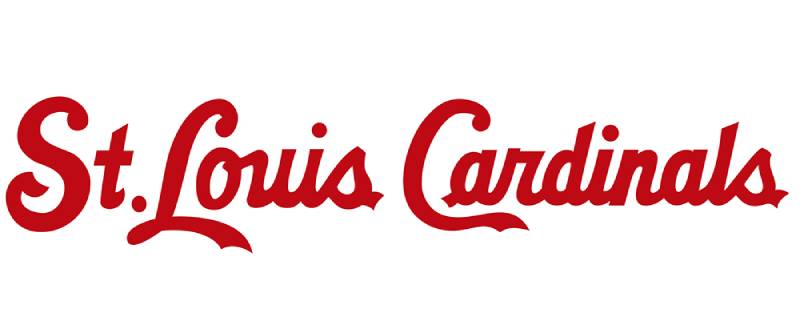
The “Cardinals” wordmark uses a custom script font that looks like calligraphy handwriting. It’s not pulled from any commercial font library. The lettering features connected, flowing characters with a prominent capital “C” that hooks over the bat.
The script style gives the logo a classic, hand-crafted feel. It’s the kind of typeface that reads as “heritage” rather than “modern.” Which makes sense, considering the franchise has been around since 1882.
Earlier versions of the logo used different lettering styles, including something close to an Old English alphabet in the earliest years. But the scripted approach has been the standard since the mid-20th century, and the current version carries bold red letters with a thin navy blue outline for readability.
What Are the Hidden Meanings in the Cardinals Logo?
The two birds facing each other on the bat create a natural symmetry. That mirrored arrangement feels balanced and stable. It’s not accidental.
The bird facing left (toward home plate, if you think about it from a baseball perspective) suggests forward motion and readiness. The yellow bat connects the team to its sport without needing any extra explanation.
There’s also the interlocking “STL” cap logo, which functions as a secondary mark. It started as a simple “SL” around 1900, and the “t” was added later. That interlock design has become just as much a part of the Cardinals identity as the birds themselves.
The original creator, Allie May Schmidt, didn’t set out to design a logo at all. She was making table decorations for a church meeting. The fact that the whole thing started from real cardinal birds sitting on a snowy branch gives the mark a layer of organic authenticity that most sports logos lack.
How Does the St. Louis Cardinals Logo Compare to Competitor Logos?
Among MLB teams, the Cardinals logo stands out for its illustrative detail. Most baseball team emblems lean toward simpler approaches. The Yankees use a clean interlocking “NY.” The Los Angeles Dodgers rely on a scripted wordmark. The Boston Red Sox keep it to a pair of colored socks.
The Cardinals went a different route. They built their logo around a full illustration with mascot imagery, typographic elements, and multiple colors working together. It’s closer in complexity to the Baltimore Orioles logo or the Toronto Blue Jays logo, which also use bird imagery.
But here’s what separates the Cardinals mark: consistency. While other bird-themed teams have gone through dramatic redesigns (the Blue Jays have had several complete overhauls), St. Louis has kept the same basic concept since 1922. That kind of brand continuity is rare, and it pays off. Fans across three or four generations recognize the same core image. Your mileage may vary on which logo is “best,” but in terms of staying power, the Cardinals are hard to beat.
Within the NL Central division specifically, the Chicago Cubs logo is the biggest rival brand. The Cubs’ circular “C” mark is simpler and more geometric. The Milwaukee Brewers logo went through its own well-received redesign. The Pittsburgh Pirates logo keeps things stripped down. And the Cincinnati Reds logo uses a wishbone “C” that’s been around for decades.
The Cardinals identity system is arguably the richest in the division, built on the strength of that birds-on-bat illustration combined with the interlocking “STL” secondary mark.
What Are the Technical Specifications of the St. Louis Cardinals Logo?
Official Color Codes
- Primary Color – Cardinal Red: Hex #C41E3A | RGB (196, 30, 58) | CMYK (0, 100, 65, 15) | Pantone PMS 200 C
- Secondary Color – Navy Blue: Hex #0C2340 | RGB (12, 35, 64) | CMYK (100, 60, 0, 56) | Pantone PMS 289 C
- Accent Color – Yellow: Hex #FEDB00 | RGB (254, 219, 0) | CMYK (0, 0, 100, 0) | Pantone PMS 107 C
- Background Color – White: Hex #FFFFFF | RGB (255, 255, 255) | CMYK (0, 0, 0, 0)
Dimensions and Proportions
The Cardinals primary logo uses a vertical orientation with the bird-on-bat illustration stacked above the “Cardinals” script. Like all MLB team marks, the logo must follow league-wide brand guidelines that specify minimum size requirements, clear space around the mark, and approved color applications.
On game jerseys, the birds-on-bat design spans across the chest, with the scripted wordmark integrated into the layout. The interlocking “STL” cap logo functions at much smaller sizes due to its simpler construction. The logo performs well as vector graphics, which allows it to scale from small cap embroidery to large stadium banners without losing quality.
For digital use, the logo works best at a minimum width of around 50 pixels for the “STL” mark and approximately 120 pixels for the full birds-on-bat version. Anything smaller and the fine details in the bird illustration start to fall apart. A higher DPI is recommended for any print design applications.
What Cultural Impact Has the St. Louis Cardinals Logo Had?
The birds on the bat is more than a team mark. It’s a civic symbol for St. Louis, Missouri. You see it on car windows, restaurant walls, tattoos, baby clothes. It represents the city as much as the Gateway Arch does.
In 2012, an ESPN reader survey named it the best-known logo in all of baseball. That’s not a small thing, considering the competition includes the Yankees’ pinstripes and interlocking “NY.”
The logo has survived wars, economic downturns, ownership changes, and a complete transformation of how sports branding works. It went from hand-stitched jersey embroidery to digital web design assets without losing its identity. There aren’t many red logos in sports that carry this much history while still looking current.
The origin story adds to the mystique. A woman making decorations for a church meeting, real birds on a snowy branch, a chance encounter with a general manager. You couldn’t script it better. It gives the logo a human quality that focus-group-designed marks just don’t have.
How Does the St. Louis Cardinals Logo Fit Into the Overall Brand Identity?
The Cardinals operate with a tight identity system. The primary birds-on-bat logo, the interlocking “STL” cap logo, and the team color palette all work together. Nothing contradicts.
Busch Stadium uses the same colors and marks across signage, concourse graphics, and digital displays. Merchandise follows the same rules. The alternate jerseys introduced in 2013 (cream-colored with “St. Louis” on the front instead of “Cardinals”) were the first to break from the wordmark tradition in 80 years, but they still used the birds-on-bat as the central image.
The mascot Fredbird, the Rally Squirrel phenomenon from the 2011 postseason, the team’s social media presence, all of it flows from the same visual foundation. The brand style guide keeps everything aligned, from the specific Pantone values down to how much clear space surrounds the logo on any given application.
Compared to other MLB franchises that have scattered identities with too many alternate logos and inconsistent color use, St. Louis keeps things focused. That discipline is part of why the brand stays strong. At least in my experience, the teams with the clearest identity systems are the ones fans connect with most deeply over time.
How Should the St. Louis Cardinals Logo Be Used?
Official Usage Guidelines
- Do: Use official logo files provided through MLB or the Cardinals’ licensing partners. Maintain specified clear space around the mark. Reproduce colors accurately using the official Pantone, RGB, CMYK, or Hex values
- Don’t: Alter the logo colors, proportions, orientation, or individual elements. Don’t place the logo on busy backgrounds that reduce legibility. Don’t recreate the logo from memory or approximate it
Where to Access Official Logos
Official Cardinals logos for media and editorial use are available through MLB’s media portal. Licensed retailers and manufacturers get logo files through MLB Properties and authorized licensees like Fanatics and New Era Cap Company. The team’s official website at mlb.com/cardinals also hosts brand assets for approved partners.
Licensing Information
The Cardinals’ logo is managed through MLB Properties for commercial licensing. Any commercial use of the logo, the interlocking “STL,” or the birds-on-bat design requires a formal licensing agreement. MLB enforces strict minimums for licensees and actively monitors unauthorized use. Fanatics holds a major licensing partnership for merchandise distribution.
Trademark Protection
St. Louis Cardinals, LLC holds multiple active federal trademark registrations with the USPTO. These cover the team name, the birds-on-bat design, the “STL” mark, and the Fredbird mascot across categories including entertainment services, apparel, sporting goods, paper goods, jewelry, and more. Personal, non-commercial use (like a homemade quilt or a fan cave decoration) is generally tolerated, but any reproduction for sale or distribution without a license can result in serious legal consequences, including fines up to $150,000 per item under copyright law and potential criminal penalties under counterfeiting statutes.
FAQ on The St. Louis Cardinals Logo
What does the St. Louis Cardinals logo look like?
The primary mark features two red cardinal birds perched on a yellow baseball bat. Below that sits the word “Cardinals” in a custom red script with navy blue outlines. It’s a combination mark that blends mascot imagery with hand-lettered text.
Who designed the original Cardinals birds on bat logo?
Allie May Schmidt created the concept in 1921 using hand-painted cardboard bird cutouts for a church event in Ferguson, Missouri. Her father, Edward H. Schmidt, turned those cutouts into official artwork for general manager Branch Rickey. The design hit jerseys in 1922.
When was the current Cardinals logo introduced?
The current version debuted in 1999. It’s a refinement of the 1998 redesign, with adjusted bird contours, white eyes, a yellow beak, and a slightly extended “C” in the scripted wordmark. Gary Kodner handled the late-1990s updates as a team consultant.
What are the official St. Louis Cardinals logo colors?
Cardinal red, midnight navy blue, yellow, and white. The red carries Pantone PMS 200 C with a hex value of #C41E3A. Navy sits at PMS 289 C (#0C2340), and yellow uses PMS 107 C (#FEDB00). These codes keep the team branding consistent across all merchandise.
How many times has the Cardinals logo changed?
Roughly nine distinct versions since 1900. The franchise started with an interlocking “SL” monogram, added the birds on bat in 1922, and has refined the design several times since. The 1956 “Sluggerbird” was the biggest departure, lasting just one season on game uniforms.
What does the interlocking STL cap logo represent?
The interlocking “STL” is the team’s secondary mark, worn on caps since the 1940s. It started as a simple “SL” around 1900. The letters represent St. Louis and function as a compact identifier that works at small sizes where the full birds-on-bat design can’t.
Is the St. Louis Cardinals logo trademarked?
Yes. St. Louis Cardinals, LLC holds multiple active registrations with the USPTO. These cover the birds-on-bat design, the “STL” mark, and the team name across categories including apparel, sporting goods, and entertainment services. Commercial use without a license is prohibited.
Why is the Cardinals logo considered one of the best in baseball?
A 2012 ESPN reader survey ranked it the most recognized MLB logo. Over a century of consistent branding helps. The birds-on-bat concept has stayed fundamentally the same since 1922, giving it a level of visual heritage that few professional sports team emblems can match.
What font is used in the Cardinals logo?
The “Cardinals” wordmark uses a custom script that resembles calligraphy. It’s not from any commercial font library. The prominent capital “C” hooks over the bat, and the connected letterforms give the whole mark a classic, hand-drawn quality that reinforces the team’s long history.
Can I use the Cardinals logo for personal projects?
Personal, non-commercial use like a homemade fan display is generally tolerated. But reproducing the logo for sale or distribution requires a formal licensing agreement through MLB Properties. Unauthorized commercial use carries serious penalties, including fines and potential criminal charges.
Conclusion
The St. Louis Cardinals logo has held its ground for over a century. From Allie May Schmidt’s cardboard cutouts to the polished redbird mark on today’s Busch Stadium merchandise, the birds on bat design keeps proving that good branding doesn’t need constant reinvention.
Eleven World Series titles. Nine logo versions. One core idea that never lost its punch.
The cardinal red and navy blue color scheme, the custom script lettering, the interlocking STL cap mark. Every piece works together. That kind of visual consistency across uniforms, licensed apparel, and digital platforms is something most MLB franchise identities struggle to pull off.
Few team emblems in professional baseball carry this much weight while still feeling fresh. The Cardinals got it right early, and they’ve been smart enough to leave it mostly alone.

Renowned for his expertise in logo design and visual branding, Bogdan has developed a multitude of logos for various clients.
His skills extend to creating posters, vector illustrations, business cards, and brochures. Additionally, Bogdan's UI kits were featured on marketplaces like Visual Hierarchy and UI8.
He also wrote in the past years on sites like Design Your Way, WebDesignerDepot, WPDean, Designmodo, Speckyboy, Slider Revolution, and more.
- The Windsurf Logo History, Colors, Font, And Meaning - 10 October 2026
- How to Remove Background From Product Photos (No Photoshop) - 10 October 2026
- How Designers can Build a Stronger Online Creative Identity - 9 October 2026

Bogdan Sandu is a seasoned designer who has been designing websites since 2008. Renowned for his expertise in logo design and visual branding, Bogdan has developed a multitude of logos for various clients. His skills extend to creating posters, vector illustrations, business cards, and brochures. Additionally, Bogdan's UI kits were featured on marketplaces like Visual Hierarchy and UI8. He also wrote in the past years on sites like Design Your Way, WebDesignerDepot, WPDean, Designmodo, Speckyboy, Slider Revolution, and more.
You Might Also Like