The Chicago Cubs logo is one of the most recognized marks in all of professional sports. It’s been around, in one form or another, since the early 1900s. And it still works.
That’s the thing about this particular emblem. While other MLB franchises have gone through total brand overhauls every decade or so, the Cubs have kept the same basic concept for over a century: a bold red “C” with “UBS” tucked inside it, sitting in a blue circle. Simple. Clean. Familiar.
The current version has been the team’s primary mark since 1979, making it one of the longest-running logos in baseball team logos history. The franchise itself dates back to 1876 (originally the Chicago White Stockings), and across all those years and name changes, the club has cycled through over 15 different logo designs. Some featured bears. Some were just text. But most of them came back to that “C.”
Within the larger picture of MLB brand identity, the Cubs logo sits alongside a handful of other timeless marks, like the New York Yankees logo and the Los Angeles Dodgers logo, as examples of how restraint and consistency build long-term recognition.
What Is the Chicago Cubs Logo?
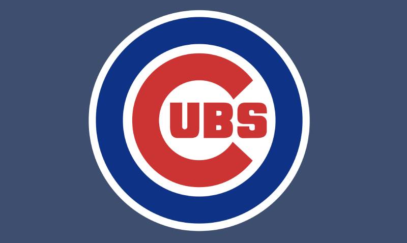
The Chicago Cubs logo is a combination mark featuring a large red sans-serif letter “C” with the letters “UBS” placed inside it, all enclosed within a royal blue circle. This version was officially introduced in 1979 as a refinement of the 1957 design. The emblem represents both the city of Chicago and the team’s name, with a red, white, and blue color scheme tied to American tradition.
Here’s a breakdown of the key attributes:
- Design Type: Combination mark (letterform plus enclosed wordmark)
- Primary Elements: Red letter “C,” blue “UBS” lettering, royal blue circular border, white background
- Official Introduction Date: 1979 (current version), based on the 1957 redesign
- Designer/Agency: The specific designer is not publicly credited. The logo evolved through internal team branding decisions over multiple decades.
- Trademark Status: Registered trademark of the Chicago Cubs, a subsidiary of the Ricketts family ownership group, licensed through Major League Baseball
- Color Palette: Cubs Blue (#0E3386), Cubs Red (#CC3433), White (#FFFFFF)
- Usage Context: Game uniforms, caps, Wrigley Field signage, official merchandise, digital platforms, broadcast graphics, and marketing materials
How Has the Chicago Cubs Logo Evolved Over Time?
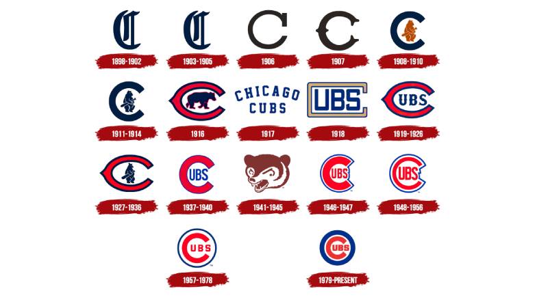
The Cubs logo has gone through more than 15 redesigns since the late 1800s. It started as a simple gothic “C,” picked up a bear mascot in 1908, experimented with wordmarks and wishbone lettering, and eventually settled into the enclosed “C” plus “UBS” format that fans know today.
The journey from that first mark to the current one is actually pretty wild when you lay it all out.
The Chicago Orphans Era (1898-1902)
Years Active: 1898-1902
Before they were even called the Cubs, the team went by the Chicago Orphans. Their first logo was an Old English letter “C” in dark blue. Nothing fancy. Just a letter.
It set the tone, though. That “C” would become the foundation for nearly everything that followed. At the time, the club had recently lost its legendary captain Adrian “Cap” Anson, and the “Orphans” nickname reflected a team without its leader.
There wasn’t much cultural weight behind this one. It was more of a functional identifier than a designed brand mark.
Early Cubs Logos (1903-1907)
Years Active: 1903-1907
The name officially became “Chicago Cubs” in 1903, though the logo stayed as a standalone “C” with minor tweaks to font style and weight.
In 1906, the Old English lettering was replaced with a cleaner block serif format in brown. A year later, the team switched to a wishbone-style “C” in a lighter blue.
These were small refinements. But the 1907 version is notable because the Cubs won their first World Series while wearing it. So there’s some sentimental value there, especially in vintage memorabilia circles.
The Bear Mascot Arrives (1908-1916)
Years Active: 1908-1916
This is where things got interesting. In 1908, for the first time, a bear appeared in the logo. A brown bear cub holding a baseball bat was placed inside a large dark “C.”
The Cubs won back-to-back World Series titles in 1907 and 1908, so this bear mascot became associated with the club’s golden era. By 1911, the bear had turned navy blue to match the “C,” creating a cleaner, more unified look.
Then in 1916, the whole thing got flipped around. The bear was drawn on all fours inside a red wishbone “C” with a blue outline. It looked more aggressive, more muscular. The red-and-blue palette showed up here for the first time in a serious way.
Wordmark and the First “C-UBS” Concept (1917-1936)
Years Active: 1917-1936
1917 stripped everything back. No bear, no circular frame. Just “CHICAGO CUBS” in blue serif typography with “Chicago” arched over “Cubs.” It lasted about a year.
The real turning point came in 1918. That’s when someone had the idea to put “UBS” inside a large “C” to spell out “CUBS.” It sounds obvious now, but this was the concept that would stick around for over a hundred years.
The first version used a boxy, gold-toned “C.” By 1919, the wishbone “C” returned in red and blue with “UBS” inside. In 1927, the bear came back briefly, replacing the letters. But by 1937, the “C-UBS” format was back for good.
The Angry Bear Interlude (1941-1956)
Years Active: 1941-1956
OK, this one was different. In 1941, the Cubs ditched the letter concept entirely and went with a standalone brown bear head. No “C,” no “UBS.” Just an angry-looking cub.
Fans have mixed feelings about this era. Some love the raw energy of the bear. Others blame it for… well, bad luck. The Billy Goat Curse started in 1945, and the Cubs wouldn’t win another World Series for over 70 years after this logo was in use.
Coincidence? Probably. But try telling that to Cubs fans who lived through the drought.
The Modern Foundation (1957-1978)
Years Active: 1957-1978
In 1957, the Cubs went back to what worked. A red “C” with blue “UBS” inside, now enclosed in a thin blue circular border. Red, white, and blue. Clean lines.
This was the template. The design felt balanced and professional, and it established the look that would carry the franchise forward. The thin blue circle gave the mark a more complete, finished quality compared to earlier versions.
The Current Chicago Cubs Logo (1979-Present)
Years Active: 1979-present
The 1979 update didn’t change the concept. It just made everything bolder. The blue outline got thicker. The “UBS” letters grew larger. The overall weight of the mark increased.
And that was it. That version has been the primary logo for nearly five decades now. It was there through the lean years, through the Sammy Sosa era, through the 2003 heartbreak, and through the 2016 World Series win that broke the 108-year championship drought.
The fact that it has survived this long without a major revision says a lot about how well the basic design works.
What Do the Design Elements of the Chicago Cubs Logo Mean?
Every piece of the Cubs logo serves a purpose. The red “C” stands for Chicago. The “UBS” letters complete the team name. The blue circle frames it all, holding the composition together and giving it a badge-like quality that works on everything from caps to stadium signage.
But there’s more going on beneath the surface if you look closely.
Why Did the Chicago Cubs Choose These Specific Colors?
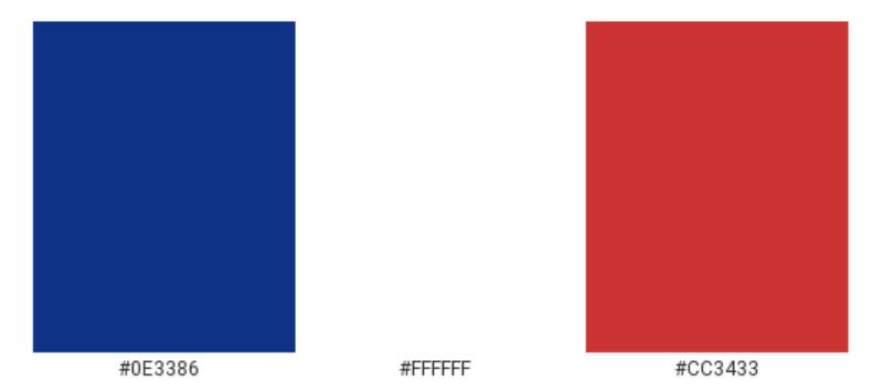
The Cubs’ official colors are blue, red, and white. These aren’t random picks. They echo the American flag, which is common among older MLB franchises that were founded during a period of strong national identity.
Cubs Blue
- Hex: #0E3386
- Pantone: PMS 294 C
- Meaning: loyalty, trust, stability
- The blue has been part of the Cubs’ identity since 1901. It reads as dependable, which fits a franchise that has leaned on tradition even during losing streaks.
Cubs Red
- Hex: #CC3433
- Pantone: PMS 186 C
- Meaning: energy, passion, competition
- Red entered the logo in 1916 and became a permanent fixture. The color psychology behind red ties to action and intensity, which makes sense for a sports brand.
White
- Hex: #FFFFFF
- Meaning: clarity, openness
- White functions as the background inside the circle. It gives the red and blue room to breathe and keeps the mark from feeling heavy. Compared to teams that use black logos or darker schemes, the Cubs’ palette feels approachable.
What Typography Style Is Used in the Chicago Cubs Logo?
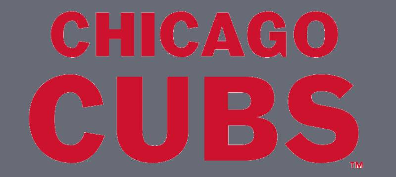
The “C” and “UBS” use a custom sans-serif typeface specific to the Cubs brand. The official font used on jerseys and branding is called “MLB Chicago Cubs.”
The letterforms are thick, slightly geometric, and squared off at certain edges. There’s no decoration. No serifs. Just solid, readable shapes that hold up whether they’re printed at 12 pixels or 12 feet tall.
The “C” itself is nearly a full circle, with the opening on the right side just wide enough to fit the “UBS” inside. That tight spacing is part of what makes the mark so compact and recognizable from a distance.
What Are the Hidden Meanings in the Chicago Cubs Logo?
There’s no buried arrow like in the FedEx logo. But there’s a clever bit of wordplay built into the structure that most people take for granted.
The “C” does double duty. It stands for “Chicago” and it’s also the first letter of “Cubs.” Placing “UBS” inside completes the name while also keeping the city reference. One letter, two meanings. That’s efficient design.
The circular frame gives the whole thing a seal-like quality, which adds a feeling of authority and legitimacy. It’s the kind of shape you’d see on a coin or an official stamp. Took me a while to notice that, but once you see it, the mark feels even more intentional.
How Does the Chicago Cubs Logo Compare to Competitor Logos?
In the National League Central, the Cubs logo holds its own through sheer simplicity. While the Milwaukee Brewers logo uses a clever glove-shaped monogram and the St. Louis Cardinals logo leans on its bird-on-bat image, the Cubs mark doesn’t try to be tricky. It just states the name and gets out of the way.
Across the broader MLB, the Cubs logo falls into a category with other letter-based marks like the Cincinnati Reds logo and the Minnesota Twins logo. These teams rely on strong logo typography and color rather than detailed illustrations.
What separates the Cubs from most of these is longevity. The core concept hasn’t changed since 1918. Most competitors have gone through complete rebrands in that same window. The Houston Astros logo, for instance, has been through at least five totally different designs since the 1960s.
Even Chicago’s crosstown rival, the Chicago White Sox logo, has gone through more dramatic changes over the same period.
What Are the Technical Specifications of the Chicago Cubs Logo?
Official Color Codes
Primary Color: Cubs Blue
Secondary Color: Cubs Red
- Hex: #CC3433
- RGB: (204, 52, 51)
- CMYK: (0, 91, 76, 6)
- Pantone: PMS 186 C
Background: White
- Hex: #FFFFFF
- RGB: (255, 255, 255)
- CMYK: (0, 0, 0, 0)
Dimensions and Proportions
The logo uses a roughly 1:1 aspect ratio since it’s circular. MLB brand guidelines require a minimum clear space around the mark equal to the height of the “UBS” lettering on all sides.
For digital applications, minimum size guidelines typically keep the logo above 32 pixels in width to maintain legibility. The mark is distributed as vector graphics (AI, EPS, SVG) for print and high-resolution JPEG and PNG files for digital use.
Official usage must follow the MLB style guide, which specifies approved color variations (full color, single color, reversed) and prohibited modifications like stretching, rotating, or altering the color values.
What Cultural Impact Has the Chicago Cubs Logo Had?
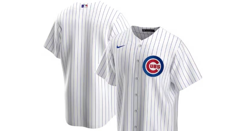
The Cubs logo transcends baseball. It’s a Chicago identity marker. You’ll see it in neighborhoods across the North Side, on murals in Wrigleyville, on tattoos, on bar signs, and on clothing worn by people who may not even follow the sport.
When the Cubs won the 2016 World Series after 108 years without a championship, that circular blue-and-red mark became a symbol of perseverance for an entire city. It showed up everywhere. News broadcasts, magazine covers, social media posts from people around the world.
The logo also carries weight in the vintage sportswear market. Original merchandise from the 1940s and 1950s bearing older versions of the mark sells for serious money among collectors. The bear-era logos especially have a cult following.
Compared to other cultural sports marks like NBA logos or NFL logos, baseball logos tend to lean more traditional. The Cubs emblem is a perfect example of that tradition holding real cultural power.
How Does the Chicago Cubs Logo Fit Into the Overall Brand Identity?
The primary logo doesn’t exist alone. It sits at the center of a larger visual system that includes the “C” cap insignia, the walking bear alternate mark, various commemorative logos, and the City Connect designs. Each piece connects back to the main emblem’s color scheme and design language.
The brand guidelines keep everything tied together. The same blue-red-white color palette runs through uniforms, Wrigley Field signage, the Marquee Sports Network broadcast package, and all licensed merchandise. The result is a brand that feels consistent whether you’re watching on TV or walking through the stadium gates.
The alternate bear logo gives the Cubs flexibility for casual merchandise and younger fan outreach without diluting the primary mark. That kind of visual hierarchy between primary and secondary logos is something a lot of sports teams struggle with.
How Should the Chicago Cubs Logo Be Used?
If you’re looking to use the Chicago Cubs logo for any purpose, there are rules. MLB and the Cubs organization enforce strict trademark protections on all team marks.
Do’s:
- Use official logo files from MLB’s licensing portal or the Cubs’ media resources
- Maintain proper clear space around the mark
- Keep the logo in its approved color combinations
- Scale proportionally without stretching or distorting
Don’ts:
- Alter the colors, fonts, or proportions
- Place the logo on busy backgrounds that reduce readability
- Use the logo for commercial purposes without an MLB license
- Recreate or redraw the logo from scratch
For commercial use, you’ll need to go through MLB Properties for licensing. Fan-made content and editorial use fall under different guidelines, but even then, misuse of the trademark can trigger takedown notices.
Official logo files are typically available through the Cubs’ media relations department or through MLB’s brand asset portal for accredited partners.
FAQ on The Chicago Cubs Logo
What does the Chicago Cubs logo look like?
The current Cubs logo features a large red “C” with “UBS” in blue placed inside it. A thick royal blue circle frames the entire mark.
White fills the background. The color palette is red, white, and blue. It’s been this way since 1979.
When was the Chicago Cubs logo first created?
The first Cubs-era logo appeared in 1903 as a standalone gothic letter “C” in dark blue. But the franchise used marks as far back as 1898 under the Chicago Orphans name.
The “C” with “UBS” inside concept started in 1918.
How many times has the Cubs logo changed?
The team has gone through over 15 logo designs across its history. Some changes were small, like adjusting line thickness. Others were major, like swapping letters for an angry bear cub in 1941.
The current version has stayed put since 1979.
What do the colors in the Chicago Cubs logo mean?
Blue represents loyalty and trust. Red signals energy and competition. White provides clarity and keeps the composition open.
These colors mirror the American flag, which is common among older National League teams founded during periods of strong national identity.
What font is used in the Chicago Cubs logo?
The Cubs use a custom sans-serif font called “MLB Chicago Cubs.” The letterforms are thick, slightly geometric, and squared at certain edges.
There are no serifs or decorative elements. Just bold, clean shapes built for readability at any size.
Why is there a bear in some Chicago Cubs logos?
The bear first appeared in 1908 as a cub holding a baseball bat inside the letter “C.” It represented the team’s nickname directly.
The bear left the primary logo after 1941 but lives on in the team’s alternate mark. Fans still love it.
Is the Chicago Cubs logo trademarked?
Yes. The logo is a registered trademark owned by the Chicago Cubs organization and licensed through Major League Baseball. Any commercial use requires an official MLB license.
Unauthorized reproduction can result in takedown notices and legal action.
What is the difference between the Cubs primary logo and alternate logo?
The primary logo is the red “C” with “UBS” inside a blue circle. The alternate logo features a walking bear cub, which has been updated several times since 1962.
Both use the same Cubs blue and red complementary color scheme.
Where can I download the official Chicago Cubs logo?
Official logo files are available through MLB’s brand asset portal for licensed partners and accredited media. The Cubs’ media relations department also provides assets.
Fan sites offer PNG and SVG versions, but those aren’t always accurate to official specs.
Did the Cubs change their logo after winning the 2016 World Series?
No. The primary logo stayed the same after the 2016 championship. The team did release a commemorative World Series logo, but the core mark remained untouched.
It had already been in use since 1979. Winning just made it more famous.
Conclusion
The Chicago Cubs logo has earned its place among the most lasting marks in MLB history. Over 15 redesigns, a bear mascot, wishbone lettering, and decades of refinement all led to one clean circular emblem that fans at Wrigley Field recognize instantly.
It works because it never tried to do too much. A red “C,” blue letters, a white background. That’s it.
From vintage Cubs merchandise to modern jerseys, the logo design principles behind this mark show what happens when a team commits to simplicity and sticks with it. Few blue logos in sports carry this kind of history.

Renowned for his expertise in logo design and visual branding, Bogdan has developed a multitude of logos for various clients.
His skills extend to creating posters, vector illustrations, business cards, and brochures. Additionally, Bogdan's UI kits were featured on marketplaces like Visual Hierarchy and UI8.
He also wrote in the past years on sites like Design Your Way, WebDesignerDepot, WPDean, Designmodo, Speckyboy, Slider Revolution, and more.
- The Cursor Logo History, Colors, Font, And Meaning - 24 September 2026
- Top 7 Web Design Subscription Services That Replace Full-Time Hires - 24 September 2026
- Canva vs PowerPoint: Which Is Better for Presentations? - 22 September 2026

Bogdan Sandu is a seasoned designer who has been designing websites since 2008. Renowned for his expertise in logo design and visual branding, Bogdan has developed a multitude of logos for various clients. His skills extend to creating posters, vector illustrations, business cards, and brochures. Additionally, Bogdan's UI kits were featured on marketplaces like Visual Hierarchy and UI8. He also wrote in the past years on sites like Design Your Way, WebDesignerDepot, WPDean, Designmodo, Speckyboy, Slider Revolution, and more.
You Might Also Like