The Colorado Rockies Logo History, Colors, Font, and Meaning
Imagine a symbol that captures the majesty of towering peaks under a boundless sky. That’s the essence the Colorado Rockies logo distills into its iconic design.
Standing out in a sea of MLB emblems, it speaks to the heart of baseball fans and design enthusiasts alike. Steeped in the rich hues and history of Denver, this logo is more than a mere sports emblem; it’s a beacon of team spirit and regional pride.
In this exploration, you’ll discover the layers behind the logo that adorns everything from Coors Field to the caps of die-hard supporters.
As a fusion of graphic design mastery and sports branding prowess, it represents not just a team, but also the enduring spirit of a state synonymous with grandeur and adventure.
By unpacking the DNA of this visual signature, insights into effective design and powerful sports marketing strategies unfold.
Prepare to delve into the evolution that brought the Rockies’ emblem to life, the choice of purple mountain imagery reflecting Colorado’s scenic backdrop, and the imaginative process that goes into Major League Baseball visual identities.
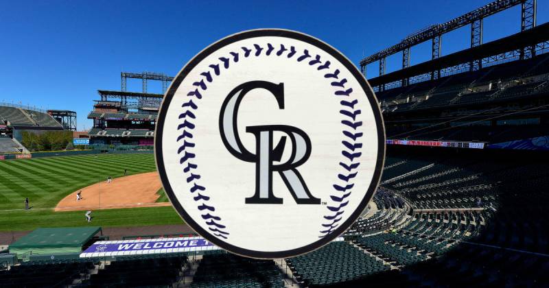
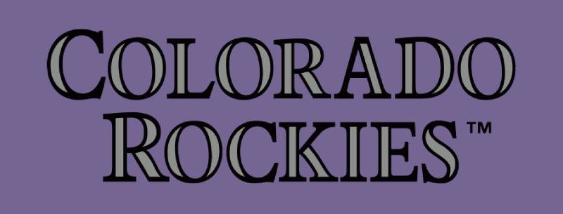
The Meaning Behind the Colorado Rockies Logo
![]()
Man, when you first lay your eyes on the Colorado Rockies logo, there’s a lot to take in. You might think, “It’s just a sports logo, how deep can it be?” But trust me, it’s got layers.
Black Beauty
Black. It’s not just for the night sky. It represents the depth and mystery of the Rocky Mountains, giving them a majestic silhouette. Plus, black in sports? It adds a touch of elegance, making the team distinguished.
Baseball Legacy
The baseball in the logo isn’t just there because it’s a baseball team. Nah, it represents the tradition and spirit of the game. Baseball has deep roots in America, and the team carries that history and love for the sport with them.
The History of the Colorado Rockies Logo
![]()
Jumping into a time machine here. The Colorado Rockies haven’t been around as long as some teams, but their logo history is still pretty rad.
The Debut
When the team was introduced, the logo was a statement. It had to show they were here to play, and boy, did they do that! The mountains and the baseball gave fans an immediate sense of pride.
Evolution and Tweaks
Like any good design, there’s always room for a lil’ sprucing up. Over the years, the logo saw some subtle changes. Nothing too wild, but enough to keep things fresh and up-to-date.
The Colors of the Colorado Rockies Logo
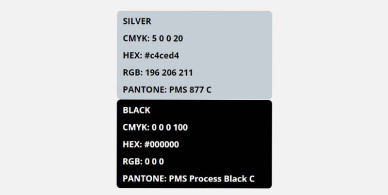
Alright, so, let’s chat about the colors. They ain’t just there to look pretty!
Purple Majesty
Purple. It ain’t just for royalty. It represents the vibrant sunsets that drape over the Rocky Mountains. Plus, purple in sports? It’s kinda unique, making the team stand out.
Silver Linings
Then there’s the silver. Kinda like the snowy peaks of the Rockies, it’s a nod to the natural beauty of Colorado.
The Font Used in the Colorado Rockies Logo
Fonts, my dudes, can make or break a design. And the Rockies? They nailed it.
Classic Yet Modern
The script is smooth, flowing like a well-pitched game. It’s got that classic baseball feel, but with a touch of modern sleekness. Not too flashy, but not dull either.
Impact on Pop Culture
The Colorado Rockies logo isn’t just for baseball nerds like yours truly. Nah, it’s made its mark in pop culture too.
Merchandise Madness
From hats to tees, mugs to keychains – the logo is everywhere. It’s become a style statement. You wear it, and instantly, you’re cool. Period.
Memorable Moments
Ever noticed the logo in movies or TV shows? It’s not just a coincidence. It’s iconic. Represents a bit of that wild, free spirit we all crave.
Behind the Designers’ Desk
Ever wondered who’s responsible for such dope design?
Vision Meets Art
It wasn’t just about drawing mountains and slapping a baseball on. The designers had a vision, a story to tell. They wanted the logo to resonate with fans and make a mark in the baseball world.
Challenges Faced
Every design journey has its bumps. For the Rockies logo, it was about balance. Making sure every element had its space without overshadowing the others. But hey, they made it work, and how!
FAQ On The Colorado Rockies Logo
What inspired the Colorado Rockies logo?
The logo draws its inspiration from the natural grandeur of the Rocky Mountains, a defining feature of the Colorado landscape.
Coupled with a color scheme that mirrors the purple hues seen at mountain twilight, the emblem symbolizes both the region’s beauty and the team’s identity.
Does the Colorado Rockies logo have any hidden meanings?
Embedded within the logo is an emblematic baseball, subtly integrating the sport into the mountainous scene. The logo’s typography also hints at strong foundation and athletic dynamism, suggesting a team rooted in tradition yet always striving forward.
How has the Colorado Rockies logo evolved over the years?
Since the team’s inception in 1993, the logo has evolved subtly, primarily in color adjustments and graphic refinement for visual impact and modernity. The core design, a mountain with a baseball, has remained consistently symbolic of Colorado’s alpine skyline.
What do the colors of the Colorado Rockies logo represent?
The colors reflect Colorado’s environment: the deep purple stands for the mountain majesty, silver signifies snow-capped peaks, and black adds a touch of elegance and strength. Together, they communicate the Rockies’ indomitable spirit.
How does the Colorado Rockies logo compare to other MLB logos?
As a beacon of regional representation, the Colorado Rockies logo distinguishes itself with its geographic features. It forgoes the typical mascot or letter monogram for a landscape, positioning it uniquely in the roster of MLB team logos.
Can you buy merchandise with the old Colorado Rockies logo?
Yes, vintage and retro merchandise featuring previous versions of the Colorado Rockies logo are prized items among fans and collectors, often available through specialty sports memorabilia stores and online marketplaces.
What elements are included in the current Colorado Rockies logo?
The contemporary logo encapsulates bold lettering of the team name, a sweeping mountain vista, and an artfully concealed baseball, embodying the spirit of Rockies baseball and the Denver community.
How do graphic designers view the Colorado Rockies logo?
Many graphic designers admire the logo’s blend of natural imagery with sports branding, lauding its unique connection to the team’s home state and its clever incorporation of baseball iconography.
Is the Colorado Rockies logo trademarked?
Absolutely, the Colorado Rockies logo, being an official emblem for a professional sports team, is trademarked to protect its exclusive use for team branding and associated sports merchandise.
How often is the Colorado Rockies logo updated or refreshed?
The Rockies have maintained a consistent brand identity since their introduction, with occasional updates for modern appeal. These refinements ensure the logo remains impactful across evolving media formats and sports marketing campaigns.
Conclusion
In the tapestry of Major League Baseball, where symbols transcend the sport, the Colorado Rockies logo stands distinct. It’s an emblem where design and local identity converge—a visual narrative etched against a tapestry of purple, silver, and black.
- A study in balance: an aesthetic capturing both the timeless Rockies and the dynamism of baseball
- A canvas evoking passion: for fans whose wardrobes are marked with this crest
- A mark speaking volumes: to the character of a team, a city, and its natural wonders
This exploration, far more than a mere overview, has been an ode to what logo design can achieve—crystalizing spirit in shapes and shades. Whether encountered on sports merchandise, fluttering on a flag at Coors Field, or flashing across screens, this logo unites and excites. It’s not mere branding; it’s a landmark in sports marketing, a masthead under which fans rally and celebrate their shared bonds through the exemplary pursuit of baseball.
If you liked this article about the Colorado Rockies logo, you should check out this article about the Arizona Diamondbacks logo.
There are also similar articles discussing the Houston Astros logo, the Miami Marlins logo, the Chicago White Sox logo, and the New York Yankees logo.
And let’s not forget about articles on the Philadelphia Phillies logo, the Toronto Blue Jays logo, the Kansas City Royals logo, and the Los Angeles Dodgers logo.
Bogdan Sandu, a seasoned designer with 15 years of diverse experience, has been designing websites since 2008.
Renowned for his expertise in logo design and visual branding, Bogdan has developed a multitude of logos for various clients.
His skills extend to creating posters, vector illustrations, business cards, and brochures. Additionally, Bogdan's UI kits were featured on marketplaces like Visual Hierarchy and UI8.
Latest posts by Bogdan Sandu (see all)