The Kansas City Royals logo is one of those rare sports marks that barely needed fixing from day one. Built around a royal blue shield, a gold crown, and the interlocking “KC” letters, it has remained structurally intact since the franchise played its first game in 1969. Shannon Manning, an artist at Hallmark Cards in Kansas City, designed the original emblem after the company opened the project to its entire staff. The crown pays tribute to the American Royal, a livestock show and rodeo held annually in Kansas City since 1899, which also inspired the team’s name. Through five decades and a handful of color tweaks, the Kansas City Royals logo still carries that same coat-of-arms structure, that same blue-and-gold punch.
The Royals compete in the American League Central division of Major League Baseball. They’ve reached the World Series four times (1980, 1985, 2014, 2015), winning twice. The franchise has gone through roughly six primary logo versions since its founding, though each one looks more like an update than a total overhaul. That kind of consistency is unusual in professional sports branding, where teams often scrap and rebuild their visual identity every decade or so.
What Is the Kansas City Royals Logo?
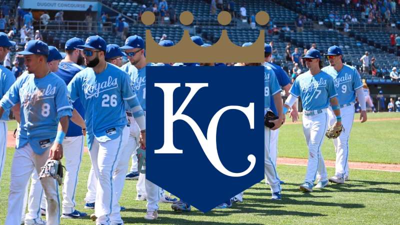
The Kansas City Royals logo is a combination mark featuring interlocking “KC” letters on a royal blue pentagon-shaped shield topped by a four-pointed gold crown. Designed by Shannon Manning of Hallmark Cards, it was introduced in 1969 and represents the team’s connection to Kansas City’s American Royal heritage.
Design Type: Combination mark (emblem with wordmark)
Primary Elements: A five-sided royal blue shield, interlocking “KC” monogram in white, a four-pointed gold crown sitting on top of the shield, and the scripted word “Royals” below (removed in the 2019 version)
Official Introduction Date: 1969
Designer: Shannon Manning, artist at Hallmark Cards, Kansas City. He beat out 20 other Hallmark artists who submitted competing designs. His prize was $100.
Trademark Status: Registered with the United States Patent and Trademark Office under Kansas City Royals Baseball Club, LLC. The club holds more than 50 separate trademark entries, including variations of the logo, the “KC” lettering, and the word “Royals.” MLB handles licensing and enforcement on the team’s behalf.
Color Palette: Royal Blue (#004687), Gold (#BD9B60), White (#FFFFFF). Earlier versions also included orange (1969-1992) before the switch to gold in 1993.
Usage Context: Jerseys, caps, Kauffman Stadium signage (the crown stands more than 100 feet tall on the scoreboard), merchandise, digital platforms, broadcast graphics, and promotional materials.
How Has the Kansas City Royals Logo Evolved Over Time?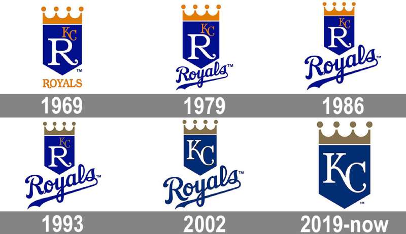
The Royals logo has gone through six primary versions since 1969, but the core structure has stayed the same. A blue shield. A gold crown. Letters inside.
Most changes were minor. Color shifts, sizing adjustments, swapping the big “R” for “KC” as the focal point.
The biggest single change came in 2002, when the prominent white “R” that had dominated the shield for over 30 years was finally dropped in favor of the “KC” monogram taking center stage.
Original Kansas City Royals Logo (1969-1978)
Years Active: 1969 to 1978
Design Description: A royal blue pentagon-shaped shield with a large white “R” as the dominant character. A smaller gold “KC” sat in the upper-right area of the shield. A four-pointed gold crown rested on top. Below the shield, the word “ROYALS” appeared in bold gold lettering.
Color Scheme: Royal blue, gold/yellow, white
Designer: Shannon Manning of Hallmark Cards. He originally experimented with placing a red stallion head inside the loop of the “R” before settling on the cleaner version. Manning modified an existing typeface to let the “K” and “C” blend into each other, while the “R” used a standard font with decorative swash flourishes that were popular in late-1960s design.
Context: The Kansas City Athletics had just left for Oakland after the 1967 season, and the city needed a fresh identity fast. Owner Ewing Kauffman turned to Hallmark, headquartered in Kansas City since 1910, and opened the design project to its entire staff. Fifteen to twenty-one artists submitted concepts. Some included livestock imagery since Kansas City was a cattle hub, but Kauffman wanted something cleaner. Manning’s shield-and-crown approach won out.
Cultural Significance: This was the birth of the Royals’ visual identity. The crown tied the team to the American Royal tradition. The shield gave it a coat-of-arms feel that suggested authority and tradition, even for a brand-new expansion franchise.
Second Primary Logo (1979-1985)
Years Active: 1979 to 1985
Design Description: Same basic layout. Gold crown on top, blue shield in the middle, white “R” still the focal point with the smaller gold “KC” in the upper right. But the crown and shield were slightly reduced in size.
Color Scheme: Royal blue, gold/yellow, white
Key Changes from Previous: The biggest visible difference was at the bottom. The bold gold “ROYALS” wordmark was replaced with a blue version in a more classic script font. The overall proportions were tightened slightly.
Context: This was the Royals’ golden era on the field. George Brett, Frank White, Willie Wilson. The team appeared in the playoffs seven times between 1976 and 1985. The subtle logo refresh kept things familiar while the franchise was building its identity through winning.
Cultural Significance: By now the crown-and-shield was becoming iconic. Fans associated it with one of baseball’s best teams. The 1985 World Series championship cemented the logo in Kansas City’s cultural memory.
Third Primary Logo (1986-1992)
Years Active: 1986 to 1992
Design Description: The word “Royals” got bigger relative to the shield. The overall composition was rebalanced to give the wordmark more weight.
Color Scheme: Royal blue, orange/gold, white
Key Changes from Previous: The orange tones became calmer and darker. This gave the whole mark a more serious, grounded feel compared to the brighter yellow-golds of the earlier versions.
Context: Post-championship era. The team was still competitive in the late 1980s but beginning to decline. The logo adjustments were cosmetic, not strategic.
Fourth Primary Logo (1993-2001)
Years Active: 1993 to 2001
Design Description: Same shield, same crown, same “R” focal point. But the color story changed significantly.
Color Scheme: Royal blue, gold (replacing orange entirely), white
Key Changes from Previous: Orange was completely removed from the color palette. A muted, elegant gold took its place. This single change altered the personality of the logo considerably, making it feel more refined.
Context: Owner Ewing Kauffman passed away in September 1993. The franchise was entering a difficult period both on and off the field. The color shift to gold gave the mark a more timeless quality, even as the team struggled competitively through most of the late 1990s.
Cultural Significance: The blue-and-gold combination became the definitive Royals palette. When people picture the Royals today, these are the colors they see.
Fifth Primary Logo (2002-2018)
Years Active: 2002 to 2018
Design Description: The “KC” monogram moved to the center of the shield, replacing the “R” that had been the focal point for over 30 years. The letters were rendered in white with narrower lines to fit the shield width better. The scripted “Royals” wordmark appeared below in blue.
Color Scheme: Royal blue (#004687), Gold (#BD9B60), White (#FFFFFF)
Key Changes from Previous: This was the most significant shift in the logo’s history. The “R” was gone. “KC” took over as the primary mark inside the shield. The small additional gold lettering from earlier versions was also removed.
Context: By 2002, the “KC” cap insignia had become more recognizable than the shield’s “R” in everyday use. The redesign simply aligned the primary logo with what fans already associated with the team. This version was in use during the 2014 and 2015 World Series appearances, which brought the logo back into the national spotlight.
Cultural Significance: This version accompanied the team’s return to relevance. Salvador Perez, Eric Hosmer, Lorenzo Cain. The 2015 World Series win made this particular version of the logo a symbol of Kansas City pride all over again.
Current Kansas City Royals Logo (2019-Present)
Years Active: 2019 to present
Design Description: A simplified dark blue shield with a pale gold crown and white “KC” monogram. The “Royals” wordmark below the shield was removed entirely.
Color Scheme: Royal blue (#004687), Gold (#BD9B60), White (#FFFFFF)
Key Changes from Previous: The removal of the “Royals” script underneath the shield. The mark now stands alone as just the shield, crown, and monogram. Cleaner. Tighter. More modern.
Context: Introduced alongside the team’s 50th anniversary celebration. The simplification follows a broader trend across professional sports toward cleaner, more adaptable logos that work well across digital platforms and merchandise.
Cultural Significance: The current version strips the logo to its absolute core elements. It signals that the crown-shield-KC combination is strong enough to work without any supporting text. After 50 years, the design speaks for itself.
What Do the Design Elements of the Kansas City Royals Logo Mean?
Every piece of the Royals logo connects back to Kansas City’s identity and the franchise’s name. The crown references royalty. The shield suggests protection and tradition.
The “KC” monogram ties the team directly to its city. None of these elements are decorative filler.
They all serve a purpose within the mark’s overall message of heritage, authority, and local pride.
What Does the Crown Symbolize?
The four-pointed gold crown is the most recognizable part of the entire mark. It references the American Royal, the annual livestock show and rodeo held in Kansas City since 1899, which directly inspired the team name.
But it also carries broader associations with royalty, authority, and championship. The crown sits at the top of the shield, creating a clear visual hierarchy that draws the eye upward.
At Kauffman Stadium, the crown on the scoreboard stands more than 100 feet tall. It has become a Kansas City landmark in its own right.
What Does the Shield Represent?
Shannon Manning described the shape as “a modified home plate shape that makes a shield, something that looks like a coat of arms.” That dual reference is clever. Home plate for baseball. A heraldic shield for the “Royal” connection.
The five-sided shape gives the logo structural stability and a sense of formality. It grounds the entire composition and provides a contained frame for the lettering.
Why Did the Kansas City Royals Choose These Specific Colors?
Royal Blue (#004687)
Pantone PMS 287 C. The team required blue from the start. It was one of only two mandates given to the Hallmark designers (the other was including a crown). Royal blue connects to the “Royals” name and carries associations of loyalty, trust, and authority. It is also the reason for two of the team’s nicknames: “The Blue Crew” and “Boys in Blue.”
Gold (#BD9B60)
Pantone PMS 7562 C. Gold replaced the original orange tones in 1993. It pairs naturally with blue in color theory and adds associations of prestige, achievement, and, obviously, royalty. Looking at brands that use gold in their logos, the color consistently signals tradition and excellence.
White (#FFFFFF)
Used for the “KC” monogram and as a supporting color. It provides contrast against the deep blue shield, making the letters readable at any size. Teams that feature white in their logos often do so for exactly this kind of functional clarity.
What Typography Style Is Used in the Kansas City Royals Logo?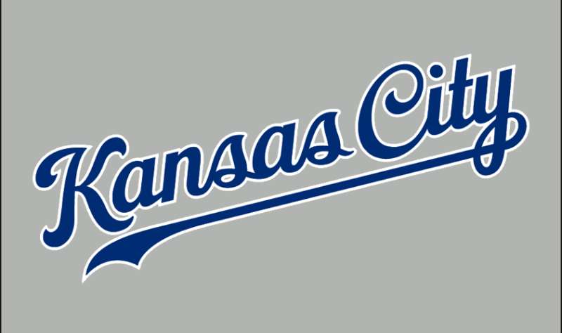
The typography in the Royals logo is entirely custom. Shannon Manning modified an existing typeface to create the interlocking “KC,” using swing-down curving flourishes called swashes that were popular in late-1960s design.
The scripted “Royals” wordmark (used through 2018) was also custom artwork. Neither the “KC” nor the “Royals” text belongs to any commercially available font family.
The lettering balances readability with personality. The swash details add a touch of elegance without making the text hard to read at small sizes, which matters for cap insignias and merchandise.
What Are the Hidden Meanings in the Kansas City Royals Logo?
The shield’s shape does double duty. It reads as a heraldic coat of arms, but it also mirrors a home plate, tying the regal imagery directly back to baseball.
Manning originally experimented with placing a red stallion head and even a steer head inside the loop of the “R,” referencing Kansas City’s ranching and rodeo heritage. Those elements were cut, but the crown still carries that same American Royal connection, just in a subtler way.
The interlocking “KC” letters were specifically designed so the characters blend into each other. That seamless connection between the two letters suggests unity between the team and its city.
How Does the Kansas City Royals Logo Compare to Competitor Logos?
Most baseball team logos fall into a few categories: letter-based marks, mascot illustrations, or wordmarks. The Royals sit in a unique spot because their emblem combines heraldic imagery with a monogram inside a shield. Very few MLB teams use that approach.
Compare it to the New York Yankees logo, which is a clean interlocking “NY” with zero ornamentation. Or the St. Louis Cardinals logo, which features two cardinal birds perched on a bat. The Royals logo lands somewhere between those extremes, combining a symbol (the crown) with letterforms (the “KC”) inside a structured frame (the shield).
Among AL Central rivals, the Minnesota Twins logo uses a wordmark approach, while the Detroit Tigers logo relies on the classic Old English “D.” The Cleveland Guardians logo went through a major rebrand in recent years.
What sets the Royals apart is consistency. While other franchises have completely reinvented themselves multiple times, Kansas City has kept the same basic framework for over 50 years. That builds a level of brand recognition that frequent redesigns can actually undermine.
What Are the Technical Specifications of the Kansas City Royals Logo?
Official Color Codes
Primary Color: Royal Blue
Secondary Color: Gold
- Hex: #BD9B60
- RGB: (189, 155, 96)
- CMYK: (8, 29, 66, 19)
- Pantone: PMS 7562 C
Accent Color: White
- Hex: #FFFFFF
- RGB: (255, 255, 255)
- CMYK: (0, 0, 0, 0)
Additional Color: Powder Blue
- Hex: #7AB2DD
- RGB: (122, 178, 221)
- Used on alternate uniforms and select merchandise
Dimensions and Proportions
The logo uses a vertically-oriented composition. The crown sits at the top, the shield fills the middle, and the “Royals” wordmark (pre-2019 versions) anchors the bottom. The shield’s pentagon shape creates a natural focal point at the center where the “KC” monogram lives.
Minimum size requirements and clear space rules are governed by MLB’s brand guidelines and the team’s own brand standards. The logo must maintain legibility at small sizes, which is why the 2019 simplification (removing the wordmark) helps. Fewer elements means the mark holds up better on small-scale applications like social media avatars and embroidered patches.
The logo is produced as vector graphics for scalability. This means it can be reproduced at any size without loss of quality, from a tiny pin to the 100-foot scoreboard crown at Kauffman Stadium.
What Cultural Impact Has the Kansas City Royals Logo Had?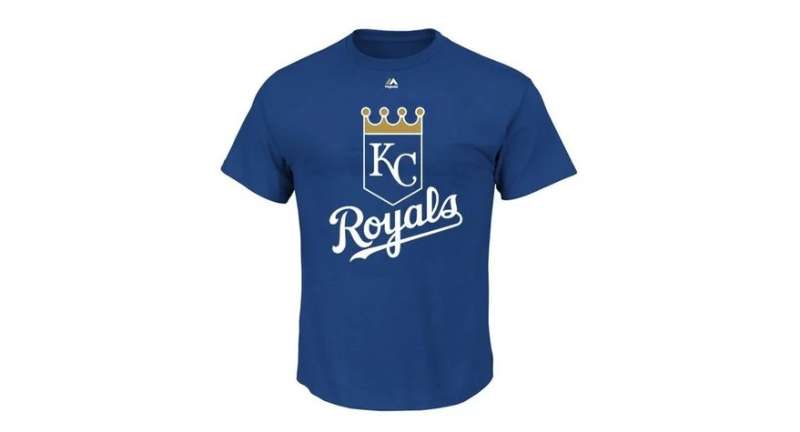
The crown is everywhere in Kansas City. On murals, tattoos, bumper stickers, bar signs.
It stopped being just a baseball logo a long time ago. For people in the KC metro area, the crown and shield are cultural markers, a way of saying “this is where I’m from.”
The 2014 and 2015 World Series runs brought the logo back to national attention after nearly 30 years out of the playoff spotlight. Suddenly the “KC” was showing up on caps and shirts in cities that had barely thought about the Royals in decades.
The logo’s connection to the American Royal tradition gives it a layer of meaning that goes beyond baseball. It ties into Kansas City’s agricultural roots, its rodeo culture, and the broader identity of the Midwest. That kind of depth is rare in sports branding.
How Does the Kansas City Royals Logo Fit Into the Overall Brand Identity?
The logo is the anchor of everything visual about the Royals. Jersey designs, cap insignias, stadium signage, digital assets, and merchandise all orbit around the crown-shield-KC combination.
The cap insignia (just the interlocking “KC” in gold on blue) works as a standalone mark. The full shield works for more formal applications. The crown alone sometimes appears as a graphic element in marketing.
Kauffman Stadium itself reinforces the brand. The massive crown scoreboard makes the logo literally part of the skyline during games. Uniform colors (royal blue home and road, powder blue alternates, gold accents) all flow directly from the logo’s palette.
The Royals’ mascot, Sluggerrr (a golden-crowned lion), extends the royal theme into a character form. Even the stadium’s former name, Royals Stadium, kept the branding tight before it was renamed for founder Ewing Kauffman. Every touchpoint circles back to the same set of visual ideas: blue, gold, crowns, and the KC monogram. The brand style guide keeps all of this consistent across every platform and application.
How Should the Kansas City Royals Logo Be Used?
Official Usage Guidelines: The logo must be reproduced in its official colors and proportions. Stretching, recoloring, rotating, or altering any element of the mark is not permitted without authorization. Clear space must be maintained around the logo to prevent visual clutter.
Where to Access Official Logos: Official Royals logo assets are available through MLB’s licensing portal. Teams, media outlets, and authorized retailers receive approved files directly from the league office. Fans can find official merchandise through the MLB Shop, Fanatics, and authorized Kansas City-area retailers.
Licensing Information: All Royals logos are licensed through MLB. The league manages licensing agreements on behalf of all 30 member teams. Any commercial use of the logo, whether on apparel, printed materials, or digital products, requires a formal license. Independent artists and small businesses cannot legally reproduce the logo on products for sale without MLB authorization.
Trademark Protection: Kansas City Royals Baseball Club, LLC holds more than 50 trademark registrations with the USPTO. These cover the “Royals” name, the “KC” lettering, various logo configurations, and associated marks like “Kauffman Stadium.” MLB actively monitors and enforces trademark protections. Unauthorized use, even by well-meaning local businesses or fan artists, can result in cease-and-desist letters and legal action. The league takes a firm stance on protecting its members’ intellectual property.
FAQ on The Kansas City Royals Logo
Who Designed the Kansas City Royals Logo?
Shannon Manning, an artist at Hallmark Cards in Kansas City, designed the original Royals logo in 1969. He beat out roughly 20 other Hallmark artists who submitted competing concepts.
His winning design featured the blue shield, gold crown, and custom lettering. His prize was $100.
What Does the Crown on the Royals Logo Represent?
The gold crown references the American Royal, an annual livestock show and rodeo held in Kansas City since 1899. That event directly inspired the team name when the franchise launched in 1969.
It also carries broader associations with authority and championship in professional sports branding.
What Are the Official Kansas City Royals Logo Colors?
The primary colors are royal blue (#004687) and gold (#BD9B60), plus white. Earlier versions from 1969 to 1992 used orange instead of gold.
The switch to the current blue-and-gold combination happened in 1993. Powder blue appears on alternate uniforms.
How Many Times Has the Royals Logo Changed?
The franchise has used six primary logo versions since 1969. But none were total overhauls.
Each update adjusted colors, proportions, or letter placement while keeping the shield-and-crown structure intact. The biggest change came in 2002 when “KC” replaced the “R” as the central element.
Why Did the Royals Replace the “R” With “KC” in Their Logo?
By 2002, the interlocking “KC” cap insignia had become more recognizable than the shield’s “R” in everyday use. The redesign aligned the primary logo with what fans already connected to the team.
The “KC” monogram was part of the original 1969 design. It just wasn’t the focal point until later.
What Font Does the Kansas City Royals Logo Use?
The lettering is entirely custom artwork. Shannon Manning modified an existing typeface for the interlocking “KC” and added decorative swash flourishes common in late-1960s design.
The scripted “Royals” wordmark was also hand-drawn. Neither belongs to any commercially available font family.
Is the Kansas City Royals Logo Trademarked?
Yes. Kansas City Royals Baseball Club, LLC holds over 50 trademark registrations with the USPTO. These cover the logo, the “KC” lettering, and the “Royals” name.
MLB handles licensing and enforcement on the team’s behalf. Unauthorized commercial use can trigger legal action.
What Is the Shape of the Royals Logo Shield?
The shield is a five-sided pentagon shape that Manning described as “a modified home plate shape that makes a shield.” It works as both a baseball reference and a heraldic coat of arms.
That dual meaning ties the sport directly to the team’s royal theme.
Where Can I Download the Official Royals Logo?
Official logo assets are available through MLB’s licensing portal for authorized use. Fans can find approved merchandise through the MLB Shop, Fanatics, and licensed Kansas City retailers.
Reproducing the logo on products for sale without a formal license is not permitted.
How Does the Royals Logo Compare to Other MLB Team Logos?
Most MLB logos are either letter-based marks or mascot illustrations. The Royals sit in a unique spot, combining a heraldic shield with a monogram and crown symbol.
Few other baseball team emblems use that coat-of-arms approach. It gives KC a distinct identity across the league.
Conclusion
The Kansas City Royals logo has held its ground for over five decades with minimal structural changes. That says a lot about Shannon Manning’s original work at Hallmark Cards.
From the 1969 debut through two World Series championships and a 50th anniversary refresh, the crown-shield-KC combination has stayed recognizable across jerseys, caps, and Kauffman Stadium’s massive scoreboard.
The blue-and-gold color scheme, the custom lettering, the heraldic shield. Each element connects back to Kansas City’s identity and the American Royal heritage that gave the franchise its name.
Few MLB teams can claim that kind of brand consistency. Most have scrapped and rebuilt their visual identity multiple times over. The Royals just kept refining what already worked.

Renowned for his expertise in logo design and visual branding, Bogdan has developed a multitude of logos for various clients.
His skills extend to creating posters, vector illustrations, business cards, and brochures. Additionally, Bogdan's UI kits were featured on marketplaces like Visual Hierarchy and UI8.
He also wrote in the past years on sites like Design Your Way, WebDesignerDepot, WPDean, Designmodo, Speckyboy, Slider Revolution, and more.
- The Cursor Logo History, Colors, Font, And Meaning - 24 September 2026
- Top 7 Web Design Subscription Services That Replace Full-Time Hires - 24 September 2026
- Canva vs PowerPoint: Which Is Better for Presentations? - 22 September 2026

Bogdan Sandu is a seasoned designer who has been designing websites since 2008. Renowned for his expertise in logo design and visual branding, Bogdan has developed a multitude of logos for various clients. His skills extend to creating posters, vector illustrations, business cards, and brochures. Additionally, Bogdan's UI kits were featured on marketplaces like Visual Hierarchy and UI8. He also wrote in the past years on sites like Design Your Way, WebDesignerDepot, WPDean, Designmodo, Speckyboy, Slider Revolution, and more.
You Might Also Like