The Detroit Tigers logo is one of the most recognized marks in American professional sports. Built around the Old English letter “D,” it represents the city of Detroit and a baseball franchise that traces back to 1894. Few baseball team logos carry this kind of weight.
The current version, a standalone navy blue Old English “D” on white, was promoted to primary logo status in 2016. But variations of it have appeared on Tigers caps and jerseys since 1904. That makes it one of the longest-running marks in Major League Baseball, second only to the Oakland Athletics’ “A” in continuous use.
Over its 120-plus-year history, the franchise has gone through roughly 30 different logo iterations. Some featured tiger mascot imagery. Others played with block lettering or circular badge formats. But the club keeps returning to that same gothic “D,” and at this point, it is as much a city symbol as a team identifier.
What Is the Detroit Tigers Logo?
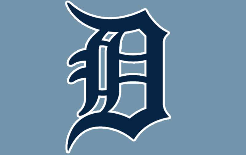
The Detroit Tigers logo is an Old English-style capital letter “D” rendered in navy blue, representing the team’s home city. Officially promoted as the primary mark in 2016, it uses a custom Blackletter typeface closely matched by Collins Old English Regular. The letter symbolizes Detroit’s baseball history and civic identity.
Here is a breakdown of the logo’s key attributes:
- Design Type: Lettermark (single-letter wordmark)
- Primary Elements: Old English capital “D” with sharp gothic strokes, pointed serifs, and a distinctive curled tail on the bottom bar
- Official Introduction Date: The current version was promoted to primary logo in 2016, though its design roots go back to 1904
- Font: Custom Blackletter typeface. The closest commercial match is Collins Old English Regular, designed by David F. Nalle. Other close fonts include Temporal by E-phemera and Cloister Black by Tilde
- Trademark Status: Registered trademark of the Detroit Tigers, owned by the franchise under MLB licensing. The Old English “D” is protected against unauthorized commercial use
- Color Palette: Navy blue (#0C2340) and white for the primary mark. Orange (#FA4616) appears in alternate logos and merchandise
- Usage Context: Jerseys, caps, Comerica Park signage, licensed merchandise, digital platforms, broadcast graphics, and fan apparel
How Has the Detroit Tigers Logo Evolved Over Time?
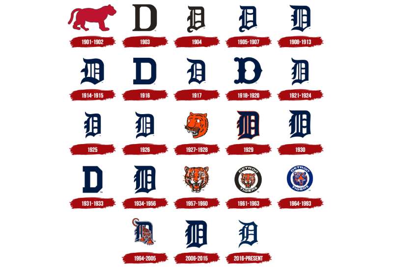
The Detroit Tigers have cycled through roughly 30 logo versions since 1901. The franchise started with a tiger silhouette, switched to letter-based marks by 1903, and has bounced between Old English lettering, block fonts, and tiger mascot imagery across different eras.
The Old English “D” first appeared in 1904 and has been the dominant design thread ever since, though the team kept experimenting with alternatives well into the 1990s.
Original Tiger Silhouette Logo (1901-1902)
- Years Active: 1901-1902
- Design Description: A red silhouette of a tiger standing on all four legs, outlined in black, placed on a white background
- Color Scheme: Red and black on white
- Designer: Unknown
- Context: The franchise’s first season as a major league team in the newly formed American League. The tiger image directly referenced the team’s name, which itself may trace back to the Detroit Light Guard military unit nicknamed “Tigers” during the Civil War
- Cultural Significance: It set the foundation for the animal mascot identity that would return multiple times in later decades
First Letter “D” Logo (1903)
- Years Active: 1903
- Design Description: A blue capital letter “D” in a handwritten style with rounded, slightly curved serifs on its vertical bar
- Color Scheme: Blue on white
- Designer: Unknown
- Context: The team moved away from the tiger imagery and adopted a letter-based mark for the first time. This was a common approach for early baseball clubs
- Key Changes from Previous: Completely dropped the animal silhouette in favor of text
- Cultural Significance: Established the “D for Detroit” concept that would become the franchise’s identity for the next century-plus
First Old English “D” Logo (1904-1907)
- Years Active: 1904-1907
- Design Description: The uppercase “D” redrawn in a custom gothic-styled font with sharp elements and an elongated tail on the bottom bar ending in a curl
- Color Scheme: Black on white (the last black-and-white logo in Tigers history)
- Designer: Unknown, though the style connects to Blackletter traditions dating back to 12th-century European manuscript lettering
- Context: The Old English “D” first appeared on Tigers uniforms here, and it also showed up on caps starting in 1905. Teenager Ty Cobb joined the team that same year
- Key Changes from Previous: Shifted from a simple handwritten “D” to an ornate gothic letterform
- Cultural Significance: This is the direct ancestor of the current logo. It became the prototype that the franchise would return to again and again over the following 120 years
Refined Old English “D” Variations (1908-1920s)
- Years Active: 1908 through the 1920s, with several sub-variations
- Design Description: The Old English “D” went through multiple adjustments. In 1908, contours were bolder and the vertical bar tails were shortened. In 1916, the team briefly tried a cleaner serif style with square-cut ends. In 1917, the ornate gothic styling returned. A “wishbone” style appeared in 1918
- Color Scheme: Transitioned from black to blue during this period
- Key Changes: Constant tweaking of stroke weight, tail length, and serif sharpness. Uniforms and caps often had slightly different versions of the “D” because they were produced by separate manufacturers and cut by hand
- Cultural Significance: This era cemented the link between the Old English “D” and Detroit baseball, even as the specific letterform kept shifting
Tiger Head Era (1927-1963)
- Years Active: 1927-1963, with sub-variations
- Design Description: In 1927, the team introduced an orange tiger head with a blue outline and white details. Later versions (1957 onward) showed a more realistic front-facing tiger. By the early 1930s, a block letter “D” briefly returned before the 1934 team brought back Old English styling on the jersey. Tiger head logos were used alongside or alternating with the “D” throughout this period
- Color Scheme: Orange, blue, black, and white
- Context: The 1934 team won the American League pennant, and the 1935 squad took the World Series. That success locked in the Old English “D” as the cap logo going forward. But the tiger head remained as an alternate mark
- Cultural Significance: This dual-identity period gave the Tigers both their letter mark and their mascot visual. The tiger within a circular badge (introduced in the late 1950s with “DETROIT TIGERS” text) became a secondary mark that fans still recognize
Tiger-in-Circle Badge (1964-1993)
- Years Active: 1964-1993
- Design Description: A tiger head leaning to the right, placed inside a thick blue ring with “DETROIT” on top and “TIGERS” on the bottom in white lettering. The black color from earlier versions was dropped in favor of blue
- Color Scheme: Navy blue, orange, and white
- Context: This badge was the primary logo during the 1968 World Series championship and the 1984 championship run. Players like Al Kaline, Kirk Gibson, Alan Trammell, and Jack Morris wore it
- Key Changes from Previous: Formalized the circular badge format and standardized the blue color scheme
- Cultural Significance: For many fans over a certain age, this is “the” Tigers logo. It coincided with some of the franchise’s greatest on-field success
Tiger Through the “D” Logo (1994-2005)
- Years Active: 1994-2005 as primary; continued as alternate through 2017
- Design Description: An aggressive orange tiger with navy blue stripes prowling through the Old English letter “D.” The tiger appeared to be emerging from or walking through the letterform, treating the “D” almost like a cage or doorway
- Color Scheme: Navy blue, orange, and white
- Context: The first major rebrand in over three decades. It combined both iconic Tigers elements (the letter and the animal) into a single mark
- Key Changes from Previous: Merged the separate mascot and lettermark traditions into one unified design
- Cultural Significance: This was a creative solution, but it was eventually simplified. By 2006, the team returned to the standalone Old English “D” as the primary mark, and the tiger-through-D was demoted to alternate status before being retired after 2017
Current Old English “D” Logo (2006-Present)
- Years Active: 2006-present (promoted to primary in 2016)
- Design Description: A clean, standalone Old English “D” in solid navy blue. No tiger, no circle, no additional elements. Took over as the sole jersey logo in 2018, giving the Tigers a consistent look across caps and uniforms for the first time in nearly a century
- Color Scheme: Navy blue (#0C2340) on white
- Context: The return to simplicity coincided with the team’s 2006 American League pennant run. The design was officially promoted to primary status a decade later
- Key Changes from Previous: Stripped away the tiger graphic entirely, returning to a pure lettermark
- Cultural Significance: The Old English “D” now functions as both a team logo and a civic symbol for Detroit. You will find it tattooed on forearms, stuck on car bumpers, and painted as street art across the city. It has gone past baseball
What Do the Design Elements of the Detroit Tigers Logo Mean?
The Old English “D” represents Detroit itself. Its sharp, pointed strokes resemble fangs and claws, connecting visually to the tiger the team is named after. The gothic letterform carries historical weight, linking the franchise to a writing style that dates back to 12th-century European manuscripts.
The logo’s strength comes from doing a lot with very little. One letter. One color. No mascot graphic needed.
Why Did the Detroit Tigers Choose These Specific Colors?
Navy blue has been the primary Tigers color since the early 1900s. The exact shade shifted a few times across eras, but the current official navy (#0C2340, Pantone PMS 289 C) has been locked in for decades.
Blue communicates authority and tradition. It is a safe, stable choice, which is exactly the point for a franchise that has kept the same city and name since 1894. Based on color psychology, deep blues also suggest trust and depth.
Orange (#FA4616, Pantone PMS 172 C) serves as the secondary color, showing up in alternate logos, trim, and merchandise rather than the primary “D” mark. It adds energy and visual pop. The pairing of navy and orange creates strong contrast, with the warm orange cutting against the cool blue effectively.
White completes the color palette and provides the background for most logo applications.
What Typography Style Is Used in the Detroit Tigers Logo?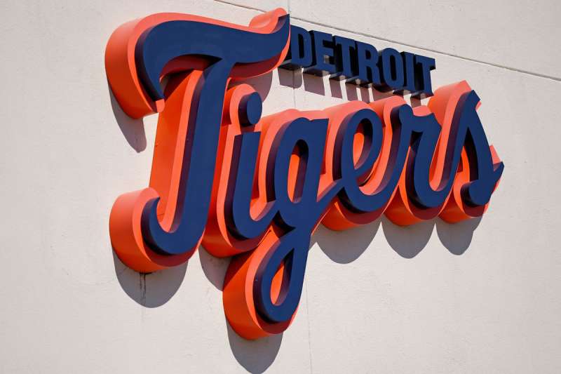
The logo uses a Blackletter typeface, specifically a style called Old English (also known as Textura, Fraktur, or Gothic minuscule). This writing style first appeared around 1150 in European manuscripts.
The closest commercial match to the Tigers’ custom letterform is Collins Old English Regular, created by type designer David F. Nalle. The typography features dramatic thick-and-thin stroke variation, sharp pointed serifs, and decorative tails.
Took me a while to notice, but the cap “D” and the jersey “D” are actually slightly different from each other. That mismatch goes back to the early 1900s when separate manufacturers hand-cut the felt letters for uniforms and embroidered the caps independently. It has become a tradition more than a mistake at this point.
What Are the Hidden Meanings in the Detroit Tigers Logo?
The pointed strokes of the Old English “D” can look like tiger claws or fangs. Whether that was intentional back in 1904 is anyone’s guess, but it works.
The Blackletter style also gives the logo an almost medieval quality, like a coat of arms or an old European guild sign. That visual heaviness communicates age and authority without needing to spell it out.
Some fans and historians connect the “Tigers” name to the Detroit Light Guard, a military unit that earned the nickname during the Civil War. If true, the logo carries a layer of military heritage underneath the baseball surface. Sports graphic designer Todd Radom has pointed out that the “D” predates the Tigers, first appearing on the National League’s Detroit Wolverines jerseys in the 1880s.
How Does the Detroit Tigers Logo Compare to Competitor Logos?
Among MLB teams, the Tigers sit in a small group of franchises built around single-letter marks. The New York Yankees have their interlocking “NY.” The St. Louis Cardinals use the “STL” monogram. The Los Angeles Dodgers go with a scripted “LA.”
But the Tigers’ Old English “D” does something the others do not. It has become a city symbol that exists independently of the team. You do not see non-baseball fans in New York wearing Yankees caps as civic pride statements the same way Detroiters wear the “D.” Well, actually, maybe you do with the Yankees. But the point stands that the Old English “D” has crossed over from sports branding into urban identity.
Compared to division rivals like the Minnesota Twins or Chicago White Sox, the Tigers logo reads as more traditional and less “designed.” The White Sox have gone through dramatic visual overhauls. The Twins have experimented with scripts and mascot graphics. Detroit just keeps coming back to the same gothic letter, barely changed.
The Boston Red Sox “B” and the Cleveland Guardians “C” are the closest parallels in terms of single-letter simplicity. But neither uses such a distinctive typeface. The Old English styling gives the Tigers mark instant recognition that a plain block letter cannot match.
What Are the Technical Specifications of the Detroit Tigers Logo?
Official Color Codes
- Navy Blue (Primary)
- Hex: #0C2340
- RGB: (12, 35, 64)
- CMYK: (100, 60, 0, 56)
- Pantone: PMS 289 C
- Orange (Secondary)
- Hex: #FA4616
- RGB: (250, 70, 22)
- CMYK: (0, 65, 83, 0)
- Pantone: PMS 172 C
- White (Background/Accent)
- Hex: #FFFFFF
- RGB: (255, 255, 255)
- CMYK: (0, 0, 0, 0)
Dimensions and Proportions
The Old English “D” is a vector graphic in its official form, which means it scales to any size without quality loss. The MLB and the Detroit Tigers organization maintain brand guidelines that specify minimum clear space around the mark, minimum reproduction sizes, and prohibited modifications.
In practice, the logo’s proportions are roughly square. The decorative tails and serifs of the Blackletter “D” extend the mark slightly in certain directions, but the overall footprint fits within a near-square bounding box. DPI specifications for print applications typically require 300 DPI minimum for merchandise and physical signage.
What Cultural Impact Has the Detroit Tigers Logo Had?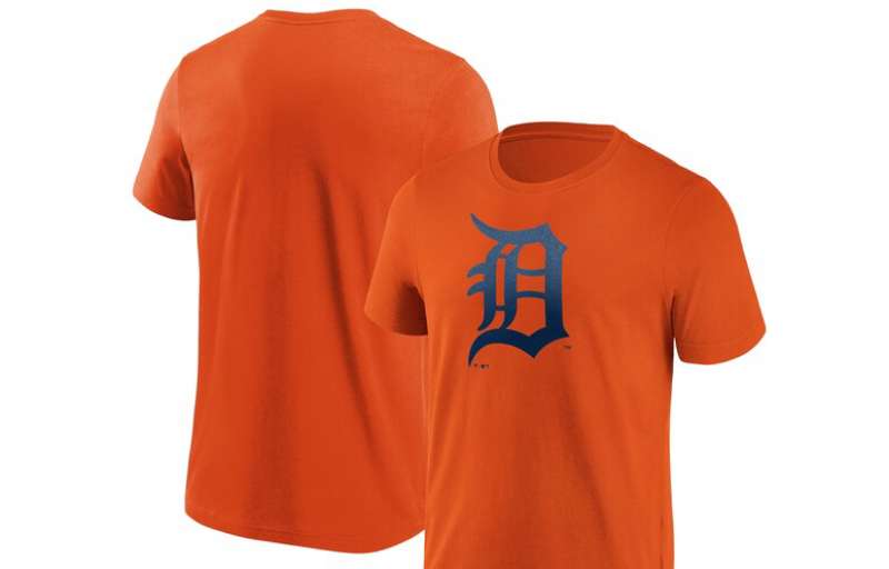
The Old English “D” stopped being just a baseball logo a long time ago. Walk through Detroit and you see it everywhere. Tattoo parlors, murals, bumper stickers, local business signage. It is a civic emblem.
The Detroit Free Press newspaper adopted the same Old English lettering style when it was founded in the 1830s, decades before the Tigers existed. So the look was already woven into the city’s visual identity before baseball claimed it. The Tigers just gave it a platform that reached millions.
After the 2008 economic crisis hit Detroit especially hard, the Old English “D” became a symbol of resilience. People who had never watched a baseball game wore it as a statement about their city. That kind of crossover from sports mark to cultural symbol is rare. You see it with the Yankees’ “NY” to some degree. Maybe the Dodgers’ “LA.” But few logos carry as much civic weight as Detroit’s “D.”
How Does the Detroit Tigers Logo Fit Into the Overall Brand Identity?
The logo sits at the center of a brand system that includes the navy and orange color scheme, the Collins Old English Regular typeface family, the Paws mascot, and the Comerica Park venue identity. Everything connects back to the “D.”
Jersey designs, cap embroidery, broadcast graphics, and digital assets all reference that same Blackletter style. The brand style guide ensures consistency across licensed merchandise sold through MLB Shop, Fanatics, New Era, and Nike.
The team’s wordmark (the full “Detroit Tigers” text) uses the same Old English styling, with “DETROIT” in a double-lined navy blue treatment above “Tigers” in a navy script with orange outline. It is all part of the same visual family. Even the alternate tiger-through-D mark, though retired from active use, maintained the same color codes and letterform foundation.
How Should the Detroit Tigers Logo Be Used?
Official Usage Guidelines
- Do: Use official vector files from MLB or the Tigers organization for any licensed products. Maintain the specified clear space around the mark. Reproduce the logo in its official navy blue or in approved single-color versions (white on dark backgrounds, black for certain print contexts)
- Don’t: Stretch, rotate, or skew the logo. Do not alter the color outside of approved palettes. Do not add effects like drop shadows, gradients, or outlines that are not in the official guidelines. Do not combine the “D” with unapproved imagery or text
Where to Access Official Logos
Licensed versions of the Detroit Tigers logo are available through MLB’s official media portals for press and broadcast use. For merchandise, retailers must go through MLB licensing. Fan-facing logo downloads in JPEG and PNG formats are widely available on the team’s official website and through sports logo databases like SportsLogos.net.
Licensing and Trademark Protection
The Old English “D” is a registered trademark of the Detroit Tigers baseball club under MLB’s licensing structure. Unauthorized commercial use, including modifications like adding drips, gradients, or other effects, is subject to legal action. Even a modified version of the Blackletter “D” can infringe on the trademark if it is recognizably derived from the Tigers’ mark.
For personal, non-commercial use (like fan art or social media graphics), most teams follow a standard fair-use tolerance. But selling products with the Old English “D,” even altered versions, without a license is a trademark violation.
FAQ on The Detroit Tigers Logo
What Does the Detroit Tigers Logo Look Like?
The current Detroit Tigers logo is a navy blue Old English “D” on a white background. No tiger graphic, no circle, no extra elements. Just one gothic letter representing the city of Detroit and its MLB franchise at Comerica Park.
When Was the Old English D First Used?
The Old English “D” first appeared on Tigers uniforms in 1904. It showed up on caps starting in 1905.
The team had used a tiger silhouette in 1901 and a plain block “D” in 1903 before switching to the Blackletter style that stuck.
What Font Is the Detroit Tigers Logo?
The logo uses a custom Blackletter typeface. The closest commercial match is Collins Old English Regular by David F. Nalle. Other similar fonts include Temporal by E-phemera and Cloister Black. The style dates back to 12th-century European lettering.
What Are the Official Detroit Tigers Logo Colors?
The official colors are midnight navy blue (#0C2340) and white for the primary mark. Orange (#FA4616) appears on alternate logos and team merchandise.
Those two blues and orange tones have defined the Tigers brand identity for decades across jerseys, caps, and signage.
Why Did the Tigers Choose the Letter D?
The “D” stands for Detroit. Simple as that. The franchise adopted letter-based marks in 1903, following a common early baseball practice. The Old English styling gave it a distinct look that separated it from other single-letter NBA logos and MLB marks.
Has the Detroit Tigers Logo Changed Over the Years?
Yes, roughly 30 times. The franchise has bounced between Old English letters, block fonts, tiger head graphics, and circular badge designs since 1901.
But the gothic “D” keeps coming back. The current version has been the primary logo since 2016, and the team has not shown interest in replacing it.
What Is the Tiger-Through-the-D Logo?
Introduced in 1994, it featured an aggressive orange tiger walking through the Old English “D.” It was the primary mark until 2006, then served as an alternate logo before being retired after the 2017 season. Fans still collect merchandise with this design.
Is the Detroit Tigers Logo Trademarked?
Yes. The Old English “D” is a registered trademark owned by the Detroit Tigers under MLB licensing. Unauthorized commercial use, including modified versions, can lead to legal action.
Personal fan art typically falls under fair use, but selling products with the mark requires a license.
Can I Use the Detroit Tigers Logo for Personal Projects?
For non-commercial use like fan blogs or social media, you are generally fine. Most teams tolerate that kind of thing.
But printing it on shirts, stickers, or anything you plan to sell without an MLB license is a trademark violation. That applies even to altered versions of the “D.”
Where Can I Download the Official Detroit Tigers Logo?
The team’s official website and sports logo databases like SportsLogos.net offer PNG and bitmap format downloads for reference. Licensed vector files for commercial use go through MLB’s media portal. Retailers must work through the league’s licensing program for any merchandise production.
Conclusion
The Detroit Tigers logo has survived more than a century of redesigns, ownership changes, and cultural shifts. And it keeps landing back on the same Old English “D” every single time.
That kind of staying power is unusual in professional sports branding. Most MLB teams tweak their marks every decade or so. Detroit just refines what already works.
The navy blue Blackletter “D” now lives beyond Comerica Park and game day merchandise. It shows up on street murals, tattoos, and local business signs across Michigan.
It is a team mark, a city symbol, and a piece of American League history all compressed into one letter. Few NFL logos or MLB emblems manage to do that.

Renowned for his expertise in logo design and visual branding, Bogdan has developed a multitude of logos for various clients.
His skills extend to creating posters, vector illustrations, business cards, and brochures. Additionally, Bogdan's UI kits were featured on marketplaces like Visual Hierarchy and UI8.
He also wrote in the past years on sites like Design Your Way, WebDesignerDepot, WPDean, Designmodo, Speckyboy, Slider Revolution, and more.
- The Windsurf Logo History, Colors, Font, And Meaning - 10 October 2026
- How to Remove Background From Product Photos (No Photoshop) - 10 October 2026
- How Designers can Build a Stronger Online Creative Identity - 9 October 2026

Bogdan Sandu is a seasoned designer who has been designing websites since 2008. Renowned for his expertise in logo design and visual branding, Bogdan has developed a multitude of logos for various clients. His skills extend to creating posters, vector illustrations, business cards, and brochures. Additionally, Bogdan's UI kits were featured on marketplaces like Visual Hierarchy and UI8. He also wrote in the past years on sites like Design Your Way, WebDesignerDepot, WPDean, Designmodo, Speckyboy, Slider Revolution, and more.
You Might Also Like