Color is doing more work than you think.
Every palette choice, every hue shift, every contrast decision carries weight. Color theory is the system that explains how colors work, interact, and affect human perception across art, design, and branding.
It covers the color wheel, color models like RGB and CMYK, color harmony, temperature, and psychology. All of it connects.
By the end of this article, you’ll understand the core principles that designers, painters, and art directors use daily to make deliberate, effective visual decisions.
What Is Color Theory

Color theory is the body of principles that explains how colors work, relate, and interact with each other and with the human eye. It sits at the intersection of science and practice, covering everything from how light produces color to how a designer chooses a color palette for a brand campaign.
The “theory” part isn’t just academic. It’s a practical system that painters, printers, UI designers, and filmmakers use every single day.
There are actually two sides to it. The scientific side deals with light, wavelengths, and human perception. The applied side deals with how colors mix, contrast, and create meaning in visual communication.
Key figures who shaped it:
- Aristotle first explored color relationships in ancient Greece
- Isaac Newton demonstrated in 1666 that white light contains all visible colors via prism refraction
- Johann Wolfgang von Goethe challenged Newton with his Theory of Colors (1810), focusing on perception
- Johannes Itten codified practical color theory for designers through his work at the Bauhaus school
- Albert Munsell developed a numerical color system still used in industries like dentistry and soil science
Color theory matters across every design field. Web design, print design, packaging, UX, interior design, and fashion all rely on its principles to make deliberate, effective visual choices.
85% of buyers say color is the main factor when choosing one product over another (Straits Research). That’s not a small influence. That’s color doing most of the selling.
—
The Color Wheel

The color wheel is the foundational tool of color theory. It organizes colors in a circular diagram to show their relationships, from direct opposites to adjacent neighbors.
Newton created the first circular color diagram in 1666. Itten later refined it into a 12-part wheel that became the standard teaching model in art and design education.
How the Color Wheel Is Structured
The wheel divides colors into three tiers. Understanding these tiers is the starting point for building any color harmony.
- Primary colors: Red, yellow, blue. These can’t be made by mixing other colors.
- Secondary colors: Orange, green, violet. Made by mixing two primaries.
- Tertiary colors: The six in-between colors, like red-orange or blue-violet, formed by mixing a primary with an adjacent secondary.
RYB, RGB, and CMYK: Which Color Wheel to Use
There isn’t just one color wheel. Which one you use depends entirely on your medium.
| Color Wheel | Model Type | Best For |
|---|---|---|
| RYB | Subtractive (pigment) | Traditional painting, art education |
| RGB | Additive (light) | Screens, digital design, photography |
| CMYK | Subtractive (ink) | Print, packaging, offset printing |
Most design software defaults to RGB. If you’re working on anything that goes to print, you’ll need to switch to CMYK or accept some color shifting when the file goes to the printer.
—
Color Properties: Hue, Saturation, and Value
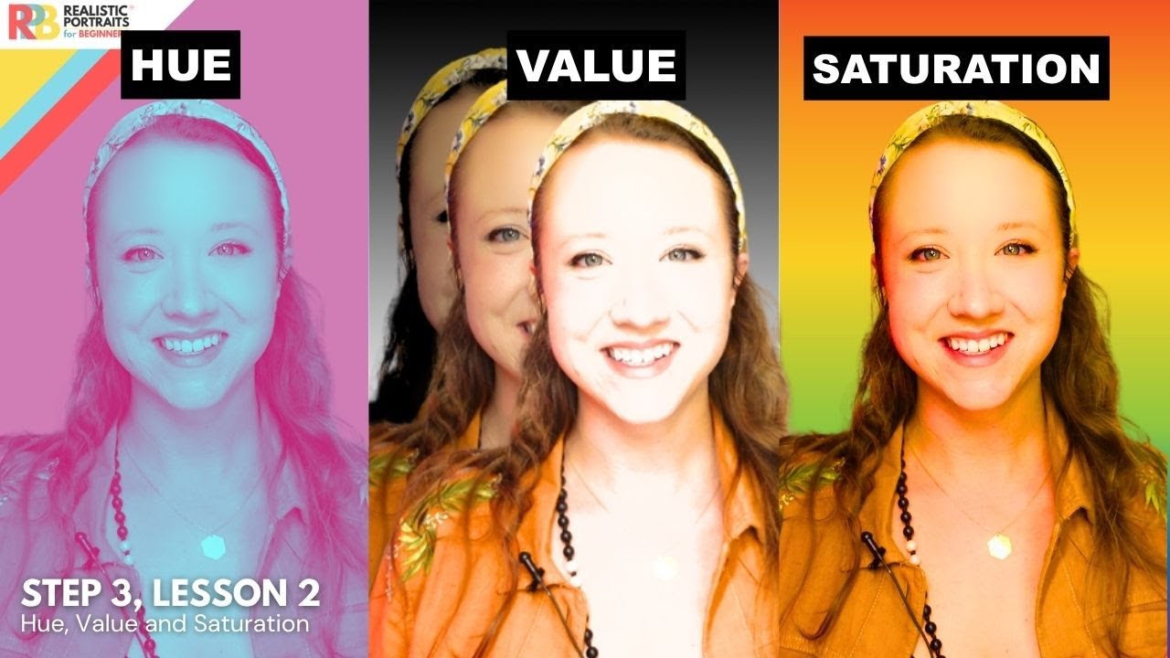
Every color has three core attributes. Miss any one of them and you lose control of how a color actually behaves in a composition.
The Three Attributes
Hue: The pure color itself. Red, cyan, yellow. It’s the quality that makes one color different from another at its most basic level.
Saturation: How intense or pure the color is. A fully saturated red is vivid and loud. A desaturated version of the same red moves toward gray.
Value: How light or dark the color is, independent of hue. Adding white produces a tint. Adding black creates a shade. Adding gray makes a tone.
In Adobe Photoshop’s HSB panel or Coolors’ color picker, these three attributes are the exact sliders you adjust. Understanding what each one controls makes palette-building much faster and less random.
Tints, Shades, and Tones in Practice
Navy blue, baby blue, and slate blue are all the same hue. The difference is value and saturation.
Brands use this constantly. A company might define its primary brand color as a specific hex value and then derive lighter tints for backgrounds and darker shades for hover states, all without introducing a second hue.
This creates cohesion without monotony. Well, most of the time. It only works if the base hue was chosen well to begin with.
—
Color Relationships and Schemes

Color schemes are built by selecting colors based on their positions relative to each other on the color wheel. Each scheme produces a different visual effect and serves a different purpose.
Complementary vs. Analogous: When to Use Each
A complementary color scheme pairs colors from opposite ends of the wheel. Blue and orange. Red and green. The contrast is high, which creates tension and visual energy. Good for call-to-action buttons, warning states, and anything that needs to grab attention fast.
Analogous colors sit next to each other on the wheel. They share tonal qualities and feel naturally harmonious. Think of a sunset palette: red, red-orange, orange, yellow-orange. Comfortable to look at, low tension, great for editorial and lifestyle brands.
Other Common Schemes
Adobe found that one in two consumers have chosen one brand over another based on color alone, with Gen Z and millennials leading at 51% (Adobe, 2025). Getting the color scheme right is not optional.
- Triadic: Three colors evenly spaced on the wheel. High contrast but more balanced than complementary. Hard to pull off without one color dominating.
- Tetradic: Four colors forming a rectangle on the wheel. Rich and varied. Works best when three colors are kept subordinate to one dominant hue.
- Split-complementary: A base color plus the two colors adjacent to its complement. Less aggressive than straight complementary but still has strong contrast.
- Monochromatic: Tints, shades, and tones of a single hue. Clean and cohesive. Often underestimated.
In film color grading, especially in DaVinci Resolve, complementary and split-complementary schemes show up constantly. The orange-and-teal look that dominated cinema throughout the 2010s is just complementary color theory applied to skin tones and environments.
—
Color Temperature

Color temperature describes where a color falls on the warm-to-cool spectrum. It affects depth, mood, and how colors interact spatially in a composition.
Warm vs. Cool: What Each Does
Warm colors (reds, oranges, yellows) feel close. They advance visually, meaning they appear to come toward the viewer. Used well, they create energy, urgency, and warmth. Used poorly, they make a composition feel claustrophobic.
Cool colors (blues, greens, purples) recede. They push back into the picture plane and create a sense of depth, distance, and calm. Most corporate brands default to cool palettes for this reason. Blue is the top trusted brand color according to 54% of consumers (Adobe, 2025).
Neutral Colors and Temperature Bias
Neutrals aren’t temperature-neutral. Most whites, grays, and beiges lean either warm or cool depending on the undertones mixed in.
This trips up a lot of designers. You pick what looks like a clean off-white on screen and it clashes with everything else because it has a subtle yellow or pink cast that fights the cool palette around it.
Interior designers deal with this constantly. Paint colors that look perfect on a chip look completely different once they’re on a wall surrounded by different light sources and furnishings.
Temperature in Photography and Lighting
In photography, color temperature is measured in Kelvin. Candlelight sits around 1800K (warm and orange). Overcast daylight is around 6500K (cool and blue). Camera white balance settings exist specifically to correct for these shifts.
In studio photography and film, color gels are placed over lights to deliberately shift temperature. A warm key light with a cool fill creates dimensional, cinematic separation between subject and background.
—
Color Models and Color Spaces
Color models are the technical systems used to define, reproduce, and communicate color across different media. Getting this wrong in professional design work causes real, costly problems.
RGB vs. CMYK: Why the Same Color Looks Different on Screen and in Print

RGB is additive. Red, green, and blue light combine to make white. Every screen uses RGB because screens emit light. The color range (gamut) is wide and includes vivid, saturated colors that literally cannot be printed.
CMYK is subtractive. Cyan, magenta, yellow, and black inks absorb light to produce color. The gamut is smaller. When you convert an RGB file to CMYK for printing, some colors shift, especially bright blues, vivid oranges, and electric greens.
Designers who don’t account for this end up surprised when their printed brochure looks nothing like what they approved on screen.
HSB, Lab, and Pantone
| Model/System | What It Does | Where It’s Used |
|---|---|---|
| HSB/HSL | Defines color by hue, saturation, brightness | Design software sliders, Adobe Color, Coolors |
| Lab color space | Device-independent color reference | Photoshop conversions, color science |
| Pantone (PMS) | Standardized physical ink matching | Brand guidelines, packaging, manufacturing |
Pantone is worth understanding separately. It’s not a digital color model but a numbered physical system. When a brand specifies “Pantone 485 C” for its red, every printer anywhere in the world mixes that exact ink. No guessing, no screen-to-print drift.
That matters more than most people realize. Coca-Cola’s red isn’t just a vibe. It’s a specific Pantone number that has to match on everything from a can in Tokyo to a billboard in São Paulo.
A pixel on a screen is defined in RGB. That same color in a JPEG file exported for print needs a CMYK conversion to avoid color drift. And if that image ends up in a bitmap format at low DPI, the color issues compound even further. These are interconnected decisions, not isolated ones.
Color Psychology

Color psychology is the study of how specific colors affect human emotions, decisions, and behavior. It’s not soft science. Consumers make initial product judgments within 90 seconds, and research published in the journal Management Decision found color contributes up to 90% of the information driving that first assessment.
85% of buyers say color is the primary reason they choose one product over another (Straits Research, 2024). That alone should change how seriously designers treat every palette decision.
What Each Color Communicates
| Color | Core Associations | Common Use Cases |
|---|---|---|
| Red | Urgency, passion, appetite | Food brands, clearance sales, CTAs |
| Blue | Trust, stability, calm | Finance, tech, healthcare |
| Green | Nature, health, growth | Wellness, sustainability, food |
| Yellow | Optimism, warmth, caution | Attention-grabbing, signage, IKEA |
| Purple | Luxury, creativity, spirituality | Beauty, premium products |
Blue is used by 33% of the world’s top brands (Straits Research). Not coincidence. IBM, Facebook, PayPal, and Samsung all chose it deliberately to project reliability in categories where trust is the deciding factor.
Cultural Differences in Color Perception
Color associations are not universal. White signals purity in Western cultures and mourning in parts of East Asia. Red means danger in many Western contexts and luck in Chinese culture.
Apple navigated this well. The company historically avoids red in its branding but introduced red packaging specifically for Chinese New Year, acknowledging that red represents fortune in that market.
A 2025 analysis across 132 peer-reviewed studies covering more than 40,000 participants from 64 countries (Psychology Today) found consistent color-emotion patterns, but also meaningful cultural variation. Global brands can’t assume a single palette reads the same way everywhere.
Gender and Color Preference
Research shows both men and women rank blue as their top preferred color. The split comes in secondary preferences: men lean toward bold, saturated shades, while women generally prefer softer, lighter tones.
Color blindness is another factor designers regularly overlook. Roughly 1 in 12 men and 1 in 200 women have some form of color vision deficiency (Circles Studio). Deuteranopia (red-green) is the most common type, which means any design relying on red and green to communicate meaning needs a backup system.
—
Color Contrast and Accessibility

Color contrast is the measurable difference in luminance between a foreground color and its background. It determines whether text is readable, whether buttons are distinguishable, and whether a design actually works for everyone who encounters it.
WebAIM’s 2024 Million analysis found contrast failures on 80.3% of the top 1 million homepages, making it the single most common accessibility violation on the web.
WCAG 2.1 Contrast Requirements
WCAG 2.1 Level AA is the legal benchmark in most countries. It sets two core contrast thresholds.
- Normal text: Minimum 4.5:1 contrast ratio against its background
- Large text (18pt or 14pt bold and above): Minimum 3:1 ratio
- UI components and graphics: Minimum 3:1 against adjacent colors
In April 2024, the U.S. Department of Justice updated Title II of the ADA to formally require WCAG 2.1 AA compliance for state and local government websites, with deadlines set for 2026 and 2027.
Designing for Color Blindness
Relying on color alone to convey meaning is one of the most common failures in UI design. A red error state that has no icon, no label, and no pattern backup is invisible to users with deuteranopia.
Practical fixes:
- Pair color with text labels or icons for all status indicators
- Test designs in grayscale before finalizing
- Use tools like Stark (Figma plugin) or the WebAIM Contrast Checker to verify ratios
None of these require abandoning a brand’s color palette. They just require thinking about the design in grayscale first and adding color as a layer, not as the only layer.
Common Contrast Failures in Practice
Light gray text on white is the single most frequent failure. The shade #AAAAAA on white produces a contrast ratio of just 2.32:1, well below the required 4.5:1 minimum (WebAIM). Designers default to it because it “looks clean,” not because it’s readable.
Pastel button colors with white text are another recurring problem. A medium blue (#4A90D9) with white text sits around 3.0:1, which passes for large text but fails for standard button labels. Darkening the background to #2563EB resolves it without changing the visual character of the color much at all.
—
How Color Theory Applies in Practice
Color theory stops being abstract the moment you’re staring at a real design problem. The principles show up constantly, in every medium, across every industry.
Graphic Design and Branding
Color is one of the first things people notice about a logo. Adobe’s 2025 consumer survey found that 16% of people say color is the very first brand element they notice, and one in two consumers have chosen one brand over another based on color alone.
Tiffany Blue is a clear example. That specific shade of robin’s egg blue has been trademarked by Tiffany and Co. The color communicates luxury before anyone reads a word. Same with Coca-Cola red. It’s a Pantone specification that has to match on every can, billboard, and cup globally.
KitKat’s 2024 redesign is a more recent case. They swapped a glossy red gradient for a flat, darker red with crisp white, applying color theory principles around contrast and visual hierarchy to modernize without losing brand recognition.
Web and UX Design
Color controls attention flow in interfaces. A high-contrast CTA button draws the eye toward conversion. A muted background color creates depth without distraction. Emphasis through color is one of the fastest ways to guide a user’s path through a page without changing layout at all.
Red CTA buttons boost conversions by 34% compared to other colors in some studies (Amra and Elma, 2025). That number gets cited constantly, though context matters. What works for an e-commerce clearance banner might be completely wrong for a healthcare intake form. Color appropriateness matters as much as color psychology.
Photography and Film
In photography, color temperature and post-processing define mood as much as composition does. Color grading in tools like DaVinci Resolve applies color theory directly, with colorists building palettes around complementary schemes between skin tones (warm) and environments (cool).
The orange-and-teal look that dominated blockbusters for over a decade is complementary color theory applied to human skin. Orange sits opposite teal on the color wheel. Faces pop. Backgrounds recede. It works because color theory says it should.
Painting and Illustration
Three areas where color theory shapes artistic decisions:
- Atmospheric perspective (cool, desaturated colors recede into the distance)
- Color mixing and pigment behavior in traditional media
- Light and shadow rendering, where warm light typically produces cool shadows and vice versa
Josef Albers spent decades studying how colors change in relation to each other in his Interaction of Color (1963). The core insight still holds: the same color looks completely different depending on what surrounds it. Painters working in oil, watercolor, or digital illustration rely on this principle to create depth, mood, and spatial coherence in their work.
Understanding balance in color relationships, combined with solid graphic design principles, is what separates intentional design from decoration. Color theory gives you the vocabulary. Practice gives you the judgment.
FAQ on What Is Color Theory
What is color theory?
Color theory is the body of principles that explains how colors work, interact, and affect human perception. It covers the color wheel, color models, harmony, temperature, and psychology. Artists, designers, and marketers all use it to make deliberate visual decisions.
What are the 3 main components of color theory?
The three core components are hue (the pure color), saturation (its intensity), and value (its lightness or darkness). Together, these attributes define any color precisely and determine how it behaves alongside other colors in a composition.
What is the color wheel and why does it matter?
The color wheel organizes colors in a circle to show their relationships. It maps primary, secondary, and tertiary colors. Designers use it to build color schemes like complementary, analogous, and triadic palettes with predictable, intentional results.
What is color harmony?
Color harmony is the visually pleasing arrangement of colors based on their relationships on the color wheel. Analogous schemes feel calm. Complementary schemes create contrast and tension. Getting harmony right is what separates a polished palette from a random one.
What is the difference between RGB and CMYK?
RGB is an additive model used for screens. CMYK is a subtractive model used for print. Converting between them causes color shifting, especially with vivid blues and oranges. Designers working across both media need to manage this actively.
How does color psychology affect design?
Colors trigger emotional responses that influence behavior. Blue builds trust. Red creates urgency. Green signals health. Research shows up to 90% of a first product impression is based on color alone. These associations shape branding, UX, and marketing decisions daily.
What is color temperature in design?
Color temperature describes whether a color reads as warm (reds, oranges, yellows) or cool (blues, greens, purples). Warm colors visually advance toward the viewer. Cool colors recede. Designers use temperature to control depth, mood, and spatial relationships in a composition.
What is a complementary color scheme?
A complementary color scheme pairs colors from opposite sides of the color wheel, like blue and orange. The contrast is high, which creates visual energy and tension. It works well for CTAs, posters, and anything that needs to grab attention quickly.
What is color contrast in accessibility?
Color contrast measures the luminance difference between a foreground color and its background. WCAG 2.1 requires a minimum ratio of 4.5:1 for normal text. Poor contrast is the most common web accessibility failure, affecting millions of users with low vision or color blindness.
Who developed modern color theory?
Several figures shaped it. Isaac Newton identified the visible spectrum in 1666. Goethe explored color perception in 1810. Johannes Itten codified practical color theory for designers at the Bauhaus school. Albert Munsell built a numerical system still used in industries today.
Conclusion
This conclusion is for an article presenting what is color theory in full, from the color wheel and primary colors to color models, temperature, and contrast ratios.
The principles aren’t separate ideas. Hue, saturation, and value connect directly to how you build a palette. Color harmony rules inform every scheme, whether complementary, triadic, or analogous.
Color psychology shapes branding. Accessibility standards protect usability. Neither is optional in professional design work.
Itten, Munsell, and Goethe built the foundation. Tools like Adobe Color, Coolors, and the Stark plugin make applying it faster. But the judgment still comes from understanding why colors behave the way they do.
Learn the system. Then trust it.
Renowned for his expertise in logo design and visual branding, Bogdan has developed a multitude of logos for various clients.
His skills extend to creating posters, vector illustrations, business cards, and brochures. Additionally, Bogdan's UI kits were featured on marketplaces like Visual Hierarchy and UI8.
He also wrote in the past years on sites like Design Your Way, WebDesignerDepot, WPDean, Designmodo, Speckyboy, Slider Revolution, and more.
- 5 Brand Compliance Checkpoints Every Enterprise Should Automate - 23 July 2026
- Timeless Open Sans Font Pairing for Any Project - 22 July 2026
- Pantone to HEX converter - 21 July 2026
Bogdan Sandu is a seasoned designer who has been designing websites since 2008. Renowned for his expertise in logo design and visual branding, Bogdan has developed a multitude of logos for various clients. His skills extend to creating posters, vector illustrations, business cards, and brochures. Additionally, Bogdan's UI kits were featured on marketplaces like Visual Hierarchy and UI8. He also wrote in the past years on sites like Design Your Way, WebDesignerDepot, WPDean, Designmodo, Speckyboy, Slider Revolution, and more.
You Might Also Like