The 37 Best Fonts for Labels Designers Can Use

Choosing the best fonts for labels is like picking the perfect outfit for a grand event. It’s a game-changer. Imagine walking into a store, eyes wandering over shelves, and there it is – a product that stands out, not just because of what’s inside, but how it’s presented. That’s the power of fonts.
In this dive into the world of typography, we’re unraveling the secret sauce that makes labels not just readable, but memorable.
Whether you’re a small business owner jazzing up your product packaging, or a curious soul fascinated by the impact of typography in marketing, this is for you.
We’re talking about everything from serif and sans serif fonts that scream professionalism to quirky handwritten fonts that give off that artisanal vibe.
By the end of this journey, you’ll be armed with knowledge about font legibility, design principles, and how fonts can align with your brand identity.
Get ready to explore a variety of typography trends and how they can elevate your label game. From legible typefaces for those tiny labels to bold fonts for a standout look, we’ve got it all covered.
The Best Fonts for Labels
| Font Name | Category/Style | Legibility | Use Case | Notable Features |
|---|---|---|---|---|
| Garamond | Serif | High | Body text, sophisticated labels | Elegant, classic design, good for print |
| Butler | Serif | High | Stylish labels, headers | Modern take on traditional serif |
| Yeseva One | Serif | Moderate | Decorative labels, headlines | Unique, bold with high contrast |
| Didot | Serif | Moderate | High-end product labels, fashion | Stylish, upscale with thin serifs |
| Times New Roman | Serif | High | General use, body text | Classic, familiar, widespread use |
| Cambria | Serif | High | General labels, readable print | Optimized for on-screen reading |
| Georgia | Serif | High | Versatile labels, both screen and print | Exceptional readability, elegant |
| Baskerville | Serif | High | Traditional labels, book text | Refined, professional design |
| Aileron | Sans-serif | High | Modern labels, body text | Clean, neutral design, good for web |
| Maison Neue | Sans-serif | High | Fashion labels, contemporary design | Geometric, friendly appearance |
| Sofia | Script | Moderate | Creative labels, invitations | Soft, calligraphic style |
| Omnes | Sans-serif | High | Branding, casual labels | Friendly, rounded sans-serif |
| Helvetica | Sans-serif | High | Corporate labels, signage | Classic, ubiquitous sans-serif |
| Arial | Sans-serif | High | General use, especially digital | Common, versatile sans-serif |
| Futura | Sans-serif | High | Modern labels, geometric designs | Geometric shapes, efficient style |
| Calibri | Sans-serif | High | General use, clear and concise labels | Friendly, modern, Office default |
| Verdana | Sans-serif | High | Web labels, small text | Wide, open letters, good at small sizes |
| Roboto | Sans-serif | High | Digital labels, UI/UX | Modern, geometric sans-serif |
| Lucia Script | Script | Low | Wedding labels, personal branding | Elegant, flowing calligraphy |
| Satisfy | Script | Moderate | Casual, decorative labels | Playful, casual handwritten style |
| Bella Donna | Script | Low | Artistic labels, invitations | Calligraphic, feminine touch |
| Homemade Apple | Handwritten | Moderate | Informal labels, organic products | Casual, approachable look |
| Loved by the King | Script | Low | Romantic labels, special occasions | Decorative with a personal touch |
| Sue Ellen Francisco | Handwritten | Moderate | Quirky labels, playful products | Relaxed, informal handwriting |
| Lemonade | Display | Low to Moderate | Refreshing, summer-themed labels | Fun, informal style with zest |
| Shortcut Vintage Bundle Font | Display | Moderate | Retro-themed labels | Vintage feel, multiple styles included |
| Mermaid Typeface | Serif | Moderate | Elegant, fantasy-themed labels | Ornate, decorative serifs |
| Gunnar | Sans-serif | High | Minimalistic labels, technical products | Modern, bold, and straightforward |
| Buchin | Display | Moderate | Artistic labels, unique branding | Handcrafted, with an artistic flair |
| Whimsy | Script/Display | Low | Whimsical labels, children products | Playful, light-hearted design |
| Watch | Sans-serif | High | Fashion labels, modern branding | Sleek, stylish sans-serif |
| Asthenia | Script | Low | Elegant labels, high-end products | Delicate and thin script |
| Habisa | Handwritten | Moderate | Casual labels, food packaging | Organic, natural handwritten appearance |
| Crafty Girls | Handwritten | Moderate | Craft labels, DIY themes | Fun, artistic, and informal |
| Shadows into the Light | Handwritten | Moderate | Personalized labels, greeting cards | Light, carefree handwriting |
| Waiting for the Sunrise | Handwritten | Moderate | Intimate labels, heartwarming messages | Warm, unassuming handwriting |
| Carbonera | Serif | High | Bold headings, statement labels | Bold, striking, with a bit of an edge |
Types of Fonts Suitable for Labels
Serif Fonts
Ah, serif fonts, the classic choice! Think of them as the timeless little black dress in your wardrobe. They’re not just fonts; they’re a statement of elegance and trustworthiness. Why? Because these fonts have those tiny feet at the end of each letter, known in the design world as serifs. And guess what? They make your labels super readable, especially for longer texts.
Some top picks? Garamond – it’s like that wise, old professor who knows how to make complex stuff look easy. Then there’s Butler – imagine a butler, but for your words, making them look sharp and sophisticated. Yeseva One adds a touch of warmth, ideal for those cozy, feel-good products.
Didot is your go-to for high-end luxury vibes. It’s like putting on a designer suit for your words. And who can forget Times New Roman and Cambria? They’re like your reliable friends who never let you down, perfect for any label looking to communicate reliability and comfort. Georgia and Baskerville? They add that hint of old-school charm, making your labels feel like a classic novel.
Sans Serif Fonts
Switching gears, let’s talk about sans serif fonts. Sans serif means “without serifs”, and these fonts are all about modern, clean lines. They’re like the trendy, minimalistic outfit you wear that screams modern chic.
First up is Aileron, sleek and versatile. It’s like the jeans that go with everything. Maison Neue? It’s the sophisticated cousin, bringing a touch of elegance to the table. And Sofia – oh, she’s fun and friendly, perfect for labels that want to feel approachable.
Omnes is your happy-go-lucky font, while Helvetica and Arial are the universal besties in the font world, known and loved by all. For a futuristic feel, there’s Futura – think of it as your sci-fi fantasy turned font. Calibri and Verdana are the all-rounders, great for just about any label, while Roboto brings a mechanical yet human touch to the mix.
Script Fonts
Okay, let’s get into the world of script fonts. These fonts are like the handwriting you wish you had, full of flair and personality. Perfect for when you want your labels to feel personal and handcrafted. Lucia Script? It’s like a beautifully penned letter. Elegant, yet approachable. Satisfy? Just like its name, it leaves a sweet, satisfying impression, ideal for food labels or anything that wants to convey a touch of whimsy.
Now, Bella Donna – this one’s got a fancy vibe, like calligraphy you’d see on a wedding invitation. Homemade Apple brings a rustic, homey feel to the table, reminding you of grandma’s apple pie. And Loved by the King has a royal touch, with loops and swirls fit for a queen. Sue Ellen Francisco rounds it off with a casual, breezy style, like a quick note jotted down by a friend.
Display and Decorative Fonts
Moving on to display and decorative fonts – these are the showstoppers. They’re like that statement piece of jewelry that turns heads. Lemonade is fresh and fun, perfect for a summer vibe. Shortcut Vintage Bundle Font takes you back in time with its retro charm, great for brands that want a touch of nostalgia.
Mermaid Typeface dives deep into fantasy, giving a mystical, underwater feel. Gunnar is strong and bold, making a statement on any label. Buchin is quirky and unexpected, for brands that dare to be different. Whimsy, true to its name, adds a playful, whimsical touch.
And then there’s Watch and Asthenia. Watch is like that sleek, modern watch you wear – it’s all about clean, impactful design. Asthenia, with its thin, delicate lines, is perfect for high-end, sophisticated products.
Handwritten and Brush Fonts
Finally, handwritten and brush fonts. These fonts are like a personal signature, each with its own character and style. Habisa is relaxed and unpretentious, great for casual or artisanal products. Crafty Girls brings a creative, artsy vibe, ideal for craft supplies or fun, youthful brands.
Shadows into the Light and Waiting for the Sunrise are light, airy, and optimistic, perfect for inspirational or wellness products. And Carbonera, with its bold brush strokes, makes a strong, confident statement, great for brands that want to stand out.
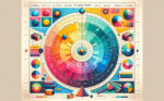
Criteria for Font Readability and Legibility
When it comes to picking the best fonts for labels, it’s not just about looking pretty. We gotta think about how easy it is to read these fonts, especially when someone’s in a hurry at the store, you know?
Readability Factors
First things first: readability. It’s like setting the right mood lighting for a date. We’re talking about the contrast and visibility of the font against the label background. Too much or too little contrast, and you’ve lost your audience.
Then, there’s the spacing between letters. Ever tried reading something where the letters are squished together? Not fun, right? The right spacing, or what the pros call kerning, makes a huge difference.
Lastly, each font’s got its own style, but we need distinct character shapes. You don’t want the ‘b’ looking like a ‘d’, causing all sorts of confusion.
Dyslexic-Friendly Fonts
Now, let’s chat about something super important: dyslexic-friendly fonts. It’s all about inclusivity. These fonts are designed to be easier to read for everyone, especially for those with dyslexia. They usually have heavier bottom portions to prevent the letters from flipping in the reader’s mind. Talk about thoughtful design, right?
Creative and Expressive Font Choices
Alright, let’s spice things up with some creative font choices. This is where we get to show off our style and personality.
Handmade and Imaginative Fonts
Handmade and imaginative fonts are like that splash of color on a canvas. They break the norms and add a personal touch. Whimsy and Lemonade are perfect examples. They’re like that quirky friend who’s always fun to be around – they add life and energy to your label.
Retro and Vintage Styles
Feeling nostalgic? Retro and vintage styles like Mermaid Typeface take you back in time. They’re like those cool, old-school records your parents played. Perfect for brands that want to evoke a sense of nostalgia and timeless charm.
Modern and Bold Fonts
And for those who want to make a statement, modern and bold fonts are the way to go. Gunnar and Buchin don’t just whisper; they shout. They’re like that bold piece of art that catches your eye and makes you go, “Wow!”
Combining Fonts for Effective Label Design
Let’s mix things up a bit! Choosing the best fonts for labels isn’t just about picking one and calling it a day. Sometimes, it’s about how you pair them up. Like peanut butter and jelly, some fonts just work better together.
Pairing Different Font Styles
Imagine you’re mixing a script font with a sans serif. The script brings the flair, and the sans serif keeps it grounded. It’s like having a conversation between two different characters on your label. One’s the life of the party (script), and the other’s the cool, collected one (sans serif).
For example, pairing something fancy like Bella Donna with a straightforward Arial can create a balance on your label that’s both eye-catching and easy to read.
Font Hierarchy and Information Layout
Now, let’s talk about the hierarchy. It’s not just what you say; it’s how you present it. The key info, like your brand name or the main feature of your product, should pop. Use a font that stands out for this – maybe something bold or with a bit of personality.
The rest of the info? That’s where your secondary font comes in. This one should be more subdued, like a Calibri or Helvetica, so it doesn’t steal the spotlight but still makes the tag team work.
Practical Tips and Best Practices
Alright, you’ve got your fonts, you’ve paired them up, but there are still a couple of things to keep in mind to nail those best fonts for labels.
Understanding Your Brand and Audience
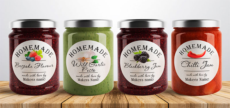
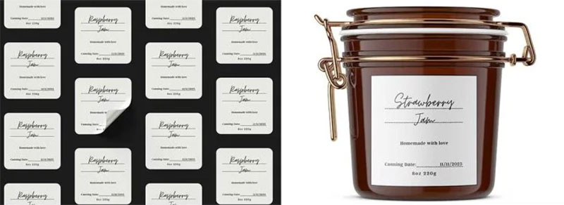
Your font choices should vibe with what your brand’s all about. If you’re all modern and techy, a sleek, clean font is your friend. Selling homemade, organic jams? Maybe something more handwritten or rustic.
Think about who you’re selling to as well. Fonts that resonate with a younger crowd might not hit the same with a more mature audience. It’s all about speaking their language.
Experimentation and Testing
Don’t be afraid to experiment. Mix and match, try out different combos. Sometimes the most unexpected pairings create the most memorable labels.
And test them out! What looks good on your screen might not look as great printed out on a label. Check for legibility, visibility, and overall appeal. Maybe even get some feedback from friends or potential customers. After all, they’re the ones you want to impress.
FAQ On The Best Fonts For Labels
What Makes a Font Suitable for Labels?
Choosing the right font for labels? It’s all about legibility and matching your brand’s vibe. You want something that’s easy to read from a distance, fits the product’s personality, and stands out on the shelf. Think about typography trends and brand identity when picking.
How Do I Decide Between Serif and Sans Serif Fonts for Labels?
Serif fonts have a classic, trustworthy feel. Great for traditional products. Sans serif? They’re clean, modern, perfect for a contemporary look. Your choice should reflect your product’s character. Think about readability and how the font aligns with your brand’s design principles.
Are Script Fonts a Good Choice for Labels?
Absolutely, if you’re aiming for a personal, artisanal feel. Script fonts, like Lucia Script or Satisfy, add a touch of elegance and uniqueness. Just ensure they’re legible, especially for essential info like ingredients or instructions.
What’s the Importance of Font Size and Color in Label Design?
Huge! Font size ensures readability; too small, and it’s a strain, too big, and it’s overpowering. Color contrast is key for visibility. Make sure your font color pops against the background but still aligns with your overall brand identity.
Can I Use Multiple Fonts on a Single Label?
Yes, but keep it balanced. Pair a bold font for the headline with a simpler one for details. This creates a font hierarchy, guiding the viewer’s eye and emphasizing key information. Remember, less is more. Too many fonts can look cluttered.
What Are Some Common Mistakes to Avoid When Choosing Fonts for Labels?
Overcomplicating is a big one. Too many styles, sizes, or colors can overwhelm. Not considering legibility, especially for small labels, is another mistake. Also, overlooking how the font reflects your brand’s personality can lead to a disconnect with your audience.
How Do Handwritten and Brush Fonts Impact Label Design?
They add a personal, human touch. Great for brands with a handmade or organic ethos. Fonts like Crafty Girls or Shadows into the Light convey a casual, approachable feel. Just ensure they remain legible and fit the overall design.
What Role Do Font Trends Play in Label Design?
Font trends can make your label look current and fresh. But, it’s a fine balance. You want to stay relevant without losing your brand’s identity or ending up with a dated look in a few years. Keep an eye on typography trends but stay true to your brand.
Is It Important to Consider the Product When Choosing a Font?
Absolutely. The font should match the product’s personality. A tech product might need a sleek, modern font, while an organic snack might suit a more rustic, natural style. It’s all about making the font complement the product.
How Can I Test the Effectiveness of My Label’s Font Choice?
Mock it up and print it out. See how it looks in real size and under different lighting. You can also get feedback from others, especially from your target demographic. Sometimes what looks good on screen doesn’t translate as well in print.
Conclusion
So, we’ve journeyed through the world of best fonts for labels, right? From the timeless elegance of serif fonts to the clean lines of sans serif, each font has its own story to tell. Remember, legibility and brand identity are key. Your label isn’t just a sticker on a product; it’s a story-telling canvas. Whether it’s the warm, personal touch of script fonts or the bold statement of display fonts, each choice paints a part of your brand’s picture.
Typography isn’t just about looking good. It’s about creating a connection, speaking to your audience without saying a word. It’s about branding, marketing, and standing out in a crowded shelf. So, take these insights, experiment, and find the perfect font that speaks your brand’s language. Because in the end, the right font can turn a simple label into an unforgettable part of your customer’s experience. Let your labels do more than just inform; let them inspire.
If you liked this article about the best fonts for labels, you should check out this article about the best fonts for business cards.
There are also similar articles discussing the best fonts for flyers, the best fonts for banners, the best fonts for ebooks, and the best fonts for small text.
And let’s not forget about articles on the best fonts for branding, the best fonts for laser cutting, fonts for ads, and the best fonts for TikTok.
Bogdan Sandu, a seasoned designer with 15 years of diverse experience, has been designing websites since 2008.
Renowned for his expertise in logo design and visual branding, Bogdan has developed a multitude of logos for various clients.
His skills extend to creating posters, vector illustrations, business cards, and brochures. Additionally, Bogdan's UI kits were featured on marketplaces like Visual Hierarchy and UI8.
Latest posts by Bogdan Sandu (see all)
- How To Find A Font: Top Font Finders To Use - 16 May 2024
- The Guinness Logo History, Colors, Font, And Meaning - 15 May 2024
- Vibrant Orange Color Palettes for Energetic Designs - 15 May 2024