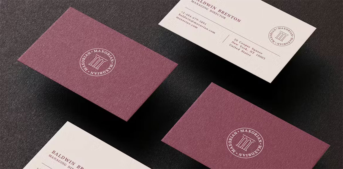
Your business card has about three seconds to make an impression before someone decides whether to keep it or toss it.
The font you choose does more work than any other design element on that 3.5 x 2 inch surface. It controls legibility, signals brand identity, and shapes how people perceive your professionalism before they’ve read a single word of contact information.
Finding the best fonts for business cards isn’t about picking what looks attractive on screen. Print legibility, stroke contrast, x-height, and licensing all determine whether a typeface actually works in production.
This guide covers the top 10 fonts used in professional card design, what makes each one print-ready, how to pair them effectively, and which ones to avoid for specific paper stocks and finishes.
The Best Fonts For Business Cards
A business card is 3.5 x 2 inches. That’s it. Every font decision you make on that tiny surface signals something about your brand before you’ve said a word. The wrong font makes contact details hard to read. The right one makes people keep the card.
Font size should stay between 10pt–16pt for primary text, and no smaller than 8pt for contact details. Stick to two typefaces max. Below are the ten best options, with the data to back them up.
—
Helvetica
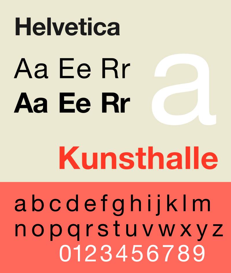
Helvetica is a neo-grotesque sans-serif font designed by Max Miedinger and Eduard Hoffmann in 1957, released by the Haas Type Foundry (Switzerland), now owned by Monotype.
It delivers neutral, highly legible type across print and screen at any size. Helvetica suits business card body text and name lines because its high x-height and tight letter spacing maintain clarity down to 8pt on coated and uncoated stock.
The New York City subway system adopted Helvetica in 1989 for all signage, proving its legibility at both large and very small reproduction sizes.
What makes Helvetica suitable for business cards?
Helvetica has a high x-height relative to its cap height, which keeps lowercase letters open and readable at small print sizes. Its stroke terminations are horizontal or vertical (not diagonal), which reduces visual noise when printed at 8–10pt. The tight default letter spacing creates a dense, compact layout that fits more information without crowding.
Key attributes:
| Attribute | Value |
| Classification | Neo-grotesque sans-serif |
| Designer | Max Miedinger & Eduard Hoffmann, 1957 |
| Weight range | Thin to Black (Helvetica Neue: 48 styles) |
| Variable font | Yes (Helvetica Now) |
| Optical sizes | Yes: Micro, Text, Display (Helvetica Now) |
| Recommended sizes | 8pt–10pt contact details; 12pt–16pt name/title |
| Letter-spacing default | Tight |
| License | Commercial (Monotype); requires desktop or web license |
| Available on | Monotype, Adobe Fonts |
| Price | Paid (subscription or one-time via Monotype) |
How does Helvetica perform at business card print sizes?
Helvetica renders clearly at 8pt on standard 300 DPI offset printing. Its closed apertures (tight openings in letters like “c” and “e”) hold well under ink spread on uncoated card stock.
Helvetica Now’s Micro optical size was specifically redrawn for small-size legibility, making it the strongest variant for contact line text.
What are the best pairings for Helvetica in business cards?
Helvetica pairs with Garamond for contrast in stroke style (geometric sans vs. old-style serif), and with Playfair Display when a high-contrast editorial name treatment is needed. The Helvetica + Garamond pairing is standard practice in corporate card design. Pairing fonts across classifications almost always produces stronger hierarchy than pairing two similar styles.
What are the limitations of Helvetica for business cards?
Helvetica requires a paid commercial license, which adds cost vs. free alternatives like Inter or Montserrat. Its closed apertures also mean it performs poorly on textured or rough paper stocks where fine strokes can fill in.
Helvetica – Recommended Use Cases Within Business Card Typography
- Best for: Name line, job title, and contact details on corporate and tech industry cards
- Avoid for: Luxury or fashion cards where a more distinctive personality is needed
- Optimal weight: Regular 55 or Medium 65 for body; Bold 75 for name
- Optimal size range: 10pt–14pt for name; 8pt–9pt for contact details
—
Garamond

Garamond is an old-style serif font traced to Claude Garamond’s work circa 1530, with the widely used Adobe Garamond version designed by Robert Slimbach in 1989, available through Adobe Fonts.
It sets long-form text with calligraphic warmth and low ink consumption at small sizes. Garamond suits business cards for law firms, financial advisors, and consultants because its moderate stroke contrast stays readable at 9pt on quality coated stock without the hairline risk of high-contrast serifs.
Apple used Garamond as its corporate font from 1984 through the early 2000s, which speaks to its authority in professional print contexts.
What makes Garamond suitable for business cards?
Garamond’s bracketed serifs and angled stress give it a calligraphic construction that guides the eye horizontally across short text lines. Its moderate stroke contrast (thicks and thins are closer in width than Bodoni or Didone serifs) means hairlines don’t disappear at 9–10pt on standard card stock. EB Garamond, the free Google Fonts version, includes a variable font implementation that covers the full weight range in a single file.
Key attributes:
| Attribute | Value |
| Classification | Old-style serif |
| Designer | Claude Garamond (c.1530); Adobe Garamond by Robert Slimbach, 1989 |
| Weight range | Regular, Italic, Bold, Bold Italic (Adobe); variable in EB Garamond |
| Variable font | Yes (EB Garamond on Google Fonts) |
| Recommended sizes | 9pt–12pt for body; 14pt–16pt for name |
| Letter-spacing default | 0 (moderate) |
| License | OFL (EB Garamond, free); Commercial (Adobe Garamond via Creative Cloud) |
| Available on | Google Fonts (EB Garamond), Adobe Fonts (Adobe Garamond) |
| Price | Free (EB Garamond); Subscription (Adobe Garamond) |
How does Garamond perform at business card print sizes?
Garamond holds detail well at 9pt on coated card stock. On uncoated or textured paper, the moderate stroke contrast avoids the hairline fill-in that affects high-contrast serifs like Bodoni.
It performs poorly below 8pt on rough-textured stocks, where the angled serifs can merge with the paper grain.
What are the best pairings for Garamond in business cards?
Garamond pairs with Helvetica for the classic editorial contrast between an old-style serif and a neutral grotesque, and with Montserrat when a more geometric, modern secondary font is needed. The Garamond + Helvetica combination is widely used in legal and financial card design.
What are the limitations of Garamond for business cards?
Garamond has a limited bold weight range, which reduces options for creating strong typographic hierarchy on a card. It also lacks a condensed variant, making it harder to fit longer names or titles on a single line at legible sizes.
Garamond – Recommended Use Cases Within Business Card Typography
- Best for: Name and title on legal, financial, academic, and consulting cards
- Avoid for: Contact detail lines below 9pt on uncoated stock
- Optimal weight: Regular for body text; Bold or Semibold for name
- Optimal size range: 10pt–14pt for name; 9pt–10pt for secondary text
—
Futura
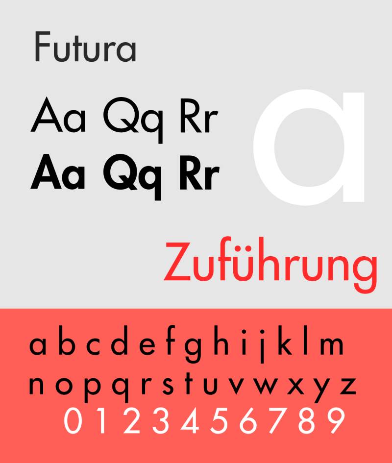
Futura is a geometric sans-serif typeface designed by Paul Renner in 1927, released by Bauer Type Foundry. The current standard version is Futura Now, released by Monotype in 2019 with 102 styles.
It structures letterforms from pure geometric shapes (circles, triangles, squares) to produce a clean, precise appearance. Futura works best for name and company text on tech, design, and modern corporate cards because its low stroke contrast and geometric construction reproduce cleanly at sizes from 10pt upward with minimal ink spread risk.
Louis Vuitton and Volkswagen both use Futura-based typefaces in their brand identity, positioning it firmly in premium professional typography.
What makes Futura suitable for business cards?
Futura’s consistent stroke width (near-zero contrast between thick and thin strokes) makes it one of the most print-stable sans-serif choices for small text. Its tall x-height keeps lowercase letters open at 9–10pt. The geometric construction means letterforms don’t rely on fine details that can be lost in print.
Key attributes:
| Attribute | Value |
| Classification | Geometric sans-serif |
| Designer | Paul Renner, 1927 (Futura Now by Monotype, 2019) |
| Weight range | Light to ExtraBold (102 styles in Futura Now) |
| Variable font | Yes (Futura Now) |
| Recommended sizes | 9pt–12pt contact text; 12pt–16pt name/heading |
| Letter-spacing default | 0 to slightly wide |
| License | Commercial (Monotype; Adobe Fonts subscription) |
| Available on | Adobe Fonts, Monotype |
| Price | Paid (subscription or one-time) |
How does Futura perform at business card print sizes?
Futura’s near-uniform stroke weight means it holds its form reliably at 9pt on both coated and uncoated card stock. Its circular bowls (in letters like “o”, “p”, “b”) retain their shape at small sizes where oval-constructed letters can appear compressed.
Futura’s Light weight (thin strokes) can disappear on rough-textured stock below 10pt. Use Book or Medium weights for contact details.
What are the best pairings for Futura in business cards?
Futura pairs with Bodoni for a high-contrast geometric combination where Futura handles contact details and Bodoni anchors the name. It also pairs with Garamond when a warmer serif body text is needed. The Futura font pairing with Bodoni is a standard practice in fashion and luxury brand card design.
What are the limitations of Futura for business cards?
Futura requires a paid license through Monotype or Adobe Fonts. Its purely geometric forms can read as cold or impersonal in service industries where a warmer, more humanist typeface (like Lato or Gill Sans) would better match the brand tone.
Futura – Recommended Use Cases Within Business Card Typography
- Best for: Name and company name on tech, architecture, and design firm cards
- Avoid for: Healthcare or hospitality cards where approachability matters
- Optimal weight: Book or Medium for contact details; SemiBold or Bold for name
- Optimal size range: 10pt–14pt name; 8pt–10pt contact text
—
Montserrat
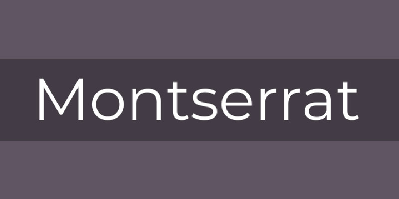
Montserrat is a geometric sans-serif typeface designed by Julieta Ulanovsky, released through Google Fonts in 2011. It is inspired by early 20th-century signage from the Montserrat neighborhood of Buenos Aires.
It provides 9 weights (Thin to Black) with matching italics and a variable font version in a single file. Montserrat suits business cards for startups, real estate firms, and creative agencies because its large x-height and wide apertures keep contact text legible at 9pt, while its 9-weight range gives strong hierarchy options for name vs. contact details.
Montserrat is the fourth most popular font on Google Fonts, with over 2.7 trillion views as of 2023, and is used on over 19 million websites.
What makes Montserrat suitable for business cards?
Montserrat’s large x-height (relative to cap height) keeps lowercase letters open at small sizes. Its wide apertures on characters like “c”, “e”, and “a” reduce misread characters at 9–10pt. The 9-weight range allows one typeface to cover both name (Bold 700) and contact text (Regular 400) without switching families.
Key attributes:
| Attribute | Value |
| Classification | Geometric sans-serif |
| Designer | Julieta Ulanovsky, 2011 |
| Weight range | Thin 100 to Black 900 (9 weights + italics) |
| Variable font | Yes |
| Recommended sizes | 9pt–12pt contact; 12pt–16pt name |
| Letter-spacing default | Slightly wide |
| License | OFL (free for commercial use) |
| Available on | Google Fonts, Adobe Fonts |
| Price | Free |
How does Montserrat perform at business card print sizes?
Montserrat’s slightly wide default letter spacing reduces the risk of characters colliding at 9pt on uncoated stock. Its uniform stroke weight (similar to Futura) prints cleanly across standard CMYK offset printing at 300 DPI.
Montserrat’s thin strokes in Thin (100) and ExtraLight (200) weights disappear at sizes below 10pt on uncoated card stock. Use Regular (400) minimum for contact text.
What are the best pairings for Montserrat in business cards?
Montserrat pairs with Lora for a geometric-sans-meets-calligraphic-serif contrast, and with Playfair Display when an editorial, high-contrast name treatment is needed. The Montserrat font pairing with Playfair Display is widely used in hospitality and lifestyle branding.
What are the limitations of Montserrat for business cards?
Montserrat’s widespread use means it lacks distinctiveness for premium or luxury brand positioning. It also has no condensed variant, which limits layout flexibility when names or titles are long.
Montserrat – Recommended Use Cases Within Business Card Typography
- Best for: All text on startup, tech, and real estate cards; single-family hierarchy
- Avoid for: Luxury, legal, or medical cards where a more authoritative serif is expected
- Optimal weight: Regular 400 for contact text; Bold 700 for name
- Optimal size range: 10pt–14pt name; 8pt–10pt contact details
—
Lato

Lato is a humanist sans-serif typeface designed by Lukasz Dziedzic in 2010, originally commissioned as a corporate font, then released free through Google Fonts under the OFL license.
It balances geometric structure with semi-rounded details that produce a warmer appearance than purely geometric sans-serifs. Lato suits business cards for healthcare, education, and service-based businesses because its generous letter spacing and 5 standard weights maintain legibility at 9pt while avoiding the coldness of more rigid geometric designs.
What makes Lato suitable for business cards?
Lato has a large x-height combined with slightly rounded terminals (the ends of strokes), which keeps letterforms open and distinct at small print sizes. Its generous default letter spacing reduces character collision risk at 9pt. The family includes 9 weights in total, though the core 5 (Thin, Light, Regular, Bold, Black) cover all hierarchy needs for a business card layout.
Key attributes:
| Attribute | Value |
| Classification | Humanist sans-serif |
| Designer | Lukasz Dziedzic, 2010 |
| Weight range | Thin to Black (9 weights including hairline and italic variants) |
| Variable font | No |
| Recommended sizes | 9pt–11pt contact text; 12pt–16pt name |
| Letter-spacing default | Slightly wide (generous) |
| License | OFL (free for commercial use) |
| Available on | Google Fonts |
| Price | Free |
How does Lato perform at business card print sizes?
Lato’s generous spacing and semi-rounded letterforms hold their form well at 9pt on both coated and uncoated stock. Its moderate stroke contrast means it doesn’t suffer from the hairline fill-in that affects thin-stroked geometric fonts under ink spread.
Lato has no condensed variant, which limits how much information fits on a single line at readable sizes. It also lacks a variable font version, requiring separate files for each weight.
What are the best pairings for Lato in business cards?
Lato pairs with Playfair Display for an approachable-sans-meets-editorial-serif contrast, and with Merriweather when a sturdy serif for longer name treatments is needed. The Lato font pairing with Merriweather is common in healthcare and education contexts.
What are the limitations of Lato for business cards?
Lato has no condensed or narrow variant, making it tricky for cards where long names or dual-language text must fit in limited space. It is not a variable font, so each weight requires a separate file in digital design environments.
Lato – Recommended Use Cases Within Business Card Typography
- Best for: Contact text and name on healthcare, wellness, and education cards
- Avoid for: Cards where condensed layout is needed due to long text strings
- Optimal weight: Regular for contact details; Bold for name
- Optimal size range: 10pt–13pt name; 9pt–10pt contact details
—
Raleway
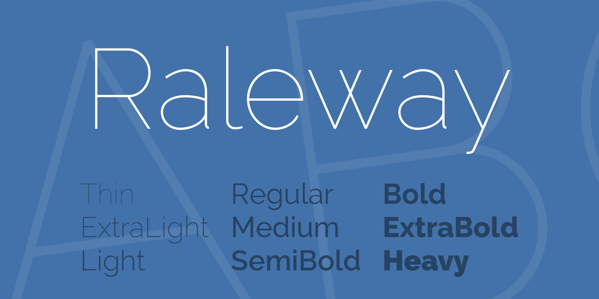
Raleway is a geometric sans-serif typeface originally designed as a single-weight display font by Matt McInerney in 2010, then expanded to 9 weights by Pablo Impallari and Rodrigo Fuenzalida, available free via Google Fonts.
It features thin, elegant letterforms with slightly condensed proportions and wide letter spacing. Raleway suits business cards for fashion brands, consultants, and creative professionals because its 9 weights (Thin to Black) allow distinct hierarchy, and its slightly condensed width fits longer names or titles on a single line at 10pt without crowding.
What makes Raleway suitable for business cards?
Raleway’s slightly condensed proportions let it fit more characters per line than Montserrat or Lato at the same point size. Its wide default tracking (letter spacing) keeps characters distinct even in lighter weights. The 9-weight range covers all hierarchy levels without switching typefaces.
Key attributes:
| Attribute | Value |
| Classification | Geometric sans-serif |
| Designer | Matt McInerney (2010); expanded by Impallari & Fuenzalida |
| Weight range | Thin 100 to Black 900 (9 weights + italics) |
| Variable font | No |
| Recommended sizes | 9pt–12pt contact text; 12pt–16pt name |
| Letter-spacing default | Wide |
| License | OFL (free for commercial use) |
| Available on | Google Fonts |
| Price | Free |
How does Raleway perform at business card print sizes?
Raleway’s lighter weights (Thin 100, ExtraLight 200) produce very thin strokes that can disappear at 9pt on uncoated paper under standard CMYK printing. The Regular (400) and Medium (500) weights print cleanly at 9–10pt on coated stock.
Its wide tracking can make contact text feel spaced-out at small sizes, which may require manual tracking adjustments in the design file.
What are the best pairings for Raleway in business cards?
Raleway pairs with Playfair Display for a fashion-forward sans-plus-editorial-serif combination, and with Lora when a calligraphic serif body text matches the brand tone. The Raleway font pairing with Playfair Display is standard practice in fashion and lifestyle card design.
What are the limitations of Raleway for business cards?
Raleway’s distinctive “W” letterform is immediately recognizable and can make the font feel generic in contexts where it has been overused. It has no variable font version, and its Thin weights are unreliable below 10pt on uncoated stock.
Raleway – Recommended Use Cases Within Business Card Typography
- Best for: Name and company name on fashion, lifestyle, and creative professional cards
- Avoid for: Contact text below 10pt on uncoated or textured stock
- Optimal weight: Regular 400 or Medium 500 for contact details; SemiBold 600 or Bold 700 for name
- Optimal size range: 11pt–15pt name; 9pt–10pt contact text
—
Playfair Display

Playfair Display is a transitional serif typeface designed by Claus Eggers Sorensen and released in 2011 via Google Fonts under the OFL license. Version 2.0 (2022) is a variable font with axes for weight, width, and optical size.
It renders high-contrast transitional serif letterforms optimized for display and headline use at large sizes. Playfair Display suits the name line on luxury, editorial, and fashion business cards because its high stroke contrast and large x-height create a strong visual anchor at 14pt and above.
Playfair Display is one of the most-used serif typefaces on the web, appearing in luxury hospitality, editorial, and premium brand design globally.
What makes Playfair Display suitable for business cards?
Playfair Display has a large x-height that keeps its letterforms open and readable at display sizes (14pt and above). Its strong contrast between thick and thin strokes creates visual weight that makes the name line stand out clearly against lighter contact text. The variable font version (v2.1) includes an optical size axis, which adjusts stroke contrast automatically for the target size.
Key attributes:
| Attribute | Value |
| Classification | Transitional serif (display) |
| Designer | Claus Eggers Sorensen, 2011 |
| Weight range | Regular to Black (6 weights + italics); variable in v2.0 |
| Variable font | Yes (v2.0, 2022) |
| Optical sizes | Yes: Needlepoint, Hairline, Titling, Display, Headline, Trumpet |
| Recommended sizes | 14pt+ for name; not recommended below 12pt |
| Letter-spacing default | 0 (moderate) |
| License | OFL (free for commercial use) |
| Available on | Google Fonts, Adobe Fonts |
| Price | Free |
How does Playfair Display perform at business card print sizes?
At 14pt and above on coated card stock, Playfair Display prints cleanly with full stroke contrast visible. Below 12pt, its thin hairline strokes can fill in or disappear on uncoated stock under standard CMYK printing.
It is not suitable for contact detail text. Use it only for the name or company name line.
What are the best pairings for Playfair Display in business cards?
Playfair Display pairs with Lato for a warm humanist sans-serif contrast that covers body and contact text, and with Source Sans Pro when a more neutral secondary font is needed. The Playfair Display font pairing with Lato is the most common and reliable starting point for editorial-style cards.
What are the limitations of Playfair Display for business cards?
Playfair Display is limited to display use only (14pt and above), which means it cannot handle contact details or secondary text. Its high stroke contrast performs poorly on textured or uncoated stocks below 12pt, where hairlines can break up or disappear in print.
Playfair Display – Recommended Use Cases Within Business Card Typography
- Best for: Name line only on luxury, fashion, hospitality, and editorial brand cards
- Avoid for: Contact text, job title lines below 12pt, or textured/uncoated stock below 14pt
- Optimal weight: Regular 400 or Bold 700 for name display
- Optimal size range: 14pt–20pt for name; pair with a readable sans-serif for everything else
—
Baskerville
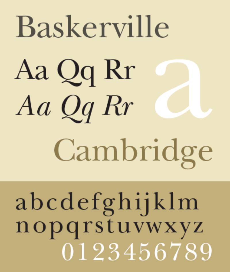
Baskerville is a transitional serif typeface created by John Baskerville in 1757 in Birmingham, England, and released commercially through Monotype and other foundries. A free version, Libre Baskerville, is available on Google Fonts.
It features tapered serifs, near-vertical letter axis, and higher stroke contrast than old-style serifs like Garamond. Baskerville suits law firms, financial institutions, and academic professionals on business cards because its near-vertical stress and tapered serifs maintain legibility at 10pt while projecting established authority.
What makes Baskerville suitable for business cards?
Baskerville’s near-vertical axis (unlike the diagonal axis of old-style serifs) makes it easier to read at small sizes because characters feel more upright and stable. Its tapered serifs are finer than Garamond’s but wider than Bodoni’s, striking a balance between elegance and print durability at 9–10pt. The stroke contrast is higher than Garamond, making it more visually distinctive for name lines.
Key attributes:
| Attribute | Value |
| Classification | Transitional serif |
| Designer | John Baskerville, 1757 |
| Weight range | Regular and Bold (Libre Baskerville); wider range via Monotype |
| Variable font | No (Libre Baskerville); check Monotype for variable options |
| Recommended sizes | 10pt–12pt contact text; 13pt–16pt name |
| Letter-spacing default | 0 (moderate) |
| License | OFL (Libre Baskerville, free); Commercial (Monotype Baskerville) |
| Available on | Google Fonts (Libre Baskerville); Monotype, Adobe Fonts |
| Price | Free (Libre Baskerville); Paid (Monotype) |
How does Baskerville perform at business card print sizes?
Baskerville’s transitional serifs are more robust than Didone-style hairlines but still require coated stock below 10pt to avoid fill-in. On 100–350gsm coated card stock at 300 DPI, it prints cleanly at 10pt across all standard weights.
On uncoated or cotton stock, use 11pt minimum to account for ink spread on the tapered serifs.
What are the best pairings for Baskerville in business cards?
Baskerville pairs with Helvetica for a traditional serif-plus-neutral-grotesque layout that reads as authoritative without being decorative, and with Futura when a more geometric, modern secondary font is needed. The Baskerville font pairing with Helvetica is a standard in legal and financial card design.
What are the limitations of Baskerville for business cards?
Libre Baskerville has only two weights (Regular and Bold), which limits hierarchy options to a single contrast level. On textured or embossed card stock, the tapered serifs can fill in or break at sizes below 11pt.
Baskerville – Recommended Use Cases Within Business Card Typography
- Best for: Name and title on legal, financial, academic, and consulting professional cards
- Avoid for: Contact text below 10pt on uncoated or textured stock
- Optimal weight: Regular for body text; Bold for name
- Optimal size range: 11pt–15pt name; 10pt–11pt contact text (coated stock)
—
Times New Roman
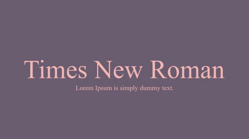
Times New Roman is a transitional serif typeface commissioned by The Times newspaper and designed by Stanley Morison with Victor Lardent in 1931, released by Monotype. It is a bundled system font on both Windows and macOS.
It prioritizes maximum legibility in narrow newspaper columns at small point sizes. Times New Roman suits business cards where a no-cost, universally available serif is needed, because its high x-height and economical character width fit more text per line than wider serif alternatives at the same point size.
What makes Times New Roman suitable for business cards?
Times New Roman was engineered for narrow newspaper columns at 8–10pt. Its high x-height, economical character width, and strong thick-to-thin stroke contrast produce clear letterforms at small sizes. On a business card, this means contact details remain legible at 9pt without requiring condensed tracking adjustments.
Key attributes:
| Attribute | Value |
| Classification | Transitional serif |
| Designer | Stanley Morison & Victor Lardent, 1931 |
| Weight range | Regular, Italic, Bold, Bold Italic |
| Variable font | No |
| Recommended sizes | 9pt–11pt contact text; 12pt–16pt name |
| Letter-spacing default | 0 (tight) |
| License | System font (bundled with Windows/macOS); commercial license via Monotype |
| Available on | System fonts (Windows, macOS), Monotype |
| Price | Free (system); Paid (Monotype commercial) |
How does Times New Roman perform at business card print sizes?
Times New Roman was specifically designed for print legibility at small sizes, making it one of the most reliable serif choices for contact text at 9pt on standard card stock. Its tight letter spacing and economical character width mean it holds more information per line than most other serif options at equivalent sizes.
It is widely perceived as generic due to its ubiquity as a word processor default, which can undermine brand distinctiveness on a business card.
What are the best pairings for Times New Roman in business cards?
Times New Roman pairs with Helvetica for a classic transitional serif-plus-grotesque contrast, and with Futura when a more geometric secondary font matches the brand direction. Both pairings use Times New Roman for the body and contact text, with the secondary font handling the name line.
What are the limitations of Times New Roman for business cards?
Times New Roman has only 4 styles (Regular, Italic, Bold, Bold Italic), which severely limits weight hierarchy. Its strong association with default word processor documents means it can signal a lack of design consideration, which is a significant drawback for brand positioning.
Times New Roman – Recommended Use Cases Within Business Card Typography
- Best for: Contact text on budget-constrained cards where free system fonts are required
- Avoid for: Premium, luxury, or creative professional cards where distinctiveness matters
- Optimal weight: Regular for contact text; Bold for name or title
- Optimal size range: 10pt–13pt name; 9pt–10pt contact details
—
Gotham
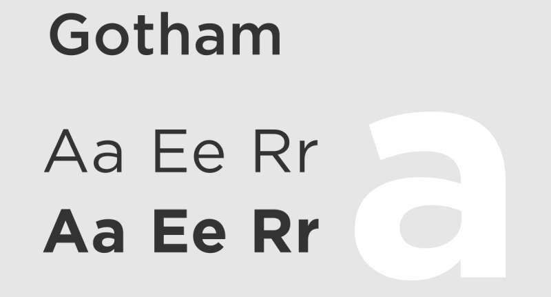
Gotham is a geometric sans-serif typeface designed by Tobias Frere-Jones in 2000, released by Hoefler&Co (formerly Hoefler & Frere-Jones). It is a premium commercial font available exclusively through typography.com.
It draws on mid-20th century American vernacular signage for a confident, democratic geometric sans-serif with broad weight availability. Gotham suits corporate, legal, and institutional business cards because its 8-weight range (from Light to Ultra) and 4 width variants (Standard, Condensed, Narrow, Rounded) give precise control over name-to-contact-text hierarchy in compact print layouts.
Barack Obama’s 2008 presidential campaign used Gotham across all print and digital materials, cementing its association with authority and institutional trust.
What makes Gotham suitable for business cards?
Gotham has a large x-height and open apertures on characters like “c”, “e”, and “s”, which maintain legibility at 9–10pt. Its 4 width variants allow the designer to choose between standard proportions for name lines and condensed for longer job titles or company names. The near-uniform stroke weight (low contrast) makes it one of the most print-stable geometric sans-serifs available.
Key attributes:
| Attribute | Value |
| Classification | Geometric sans-serif |
| Designer | Tobias Frere-Jones, 2000 |
| Weight range | Light to Ultra (8 weights); 4 width variants |
| Variable font | No |
| Recommended sizes | 9pt–12pt contact text; 12pt–16pt name |
| Letter-spacing default | 0 (slightly open) |
| License | Commercial (Hoefler&Co desktop from ~$199; web via Cloud.typography subscription) |
| Available on | typography.com (Hoefler&Co) exclusively |
| Price | Paid (from ~$199 desktop; subscription for web) |
How does Gotham perform at business card print sizes?
Gotham’s near-uniform stroke weight makes it highly stable in print at 9pt on both coated and uncoated card stock. Its open apertures prevent character misreading at small sizes. The condensed variants allow more characters per line without reducing point size below the legibility threshold.
Gotham is a premium font with significant licensing costs. Teams without an existing Hoefler&Co license should evaluate Montserrat as a free alternative first.
What are the best pairings for Gotham in business cards?
Gotham pairs with Garamond for a modern-geometric-sans-meets-old-style-serif contrast used extensively in legal and financial cards, and with Bodoni when a high-contrast serif name treatment is needed for luxury positioning. The Gotham font pairing with Garamond is standard practice in corporate identity systems that span both print and digital.
What are the limitations of Gotham for business cards?
Gotham requires a paid commercial license starting at approximately $199 for desktop use, with web use requiring a separate Cloud.typography subscription. It is not a variable font, which means each weight requires a separate file and there is no mid-point weight interpolation.
Gotham – Recommended Use Cases Within Business Card Typography
- Best for: Name, title, and contact text on corporate, institutional, and political organization cards
- Avoid for: Projects with tight font budgets (use Montserrat instead); cards needing a warm, humanist tone
- Optimal weight: Book or Medium for contact text; Bold or Black for name
- Optimal size range: 10pt–14pt name; 9pt–10pt contact text
—
Font Classification Quick Reference
Choosing between these ten options often comes down to brand category and print method. This table summarizes the key trade-offs.
| Font | Classification | Best Brand Category | License | Min. Print Size |
| Helvetica | Neo-grotesque sans | Corporate, tech | Paid | 8pt coated |
| Garamond | Old-style serif | Legal, finance, academia | Free (EB) | 9pt coated |
| Futura | Geometric sans | Design, architecture, luxury | Paid | 9pt any |
| Montserrat | Geometric sans | Startup, real estate, creative | Free | 9pt coated |
| Lato | Humanist sans | Healthcare, education | Free | 9pt any |
| Raleway | Geometric sans | Fashion, lifestyle | Free | 10pt coated |
| Playfair Display | Transitional serif (display) | Luxury, editorial | Free | 14pt (name only) |
| Baskerville | Transitional serif | Legal, financial, academic | Free (Libre) | 10pt coated |
| Times New Roman | Transitional serif | Budget/generic | Free (system) | 9pt any |
| Gotham | Geometric sans | Corporate, institutional | Paid ($199+) | 9pt any |
Understanding font psychology helps when choosing between these options. Serifs signal authority and tradition. Geometric sans-serifs signal modernity and precision. Humanist sans-serifs signal warmth and approachability.
If the budget allows only one paid font, Gotham or Futura offer the most width and weight flexibility. If the project is free-font only, Montserrat + Playfair Display covers the widest range of brand categories without sacrificing print legibility. Font licensing is worth reviewing carefully before committing to a commercial typeface for print production.
For anyone still testing combinations, a font pairing generator can speed up the shortlist process significantly.
What Makes a Font Work on a Business Card?
A standard US business card is 3.5 x 2 inches. That’s it. Every typeface decision happens inside that footprint, and the margin for error is close to zero.
72% of people judge a company based on the quality of its business card, according to Wave Connect research. And 39% won’t engage with a business if the card looks unprofessional.
Font selection is the single design variable with the most leverage. It controls legibility, hierarchy, and brand tone simultaneously.
| Text Role | Recommended Size | Absolute Minimum |
| Name / Company | 12pt–16pt | 10pt |
| Job title | 9pt–12pt | 8pt |
| Contact details | 8pt–10pt | 7pt |
Four structural attributes determine whether a typeface works at these sizes: x-height, stroke contrast, letter spacing default, and weight range.
How does stroke contrast affect legibility at small print sizes?
Low stroke contrast (near-uniform thick and thin strokes) is more stable in print. Readability Consortium research confirms that low stroke contrast improves word recognition, and heavy or light letter-weight fonts both slow reading speed.
High-contrast serifs like Bodoni carry dramatic thick-to-thin transitions. Below 10pt on uncoated stock, the thin strokes fill with ink and disappear.
Practical rule:
- Fonts with near-uniform strokes (Futura, Montserrat, Helvetica) hold at 8–9pt on coated stock
- Moderate-contrast serifs (Garamond, Baskerville) hold at 9–10pt on coated stock
- High-contrast Didone serifs (Bodoni, Didot) need 12pt minimum, coated stock only
What is the minimum font size for business cards?
pt is the industry standard floor for contact details on standard offset printing at 300 DPI, per VistaPrint and 4OVER4 printing guidelines. Some printers note 7pt as an absolute hard floor for legal fine print only.
Special finishes change the math entirely. Foil stamping, spot UV, and embossing require 8–10pt minimum per Boxcar Press specifications, with 12pt recommended for raised foil treatments to prevent hairline fill-in under heat pressure.
OVER4, which has printed over 10 billion cards for 150,000+ businesses, reports that the most effective designs consistently keep contact text at 10pt or above.
—
Which Font Classification Is Best for Business Cards?
There are three classifications worth considering for print: sans-serif, serif, and script. Each has a structural profile that maps to a specific use on the card.
60% of designers use a serif font in branding projects vs. 40% using sans-serif, according to WhatFontIs 2023 research. On business cards specifically, the split is closer to even, because legibility requirements favor sans-serif at contact text sizes.
| Classification | Best Position on Card | Minimum Safe Size | Brand Category |
| Geometric sans-serif | Name + contact text | 8pt coated | Tech, startup, architecture |
| Humanist sans-serif | Name + contact text | 9pt any stock | Healthcare, education, services |
| Old-style serif | Name + title | 9pt coated | Legal, finance, academia |
| Transitional serif | Name line | 10pt coated | Corporate, institutional |
| Script / Display | Name line only | 14pt minimum | Luxury, fashion, creative |
When do serif fonts outperform sans-serif fonts on business cards?
Serifs outperform sans-serifs in one specific scenario: name and title lines at 12pt and above on coated card stock. At those sizes, the psychological weight of a serif, its signal of authority and tradition, is fully visible without legibility risk.
Law firms, financial advisors, and consultants consistently use serifs like Garamond and Baskerville for this reason.
Below 10pt, or on uncoated stock, the structural advantage disappears. At small sizes, the open apertures of a well-made sans-serif (Montserrat, Lato) outperform the angled serifs of old-style typefaces where ink absorption spreads strokes unpredictably.
Why are script fonts limited to name-line use on business cards?
Open counters collapse in script fonts below 12pt. The connecting strokes between letters, which define script’s visual identity, merge at small sizes and become unreadable.
Playfair Display is the closest script-adjacent option that still works at 14pt. Purpose-built calligraphic scripts (Pacifico, Great Vibes) should only appear at 18pt or above on the name line, paired with a clean sans-serif for all contact text.
Using script fonts for email addresses, phone numbers, or URLs is one of the fastest ways to make a card unreadable. The display font category faces the same constraint: visually distinct at large sizes, structurally unsuitable below 14pt.
—
How Does Font Licensing Affect Business Card Design?
47% of designers say navigating and managing font licensing is challenging, according to Monotype’s 2024 Font Use and Forecasting Survey. For business card print production specifically, this matters because a font used without a commercial desktop or print license exposes the designer and client to copyright liability.
In 2023, Production Type filed a copyright infringement lawsuit against Nike for using their Kreuz Light font in marketing projects without proper licensing (Extensis).
Three license categories apply to business card print production:
- OFL (Open Font License): Free for all use including commercial print. Covers Montserrat, Lato, Raleway, Playfair Display, EB Garamond, Libre Baskerville
- Commercial desktop license: One-time or subscription purchase for use in print design files. Covers Helvetica (Monotype), Futura (Monotype), Gotham (Hoefler&Co from ~$199)
- System bundled: Included with OS. Times New Roman, Arial, Georgia are free to use in print with no additional license required
About 80% of professional designers pay for font licenses, according to Linearity 2023 data. For those who don’t, Google Fonts provides 1,826 OFL families as of May 2025, including strong business card options across every classification.
Over 83% of Fortune 500 companies use proprietary or customized typefaces for brand identity, per Business Research Insights. Small businesses spend an average of $300 annually on font licensing (Linearity).
The practical trade-off is clear:
- OFL fonts (Montserrat, EB Garamond): zero cost, no restrictions, structural quality matches premium alternatives
- Commercial fonts (Gotham, Helvetica, Futura): higher cost, broader weight and width variants, stronger brand differentiation in premium contexts
—
How Do Font Size and Spacing Affect Business Card Readability?
55% of consumers say font style and size is a key factor in their reading experience, according to WhatFontIs 2023 research. On a 3.5 x 2 inch card, getting both wrong simultaneously is almost inevitable without a clear size and spacing system.
The spacing variables that affect readability at small print sizes are letter spacing (tracking), word spacing, and leading (line height). Royal Danish Academy research from 2024 confirms that x-height and font spacing together directly determine legibility speed in time-sensitive contexts.
What font size is too small for a business card?
Below 7pt, no standard sans-serif or serif renders cleanly in offset CMYK print at 300 DPI. Below 8pt, only low-contrast geometric sans-serifs on coated stock survive without character blurring.
The two-size system that works consistently:
- Name / company: 12pt–16pt, Bold 700 weight minimum
- Contact details: 8pt–10pt, Regular 400 weight
Using a single typeface family (Montserrat, Lato) across both levels eliminates the visual conflict that comes from pairing mismatched typefaces. Weight variation within a family creates hierarchy without the risk of a poorly matched combination.
How does paper stock affect the minimum usable font weight?
Coated stock (glossy, silk-laminated) holds ink on the surface. Uncoated, cotton, and textured stocks absorb ink, which spreads strokes by an estimated 10–20% effective width increase under standard CMYK offset conditions.
Stock-specific weight rules:
- Coated / glossy: Regular (400) holds at 8pt for most sans-serifs
- Uncoated: Medium (500) or higher at 9pt minimum; Light weights disappear
- Cotton (letterpress stock): Bold (700) recommended below 10pt; thin strokes collapse under impression pressure
- Textured: Avoid angled-serif typefaces (Garamond) below 11pt; geometric sans-serifs hold better
VistaPrint production guidelines note that spot UV and foil finishes require critical details at 8pt minimum, with primary names at 10–16pt to prevent small counters from filling under heat or UV application.
—
What Are the Best Font Pairings for Business Cards?
The two-typeface maximum is both a design principle and a practical constraint. On a 3.5 x 2 inch card, three fonts create visual chaos. One font (with weight variation) can handle everything if the weight range is wide enough.
When two typefaces are used, the pairing logic centers on classification contrast (serif + sans-serif), shared x-height proportion, and differentiated weight axis.
The five pairings below are the most structurally justified combinations for business card use:
| Pairing | Name Line | Contact Text | Best For |
| Helvetica + Garamond | Garamond Bold | Helvetica Regular | Legal, finance, corporate |
| Montserrat + Playfair Display | Playfair Display Bold | Montserrat Regular | Hospitality, lifestyle |
| Futura + Bodoni | Bodoni Bold | Futura Book | Luxury, fashion |
| Lato + Merriweather | Merriweather Bold | Lato Regular | Healthcare, education |
| Gotham + Garamond | Garamond Regular | Gotham Book | Institutional, political |
How do you pair a serif and sans-serif font on a business card?
Shared x-height is the structural anchor. When a serif and sans-serif have similar x-heights, they read as a coherent system even though their classifications differ visually.
Practical steps:
- Place the serif on the name line (largest text, most print-stable position)
- Place the sans-serif on contact text (small size, requires open apertures)
- Match weights visually: a Bold serif name should pair with a Regular sans-serif contact block
- Avoid pairing two typefaces with similar x-heights and similar stroke weight. They read as a mistake, not a choice
The font pairing generator can speed up shortlisting by previewing combinations at business card-scale type sizes before committing to a layout.
Which font combinations work best for luxury business cards?
Futura + Bodoni is the standard for luxury print. The pairing contrasts a pure geometric sans-serif (Futura) with a high-contrast Didone serif (Bodoni), which produces maximum visual differentiation between the name line and contact block.
Key constraint: Bodoni requires 12pt minimum on coated stock. Its hairline serifs are the thinnest of any commonly used typeface and will not survive foil stamping or uncoated stock below 12pt.
Montserrat + Playfair Display is the free-font equivalent. Both are OFL-licensed, available on Google Fonts, and produce a similar high-contrast editorial aesthetic at a lower cost. The Montserrat pairing with Playfair Display is widely used in hospitality, beauty, and lifestyle card design. Similarly, the Playfair Display pairing with Lato is the most common default for editorial-style cards.
—
How Do Print Method and Card Stock Change Font Requirements?
Print method overrides font choice. A typeface that works at 9pt on digital offset will fail at 9pt on letterpress cotton stock. The structural properties of the printing process determine the minimum viable weight and size, regardless of what looks correct on screen.
10 billion business cards are printed annually in the US alone (Wave Connect). Real-world print failures, blurred contact text, filled-in counters, and missing hairlines, almost always trace back to a mismatch between the chosen font and the production method.
What fonts work best for letterpress business cards?
Letterpress presses ink into the paper surface under direct impression pressure. The ink spreads into the paper fibers on contact, which eliminates thin strokes entirely at small sizes.
Letterpress font rules (per 1800 Printing and Vermillion Silk specifications):
- Minimum font size: 6pt for solid sans-serif, 7pt for reversed text
- Minimum stroke width: 0.25pt in vector format (converted to outlines)
- Recommended weight: Bold 700 or heavier below 10pt
- Avoid: fine-stroke serifs (Garamond, Baskerville), condensed fonts, any thin or extralight weight
- Best choices: Futura Medium/Bold, Montserrat Bold, Gotham Bold
Geometric sans-serifs perform best in letterpress because their near-uniform stroke weight distributes impression pressure evenly. Angled serifs compress and spread unpredictably under the plate.
Which typefaces hold detail under foil stamping and spot gloss?
Foil stamping applies a heated metallic plate to the card surface. The heat and pressure cause any fine stroke below 1.5pt to bleed beyond the letterform edge.
Boxcar Press and NextDay Flyers production specs set the minimum at 8pt for most fonts under foil stamping, with strokes and borders above 1.5pt. 4OVER4 recommends 10pt minimum and ideally 12pt for raised foil name treatments.
The safest typefaces for foil applications:
- Gotham Bold or Black: wide stroke, geometric construction, holds detail cleanly
- Montserrat Bold 700+: uniform stroke weight, open counters survive heat pressure
- Helvetica Bold: tight spacing helps with foil registration accuracy
Avoid Garamond, Playfair Display, and any script font for foil stamping below 14pt. Their thin hairlines collapse under the heated plate and produce blurred letterforms rather than clean metallic edges.
Spot UV follows the same rules as foil: 8pt minimum, bold weights only, simple letterforms without fine serif details. MOO’s production guidelines note that spot UV “can fill in small counters,” which eliminates any typeface with narrow letter apertures at small sizes.
FAQ on The Best Fonts For Business Cards
What is the best font for a business card?
Helvetica, Montserrat, and Garamond are the most reliable choices. Helvetica suits corporate brands, Montserrat works for modern startups, and Garamond fits legal or financial professionals. The best font depends on your industry, brand tone, and print method.
What font size should I use on a business card?
Use 10pt–16pt for your name and company. Keep job titles between 9pt–12pt. Contact details should stay at 8pt–10pt minimum. Never go below 7pt in print. Smaller text blurs on most card stocks, making contact information unreadable at a glance.
How many fonts should be on a business card?
Two fonts maximum. One for the name line, one for contact details. Using a single typeface family with varied weights (Regular + Bold) is often cleaner. Three or more fonts create visual noise on a small surface.
Are serif or sans-serif fonts better for business cards?
Sans-serif fonts are more legible at small contact-text sizes. Serifs work well for name lines at 12pt and above, particularly for legal, finance, and academic professionals. Neither is universally better. Match the classification to your brand category.
Can I use a script font on my business card?
Script fonts belong on the name line only, at 14pt minimum. Never use them for contact details, phone numbers, or email addresses. Their connecting strokes collapse below 12pt in print, making text illegible at standard card dimensions.
What fonts are free to use on business cards?
Montserrat, Lato, Raleway, Playfair Display, and EB Garamond are all free under the Open Font License. All are available on Google Fonts with no commercial print restrictions. These cover every major brand category without any licensing cost.
Does font choice affect how professional a business card looks?
Yes. 72% of people judge a company based on business card quality, according to Wave Connect research. Typography is the primary visual signal on a card. A poorly chosen typeface signals careless design, which transfers directly to brand perception.
What font works best for luxury business cards?
Futura paired with Bodoni is the standard for luxury print. Bodoni’s high stroke contrast reads as premium at 12pt and above on coated stock. For a free alternative, Montserrat paired with Playfair Display produces a similar editorial result.
What is the minimum font size for foil stamping on a business card?
pt is the production minimum for foil stamping, per Boxcar Press specifications. For raised foil name treatments, 10pt–12pt is recommended. Thin hairline strokes and fine serifs collapse under heat pressure, so use Bold weights only for any foil application.
How do I choose a font pairing for my business card?
Pair a serif with a sans-serif for maximum contrast. Match their x-heights so the combination reads as intentional. Place the serif on the name line and the sans-serif on contact text. Use a font pairing generator to preview combinations before committing.
Conclusion
This conclusion is for an article presenting the best fonts for business cards, and the core takeaway is simple: typeface selection is a structural decision, not an aesthetic one.
Print legibility, stroke contrast, weight range, and paper stock compatibility determine whether a font works in production. What looks sharp on screen can fail completely on uncoated card stock.
Serif typefaces like Garamond and Baskerville signal authority for legal and financial brands. Geometric sans-serifs like Montserrat and Futura suit modern corporate identity and hold up across every print method.
Match your typeface classification to your brand category. Keep font size above 8pt for contact details. Stick to two fonts maximum.
Get those decisions right, and your card does the work long after the handshake ends.

Renowned for his expertise in logo design and visual branding, Bogdan has developed a multitude of logos for various clients.
His skills extend to creating posters, vector illustrations, business cards, and brochures. Additionally, Bogdan's UI kits were featured on marketplaces like Visual Hierarchy and UI8.
He also wrote in the past years on sites like Design Your Way, WebDesignerDepot, WPDean, Designmodo, Speckyboy, Slider Revolution, and more.
- The Windsurf Logo History, Colors, Font, And Meaning - 10 October 2026
- How to Remove Background From Product Photos (No Photoshop) - 10 October 2026
- How Designers can Build a Stronger Online Creative Identity - 9 October 2026

Bogdan Sandu is a seasoned designer who has been designing websites since 2008. Renowned for his expertise in logo design and visual branding, Bogdan has developed a multitude of logos for various clients. His skills extend to creating posters, vector illustrations, business cards, and brochures. Additionally, Bogdan's UI kits were featured on marketplaces like Visual Hierarchy and UI8. He also wrote in the past years on sites like Design Your Way, WebDesignerDepot, WPDean, Designmodo, Speckyboy, Slider Revolution, and more.
You Might Also Like