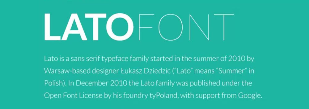
Lato sits in your Google Fonts library waiting to do something interesting, but pairing it wrong turns clean design into visual chaos. This humanist sans-serif deserves better than random combinations that undermine your entire typographic hierarchy.
The problem isn’t Lato.
Most designers grab the first serif font they see and call it a pairing. But effective font combinations require understanding contrast, mood, and technical performance across devices.
This guide provides Lato font pairing examples that actually work. You’ll see specific weight combinations, optimal size ranges, and accessibility considerations for each pairing. From editorial designs to mobile interfaces, these combinations solve real typography challenges instead of creating new ones.
Lato font pairing options
| Serif Pairing | Classification | Design Context | Readability Factor |
|---|---|---|---|
| Merriweather | Transitional Serif | Editorial content requiring high legibility on screens | Optimized for digital reading |
| Lora | Modern Serif | Body text combining contemporary aesthetics with classical structure | Balanced stroke weight |
| Playfair Display | Transitional Display Serif | Headlines demanding attention with high contrast strokes | Display-optimized hierarchy |
| DM Serif Display | Contemporary Display Serif | Premium editorial layouts needing distinctive visual hierarchy | High contrast for emphasis |
| Libre Baskerville | Transitional Serif | Traditional reading experiences adapted for web environments | Print-inspired legibility |
| PT Serif | Transitional Serif | Universal text applications with multilingual support | Consistent x-height clarity |
| Sans-Serif Pairing | Classification | Design Context | Readability Factor |
| Roboto | Neo-Grotesque | Material Design interfaces requiring mechanical precision | Dual nature flexibility |
| Open Sans | Humanist Sans-Serif | Accessible interface typography with neutral appearance | Wide letter spacing |
| Raleway | Elegant Sans-Serif | Fashion brands and lifestyle content with refined aesthetics | Thin weight elegance |
| Montserrat | Geometric Sans-Serif | Urban branding projects with modernist geometric structure | Consistent geometric forms |
| Source Sans Pro | Humanist Sans-Serif | User interface components prioritizing functional clarity | Adobe-optimized spacing |
| Poppins | Geometric Sans-Serif | Contemporary digital products with circular letterforms | Friendly rounded geometry |
| Nunito | Rounded Sans-Serif | Approachable brand communication with soft terminals | Balanced rounded terminals |
| Work Sans | Grotesque Sans-Serif | Screen-optimized text with technical documentation focus | Screen-hinted clarity |
| Inter | Neo-Grotesque | Digital interfaces requiring pixel-perfect rendering | Tall x-height optimization |
Lato and Merriweather
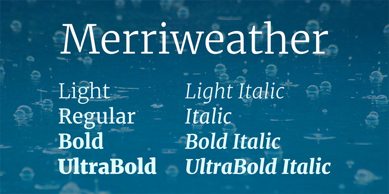
This combination brings together humanist warmth with traditional elegance. Merriweather’s large x-height makes it particularly effective for digital reading.
Pairing Composition
- Primary font: Lato Regular (400)
- Secondary font: Merriweather Regular (400) / Bold (700)
- Font relationship type: Complementary
Visual Characteristics
- Contrast level: Medium
- Mood: Professional yet approachable
- Hierarchy clarity: The serif font provides strong distinction from Lato’s clean lines, creating natural separation between headings and body text
Best Use Cases
- Primary use: Websites and blogs
- Content type: Editorial content, long-form articles
- Industry fit: Publishing, education, corporate communications
Merriweather works beautifully for headings while Lato handles body text. The pairing maintains excellent readability across screen sizes.
Readability Attributes
- Body text size range: 16-18px (Lato)
- Heading size range: 28-48px (Merriweather)
- Optimal line height: 1.5-1.6
- Screen performance: Both fonts render sharply on desktop and mobile
Accessibility Considerations
- WCAG AA compliance achievable with proper color contrast
- Merriweather Bold (700) provides sufficient weight for headings
- Minimum 16px for body text ensures legibility
- Both fonts maintain distinct letterforms at small sizes
Lato and Lora
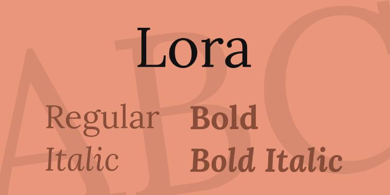
Lora’s calligraphic roots complement Lato’s geometric structure. This pairing feels contemporary without sacrificing warmth.
Pairing Composition
- Primary font: Lato Regular (400) / Bold (700)
- Secondary font: Lora Regular (400) / Italic (400)
- Font relationship type: Harmonious
Visual Characteristics
- Contrast level: Medium
- Mood: Elegant and modern
- Hierarchy clarity: Similar x-heights create cohesive visual flow while serif vs. sans distinction maintains clear separation
Both fonts share similar proportions. Makes them feel related without being redundant.
Best Use Cases
- Primary use: Blogs, portfolios, creative websites
- Content type: Lifestyle content, personal branding
- Industry fit: Fashion, design, arts and culture
Readability Attributes
- Body text size range: 16-18px
- Heading size range: 24-42px
- Optimal line height: 1.6
- Screen performance: Excellent rendering across all devices
Lora’s italics are particularly expressive. Use them for pull quotes or emphasis.
Accessibility Considerations
- Strong character differentiation supports dyslexia-friendly design
- Regular weights provide comfortable reading experience
- Consider using Lato for navigation and UI elements
- Lora works well at 18px+ for extended reading
Lato and Playfair Display
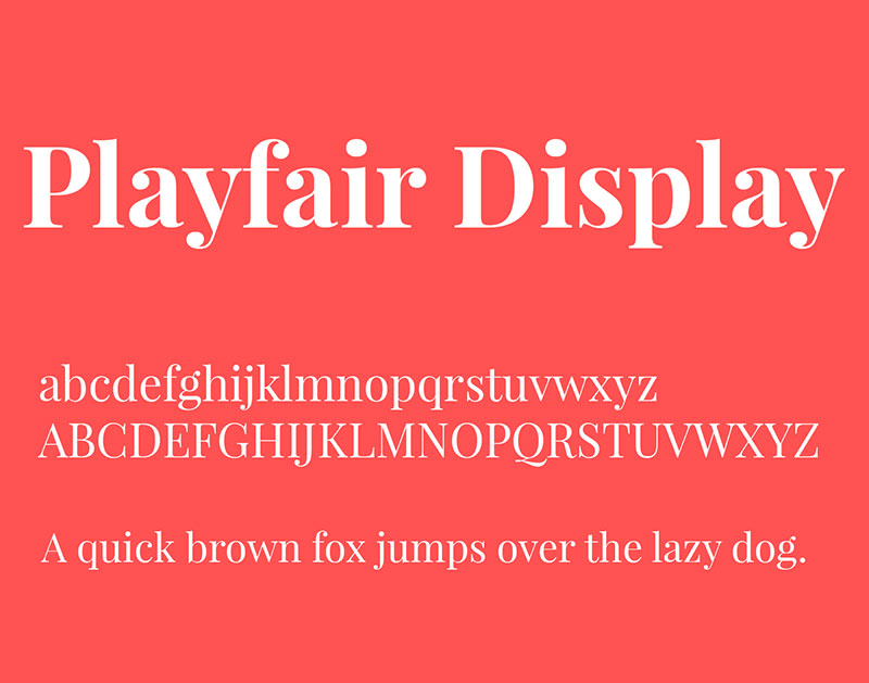
High contrast meets humanist simplicity. Playfair Display’s dramatic strokes demand attention while Lato grounds the design.
Pairing Composition
- Primary font: Lato Regular (400)
- Secondary font: Playfair Display Bold (700) / Regular (400)
- Font relationship type: Contrasting
Visual Characteristics
- Contrast level: High
- Mood: Sophisticated and refined
- Hierarchy clarity: Playfair’s high contrast creates immediate focal point for headers
Best Use Cases
- Primary use: Marketing sites, luxury branding
- Content type: Editorial design, promotional materials
- Industry fit: Fashion, hospitality, premium services
Playfair Display works best in larger sizes. The delicate strokes break down below 20px.
Readability Attributes
- Body text size range: 16-18px (Lato)
- Heading size range: 32-72px (Playfair Display)
- Optimal line height: 1.5 (Lato), 1.2 (Playfair headings)
- Screen performance: Lato performs well universally; Playfair needs larger sizes for mobile
Accessibility Considerations
- Avoid using Playfair Display for body text
- High contrast between fonts improves scannability
- Ensure sufficient white space around Playfair headings
- Lato maintains accessibility at all required sizes
Lato and Roboto
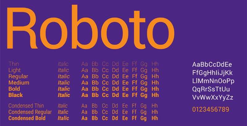
Two Google Fonts giants paired together. Both are versatile, but Roboto’s slightly mechanical feel contrasts Lato’s warmth.
Pairing Composition
- Primary font: Lato Regular (400)
- Secondary font: Roboto Medium (500) / Regular (400)
- Font relationship type: Complementary
Visual Characteristics
- Contrast level: Low to medium
- Mood: Clean and technical
- Hierarchy clarity: Subtle geometric differences create distinction without drama
This pairing works when you need professional typography without strong personality.
Best Use Cases
- Primary use: Web applications, mobile apps
- Content type: Technical documentation, UI design
- Industry fit: Technology, SaaS, startups
Readability Attributes
- Body text size range: 14-16px
- Heading size range: 20-36px
- Optimal line height: 1.5-1.6
- Screen performance: Both optimized for screen rendering at all sizes
Accessibility Considerations
- Both fonts designed with digital accessibility in mind
- Clear letterform distinction at small sizes
- Consider using Roboto Medium for better weight contrast
- Works well in dense information displays
Lato and Open Sans
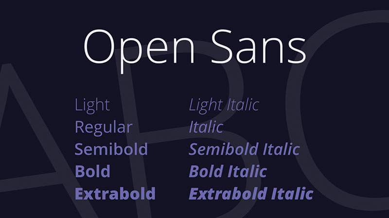
Similar but not identical. Open Sans brings slightly more structure to counter Lato’s softer curves.
Pairing Composition
- Primary font: Lato Regular (400)
- Secondary font: Open Sans SemiBold (600)
- Font relationship type: Harmonious
Visual Characteristics
- Contrast level: Low
- Mood: Friendly and approachable
- Hierarchy clarity: Weight variation provides primary distinction
Both are humanist sans-serif fonts with warm characteristics.
Best Use Cases
- Primary use: Corporate websites, educational platforms
- Content type: Informational content, documentation
- Industry fit: Education, non-profits, healthcare
Readability Attributes
- Body text size range: 16-18px
- Heading size range: 24-40px
- Optimal line height: 1.6
- Screen performance: Exceptional cross-browser compatibility
This combination requires strong weight differentiation. Use Open Sans SemiBold or Bold for headings.
Accessibility Considerations
- Both fonts meet WCAG AA standards easily
- Similar x-heights support consistent visual rhythm
- Excellent for readers with visual impairments
- Works well for dyslexia-friendly design
Lato and Raleway
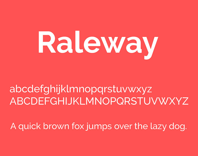
Raleway’s elegant thin weights contrast beautifully with Lato’s sturdy presence. Creates a sophisticated hierarchy.
Pairing Composition
- Primary font: Lato Regular (400)
- Secondary font: Raleway Light (300) / SemiBold (600)
- Font relationship type: Complementary
Visual Characteristics
- Contrast level: Medium to high
- Mood: Modern and stylish
- Hierarchy clarity: Raleway’s refined appearance naturally elevates heading importance
Best Use Cases
- Primary use: Creative portfolios, agencies
- Content type: Marketing materials, presentations
- Industry fit: Design studios, creative services
Raleway’s thin weights look stunning but need larger sizes. Don’t go below 24px for Light weight.
Readability Attributes
- Body text size range: 16-18px (Lato)
- Heading size range: 28-56px (Raleway)
- Optimal line height: 1.5 (Lato), 1.3 (Raleway)
- Screen performance: Lato universal; Raleway best on high-DPI screens
Accessibility Considerations
- Avoid Raleway Thin/ExtraLight weights for accessibility
- Use SemiBold or Bold Raleway for better contrast
- Lato provides reliable body text readability
- Consider font spacing adjustments for Raleway at display sizes
Lato and Montserrat
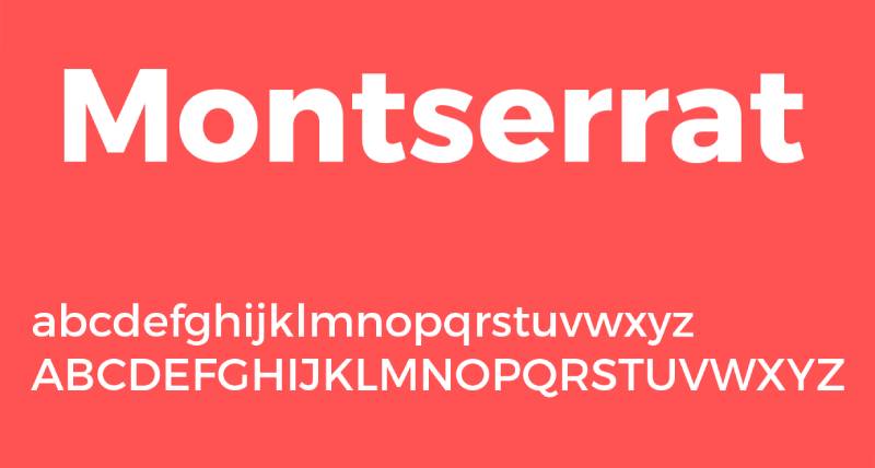
Geometric meets humanist. Montserrat’s urban inspiration brings bold structure to Lato’s friendly demeanor.
Pairing Composition
- Primary font: Lato Regular (400)
- Secondary font: Montserrat Bold (700) / SemiBold (600)
- Font relationship type: Complementary
Visual Characteristics
- Contrast level: Medium
- Mood: Confident and contemporary
- Hierarchy clarity: Montserrat’s commanding presence makes headers unmistakable
Best Use Cases
- Primary use: Corporate branding, presentations
- Content type: Business communications, marketing
- Industry fit: Finance, consulting, technology
Both fonts share modern sensibilities but Montserrat feels more assertive.
Readability Attributes
- Body text size range: 16-18px (Lato)
- Heading size range: 24-48px (Montserrat)
- Optimal line height: 1.5-1.6
- Screen performance: Excellent across all devices and resolutions
Accessibility Considerations
- High x-heights support readability
- Bold weights provide strong visual hierarchy
- Works well in graphic design applications
- Both fonts maintain clarity at small sizes
Lato and Source Sans Pro
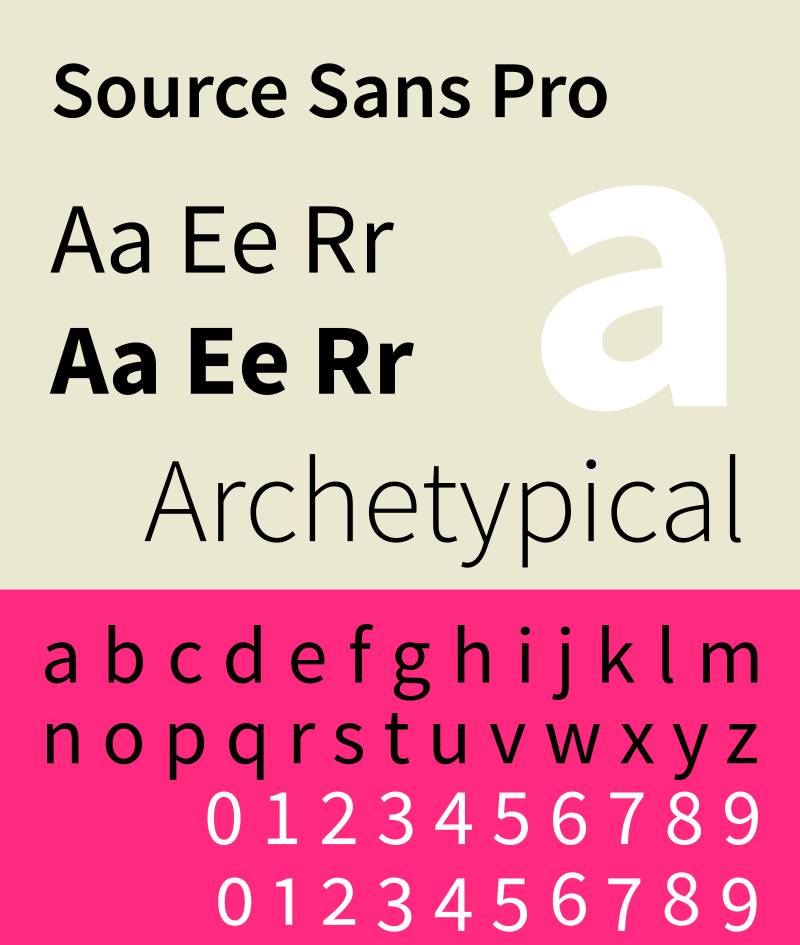
Adobe’s first open-source typeface pairs naturally with Lato. Both prioritize clarity and functionality.
Pairing Composition
- Primary font: Lato Regular (400)
- Secondary font: Source Sans Pro SemiBold (600)
- Font relationship type: Harmonious
Visual Characteristics
- Contrast level: Low to medium
- Mood: Professional and neutral
- Hierarchy clarity: Subtle differences require weight variation for effective hierarchy
Best Use Cases
- Primary use: Web design, applications
- Content type: Technical content, interfaces
- Industry fit: Software, enterprise, technology
Both fonts were designed for screen optimization. Perfect for UI work.
Readability Attributes
- Body text size range: 14-16px
- Heading size range: 20-38px
- Optimal line height: 1.5-1.6
- Screen performance: Both designed specifically for digital environments
Accessibility Considerations
- Comprehensive language support
- Clear letterform distinction
- Works well at small sizes
- Ideal for dense information displays
Lato and Poppins
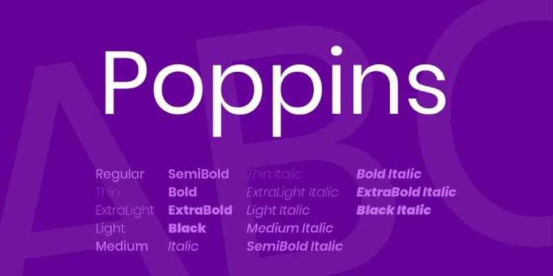
Poppins brings geometric precision to balance Lato’s organic warmth. Both feel contemporary and accessible.
Pairing Composition
- Primary font: Lato Regular (400)
- Secondary font: Poppins Medium (500) / SemiBold (600)
- Font relationship type: Complementary
Visual Characteristics
- Contrast level: Medium
- Mood: Modern and friendly
- Hierarchy clarity: Poppins’ rounder forms create visual distinction while maintaining cohesion
Best Use Cases
- Primary use: Mobile apps, modern websites
- Content type: User interfaces, marketing
- Industry fit: Startups, consumer apps, e-commerce
Poppins’ rounded geometry feels playful without being childish. Works across age demographics.
Readability Attributes
- Body text size range: 14-16px
- Heading size range: 22-40px
- Optimal line height: 1.5-1.6
- Screen performance: Optimized for mobile and desktop screens
Accessibility Considerations
- Both fonts support extensive language sets
- Clear character differentiation
- Good weight range for hierarchy
- Maintains legibility at smaller mobile sizes
Lato and Nunito
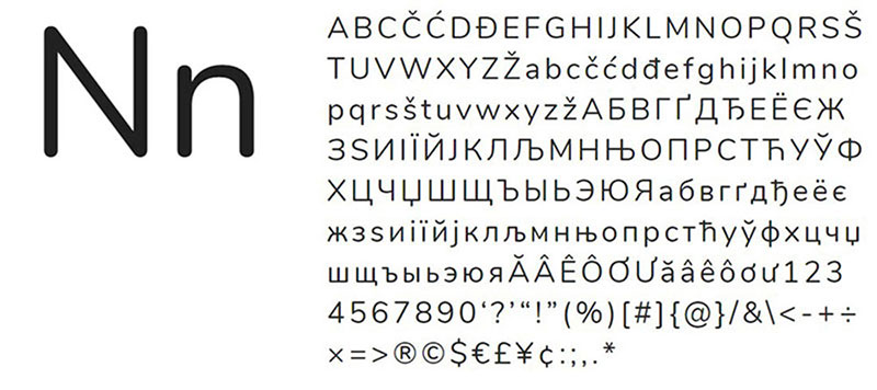
Nunito’s rounded terminals soften Lato’s already-friendly appearance. Creates an approachable, welcoming tone.
Pairing Composition
- Primary font: Lato Regular (400)
- Secondary font: Nunito SemiBold (600) / Bold (700)
- Font relationship type: Harmonious
Visual Characteristics
- Contrast level: Low to medium
- Mood: Warm and inviting
- Hierarchy clarity: Similar proportions require weight contrast for effective separation
Both fonts share humanist characteristics. The combination feels cohesive and gentle.
Best Use Cases
- Primary use: Educational platforms, children’s books
- Content type: Friendly communications, learning materials
- Industry fit: Education, healthcare, family services
Readability Attributes
- Body text size range: 16-18px
- Heading size range: 24-42px
- Optimal line height: 1.6-1.7
- Screen performance: Both render well across devices with slightly softer appearance
Accessibility Considerations
- Rounded forms reduce visual tension
- Good for extended reading sessions
- Consider using Nunito SemiBold for sufficient contrast
- Both fonts work well for younger readers
Lato and DM Serif Display
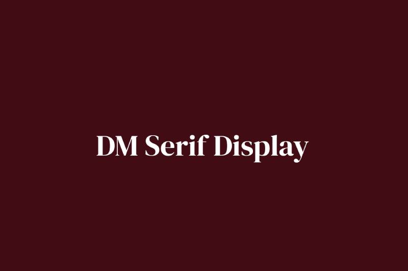
DM Serif Display brings high-contrast drama to Lato’s understated presence. This pairing makes a statement.
Pairing Composition
- Primary font: Lato Regular (400)
- Secondary font: DM Serif Display Regular (400)
- Font relationship type: Contrasting
Visual Characteristics
- Contrast level: High
- Mood: Bold and editorial
- Hierarchy clarity: DM Serif Display’s sharp serifs and high contrast create immediate visual emphasis
Best Use Cases
- Primary use: Editorial design, posters
- Content type: Display typography, headlines
- Industry fit: Publishing, fashion, arts
DM Serif Display works exclusively for large display text. Never use it below 28px.
Readability Attributes
- Body text size range: 16-18px (Lato)
- Heading size range: 36-96px (DM Serif Display)
- Optimal line height: 1.5 (Lato), 1.1-1.2 (DM Serif Display)
- Screen performance: Lato universal; DM Serif Display requires high-resolution displays
Accessibility Considerations
- Reserve DM Serif Display for display purposes only
- High contrast ratio between styles improves scannability
- Ensure adequate size for DM Serif Display (minimum 28px)
- Lato provides reliable accessibility for all text content
Lato and Libre Baskerville
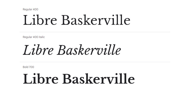
Classic Baskerville proportions meet modern web optimization. Libre Baskerville brings traditional elegance to digital spaces.
Pairing Composition
- Primary font: Lato Regular (400)
- Secondary font: Libre Baskerville Regular (400) / Bold (700)
- Font relationship type: Complementary
Visual Characteristics
- Contrast level: Medium to high
- Mood: Traditional yet accessible
- Hierarchy clarity: Baskerville’s classical proportions create formal hierarchy
Best Use Cases
- Primary use: Academic sites, professional services
- Content type: Formal documents, scholarly content
- Industry fit: Law, academia, publishing
Libre Baskerville maintains traditional design principles while being optimized for screens.
Readability Attributes
- Body text size range: 16-18px (Lato)
- Heading size range: 28-48px (Libre Baskerville)
- Optimal line height: 1.6
- Screen performance: Both perform well across screen types
Accessibility Considerations
- Strong serif structure aids character recognition
- Bold weight provides clear heading distinction
- Both fonts maintain legibility at required sizes
- Works well for longer reading sessions
Lato and PT Serif

PT Serif brings versatility through its extensive weight range. Designed specifically for universal applications.
Pairing Composition
- Primary font: Lato Regular (400)
- Secondary font: PT Serif Regular (400) / Bold (700)
- Font relationship type: Complementary
Visual Characteristics
- Contrast level: Medium
- Mood: Balanced and versatile
- Hierarchy clarity: Clear serif vs. sans distinction with compatible x-heights
Best Use Cases
- Primary use: Multi-platform publishing
- Content type: Books, magazines, digital publications
- Industry fit: Publishing, journalism, education
PT Serif adapts well to both print and digital. Equally comfortable in both contexts.
Readability Attributes
- Body text size range: 14-18px
- Heading size range: 24-44px
- Optimal line height: 1.5-1.6
- Screen performance: Designed for screen optimization while maintaining print quality
Accessibility Considerations
- Extensive language support
- Clear letterform distinction
- Works at smaller sizes than many serifs
- Good for extended reading
Lato and Work Sans
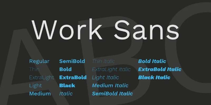
Work Sans channels early Grotesque fonts with modern optimization. Pairs with Lato to create clean, functional typography.
Pairing Composition
- Primary font: Lato Regular (400)
- Secondary font: Work Sans Medium (500) / SemiBold (600)
- Font relationship type: Harmonious
Visual Characteristics
- Contrast level: Low to medium
- Mood: Clean and utilitarian
- Hierarchy clarity: Requires weight differentiation for effective hierarchy
Best Use Cases
- Primary use: Corporate sites, technical documentation
- Content type: Professional communications
- Industry fit: Technology, corporate, government
Both fonts prioritize function over decoration. Creates serious, professional tone.
Readability Attributes
- Body text size range: 14-16px
- Heading size range: 20-36px
- Optimal line height: 1.5-1.6
- Screen performance: Optimized for both screen and print
Accessibility Considerations
- Clear, functional letterforms
- Good weight range for hierarchy
- Maintains clarity at small sizes
- Works well in dense layouts
Lato and Inter
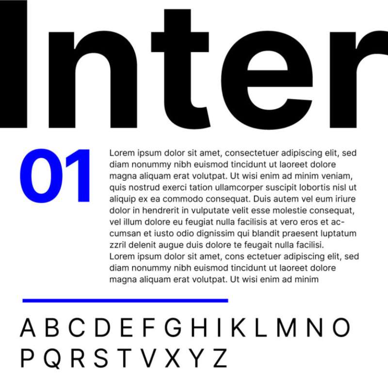
Inter was designed specifically for computer screens with tall x-height and open apertures. Pairs naturally with Lato’s digital optimization.
Pairing Composition
- Primary font: Lato Regular (400)
- Secondary font: Inter Medium (500) / SemiBold (600)
- Font relationship type: Harmonious
Visual Characteristics
- Contrast level: Low
- Mood: Technical and precise
- Hierarchy clarity: Subtle differences require careful weight selection
Best Use Cases
- Primary use: User interfaces, web applications
- Content type: UI text, dashboards
- Industry fit: Software, SaaS, digital products
Inter’s design focuses on legibility at small sizes. Perfect for interface work.
Readability Attributes
- Body text size range: 13-16px
- Heading size range: 18-32px
- Optimal line height: 1.5
- Screen performance: Both optimized for screen rendering with enhanced clarity at small sizes
Accessibility Considerations
- Variable fonts support precise weight adjustment
- Exceptional clarity at small sizes
- Open apertures improve character recognition
- Ideal for UI components and dense information
FAQ on Lato Font Pairing
What makes a good font pairing with Lato?
Good pairings balance Lato’s humanist warmth with contrasting styles. Serif fonts like Merriweather or Playfair Display create clear visual hierarchy through structural contrast.
Other sans-serifs work when weight or geometric differences provide distinction. Similar x-heights ensure cohesive typography across your design.
Can I pair Lato with another sans-serif font?
Yes, but choose carefully. Pair Lato with geometrically different sans-serifs like Montserrat or Roboto.
The key is creating enough contrast through weight, proportion, or character width. Without sufficient distinction, the pairing feels redundant and confuses typographic hierarchy.
What serif fonts pair best with Lato?
Merriweather, Lora, and Playfair Display are top choices. Merriweather offers excellent screen readability with large x-height.
Playfair Display brings high contrast for dramatic headers. Libre Baskerville provides traditional elegance while maintaining digital optimization across devices and screen sizes.
Should Lato be used for headings or body text?
Lato works beautifully for both. Its versatile weight range (100-900) supports multiple applications.
For body text, use Regular (400) at 16-18px. For headings, Bold (700) or Black (900) creates strong presence. Pair with serif fonts when using Lato for body text.
What size should Lato be for optimal readability?
Minimum 16px for body text ensures comfortable reading. Desktop displays can handle 14px, but mobile users need larger sizes.
Headings should start at 24px minimum. Line height of 1.5-1.6 improves readability significantly. Adjust based on weight and context.
Is Lato accessible for users with disabilities?
Yes. Lato meets WCAG AA standards when sized appropriately. Its clear letterforms support readers with visual impairments.
The font works well for dyslexia-friendly design due to distinct character shapes. Avoid weights below Light (300) for accessibility purposes.
How do I create hierarchy with Lato font pairings?
Use weight contrast within Lato or pair with contrasting typefaces. Bold headings with regular body text establish clear structure.
Size variation reinforces hierarchy. Combine with color and spacing adjustments. Serif headings with Lato body text work exceptionally well for editorial content.
Can Lato work for print design?
Absolutely. While optimized for screens, Lato performs well in print applications. Its sturdy structure translates effectively to paper.
Use slightly heavier weights for print than screen. Consider tracking adjustments for smaller print sizes to maintain legibility and visual clarity.
What industries commonly use Lato font pairings?
Technology companies favor Lato for its modern appeal. Education platforms use it for friendly accessibility.
Corporate sites appreciate its professional versatility. Creative agencies pair it with dramatic serifs for sophisticated branding. Works across virtually any industry requiring clean web typography.
Should I use Lato italics in my font pairing?
Use italics sparingly for emphasis or pull quotes. Lato’s italics maintain readability but shouldn’t replace regular weight for body text.
They work well for bylines, captions, or highlighting specific terms. Overuse creates visual clutter and reduces emphasis effectiveness throughout your design.
Conclusion
These Lato font pairing examples demonstrate how strategic typeface combinations solve real design problems. Each pairing balances contrast, readability, and mood to create effective visual communication.
Start with complementary typefaces that share similar x-heights but contrasting structures.
Test your combinations across devices before committing. What works on desktop might fail on mobile screens. Pay attention to weight distribution and size ratios.
Remember that successful pairing fonts requires understanding both technical performance and aesthetic balance. Consider leading, kerning, and overall grid systems in your layouts.
Your brand guidelines should document specific font combinations with size specifications and use cases. This ensures consistency across all touchpoints and maintains strong typographic hierarchy throughout your digital and print materials.

Renowned for his expertise in logo design and visual branding, Bogdan has developed a multitude of logos for various clients.
His skills extend to creating posters, vector illustrations, business cards, and brochures. Additionally, Bogdan's UI kits were featured on marketplaces like Visual Hierarchy and UI8.
He also wrote in the past years on sites like Design Your Way, WebDesignerDepot, WPDean, Designmodo, Speckyboy, Slider Revolution, and more.
- The Windsurf Logo History, Colors, Font, And Meaning - 10 October 2026
- How to Remove Background From Product Photos (No Photoshop) - 10 October 2026
- How Designers can Build a Stronger Online Creative Identity - 9 October 2026

Bogdan Sandu is a seasoned designer who has been designing websites since 2008. Renowned for his expertise in logo design and visual branding, Bogdan has developed a multitude of logos for various clients. His skills extend to creating posters, vector illustrations, business cards, and brochures. Additionally, Bogdan's UI kits were featured on marketplaces like Visual Hierarchy and UI8. He also wrote in the past years on sites like Design Your Way, WebDesignerDepot, WPDean, Designmodo, Speckyboy, Slider Revolution, and more.
You Might Also Like