Bold, mechanical, unapologetic. That’s what industrial fonts bring to the table.
Whether you’re designing a logo for a construction brand or crafting identity for a craft brewery, the best industrial fonts do the heavy lifting. They communicate strength before anyone reads a single word.
These typefaces share common DNA: thick strokes, geometric shapes, and zero fluff. Names like Bebas Neue, DIN, and Eurostile probably ring a bell.
This guide covers:
- Top free and premium industrial typefaces
- Where to download them
- How to pair them without creating visual chaos
Let’s get into it.
The Best Industrial Fonts
| Font Name | Primary Characteristics | Best Use Cases | Style Category |
|---|---|---|---|
| TT Norms Pro | Geometric sans-serif with balanced proportions, clean lines, and excellent readability across weights | Corporate branding, UI design, technical documentation | Geometric Sans |
| Facility | Wide letterforms with strong horizontal emphasis, utilitarian structure | Wayfinding signage, architectural branding, logistics | Wide Industrial |
| Burford Base | Condensed geometric sans with tight spacing, high-impact presence | Posters, headlines, brand marks requiring strong vertical emphasis | Condensed Display |
| Gliford | Robust geometric structure with industrial precision and minimal stroke variation | Manufacturing branding, engineering firms, technical presentations | Geometric Industrial |
| Industrial Sans | Straightforward sans-serif with mechanical undertones and uniform weight distribution | Factory signage, equipment labeling, industrial catalogs | Utilitarian Sans |
| Thunder | Heavy, condensed letterforms with dramatic presence and aggressive angles | Sports branding, event posters, attention-grabbing headlines | Bold Condensed |
| Typehead | Vintage industrial aesthetic with mechanical detailing and retro character | Vintage branding, craft beer labels, nostalgic design projects | Retro Industrial |
| Gasterol | Rounded terminals with friendly industrial vibe, approachable yet sturdy | Consumer product packaging, friendly tech brands, modern retail | Rounded Industrial |
| Foreman | Strong, authoritative letterforms with construction-inspired geometry | Construction companies, heavy machinery branding, safety materials | Construction Type |
| Grind | Distressed, rough texture with worn industrial character and grit | Urban streetwear, edgy branding, music industry graphics | Distressed Display |
| XHARP | Angular, sharp edges with cutting-edge technological appearance | Tech startups, gaming brands, futuristic design concepts | Angular Tech |
| Hardstage | Sturdy construction with bold presence, stage-ready visibility | Concert posters, entertainment venues, theatrical productions | Bold Display |
| Finalist Round Slab | Rounded slab serifs with industrial strength and approachable warmth | Editorial design, product branding, corporate communications | Rounded Slab |
| Uphead | Upright, tall proportions with commanding vertical presence | Architectural signage, premium branding, luxury industrial products | Tall Display |
| HK Gothic | Asian-inspired gothic sans with modern industrial refinement | International branding, multilingual projects, modern Asian design | Gothic Sans |
| Gore | Dark, aggressive styling with dramatic industrial edge | Horror branding, extreme sports, alternative music graphics | Dark Display |
| Frankerd | Bold geometric structure with distinctive character and industrial solidity | Logo design, packaging, distinctive brand identities | Geometric Bold |
| KARBONIS | Carbon-fiber inspired aesthetic with sleek technical appearance | Automotive branding, high-tech products, performance gear | Technical Modern |
| Zwizz | Energetic, dynamic forms with motion-inspired industrial character | Energy brands, fast-paced industries, dynamic marketing materials | Dynamic Display |
| Morgan | Refined industrial serif with heritage character and authoritative presence | Financial institutions, established brands, luxury industrial design | Industrial Serif |
| Höchstadt | German-inspired industrial precision with clean, orderly construction | Engineering firms, precision manufacturing, technical publications | Precision Industrial |
| Union | Labor-inspired design with solidarity and strength in letterforms | Worker-focused brands, community organizations, social campaigns | Labor Industrial |
| Antic | Simple, classic industrial sans with timeless straightforward design | Universal signage, educational materials, accessible design | Classic Industrial |
| Sputnik | Space-age industrial design with retro-futuristic geometric forms | Retro tech branding, science museums, vintage space themes | Retro-Futurist |
| TT Rationalist | Rationalist approach with systematic construction and logical proportions | Scientific publications, data visualization, analytical platforms | Rationalist Sans |
| TT Slabs | Industrial slab serif family with mechanical precision and versatility | Print publications, editorial design, versatile branding systems | Industrial Slab |
| Boston Traffic | Urban, utilitarian design inspired by transportation signage systems | Transit systems, urban planning materials, city infrastructure | Transit Industrial |
| Knucklehead | Rugged, tough character with motorcycle-inspired industrial aesthetic | Motorcycle brands, garage culture, masculine product branding | Rugged Display |
| Ache | Raw, unpolished industrial character with authentic weathered appearance | Authentic brands, artisanal products, raw industrial aesthetics | Raw Industrial |
TT Norms Pro
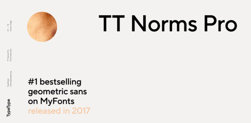
A geometric sans serif from TypeType foundry, designed by Ivan Gladkikh and released in 2016. This has become the corporate typeface for ASUS, AliExpress, DreamWorks, and Doordash.
It’s basically the workhorse everyone reaches for when they need something that looks clean but has enough personality to matter.
Technical Specifications
- Family type: Geometric sans serif
- Weights: 104 styles total (44 uprights, 44 italics, 2 variable fonts)
- Widths: Classic, Compact, Condensed, Expanded, plus Mono
- Character set: 2,564 glyphs per style
- Language support: 290+ languages including Arabic, Cyrillic, Greek
- Formats: OTF, TTF, WOFF, variable font
Visual Characteristics
The letterforms sit on a clean baseline with perfect optical precision. Proportions stay consistent across weights.
Alternate characters exist for G, M, Q, and several numerals. Twenty stylistic sets give you options for slashed zeros and branched leg forms.
Neutral enough for body text. Aesthetic enough for headlines.
Industrial Design Applications
Works across manufacturing branding, technical documentation, and product interfaces. The automotive industry loves it. So does banking.
Screen rendering is exceptional. Print holds up at any DPI.
Readability Context
High legibility at small sizes due to generous x-height. The condensed widths excel in space-constrained environments like machinery labeling and dashboard interfaces.
Works equally well for web design and print design.
Pairing Recommendations
Pair with TT Norms Pro Serif for contrast. The Mono variant handles code blocks and technical specs.
For typographic hierarchy, use bold weights for headlines and regular for running text.
Licensing & Availability
Commercial license required. Available on MyFonts, Adobe Fonts, and directly from TypeType. Trial versions free for testing.
Facility
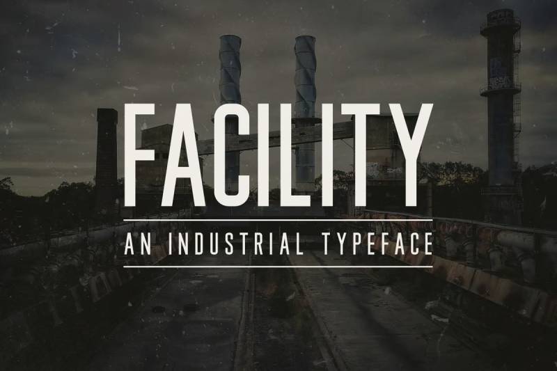
A tall, condensed sans-serif font from Medialoot, designed by Tony Thomas. Released in 2018. Takes direct inspiration from factory signage and warehouse typography.
Not your typical aggressive industrial typeface. The subtle rounded corners soften everything just enough.
Technical Specifications
- Family type: Condensed sans serif
- Weights: Single weight
- Character set: Full uppercase, lowercase, numbers 0-9, common symbols
- Language support: Extensive Western European coverage
- Formats: OTF, TTF
Visual Characteristics
Tall narrow proportions create strong vertical emphasis. Uniform stroke widths throughout.
The rounded corners are subtle. You almost miss them. But they prevent that harsh, cold feeling you get from pure geometric industrials.
Clean lines. High uniformity. Makes a statement without yelling.
Industrial Design Applications
Headlines and signage are the sweet spot. Works for construction company branding, warehouse graphics, and transport labeling.
The condensed proportions let you fit more text into tight horizontal spaces. Useful for machinery labels and technical packaging.
Readability Context
Easy to read despite the condensed structure. Best at medium to large sizes for headlines and display font applications.
Not ideal for body text or extended reading.
Pairing Recommendations
Combine with a geometric sans for body text. The condensed proportions create natural contrast with standard-width fonts.
Licensing & Availability
Available through Medialoot. Check their license terms for commercial use.
Burford Base
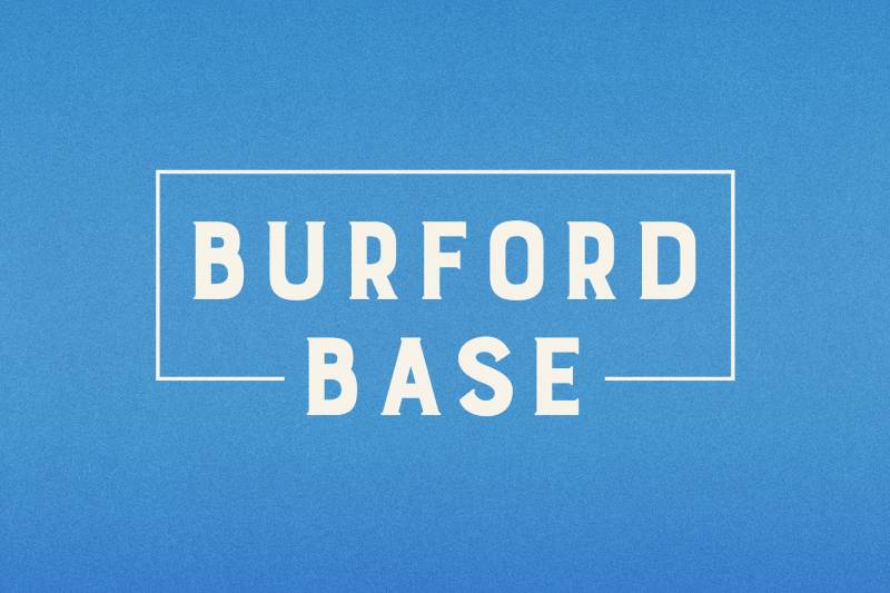
A layer-based display font designed by Kimmy Kirkwood of Kimmy Design. Sketched during travels through Europe, later digitized from drawings made in Amsterdam’s Vondel Park.
The whole concept revolves around stacking layers. You build textures and effects by combining multiple font files.
Technical Specifications
- Family type: Display serif (layer-based system)
- Styles: 18 layering fonts total
- Layers: 5 base, 3 top, 5 bottom, 2 graphic element sets
- Stylistic alternates: Available for A, C, E, F, G, H, P, Q, R
- Language support: Latin, Cyrillic, Greek
- Formats: OTF, TTF
Visual Characteristics
Heavy, bold letterforms with a distinctive 1920s retro feel. The serif font structure provides that classic industrial era aesthetic.
Layer options include: Basic, Dots, DropShadow, Extrude, Inline, Line, Marquee, Outline, Stripes.
Each layer stacks precisely with the others. The geometric construction ensures perfect alignment.
Industrial Design Applications
Perfect for vintage industrial branding. Packaging design benefits from the layered texture options.
The Extras sets (100+ elements each) include banners, borders, corners, arrows, and catchwords that complement industrial themes.
Works for poster design, product labels, and retro manufacturing aesthetics.
Readability Context
Designed for display use at large sizes. The layering effects reduce legibility at small sizes.
Headlines and logo work are the primary applications.
Pairing Recommendations
Use Burford Basic when layering isn’t needed. Pair with a clean sans serif for body text to create strong visual hierarchy.
Licensing & Availability
Commercial font. Pro package includes all 18 layers. Basic package (13 fonts) available for users without layering capabilities.
Available on MyFonts, FontSpring, and Kimmy Design.
Gliford
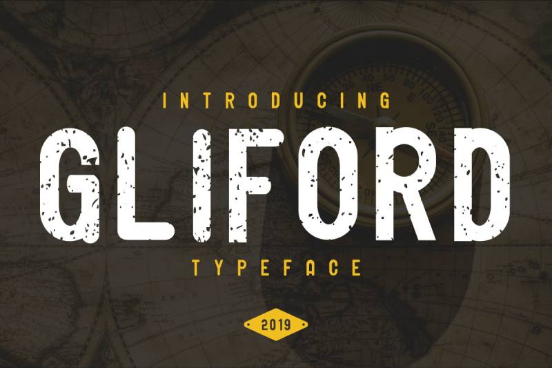
A bold sans serif from Edric Studio with retro-vintage origins. Comes in Regular, Grunge, and Italic styles. Initially conceived as vintage, but the application range turned out much wider.
You get three personalities in one family.
Technical Specifications
- Family type: Bold sans serif
- Styles: Regular, Grunge, Italic
- Formats: OTF, TTF, WOFF
- Character set: Full Latin alphabet, numerals, punctuation
Visual Characteristics
Strong, severe letterforms with substantial weight. The Regular version stays clean and geometric.
Grunge adds worn texture for that industrial weathered look. Italic brings motion and style.
The heavy strokes work well for creating a focal point in layouts.
Industrial Design Applications
Handles gaming, adventure, outdoor apparel, and manufacturing branding. The Grunge variant particularly suits rugged industrial applications.
Poster work, flyer design, and logo creation all benefit from the bold character.
Fonts for t-shirts and merchandise work well with this typeface.
Readability Context
Best at medium to large display sizes. The bold weight maintains legibility but limits body text applications.
Print performs better than screen for the Grunge variant.
Pairing Recommendations
Match with lighter weight sans serifs for body content. The boldness needs breathing room.
Licensing & Availability
Demo version free for personal use. Commercial license required for business applications.
Purchase through Edric Studio directly.
Industrial Sans
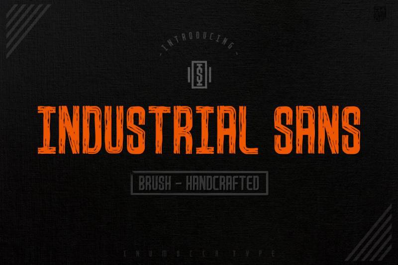
A contemporary geometric sans serif from Unio Creative Solutions. The name says it all. Three weights plus obliques, designed with optical precision as the core principle.
Took me a while to find this one, but it delivers exactly what it promises.
Technical Specifications
- Family type: Geometric sans serif
- Weights: Light, Regular, Bold (plus obliques for each)
- Styles: 6 total
- Character set: 450+ characters
- Language support: Latin, Greek, Central/Eastern European
- OpenType features: Standard and discretionary ligatures
- Formats: OTF
Visual Characteristics
Geometry drives every glyph decision. Proportions maintain continuity across the entire family.
Clean, functional appearance without decorative elements. The design prioritizes versatility and readability.
Stroke weights stay consistent within each style.
Industrial Design Applications
Headlines, logos, corporate identity, technical documentation. The geometric foundation suits engineering graphics and manufacturing contexts.
Works for warehouse signage and technical specifications alike.
Recommended for brand guidelines requiring a modern industrial aesthetic.
Readability Context
Functional at both small and large sizes. The geometric precision aids legibility across applications.
Screen optimization is solid. Print holds detail well.
Pairing Recommendations
The three weights create natural internal hierarchy. Bold for headlines, Regular for subheads, Light for body text.
Pair with a contrasting slab serif font for added variety.
Licensing & Availability
Commercial font available on Envato Elements and FontSpring.
Thunder
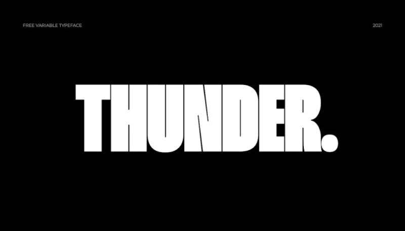
A condensed typeface designed by Rajesh Rajput. Offers 36 styles with two contrast levels. Also available as a variable font. Released 2021.
Free for personal and commercial use. Yeah, really.
Technical Specifications
- Family type: Condensed sans serif
- Styles: 36 (including high contrast variants)
- Weights: 18 weights plus italic versions
- Variable font: Supports weight axis
- Formats: TTF, OTF
Visual Characteristics
Sharp edges define the character. Strong vertical emphasis with proportional contrast between strokes.
The condensed structure creates tall, narrow letterforms. High contrast versions add drama.
Angular terminals give it that industrial edge.
Industrial Design Applications
Branding, fonts for posters, magazines, websites, mobile apps. The versatility comes from having so many weight options.
Works across packaging, film titles, and advertising headlines.
Manufacturing and automotive contexts suit the bold character well.
Readability Context
Display sizes are optimal. The condensed proportions limit small text applications.
Both screen and print perform well. The sharp edges stay crisp.
Pairing Recommendations
Use lighter weights for supporting text. The variable font allows fine-tuning font spacing and weight relationships.
Pairing fonts with a rounded sans serif creates nice contrast.
Licensing & Availability
Free for personal and commercial use. Download from Gumroad (pay what you want) or Behance.
Typehead
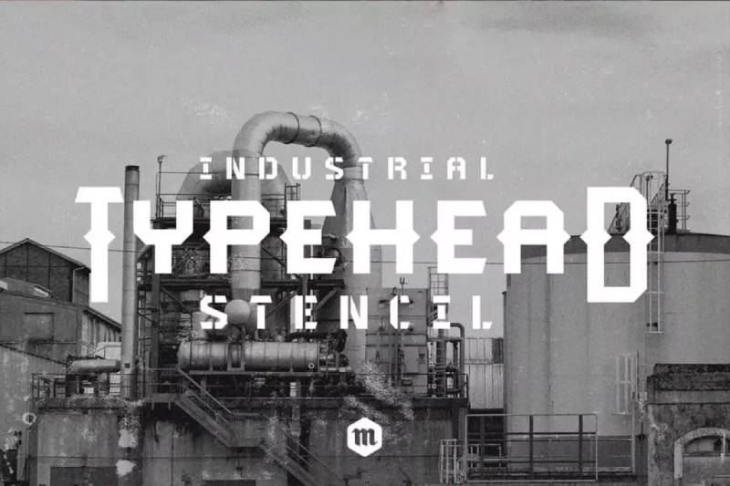
A bold industrial stencil typeface from Headfonts. Four fonts in the family: Regular, Deco, and stencil versions of each.
The geometric edges and spiky crossbars make this unmistakably industrial.
Technical Specifications
- Family type: Industrial sans serif / stencil
- Styles: 4 (Regular, Deco, Regular Stencil, Deco Stencil)
- Character set: 252 glyphs per style
- Uppercase and lowercase: Yes
- Language support: Extensive Latin script
- Formats: OTF
Visual Characteristics
Hard, full-bodied letterforms with geometric edges. The spiky crossbars add distinctive character.
Stencil versions offer industrial manufacturing aesthetics. The Deco variants add calligraphic flourishes.
Strong, thick strokes create powerful visual impact.
Industrial Design Applications
Titles requiring impact. Creative industrial designs. Military and construction contexts.
The stencil options suit warehouse signage, crate labeling, and utilitarian applications.
Works for fonts for flyers with industrial themes.
Readability Context
Display font optimized for headlines. Not suitable for body text.
High legibility at large sizes due to bold construction.
Pairing Recommendations
Pair with clean geometric sans serifs for body content. The stencil versions need simpler companions.
Licensing & Availability
Available on Envato Elements and Creative Market. Free version available for testing.
Gasterol
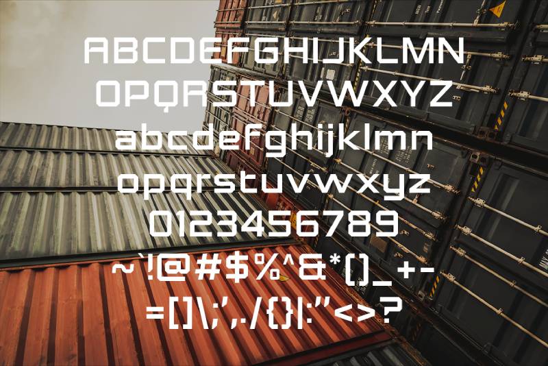
An industrial steel display font from Konstantine Studio. Designed to evoke shipping containers and harbor infrastructure.
Built for brands that demand attention. Not for the subtle approach.
Technical Specifications
- Family type: Industrial display sans serif
- Character set: Full Latin alphabet
- Formats: OTF, TTF
Visual Characteristics
Tough, weathered aesthetic. Heavy, blocky letterforms with industrial character.
The design references shipping containers and steel construction. Angular forms dominate.
Creates immediate visual authority.
Industrial Design Applications
Industrial manufacturing branding. Military applications. Automotive companies.
Works for heavy machinery graphics and construction signage.
Best suited for contexts requiring bold, uncompromising typography.
Readability Context
Large display sizes only. The heavy weight limits smaller applications.
Creates strong emphasis in headline contexts.
Pairing Recommendations
Requires lighter companion fonts for balance. Geometric sans serifs work well.
Licensing & Availability
Commercial font. Available on Envato Elements and Konstantine Studio.
Foreman

A vintage display font from Medialoot, inspired by industrial factory posters from the 1920s. Big, bold, condensed letterforms built for maximum impact.
All caps only. Makes a statement without apology.
Technical Specifications
- Family type: Condensed display serif
- Weights: Bold (free), Regular and Light (premium)
- Character set: Uppercase letters, numbers 0-9, common symbols
- Formats: OTF, TTF
Visual Characteristics
Strong vertical emphasis with hard geometric lines. The design echoes Art Deco movement aesthetics from the 1930s and 1940s.
Blocky, uniform character construction. Consistent stroke widths throughout.
Industrial Design Applications
Headlines, signage, and branding materials. The vintage industrial aesthetic suits manufacturing, construction, and retro-themed projects.
Works well for poster design and product labeling.
Licensing & Availability
Free Bold version with attribution. Premium package for commercial use without attribution.
Available through Medialoot.
Grind
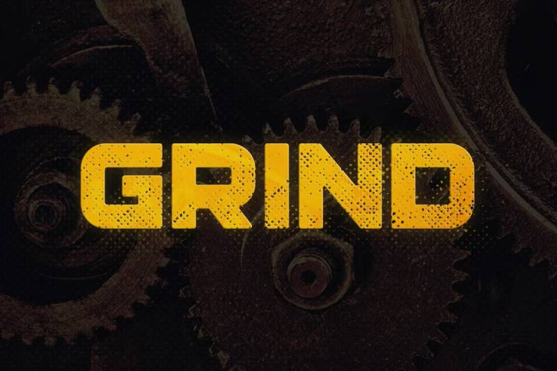
A bold display typeface from Tugcu Design Co. Designed with strength and toughness as the core principles. Inspired by industrial era signage and billboards.
Four distinct styles give you options.
Technical Specifications
- Family type: Display sans serif
- Styles: Simple, Demolished, Halftone, Timber
- Character set: Letters, numbers, punctuation
- Language support: Multilingual
- Formats: OTF, TTF
Visual Characteristics
Big, heavy letterforms. The Simple style offers clean edges. Demolished adds worn texture.
Halftone creates dot pattern effects. Timber brings wood grain texture.
Strong industrial presence across all variants.
Industrial Design Applications
Signs, logos, headlines. The textured styles work for vintage manufacturing aesthetics.
Gaming, sports, and machinery branding benefit from the powerful presence.
Licensing & Availability
Commercial license available. Purchase through Creative Market, Font Bundles, or Tugcu Design.
XHARP
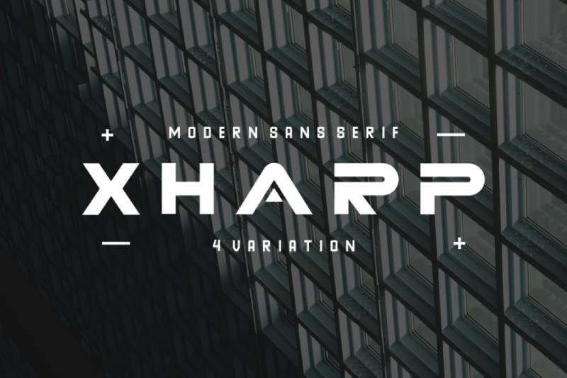
A futuristic modern font from Edric Studio. Four styles: Regular, 3D, Gradient, and Laser. Sans serif family with industrial undertones.
Built for technology and creative industries.
Technical Specifications
- Family type: Futuristic sans serif
- Styles: 4 (Regular, 3D, Gradient, Laser)
- Character set: 475+ characters with OpenType features
- Formats: OTF, TTF
Visual Characteristics
Bold geometric shapes with sharp angles. Consistent stroke width creates uniform appearance.
The 3D and Gradient styles add depth and visual interest.
All straight edges. Minimal curves.
Industrial Design Applications
Technology branding, sci-fi themes, modern advertising. Digital interfaces and futuristic product design.
Works for signage, flyers, and brochures in tech contexts.
Licensing & Availability
Demo free for personal use. Commercial license required for business applications.
Purchase through Edric Studio.
Hardstage
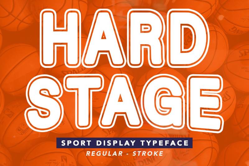
An industrial display font by aarleykaiven. Inspired by bold things and stiff, industrial aesthetics.
Creates contrast and visual impact.
Technical Specifications
- Family type: Display sans serif
- Formats: TTF
- Style: Single weight
Visual Characteristics
Bold, thick letterforms with strong industrial character. Designed to look stiff and powerful.
Creates immediate visual authority.
Industrial Design Applications
Poster design, album art, logo creation. Modern industrial branding.
Works across manufacturing, construction, and technical contexts.
Licensing & Availability
Available on Envato Elements and GraphicRiver.
Finalist Round Slab
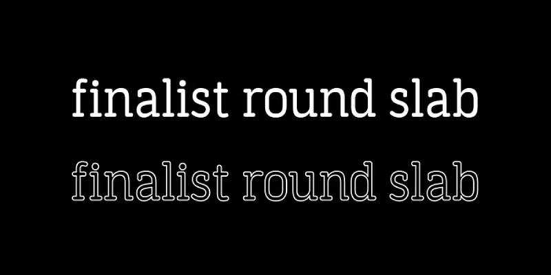
A geometric slab serif designed by Bülent Yüksel. Started development in 2014. Strong body with simple geometrical surface.
The slightly rounded corners keep it readable without losing power.
Technical Specifications
- Family type: Slab serif
- Weights: 7 (Thin to Black)
- Styles: 14 total (uprights and italics)
- Character set: 450+ characters
- OpenType features: Case-sensitive forms, fractions, old style figures
- Language support: Multilingual (European Latin)
- Formats: OTF, TTF
Visual Characteristics
Clear geometrical letterforms with slab serifs. Delicate rounding on corners softens the industrial edge.
Maintains strong presence while remaining approachable. Works in headlines and text blocks.
Industrial Design Applications
Websites, print, motion graphics, logo design, packaging design.
The range of weights supports complete typographic hierarchy needs.
Readability Context
Strong personality at headline sizes. Still works gracefully in text blocks.
The rounded edges improve legibility at all sizes.
Licensing & Availability
Commercial font. Available on MyFonts and FontSpring.
Uphead
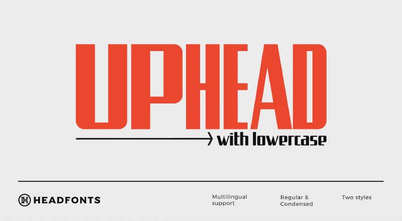
An industrial sans serif from Headfonts. Inspired by Eastern European street signs. Balances hard lines with smooth curves.
Sharp and tight. Makes an impression.
Technical Specifications
- Family type: Industrial sans serif
- Styles: 2 (Regular, Condensed)
- Character set: Full A-Z, numerals, punctuation
- Language support: Extensive Latin script
- Formats: OTF
Visual Characteristics
Strong appearance with modern touches. Hard lines balanced by controlled curves.
Maintains industrial character without being aggressive. Clean, readable construction.
Industrial Design Applications
Logo design, headers, block text. The condensed version works for space-constrained applications.
Technical documentation and engineering contexts suit this typeface well.
Licensing & Availability
Available on Envato Elements and Creative Market.
HK Gothic
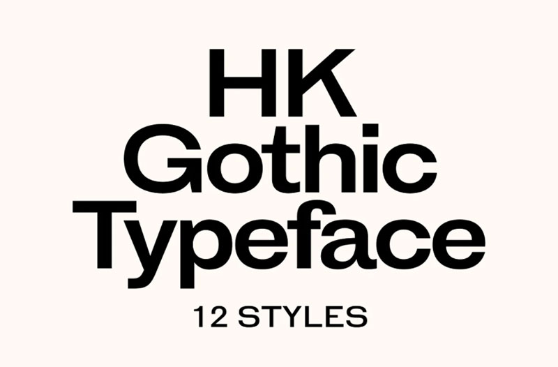
A sans serif inspired by early American Gothic typefaces. Designed by Alfredo Marco Pradil, released through Hanken Design Co. in 2017.
Wide letterforms with a large x-height.
Technical Specifications
- Family type: Gothic sans serif
- Weights: 6 (Light to Black)
- Styles: 12 (uprights and italics)
- Formats: OTF, TTF, WOFF, WOFF2
Visual Characteristics
Wide proportions create strong horizontal presence. Large x-height improves readability.
The early American Gothic influence shows in the sturdy, no-nonsense construction.
Industrial Design Applications
Works across technical documentation, branding, and editorial design.
The weight range supports complete hierarchy systems.
Licensing & Availability
Commercial font from Hanken Design Co.
Gore
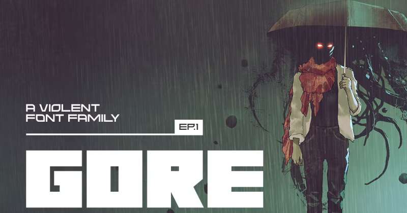
A bold display font from Tugcu Design Co. No curves anywhere. Aggressive, angular construction.
Great for titles. Pairs well with sans serifs and scripts.
Technical Specifications
- Family type: Display sans serif
- Styles: 2 (Regular, Rough)
- Character set: Multilingual uppercase letters, numbers, punctuation
- Formats: OTF, TTF
Visual Characteristics
Big, strong letterforms built entirely from straight lines. Zero curves.
The Rough version adds texture for worn, industrial aesthetics.
Angular forms create immediate visual impact.
Industrial Design Applications
Horror, sci-fi, thriller projects. Industrial manufacturing branding.
Book covers, movie posters, gaming graphics, album artwork.
Licensing & Availability
Free demo for personal use. Commercial license through Creative Market and Font Bundles.
Frankerd
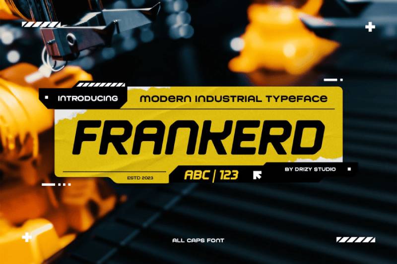
A modern industrial font from Drizy Studio. Blends contemporary aesthetics with mechanical edge.
Strikes a balance between sophistication and industrial strength.
Technical Specifications
- Family type: Industrial sans serif
- Character set: Full alphabet, punctuation, numbers
- Features: Multilingual support, alternates, ligatures
- Formats: OTF, TTF
Visual Characteristics
Clean, somewhat mechanical character construction. Modern appeal with industrial foundation.
Works across multiple applications without looking out of place.
Industrial Design Applications
Branding, advertising, product packaging, signage.
Fonts for flyers and promotional materials.
Licensing & Availability
Demo free for personal use. Commercial license through Envato Elements.
KARBONIS
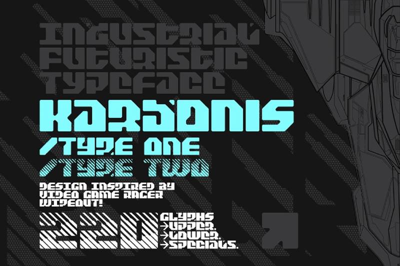
A futuristic industrial display font. Sharp, angular letterforms with technological aesthetics.
Technical Specifications
- Family type: Futuristic display
- Style: Single weight
- Formats: OTF, TTF
Visual Characteristics
Angular construction with sci-fi industrial feel. Strong geometric foundation.
Creates technological, mechanical presence.
Industrial Design Applications
Tech branding, futuristic manufacturing, gaming graphics.
Works for aerospace and automotive contexts.
Zwizz
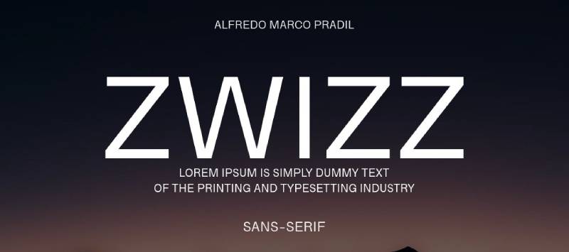
A modern geometric sans serif with industrial undertones.
Clean construction for contemporary applications.
Technical Specifications
- Family type: Geometric sans serif
- Formats: OTF, TTF
Visual Characteristics
Balanced proportions with geometric precision. Modern, clean appearance.
Industrial Design Applications
Corporate branding, technical documentation, modern industrial contexts.
Morgan
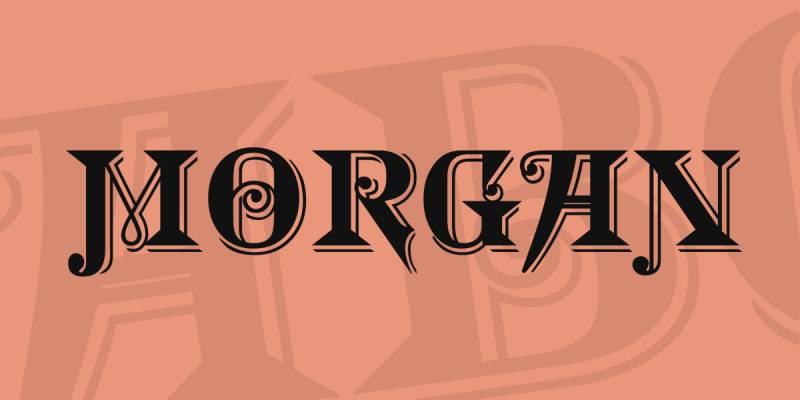
A display typeface with industrial character.
Strong presence for headline applications.
Technical Specifications
- Family type: Display sans serif
- Formats: OTF, TTF
Visual Characteristics
Bold construction with defined industrial aesthetic.
Industrial Design Applications
Headlines, logos, branding materials.
Höchstadt
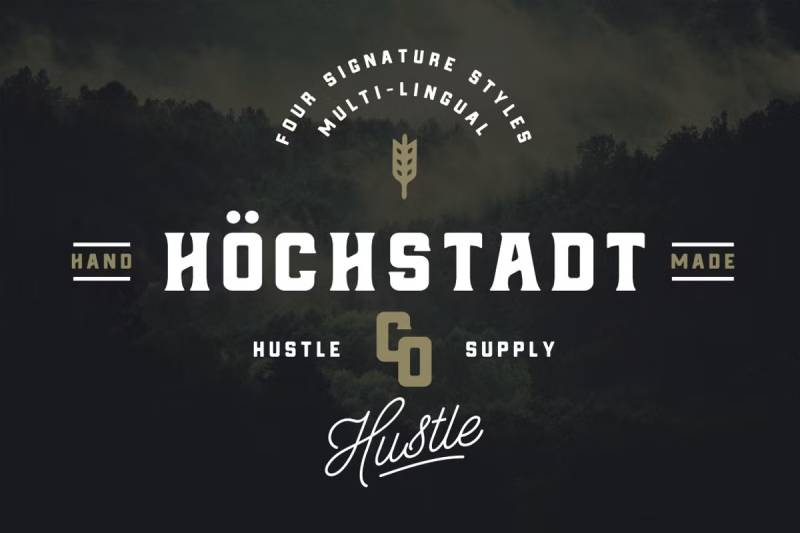
A German-influenced industrial typeface.
Reflects precision and technical excellence.
Technical Specifications
- Family type: Industrial display
- Formats: OTF, TTF
Visual Characteristics
Precise construction reflecting German engineering aesthetics. Clean, functional appearance.
Industrial Design Applications
Technical documentation, engineering graphics, precision manufacturing branding.
Union
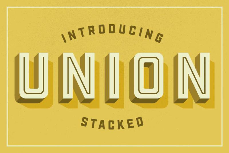
A heavy distressed title font with four weights. Industrial strength with vintage texture.
Technical Specifications
- Family type: Distressed display
- Weights: 4
- Formats: OTF, TTF
Visual Characteristics
Bold, distressed letterforms. The weathered texture adds industrial character.
Strong visual presence for headline applications.
Industrial Design Applications
Headlines, title designs, vintage industrial branding.
The distressed style suits manufacturing and construction contexts.
Antic
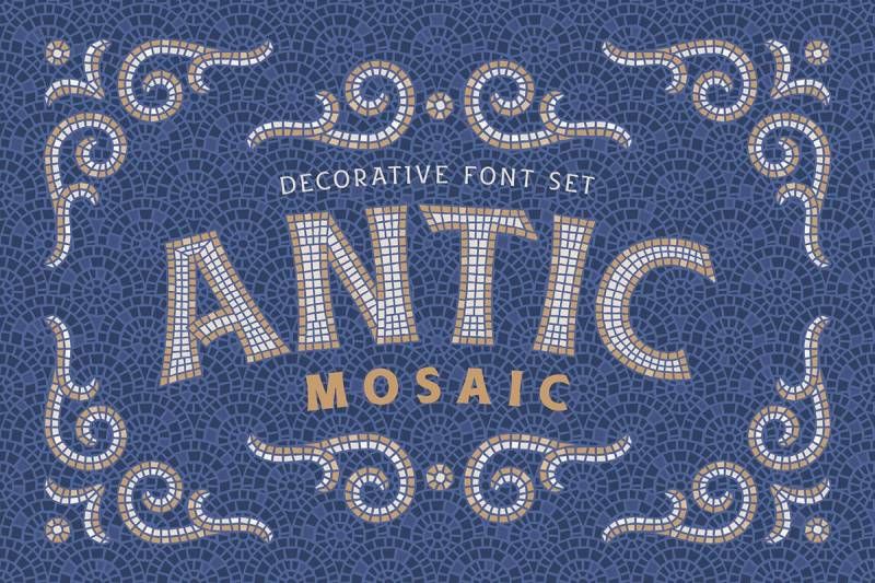
A bold, big display font. Industrial era inspired with strong presence.
Makes statements through size and weight.
Technical Specifications
- Family type: Display sans serif
- Formats: OTF, TTF
Visual Characteristics
Bold, substantial letterforms. Big presence without unnecessary decoration.
Industrial Design Applications
Headlines, signage, bold branding applications.
Sputnik
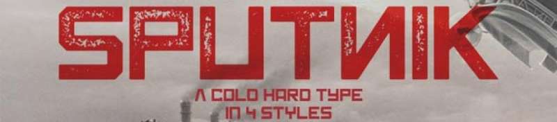
An industrial sci-fi font family from Tugcu Design Co. Inspired by Soviet propaganda posters.
Toggle Caps Lock for alternate characters. Comes in 4 styles.
Technical Specifications
- Family type: Industrial display
- Styles: 4 (Regular, Rough, and variants)
- Character set: Uppercase letters with alternates, numbers, punctuation
- Formats: OTF, TTF
Visual Characteristics
Wide, blocky letterforms with Constructivism influence. Cold, industrial aesthetic.
The Rough versions add texture for vintage applications.
Looks particularly good in red. Obviously.
Industrial Design Applications
Propaganda-style posters, vintage industrial branding, cold war themed projects.
Works for poster design and retro manufacturing aesthetics.
Licensing & Availability
Commercial license through Creative Market and Font Bundles.
TT Rationalist

A contemporary slab serif from TypeType. Designed to complement TT Norms Pro and TT Commons Pro.
Functional and original. Modern take on the slab serif form.
Technical Specifications
- Family type: Slab serif
- Styles: 22 (10 uprights, 10 italics, 2 variable fonts)
- Character set: 950+ glyphs per style
- Language support: 200+ languages
- OpenType features: 27 features including small caps, stylistic sets
- Formats: OTF, TTF, variable
Visual Characteristics
Trapezoidal serifs instead of traditional rectangular slabs. This gives modern appearance.
Avoids the “Wild West” historical associations common in slab serifs.
Works for headlines and text arrays equally well.
Industrial Design Applications
Publishing, magazines, brochures. Headlines on posters.
Pairs with TT Norms Pro and TT Commons Pro for complete brand systems.
Licensing & Availability
Commercial font from TypeType. Available on MyFonts and TypeType.org.
TT Slabs
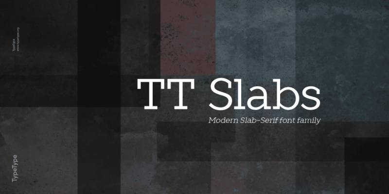
A versatile slab serif from TypeType with wide proportions. Designed by Ivan Gladkikh.
Simple, geometric, high-quality. Released 2014.
Technical Specifications
- Family type: Slab serif
- Weights: 5 (Thin to Black)
- Styles: 10 (uprights and italics)
- OpenType features: Case-sensitive forms, fractions, numerators, denominators
- Formats: OTF, TTF
Visual Characteristics
Geometric character with classic slab serifs. Wide proportions create stable appearance.
The condensed version (TT Slabs Condensed) available separately for text-heavy applications.
Industrial Design Applications
Food packaging, household appliances packaging, newspapers, magazines.
Signs, theatrical scenery, logos, interior design, shop decoration.
Optimized for websites, mobile apps, and print.
Licensing & Availability
Trial version free for testing. Commercial license from TypeType.
Boston Traffic
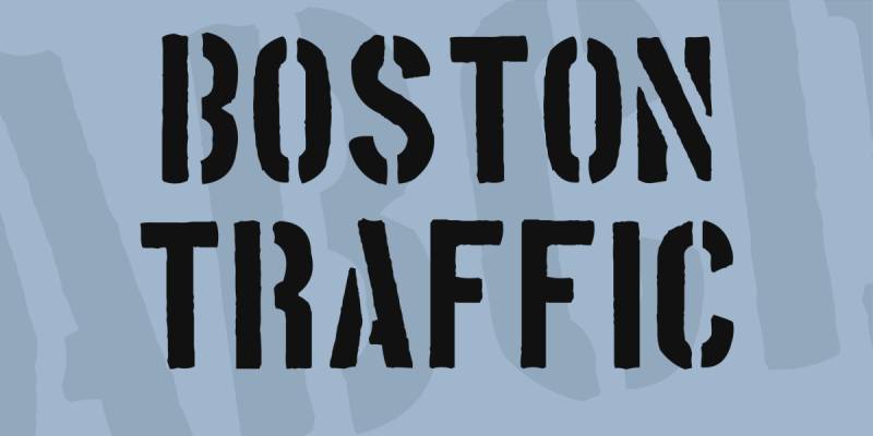
A stencil industrial font designed by Vic Fieger. Released 2004. Over 800,000 downloads on DaFont.
Rugged, industrial, military aesthetic.
Technical Specifications
- Family type: Stencil display
- Style: Single weight
- Character set: 247 characters
- Formats: TTF
Visual Characteristics
Bold stencil design with distressed texture. Cut-out sections create classic military/industrial look.
All caps construction. Strong, angular lines.
Industrial Design Applications
Urban-themed designs, posters, signage, branding.
Military, construction, and transportation contexts.
Licensing & Availability
Freeware. Free for personal and commercial use.
Available on DaFont, Font Squirrel, and numerous other sources.
Knucklehead
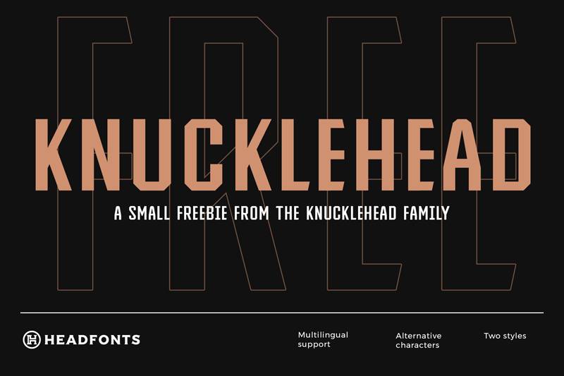
A vintage Western font family from Headfonts. Inspired by American Western culture.
Traditional yet modern. Four subfamilies: Sans, Serif, Deco, Slab.
Technical Specifications
- Family type: Display (Sans, Serif, Deco, Slab variants)
- Weights: 5 per subfamily (Light to Ultra Black)
- Character set: Uppercase, lowercase, multilingual support, symbols, numbers
- Features: Alternative characters, PUA encoded
- Formats: OTF, TTF
Visual Characteristics
Vintage Western touch with industrial strength. Each subfamily offers different character.
Sans for clean applications. Serif for traditional. Slab for industrial weight.
Industrial Design Applications
Logos, posters, fonts for wedding invitations with rustic themes.
Works for manufacturing branding with vintage American aesthetic.
Licensing & Availability
Free Regular version. Premium family on Creative Market and Envato Elements.
Ache
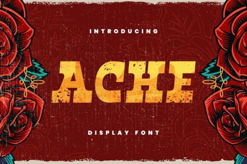
A vintage industrial font with bold presence. Multiple weights available.
Clear, bold aesthetic ideal for headlines.
Technical Specifications
- Family type: Display
- Weights: Light, Regular, Bold (15 variations total)
- Formats: TTF, OTF
Visual Characteristics
Vintage industrial feel. Bold, clear letterforms.
The free Bold version delivers strong visual impact.
Industrial Design Applications
Headlines, branding, product packaging.
Works for retro industrial themes and manufacturing contexts.
Licensing & Availability
Bold version free. Premium package for additional weights.
FAQ on The Best Industrial Fonts
What defines an industrial font?
Industrial fonts feature bold weights, geometric shapes, and mechanical aesthetics. Think thick strokes, condensed letterforms, and angular edges.
They’re inspired by factory signage, blueprint lettering, and engineering documents. No decorative frills here.
Which industrial fonts are free to download?
Bebas Neue, Oswald, and Barlow Condensed top the list. All three are available on Google Fonts.
Archivo Black and Big Shoulders Display also work great. Free, versatile, and ready for commercial projects.
What’s the best industrial font for logos?
DIN remains a classic choice. It’s clean, authoritative, and scales beautifully.
Eurostile and Bank Gothic also perform well for brand identity work. They look sharp at any size.
Can I use industrial fonts for web design?
Absolutely. Most popular options like Roboto Condensed and Fjalla One are web fonts optimized for screen display.
Just watch your font spacing at smaller sizes. Condensed styles need breathing room.
How do I pair industrial fonts effectively?
Contrast is key. Match a bold industrial display font with a neutral sans-serif font for body text.
Bebas Neue pairs well with Open Sans. Trade Gothic with Helvetica. Simple combinations work best.
Are industrial fonts good for packaging?
They’re perfect for it. The heavy weight and utilitarian style communicate durability and authenticity.
Craft breweries, tool companies, and outdoor brands use them constantly. They read well on shelves too.
What’s the difference between industrial and grunge fonts?
Industrial fonts stay clean and precise. Grunge fonts add distressed textures, rough edges, and weathered effects.
Some designers combine both for a vintage machinery look. Different tools, different purposes.
Where can I buy premium industrial typefaces?
MyFonts, Adobe Fonts, and Fontspring carry extensive collections. Creative Market and Envato Elements offer subscription access.
Check font licensing terms carefully. Commercial use requires the right license.
Which industrial fonts have multiple weights?
Industry, Knockout, and Trade Gothic offer large font families. You get thin to black weights plus condensed variations.
Variable fonts like Barlow give you infinite weight options in one file.
Do industrial fonts work for print materials?
Yes. They handle poster design and print design beautifully.
High DPI output keeps those crisp edges intact. Bold industrial typefaces command attention on any printed surface.
Conclusion
Finding the best industrial fonts comes down to matching style with purpose. Your project dictates everything.
For headlines and signage, heavy weights like Knockout and Impact deliver maximum contrast. For packaging design, Franklin Gothic and Akzidenz Grotesk bring that utilitarian edge without sacrificing readability.
Don’t overlook typography fundamentals. Proper kerning and tracking adjustments make condensed typefaces breathe.
The real trick? Understanding font psychology. Industrial typefaces signal strength and reliability. That’s why construction firms, automotive brands, and manufacturing companies reach for them.
Start with free options from Google Fonts or Font Squirrel. Upgrade to premium font families when budgets allow. Either way, bold mechanical typography elements will anchor your designs with authority.

Renowned for his expertise in logo design and visual branding, Bogdan has developed a multitude of logos for various clients.
His skills extend to creating posters, vector illustrations, business cards, and brochures. Additionally, Bogdan's UI kits were featured on marketplaces like Visual Hierarchy and UI8.
He also wrote in the past years on sites like Design Your Way, WebDesignerDepot, WPDean, Designmodo, Speckyboy, Slider Revolution, and more.
- The Windsurf Logo History, Colors, Font, And Meaning - 10 October 2026
- How to Remove Background From Product Photos (No Photoshop) - 10 October 2026
- How Designers can Build a Stronger Online Creative Identity - 9 October 2026

Bogdan Sandu is a seasoned designer who has been designing websites since 2008. Renowned for his expertise in logo design and visual branding, Bogdan has developed a multitude of logos for various clients. His skills extend to creating posters, vector illustrations, business cards, and brochures. Additionally, Bogdan's UI kits were featured on marketplaces like Visual Hierarchy and UI8. He also wrote in the past years on sites like Design Your Way, WebDesignerDepot, WPDean, Designmodo, Speckyboy, Slider Revolution, and more.
You Might Also Like