Users judge your website in 50 milliseconds. In that fraction of a second, the focal point of your design either captures attention or loses it completely.
So why is a focal point essential to a design? Because it controls where the eye goes first, what the viewer remembers, and whether they take action. Without one, every element on the page competes at the same volume. Nothing stands out. Nothing communicates.
This article breaks down how focal points work at a perceptual level, the techniques that create them, and how to test whether yours is actually doing its job. You’ll also see the real data behind why designs with clear focal dominance consistently outperform those without.
What Is a Focal Point in Design

A focal point is the specific area in a composition that grabs the viewer’s attention first. It’s the entry point. The thing your eyes lock onto before anything else registers.
Every layout, every poster, every interface has one (or should). Without it, the viewer’s gaze just floats around with no anchor. And that’s a problem I’ve seen kill otherwise solid designs more times than I can count.
The concept goes back centuries. Leonardo da Vinci used converging lines in The Last Supper to pull your eye straight to Christ’s head. That’s a focal point built into the architecture of the painting itself. The technique hasn’t changed much since then, only the medium has.
But here’s where people get confused. A focal point is not the same as emphasis. Emphasis is a broader principle. A focal point is its most concentrated expression. One specific spot where visual weight, contrast, or isolation directs attention.
It works differently depending on the discipline, too.
In poster design, the focal point is usually a single dominant image or headline. In photography, it might be a face or an object placed along the rule of thirds. In UI/UX, it’s typically a call-to-action button or a hero section that tells you what the page is about within seconds.
Lindgaard et al.’s research found that users form visual appeal judgments about a website in just 50 milliseconds. That’s faster than a blink. If your focal point doesn’t land in that window, you’ve already lost the viewer’s first impression.
Focal Point vs. Emphasis vs. Visual Weight
These three terms get tossed around like they mean the same thing. They don’t.
Visual weight refers to how much an element “pulls” attention based on its size, color, density, or position. A large red circle has more visual weight than a small gray one.
Emphasis is the design principle that makes certain elements stand out from the rest. You can create emphasis through scale and proportion, color, or placement.
Focal point is the result. It’s the single area where emphasis and visual weight converge to create the strongest point of attraction. Think of it as the bullseye.
| Term | What It Does | How It Works |
|---|---|---|
| Visual weight | Creates perceived heaviness | Size, color density, texture |
| Emphasis | Makes elements stand out | Contrast, isolation, scale |
| Focal point | Directs first attention | Combination of weight + emphasis |
How Focal Points Control Where People Look

Your eyes don’t just wander randomly across a design. They follow predictable paths, and focal points are what trigger those paths in the first place.
Nielsen Norman Group’s landmark 2006 eye-tracking study with 232 participants across thousands of web pages identified the F-pattern: users read horizontally across the top, then drop down and read a shorter horizontal line, then scan vertically down the left side. The focal point at the top of the page initiates that entire sequence.
A follow-up study confirmed the same pattern holds true today. But here’s the catch. The F-pattern is actually a failure state. It shows up when pages lack clear visual hierarchy and strong focal anchors. Well-structured pages with clear headings produce what Nielsen Norman Group calls a “layer-cake” pattern, where users actually read each section.
That distinction matters a lot.
Saccadic Movement and Pre-Attentive Processing
The science behind this is rooted in how our eyes physically move. We don’t scan smoothly. Our eyes jump in rapid, jerky motions called saccades, landing on fixation points for roughly 200 to 300 milliseconds each.
Focal points act as fixation magnets. When something in the visual field has high contrast, unusual scale, or strong isolation from surrounding elements, the brain flags it before conscious thought kicks in. This is called pre-attentive processing.
A 2024 PMC study on eye-tracking in design evaluation confirmed that eye-tracking technology captures gaze patterns in real-time, giving objective data on which design elements attract attention and which get ignored. The study reviewed 30 papers and found consistent evidence that contrast and spatial positioning are the two strongest predictors of where fixation lands first.
How Gestalt Principles Support Focal Point Perception
The figure-ground relationship is the foundation here. Your brain automatically separates what’s in front (the figure) from what’s behind (the ground). A focal point works because it registers as the figure.
Research from Emplifi shows that 49% of consumers abandon brands because of poor user experience. Gestalt principles like proximity, similarity, and closure either reinforce or compete with a focal point. When they work together, the composition feels intuitive. When they fight each other, the viewer’s attention fragments.
Look at the FedEx logo. The hidden arrow between the E and the x works because of closure. Your brain completes the shape. The WWF panda uses figure-ground to make the black shapes read as a complete animal against white space. Both are focal point strategies built on perceptual psychology, not decoration.
What Happens When a Design Has No Focal Point

Everything competes. Nothing wins.
That’s the short version. When a layout lacks a clear focal point, you get what some designers call visual entropy. Every element screams at the same volume, and the viewer’s eye bounces around with no landing spot. The result? People leave.
Forrester Research found that a well-designed user experience can boost conversion rates by up to 400%. Flip that around. A confusing layout with no clear focus actively pushes people away. VWO data shows that removing a navigation bar from a landing page (giving one CTA all the attention) doubled signups from 3% to 6% for Yuppiechef.
The Billboard Test
Quick way to check your design: blur your eyes or step back from the screen. Can you still tell what the main message is? If not, your focal point is either missing or buried under visual noise.
This is basically a low-tech version of what Hotjar and Crazy Egg do with heatmaps. Those tools show you exactly where people look and click. But the squint test is free and takes two seconds.
Real-World Failure Patterns
Apple’s product pages are the textbook example of focal clarity. One product. One hero image. One action. Compare that to the average early-2000s website, crammed with banner ads, animated GIFs, and three competing navigation bars. The difference isn’t just aesthetic. It’s functional.
A 2025 study by MindFeeder found that CTAs placed prominently above the fold get 304% more clicks than those buried below it. That’s the direct cost of a missing or misplaced focal point. Not “slightly lower engagement.” Three hundred percent less clicks.
According to Forbes, 94% of first impressions are design-related. If your focal point doesn’t communicate the core message within the first few seconds, your layout is already working against you.
Focal Point and Visual Hierarchy Are Not the Same Thing

People mix these up constantly. And honestly, it’s an easy mistake to make because they’re deeply connected. But they serve different roles in a composition.
Visual hierarchy is the full ordering system. It tells the viewer what to look at first, second, third, and so on. It’s the entire sequence of attention across a page or layout.
The focal point is just the first step. It’s the entry door into that hierarchy.
A design can have a strong hierarchy but a weak focal point. Took me a while to wrap my head around that one. Picture a well-organized dashboard with clear sections and typographic hierarchy, but no single element that grabs you first. You know the information is structured, but you don’t know where to start. That’s a hierarchy problem masked as a focal point problem.
The “First Read” Concept
Josef Müller-Brockmann’s grid systems gave designers a framework for organizing content into predictable structures. But even within a perfectly gridded layout, something has to break the pattern just enough to say “start here.”
That’s the first read. And it’s what the focal point provides.
Nielsen Norman Group’s eye-tracking data confirms this. Users spend an average of less than a minute on a page and read roughly 20% to 28% of the text. The focal point determines which 20% that will be. If the first read fails, the rest of your carefully structured hierarchy never gets seen.
| Concept | Role | Scope |
|---|---|---|
| Focal point | Entry point for attention | Single area |
| Visual hierarchy | Full attention sequence | Entire composition |
| First read | Initial engagement moment | First 1–3 seconds |
Techniques That Create Strong Focal Points

There are specific, repeatable methods for building focal points. None of them are mysterious. Most come down to making one thing different from everything else around it.
The Von Restorff effect, identified in 1933 by Hedwig von Restorff, explains why this works at a cognitive level. When multiple similar items are presented together, the one that differs is most likely to be remembered. That’s the psychological engine behind every focal point technique.
Color as the Most Immediate Focal Tool
Color contrast is the fastest way to create a focal point. Your brain processes color differences before it processes shape or text. That’s pre-attentive processing doing its job.
HubSpot tested green versus red CTA buttons on a client site and found that the red button increased conversions by 21%. But the real lesson isn’t “use red.” It’s that the red button had higher contrast against the page’s existing color palette, making it the focal point.
Adobe’s research indicates that high-contrast buttons improve CTA visibility by 50% on design-heavy sites.
Warm colors (reds, oranges, yellows) tend to advance visually, while cool colors (blues, greens) recede. That’s why a warm-toned CTA on a cool-toned layout creates an almost automatic focal point. The psychology of color isn’t just about mood. It’s about spatial perception and attention capture.
Understanding color theory helps you pick combinations that maximize this effect. A complementary color scheme naturally creates high contrast because the colors sit on opposite sides of the color wheel.
How Typography Creates Focal Dominance
Type scale is one of the most underused focal tools. A headline set at 48px next to body text at 16px creates an immediate size contrast that pulls the eye. But size alone isn’t enough.
Weight matters too. A bold sans-serif heading against light body copy creates two levels of contrast at once: weight and style. Add color contrast to the mix and you’ve got a triple-layer focal point.
Display fonts work especially well as focal anchors in poster and editorial layouts because they’re designed to be looked at, not read in long passages. That’s their entire purpose.
The interplay between typographic focal points and image-based ones is tricky, though. If both your headline and your hero image compete at the same visual weight, neither functions as a true focal point. One has to win. Your mileage may vary on which one to prioritize, but for landing pages, I’ve generally seen the headline work harder than the image.
Spatial Techniques
Negative space and isolation are probably the cleanest focal techniques. Pull an element away from everything else, surround it with breathing room, and the eye goes straight there. No color tricks needed.
Leading lines and directional cues add another layer. Photographs where a person’s gaze points toward a CTA literally guide the viewer’s eye along that path. Framing works similarly, using surrounding elements to box in the focal area.
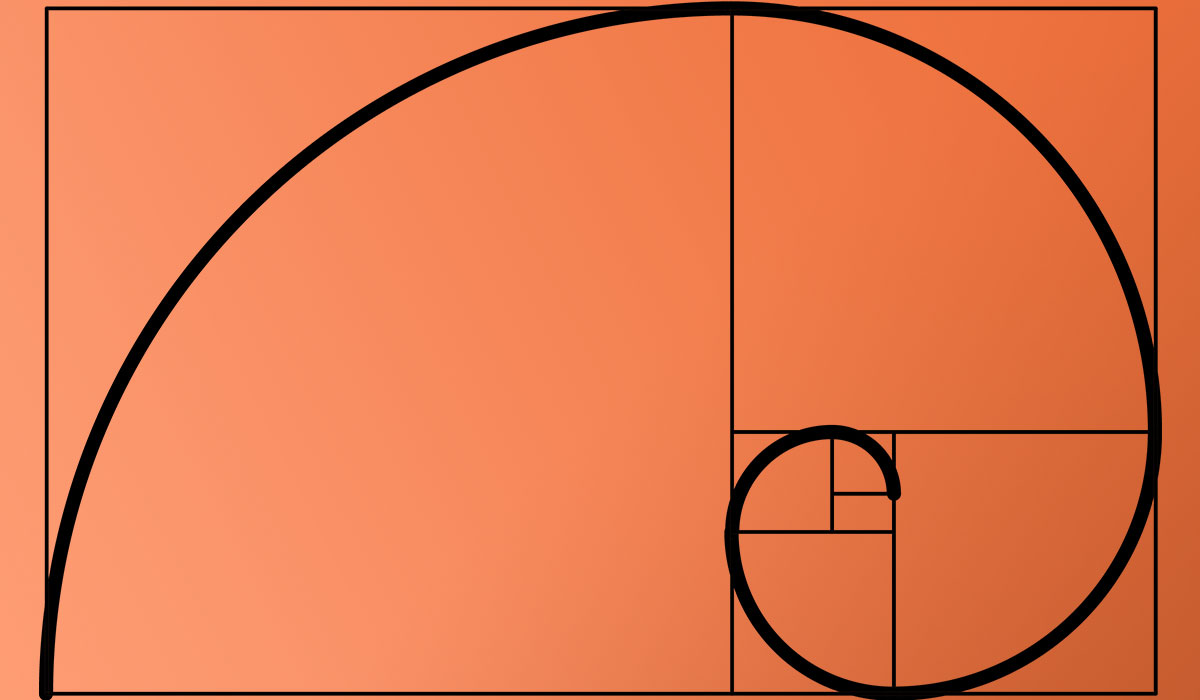
Placement based on the golden ratio or rule of thirds puts focal elements at natural resting points where the eye expects to find something interesting. These aren’t arbitrary aesthetic choices. They’re rooted in how human perception organizes spatial information.
Focal Points in Digital Interfaces vs. Print Design

Print is fixed. What you see is the entire composition, all at once. The focal point has one job: grab attention in a static frame.
Digital changes everything.
Screens scroll. Elements animate. Layouts shift across breakpoints. The focal point has to survive all of that and still work. That’s a much harder problem than most people realize.
Above-the-Fold Strategy
The concept of “above the fold” comes from newspapers, where the top half of the front page had to sell the paper. In web design, it means the content visible before scrolling.
Research consistently backs this up. CTAs above the fold receive significantly more engagement than those below. That first visible section is where your focal point needs to land, because most users decide within 3 to 5 seconds whether to stay or leave.
Google’s Material Design guidelines and Apple’s Human Interface Guidelines both stress the concept of visual priority in initial viewport content. They don’t use the term “focal point” explicitly, but the principle is identical: the most important action or message should be visually dominant in the first screen the user sees.
Motion and Animation as Focal Tools
Here’s something print can’t do. A subtle animation, a micro-interaction, a loading state that draws the eye. Motion graphics add a temporal dimension to focal point design that static layouts simply don’t have.
But there’s a trap. Too much motion creates the same problem as too many static focal points. Everything moves, nothing stands out. The best digital focal points use motion sparingly, as an accent rather than a constant.
Responsive Design Challenges
A focal point that works beautifully on a 27-inch desktop monitor might completely fall apart on a 5-inch phone screen. The hero image gets cropped. The headline wraps awkwardly. The CTA slides below the fold.
This is one of the trickiest parts of modern design. Your focal point has to be resolution-independent and layout-flexible. That usually means building focal dominance through contrast and hierarchy rather than relying on fixed positioning, since position is the first thing that changes across breakpoints.
VWO reports that around 62% of top-ranking websites on Google are optimized for mobile. If your focal point strategy only works on desktop, you’re missing the majority of your audience.
How Multiple Focal Points Work in Complex Compositions

Not every design needs a single focal point. Some layouts need two, three, or even more. The question is whether those multiple points of interest work together or tear each other apart.
Smashing Magazine’s breakdown of dominance and hierarchy describes this as a three-tier system: dominant, sub-dominant, and subordinate. The dominant element gets the highest visual weight. Sub-dominant elements (your secondary focal points) get less. Everything else recedes into the background.
Primary, Secondary, and Tertiary Focal Points
Primary: The element that grabs attention first. Biggest contrast, most visual weight.
Secondary: Where the eye goes next. Supports or expands on the primary message.
Tertiary: The third stop. Usually contextual details or supporting information.
This sequence creates a visual path. Your eye doesn’t just land somewhere and stay there. It moves. And the order of that movement determines how much of the design actually gets processed.
When Multiple Focal Points Fragment a Design
Backlinko’s landing page research found that pages written at a 5th to 7th grade reading level convert at 11.1% versus 5.3% for college-level copy. The same principle applies to visual complexity. Simpler compositions with fewer competing focal points consistently outperform cluttered ones.
Bloomberg Businessweek’s editorial layouts are a good example of managed multi-focal design. Their spreads use rhythm and clear size hierarchy to guide the reader through multiple images and text blocks without losing coherence.
Dashboard design is where this gets really tricky. A data dashboard might have six or seven panels, each demanding attention. Without clear focal ranking (which panel matters most right now?), users just stare at the screen and absorb nothing.
| Focal Structure | Best For | Risk |
|---|---|---|
| Single focal point | Landing pages, ads, posters | Can feel too simple for complex content |
| Dual focal points | Editorial spreads, product pages | Competition between the two |
| Multi-focal system | Dashboards, magazines | Visual fragmentation if not ranked |
Focal Point as a Communication Tool, Not Just a Visual One
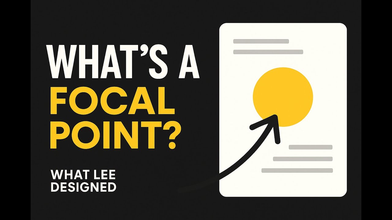
This is the part that gets overlooked the most. A focal point isn’t just about making something look good. It decides what the viewer remembers and, more critically, what they do next.
Firework data shows that well-optimized landing pages can see up to a 220% boost in conversion rates compared to generic web pages. That boost comes largely from clarity of focus, one message, one action, one visual anchor.
Focal Points and Conversion
Unbounce’s Q4 2024 analysis of 41,000 landing pages with 464 million visitors found a median conversion rate of 6.6%. The top performers hitting 15%+ all shared a common trait: a single, unmistakable focal point tied directly to the call to action.
That’s not a coincidence. When the focal point and the desired user action align, the design does the selling. When they don’t (like when a beautiful hero image steals attention from the signup form), conversion drops.
Mailmodo tested changing their CTA copy from “Book a Demo” to “Talk to a Human” and saw a 110% increase in conversions. But the copy change only worked because the button was already the visual focal point of the page. Good words on an invisible button accomplish nothing.
How Focal Points Reflect Brand Hierarchy
What you choose to make the focal point tells people what your brand cares about.
Apple puts the product front and center. Always. The product IS the focal point. That communicates confidence in what they’re selling without a single word of explanation.
Compare that to a landing page that leads with a stock photo of smiling people. The focal point says “we’re friendly.” But it doesn’t say what the product does or why anyone should care. The gap between “what looks good” and “what communicates clearly” is where most designs fail.
A brand guidelines document should define not just colors and typography, but focal point hierarchy, which element gets priority in every layout. Without that, every designer on the team will make different choices about what matters most, and the brand’s visual identity fractures.
Testing Whether Your Focal Point Actually Works
You can’t just assume your focal point is doing its job. You have to test it. And there are both quick, free methods and professional tools for this.
Nielsen Norman Group found that heatmaps can identify areas of interest on a website with 88% accuracy. That’s more effective than traditional usability testing methods alone for spotting where attention actually lands versus where you designed it to land.
Quick Validation Methods
The squint test: Blur your vision or squint at the screen. Whatever element you still recognize first is your focal point. If it’s not the one you intended, your hierarchy needs work.
The blur test: Apply a Gaussian blur in Photoshop or Figma. Same concept, just more precise. The areas with highest saturation and contrast will survive the blur. Everything else disappears.
Both take under a minute. Both catch problems that you’d otherwise need a full user test to find.
Professional Testing Tools
| Tool | What It Does | Best For |
|---|---|---|
| Hotjar | Click and scroll heatmaps | Live site behavior analysis |
| Crazy Egg | Click maps, confetti reports | Identifying dead zones |
| Lyssna (formerly UsabilityHub) | Five-second tests | First-impression validation |
| Attention Insight | AI-predicted attention maps | Pre-launch design review |
Involve.me reports that 88% of online consumers are less likely to return after a poor landing page experience. Testing focal point effectiveness before launch is cheaper than losing those visitors after.
Common Failure Patterns
After running tests across dozens of layouts over the years, the same problems keep showing up.
Decorative focal point: The prettiest element gets all the visual weight, but it’s not connected to the page’s purpose. A gorgeous illustration that nobody clicks doesn’t serve the design.
Contradictory focal point: The focal point pulls attention toward one message, but the CTA asks for a completely different action. Like a hero image about “community” above a button that says “Buy Now.” The two stories don’t match.
Ghost focal point: No single element dominates. The viewer’s eye wanders. Nothing registers. This is the most common issue with committee-designed pages where every stakeholder insisted their section “needs to pop.”
HubSpot data shows that A/B testing can increase website conversion rates by up to 300%. Most of those gains come from fixing exactly these kinds of focal point failures, making the right thing visible and removing what competes with it.
FAQ on Why Is Focal Point Essential To A Design
What is a focal point in design?
A focal point is the area in a composition that draws the viewer’s attention first. It’s created through contrast, scale, color, or isolation. Every effective layout uses one to guide where people look before anything else.
Why is a focal point important in graphic design?
Without a focal point, all elements compete equally. The viewer’s eye wanders with no direction. A clear focal point creates visual order, communicates the main message fast, and keeps people engaged instead of confused.
How do you create a focal point in a design?
Use contrast in color, size, or shape. Isolate the element with negative space. Apply leading lines or directional cues. The Von Restorff effect confirms that the item that differs from its surroundings gets remembered.
Can a design have more than one focal point?
Yes, but they need clear ranking. A primary focal point captures attention first, then secondary and tertiary points guide the eye in sequence. Without hierarchy between them, multiple focal points create visual fragmentation.
What is the difference between focal point and visual hierarchy?
A focal point is the single entry point for attention. Visual hierarchy is the full ordering system that sequences where the eye travels after that first landing. One is the door. The other is the hallway.
How does a focal point affect user experience on websites?
It determines whether visitors understand your page within seconds. Research shows users form opinions in 50 milliseconds. A strong focal point tied to your call to action directly improves engagement and conversion rates.
What role does color play in creating a focal point?
Color contrast is the fastest way to attract attention. Warm colors advance visually while cool colors recede. A bold CTA button in a contrasting hue against a muted background becomes an automatic focal point.
How do Gestalt principles relate to focal points?
The figure-ground relationship is the foundation. Your brain separates what’s in front from what’s behind. Principles like proximity, similarity, and closure either reinforce a focal point or compete with it depending on how they’re applied.
What happens when a design lacks a focal point?
Everything fights for attention and nothing wins. Users bounce faster, engagement drops, and conversion suffers. Forrester research shows that a well-designed experience can boost conversion rates by up to 400%. The opposite is equally true.
How do you test if your focal point is working?
Use the squint test or apply a blur filter in your design tool. Whatever element remains visible is your focal point. For data-driven validation, tools like Hotjar and Crazy Egg provide heatmaps showing where users actually look.
Conclusion
Understanding why a focal point is essential to a design comes down to one thing: control. Control over where the viewer looks, what they process first, and whether they act on what they see.
Every technique covered here, from color contrast and typographic weight to spatial isolation and the Von Restorff effect, serves that same goal. Direct the eye. Deliver the message. Remove the noise.
The data backs this up consistently. Layouts with clear visual dominance outperform scattered compositions in engagement, recall, and conversion. That’s true across landing pages, editorial spreads, packaging, and user interfaces.
Test your designs with the squint test or heatmap tools before launch. Build focal hierarchy into your brand system. And when in doubt, simplify.
A strong focal point doesn’t just make a design look better. It makes the design work.

Renowned for his expertise in logo design and visual branding, Bogdan has developed a multitude of logos for various clients.
His skills extend to creating posters, vector illustrations, business cards, and brochures. Additionally, Bogdan's UI kits were featured on marketplaces like Visual Hierarchy and UI8.
He also wrote in the past years on sites like Design Your Way, WebDesignerDepot, WPDean, Designmodo, Speckyboy, Slider Revolution, and more.
- From Mockup to Code: How AI-Augmented Development Speeds Up the Design Handoff - 19 September 2026
- The Beehiiv Logo History, Colors, Font, And Meaning - 18 September 2026
- Why Small Teams Wait Too Long to Bring On Specialist Engineers - 17 September 2026

Bogdan Sandu is a seasoned designer who has been designing websites since 2008. Renowned for his expertise in logo design and visual branding, Bogdan has developed a multitude of logos for various clients. His skills extend to creating posters, vector illustrations, business cards, and brochures. Additionally, Bogdan's UI kits were featured on marketplaces like Visual Hierarchy and UI8. He also wrote in the past years on sites like Design Your Way, WebDesignerDepot, WPDean, Designmodo, Speckyboy, Slider Revolution, and more.
You Might Also Like