

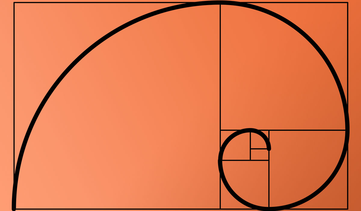
The number 1.618 has shaped buildings, logos, and screen layouts for over two thousand years. The golden ratio in design is a proportional system rooted in the Fibonacci sequence, and it keeps showing up because it produces compositions that feel right without anyone being able to explain exactly why.
But here’s the thing. Not everything you have heard about phi is true.
This guide breaks down how the golden ratio actually works in typography, layout, logo construction, and UI spacing. It covers the real math behind phi, the scientific research for and against it, and the practical tools that make applying it to your projects straightforward.
What Is the Golden Ratio in Design

The golden ratio is a mathematical proportion of approximately 1:1.618, represented by the Greek letter phi (φ). When you divide a line into two parts so that the longer part divided by the shorter part equals the whole length divided by the longer part, you get this ratio.
It comes from the Fibonacci sequence, where each number is the sum of the two before it: 0, 1, 1, 2, 3, 5, 8, 13, 21, 34. As the numbers grow, the ratio between consecutive values gets closer and closer to 1.618.
Designers use phi to determine spacing, sizing, and composition. It shows up in layouts, logos, type systems, and grid structures. The ratio gives a framework for making decisions about visual proportion that feel natural rather than forced.
Stanford University research found that 94% of first impressions are related to design, and those judgments form within 50 milliseconds. Proportion plays a direct role in that snap decision. Phi is one tool (not the only one) for getting those proportions right.
The Math Behind Phi
The formula is straightforward: A/B = (A+B)/A = 1.618033987.
If length A is 100 pixels, then length B would be 161.8 pixels. You can keep nesting these proportions infinitely, and each new rectangle maintains the same ratio. That self-similar quality is what makes the golden rectangle useful for layout work.
As noted by the Nielsen Norman Group, the human eye processes images built with this ratio more quickly. The proportion creates a visual path that feels intuitive to scan.
Golden Ratio vs. Rule of Thirds
These two get mixed up constantly. They are related but not the same thing.
| Feature | Golden Ratio | Rule of Thirds |
|---|---|---|
| Division | 61.8% / 38.2% | 33.3% / 33.3% / 33.3% |
| Origin | Fibonacci sequence, Euclid | Photography composition |
| Precision | Mathematically specific | Rough guideline |
| Best for | Layouts, logos, type scales | Photo cropping, quick composition |
The rule of thirds splits a frame into nine equal sections. The golden ratio creates an asymmetric split that’s slightly off-center. Both guide focal point placement, but the golden ratio provides tighter mathematical relationships between elements.
Look, for quick photo crops, the rule of thirds works fine. But when you are building an entire layout system or defining a type scale, the golden ratio gives you a proportional backbone that the rule of thirds just cannot match.
Where the Golden Ratio Appears in Nature and Architecture

Phi shows up in places you would never expect. Sunflower seed heads arrange themselves in spirals that follow Fibonacci numbers. Nautilus shells grow in logarithmic spirals tied to phi. Hurricane formations, pinecone patterns, even the branching of trees.
That presence in nature is part of why the ratio resonates visually. Our brains are tuned to recognize these patterns, whether we are conscious of it or not.
Classical Architecture and Phi
The Parthenon in Athens is the most cited example. Art historians have drawn golden rectangles over its facade, and the proportions of the columns, entablature, and pediment align closely with 1:1.618.
The Great Pyramid of Giza has a similar claim. The ratio of its slant height to half its base is approximately phi. Whether the Egyptian builders knew about this proportion or stumbled into it is still debated.
Notre-Dame Cathedral in Paris displays golden ratio relationships in the placement of its rose windows relative to the overall facade height. These aren’t coincidences across so many structures built centuries apart.
Took me a while to accept that some of these claims are genuinely disputed, though. Not every “golden ratio in architecture” overlay you see online holds up under scrutiny. Some are retrofitted by enthusiasts who stretch the lines to make things fit.
Le Corbusier’s Modulor System
Le Corbusier took this further than anyone. In 1945, he created the Modulor, a proportional system that married the golden ratio with human body measurements.
The system used a 1.83-meter man with arm raised to 2.26 meters as the standard figure. The height of the navel divided by total height approximated phi. From there, Le Corbusier generated two measurement series (red and blue) segmented by the golden ratio, producing dimensions like 113cm, 70cm, and 43cm.
He applied Modulor to everything. The Unité d’Habitation in Marseille was built entirely around these proportions, from apartment dimensions to furniture sizing. When he presented Modulor to Albert Einstein in 1946, Einstein reportedly said it was “a scale of proportions which makes the bad difficult and the good easy.”
Fair criticism: the Modulor assumed a single male body type. Most contemporary designers pair phi-based systems with broader anthropometric data to serve diverse users. But the core idea, that proportional systems rooted in phi produce visual harmony, remains influential across design movements and disciplines.
The Golden Rectangle and Golden Spiral
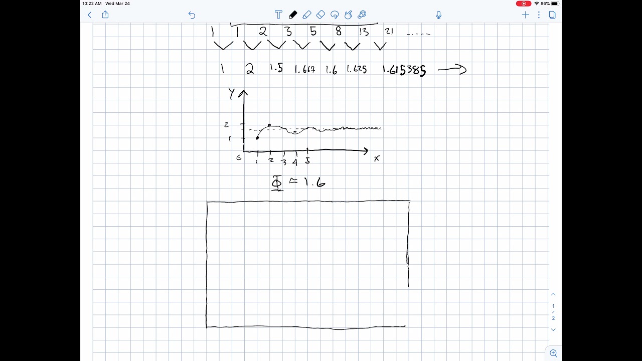
A golden rectangle has sides in the ratio 1:1.618. Remove a perfect square from one end, and the remaining shape is another golden rectangle. You can keep doing this forever, each time getting a smaller version with identical proportions.
Connect the corners of those nested squares with a curve, and you get the golden spiral. It is a logarithmic spiral that appears constantly in natural forms and has become one of the most recognized compositional tools in design.
How to Build a Golden Rectangle
Step 1: Draw a square.
Step 2: Find the midpoint of the square’s base.
Step 3: Draw an arc from that midpoint to the opposite top corner of the square.
Step 4: Extend the base to where the arc lands. That new length is your golden rectangle’s width.
The relationship between the square and the extension is exactly phi. This construction method dates back to Euclid, around 300 BCE. It’s been used the same way for over 2,300 years.
Practical Applications for Designers
The golden spiral is not just a pretty shape. It tells you where a viewer’s eye wants to land.
Photographers overlay the spiral when cropping images, placing the tightest part of the spiral on the subject’s face or the most important detail. The curve draws attention from the outer edges toward the focal area along a path that feels natural.
In layout work, the golden rectangle defines content blocks. A 960-pixel layout divided by 1.618 gives roughly 593 pixels for content and 367 pixels for a sidebar. That split looks clean without either column feeling too cramped or too wide.
Tools that generate these overlays are built into most professional software. Figma has plugins like GoldenRATIO and Golden Section. Photoshop lets you apply golden spiral crop overlays directly. The math is handled for you.
The Nielsen Norman Group recommends using the golden spiral for image composition in UI design, specifically for placing key design elements where users naturally look first.
Golden Ratio in Logo Design
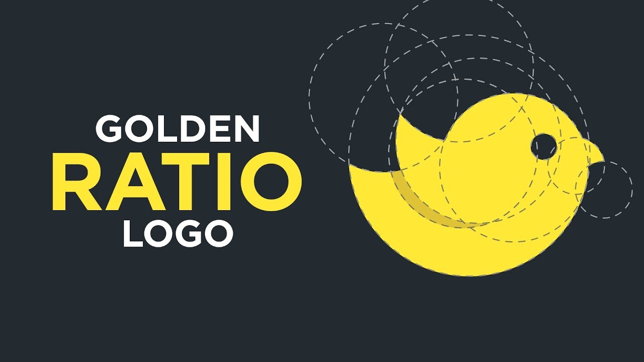
Every designer has seen those overlay diagrams. Circles and arcs drawn over the Apple logo, the old Twitter bird, the Pepsi globe. Fibonacci circles perfectly aligned with every curve.
Here is what most articles will not tell you: a lot of those overlays are applied after the logo was designed.
Real Examples vs. Retroactive Justification
Inkbot Design calls it “post-rationalisation.” Designers sketch a logo by hand, refine it until it looks right, and then overlay a golden ratio grid to demonstrate mathematical precision to the client. The grid fits because the designer’s trained eye already gravitates toward phi-like proportions.
That does not mean the ratio is useless for logo creation. The best logos use phi during the construction phase, not after.
The old Twitter bird logo was genuinely constructed from overlapping circles whose diameters followed the Fibonacci sequence. Each circle was proportional to the next by a factor of 1.618. The result was a simple mark that felt balanced at any size.
Pepsi’s 2008 rebrand is a different story. The design agency Arnell Group produced a 27-page document connecting the logo to the golden ratio, gravitational fields, and the “expansion of the universe.” Fortune reported the redesign cost $1 million. The document went viral as an example of over-justification.
The Apple logo’s outlines do map to Fibonacci circles, but designer Rob Janoff has never confirmed he used the sequence intentionally. In interviews, he acknowledged learning about these alignments years after creating the mark.
When Phi Actually Helps in Logo Work
The golden ratio is genuinely useful for specific tasks during logo construction:
- Defining curve radii so that arcs within a mark share proportional relationships
- Sizing the relationship between a symbol and its wordmark
- Building circular grid systems where overlapping circles create organic intersections
- Checking visual balance between positive and negative space
National Geographic’s logo is a golden rectangle. The ratio of its outer width to its length is 1:1.618. That is one of the cleanest and most recognized marks in the world, and its proportions are not an accident.
The takeaway: do not force a logo into golden ratio geometry for the sake of a client presentation. But if you are refining curves and proportions, phi gives you a reliable reference for what makes a mark feel right.
Typography and the Golden Ratio

Font sizing is one of the most practical, least debated applications of phi. Took me longer than I’d like to admit to realize that picking type sizes “by feel” usually lands you within a few pixels of a golden ratio scale anyway.
The math is dead simple. Take your body text size, multiply by 1.618, and you get your heading size.
Calculating Type Sizes with Phi
16px body text × 1.618 = ~26px heading.
The Nielsen Norman Group documents this exact calculation. If your body copy is 16px, your H1 should land around 26px for golden ratio sizing. Scale further: 26px × 1.618 = ~42px for a display heading.
That progression gives you a full typographic hierarchy that maintains consistent visual relationships between every level of text. Captions go the other direction: 16px ÷ 1.618 = ~10px for small text.
| Element | Size (Golden Ratio at 16px base) |
|---|---|
| Display | ~68px |
| H1 | ~42px |
| H2 | ~26px |
| Body | 16px |
| Caption | ~10px |
Line Height and Spacing
This is where it gets really useful. A 2004 study from the University of Reading found that longer lines of text need more space between them for the eye to accurately find the next line down. The golden ratio provides a ready-made formula for this.
Line height set at 1.618 times your font size produces comfortable reading. For 16px body text, that is roughly 26px of line height. The GRT (Golden Ratio Typography) Calculator by Chris Pearson automates this, adjusting line height based on both font size and content width.
Paragraph spacing follows the same logic. If your line height is 26px, the space between paragraphs should be 26px × 1.618 = ~42px. Everything stays proportionally connected.
Modular Scales in Practice
Tim Brown, formerly of Adobe and Typekit, popularized modular scale systems for web typography. His tool at modularscale.com lets you plug in a base size and a ratio (including phi) to generate a full set of harmonious measurements.
Robert Bringhurst’s The Elements of Typographic Style was doing this decades earlier for print. He described the golden ratio as one of several “consonant ratios” for creating typographic harmony, alongside the Perfect Fourth (4:3) and Perfect Fifth (3:2).
Your mileage may vary with the 1.618 ratio for content-heavy applications. Cieden’s research warns that it can produce overly large headings that waste screen space. A Major Third (1.25) or Perfect Fourth (1.333) sometimes works better for data-dense UIs. The golden ratio scale shines on editorial websites, landing pages, and any layout where headings need to make a strong visual statement.
Layout and Grid Systems Built on Phi

Splitting a layout into 61.8% and 38.2% columns is the most direct way to apply the golden ratio to page structure. Content gets the wider column. Sidebar, navigation, or secondary elements take the narrower one.
This is not theory. It is the mathematical backbone of countless two-column layouts across the web.
The Two-Column Golden Split
Design Shack recommends starting with common browser resolutions. At a 1366-pixel viewport (still among the most common widths), applying the golden ratio gives you an 844-pixel content area and a 522-pixel sidebar.
That split produces a reading area wide enough for comfortable line lengths while giving the sidebar room for navigation, ads, or supplementary content. It avoids the common trap of either cramming the sidebar or making it feel empty.
A Hostinger analysis found that 79% of visitors leave sites with poor usability, including cluttered layouts. The golden ratio split naturally controls information density because it prevents both columns from competing for attention equally.
Beyond Two Columns
Phi works with more complex grid systems too. You can subdivide each golden ratio column further by phi to create nested proportional relationships. A three-column layout might use a 38.2% / 23.6% / 38.2% split, where the middle column is derived from dividing the smaller portion by phi again.
Whitespace distribution follows the same principle. If your outer margin is 60px, your inner gutters might be 60 ÷ 1.618 = ~37px. Padding within cards could drop to 37 ÷ 1.618 = ~23px. Every spacing value relates to every other one through the same proportion.
This is basically what CSS custom properties were made for:
--space-lg: 60px--space-md: 37px(60 ÷ 1.618)--space-sm: 23px(37 ÷ 1.618)--space-xs: 14px(23 ÷ 1.618)
Every token in that scale has a reason for existing, which is more than you can say for most spacing systems built on round numbers like 8, 16, 24, 32.
Golden Ratio and the 12-Column Grid
Most design systems use a 12-column grid. The golden ratio does not replace that. It sits on top of it.
A 12-column grid split at phi gives you roughly 7 columns for content and 5 for the sidebar. That 7:5 ratio equals 1.4, which is close to phi (the actual Fibonacci ratio of 8:5 = 1.6 is even closer). So aligning a golden ratio layout to a standard 12-column grid is practical, not theoretical.
Swiss design traditions, which gave us modern grid systems through the work of Josef Müller-Brockmann, share roots with proportional thinking. The golden ratio is one way to make a grid feel organic rather than rigid, adding a sense of visual rhythm to what might otherwise be a mechanical structure.
According to Forrester, a well-executed user experience can boost conversions by up to 400%. Proportional layout systems contribute directly to that experience. They do not guarantee it, but they give you a structural advantage over layouts assembled from gut feeling alone.
The Golden Ratio in UI and Web Design
Proportional systems matter more on screens than anywhere else. Users form opinions about a website within 50 milliseconds, according to Google research. That is barely enough time for conscious thought. It is all pattern recognition.
Phi gives you a repeatable system for spacing, sizing, and layout that works at the speed of that first impression.
Applying Phi to Component Spacing
Button padding is a good place to start. If horizontal padding is 24px, vertical padding at 24 ÷ 1.618 = ~15px creates a naturally proportioned button. The horizontal axis gets more room because text reads left to right, and the vertical stays compact.
Card components follow the same logic. A card with 32px padding on the sides and 20px on top and bottom (32 ÷ 1.618 ≈ 20) looks balanced without eyeballing every value.
A 2024 study published in the International Journal of Design Creativity tested golden ratio application in UI design with 114 participants. The results showed a positive relationship between phi-based layouts and user satisfaction, measured through regression analysis (Kurniawan, 2024).
Spacing tokens derived from phi work across an entire design system. You set one base value and multiply or divide by 1.618 for every other size. Everything connects to everything else.
Responsive Scaling with the Golden Ratio
The problem: golden ratio layouts create decimal values that don’t always map cleanly to pixel grids on different screen sizes.
A 61.8% / 38.2% split looks great on a 1440px monitor. On a 375px phone screen, that same split gives you columns of 232px and 143px, which is too narrow for comfortable reading.
The practical fix is simple. Use phi for desktop and tablet layouts. Stack to single-column on mobile. Most responsive frameworks already handle this through breakpoints. The golden ratio informs the proportion, not the behavior at every viewport.
Hostinger data shows 79% of visitors leave websites with poor usability. Forcing phi onto a mobile layout where it doesn’t work creates exactly the kind of friction that drives people away. Use the ratio where it helps. Drop it where it doesn’t.
Does the Golden Ratio Actually Work? The Research

This is where things get honest. The golden ratio has been studied for over 150 years, and the results are… mixed.
It depends entirely on what you mean by “work.”
Supporting Evidence
Gustav Fechner ran the first formal experiments in 1876. He showed participants ten rectangles with different proportions and asked which they found most pleasing.
35% chose the golden rectangle (5:8 ratio), making it the single most preferred option. And 76% of all choices fell within the three rectangles closest to phi (Fechner, 1876).
A 2007 fMRI study by Di Dio, Macaluso, and Rizzolatti pushed deeper. They showed participants Classical and Renaissance sculptures in original proportions (built on phi) alongside versions with altered proportions. The original sculptures activated the anterior insula, a brain region linked to emotional processing. The altered versions did not trigger the same response.
A 2022 eye-tracking study found a 53% preference rate for golden ratio proportions across 256 participants. Shorter viewing time correlated with higher aesthetic ratings for phi-based stimuli, suggesting the ratio supports faster visual processing (De Bartolo et al., 2022).
Contradicting Studies and Criticisms
Not everyone agrees. And the criticism is not trivial.
| Criticism | Source | Finding |
|---|---|---|
| No consistent preference | Stanford (Keith Devlin) | Students showed random, non-repeatable choices |
| Cultural variation | Korean studies (2006, 2012) | Korean subjects preferred 7:10 ratio over phi |
| Not automatically elicited | Stieger & Swami (2015) | IAT tests found no implicit preference for φ in art |
| Broad proportions work | McManus (1980) | Ratios of 1.5, 1.6, and 1.75 all performed similarly |
A comprehensive 2024 review in Maxillofacial Plastic and Reconstructive Surgery concluded that many historical claims about phi in architecture and human proportions lack supporting measurements. Several “golden ratio” overlays on the Parthenon and Mona Lisa were applied retroactively without documentation from the original creators.
Christopher Green’s influential review in Perception summed it up well: the aesthetic effects “may well be real, but if they are, they are fragile.” One study confirms the preference. The next refutes it. Then another restores it.
The honest takeaway: Phi is not magic. It is one proportional system among several that produce visually comfortable results. Ratios in the range of 1.5 to 1.75 all perform reasonably well. But phi has the advantage of being mathematically self-similar, which means it generates consistent, nested relationships that other ratios do not.
How to Apply the Golden Ratio Without Overcomplicating Your Design
Most designers who fail with the golden ratio fail because they treat it like a rigid law instead of a reference. Nobody builds a good layout by forcing every margin, padding value, and column width into exact phi calculations.
Start with content. Then check your proportions against phi. Not the other way around.
A Practical Workflow
Step 1: Define your base measurement. Usually the body text size (16px is standard for web interfaces).
Step 2: Generate your scale. Multiply by 1.618 for larger values. Divide by 1.618 for smaller ones. This gives you sizing for headings, spacing tokens, and component dimensions.
Step 3: Apply selectively. Use the ratio for the two or three most important proportional relationships (content vs. sidebar, heading vs. body, image vs. text area). Let the rest follow naturally.
Step 4: Round your numbers. 25.888px becomes 26px. Phi is a guide, not a ruler. Kimberly Elam’s Geometry of Design makes this point repeatedly: the designer’s eye should always override the calculator.
Common Mistakes
Forcing every element: Not every component needs to be in golden ratio proportion. Buttons, icons, and small UI elements often work better with simpler ratios like 1:1 or 1:2.
Ignoring content: A golden ratio sidebar is useless if the content area is too narrow for your paragraph text. Readable line length (45 to 75 characters) comes first.
Using it as decoration: Overlaying a golden spiral on a finished layout to make it look “mathematical” adds nothing if the underlying visual hierarchy is broken. Fix the hierarchy first. Then check if phi can refine it.
According to VWO, 80% of user attention goes to the left side of a web page. That behavioral data matters more than any proportional system. Phi should work with reading patterns and Gestalt principles, not against them.
Tools and Resources for Working with the Golden Ratio

You do not need to calculate phi by hand. These tools handle the math so you can focus on actual design decisions.
Design Software Plugins
| Tool | Platform | Function |
|---|---|---|
| Golden Spiral | Figma | Generates spirals, rectangles, and grid overlays |
| Golden Ratio Generator | Figma | Calculates type sizing based on phi |
| Golden Ratio Align & Resize | Figma | Automatically positions and sizes selected elements |
| Golden Spiral Crop Overlay | Photoshop | Composition guides for image cropping |
The Figma plugin ecosystem has grown significantly. Golden Spiral alone lets you generate composition overlays with one click, removing the need for manual construction entirely.
Browser-Based Calculators
Modular Scale (modularscale.com): Built by Tim Brown. Plug in a base size and ratio, get a full set of harmonious measurements. Supports phi plus other ratios like Perfect Fourth and Major Third.
GRT Calculator (grtcalculator.com): Specifically designed for golden ratio typeface sizing. Calculates line height adjustments based on content width, not just font size. Outputs CSS custom properties you can copy directly.
TypeScale (typescale.com): Visual preview tool that lets you experiment with different ratio scales and see the results immediately. Exports CSS tokens.
Books Worth Reading
- “Geometry of Design” by Kimberly Elam covers proportion and composition with visual breakdowns of real-world examples
- “The Elements of Typographic Style” by Robert Bringhurst includes modular scale theory applied to print and digital type systems
- “The Golden Ratio” by Mario Livio provides the mathematical and historical foundation, separating evidence from myth
These resources range from deeply practical (Elam, Bringhurst) to broadly scientific (Livio). If you are only going to read one, go with Elam. It is the most directly applicable to daily design work and covers scale and proportion in a way that sticks.
FAQ on Golden Ratio In Design
What is the golden ratio in design?
The golden ratio is a mathematical proportion of 1:1.618, represented by the Greek letter phi (φ). Designers use it to determine spacing, sizing, and composition in layouts, logos, and typography to create visually balanced work.
How do you calculate the golden ratio?
Divide a line into two parts where the longer part divided by the shorter equals roughly 1.618. Or just multiply any measurement by 1.618 to get the next size up. Divide by 1.618 to go smaller.
What is the difference between the golden ratio and the rule of thirds?
The rule of thirds splits a frame into nine equal sections. The golden ratio creates an asymmetric split at 61.8% and 38.2%. Both guide focal point placement, but phi provides tighter mathematical relationships between elements.
Is the golden ratio the same as the Fibonacci sequence?
Not exactly. The Fibonacci sequence (0, 1, 1, 2, 3, 5, 8, 13…) produces ratios that approach 1.618 as numbers increase. The golden ratio is the limit that the Fibonacci sequence converges toward, not the sequence itself.
How is the golden ratio used in logo design?
Designers use overlapping circles scaled by phi to build logomarks. The Apple, Pepsi, and old Twitter logos all map to Fibonacci circle grids. Some logos are built on phi intentionally, while others are fitted to it after the fact.
Can the golden ratio improve typography?
Yes. Multiply your body text size by 1.618 to get heading sizes. A 16px base produces a ~26px heading. Line height and paragraph spacing follow the same multiplier, creating a consistent typographic hierarchy across your design.
Does the golden ratio work in responsive web design?
It works well on desktop and tablet layouts where a 61.8% / 38.2% content split is practical. On mobile screens, single-column stacking typically replaces the ratio. Apply phi where it fits. Drop it where it creates cramped layouts.
Is there scientific proof that the golden ratio is more attractive?
Evidence is mixed. Fechner’s 1876 study showed 35% preference for golden rectangles. A 2007 fMRI study found brain activation linked to phi proportions. But other studies show similar ratios (1.5 to 1.75) perform comparably.
What tools help apply the golden ratio in design?
Figma plugins like Golden Spiral and Golden Ratio Generator handle overlays and type scales. Browser tools like modularscale.com and GRT Calculator produce spacing and font values based on phi automatically.
Should every design use the golden ratio?
No. Phi is a guide, not a rule. It works best for layouts, type scales, and logo refinement. Small UI elements like icons and buttons often work better with simpler ratios. Use it where proportion matters most. Skip it where it feels forced.
Conclusion
The golden ratio in design is not a magic formula. It is a proportional framework with real mathematical roots, real applications in layout and type systems, and real limitations that honest practitioners should acknowledge.
Phi works best when you treat it as a starting point. Use it to set column widths, generate modular scales, and refine logo curves. Then let your eye make the final call.
The research supports a simple conclusion: proportions near 1.618 tend to produce visually comfortable results, but they are not the only proportions that do. A rigid obsession with phi helps no one.
Build your design principles around content, contrast, and user behavior first. Then use the golden ratio to sharpen what already works.

Renowned for his expertise in logo design and visual branding, Bogdan has developed a multitude of logos for various clients.
His skills extend to creating posters, vector illustrations, business cards, and brochures. Additionally, Bogdan's UI kits were featured on marketplaces like Visual Hierarchy and UI8.
He also wrote in the past years on sites like Design Your Way, WebDesignerDepot, WPDean, Designmodo, Speckyboy, Slider Revolution, and more.
- Jujutsu Kaisen Font Generator - 12 October 2026
- The Windsurf Logo History, Colors, Font, And Meaning - 10 October 2026
- How to Remove Background From Product Photos (No Photoshop) - 10 October 2026

Bogdan Sandu is a seasoned designer who has been designing websites since 2008. Renowned for his expertise in logo design and visual branding, Bogdan has developed a multitude of logos for various clients. His skills extend to creating posters, vector illustrations, business cards, and brochures. Additionally, Bogdan's UI kits were featured on marketplaces like Visual Hierarchy and UI8. He also wrote in the past years on sites like Design Your Way, WebDesignerDepot, WPDean, Designmodo, Speckyboy, Slider Revolution, and more.
You Might Also Like


