People judge a brand in under half a second. Before they read a single word, the colors, shapes, and letterforms in a logo have already triggered an emotional response.
That’s logo design psychology at work. It’s the reason certain marks feel trustworthy on sight while others get scrolled past without a thought.
This article breaks down the science behind those split-second reactions. You’ll learn how color triggers specific emotions, why shape symbolism affects consumer perception, how typography shifts brand personality, and what cognitive principles like processing fluency and the mere exposure effect mean for your brand’s visual identity.
No guesswork. Just research-backed principles that separate logos people remember from logos people forget.
What is Logo Design Psychology

Logo design psychology is the study of how visual elements in a logo trigger specific emotional and cognitive responses in people.
It pulls from behavioral science, color psychology, Gestalt theory, and cognitive neuroscience to explain why certain marks feel trustworthy, others feel exciting, and some just feel… off.
Every curve, angle, hue, and letterform sends a signal. Most people process these signals in under 400 milliseconds, according to research from the Missouri University of Science and Technology.
That’s faster than conscious thought.
So the real question isn’t whether your logo communicates something. It always does. The question is whether it communicates what you actually intended.
A 2019 study published in the Journal of Business Research found that logo design directly affects perceived brand personality, which then influences consumer purchase intent. The connection between visual identity and buying behavior is not abstract. It’s measurable.
Logo design psychology sits at the intersection of graphic design principles, brand strategy, and human perception. It covers color associations, shape symbolism, typographic choices, spatial relationships, and compositional balance.
How Does Color Affect Logo Perception
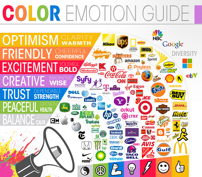
Color is the first thing the brain registers. Before shape, before text, before any conscious reading of a logo, color hits the limbic system and triggers an emotional reaction.
Research from the Institute for Color Research shows that people make subconscious judgments about a product within 90 seconds. Up to 90% of that assessment is based on color alone.
That’s a staggering number. And it explains why brands like Coca-Cola, Target, and McDonald’s guard their color palettes so aggressively.
The key with color theory in logo design is understanding that colors don’t carry universal meaning. They carry contextual meaning, shaped by culture, industry norms, and surrounding design elements.
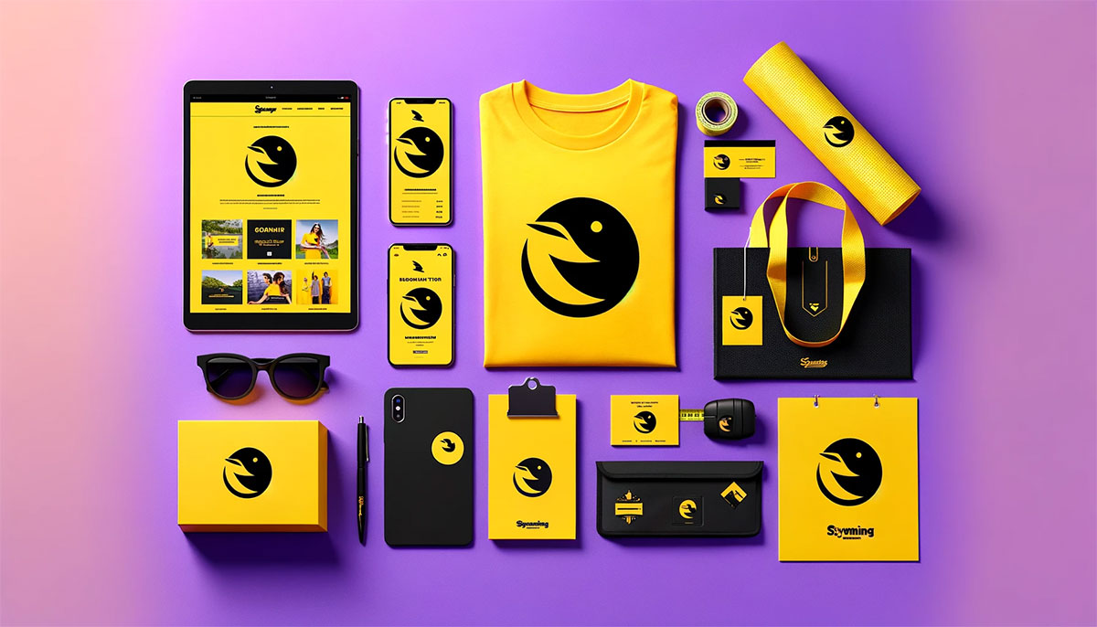
What Emotions Do Warm Colors Trigger in Logos
Red activates urgency, appetite, and excitement. Orange signals friendliness and confidence. Yellow triggers optimism but can read as cheap at full saturation.
Warm colors push outward. They demand attention, which is exactly why fast food chains and clearance sales rely on them heavily.
What Emotions Do Cool Colors Trigger in Logos
![]()
Blue builds trust. It’s the most used color in corporate logos worldwide, from IBM to Samsung to PayPal. Green signals health, growth, and environmental responsibility.
Purple has long been tied to luxury and creativity. Cool tones pull inward, creating calm and reliability. Financial institutions and healthcare brands lean on them for good reason.
How Does Color Contrast Influence Brand Recognition
Contrast determines whether your logo gets noticed or ignored. A study from the University of Loyola, Maryland found that color increases brand recognition by up to 80%.
But it’s not just about picking a bold color. It’s about how colors interact. High-contrast combinations (black and yellow, white and red) cut through visual noise. Low-contrast palettes using analogous colors feel harmonious but can disappear at small sizes.
The FedEx logo uses purple and orange, a complementary color scheme that creates maximum visual tension. That’s deliberate. It makes the mark impossible to miss on the side of a truck doing 70 mph.
How Does Shape Psychology Work in Logo Design
Shapes speak a language that predates written words. The human brain categorizes shapes almost instantly, assigning them meaning based on thousands of years of pattern recognition and survival instinct.
The psychology of shapes in logo design maps directly to how we feel about the brand behind the mark. Angular shapes create one set of associations; curved shapes create another entirely.
What Do Circular Shapes Communicate in a Logo
Circles suggest community, protection, and continuity. Think Olympic rings, Pepsi, Starbucks. No sharp edges means no perceived threat.
Circular logos tested higher for warmth and approachability in a 2017 study from the Journal of Consumer Research.
What Do Angular Shapes Signal to Consumers
Triangles and rectangles communicate stability, power, and professionalism. Mitsubishi’s three-diamond mark, the Delta Airlines triangle, Microsoft’s four-square window.
Angular shapes feel structured and dependable. They work well for tech companies, financial firms, and brands that need to project authority fast.
How Do Organic vs. Geometric Shapes Change Brand Perception
Geometric shapes feel manufactured, precise, engineered. Organic shapes feel human, natural, approachable.
A tech startup building enterprise software benefits from geometric precision. A handmade skincare brand benefits from organic, hand-drawn forms. Mixing the two can work, but only when the tension is intentional and not accidental.
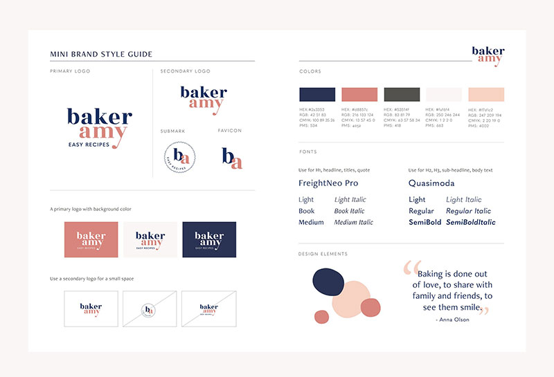
What Role Does Typography Play in Logo Psychology
Font psychology is one of the most underestimated parts of logo design. A 2012 study by psychologist Sarah Hyndman confirmed that typeface selection changes how people perceive taste, value, and trustworthiness of a brand.
The letterforms in your logo carry as much weight as the symbol. Sometimes more. Google, FedEx, Coca-Cola, and Disney are all wordmarks where brand typography does the heavy lifting.
How Do Serif Fonts Influence Trust and Authority
Serif fonts carry history. Those small strokes at the ends of letters trace back to Roman stone carving. Brands like Times, Vogue, and Tiffany & Co. use serifs to project heritage, reliability, and sophistication.
Perfect for finance, law, and luxury. Terrible for brands that need to feel casual or disruptive.
How Do Sans-Serif Fonts Affect Perceived Modernity
Sans-serif fonts strip away ornamentation. What’s left is clean, direct, modern. Helvetica, Futura, and Gotham dominate tech, fashion, and startup logos for exactly this reason.
The shift from serif to sans-serif in recent corporate rebrands (Google in 2015, Warner Bros. in 2019) reflects a broader push toward digital-first readability and perceived innovation.
What Psychological Effect Do Custom Letterforms Have on Brand Identity
Custom letterforms create something off-the-shelf fonts cannot: uniqueness at the structural level. Coca-Cola’s Spencerian script and Disney’s handwritten wordmark are recognizable without any other context.
The trade-off is cost and time. Custom type requires skilled type designers and multiple rounds of optical adjustments. Details like kerning, x-height, and stroke weight all need to be calibrated to the brand’s personality.
How Does Symmetry vs. Asymmetry Affect Logo Effectiveness
The brain is wired to prefer symmetry. Evolutionary psychologists link this preference to mate selection, health assessment, and environmental safety. That preference carries directly into how we evaluate logos.
But preference doesn’t always mean effectiveness. Some of the most memorable logos in history break symmetry on purpose.
What Does Symmetry Signal in Brand Communication
Symmetrical logos project order, stability, and professionalism. McDonald’s arches, the Target bullseye, Chanel’s interlocking C’s.
Research from the International Journal of Design (2018) found that symmetrical logos increased perceived trustworthiness by 15-20% compared to asymmetrical versions of the same mark.
When Does Asymmetry Strengthen Logo Memorability
Asymmetry creates visual tension. Tension creates interest. Interest creates recall.
The Nike Swoosh is asymmetrical. The Apple logo (with its bite) is asymmetrical. Both rank among the most recognized symbols on the planet. Asymmetric logos work when the brand itself is about energy, disruption, or forward movement.
How Does Negative Space Influence Logo Interpretation

Negative space is the area around and between the main elements of a design. In logo work, it’s not empty. It’s active. The best designers use white space as a second layer of communication, hiding shapes and meaning inside what most people initially overlook.
The brain fills in gaps automatically. That’s a core principle of Gestalt psychology, specifically the law of closure. Logos that use this well feel clever without feeling forced.
What Are Examples of Negative Space in Successful Logos
The FedEx arrow between the E and x is the textbook case, designed by Lindon Leader in 1994. The World Wildlife Fund panda uses black shapes and lets the viewer’s brain construct the white areas. The NBC peacock, the Spartan Golf Club player, the Guild of Food Writers spoon.
All of them reward a second look.
How Does Hidden Imagery Affect Consumer Recall
Hidden elements create an “aha” moment. A 2015 study in Consciousness and Cognition found that this discovery triggers a small dopamine release, which the brain then associates with the brand itself.
Logos with embedded imagery scored 15% higher in unaided recall tests compared to straightforward marks. The trick: the hidden element has to be discoverable but not obvious on first glance.
How Does Logo Simplicity Relate to Cognitive Processing
Simple logos get remembered. Complex logos get ignored. That sounds reductive, but decades of cognitive load research back it up.
The human brain has limited processing bandwidth. A logo that demands too much visual decoding gets filtered out. One that processes quickly gets stored. This is why the most enduring logos in history, Nike, Apple, Mercedes, are brutally simple.
What Is the Processing Fluency Effect in Logo Design
Processing fluency is the ease with which the brain interprets visual information. Higher fluency equals higher preference. A 2004 study by Reber, Schwarz, and Winkielman confirmed that people consistently rate easy-to-process stimuli as more trustworthy, more beautiful, and more true.
Applied to logos: if someone has to work to understand your mark, you’ve already lost them.
How Many Visual Elements Can a Consumer Process in a Logo
George Miller’s research on cognitive limits suggests 7 plus or minus 2 items for working memory. But for rapid visual recognition, that number drops dramatically. Most effective logos contain 2-3 distinct visual elements maximum.
The minimalist design trend in recent rebrands (Burger King 2021, Peugeot 2021, Warner Bros. 2019) reflects this reality. Strip it down until only the core idea remains.
How Do Cultural Differences Change Logo Perception
A logo that works in New York might fail in Tokyo. Cultural symbolism shifts the meaning of colors, shapes, animals, and gestures in ways that catch global brands off guard.
Pepsi learned this the hard way in Southeast Asia when a color change diluted brand recognition overnight. Localization isn’t optional for brands operating across borders.
What Symbols Have Different Meanings Across Cultures
Owls symbolize wisdom in Western cultures, bad luck in parts of India and the Middle East. Dragons are threatening in European contexts, auspicious in Chinese culture. The thumbs-up gesture is positive in America, offensive in parts of West Africa and the Middle East.
Even something as basic as a checkmark can cause confusion. In Japan, an O (circle) means correct, while a checkmark can mean incorrect.
How Do Color Associations Shift Between Western and Eastern Markets
White represents purity in Western markets. It represents mourning in China, India, and much of East Asia. Red means danger or urgency in the West but luck, prosperity, and celebration in Chinese culture.
Green reads as “natural” and “healthy” in North America and Europe. In some South American countries, it’s associated with death. Any global brand using a monochrome color strategy across all markets is taking a real gamble.
What Is the Mere Exposure Effect in Logo Design
The mere exposure effect, first documented by psychologist Robert Zajonc in 1968, states that people develop preferences for things simply because they’re familiar with them. No rational evaluation needed. Just repetition.
This single psychological principle explains why massive companies spend billions putting their logos on everything from stadium naming rights to the bottom corner of a YouTube ad.
How Does Repetition Build Logo Familiarity
Each exposure strengthens the neural pathway associated with that visual. After roughly 10-15 exposures, recognition becomes nearly automatic. The logo stops being processed as “new information” and starts being processed as “known entity.”
That shift is where brand trust begins to form.
What Is the Relationship Between Logo Exposure Frequency and Brand Trust
A 2020 study in the Journal of Marketing Research found a direct correlation: higher logo exposure frequency led to increased trust ratings, even when participants had zero experience with the actual product.
Familiarity breeds comfort. Comfort breeds trust. The visual identity doesn’t have to be beautiful. It has to be consistent and everywhere.
How Do Proportions and the Golden Ratio Apply to Logo Design
![]()
The golden ratio (1:1.618) appears in nature, architecture, and classical art. Its application in logo design is debated, but several iconic marks align with it closely enough to make the conversation worth having.
Scale and proportion affect how balanced and “right” a logo feels, even when the viewer can’t articulate why.
What Is the Golden Ratio in Visual Design
It’s a mathematical ratio found in the Fibonacci sequence where each number is the sum of the two before it (1, 1, 2, 3, 5, 8, 13…). The ratio between consecutive numbers approaches 1.618, which produces rectangles, spirals, and grids that humans consistently rate as visually pleasing.
Which Well-Known Logos Use Golden Ratio Proportions
The Apple logo, the Twitter bird (original version), the Toyota emblem, and the Pepsi globe all reportedly use golden ratio geometry in their construction. National Geographic’s yellow rectangle is a golden rectangle.
Whether these were designed with the ratio intentionally or retrofitted to it afterward is debatable. But the proportional harmony is measurable either way.
How Does Logo Design Psychology Affect Consumer Purchasing Behavior
Logo design doesn’t just build recognition. It moves product. The connection between visual brand identity and buying decisions has been studied repeatedly, and the data is consistent: logos affect purchase intent, perceived value, and willingness to pay premium prices.
What Research Links Logo Design to Buying Decisions
A 2021 study in the Journal of Consumer Psychology found that logos perceived as “descriptive” (visually illustrating the brand’s product or service) increased purchase likelihood by 13% compared to abstract marks. Separate research from Nielsen showed that packaging with strong logo visibility increased point-of-sale conversions by up to 5.5%.
How Does Logo Redesign Impact Existing Brand Loyalty
Badly. At least initially. The 2010 Gap logo fiasco lasted six days before public outrage forced a reversal. Tropicana lost $30 million in sales within two months of a rebrand in 2009.
Loyal customers form emotional bonds with existing logos. Changing a mark without understanding the psychological equity it holds is one of the most expensive rebranding mistakes a company can make. Smart brands follow a thorough rebranding checklist before touching their primary mark.
What Are the Most Common Logo Design Psychology Mistakes
Knowing what works matters. Knowing what fails matters more, because the downside of a bad logo hits faster and harder than the upside of a good one.
Most psychological errors in logo design come from overthinking, overdesigning, or ignoring the audience entirely.
How Does Visual Overload Hurt Brand Recognition
Too many colors, too many shapes, too many typefaces. The result is a mark that fights itself. The brain can’t find a focal point, so it disengages.
Strong visual hierarchy solves this: one dominant element, one secondary element, everything else supporting. The core principles of logo design prioritize clarity over cleverness, every time.
What Happens When Color and Shape Psychology Conflict in a Logo
A sharp, angular mark in pastel pink sends two different signals. The shape says aggression and precision; the color says soft and gentle. The brain receives mixed cues and defaults to confusion or distrust.
Color and shape need to tell the same story. A rounded logo in warm tones builds approachability. A geometric mark in deep blue builds authority. When these signals conflict, the logo loses its psychological punch and the brand pays for it in weaker recall and lower consumer confidence.
FAQ on Logo Design Psychology
What is logo design psychology?
Logo design psychology is the study of how visual elements like color, shape, and typography trigger emotional and cognitive responses in viewers. It draws from behavioral science, Gestalt theory, and neuromarketing to explain why certain logos build trust and brand recognition faster than others.
Why does color matter so much in a logo?
Color is the first thing the brain processes. Research from the Institute for Color Research shows up to 90% of snap product judgments are based on color alone. The right color palette triggers specific emotional responses that align with brand personality.
What shapes work best for logos?
It depends on the message. Circles communicate community and warmth. Triangles signal power and stability. Organic shapes feel human and approachable. The best shape is the one that matches the brand’s core identity, not the one that’s trending.
How does typography affect logo perception?
Typography shifts how people perceive brand personality. Serif typefaces project heritage and authority. Sans-serif typefaces feel modern and clean. Custom letterforms create uniqueness but cost more. The wrong font can undermine an otherwise strong mark.
What is the mere exposure effect in branding?
The mere exposure effect, documented by psychologist Robert Zajonc in 1968, means people prefer things they see repeatedly. Applied to logos, consistent visibility across touchpoints builds familiarity, which then builds trust, even without direct product experience.
Does logo simplicity really matter?
Yes. Simple logos process faster in the brain, and processing fluency research confirms that easier-to-interpret visuals are rated as more trustworthy and more appealing. Nike, Apple, and Mercedes prove that reduction beats complexity for long-term recall.
Can a logo actually influence buying decisions?
A 2021 study in the Journal of Consumer Psychology found descriptive logos increased purchase likelihood by 13%. Logo design directly affects perceived brand value, consumer confidence, and willingness to pay premium prices.
How do cultural differences affect logo design?
Colors, symbols, and animals carry different meanings across cultures. White signals purity in Western markets but mourning in China. Brands operating globally must research local cultural symbolism to avoid sending the wrong psychological signal.
What is the golden ratio in logo design?
The golden ratio (1:1.618) is a mathematical proportion found in nature and classical art. Logos from Apple, Toyota, and National Geographic reportedly use it. It produces proportional harmony that viewers perceive as visually balanced and aesthetically correct.
What are the biggest psychological mistakes in logo design?
Visual overload, conflicting color and shape signals, and ignoring cultural context are the top three. When a logo sends mixed psychological cues, the brain defaults to confusion. Clarity and consistency beat cleverness every time.
Conclusion
Logo design psychology isn’t decoration theory. It’s applied cognitive science with direct, measurable effects on consumer behavior and brand perception.
Every design decision, from a split-complementary color scheme to the weight of a font, sends a psychological signal. Those signals either build trust or erode it. There’s no neutral ground.
The brands that get this right, Coca-Cola, Apple, Nike, treat their logos as strategic assets backed by research, not aesthetic preferences picked from a mood board.
Start with what your audience needs to feel. Work backward from there. Test against real people, not personal taste.
A logo built on psychological principles doesn’t just look good. It performs. And performance is the only metric that actually matters when brand equity is on the line.
Renowned for his expertise in logo design and visual branding, Bogdan has developed a multitude of logos for various clients.
His skills extend to creating posters, vector illustrations, business cards, and brochures. Additionally, Bogdan's UI kits were featured on marketplaces like Visual Hierarchy and UI8.
He also wrote in the past years on sites like Design Your Way, WebDesignerDepot, WPDean, Designmodo, Speckyboy, Slider Revolution, and more.
- The Airtable Logo History, Colors, Font, And Meaning - 12 July 2026
- How to Blur Background in Canva: A Quick Tutorial - 11 July 2026
- Typography Trends - 10 July 2026
Bogdan Sandu is a seasoned designer who has been designing websites since 2008. Renowned for his expertise in logo design and visual branding, Bogdan has developed a multitude of logos for various clients. His skills extend to creating posters, vector illustrations, business cards, and brochures. Additionally, Bogdan's UI kits were featured on marketplaces like Visual Hierarchy and UI8. He also wrote in the past years on sites like Design Your Way, WebDesignerDepot, WPDean, Designmodo, Speckyboy, Slider Revolution, and more.
You Might Also Like