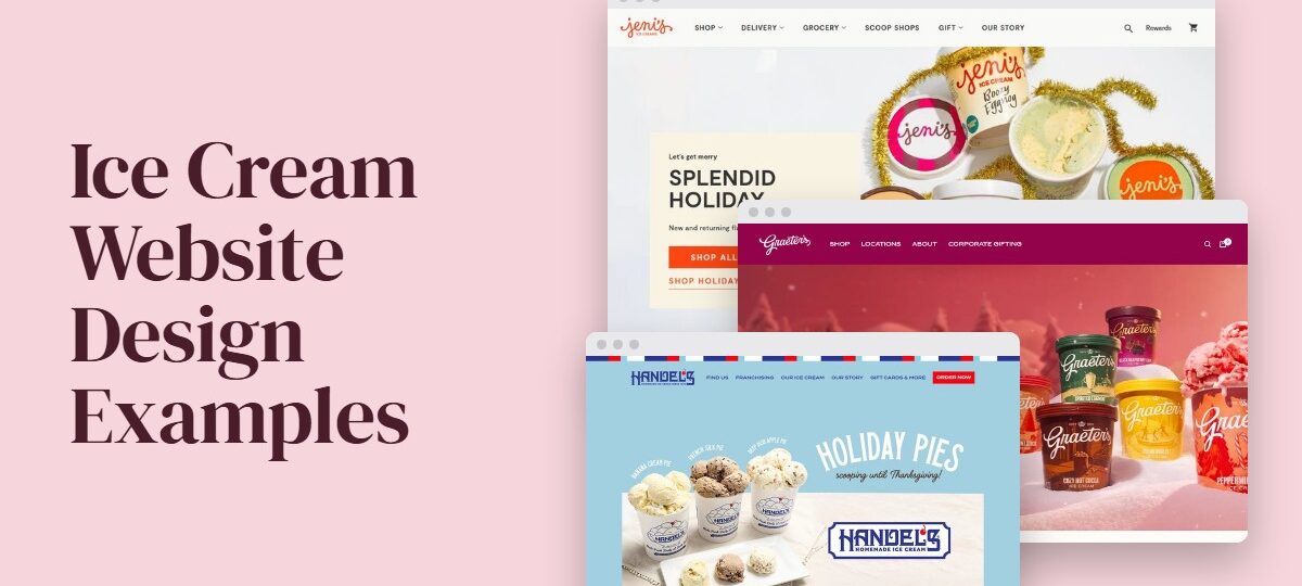
A scoop shop and a pint shipper both sell ice cream, and their websites should look nothing alike. That’s the test applied to Jeni’s, Salt & Straw and Graeter’s below: does the design fit the way the business actually sells?
Walk-in shops need hours and directions on the first screen. Pint brands need a flavor grid and shipping rules instead. Franchise systems get their own section further down, since they’re a different problem again.
Pastel is the default palette in frozen dessert branding, and it fails contrast checks more easily than dark colors do. WebAIM’s 2026 report found low-contrast text on 83.9% of home pages, up from 79.1% in 2025.
Which Ice Cream Websites Are Worth Studying?
The list runs from pint brands with real ecommerce (Jeni’s Splendid Ice Creams, Salt & Straw, Van Leeuwen) to household names with deep flavor catalogs (Ben & Jerry’s, Haagen-Dazs). Then there are smaller brands and local shops that win on personality: Treadwell’s, Big Gay Ice Cream, Kinda and Afters.
Colorlib and BentoBox both publish gallery roundups that stack screenshots with a line of praise under each. The sorting here works differently. It looks at what each design does and where it sends the visitor.
To get in, a site needed a design move that fits in one sentence and a clear next step for the visitor, like ordering, shipping or visiting. It also had to be documented somewhere, either on the brand’s own pages or in a named design write-up.
| Site | Brand model | Standout design move | Where it sends visitors |
|---|---|---|---|
| Ben & Jerry’s | National pint brand | Online Flavor Graveyard plus dietary and allergen labeling pages | Flavor browsing, fan requests to bring flavors back |
| Jeni’s Splendid Ice Creams | Direct-to-consumer pints | Frozen-delivery promise repeated on shop and shipping pages | Nationwide shipping, gift cards |
| Salt & Straw | Scoop shops and pints | Classic flavors and the monthly series shown as two groups | Pack builder, scoop shops |
| Haagen-Dazs | Premium national brand | Masonry gallery and video on the homepage, scroll animation on product pages | Product browsing, site search |
| Treadwell’s | Local shop, open since 1946 | Playful, visual, mobile-friendly redesign (Gravoc, 2022) | Shop visits, event treats |
| Kinda | Plant-based brand | Bold display type and custom illustration | Brand story first (no checkout live when Wix profiled it) |
The last column is the one to read first. It shows what each design wants a visitor to do next.
How Do Ice Cream Websites Present Flavors?
Cards work best, one per flavor, each with a name and a one-line taste description plus an add button. Rotating flavors sit in their own group, apart from the permanent lineup.
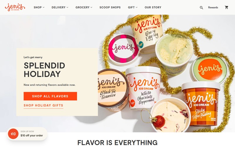
On Jeni’s, the flavor name links to a product page and a short taste tagline sits under it. Hovering swaps in a second image, and an ADD button finishes the card. The visual hierarchy is tight here: name, tagline, button, in that order.
Sold-out pints stay on the page with a marker. That beats deleting a flavor that returns next month, because a deleted flavor just looks like a discontinued one.
Salt & Straw’s pick-your-pints page splits classic flavors from a monthly rotation, then lets shoppers mix both into a single pack. Per the brand’s own page, each month’s series spotlights regional flavors and the makers behind them.
Dietary information belongs on the flavor itself, and Ben & Jerry’s handles this thoroughly, according to its allergen page. Allergens appear in bold uppercase at the end of each ingredient list. Certified gluten-free flavors get a GF symbol and are held to 10 parts per million of gluten or less. Non-dairy flavors carry a Non-Dairy label, and lid color shows the base (green for almond milk, yellow for sunflower butter).
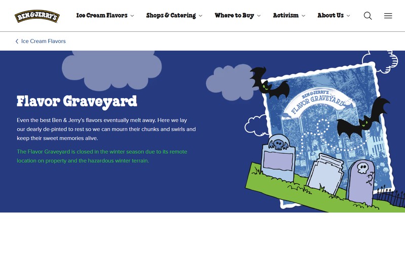
The same brand also gets content out of flavors it has retired. Its Flavor Graveyard started as a physical plot at the Vermont factory in 1997. An online version now lives on its websites, with a form where fans can ask for a flavor to return.
Gallery layout is the other decision. Haagen-Dazs uses a masonry gallery with video on the homepage, and Earnest Ice Cream puts a masonry grid of menu items in its hero (Colorlib’s roundup).
Where the menu is plain text, pick typefaces built for menus. A long list of flavor names has to stay readable at phone size.
What Gets Visitors to Order, Ship or Visit?
Pint brands have shipping as the main path, and scoop shops have location and hours. Everything else on the page backs that up.
Shipping pages for pint brands
Baymard’s February 2024 survey of 1,012 people (reported by eMarketer) put extra costs (shipping, tax, fees) at the top of the reasons US adults gave for abandoning a cart, at 48%. Pint brands put their shipping rules ahead of checkout for that reason.
Frozen shipping carries packaging cost that a cookie order never does. Van Leeuwen’s FAQ ties its minimum to the coolers and dry ice each box needs.
Jeni’s sets a five-pint minimum with flat-rate shipping, whether the box holds 5 pints or 20 (jenis.com). It also promises frozen delivery in an insulated box with plenty of dry ice, and shows an animation of the box opening. Van Leeuwen has a minimum order too, explained on its FAQ page.
One thing to copy carefully. Two Van Leeuwen FAQ pages retrieved in November 2026 state the minimum differently, five items on one and a $60 order on the other.
Whatever your rule is, state it once and link to it from everywhere else.
Location pages for scoop shops
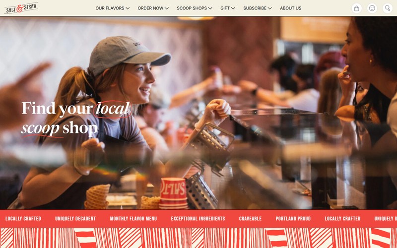
Someone landing on a scoop shop location page wants the address and a map first, then the hours, including holiday changes. If the shop takes orders ahead, the pickup or delivery link belongs right there too.
Google Business Profile special hours cover temporary changes of up to 6 days in a row, per Google’s help documentation as of November 2026. A seasonal closure longer than that falls outside the feature.
Put LocalBusiness structured data on the page that carries the shop’s details. Google’s Search Central documentation lists opening hours (including seasonal closures), departments and a menu URL among the details the markup can pass along, so keep it matching the Business Profile.
Secondary paths: gifts and events
Jeni’s sells gift cards as a no-melt way to give ice cream, which turns the shipping problem into a selling point.
Events matter for some shops. Treadwell’s, serving the North Shore of Massachusetts since 1946, handles personal and corporate events, and its 2022 redesign by Gravoc keeps that audience in view.
Visual Identity Choices in Ice Cream Website Design
The examples above split into warm pastel with illustration, black and white, and photo-led with pastel accents. Typography and illustration do the rest of the identity work.
Color palettes
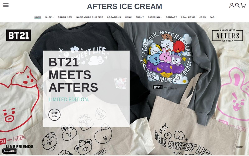
Kinda runs warm pastel backgrounds from header to footer (Wix’s gallery profile). Afters goes the other way and stays sleek in 2 colors, with a hero call to action, an image carousel above the fold and a sticky header (Colorlib). Pierre’s Ice Cream pairs a parlor-style pastel scheme with large ice cream images (Muffin Group).
Afters shows that 2 colors can hold a whole identity when the photography carries the flavor. I like that kind of restraint, though it’s a minimalist design bet, and it only pays off with strong images.
Typography
Bold, conversational type carries Kinda’s personality in the lettering alone, according to Wix’s profile. Kiwi slang in the copy does some of the branding work too.
Display typefaces suit flavor names and hero headlines. Ingredients, allergens and hours are better off in a plain sans-serif.
Illustration and motion
Kinda’s custom drawings and cartoon cauliflower mascot run through headers and dividers.
BentoBox described Big Gay Ice Cream’s site in 2021 as colorful and illustrated, with FAQs and philanthropy information sitting inside the playful design.
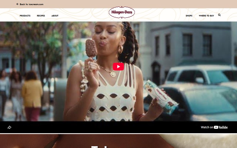
Other sites lead with photos. Haagen-Dazs and Earnest lean on image galleries, and Haagen-Dazs adds scroll animation on its product pages.
Motion belongs where the visitor is already looking at a product. On a location page it only delays the hours.
Which Design Approach Fits Which Ice Cream Business?
Start from the business model. Scoop shops lead with directions. Pint brands want a flavor grid and shipping up front, and franchise systems need a store template that repeats cleanly. Small artisan parlors do well with a short menu and strong photography.
Most sites go wrong by borrowing the wrong model. A shop that copies a pint brand’s layout ends up burying its own address.
Scoop shops: directions before story
If most sales are walk-ins, the home page is a signpost. Put the address, today’s hours and a map link in the first mobile screen.
Use one primary button, either directions or order ahead, and keep the flavor list as plain text that changes daily. The brand story can wait below the fold, where it has room.
Pint brands: the grid does the selling
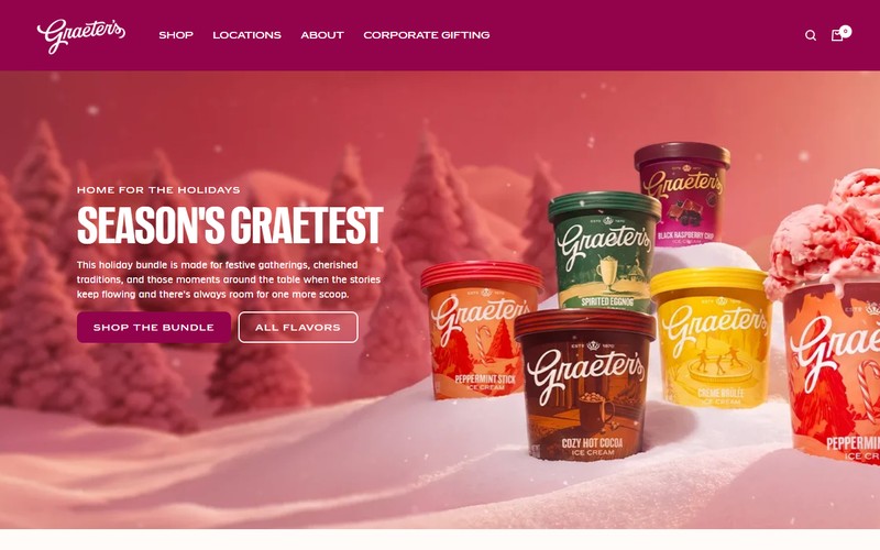
Graeter’s is a good model here. Its webstore sells pre-built bundles and a build-your-own pack from one catalog, and its shipping page says packs go out in 6 or 12 pints.
A pint buyer compares flavors side by side, so the layout has to allow that. A flavor grid that sticks to consistent grid systems lets people scan twenty options without opening twenty tabs.
Graeter’s product pages also repeat one line: hand-packed in Cincinnati, made in 2.5-gallon batches, French Pot process since 1870. Saying it the same way on every page is how a claim starts to feel like part of the brand.
Franchise systems: one template, many shops
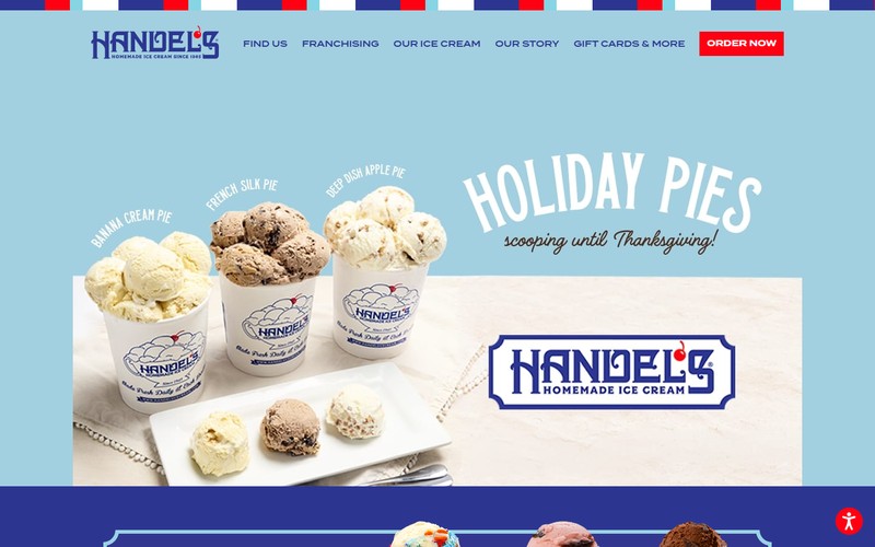
Handel’s gives each shop its own page under a /store/ path and keeps franchise recruiting in a separate section with a five-step process and an inquiry form. Visitors and prospective owners never share a funnel.
A store template for this model should run hours and address first, then the local flavor list, then an order or pickup link. Nothing about franchising belongs on it.
The local flavor list matters most. Franchising.com press releases from 2023 describe Handel’s shops serving 48 flavors at a time, with more than 140 flavors rotating seasonally, so a template that lists the full rotation on every store page would mislead visitors.
Where a signature claim backfires
Sources disagree on Graeter’s headline process. Tasting Table calls it the only company still using the French Pot method, while The Nibble’s review says the technique looks much like other small-batch freezing and that the name works mostly as marketing.
The design lesson is simple. If a claim sits in a headline, some visitors will test it, so put the evidence beside it (batch size, where pints are packed) the way Graeter’s does on its product pages.
Which Platform Fits an Ice Cream Website?
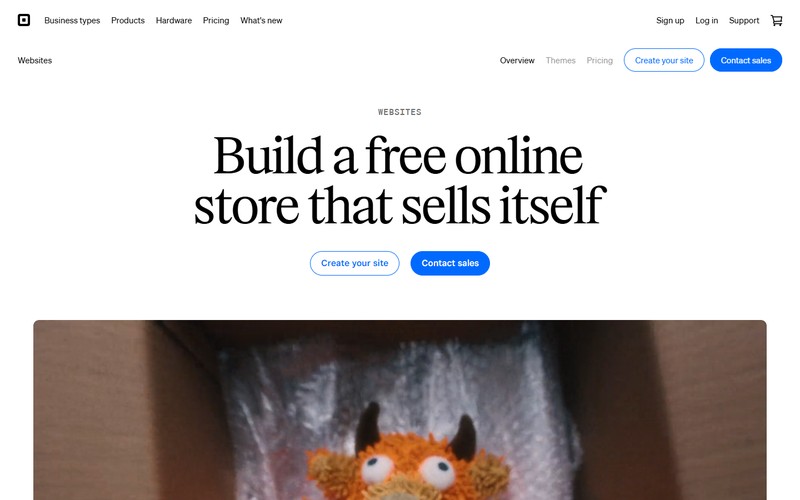
Shopify is the pick for pint shipping. A single shop taking pickup orders is better off on Square Online. Webflow suits design-led brands with small catalogs, and WordPress makes sense for teams that want full control and will actually maintain it. Squarespace sits between a brochure site and a store.
| Platform | Best fit | Ordering support | Main limit |
|---|---|---|---|
| Shopify | Pint brands that ship | Full store, carts, shipping setup | Monthly fee plus app costs |
| Webflow | Design-led brands, small catalogs | Ecommerce plans | Item caps by plan |
| Square Online | One scoop shop, pickup orders | Free plan, built-in payments | Less layout freedom |
| Squarespace | Shops with a few products | Built-in checkout | Plans and fees changed |
| WordPress | Fully custom builds | WooCommerce plugin | You own updates and speed |
What it costs
WebsiteBuilderExpert’s 2026 pricing guide and Tech.co both list Shopify’s Basic plan at $29 a month billed annually, or $39 month to month.
Webflow’s own plan update lists ecommerce item limits of 500, 5,000 and 15,000 across its plans, and the Standard tier carries a 2% transaction fee. Square Online starts free.

Squarespace is where sources disagree. Older guides such as WPShout list a Business plan with a 3% transaction fee, while Costbench lists a renamed Basic tier at 2%, so read the live pricing page before you commit.
Setup effort usually runs lowest on Square Online and Squarespace, and highest on WordPress and Webflow.
Where each one stops fitting
- Shopify is heavy for a shop that sells nothing online.
- Webflow’s caps rarely bite a flavor catalog, but count your products and variants before picking a plan.
- Pint brands should test Square Online’s shipping options before building on it.
- WordPress stops fitting the day nobody owns updates.
- No platform handles frozen shipping on its own. Dry ice and carrier choice live in your fulfillment setup.
What Mobile Speed and Accessibility Checks Apply?
Mobile pages need to pass Core Web Vitals, and text needs to meet WCAG 2.2 AA contrast. Both can be measured before launch. Playful ice cream designs tend to miss them anyway.
The thresholds come from web.dev’s Core Web Vitals documentation and the W3C’s WCAG 2.2. LCP should land at 2.5 seconds or less and INP at 200 milliseconds or less. CLS needs 0.1 or less, measured at the 75th percentile of page loads.
On the accessibility side, normal text needs a 4.5:1 contrast ratio and large text 3:1 (criterion 1.4.3). Buttons and other interface parts need 3:1 against their surroundings (1.4.11), and tap targets should be at least 24 by 24 CSS pixels (2.5.8).
Mobile-first layout
Design the phone view first. Someone looking for a shop is usually holding a phone in one hand, so the order or directions button belongs where a thumb lands.
Loading speed is the likely weak spot. HTTP Archive’s 2025 Web Almanac found good LCP on 62% of mobile origins, the lowest pass rate of the Core Web Vitals.
Hero photos cause much of it. Chrome’s documentation says never to put loading=”lazy” on the LCP image, yet the same Almanac found about 16% of pages doing exactly that. Lazy loading is fine for the flavor gallery further down.
Set width and height on every flavor photo so the grid doesn’t jump while it loads. And pick a readable body face before adding a display face for flavor names (see fonts for accessibility for options).
Where playful designs fail
Pastel text on a pink or mint background is the classic miss. WebAIM’s 2026 report found low-contrast text on 83.9% of home pages, up from 79.1% in 2025, and plenty of articles still quote the older number.
Test every pastel pairing against the 4.5:1 rule, and check button edges too. A short primer on contrast helps if the ratios are new to your team.

Autoplay video causes trouble next. A looping background video that runs past five seconds beside other content needs a pause control under WCAG 2.2.2, and a still image on mobile is simpler. Heavy scroll animation hurts INP, so cut animation before you cut photos.
Missing alt text is the other one, at 53.1% of home pages in WebAIM’s 2026 report. A flavor photo needs a name and a description, like “Salted caramel pint, lid off”. Pastel buttons with no visible edge round out the usual misses.
How to Turn These Examples Into Your Own Design
Business model comes first, then the primary action, and only after that the palette and type. Flavor display, the order or visit flow and the checks follow. Starting with the logo and colors is the usual mistake.
Gather references on a mood board first, three to five sites at most, each tied to one move you want to copy.
- Pick the model: scoop shop, pint brand, franchise or small artisan parlor.
- Choose one primary action for the first mobile screen.
- Build the palette, then test every text pairing at 4.5:1 before adding more colors.
- Pair one display face with one plain body face, and keep body text readable at phone size.
- Show flavors as a consistent grid or list with a name, one photo and a short descriptor. Write the alt text as you upload.
- Build the order or visit flow, then test it on a real phone with one hand.
- Run the checks on Core Web Vitals on mobile, contrast, tap targets and motion controls.
Record the final palette, type and spacing in a brand style guide. The next seasonal flavor then drops in without a redesign.
Build mistakes worth catching before launch
- A lazy-loaded hero image
- Pastel text on pastel backgrounds
- Autoplay video with no pause control
- Flavor photos without alt text
- A franchise template listing flavors a given shop doesn’t serve
Ice Cream Website Design FAQ
Do ice cream shops need a website if they already have social media accounts?
They do. Social profiles don’t give much control over hours, directions or ordering, and a website gives Google Business Profile a page to point to.
Most visits come down to hours, an address and the current flavors, so even a very plain site does the job.
How should a site present seasonal or limited-run flavors?
Give them a dedicated strip near the top of the flavor page, with a start or end date. Handel’s announces monthly featured flavors, and Graeter’s sells seasonal bundles such as its Last Scoops of Summer set.
Should allergen details appear on flavor pages?
Definitely. Ice cream usually contains milk, and plenty of flavors add eggs, nuts or wheat, so allergens should sit beside each flavor name, not on a separate page.
Add a line asking visitors to confirm cross-contact questions with the shop.
Which pages does a small ice cream shop website need?
Home, flavors, location with hours, and an order or contact page cover most shops.
Pint brands add shipping information and a cart, and a franchise adds a page for each shop.
How often should the flavor list be updated?
The day flavors change. A list that’s a day behind sends people to the counter for something that’s sold out.
A plain text list with a simple editor makes that a two-minute job.
What It Costs to Keep an Ice Cream Website Current
The platform subscription is the small part. The real expense is one flavor-list edit every time the menu changes, so the editing routine matters more than the hosting.
Make the flavor list editable text first. Then name one person who has edit access, and build seasonal pages before their launch dates. Text goes first because edit access to an image-based menu changes nothing, and the named editor comes second because a page without an owner goes unedited.
There’s a visual cost. A text list looks plainer than a designed flavor poster, but accuracy wins that exchange for any shop that rotates flavors.
Platform plans and fees change, as the conflicting Squarespace guides show. This advice was checked on November 11, 2026, and a pricing revision from any platform would change the cost side of it.

Renowned for his expertise in logo design and visual branding, Bogdan has developed a multitude of logos for various clients.
His skills extend to creating posters, vector illustrations, business cards, and brochures. Additionally, Bogdan's UI kits were featured on marketplaces like Visual Hierarchy and UI8.
He also wrote in the past years on sites like Design Your Way, WebDesignerDepot, WPDean, Designmodo, Speckyboy, Slider Revolution, and more.
- The LinkedIn Logo History, Colors, Font, and Meaning - 20 November 2026
- How to Design Landing Pages That Convert Visitors into Email Subscribers - 20 November 2026
- Why Quality Assurance is the Backbone of Seamless UI/UX and Web Design - 20 November 2026

Bogdan Sandu is a seasoned designer who has been designing websites since 2008. Renowned for his expertise in logo design and visual branding, Bogdan has developed a multitude of logos for various clients. His skills extend to creating posters, vector illustrations, business cards, and brochures. Additionally, Bogdan's UI kits were featured on marketplaces like Visual Hierarchy and UI8. He also wrote in the past years on sites like Design Your Way, WebDesignerDepot, WPDean, Designmodo, Speckyboy, Slider Revolution, and more.
You Might Also Like