You’ve seen it thousands of times. On laptops, phones, watches, storefronts. But why is there a bite in the Apple logo?
Most people assume it references Alan Turing, the Bible, or some clever “byte” pun. None of those are true.
The real answer comes from Rob Janoff, the designer who created the bitten apple silhouette in 1977 for Apple Inc. His explanation is surprisingly simple, and it has nothing to do with symbolism or hidden meaning.
This article covers the confirmed origin of the bite, the myths that grew around it, how the Apple logo changed over the years, and what makes this logo work as one of the most recognized brand symbols on the planet.
Why Is There a Bite in the Apple Logo

The bite in the Apple logo exists for one reason: scale. Rob Janoff, the graphic designer who created the logo in 1977, added the bite so the shape would read as an apple and not a cherry or tomato when printed at small sizes.
That’s it. No hidden message. No grand symbolism.
Janoff confirmed this in a 2009 interview with CreativeBits. He said he designed it with a bite for scale and proportion, so people would immediately get that it was an apple.
The bite mark solved a basic recognition problem. A round fruit silhouette without any distinguishing feature looks generic. Add a single bite to the right side and suddenly the shape becomes unmistakable, even at the size of an app icon on your phone.
After Janoff finished the design, his creative director at Regis McKenna Inc. pointed out something he hadn’t noticed. The word “bite” sounds like “byte,” the standard unit of digital information.
Janoff had no idea. He called it a happy coincidence.
That accidental pun between bite and byte gave the logo an extra layer of meaning that Janoff never planned. But it stuck, and people have been reading into it ever since.
Who Designed the Apple Logo
Rob Janoff designed the bitten apple logo. He was an art director at Regis McKenna Inc., an advertising and PR agency in Silicon Valley that handled Apple’s account in 1977.
Steve Jobs gave Janoff almost no specific brief. Just make something simple.
Janoff didn’t know much about computers at the time. He sketched several mock-ups by hand, not on a computer. One variation had a clean silhouette of an apple with a leaf tilted to the right and a bite taken from the right side.
That was the one.
The project came at a turning point for Apple Inc. The company was about to launch the Apple II, its first real consumer product. The original logo, a detailed black-and-white illustration, would not work on product packaging or in advertising at different sizes.
Jobs needed something that could scale down to a small label and still be recognized instantly. Janoff delivered exactly that. He ranks among the most famous graphic designers in corporate history because of this single project, even though many people outside design circles have never heard his name.
What Did the First Apple Logo Look Like

The original Apple logo from 1976 looked nothing like what you see today. Ronald Wayne, Apple’s often-forgotten third co-founder, designed it.
It was a detailed pen-and-ink illustration of Isaac Newton sitting under an apple tree, with a single apple hanging above his head. A ribbon wrapped around the border carried a quote from William Wordsworth.
The whole thing felt more like a book cover design than a tech company mark.
It was intricate. It was artistic. And it was completely wrong for a consumer electronics brand trying to reach everyday people.
The problems were obvious:
- Too complex to reproduce at small sizes
- Impossible to recognize from a distance
- Looked outdated next to competitors’ cleaner marks
- Could not be printed on products without losing detail
Steve Jobs knew this wouldn’t last. The Apple II needed a visual identity that worked everywhere, from a tiny product label to a full-page magazine ad.
So he brought in Regis McKenna’s agency, and Rob Janoff started from scratch.
What Does the Bite in the Apple Logo Mean
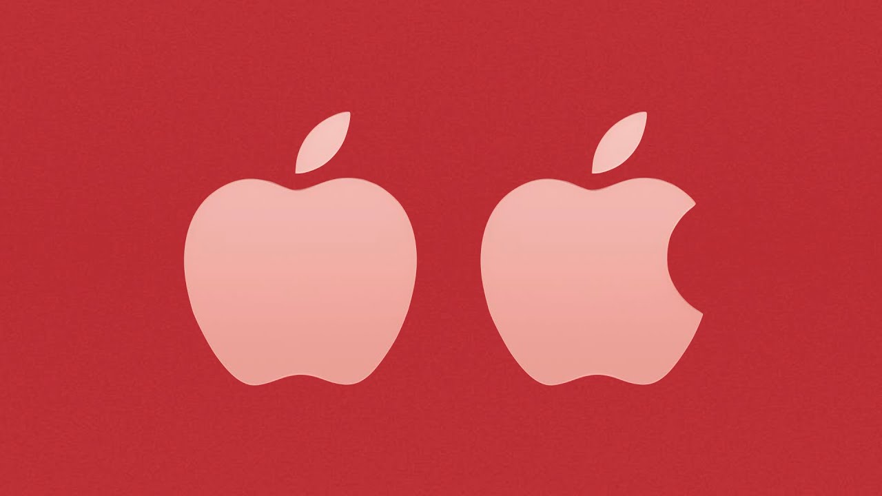
The bite means the shape is an apple. That’s the primary and confirmed purpose straight from Rob Janoff himself.
Without the bite, the silhouette could pass for a cherry, a peach, or even a tomato. Especially when scaled down to something the size of a pixel-level icon. The bite removes all ambiguity.
Janoff also mentioned that biting into an apple is a universal human experience. It crosses cultures and languages. Everyone who has ever eaten an apple recognizes that shape, which makes the logo’s psychological connection immediate and personal.
Then there’s the “byte” coincidence.
A byte is a fundamental unit of digital information in computing. The fact that Apple’s logo features a “bite” that sounds identical to “byte” was pure accident. Janoff has repeated this in multiple interviews. His creative director was the first person to point it out after the design was already finished.
But here’s the thing. Even accidental meaning builds brand power. The bite-byte connection gave people a reason to talk about the logo, share theories, and attach personal interpretations to it.
That kind of organic storytelling around a brand symbol is something most companies spend millions trying to manufacture. Apple got it for free.
Common Myths About the Apple Logo Bite
People love a good origin story. And when the real explanation is “so it wouldn’t look like a cherry,” well, that’s not dramatic enough for most folks.
So myths filled the gap. Some of them are actually pretty compelling, which is probably why they’ve survived for decades.
Is the Apple Logo a Tribute to Alan Turing
Alan Turing was a British mathematician who cracked Nazi Germany’s Enigma code during World War II. He’s widely considered the father of modern computer science. In 1954, Turing died from cyanide poisoning, and a half-eaten apple was found beside him.
The connection seems almost too perfect. A computing pioneer, a bitten apple, a tech company called Apple. Janoff himself has said this is his favorite myth about the logo.
But he also confirmed he had never heard of Alan Turing when he created the design in 1977. The rainbow stripes on the original logo added fuel to this theory because they resembled the Pride flag, and Turing was persecuted for his homosexuality. In reality, the rainbow stripes referenced the Apple II’s color display capability.
Is the Apple Logo a Biblical Reference
The Adam and Eve theory connects the bitten apple to the forbidden fruit from the Tree of Knowledge. Bite into the fruit, gain knowledge. Buy an Apple product, gain access to technology.
It sounds clever, but Janoff has flatly denied it. He has described himself as one of the least religious people around. Steve Jobs was not particularly religious either. The biblical reading is a projection, not an intention.
Is the Apple Logo Connected to Isaac Newton
This one has a grain of truth, but it’s misplaced. Isaac Newton’s connection to Apple exists only through Ronald Wayne’s original 1976 logo, the one with Newton sitting under the tree.
When Janoff redesigned the logo in 1977, he dropped every reference to Newton. The bitten apple has zero connection to the falling-apple-gravity story.
What muddied things further was Apple releasing a product called the Newton PDA in 1993, more than 15 years after Janoff’s logo was already in use. That product name was a separate branding decision, not proof that the logo referenced Newton all along.
How the Apple Logo Changed Over the Years

The Apple logo has gone through four major versions since 1976. Each redesign tracked a shift in the company’s products, technology, and market position.
The evolution of this logo tells you a lot about how Apple saw itself at each stage.
1976: The Newton illustration. Ronald Wayne’s pen-and-ink drawing of Isaac Newton under an apple tree. Complex, detailed, and impossible to scale. It lasted roughly a year.
1977: The rainbow-striped bitten apple. Rob Janoff’s redesign introduced the silhouette with a bite and six colored stripes. The rainbow wasn’t decorative. The Apple II was the first personal computer that could display color images, and the stripes showed that off directly in the logo.
Those rainbow bands were not analogous colors blending into each other. They were distinct, flat bands of green, yellow, orange, red, purple, and blue. Arranged in a specific order with green at the top, partly because Janoff wanted the leaf to sit naturally against the green stripe.
1998: The monochrome shift. Steve Jobs returned as CEO after a 12-year absence and ordered a redesign to coincide with the iMac launch. The rainbow stripes were gone. Apple moved to a clean monochrome version that matched the iMac’s translucent, modern aesthetic.
This was a turning point. The company was signaling maturity, simplicity, premium positioning.
2001 to present: Metallic and minimal. The silhouette stayed identical. Only the surface treatment changed, from glossy Aqua effects to brushed aluminum to the flat, clean version used today. The shape Rob Janoff drew in 1977 has not been altered in nearly 50 years.
The bite, the leaf, the overall proportions. All unchanged. That kind of longevity in brand style is rare for any company, let alone one that reinvents its products every few years.
Why the Apple Logo Works as a Brand Symbol

A 2020 survey by Promotique (Vistaprint) and OnePoll found that Apple has the most recognized brand logo in America, ahead of McDonald’s and Coca-Cola.
That’s not an accident. The logo works because it follows several core logo design principles almost perfectly.
First, scalability. The bitten apple silhouette is legible at every size. On a MacBook lid, on an Apple Watch face, inside a 16×16 pixel favicon. Look, I already used pixel. The shape holds up because there are no fine details to lose.
Second, the psychology of its shape. Circles and rounded forms feel approachable, friendly, organic. The apple silhouette triggers warmth. The bite adds a human element, something imperfect and lived-in. That slight asymmetry makes the mark feel less corporate and more personal.
Third, myth generation. The logo invites interpretation. People project meaning onto it, from Alan Turing to Adam and Eve to the byte pun. Every theory becomes free brand narrative that keeps the logo in cultural conversation.
Most companies pay agencies millions to create that kind of buzz. Janoff’s design did it organically because he left just enough ambiguity in one small detail: the bite.
The contrast between the logo’s simplicity and the depth of stories people attach to it is what makes it stick. Simple to see. Hard to stop thinking about.
How Did Apple Get Its Name
The name came before the logo. And the story behind it is about as simple as the bite explanation.
According to Walter Isaacson’s biography of Steve Jobs, the name happened during a drive. Steve Wozniak was picking Jobs up from the airport, driving along Highway 85 in California. Jobs had just returned from visiting an apple orchard in Oregon.
He was on a fruitarian diet at the time. He liked the word. It sounded fun, not intimidating.
Wozniak recalled that Jobs suggested “Apple Computer” and they tried to come up with something better but couldn’t. They considered whether the name would cause trademark issues with Apple Records, the Beatles’ label, but went ahead anyway.
Jobs grew up in Cupertino, an area that was still surrounded by orchards in the 1970s before Silicon Valley development paved most of them over. The agricultural roots of the region may have made the name feel natural to him.
The naming process was informal, almost casual. No focus groups, no branding consultants, no market research. Just a guy who liked apples picking a name on a car ride.
That simplicity carried forward into everything Apple built, including the logo. When Rob Janoff sat down to design the mark a year later, he already had the name to work with. An apple with a bite. Direct, clear, and impossible to confuse with anything else.
FAQ on Why Is There a Bite in the Apple Logo
Why does the Apple logo have a bite taken out of it?
Rob Janoff added the bite for scale. Without it, the apple silhouette looked too much like a cherry or tomato at small sizes. The bite made the fruit instantly recognizable as an apple across all formats and dimensions.
Is the Apple logo bite a reference to Alan Turing?
No. Alan Turing died in 1954 with a cyanide-laced apple beside him, but Janoff confirmed he had never heard of Turing when he designed the logo in 1977. It’s a compelling myth, not a fact.
Does the bite represent the biblical forbidden fruit?
Janoff denied any connection to Adam and Eve or the Tree of Knowledge. He described himself as not religious. Steve Jobs wasn’t particularly religious either. The biblical interpretation is a cultural projection, not an intentional design choice.
Is the bite in the Apple logo a play on the word “byte”?
The bite-byte connection was accidental. Janoff’s creative director at Regis McKenna Inc. pointed out the pun after the design was already complete. Janoff embraced it as a lucky coincidence, but it played no part in the original concept.
Who designed the current Apple logo?
Rob Janoff created the bitten apple silhouette in 1977 while working at Regis McKenna Inc. Steve Jobs gave him minimal direction. The core shape Janoff drew has remained unchanged for nearly 50 years, making him one of the most impactful logo designers in history.
What did the original Apple logo look like before the bite?
The first Apple logo from 1976, designed by Ronald Wayne, depicted Isaac Newton sitting under an apple tree. It was a detailed pen-and-ink illustration with a William Wordsworth quote. Too complex to scale, it lasted roughly one year.
Why did Apple change from the rainbow logo to monochrome?
Steve Jobs ordered the switch in 1998 to match the iMac’s modern aesthetic. The rainbow stripes originally highlighted the Apple II’s color display. By 1998, color screens were standard, so the stripes lost their purpose and the brand moved to a cleaner look.
Has the shape of the Apple logo ever changed?
The silhouette itself has not changed since 1977. Only the surface treatment shifted, from rainbow stripes to monochrome to metallic finishes. The bite, leaf, and overall proportions remain exactly as Janoff originally drew them.
Why is the Apple logo so recognizable?
The design is simple, scalable, and carries a built-in conversation starter with the bite. A 2020 Promotique and OnePoll survey ranked it as the most recognized brand logo in America, ahead of McDonald’s and Coca-Cola.
How did Apple get its name?
Steve Jobs suggested it after visiting an Oregon apple orchard while on a fruitarian diet. He and Steve Wozniak tried to find a better name during a drive along Highway 85 in Cupertino but couldn’t. The name stuck.
Conclusion
So why is there a bite in the Apple logo? Because without it, you’d be looking at a cherry.
Rob Janoff solved a shape distinction problem in 1977, and that solution became one of the most talked-about design decisions in corporate history. The bite-byte coincidence, the Alan Turing myth, the forbidden fruit theory. None were planned. All added cultural weight.
The logo survived four decades without a single change to its silhouette. From rainbow stripes on the Apple II to the sleek metallic finish on today’s MacBook, the bite stayed.
Good logos matter because they carry meaning people didn’t even know they were looking for. Janoff’s bitten apple proves that the strongest brand identity sometimes starts with the simplest choice.
One bite. Nearly fifty years. Still unmistakable.

Renowned for his expertise in logo design and visual branding, Bogdan has developed a multitude of logos for various clients.
His skills extend to creating posters, vector illustrations, business cards, and brochures. Additionally, Bogdan's UI kits were featured on marketplaces like Visual Hierarchy and UI8.
He also wrote in the past years on sites like Design Your Way, WebDesignerDepot, WPDean, Designmodo, Speckyboy, Slider Revolution, and more.
- The Cursor Logo History, Colors, Font, And Meaning - 24 September 2026
- Top 7 Web Design Subscription Services That Replace Full-Time Hires - 24 September 2026
- Canva vs PowerPoint: Which Is Better for Presentations? - 22 September 2026

Bogdan Sandu is a seasoned designer who has been designing websites since 2008. Renowned for his expertise in logo design and visual branding, Bogdan has developed a multitude of logos for various clients. His skills extend to creating posters, vector illustrations, business cards, and brochures. Additionally, Bogdan's UI kits were featured on marketplaces like Visual Hierarchy and UI8. He also wrote in the past years on sites like Design Your Way, WebDesignerDepot, WPDean, Designmodo, Speckyboy, Slider Revolution, and more.
You Might Also Like