The Changing Face of Brands: Evolution of Logos Explained
Imagine a world where every brand whispers its story without uttering a single word. That’s the power of logos. They’re not just symbols; they’re the heartbeats of brands, evolving with time, telling tales of innovation, culture, and identity. As a web designer, I’ve seen logos transform from mere identifiers to storytellers, mirroring the evolution of logos.
In this dive into the logo’s journey, we’ll explore how these visual anchors have shifted from the Industrial Revolution to the Digital Age.
You’ll see how Apple’s bitten fruit and Nike’s swoosh aren’t just designs; they’re chapters in a brand’s narrative.
We’ll unravel the logo design history, witnessing the changes in corporate logos and how they reflect the brand identity development.
By the end of this exploration, you’ll grasp not just the historical branding but the symbolism in logos that subtly influences our choices. From famous logo transformations to the visual identity evolution, get ready to see logos in a light you’ve never imagined before.
Evolution of Famous Logos
Apple
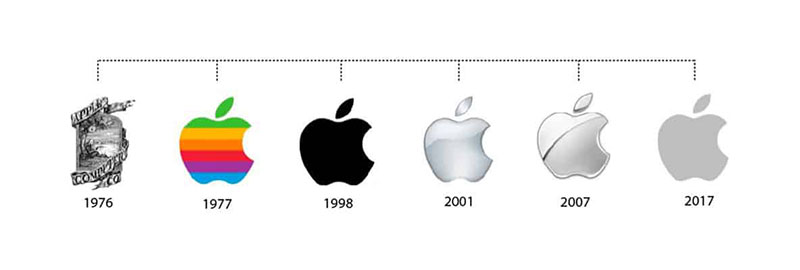
Let’s talk about Apple. You know, the tech giant, not the fruit. Their logo? It’s a legend in the evolution of logos.
It started as this intricate drawing of Isaac Newton sitting under an apple tree. Pretty, but not exactly easy to slap on a product.
Then, in 1977, boom! The rainbow apple appeared. Why a rainbow? It was all about being different, standing out.
Plus, it was the 70s, rainbows were big. This logo rode the wave of Apple’s growing popularity.
Fast forward to now, and we’ve got the sleek, monochrome apple. It’s minimalist, it’s modern, it’s Apple.
This logo isn’t just a symbol; it’s a statement. It’s about simplicity and sophistication. It’s a perfect example of how logo redesign trends and brand identity development play out in the real world.
Nike
Now, onto Nike. The swoosh. It’s more than a logo; it’s an icon. The story goes that it was designed by a student for just $35. Talk about a good investment!
The swoosh first appeared in 1971, and it was all about motion, energy, and victory. It captured the essence of Nike’s brand perfectly. Over the years, this logo has evolved, but it’s always stayed true to its roots.
From a simple swoosh to the 3D effect in the 90s, and then back to a flat design, Nike’s logo has adapted to the times. It’s a prime example of how logos evolve while keeping their soul intact. It’s not just about changes in corporate logos; it’s about evolving a brand’s identity while staying true to what it stands for.
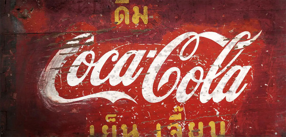
Coca-Cola
![]()
Coca-Cola, oh boy, where do we even start? This logo is like a time machine. It takes you back, way back. The first Coca-Cola logo? It was all fancy, in Spencerian script. You know, the kind of font that screams, “I’m classy.”
But here’s the kicker: it’s barely changed since 1887. Sure, it got bolder, more confident, like it’s saying, “Yeah, I’m Coca-Cola, and I own it.” This logo’s evolution isn’t about big changes. It’s about tiny tweaks, making sure it stays relevant while keeping its soul intact.
It’s a masterclass in brand identity development. Coca-Cola’s logo evolution shows how subtle changes can make a huge impact. It’s not just a logo; it’s a cultural icon.
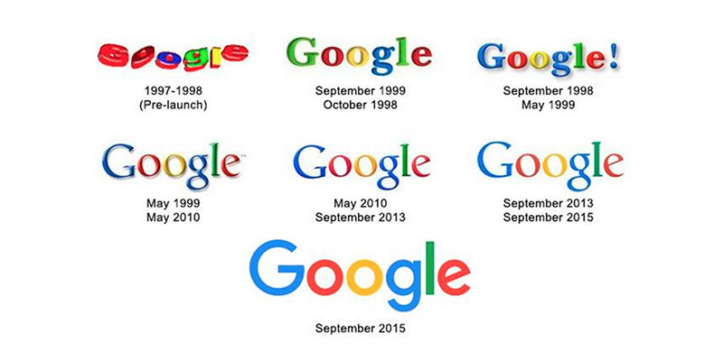
Google, the tech giant, the king of search engines. Their logo? It’s a journey through time. The first Google logo? It was colorful, quirky, a bit like a college project. But hey, it worked.
Then, Google grew up. The logo got sleeker, more professional, but it kept its colors. Why? Because colors are Google’s thing. They’re playful, yet they mean business.
The current logo? It’s minimalist, modern, and it screams “Google.” It’s a perfect example of how logo redesign trends and visual identity evolution play out in the tech world. Google’s logo evolution is all about adapting to the digital age, keeping it fresh while staying recognizable.
McDonald’s
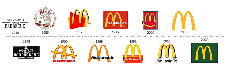
McDonald’s, the fast-food giant. Their logo? It’s golden, literally. The original logo had one yellow arch. Simple, yet effective. But then, the game changed. They doubled it up, making the famous golden arches.
The red background came next, adding a punch of energy and appetite appeal. It’s bold, it’s bright, it’s McDonald’s. This logo’s evolution is a story of how a simple idea can become an iconic symbol.
The golden arches aren’t just a logo; they’re a beacon for hungry people everywhere. It’s a prime example of how historical branding and changes in corporate logos can shape a brand’s identity and its place in our culture.
Shell
![]()
Look at Shell, with its yellow and red shell emblem. That thing’s a beacon.
Started off with a realistic mussel shell, then upgraded to the scallop design in 1904. More than a hundred years later, it’s sleeker, vibrant, grabs your eyes like a shiny object.
It’s all brand identity development done right.
Baskin-Robbins
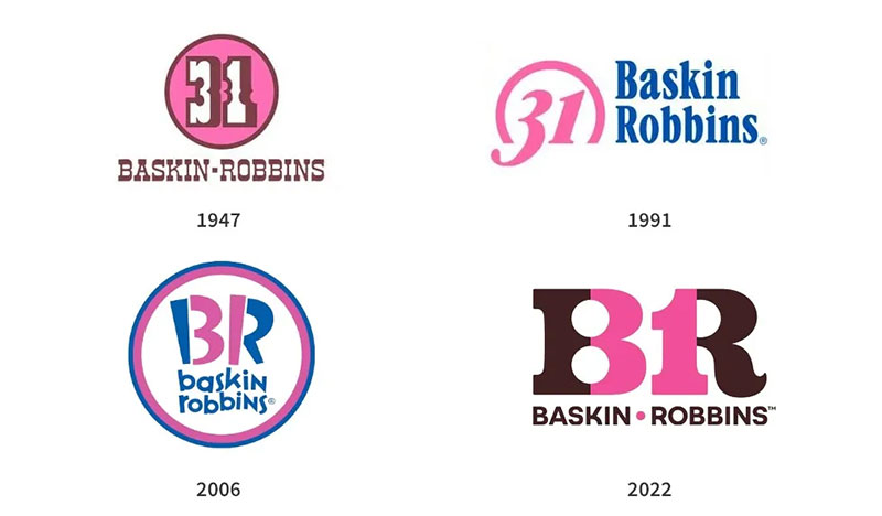
Baskin-Robbins? Clever. Their emblem’s got that BR that doubles as the number 31. Why? That’s their famous 31 flavors promise.
The logos started with that classic 50’s feel and morphed into, well, a hidden smile in the “B”. Talk about a logo redesign trend playing tricks on the eyes!
Levi’s
![]()
Levi’s and the batwing. Simple. Bold. Effective. This logo’s like a stamp of quality on denim. You see it, you know it’s durable.
The red tab with that unmistakable typeface – it’s remained pretty steadfast. Tiny tweaks, yes, for that modern touch.
It’s the subtle art of visual identity changes and brand marks modifications, keeping the rugged spirit alive.
Canon
![]()
Canon, now that’s history merged with high-tech. From “Kwanon” to Canon, they dropped the Buddhist deity and focused on precision.
The logos went from elaborate to minimal, from typography to the simple image of a camera. It’s a journey in evolutionary design focusing on quality imagery.
Starbucks
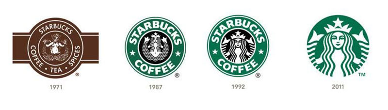
Ah, Starbucks. Started with that seductive siren full of detail, now she’s a global wake-up call. The logo stripped down to its essence over time, as if saying, “Coffee. Here. Now.”
It’s a masterstroke in dynamic branding, a lesson in how to make visual communication subtly powerful.
Pepsi
Pepsi’s globular dance – blue, red, and white – it’s punchy. The logo’s morphed from script to circle, a kind of logo timeline playing out.
It’s flirty; it winks at history while staying right with the times. That circular badge? It zaps energy and movement, just like the drink.
Chevrolet
![]()
Chevrolet’s got the cross-style bowtie. Elegant. Iconic. Tells a story of ruggedness and class. First sketched out in 1913, it’s become bolder, switched up colors, but at its heart, it’s stayed a flag bearer of the open road.
It’s a classic spin on corporate rebranding and how brand logo progression can zoom into the future.
Microsoft
![]()
Talk about evolution, Microsoft’s logo iterations went from geek to chic. From early disco vibes to the clean-cut window of today.
Hybrid of digital and real, it’s a tile system that’s all business yet friendly. It’s a case study in minimalist, modern design keeping its colors, because hey, variety is the spice of digital life.
Doritos
Doritos, oh boy, from that sombrero feeling to the current splash of zest. The changes are all about kick, crunch, being bold.
Red, bold typography, loud and proud. It’s a story of how to make aesthetic trends in logos work hard, say it loud – snack time just got epic.
Buick
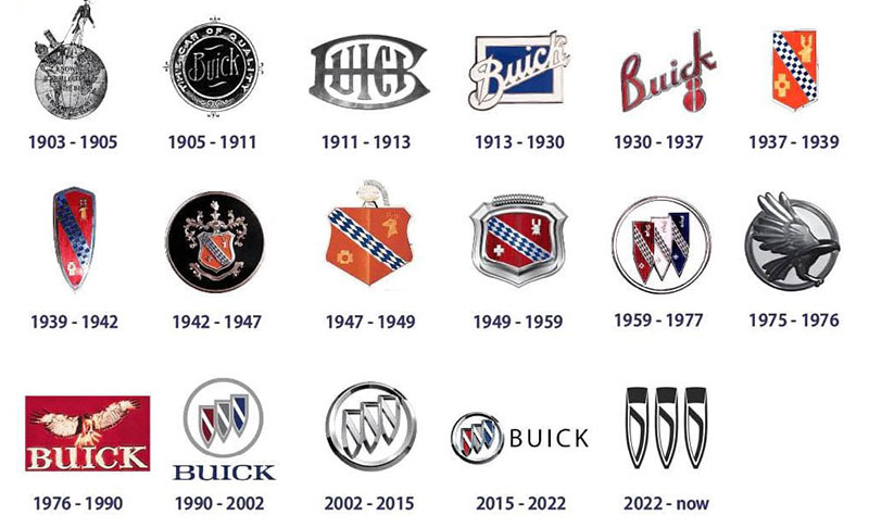
Buick’s tri-shield. It’s armor, it’s heritage. First, each shield represented a model. Now? They’re united, in harmony, a trinity of luxury and performance.
Metallic colors give it that sophistication. This logo’s keeping pace while remembering where it’s parked.
Amazon
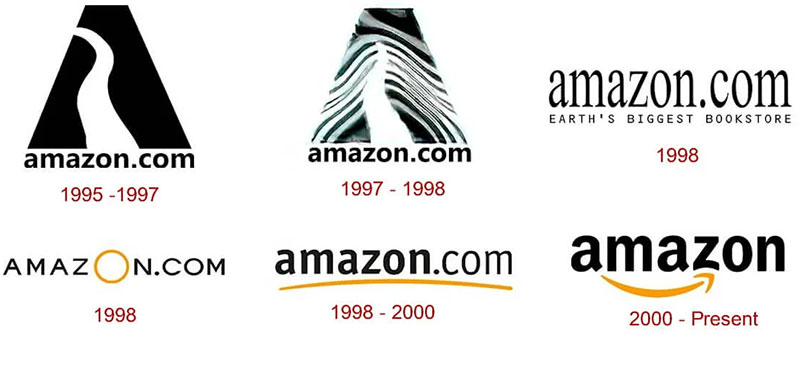
Amazon, the smile that delivers from A to Z. Literally, it goes from A to Z. From a river to the biggest store in the world.
It’s a smart logo; it makes you feel good, like opening a package. Logo adaptation here’s about staying friendly, being the go-to for, well, almost everything!
BMW
![]()
BMW’s roundel, the propeller myth, right? It stuck. Bavaria’s colors whirl in those quadrants, and it’s been a status symbol on wheels.
It’s only grown cleaner, clearer, like a window into the future of driving. It’s an iconic brand symbol tuning up with the times.
Adidas
Three stripes. Then the trefoil. Now the mountain. Adidas. It shouts, climb, strive, win.
Their logo evolution is a blueprint in staying competitive, pushing the envelope.
Logos here tell a story of sporting spirit and logo transformation that’s always in motion.
Walmart
![]()
The spark in Walmart’s branding. Simple. A star turned sunburst turned spark. I
t’s a wheel turning, symbolic representation of deals, aisles, a community meeting point. It’s gotten brighter, more defined, a beacon for bargain hunters across the globe. All about being the friendly giant next door.
The Role of Logos in Brand Identity
Emotional Connection and Brand Perception
Ever noticed how a simple swoosh makes you think of Nike? That’s the magic of logos.
They’re more than just fancy designs; they’re the silent ambassadors of a brand. In the evolution of logos, we’ve seen how they create an emotional bond with us. It’s like logos have their own language, speaking directly to our hearts.
How logos instill trust and convey brand messages is fascinating. They’re not just random shapes and colors.
Each curve, each hue is a carefully thought-out decision. It’s all about psychology. Take Apple’s logo, for instance. It’s simple, yet it speaks volumes about sophistication and innovation.
And then there’s the impact of color psychology in logo design. Colors aren’t just pretty; they’re powerful.
They can make us feel calm, excited, or even hungry (looking at you, McDonald’s). It’s all part of the brand identity development.
Modern Successful Logos and Marketing Strategies
The Role of Logos in Contemporary Marketing
Logos today? They’re like the superheroes of the marketing world. Think about it. In a world where every second a new brand pops up, standing out is tough. That’s where logos come in, capes and all.
Logos in a saturated market? They’re your first impression, your handshake, your “Hey, look at me!” moment. They’re not just logos; they’re the face of the brand. And in today’s digital jungle, that’s gold.
But it’s not just about looking pretty. Logos as a powerful marketing tool? Absolutely. They’re like a shortcut to your brain. See a swoosh, think Nike. See an apple with a bite, think different. That’s the power of a well-crafted logo.
Examples of Successful Modern Logos
Remember when Google went for a makeover in 2015?

That was a big deal. It wasn’t just a change; it was a statement. It said, “We’re ready for the future.” That’s what successful logos do. They evolve with the times, but they keep their soul.
And then there are logos that have become cultural icons. Like Apple. It’s not just a logo; it’s a lifestyle. These logos aren’t just part of the brand; they are the brand.
Challenges and Failures in Logo Design
Risks of Poorly Designed Logos
Not all logos hit the jackpot. Some miss the mark, and oh boy, can that backfire.
A poorly designed logo? It’s like showing up to a black-tie event in pajamas. It sends the wrong message.
Examples of logo design failures? They’re lessons in what not to do. They show us that a logo isn’t just a fancy doodle.
It’s a strategic tool. Get it wrong, and it’s not just a design fail; it’s a brand fail.
The importance of professional logo design consultation can’t be overstated. It’s like going to a doctor instead of Googling your symptoms.
Professionals know their stuff. They understand that a logo needs to resonate with the audience, align with the brand’s values, and stand the test of time.
FAQ On Evolution Of Logos
What is the Evolution of Logos?
Logos have journeyed from simple symbols to complex brand identities. It’s like watching a kid grow up. They started as basic identifiers, then evolved into intricate designs reflecting brand stories and values.
This evolution mirrors cultural and technological shifts, making logos more than just art; they’re a snapshot of history.
Why Do Logos Change Over Time?
Logos change because brands evolve. It’s like updating your wardrobe; you gotta keep up with the times.
Brands grow, markets shift, and logos need to reflect that. They adapt to stay relevant and appealing. It’s not just a facelift; it’s about staying connected with the audience.
What’s the Impact of a Logo Redesign?
A logo redesign can be like a shot of espresso for a brand. It can reenergize and refocus the brand identity.
But it’s risky; get it wrong, and you might alienate loyal customers. Done right, it can attract new audiences and refresh the brand’s image.
How Do Cultural Changes Influence Logo Design?
Cultural shifts are like the wind that steers the logo’s sail. As society changes, so do consumer values and aesthetics.
Logos adapt to these changes to stay relevant and resonate with the current audience. They’re a mirror reflecting societal trends and preferences.
Can a Logo Redesign Fail? Examples?
Absolutely, logo redesigns can flop. Remember Gap’s 2010 redesign? It lasted just one week! It’s a classic case of fixing something that wasn’t broken.
A failed redesign can confuse customers and dilute brand identity. It’s a delicate dance between innovation and tradition.
What Role Does Technology Play in Logo Evolution?
Technology is the backstage crew in the logo theater. With digital advancements, logo designs have become more dynamic and versatile.
Think 3D effects or animation. Tech allows for more creativity in design, making logos not just symbols but experiences.
How Do Logos Reflect a Brand’s Identity?
Logos are like the face of a brand. They encapsulate the brand’s personality, values, and story.
A well-designed logo communicates what the brand stands for and what it offers, creating an instant connection with the audience. It’s the visual shorthand for the brand’s identity.
What’s the Significance of Color in Logo Design?
Color in logos is like spices in cooking; it can change the whole flavor. Each color evokes different emotions and associations.
Red screams energy and passion, while blue is all about trust and stability. Choosing the right color palette is crucial in conveying the right message.
How Has Globalization Affected Logo Design?
Globalization has turned logo design into a global conversation. Brands now cater to a worldwide audience, making logos more inclusive and universally appealing.
It’s about balancing local charm with global sophistication. Logos have become more simplified and adaptable to various cultures and languages.
What’s the Future of Logo Design?
The future of logo design? It’s like stepping into a sci-fi movie. Expect more interactive and adaptable logos, thanks to augmented reality and AI.
Logos will become more than static images; they’ll be immersive experiences. The focus will be on personalization and digital adaptability.
Conclusion On Evolution Of Logos
Wrapping up this journey through the evolution of logos, it’s like we’ve time-traveled, isn’t it? From ancient symbols to digital masterpieces, logos have come a long way.
They’re not just brand identifiers anymore; they’re storytellers, emotion-evokers, and culture-shapers.
In this era of brand identity development and visual identity evolution, logos have become crucial in connecting with audiences.
They’ve adapted to technological advancements, cultural shifts, and market dynamics, always staying a step ahead. It’s fascinating how a simple design can capture the essence of a brand and make it unforgettable.
As we’ve seen, the evolution of logos is more than a design trend; it’s a reflection of our society’s progress.
Whether it’s the minimalist charm of Apple or the dynamic swoosh of Nike, logos will continue to be the silent yet powerful voices of brands.
They’re set to evolve further, embracing new technologies and ideas, always ready to tell the next chapter of their story.
If you liked this article about the evolution of logos, you should check out this article about companies that need rebranding.
There are also similar articles discussing rebranding questions, rebranding failures, why HBO keeps rebranding, and how to make a logo transparent.
And let’s not forget about articles on how to animate a logo, how to trademark a logo, what is brand positioning, and rebranding strategies.
Bogdan Sandu, a seasoned designer with 15 years of diverse experience, has been designing websites since 2008.
Renowned for his expertise in logo design and visual branding, Bogdan has developed a multitude of logos for various clients.
His skills extend to creating posters, vector illustrations, business cards, and brochures. Additionally, Bogdan's UI kits were featured on marketplaces like Visual Hierarchy and UI8.
Latest posts by Bogdan Sandu (see all)
- Green Color Palettes for Designers To Use - 11 May 2024
- Digital Style: What Font Does Cash App Use? - 11 May 2024
- The Coors Light Logo History, Colors, Font, And Meaning - 10 May 2024