


The Chevrolet Logo History, Colors, Font, and Meaning

Ever pause at a red light and spot that iconic bowtie flashing by? That’s the Chevrolet logo—more than just an emblem adorning motor hoods; it’s a emblematic cornerstone of a legendary automotive saga.
Settle in as we unspool the yarn of this American icon. From its birth in Detroit’s visionary minds to its reign over highways and hearts, the Chevy insignia’s journey mirrors the brand’s relentless drive.
As wheels spun, the golden bowtie evolved, mapping out Chevrolet’s destiny, embedded in the cultural tarmac of generations.
Expect an expedition through the past’s rearview mirror to the logo’s contemporary gleam—a design odyssey etched in auto lore.
Discover how a symbol transcends branding, knitting itself into the fabric of society, becoming as familiar as the growl of a muscle car’s ignition.
Embark on this voyage. Unearth the Chevrolet logo’s heritage, its profound impact on branding, and how it steers the marque through the bustling streets of marketing and identity.
The Meaning Behind the Chevrolet Logo
The Chevrolet logo, often referred to as the “Chevy Bowtie”, carries a sense of mystery with it. What’s so special about it, you might ask?
Well, the emblem is more than just an appealing design – it’s a symbol of trust, reliability, and American spirit. It’s like a well-fitted suit, giving the brand a personality that’s both suave and robust, just like the vehicles it adorns.
The Origins of the Chevrolet Logo
The birth of the company
In 1911, Chevrolet Motor Company was founded by Louis Chevrolet and William C. Durant.
The Swiss-born race car driver and the American industrialist joined forces to create a company that would eventually become one of the most significant players in the automotive industry.
Theories on the bowtie’s inspiration
The origin of the Chevrolet logo is shrouded in mystery, with several competing theories about its inspiration. Let’s look at a few of the most popular ones:
The Swiss cross

Some argue that the bowtie design was inspired by the Swiss cross, as Louis Chevrolet was Swiss-American.
It’s said that he wanted to pay homage to his roots, which led to the creation of the bowtie logo.
The wallpaper in a Paris hotel
Another theory suggests that William Durant spotted a bowtie-like pattern on the wallpaper of a Paris hotel during a trip to Europe.
He was so taken by the design that he allegedly tore off a piece of the wallpaper and brought it back to the United States as inspiration for the Chevrolet logo.
The Coalettes coal logo
![]()
There’s also the possibility that the bowtie design was influenced by the Coalettes coal company logo, which featured a similar shape.
Durant may have been inspired by the Coalettes logo, adapting it to create the now-famous Chevrolet emblem.
Other influences
Some people claim that the logo was influenced by various designs and patterns Durant encountered in his daily life, including the emblem of the newspaper he read or even the shape of his wife’s garter.
Ultimately, the true origin of the Chevrolet bowtie remains a mystery, with these theories merely scratching the surface of its enigmatic beginnings.
The Evolution of the Chevrolet Logo Over Time
The Chevrolet logo has seen many iterations over the past century, adapting to changing design trends and reflecting the company’s growth. Let’s explore some of the most notable changes.
The inaugural logo
![]()
The very first Chevrolet bowtie appeared in 1913 and featured a simple, yet elegant, design.
The emblem was a stylized bowtie shape, with the word “Chevrolet” emblazoned across its center in capital letters. This minimalist design was the starting point for what would become an iconic symbol.
The streamlined era
![]()
During the 1930s, the Chevrolet logo underwent significant changes to reflect the streamlined and aerodynamic designs of the era.
The bowtie became sleeker and more elongated, with the company’s name now appearing below the emblem.
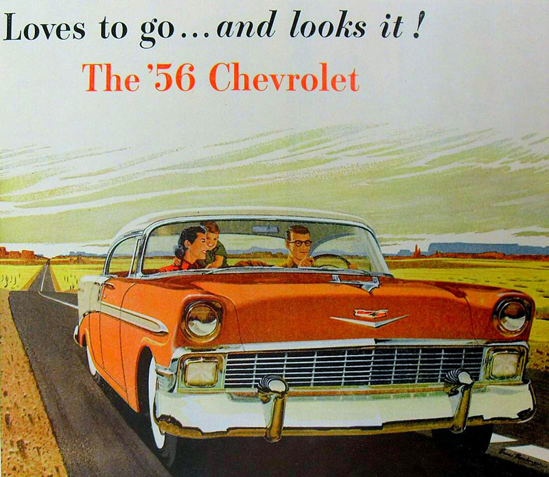
The golden age
![]()
The 1950s are often considered the golden age of American car manufacturing, and the Chevrolet logo evolved accordingly.
The bowtie took on a more luxurious look, with gold accents and a 3D effect that made it stand out. This version of the logo has become one of the most recognizable and is still synonymous with the brand’s mid-century success.
The minimalist touch
![]()
As we moved into the 1970s, the world of design saw a shift toward minimalism, and the Chevrolet logo followed suit.
The gold accents were replaced with a simple blue or black outline, and the 3D effect was dropped in favor of a flat, more contemporary design. This minimalist approach reflected the changing tastes and priorities of the automotive world, as well as the general design trends of the time.
The metallic sheen
![]()
The 1990s brought a new aesthetic to the Chevrolet logo, with a metallic sheen that conveyed a sense of modernity and sophistication.
The bowtie retained its minimalist design but incorporated the metallic finish, giving it a more polished and up-to-date look.
The modern era
![]()
In the 2000s, the Chevrolet logo underwent further refinements, keeping up with the evolving trends of the 21st century.
The bowtie took on a more angular and streamlined appearance, while retaining its metallic finish. This version of the logo represents the current iteration, symbolizing Chevrolet’s commitment to innovation and progress.
The Colors of the Chevrolet Logo
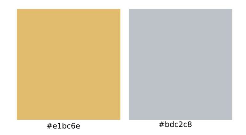
The Power of Gold
Did you ever notice how the Chevy logo seems to pop out at you, with its distinctive golden hue? This isn’t by accident. The gold color was carefully chosen for its connotations of wealth, quality, and prosperity. It’s like a shining promise that the car you’re about to buy is worth every penny.
The Contrast of Silver
But wait, there’s more! The logo isn’t just gold – it’s often set against a silver or chrome background. This contrast creates a dynamic visual, and the silver further emphasizes sophistication and modernity. Together, these colors form a winning combo that’s hard to ignore.
The Font Used in the Chevrolet Logo
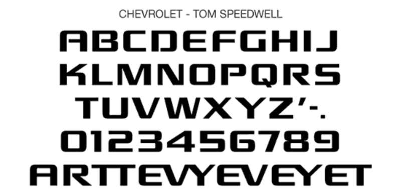
A Typeface with a Statement
Let’s talk typography. The Chevrolet wordmark, usually seen beneath the logo, uses a custom typeface. It’s bold, it’s uppercase, and it screams confidence. Just like the vehicles it represents, the font is strong, robust, and reliable, sending a clear message of strength and quality.
The Magic of Simplicity
Despite its custom nature, the font used in the Chevrolet logo isn’t overly complex or intricate. It’s a simple, sans-serif typeface, free from any unnecessary flourishes. This simplicity speaks to the brand’s straightforward, no-nonsense approach to delivering quality vehicles.
The Adaptability of the Chevrolet Logo
Logo in Digital Spaces
In the world of digital media, the Chevrolet logo shows off its adaptability. It fits perfectly onto app icons, website headers, and digital ads. Its clear and simple design ensures it stands out, even on smaller screens.
Logo on Merchandise
Let’s not forget the logo’s role beyond the cars themselves. Think about merchandise – t-shirts, mugs, keychains – you name it, and the logo adapts to fit. Its bold design and striking colors make it instantly recognizable, even on these smaller, diverse formats.
The Emotional Connection of the Chevrolet Logo
Symbol of Trust
There’s more to a logo than just aesthetics, you know. It’s also about the feelings it stirs within us. For many, the Chevrolet logo is a symbol of trust, a badge of assurance. It’s like a steadfast friend, always reliable, always there.
A Statement of Pride
Chevrolet has long been a staple of American culture. Seeing that bowtie emblem can evoke a sense of pride, a connection to a long-standing tradition of automotive excellence. It’s a declaration of belonging to a community that values quality, innovation, and resilience.
There you have it. The Chevrolet logo, a timeless emblem, has shaped and been shaped by the brand’s journey. It’s more than just a mark on a car; it’s a storyteller, a symbol of trust, and an icon that continues to stand the test of time.
The Chevrolet Logo and the Automotive Industry
Chevrolet’s impact on the industry
Throughout its history, Chevrolet has had a significant impact on the automotive industry, both in terms of design and technological advancements.
The company has consistently pushed boundaries and adapted to changing consumer preferences, with the evolution of its logo reflecting these shifts.
How the logo adapted to evolving design trends
As we’ve seen, the Chevrolet logo has gone through several transformations over the past century, each one reflecting the design trends of its time.
From the streamlined elegance of the 1930s to the bold extravagance of the 1950s, and the minimalist aesthetic of the 1970s to the polished metallic look of the modern era, the bowtie emblem has consistently evolved in tandem with the automotive world.
Chevrolet Logo and the Role of Marketing
The role of advertising in Chevrolet’s history
Advertising has played a significant role in Chevrolet’s success, with the logo acting as a crucial visual element in these marketing efforts.
The company has utilized various advertising strategies to promote its vehicles, from print ads and billboards to television commercials and digital campaigns. In each case, the Chevrolet bowtie has served as a powerful symbol of the brand’s identity and values.
The logo as a representation of the brand
The Chevrolet logo is more than just a design; it represents the company’s ethos and its commitment to quality, innovation, and reliability.
As the bowtie has evolved over the years, it has continued to embody these core principles, acting as a visual representation of the brand’s promise to its customers.
The Chevrolet Logo in Popular Culture
Appearances in movies and TV shows

The Chevrolet logo has made numerous appearances in movies and TV shows over the years, often serving as a symbol of Americana and automotive excellence.
From classic films like “American Graffiti” to popular TV series like “Supernatural,” the bowtie emblem has become a recognizable and enduring presence on the silver screen.
Influence on music and literature
The Chevrolet brand has also left its mark on music and literature, with countless songs and stories referencing the company and its vehicles.
For example, the Beach Boys’ hit “409” and Don McLean’s classic “American Pie” both pay tribute to Chevrolet cars, while authors like Stephen King have woven the brand into their narratives.
The Future of the Chevrolet Logo
The role of the logo in an electric vehicle era
As the automotive industry shifts toward electric vehicles, the Chevrolet logo will likely continue to evolve to reflect this new focus. The bowtie emblem could take on a more futuristic design, symbolizing the brand’s commitment to sustainable transportation and cutting-edge technology.
Anticipating future design trends
While it’s impossible to predict exactly how the Chevrolet logo will change in the coming years, one thing is certain: the emblem will continue to adapt to the latest design trends and consumer preferences.
Just as it has for the past century, the bowtie will remain a powerful symbol of Chevrolet‘s enduring legacy and its ongoing commitment to innovation, quality, and excellence in the world of automotive design.
FAQ On The Chevrolet Logo
What spurred the creation of the Chevrolet logo?
The Chevy logo, that standout bowtie emblem—it’s shrouded in mystery, yeah? Legend whispers, William C. Durant, co-founder, got struck by wallpaper inspiration in a French hotel.
Others reckon it’s a stylized Swiss cross, nodding to Louis Chevrolet’s heritage. It’s one of those tales that keeps the marque’s heart pumping.
Is there a backstory to the Chevrolet logo colors?
Now, colors aren’t random, right? The gold shade dominating the Chevrolet badge, people say it stands for excellence and riches, mirroring Chevy’s standards.
Over time, iterations toyed with black, silver, and blue, each hue adding depth to branding, weaving a tapestry rich as Chevy’s own history.
How does the Chevrolet logo symbolize the brand?
That bowtie? It’s more than fabric cut and stitched. It’s a beacon of innovation and American spirit. It evokes reliability—and let’s not forget, triumph.
A symbol shared across different car models, echoing through showrooms and roads, that’s the kind of timeless branding resonating with anyone dreaming of their next set of wheels.
What changes has the Chevrolet logo undergone?
Much like flipping through a family album, the logo’s seen some makeovers—subtle tweaks, really. From stark outlines to 3D effects, from flat designs back to chrome finishes.
Each adjustment whispers the same story: adaptation and the pursuit of modern flair without losing its soulful identity.
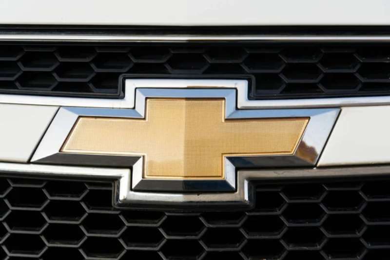
Why does Chevrolet often use the term “bowtie” for their logo?
Chalk it up to its likeness to the accessory, that dapper touch to a suit. The Chevy emblem’s resemblance to a bowtie is uncanny. Now, that’s what stuck. It rolls off the tongue, right? Folks just latched onto “bowtie” as a casual callout to Chevy’s signature.
What is the significance of the Chevrolet logo in marketing?
Talk branding and the Chevy logo leaps front and center. It’s that known. A cornerstone in auto marketing, signaling a rally cry for innovation, trust, endurance. Sets the tone for ads, dealership signage, even swag. It’s the first handshake between Chevy and the world.
Has the digital age influenced the design of the Chevrolet logo?
Sure has. The emblem’s gotta shine on screens, right? Crisper lines, a lean towards minimalism, that’s a nod to digital’s demands. It’s gotta pop in a thumb scroll, command attention amidst screen dazzle. So Chevy wove this digital zeitgeist into the logo’s latest threads.
Does the Chevrolet logo have hidden meanings?
Hidden meanings? Well, it’s kind of like peeling an onion. Some say the slanted cross is a tribute to the cross of Switzerland, others dissect its elements, looking for secret nods to heritage or technology. It’s a tapestry with layers of narrative, each awaiting discovery.
Are there any popular myths about the Chevrolet logo?
Get this, some yarns suggest Durant spied the design on wallpaper or that it’s a version of the cross in the Swiss flag. Myths gust through the Chevy lore, some as wild as a road trip yarn. They embroider the logo with that bit of mystery, you know?
What impact does the Chevrolet logo have on consumer perception?
Tell you what, when folks glimpse that emblem, it’s like a spark. Signals sturdiness, adventure, and Americana. It’s that nod you give to a trusted friend.
The badge, it carries weight, influencing decisions—maybe it’s that small push a consumer needs to say, “Yeah, I’ll go with a Chevy.”
Conclusion
And there we set the last pixel on our canvas, the Chevy bowtie etched in the digital ether. This journey, it’s unwrapped the Chevrolet logo with the care of lifting the hood on a classic Camaro. It’s a stamp of innovation, echoing through showrooms and the hum of busy streets.
What did we unpack? The golds and blues, the evolution touching every angle of brand identity, and those wild myths that teasingly dance around its origins. Grab any thread, from the logo’s design odyssey to its steadfast hinge in marketing, and you’re woven into the very fabric of this American legend.
Speaking to hearts and consumer logic alike, the emblem is a beacon. A pulse in the vast network of automotive lore. Next time that logo catches your eye, remember: You’re not just seeing an icon; you’re glimpsing a legacy in motion.
If you liked this article about the Chevrolet logo, you should check out this article about the Alfa Romeo logo.
There are also similar articles discussing the Lexus logo, the Mazda logo, the Aston Martin logo, and the McLaren logo.
And let’s not forget about articles on the Acura logo, the GMC logo, the Genesis logo, and the Maybach logo.
Bogdan Sandu, a seasoned designer with 15 years of diverse experience, has been designing websites since 2008.
Renowned for his expertise in logo design and visual branding, Bogdan has developed a multitude of logos for various clients.
His skills extend to creating posters, vector illustrations, business cards, and brochures. Additionally, Bogdan's UI kits were featured on marketplaces like Visual Hierarchy and UI8.
Latest posts by Bogdan Sandu (see all)
- The Asahi Logo History, Colors, Font, And Meaning - 4 May 2024
- Playtime Perfection: Fun Kids Color Palettes - 4 May 2024
- PX to REM Converter - 4 May 2024