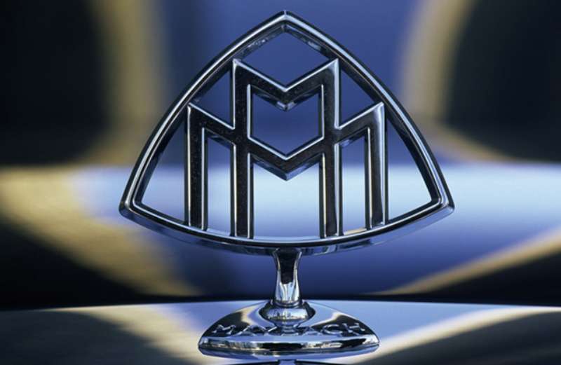
The Maybach Logo stands as one of the most recognizable symbols in ultra-luxury automotive branding. It represents over a century of German engineering excellence and handcrafted opulence.
The current emblem features two overlapping M letters within a triangular frame. Mercedes-Benz revived this iconic mark in 2002 when they relaunched Maybach as a standalone brand. The original company, Maybach Motorenbau, was founded in 1909 by Wilhelm Maybach and his son Karl.
Throughout its history, the brand has used approximately four distinct logo versions. Each iteration maintained the double M motif while adapting to contemporary logo design principles and market positioning within the premium automotive segment.
What is the Maybach Logo?
![]()
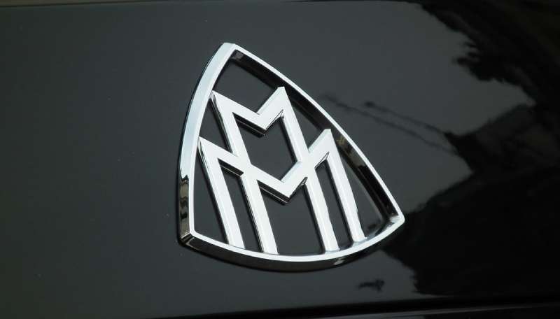
The Maybach Logo is a triangular emblem containing two overlapping capital M letters. Introduced in 1909, it was designed to honor founders Wilhelm and Karl Maybach. The interlocked letters symbolize the father-son partnership that built the brand.
Design Specifications
- Design Type: Combination mark (emblem with monogram)
- Primary Elements: Double M monogram, triangular border, chrome or silver finish
- Official Introduction Date: 1909 (original), 2002 (modern revival)
- Designer: Wilhelm Maybach (original concept)
- Trademark Status: Registered trademark under Daimler AG (now Mercedes-Benz Group)
- Color Palette: Silver/Chrome (#C0C0C0), Black (#000000), occasionally Gold (#D4AF37)
- Usage Context: Vehicle badges, hood ornaments, steering wheels, key fobs, marketing materials, dealership signage
How Has the Maybach Logo Evolved Over Time?
![]()
The Maybach emblem has gone through four major phases since 1909.
It started as a simple double M design. Then it gained Art Deco influences in the 1920s and 1930s.
The brand went dormant after World War II. Mercedes-Benz brought it back in 2002 with a modernized version.
Original Maybach Logo (1909-1940)
- Years Active: 1909-1940
- Design Description: Two capital M letters overlapping within a simple geometric frame. Clean lines with minimal ornamentation.
- Color Scheme: Polished metal finish, typically nickel or chrome
- Designer: Attributed to Wilhelm Maybach
- Context: Created when Maybach Motorenbau began producing luxury vehicles and aircraft engines. The company supplied engines for Zeppelin airships during this period.
- Key Changes from Previous: First iteration, established the double M concept
- Cultural Significance: Represented German engineering prowess during the early automotive era. The brand competed directly with Rolls-Royce for the title of world’s finest automobile.
Pre-War Refined Logo (1930s-1941)
- Years Active: Early 1930s to 1941
- Design Description: More ornate double M with stronger Art Deco influences. The triangular shape became more pronounced.
- Color Scheme: Chrome with occasional enamel accents
- Designer: In-house design team
- Context: Aligned with the Maybach Zeppelin and DS series, the most luxurious cars of their time
- Key Changes from Previous: Added decorative elements reflecting period aesthetics
- Cultural Significance: Became associated with royalty, heads of state, and the ultra-wealthy
Dormant Period (1941-2002)
Maybach stopped producing passenger vehicles after World War II. The company shifted to manufacturing diesel engines for railways and other industrial applications.
The logo essentially disappeared from public consciousness during these six decades. Daimler-Benz acquired the brand in 1960 but kept it dormant.
Modern Revival Logo (2002-2012)
- Years Active: 2002-2012
- Design Description: Refined double M within a more angular triangular frame. Cleaner, more contemporary execution while honoring heritage.
- Color Scheme: Polished chrome, black enamel backgrounds
- Designer: Mercedes-Benz design team
- Context: Daimler relaunched Maybach as a standalone ultra-luxury brand to compete with Bentley and Rolls-Royce
- Key Changes from Previous: Modernized proportions, sharper angles, updated finish quality
- Cultural Significance: Became a status symbol in hip-hop culture and among new money clientele
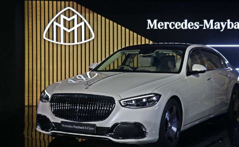
Mercedes-Maybach Era Logo (2014-Present)
- Years Active: 2014 to present
- Design Description: The double M emblem now appears alongside the Mercedes-Benz three-pointed star. Both marks work together as a co-branded identity.
- Color Scheme: Chrome silver, black, with occasional rose gold variants
- Designer: Mercedes-Benz Global Design
- Context: Maybach repositioned as Mercedes-Benz’s ultra-luxury sub-brand rather than a standalone marque
- Key Changes from Previous: Paired with Mercedes star, slightly simplified double M
- Cultural Significance: Bridges heritage with contemporary luxury expectations
What Do the Design Elements of the Maybach Logo Mean?
Every part of the Maybach emblem carries specific meaning.
The overlapping M letters represent the Maybach family name. They also reference the partnership between Wilhelm and Karl.
The triangular frame suggests stability and upward momentum. It creates a strong focal point that draws attention immediately.
Why Did Maybach Choose These Specific Colors?
Silver dominates the Maybach color palette for good reason.
Chrome and silver finishes communicate precision engineering. They also reflect light beautifully on a vehicle’s hood.
Black backgrounds create contrast that makes the emblem pop. The combination feels both timeless and expensive.
- Silver/Chrome: Hex #C0C0C0. Represents precision, modernity, and high technology. The metallic quality suggests valuable materials and expert craftsmanship.
- Black: Hex #000000. Conveys power, sophistication, and exclusivity. Common among black logos in the luxury sector.
- Gold (occasional): Hex #D4AF37. Used on special editions. Represents ultimate luxury and rarity, similar to other gold logos in premium markets.
What Typography Style Is Used in the Maybach Logo?
The double M uses custom letterforms rather than a standard typeface.
The letters feature geometric construction with subtle curves. They lean slightly toward sans-serif characteristics while maintaining classic proportions.
Readability stays high even at small sizes on key fobs or wheel caps. The kerning between the overlapping letters required careful attention to prevent visual confusion.
What Are the Hidden Meanings in the Maybach Logo?
The overlapping structure creates an interesting effect. Where the two M letters meet, they form a subtle arrow pointing upward.
This wasn’t accidental. Maybach built aircraft engines before cars, and the upward direction connects to that aviation heritage.
The triangular border also relates to the brand’s Zeppelin connection. Many interpret the shape as representing an airship’s nose profile or a mountain peak suggesting achievement.
How Does the Maybach Logo Compare to Competitor Logos?
Ultra-luxury automotive brands share certain visual approaches. Most favor chrome finishes and monochromatic schemes.
But Maybach’s double M stands apart from competitors. It’s more abstract than the Bentley Logo with its winged B or the Rolls-Royce Logo featuring the Spirit of Ecstasy.
Comparative Analysis
Maybach vs. Rolls-Royce: Rolls-Royce uses a figurative mascot (Spirit of Ecstasy) while Maybach relies purely on letterforms. Both communicate exclusivity but through different visual strategies.
Maybach vs. Bentley: Bentley’s winged B emphasizes speed and flight more overtly. Maybach’s overlapping letters feel more understated and mysterious.
Maybach vs. BMW: BMW’s roundel and Maybach’s triangle both use geometric shapes, but BMW’s propeller reference speaks to different heritage than Maybach’s Zeppelin connection.
Maybach vs. Mercedes-Benz: The three-pointed star represents land, sea, and air transportation. Now paired with Maybach’s double M, the two symbols create a layered brand hierarchy.
What Are the Technical Specifications of the Maybach Logo?
Official Color Codes
- Primary Silver: Hex #C0C0C0, RGB (192, 192, 192), CMYK (0, 0, 0, 25)
- Primary Black: Hex #000000, RGB (0, 0, 0), CMYK (0, 0, 0, 100)
- Accent Gold: Hex #D4AF37, RGB (212, 175, 55), CMYK (0, 17, 74, 17), Pantone 873 C
- Mercedes-Maybach Chrome: Hex #E8E8E8, RGB (232, 232, 232), CMYK (0, 0, 0, 9)
Dimensions and Proportions
- Aspect Ratio: Approximately 1:1.15 (width to height) for the triangular version
- Minimum Size Requirements: 12mm height for physical badges, 40 pixels for digital applications
- Clear Space: Minimum clear space equal to the height of one M letter on all sides
- File Formats: Available as vector graphics (AI, EPS, SVG) and raster formats for approved partners
What Cultural Impact Has the Maybach Logo Had?
The Maybach emblem transcended automotive circles in the 2000s. Hip-hop artists like Jay-Z and Rick Ross made the brand a cultural phenomenon.
Rick Ross even named his record label Maybach Music Group. The double M became shorthand for extreme wealth and success.
In China and the Middle East, the logo carries significant prestige value. Buyers often choose Maybach specifically for the badge’s recognition factor among peers.
How Does the Maybach Logo Fit Into the Overall Brand Identity?
The double M works within a larger visual system today. Mercedes-Maybach products display both the three-pointed star and the Maybach emblem.
This dual-badge approach serves strategic purposes. It leverages Mercedes-Benz recognition while maintaining Maybach’s heritage positioning.
Brand guidelines specify exactly where each emblem appears. The star takes the hood position while the double M appears on C-pillars, wheel centers, and interior trim.
Marketing materials follow strict visual hierarchy rules. The Maybach name appears in a custom serif font that complements the geometric logo.
How Should the Maybach Logo Be Used?
Official Usage Guidelines
Do:
- Maintain minimum clear space around the emblem
- Use approved color combinations only
- Scale proportionally without distortion
- Apply to approved materials and surfaces
Don’t:
- Rotate or skew the logo
- Apply unapproved colors or gradients
- Place on busy backgrounds that reduce legibility
- Modify the overlapping M proportions
- Combine with unauthorized graphic elements
Accessing Official Assets
Authorized dealers and partners can access official logo files through the Mercedes-Benz Brand Portal. Media outlets may request assets through the corporate communications department.
Trademark Protection
The Maybach name and double M emblem are registered trademarks of Mercedes-Benz Group AG. Unauthorized commercial use can result in legal action.
Personal use (like fan art or editorial content) generally falls under fair use, but selling merchandise featuring the logo requires explicit licensing agreements.
Counterfeit Maybach badges remain a problem in some markets. The company actively pursues manufacturers and sellers of fake emblems.
FAQ on The Maybach Logo
What Does the Maybach Logo Represent?
The Maybach emblem represents the partnership between Wilhelm Maybach and his son Karl. The overlapping M letters honor both founders of Maybach Motorenbau.
It symbolizes German engineering excellence and ultra-luxury craftsmanship. The design has signified prestige since 1909.
Who Designed the Original Maybach Logo?
Wilhelm Maybach created the original double M concept in 1909. He wanted a simple mark that reflected the family name.
No external design agency was involved. The psychology of shapes behind the triangular frame suggests stability and ambition.
What Do the Two M’s in the Maybach Logo Mean?
The two M’s stand for Maybach Motorenbau, the original company name. They also reference the father-son team.
Some interpret the overlapping letters as representing unity between tradition and innovation. The interlocked design creates visual unity that feels intentional.
When Was the Maybach Logo First Created?
The original Maybach badge appeared in 1909. This coincided with the founding of Maybach Motorenbau GmbH in Germany.
The company initially built engines for Zeppelin airships. Vehicle production followed shortly after, carrying the double M symbol.
What Colors Are Used in the Official Maybach Logo?
Silver and black dominate the official color scheme. Chrome finishes appear on physical badges.
Gold variants exist for special editions. Understanding color psychology explains why these choices communicate luxury and exclusivity so effectively.
Is the Maybach Logo Trademarked?
Yes. Mercedes-Benz Group AG holds the trademark for both the Maybach name and double M emblem.
The registration covers global markets. Unauthorized commercial use faces legal consequences. Counterfeit badges remain a persistent issue in some regions.
What Is the Difference Between Maybach and Mercedes-Maybach Logos?
The standalone Maybach logo features only the double M. Mercedes-Maybach vehicles display both the three-pointed star and the Maybach emblem together.
This dual-badge strategy started in 2014. It creates clear typographic hierarchy between parent brand and sub-brand.
Why Is the Maybach Logo Shaped Like a Triangle?
The triangular frame connects to Maybach’s aviation heritage. The company built engines for Zeppelin airships before making cars.
Triangles suggest upward movement and achievement. This shape choice reflects the brand’s aspirational positioning in luxury markets.
How Much Does a Replacement Maybach Emblem Cost?
Genuine Maybach hood ornaments cost between $200 and $800. Prices vary by model and finish.
Wheel center caps run $50 to $150 each. Always purchase through authorized Mercedes-Benz dealers to avoid counterfeits flooding online marketplaces.
What Font Style Appears in the Maybach Logo?
The double M uses custom typography rather than a standard font. The letterforms blend geometric precision with subtle curves.
This bespoke approach ensures the Maybach wordmark remains distinctive. No commercially available typeface matches it exactly.
Conclusion
The Maybach Logo remains one of the most distinctive marks in automotive history. Its double M design has survived world wars, brand dormancy, and corporate acquisitions.
Few luxury car badges carry this much heritage. The emblem connects directly to Zeppelin airships, German coachbuilding traditions, and over a century of engineering excellence.
Today’s Mercedes-Maybach vehicles blend that legacy with modern storytelling. The chrome badge on an S-Class or GLS signals something beyond transportation.
It represents membership in an exclusive club. That’s the real power of effective design elements working together across generations.
Renowned for his expertise in logo design and visual branding, Bogdan has developed a multitude of logos for various clients.
His skills extend to creating posters, vector illustrations, business cards, and brochures. Additionally, Bogdan's UI kits were featured on marketplaces like Visual Hierarchy and UI8.
He also wrote in the past years on sites like Design Your Way, WebDesignerDepot, WPDean, Designmodo, Speckyboy, Slider Revolution, and more.
- The Airtable Logo History, Colors, Font, And Meaning - 12 July 2026
- How to Blur Background in Canva: A Quick Tutorial - 11 July 2026
- Typography Trends - 10 July 2026
Bogdan Sandu is a seasoned designer who has been designing websites since 2008. Renowned for his expertise in logo design and visual branding, Bogdan has developed a multitude of logos for various clients. His skills extend to creating posters, vector illustrations, business cards, and brochures. Additionally, Bogdan's UI kits were featured on marketplaces like Visual Hierarchy and UI8. He also wrote in the past years on sites like Design Your Way, WebDesignerDepot, WPDean, Designmodo, Speckyboy, Slider Revolution, and more.
You Might Also Like