The Genesis logo stands as one of the more striking automotive emblems to emerge in recent years. It represents the luxury vehicle division of Hyundai Motor Group, which spun off as its own brand in 2015.
This winged emblem positions Genesis within the competitive landscape of premium automakers like BMW, Mercedes-Benz, and Lexus. The current version features a triangular crest flanked by stylized wings, introduced when the brand launched independently.
Genesis has used variations of this core design since its founding, though the emblem has seen refinements. The brand itself grew from the Hyundai Genesis sedan nameplate, first appearing in 2008 before becoming a standalone marque seven years later.
What is the Genesis Logo?

The Genesis logo is a winged emblem featuring a shield-shaped crest with the brand name, officially introduced in November 2015 when Hyundai established Genesis as an independent luxury division. The design team created it to signal prestige and forward motion.
Design Type: Combination mark (emblem with wordmark)
Primary Elements: Triangular shield crest, bilateral wings extending outward, “GENESIS” wordmark positioned below or integrated within the design
Official Introduction Date: November 4, 2015
Designer/Agency: Hyundai Motor Group’s internal design team, with Luc Donckerwolke later joining as Chief Creative Officer to refine brand identity
Trademark Status: Registered trademark of Genesis Motor, LLC in the United States and internationally
Color Palette: Primary copper/bronze metallic, secondary black, with silver/chrome variants for different applications
Usage Context: Vehicle grilles, steering wheels, key fobs, dealership signage, marketing materials, digital platforms, and merchandise
How Has the Genesis Logo Evolved Over Time?
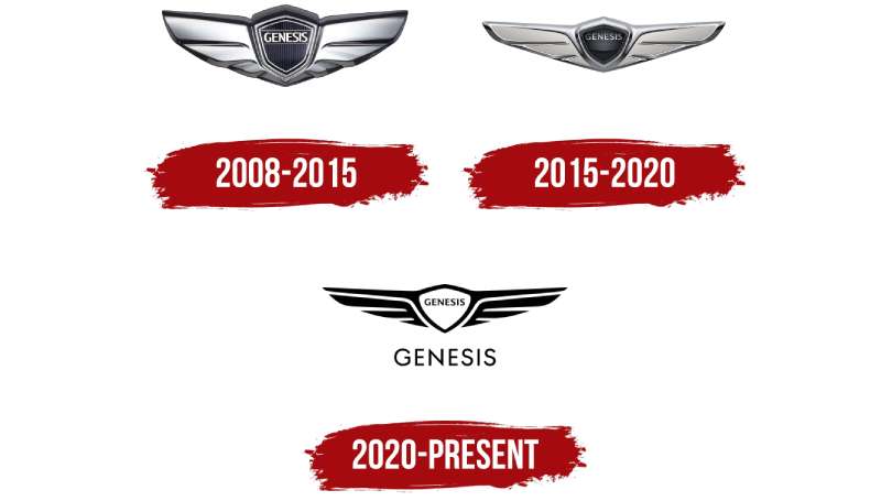
The Genesis emblem has undergone subtle but meaningful changes since 2008. It started as a Hyundai sub-brand badge before becoming the standalone symbol we recognize today.
Each iteration refined the wings and crest proportions. The most recent updates focused on simplifying details for digital readability.
Original Hyundai Genesis Badge (2008-2015)
Years Active: 2008-2015
Design Description: The initial badge appeared on the Hyundai Genesis sedan and Coupe. It featured a winged emblem but remained clearly connected to Hyundai’s corporate identity. The wings were more ornate, with detailed feathering.
Color Scheme: Chrome silver with black accents
Context: Hyundai introduced this as their first serious attempt at the luxury sedan market. The badge needed to feel premium while still carrying Hyundai DNA.
Cultural Significance: It represented South Korea’s ambition to compete with German and Japanese luxury brands.
Standalone Genesis Brand Logo (2015-2020)
Years Active: 2015-2020
Design Description: When Genesis became independent, the logo received a complete overhaul. The wings became more angular and streamlined. A distinct crest shape emerged at the center.
Color Scheme: Copper/bronze became the signature color, paired with black
Designer: Hyundai Motor Group design team under Peter Schreyer’s leadership
Key Changes from Previous: Removal of Hyundai associations, introduction of the copper color identity, simplified wing geometry
Context: The brand needed to establish its own identity separate from its parent company. This logo had to stand on its own against Lexus, Infiniti, and European rivals.
Refined Genesis Emblem (2020-Present)
Years Active: 2020-present
Design Description: The current version features cleaner lines and improved proportions. The crest is more pronounced, and the wings feel more integrated rather than attached.
Color Scheme: Retained copper/bronze identity with expanded silver and black variants
Designer: Refined under Luc Donckerwolke and SangYup Lee
Key Changes from Previous: Streamlined details for better reproduction at small sizes, adjusted wing angles, enhanced three-dimensional appearance on physical badges
Context: As Genesis expanded its lineup with SUVs like the GV70 and GV80, plus electric vehicles like the GV60, the logo needed to work across more applications.
What Do the Design Elements of the Genesis Logo Mean?
The winged crest communicates speed, luxury, and aspiration. Wings have historically symbolized freedom and transcendence in automotive branding.
The triangular shield suggests protection and stability. Together, these elements tell a story of refined power.
Why Did Genesis Choose These Specific Colors?
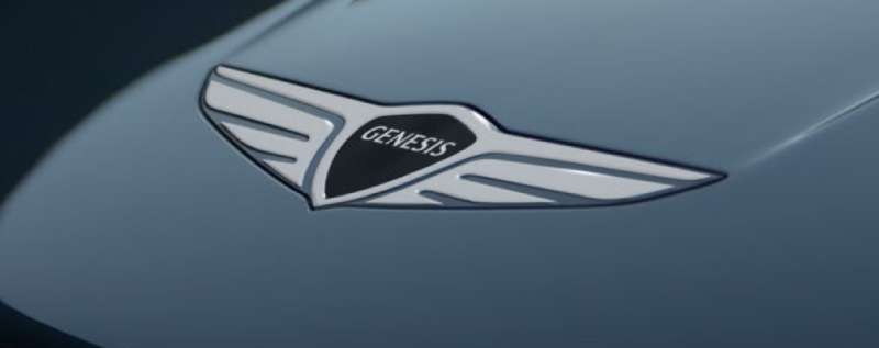
The copper/bronze primary color sets Genesis apart from competitors who typically use silver, blue, or red.
This choice reflects color psychology principles. Copper suggests warmth, craftsmanship, and timelessness.
Copper/Bronze: Hex approximately #B87333, represents sophistication without coldness, differentiates from silver-heavy luxury competitors
Black: Hex #000000, provides contrast and grounds the metallic tones, signals premium positioning
Silver/Chrome: Used in alternate applications, connects to traditional automotive luxury cues while maintaining versatility
What Typography Style Is Used in the Genesis Logo?
Genesis uses a custom sans-serif wordmark with distinctive characteristics. The letterforms are geometric yet refined.
The tracking is generous, giving each letter room to breathe. This creates an airy, upscale feeling.
Vertical strokes are slightly tapered. The “G” features a unique crossbar treatment that has become recognizable.
What Are the Hidden Meanings in the Genesis Logo?
The wings form a shape that mirrors the letter “G” when viewed abstractly. Some see this as intentional, others as coincidence.
The bilateral symmetry suggests balance and precision. This reflects the brand’s focus on engineering excellence.
The upward angle of the wings implies ascension and progress. Genesis positions itself as a rising competitor to established luxury names.
How Does the Genesis Logo Compare to Competitor Logos?
Genesis occupies interesting territory among luxury automotive emblems. It shares the winged motif with Bentley and Aston Martin, though with distinct execution.
Where Bentley’s wings feel ornate and traditional, Genesis opts for sharper, more contemporary lines.
Compared to its direct competitor Lexus, Genesis has chosen symbolism over abstraction. The Lexus “L” is minimal and geometric. Genesis went for something with more visual weight.
Against German competitors like BMW and Audi, the winged emblem feels intentionally different. These established brands use geometric shapes. Genesis signals that it’s playing a different game.
The Hyundai logo connection has been carefully managed. While Genesis emerged from Hyundai, the two emblems share no visual language today.
What Are the Technical Specifications of the Genesis Logo?
Official Color Codes:
Primary Copper/Bronze:
Black:
- Hex: #000000
- RGB: (0, 0, 0)
- CMYK: (0, 0, 0, 100)
Dimensions and Proportions:
The logo follows specific aspect ratio guidelines. The wing span typically measures approximately 3:1 ratio to the crest height.
Minimum size requirements ensure the emblem remains legible. Digital applications require at least 24 pixels height for the crest portion.
Clear space specifications mandate padding equal to the height of the “G” letterform on all sides.
The brand guidelines document covers approved color variations, placement rules, and prohibited modifications.
What Cultural Impact Has the Genesis Logo Had?
The Genesis emblem has reshaped perceptions of Korean automotive manufacturing. It proved that a Hyundai spinoff could create genuine luxury credibility.
The logo appears at major sporting events, fashion partnerships, and cultural sponsorships. It has become recognizable beyond car enthusiast circles.
Younger luxury buyers especially respond to the brand’s fresh positioning. The logo feels less stuffy than traditional European emblems.
How Does the Genesis Logo Fit Into the Overall Brand Identity?

The logo anchors a comprehensive visual system. It connects to Genesis showroom architecture, vehicle interior design, and marketing materials through consistent application.
The copper accent color appears throughout Genesis dealerships and on the signature “Two Lines” lighting design found on all vehicles.
This relationship between emblem and environment creates cohesive storytelling. Customers experience the brand consistently across touchpoints.
The brand style guide ensures this consistency extends to everything from business cards to television commercials.
How Should the Genesis Logo Be Used?
Official Usage Guidelines:
Do maintain minimum clear space around the logo. Do use approved color variations only. Do preserve the original proportions when scaling.
Don’t rotate or distort the emblem. Don’t place the logo on busy backgrounds that reduce legibility. Don’t recreate the logo using alternative fonts or wing designs.
Accessing Official Logos:
Genesis provides logo files through its media portal for press and authorized partners. Dealerships receive assets through corporate channels.
Licensing Information:
Unauthorized commercial use is prohibited. Merchandise featuring the Genesis logo requires licensing agreements with Genesis Motor, LLC.
Trademark Protection:
The winged emblem and “Genesis” wordmark are registered trademarks. The brand actively protects against counterfeiting and unauthorized reproduction, particularly in aftermarket automotive accessories.
FAQ on The Genesis Logo
What Does the Genesis Logo Represent?
The Genesis logo represents the brand’s pursuit of luxury and performance. The winged emblem signals speed, prestige, and aspiration.
It positions Genesis Motor LLC as a serious competitor in the premium car market. The design draws from classic automotive heritage while feeling contemporary.
Who Designed the Genesis Logo?
Hyundai Motor Group’s internal design team created the original Genesis emblem in 2015. Peter Schreyer oversaw initial development.
Luc Donckerwolke later refined the brand identity as Chief Creative Officer. SangYup Lee contributed to recent updates across the vehicle lineup.
When Was the Genesis Logo Created?
The standalone Genesis logo debuted on November 4, 2015. This marked the brand’s separation from Hyundai as an independent luxury division.
Earlier versions existed on the Hyundai Genesis sedan starting in 2008. The current refined emblem emerged around 2020.
What Are the Official Genesis Logo Colors?
Genesis uses copper bronze as its signature color. This distinguishes it from competitors using silver or blue.
Black provides contrast in the color palette. Chrome and silver variants exist for specific applications on vehicles and marketing materials.
Why Does the Genesis Logo Have Wings?
Wings symbolize freedom, speed, and elevated status. This follows logo design principles used by luxury automakers for decades.
The psychology of shapes suggests wings convey upward motion. Genesis wanted to signal ambition and progress in their Korean car brand identity.
Is the Genesis Logo Related to Hyundai?
Genesis is the Hyundai luxury division, but their logos share no visual connection today. The separation was intentional.
Genesis needed its own automotive brand identity to compete with BMW, Mercedes-Benz, and Lexus. The winged crest establishes independence from its parent company.
How Has the Genesis Logo Changed Over Time?
The emblem evolved through three main phases. It started as a Hyundai sub-brand badge, became an independent symbol in 2015, then received refinements in 2020.
Each update streamlined the wing geometry. Recent changes improved digital readability across the Genesis vehicle lineup.
What Font Does Genesis Use in Their Logo?
Genesis uses a custom sans-serif font for their wordmark. The typography features geometric letterforms with subtle refinements.
Generous spacing between letters creates an upscale appearance. The distinctive “G” has become a recognizable element of their premium vehicle logo.
Can I Download the Official Genesis Logo?
Genesis provides logo files through their media portal for authorized use. Press and partners can access official vector graphics there.
Unauthorized commercial use violates trademark protections. The Genesis Motors emblem is registered with the United States Patent and Trademark Office.
What Makes the Genesis Emblem Shape Unique?
The triangular crest combined with bilateral wings creates a distinctive silhouette. This differs from the circular badges used by Maserati or Alfa Romeo.
The shape suggests balance and forward momentum. It works effectively on vehicle grilles from the G70 sedan to the GV80 SUV.
Conclusion
The Genesis logo represents more than just a car badge. It signals South Korea’s arrival in the luxury automotive segment.
From its origins as a Hyundai sub-brand to its current status as an independent marque, the winged emblem has earned recognition alongside established European competitors.
The copper bronze color choice and refined wing geometry set it apart. These details matter in a crowded premium car market.
Whether on a G90 sedan or GV60 electric vehicle, this vehicle badge design carries the brand’s ambitions forward. Genesis proved that thoughtful brand visual identity can reshape consumer perception entirely.

Renowned for his expertise in logo design and visual branding, Bogdan has developed a multitude of logos for various clients.
His skills extend to creating posters, vector illustrations, business cards, and brochures. Additionally, Bogdan's UI kits were featured on marketplaces like Visual Hierarchy and UI8.
He also wrote in the past years on sites like Design Your Way, WebDesignerDepot, WPDean, Designmodo, Speckyboy, Slider Revolution, and more.
- The Cursor Logo History, Colors, Font, And Meaning - 24 September 2026
- Top 7 Web Design Subscription Services That Replace Full-Time Hires - 24 September 2026
- Canva vs PowerPoint: Which Is Better for Presentations? - 22 September 2026

Bogdan Sandu is a seasoned designer who has been designing websites since 2008. Renowned for his expertise in logo design and visual branding, Bogdan has developed a multitude of logos for various clients. His skills extend to creating posters, vector illustrations, business cards, and brochures. Additionally, Bogdan's UI kits were featured on marketplaces like Visual Hierarchy and UI8. He also wrote in the past years on sites like Design Your Way, WebDesignerDepot, WPDean, Designmodo, Speckyboy, Slider Revolution, and more.
You Might Also Like