


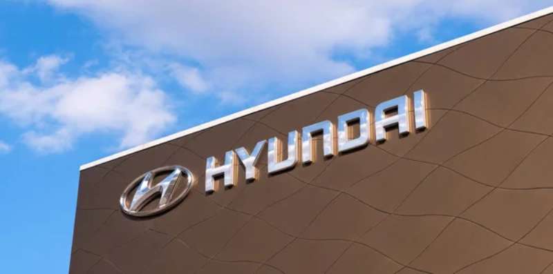
The Hyundai Logo History, Colors, Font, and Meaning
You know what catches the eye when you’re cruising down the highway? Those sleek automotive badges glinting in the sunlight. They’re not just emblems; they’re stories, art, identities shaped into metal. Today, let’s zoom in on one – the Hyundai logo.
It’s more than a silver ‘H’; it’s a signature, a promise, a tale of innovation straight from South Korea’s bustling streets.
We’ll unpack this iconic symbol together. I’ll guide you through the hidden meanings, the strokes of genius in its design, the evolution from a simple badge to a beacon of the automotive industry.
As we explore the craftsmanship behind the branding, the insights will unfold, revealing how this emblem mirrors Hyundai’s global journey.
So, buckle up. From the H’s elegant curves to the company’s heartbeat in the automotive sector, by the end of this read, you’ll understand the genius intertwined with Hyundai’s branding – where design meets legacy.
Key takeaways
- Symbolism: The Hyundai logo is a stylized ‘H’ representing two people, a customer and a company representative, shaking hands—a symbol of trust and satisfaction between the company and its customers.
- Logo Evolution: Originally a simple ellipse with the company’s name, the logo evolved into the ‘H’ emblem in the 1990s to reflect Hyundai’s growth, dedication to customer satisfaction, and quality service.
- Color Meaning: The blue color sometimes used in the background of the Hyundai logo represents trust, loyalty, and wisdom, aligning with the handshake symbol and reinforcing the brand’s commitment to customer trust.
- Typography: The logo uses a custom, sans-serif font that is simple, modern, and clean, which communicates Hyundai’s commitment to modernity and is highly legible, demonstrating respect for customers by ensuring easy recognition.
The Meaning Behind the Hyundai Logo
![]()
You know what’s wild about logos? They’re like visual poetry, loaded with deeper meanings, and yet so simple at a glance. Just like the Hyundai logo, a beauty that’s more than meets the eye.
Not Just an ‘H’
So, you look at the Hyundai logo and you think, “Well, that’s just an ‘H’, right?” Not quite, my friend. It’s a lot more than that. The stylized ‘H’ is a clever design. It’s two people—a customer and a company rep—shaking hands. Now, that’s a neat twist, isn’t it?
Symbol of Trust
The handshake, a universal gesture of trust and satisfaction. It implies a successful agreement, a mutual understanding. That’s what Hyundai wants to convey—a trusted bond between the company and its customers.
The History of the Hyundai Logo
![]()
Logos evolve. They’re like living, breathing entities, changing with the times. So, let’s take a trip down memory lane and explore the Hyundai logo’s journey.
The Early Days
Back in the day, Hyundai had a different logo. It was a simple ellipse with the company’s name. But as the company evolved, they needed a new symbol, something that could match their growth and vision.
The Birth of the ‘H’
The Hyundai logo as we know it came into being in the 1990s. The emblem, the stylized ‘H’, encapsulates Hyundai’s dedication to customer satisfaction and quality service. It was a bold step, a new identity, setting the stage for a promising future.
The Colors of the Hyundai Logo
![]()
Colors, they evoke emotions, convey messages. The Hyundai logo’s colors are no exception. Let’s dive into this vibrant world.
The Blue Accent
Sometimes, you’ll see the Hyundai logo wrapped in a blue oval. Blue, the color of trust, loyalty, wisdom. It compliments the handshake symbol, reinforcing the brand’s commitment to customer trust.
The Font Used in the Hyundai Logo
![]()
Typography, an underrated art. The Hyundai logo’s font, it’s a silent messenger, speaking volumes about the brand.
Modern Simplicity
The Hyundai logo uses a custom, sans-serif font. It’s simple, modern, clean—much like the cars they manufacture. It communicates Hyundai’s commitment to modernity and their forward-thinking approach.
The Power of Legibility
The logo’s legibility is its strength. It’s easy to read from a distance, whether on a giant billboard or a car’s rear. This clarity, it’s about respect for the customer. You don’t need to squint to recognize a Hyundai.
The Impact of the Hyundai Logo
Let’s get into how a logo, a simple emblem, can create waves in the market.
A Global Recognition
Over the years, the logo has earned a global recognition. You see the stylized ‘H’, you immediately think Hyundai. That’s the power of a well-designed logo—it builds a solid brand identity.
Driving Customer Connection
The handshake in the logo, it’s not just symbolic. It drives customer connection, reinforcing their belief in Hyundai’s commitment to their satisfaction. It’s a silent promise that Hyundai delivers with every car.
The Future of the Hyundai Logo
Logos evolve, remember? So, what’s in store for the Hyundai logo?
Maintaining the Essence
While trends shift and design philosophies adapt, the essence of the logo will likely remain. The handshake, the bond, the trust—it’s integral to Hyundai’s brand identity. They’ll probably continue to embrace that.
Potential for Innovation
However, there’s always room for innovation. Maybe they’ll play with colors. Perhaps they’ll experiment with the font. Or they might incorporate new design elements. Whatever the future holds, it’s bound to be exciting.
Remember, a logo’s journey is an ongoing narrative. It’s the story of the brand, the tale of its evolution. The Hyundai logo, with its simple elegance and deeper meanings, beautifully encapsulates the brand’s story so far. And I, for one, can’t wait to see where it goes next.
FAQ On The Hyundai Logo
What’s the story behind the Hyundai logo?
At face value, you think, “That’s a chic ‘H’, right?” But oh, it’s a masterstroke. A handshake, if you will – two humans making a deal. It’s the very ethos of trust and satisfaction that Hyundai pledges to its customers. A symbolic nod to the company’s commitment to excellence.
Does the Hyundai logo have a hidden meaning?
Hidden? Perhaps only to the casual observer. Look closer – that ‘H’ isn’t just about Hyundai. It reflects a silhouette of two people shaking hands: a company representative and a satisfied customer.
It’s a business bond, a relationship built on trust, captured in one simple, yet profound design.
How has the Hyundai logo evolved over time?
It’s a journey from plain text to the iconic ‘H’ we know today. The logo’s evolution reflects Hyundai’s growth – from a local player to a global heavyweight in the automotive sector.
The refinement of the badge mirrors the modernization of their vehicle designs and brand philosophy: continuous improvement.
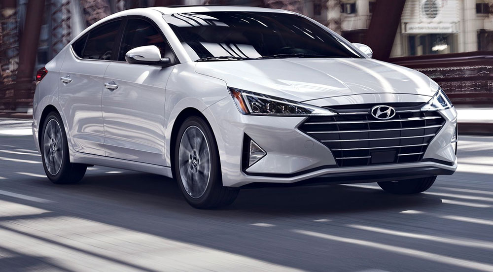
Is the Hyundai emblem the same for all its cars?
Across the fleet, that recognizable ‘H’ stands proud — it’s Hyundai’s signature. While the size might adjust to fit different models’ aesthetics, the emblem’s essence remains untouched.
It’s the thread that weaves through their range, uniting everything from compact cars to the brawniest SUVs under the Hyundai family.
What does the color of the Hyundai logo mean?
Silver – it’s sleek, modern, and oozes sophistication. The color choice reflects Hyundai’s innovative spirit and futuristic approach. Silver also conveys high quality and durability, characteristics that Hyundai prides itself on. Essentially, it’s the brand’s sleek suit of armor.
How does the Hyundai logo contribute to the company’s branding?
A brand is a story told in milliseconds and that logo – it’s the storyteller. It encapsulates Hyundai’s identity: customer-centric, reliable, top-notch. It’s the visual hook that connects advertising, dealerships, and the cars we drive – it’s branding with horsepower.
Are there different versions of the Hyundai logo for international markets?
By and large, consistency is key. Hyundai prides itself on a universal emblem that’s instantly recognizable, whether you’re in Seoul or San Francisco.
Occasionally, there may be slight tweaks or special editions, but that ‘H’ is a constant, unwavering symbol of the brand’s global presence.
How does the Hyundai logo stand out from competitors?
Amidst a sea of automotive logos, Hyundai’s in the fast lane. It’s the harmony of simplicity and depth. A straightforward ‘H’ that signifies so much – human relationships, quality, and trust.
That balance of minimalism and meaning gives Hyundai the edge, a logo that’s both eye-catching and loaded with intent.
What importance does the Hyundai logo hold in automobile design?
It’s the crown on every Hyundai creation. A central highlight that speaks volumes in its understated elegance. Designers sculpt each vehicle with this badge in mind, ensuring aesthetic flow that leads, inevitably, to the logo – the symbolic heart of Hyundai’s design language.
How does Hyundai protect its logo as a trademark?
Legal fortresses, paperwork taller than some cars. Hyundai’s logo is fiercely guarded – a legal trademark registered across the globe. It’s their brand’s flag, and they make sure it’s waved with respect, ensuring no misuse or unauthorized copies sully the emblem’s reputation and value.
Conclusion
We’ve cruised through the curves and storylines of that familiar crest, the Hyundai logo. It’s a marque that unfolds tales of trust, emblematic of a handshake. Think of it as the first “hello” at a dealership, or that nod of assurance as you grip the steering wheel.
- What began as a simple name evolved into a symbol that’s a handshake, inked in silver.
- That badge narrates a global saga, from the busy streets of South Korea to the highways of the world.
- It’s a beacon of brand identity in the automotive industry, a constant across Hyundai’s diverse fleet.
This H symbol, an artful concoction of sleek lines and connections, invites us into a world where vehicles are more than just machines; they’re partners in the journey of life, heralded by an emblem that’s become synonymous with innovation and branding. So, whenever you next spot that badge shining in the metallic sun, you’re in on the secret – it’s Hyundai’s weltanschauung, encapsulating connectivity and progress, neatly wrapped in a single letter.
If you liked this article about the Hyundai logo, you should check out this article about the Lamborghini logo.
There are also similar articles discussing the Bentley logo, the Jeep logo, the Audi logo, and the Cadillac logo.
And let’s not forget about articles on the Jaguar logo, the Chrysler logo, the Maserati logo, and the Dodge logo.
Bogdan Sandu, a seasoned designer with 15 years of diverse experience, has been designing websites since 2008.
Renowned for his expertise in logo design and visual branding, Bogdan has developed a multitude of logos for various clients.
His skills extend to creating posters, vector illustrations, business cards, and brochures. Additionally, Bogdan's UI kits were featured on marketplaces like Visual Hierarchy and UI8.
Latest posts by Bogdan Sandu (see all)
- REM to PX Converter - 5 May 2024
- The Asahi Logo History, Colors, Font, And Meaning - 4 May 2024
- Playtime Perfection: Fun Kids Color Palettes - 4 May 2024