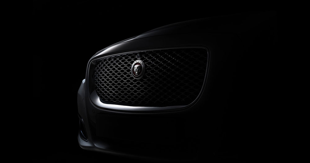
The Jaguar Logo stands as one of the most recognized symbols in automotive history. A leaping cat frozen mid-stride. British luxury captured in chrome.
This emblem belongs to Jaguar, the luxury car brand of JLR (Jaguar Land Rover), based in the English Midlands and owned by India’s Tata group since 2008. Within the broader landscape of car logos, Jaguar’s mark occupies a unique space where animal mascots meet refined elegance.
For decades the brand used two cat symbols: the “Leaper” mascot, first sold in 1938, and the “Growler” face badge. In November 2024 Jaguar replaced its identity with a mixed-case “JaGUar” wordmark, a redrawn Leaper and a new monogram. The company began in 1922 as the Swallow Sidecar Company.
What is the Jaguar Logo?
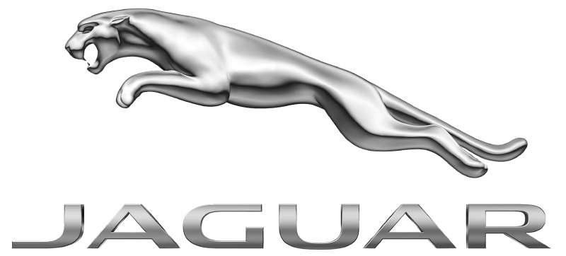
Since November 2024, the Jaguar logo is a rounded, mixed-case “JaGUar” wordmark, created by JLR’s in-house design team under chief creative officer Gerry McGovern, with a redrawn Leaper and a “Jr” monogram as maker’s marks. It replaced the chrome Leaper and squared JAGUAR wordmark used from 2012.
| Symbol | “JaGUar” wordmark, plus a redrawn leaping cat and a circular “Jr” monogram |
| Designer/agency | JLR in-house design team under Gerry McGovern; launch campaign with agency Accenture Song |
| Current version since | 19–20 November 2024 |
| Colors (hex) | No official codes published; wordmark shown in black or white, with a vivid red, yellow and blue campaign palette |
| Typeface | Custom lettering; jaguar.com uses a custom font called Jaguar Exuberant. No free match is widely known |
| Previous major version | Chrome Leaper over a silver all-caps JAGUAR wordmark (2012–2024) |
How Has the Jaguar Logo Evolved Over Time?
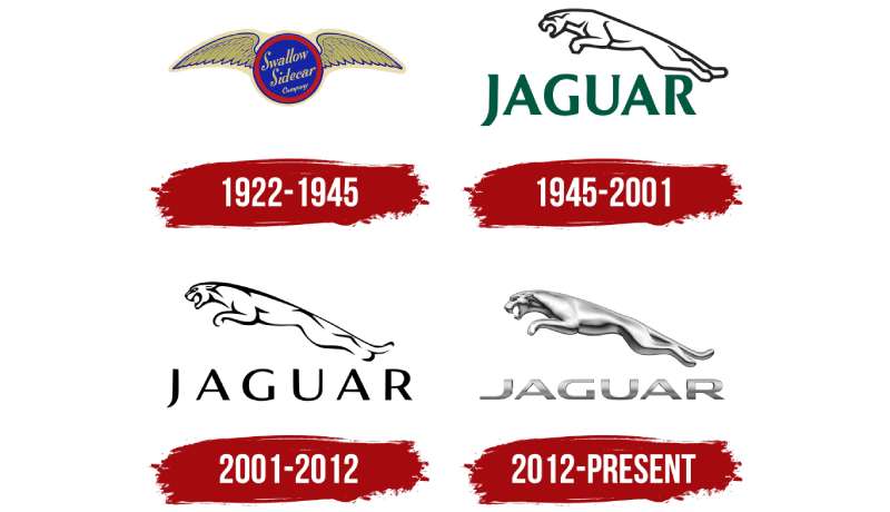
The Jaguar brand identity has changed a lot since 1922. What began as a winged Swallow Sidecar badge became the leaping cat, and then, in 2024, a wordmark-led system.
Each redesign reflected shifts in ownership, market position and design trends.
Swallow Sidecar Company Badge (1922 to the 1930s)
William Lyons and William Walmsley founded the Swallow Sidecar Company in Blackpool in 1922 to make motorcycle sidecars, and later car bodies. The business moved to Coventry in 1928.
The early badge was a circle reading “Swallow Sidecar Company” with spread wings on either side. No jaguar imagery existed yet, and the look fits the Art Deco taste of the time.
SS Jaguar (1935 to 1945)
The company became SS Cars, and in 1935 the name “Jaguar” first appeared as a model name on the SS Jaguar saloon.
Late in 1938 SS Cars began selling a leaping cat mascot as an accessory, announced in The Autocar for two guineas. It is usually credited to motoring artist F. Gordon Crosby. The Jaguar Enthusiasts’ Club says Lyons disliked an aftermarket mascot that looked like a “cat shot off a fence” and had amateur sculptor Bill Rankin design an official one, with Crosby believed to have made the bronze prototype.
Jaguar Cars and the Green Wordmark (1945 to about 2001)
In 1945 SS Cars was renamed Jaguar Cars. The SS initials had become associated with the Nazi SS during the war.
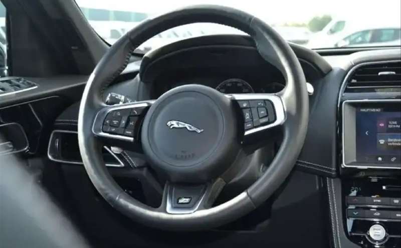
The Leaper became the brand’s symbol, reworked in 1955 with outstretched rear legs. The wordmark was a classic serif “JAGUAR” usually printed in dark green under the cat. If you are looking for the old Jaguar logo, this green-and-chrome version is the one most people remember.
The roaring jaguar face, nicknamed the Growler, was used on grilles, wheel centers and steering wheels.
The Thin Black Wordmark (about 2001 to 2012)
During Ford’s ownership (1989 to 2008), the wordmark turned black and its letterforms became thinner and wider spaced. The Leaper stayed above it.
The bonnet mascot itself disappeared from Jaguar cars in 2005. Since the early 1990s, European rules on external projections had required mascots to retract, bend or break off.
The Silver Leaper (2012 to 2024)
In 2012, under Tata ownership, Jaguar introduced a glossy silver Leaper above a metallic, squared JAGUAR wordmark. This is the badge on cars such as the F-Type and F-Pace, with the Growler still used on grilles.
The 2024 “Copy Nothing” Rebrand
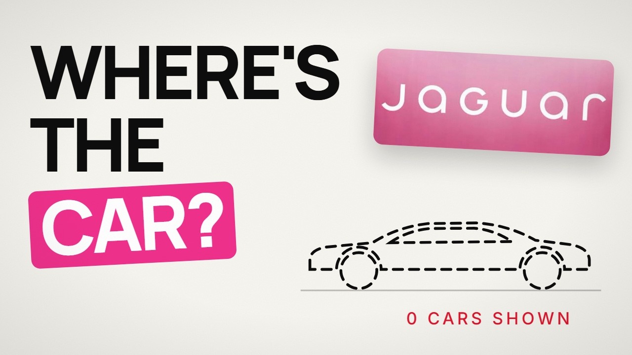
Jaguar revealed its new identity on 19 November 2024, ahead of a move to all-electric cars. The slogan “Copy Nothing” comes from a principle attributed to Sir William Lyons.
The new wordmark reads “JaGUar”, a geometric, symmetrical mix of upper and lowercase letters. The Leaper was redrawn and set against horizontal stripes Jaguar calls a “strikethrough”. A circular monogram of a “J” and “r” serves as a second maker’s mark. The Growler was dropped.
The rebrand was heavily criticized online. In 2025 JLR reviewed its contract with Accenture Song, and in December 2025 reports said McGovern had left JLR, which Jaguar denied had been a dismissal. The 2024 identity is still the one Jaguar uses.
What Do the Design Elements of the Jaguar Logo Mean?
The leaping jaguar stands for speed, power and grace, the qualities Lyons wanted his cars to have.
The 2024 wordmark aims for “visual harmony” through symmetry. Jaguar’s in-house team calls the design style “exuberant modernism”.
What Are the Jaguar Logo Colors?
Jaguar has never published official color codes for its logos, so any Pantone, RGB or CMYK values you find online are estimates.
- Green (classic wordmark): approx. #00563C, sampled from a reproduction of the post-war wordmark
- Chrome/silver (2012 to 2024): a metallic gradient, not a single flat color
- Black and white: the 2024 wordmark is usually shown in black on light backgrounds or white on dark ones
- 2024 campaign palette: vivid red, yellow and blue, inspired by a painter’s studio (no official hex values)
Understanding color psychology helps explain the old choice. Deep green echoes British racing heritage, and chrome suggests precision.
The 2024 color palette deliberately breaks with that, which is part of why it was so divisive.
What Font Is Used in the Jaguar Logo?
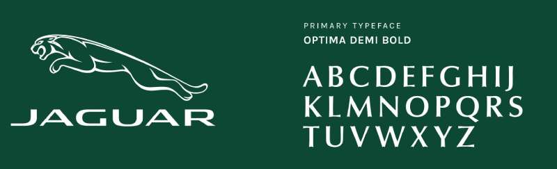
Jaguar’s logos have always used custom lettering, not an off-the-shelf font.
The post-war wordmark was a classic serif in capitals. The 2001 version was thin and wide, and the 2012 version a metallic squared design closer to sans-serif fonts. Some sites suggest Optima as a close match for older lettering, but Jaguar has never confirmed a font name.
The 2024 “JaGUar” wordmark is a rounded, geometric mix of capitals and lowercase. Jaguar’s website now loads a custom typeface named Jaguar Exuberant. Critics say the new typography trades legibility for distinctiveness.
What Are the Hidden Meanings in the Jaguar Logo?
The Leaper is caught mid-leap, suggesting motion even when still. That captures what Jaguar cars aimed to deliver.
The Growler showed the cat head-on, mouth open. It was confident rather than cute.
In the 2024 identity, the double “J”/”r” monogram is described by Jaguar as a “signifier of a completed work”, like a maker’s stamp.
How Does the Jaguar Logo Compare to Competitor Logos?
Among luxury carmakers, Jaguar’s animal mascot puts it in select company. Most competitors use abstract symbols, initials or coats of arms.
The Ferrari Logo features its prancing horse. Both use animals to suggest speed, but Ferrari’s horse rears up while Jaguar’s cat leaps forward.
The Bentley Logo takes a different path with its winged B. More restrained. More traditional British.
The Lamborghini Logo uses a charging bull, which reads as aggressive where Jaguar’s cat reads as graceful.
The Porsche Logo puts the Stuttgart horse inside a coat of arms. Heraldic and historical.
With the 2024 rebrand, Jaguar moved away from all of these toward a wordmark-first identity, closer to fashion brands than car brands.
What Cultural Impact Has the Jaguar Logo Had?
The leaping cat became a symbol of British style during the 1960s, when Jaguar’s saloons and the E-Type carried the name worldwide. Enzo Ferrari is often quoted calling the E-Type the most beautiful car ever made.
The mascot proved animal imagery could work in premium markets without feeling childish.
The 2024 rebrand sparked a huge online debate, including a much-shared post from Elon Musk asking whether Jaguar sells cars. Loved or hated, it got people talking about Jaguar again.
How Does the Jaguar Logo Fit Into the Overall Brand Identity?
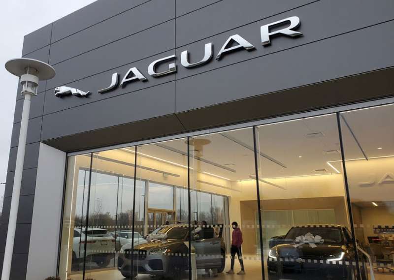
Until 2024, the Leaper and Growler anchored the whole identity, from dealership facades to wheel centers.
Jaguar’s internal brand guidelines are not public, but the themes were clear: British heritage, racing pedigree and graceful power.
The 2024 identity is a complete rethink. As Jaguar moves to electric-only cars priced above £100,000, it wants buyers who may not care about heritage. Jaguar showed the Type 00 concept in December 2024 at Miami Art Week, and the first production model is a four-door GT.
How Should the Jaguar Logo Be Used?
This is general advice, not Jaguar’s own rules.
The Jaguar name, Leaper, Growler and new marks are registered trademarks of JLR. Commercial use needs written permission. Editorial use, such as news and reviews, is usually treated differently.
Keep the logo unaltered, scale it proportionally and use a clean file, ideally vector graphics.
FAQ on the Jaguar Logo
What does the Jaguar logo represent?
The leaping jaguar represents speed, power and grace. Sir William Lyons chose the jaguar name and mascot because they matched what he wanted his cars to be. The 2024 wordmark represents a break toward modern, electric luxury.
Who designed the Jaguar Leaper?
The 1938 mascot is usually credited to motoring artist F. Gordon Crosby. The Jaguar Enthusiasts’ Club says amateur sculptor Bill Rankin designed it at Lyons’s request, with Crosby believed to have made the bronze prototype. Crosby died in 1943, so he was not involved in later versions.
Who designed the new Jaguar logo?
JLR’s in-house design team, led by chief creative officer Gerry McGovern, created the 2024 identity. The launch campaign was made with JLR’s agency Accenture Song. No outside identity studio has been credited.
When did Jaguar change its logo?
The new identity was revealed on 19 November 2024. Earlier major changes came in 1945 (SS Cars became Jaguar), around 2001 (thin black wordmark) and 2012 (silver Leaper and metallic wordmark).
What did the old Jaguar logo look like?
The classic version was a chrome leaping cat above a serif JAGUAR wordmark in dark green. From 2012 to 2024 it was a glossy silver Leaper over a squared metallic wordmark.
Why did Jaguar change their logo in 2024?
Jaguar is relaunching as an electric-only luxury brand. The new “Copy Nothing” identity was meant to signal that reset and reach new buyers. It was controversial with longtime fans.
What is the difference between the Leaper and the Growler?
The Leaper is a side view of a jumping cat, first sold as a bonnet mascot in 1938. The Growler is a front view of a roaring jaguar’s face, used on grilles and wheels. The Growler was dropped in 2024; the Leaper was redrawn.
Is the Jaguar hood ornament still used today?
No. The Leaper mascot disappeared from Jaguar bonnets in 2005, years after European rules began requiring mascots to fold or break away. The cat lived on as a flat badge instead.
What are the Jaguar logo colors?
Jaguar publishes no official codes. The classic wordmark was dark green (approx. #00563C, sampled), the 2012 logo was chrome, and the 2024 wordmark appears in black or white. Basic color theory explains the old pairing: green for heritage, silver for precision.
What font does Jaguar use in their logo?
Custom lettering. The older wordmarks drew on classic serif and squared forms, and the 2024 one is a rounded mixed-case design. Jaguar’s website uses a custom typeface named Jaguar Exuberant, which is not available to the public.
Is there a black Jaguar logo?
Yes. The 2001 to 2012 wordmark was black, and the 2024 “JaGUar” wordmark is usually shown in black on light backgrounds. Black versions of the Leaper also appear on trim and in print.
Can I use the Jaguar logo for my business?
No, not without permission. JLR owns the Jaguar trademarks worldwide. Editorial use may be acceptable, but commercial use always needs approval, in line with basic logo design principles about protecting a brand mark.
Conclusion
The Jaguar Logo remains one of the most recognized symbols in British motoring. From the 1938 leaping cat mascot to the controversial 2024 rebrand, the emblem has kept changing.
Few car badges carry such weight. The leaping cat connects decades of racing success with luxury craftsmanship.
Whether you prefer the classic chrome Leaper or the new “JaGUar” direction, one thing stays true. This brand identity shaped how we think about automotive branding.
The Growler and Leaper earned their place in design history.
Sources
- Jaguar Enthusiasts’ Club, The story behind the Jaguar leaper – https://jec.org.uk/2016/the-story-behind-the-jaguar-leaper/
- Wikipedia, Frederick Gordon Crosby – https://en.wikipedia.org/wiki/Frederick_Gordon_Crosby
- Creative Review, Jaguar mystifies with ‘reimagined’ brand identity – https://www.creativereview.co.uk/jaguar-car-branding-logo-design/
- Creative Boom, Jaguar reveals its reimagined brand, marking a new era – https://www.creativeboom.com/news/jaguar-launches-its-reimagined-brand/
- Carwow, Everything you need to know about Jaguar’s controversial new rebrand – https://www.carwow.co.uk/news/8106/jaguar-rebrand-new-logo
- AutoGuide, Jaguar reportedly to ditch ad agency responsible for rebrand – https://www.autoguide.com/auto/jaguar-reportedly-to-ditch-ad-agency-responsible-for-rebrand-44620036
- Motor1, Jaguar Denies Firing Design Boss – https://www.motor1.com/news/780585/jaguar-design-boss-gerry-mcgovern-fired-denied/
- Jaguar, jaguar.com font style sheet – https://modules.jaguarlandrover.com/modules/jcxspa/latest/static-general-font.css

Renowned for his expertise in logo design and visual branding, Bogdan has developed a multitude of logos for various clients.
His skills extend to creating posters, vector illustrations, business cards, and brochures. Additionally, Bogdan's UI kits were featured on marketplaces like Visual Hierarchy and UI8.
He also wrote in the past years on sites like Design Your Way, WebDesignerDepot, WPDean, Designmodo, Speckyboy, Slider Revolution, and more.
- How to Unlock Canva Page and Locked Elements - 4 November 2026
- How to Design a Google Docs Template That Looks Professionally Designed: Fonts, Grid and Color - 4 November 2026
- Black Metal Font Generator - 2 November 2026

Bogdan Sandu is a seasoned designer who has been designing websites since 2008. Renowned for his expertise in logo design and visual branding, Bogdan has developed a multitude of logos for various clients. His skills extend to creating posters, vector illustrations, business cards, and brochures. Additionally, Bogdan's UI kits were featured on marketplaces like Visual Hierarchy and UI8. He also wrote in the past years on sites like Design Your Way, WebDesignerDepot, WPDean, Designmodo, Speckyboy, Slider Revolution, and more.
You Might Also Like