The Dodge Logo stands as one of the most recognized symbols in American automotive history. What started as a simple circular emblem for the Dodge Brothers has transformed into a bold, aggressive mark that screams muscle car heritage.
A logo does more than identify a brand. It tells a story. And Dodge’s visual identity has been telling stories since 1910.
The current wordmark debuted in 2010, replacing the ram head that many still associate with the brand. That ram now lives exclusively on Ram Trucks. Dodge has gone through roughly a dozen logo changes, each reflecting shifts in ownership, market position, and design trends.
Today’s version keeps things clean. Just the name. Bold letters. Red accents. It works.
What is the Dodge Logo?
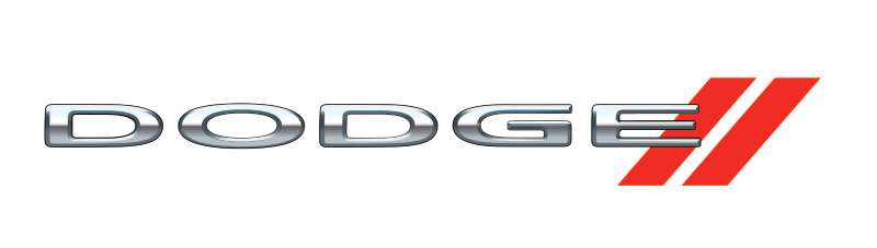
The Dodge Logo is a bold red wordmark featuring the brand name in custom uppercase lettering with two diagonal stripes. Introduced in 2010 after the Ram truck division split, the design emphasizes performance heritage while the stripes reference classic racing aesthetics.
Design Attributes:
- Design Type: Wordmark with graphic accent
- Primary Elements: Custom sans-serif typography, twin diagonal stripes
- Official Introduction Date: 2010
- Designer/Agency: Pentagram (identity refinement)
- Trademark Status: Registered trademark of Stellantis N.V.
- Color Palette: Dodge Red (#BA0C2F), Black (#000000), White (#FFFFFF)
- Usage Context: Vehicle badges, dealership signage, marketing campaigns, merchandise, digital platforms, motorsport branding
How Has the Dodge Logo Evolved Over Time?
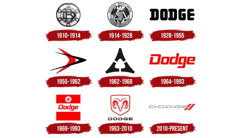
The Dodge emblem has undergone significant changes across 115 years. From ornate Victorian lettering to geometric shapes to animal mascots, each era brought something different.
The brand cycled through at least 12 major versions. Some lasted decades. Others barely made it five years.
Original Dodge Brothers Logo (1910-1914)
- Years Active: 1910-1914
- Design Description: Circular emblem with interlocking “DB” monogram, ornate serif lettering spelling “Dodge Brothers”
- Color Scheme: Black and white
- Designer: Unknown (likely in-house)
- Context: John and Horace Dodge founded their parts supply company, needed professional branding to compete with established manufacturers
- Key Changes from Previous: First official company logo
- Cultural Significance: Represented early American industrial craftsmanship and family business values
Star of David Era (1914-1927)
- Years Active: 1914-1927
- Design Description: Two interlocking triangles forming a six-pointed star with “DB” in center
- Color Scheme: Blue and white
- Designer: Unknown
- Context: Dodge Brothers began manufacturing complete automobiles, needed distinctive hood ornament
- Key Changes from Previous: Geometric shape replaced circular format
- Cultural Significance: Often mistaken for religious symbolism, but actually represented the interlocking skills of the two brothers
Chrysler Acquisition Period (1928-1955)
- Years Active: 1928-1955
- Design Description: Various wordmarks and crests, integration with Chrysler’s corporate identity
- Color Scheme: Red, white, and blue variations
- Designer: Chrysler in-house design team
- Context: Walter Chrysler purchased Dodge, brand lost some individual identity
- Key Changes from Previous: Star emblem phased out, more corporate styling adopted
- Cultural Significance: Reflected consolidation era of American auto industry
Forward Look Era (1955-1962)
- Years Active: 1955-1962
- Design Description: Stylized “Forward Look” script with jet-age inspired elements
- Color Scheme: Chrome with various background colors
- Designer: Virgil Exner’s design team
- Context: Space race enthusiasm, optimistic American design movement
- Key Changes from Previous: Dropped traditional crests for futuristic styling
- Cultural Significance: Captured mid-century modern aesthetic perfectly
Fratzog Symbol (1962-1976)
- Years Active: 1962-1976
- Design Description: Three-pointed deltoid shape, abstract geometric symbol
- Color Scheme: Red and white
- Designer: Chrysler design studio
- Context: Muscle car era, needed aggressive visual identity
- Key Changes from Previous: Completely abstract, no text integration
- Cultural Significance: Became synonymous with Charger, Challenger, and Dart models
Pentastar Integration (1976-1993)
- Years Active: 1976-1993
- Design Description: Five-pointed star (Pentastar) shared across Chrysler brands with Dodge wordmark
- Color Scheme: Blue, red, white
- Designer: Lippincott & Margulies
- Context: Corporate unification under Chrysler umbrella
- Key Changes from Previous: Individual brand identity minimized
- Cultural Significance: Controversial period, many felt Dodge lost uniqueness
Ram Head Era (1993-2010)
- Years Active: 1993-2010
- Design Description: Aggressive ram head in frontal view, chrome or silver finish
- Color Scheme: Silver, red accents
- Designer: Chrysler design team
- Context: Dodge trucks gaining market share, needed powerful mascot
- Key Changes from Previous: First animal mascot in brand history
- Cultural Significance: Still confused with Dodge despite now belonging exclusively to Ram Trucks brand
Current Wordmark (2010-Present)
- Years Active: 2010-present
- Design Description: Bold uppercase wordmark with twin diagonal stripes
- Color Scheme: Red, black, white
- Designer: Pentagram (refinement)
- Context: Ram division split off, Dodge refocused on performance cars
- Key Changes from Previous: Removed all mascot imagery, pure typography
- Cultural Significance: Signals return to muscle car roots without truck association
What Do the Design Elements of the Dodge Logo Mean?
Every piece of the current Dodge wordmark carries intention. The diagonal stripes recall classic racing liveries from the 1960s and 70s.
That red color? It’s not just any red. Dodge Red connects directly to the brand’s performance heritage.
The aggressive letterforms suggest speed and power. Nothing soft here. Nothing subtle.
Why Did Dodge Choose These Specific Colors?
Understanding how colors affect perception explains Dodge’s choices perfectly.
Dodge Red (#BA0C2F)
- Pantone: 187 C
- Symbolic meaning: Power, passion, speed, excitement
- Psychological impact: Increases heart rate, creates urgency
- Brand connection: Racing heritage, muscle car culture, American performance
Brands using red in their visual identity consistently project energy and boldness. Dodge fits right in.
Black (#000000)
- Symbolic meaning: Sophistication, power, premium quality
- Psychological impact: Creates strong visual contrast
- Brand connection: Muscle car tradition, nighttime street racing culture
Many performance brands prefer black-dominant color schemes for similar reasons.
What Typography Style Is Used in the Dodge Logo?
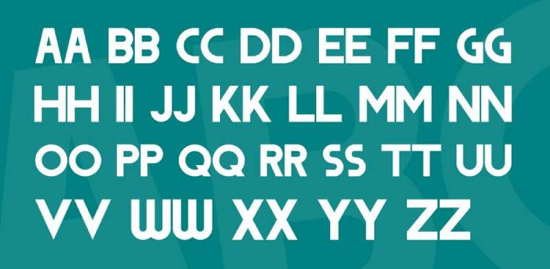
The current wordmark uses a custom sans-serif typeface. It’s not available for public use.
The letters sit heavy and wide. Squared-off terminals give it an industrial feel.
Good typographic choices communicate brand personality instantly. Dodge’s custom font screams American muscle without saying a word.
Readability at speed matters when your logo appears on cars doing 150 mph. The thick strokes and open letterforms work at any size.
What Are the Hidden Meanings in the Dodge Logo?
The twin diagonal stripes aren’t random. They reference the racing stripes found on classic Dodge muscle cars like the Charger and Challenger.
Some see them as acceleration marks. Others interpret them as lane markers on a racetrack.
Designers have confirmed the stripes connect past and present. They’re a visual bridge between 1960s heritage and modern performance.
The angle matters too. It tilts forward, suggesting forward motion and speed.
How Does the Dodge Logo Compare to Competitor Logos?
American muscle car brands take different approaches to visual identity.
Ford keeps their classic blue oval, unchanged for decades. Conservative. Traditional.
Chevrolet’s bowtie stays instantly recognizable but feels more mainstream.
Dodge went bolder. The wordmark with racing stripes positions them as the aggressive option. The rebellious choice.
European competitors like BMW and Ferrari use more refined approaches. Dodge doesn’t want refined. Dodge wants loud.
What Are the Technical Specifications of the Dodge Logo?
Official Color Codes:
- Primary Color (Dodge Red): Hex #BA0C2F | RGB (186, 12, 47) | CMYK (0, 94, 75, 27) | Pantone 187 C
- Secondary Color (Black): Hex #000000 | RGB (0, 0, 0) | CMYK (0, 0, 0, 100)
- Accent Color (White): Hex #FFFFFF | RGB (255, 255, 255) | CMYK (0, 0, 0, 0)
Dimensions and Proportions:
- Aspect Ratio: Approximately 4:1 (horizontal wordmark)
- Minimum Size: 0.75 inches wide for print, 100 pixels for digital
- Clear Space: Height of the “D” on all sides minimum
- File Formats: Available as vector files (AI, EPS, SVG) and raster formats (PNG, JPG)
What Cultural Impact Has the Dodge Logo Had?
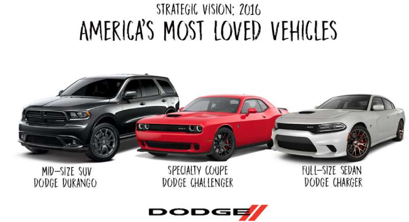
The Dodge brand carries weight in American culture that goes beyond cars. It’s appeared in countless films, TV shows, and music videos.
The Dukes of Hazzard made the Dodge Charger iconic. Fast and Furious continued that legacy.
Muscle car enthusiasts get tattoos of the old ram head. The Fratzog has cult following among collectors.
Current branding resonates with a younger performance crowd. The racing stripes work well on merchandise and apparel.
How Does the Dodge Logo Fit Into the Overall Brand Identity?
Dodge’s visual system extends beyond just the logo. The racing stripes appear across advertising, vehicle design cues, and dealership architecture.
The red color dominates marketing materials. Black provides contrast and premium feel.
Every touchpoint reinforces the same message: power, speed, American muscle.
Official brand guidelines ensure consistency across all channels. Dealers can’t improvise. Everything stays on brand.
How Should the Dodge Logo Be Used?
Official Usage Guidelines:
- Never stretch, rotate, or distort the logo
- Maintain minimum clear space requirements
- Use only approved color combinations
- Don’t place on busy backgrounds without proper contrast
- Never recreate or modify the wordmark
Where to Access Official Logos:
- Stellantis media portal (for press use)
- Authorized dealer resources
- Licensed merchandise partners only
Licensing Information:
- The Dodge name and logo are registered trademarks
- Commercial use requires written permission from Stellantis
- Fan art and personal use fall into gray areas, proceed carefully
- Counterfeit merchandise is actively pursued legally
Trademark Protection:
- Registered in multiple international markets
- Protected under automotive and merchandise categories
- Stellantis maintains aggressive trademark enforcement
FAQ on The Dodge Logo
What Does the Current Dodge Logo Look Like?
The current Dodge emblem features a bold red wordmark with custom uppercase lettering. Two diagonal stripes sit beside the text.
It’s clean. Simple. No mascot, no complex imagery.
The color palette sticks to red, black, and white. Racing heritage shows through in every design choice.
Why Did Dodge Stop Using the Ram Head Emblem?
Chrysler split the truck division into its own brand in 2010. Ram Trucks took the ram head symbol with them.
Made sense for both brands. Dodge refocused on muscle cars like the Challenger and Charger.
The ram head now belongs exclusively to the pickup truck lineup.
What Is the Fratzog Symbol?
The Fratzog was Dodge’s abstract logo from 1962 to 1976. Three arrowhead shapes formed a triangular design.
Nobody knows where the name came from. Even Chrysler historians can’t trace it.
It appeared during the golden age of American muscle. Collectors still love it.
What Colors Are in the Official Dodge Logo?
Dodge Red dominates the visual identity. The hex code is #BA0C2F.
Black and white provide supporting roles. Understanding color theory basics explains why this combination works.
Red signals power and speed. Black adds sophistication. The combination hits hard.
When Was the Current Dodge Logo Introduced?
The current wordmark launched in 2010. It coincided with the Ram Trucks separation.
Pentagram handled the identity refinement. The core principles of logo design guided every decision.
Fifteen years later, it still feels fresh.
Who Originally Designed the Dodge Logo?
John and Horace Dodge created their first company emblem around 1910. The Dodge Brothers needed branding for their parts business.
Various designers shaped later versions. Virgil Exner influenced the Forward Look era.
Modern iterations came from Chrysler’s in-house teams and outside agencies like Pentagram.
What Does the Dodge Logo Symbolize?
Power. Performance. American automotive heritage.
The diagonal stripes reference classic racing liveries. They create visual movement that suggests speed.
Every design element reinforces the muscle car identity. Nothing accidental here.
Is the Ram Head Still Associated with Dodge?
Not officially. The ram head belongs to Ram Trucks now.
But people still confuse them. Decades of shared branding created lasting associations.
Dodge dealerships often sell both brands. That doesn’t help the confusion. The brand style guides keep them separate.
How Many Times Has the Dodge Logo Changed?
At least twelve major versions since 1910. Some changes were subtle. Others completely reinvented the brand identity.
The Star of David era, Fratzog period, and ram head years each brought dramatic shifts.
Ownership changes often triggered redesigns. Chrysler, DaimlerChrysler, Fiat, and now Stellantis all left marks.
Can I Use the Dodge Logo for My Business?
No. The Dodge trademark belongs to Stellantis. Commercial use requires written permission.
Licensed merchandise partners go through official channels. Counterfeit products face legal action.
Fan art sits in gray territory. Personal use might be okay. Selling anything with the logo definitely isn’t.
Conclusion
The Dodge Logo tells the story of an American automaker that refused to fade into history. From the Dodge Brothers’ original emblem to today’s bold wordmark, each version captured its era perfectly.
That’s what good brand storytelling does.
The current design strips away nostalgia and focuses on performance. Red and black. Racing stripes. Muscle car identity distilled into pure visual form.
Stellantis now owns the brand. The heritage remains intact.
Whether you prefer the Fratzog or the modern wordmark, Dodge’s visual identity continues to represent raw American automotive power.

Renowned for his expertise in logo design and visual branding, Bogdan has developed a multitude of logos for various clients.
His skills extend to creating posters, vector illustrations, business cards, and brochures. Additionally, Bogdan's UI kits were featured on marketplaces like Visual Hierarchy and UI8.
He also wrote in the past years on sites like Design Your Way, WebDesignerDepot, WPDean, Designmodo, Speckyboy, Slider Revolution, and more.
- The Windsurf Logo History, Colors, Font, And Meaning - 10 October 2026
- How Designers can Build a Stronger Online Creative Identity - 9 October 2026
- Minecraft Font Generator - 8 October 2026

Bogdan Sandu is a seasoned designer who has been designing websites since 2008. Renowned for his expertise in logo design and visual branding, Bogdan has developed a multitude of logos for various clients. His skills extend to creating posters, vector illustrations, business cards, and brochures. Additionally, Bogdan's UI kits were featured on marketplaces like Visual Hierarchy and UI8. He also wrote in the past years on sites like Design Your Way, WebDesignerDepot, WPDean, Designmodo, Speckyboy, Slider Revolution, and more.
You Might Also Like