The Stellantis logo represents a multinational automotive manufacturing corporation formed through the 2021 merger of Fiat Chrysler Automobiles and PSA Group.
This logo functions as the corporate brand identity for the holding company, while its 14 individual automotive brands maintain their own distinct emblems. The Stellantis corporate identity emerged in November 2020, debuting a minimalist design with futuristic typography and symbolic star elements that reference the company name’s Latin origin meaning “to brighten with stars.”
The automotive conglomerate represents over 120 years of combined automotive manufacturing heritage.
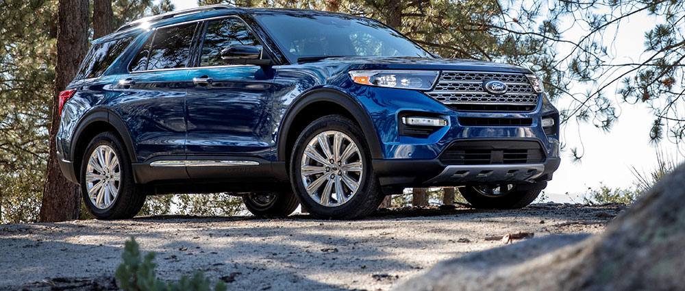
The merger created the world’s fourth-largest automaker by sales volume in 2021, uniting brands including Jeep, Peugeot, Dodge, Fiat, Ram, Chrysler, Citroën, Alfa Romeo, Maserati, and Opel under one corporate umbrella.
What is the Stellantis Logo?

The Stellantis logo is a combination mark featuring extended sans-serif wordmark typography in deep blue, accompanied by a circular constellation of blue dots surrounding a stylized letter “A” with no crossbar. Publicly unveiled November 9, 2020, the design was created by Publicis Group with internal refinement by Stellantis design teams, officially launching with the January 16, 2021 merger completion.
Design Type: Combination mark (wordmark plus abstract symbol)
Primary Elements:
- Extended sans-serif typeface with futuristic characteristics
- Stylized letter “A” formed by two diagonal lines without horizontal crossbar
- Circular cluster of blue dots in varying sizes representing stars
- Custom typography with no direct commercial analogs (similar to Baradig and Snasm fonts)
Official Introduction Date: November 9, 2020 (public unveiling); January 16, 2021 (official corporate launch)
Designer/Agency: Publicis Group in collaboration with Stellantis design teams
Trademark Status: Registered trademark of Stellantis N.V., Amsterdam headquarters
Color Palette:
- Primary: Deep blue (hex values commonly cited as #00133b to #243882 range)
- Secondary: White for reversed applications
- The blue represents professionalism, reliability, and technological innovation
Usage Context:
The logo appears exclusively at corporate group level on investor materials, press releases, corporate communications, and official Stellantis websites. Individual automotive brand logos (Jeep, Dodge, Peugeot, etc.) remain unchanged for vehicle badging and consumer-facing materials. The design system prioritizes brand guidelines that preserve each brand’s individual identity while establishing Stellantis as the overarching corporate entity.
How Has the Stellantis Logo Evolved Over Time?

The Stellantis logo underwent two distinct versions during its brief development period. The beta version appeared July 2020 with black lettering on white background, while the official blue design debuted November 2020, adding the distinctive star constellation element that reinforced the company’s name meaning.
Both versions maintained the extended sans-serif typography and crossbar-free “A” character.
Beta Stellantis Logo (July-November 2020)
Years Active: July 15, 2020 – November 9, 2020
Design Description: Minimalist black wordmark on white background with extended sans-serif typeface, featuring the characteristic “A” formed by two diagonal lines without a horizontal crossbar
Color Scheme: Black and white only
Designer: Internal design teams preparing for merger announcement
Context: Created during pre-merger planning phase as FCA and PSA finalized their combination agreement, used in early internal communications
Key Changes from Previous: First-ever Stellantis identity, representing departure from acronym-heavy naming conventions (FCA, PSA)
Cultural Significance: Symbolized equal partnership merger structure, avoiding hierarchical implications
Official Stellantis Logo (November 2020-Present)
Years Active: November 9, 2020 – Present
Design Description: Deep blue wordmark with circular constellation of varying-sized blue dots surrounding the stylized “A” character
Color Scheme: Deep blue (primary) with white for reversed applications and backgrounds
Designer: Publicis Group with Stellantis design team refinement
Context: Unveiled publicly ahead of January 2021 merger completion, designed to represent “optimism, energy and renewal” according to corporate statements
Key Changes from Previous: Added star constellation graphic element, changed from black to deep blue, refined letter spacing and stroke consistency
Cultural Significance: The star imagery directly references Latin etymology of “Stellantis” and acknowledges 120+ year automotive manufacturing heritage of combined brands
The evolution from beta to official version demonstrated deliberate refinement. Designers adjusted diagonal cuts on letters for increased uniformity, eliminated narrow sections in characters like “T,” “E,” and “L,” and straightened the curve in the letter “S.”
All glyphs now feature consistent boldness throughout.
The addition of the circular star pattern creates a focal point around the “A” character with larger dots positioned closer to the letterform and smaller dots radiating outward.
What Do the Design Elements of the Stellantis Logo Mean?

The star constellation surrounding the stylized “A” represents the illumination and guidance provided by bringing together 14 automotive brands. The Latin root “stello” means “to brighten with stars,” directly informing the circular dot pattern that suggests a celestial cluster guiding the merged entity’s future direction in sustainable mobility and automotive innovation.
The crossbar-free “A” symbolizes openness and forward momentum.
Why Did Stellantis Choose These Specific Colors?
The deep blue color palette connects to professional reliability and technological advancement.
Primary Blue:
- Color name: Deep Blue/Stellantis Blue
- Hex codes: Ranges from #00133b to #243882 depending on application
- Symbolic meaning: Trust, stability, professionalism, technological innovation
- Psychological impact: Projects reliability and corporate authority while suggesting forward-thinking innovation
- Brand connection: Reflects automotive industry standards while distinguishing from heritage red/silver typical of individual brand logos
The shift from black (beta version) to blue marked a strategic choice. Black suggested formality and strictness, while blue evokes the celestial reference inherent in the company name.
The color choices align with color psychology principles that associate blue tones with dependability.
What Typography Style Is Used in the Stellantis Logo?
The custom futuristic sans-serif typeface features extended character width and geometric precision. No commercial equivalent exists, though similarities to Baradig and Snasm fonts appear in specific characters.
The uppercase-only lettering emphasizes corporate authority and modernity. Uniform stroke width across all characters creates visual balance while diagonal cuts on letter terminals add distinctive personality without compromising readability.
The extended width provides stability and presence across digital and print applications.
What Are the Hidden Meanings in the Stellantis Logo?
The constellation pattern contains varying dot sizes that create depth and dimension, suggesting both astronomical distance and the varying scales of the 14 brands.
The stylized “A” without crossbar can be interpreted as an upward arrow or mountain peak, suggesting aspiration and achievement. Some observers note the dots’ circular arrangement forms a subtle orbital pattern, reinforcing themes of systematic organization and interconnected brand relationships.
The futuristic typography deliberately avoids automotive industry cliches like speed lines or mechanical elements, instead positioning Stellantis as a technology and mobility company rather than traditional automaker.
How Does the Stellantis Logo Compare to Competitor Logos?

Stellantis adopts minimalist corporate branding similar to holding companies rather than traditional car logos which typically feature emblematic symbols. Volkswagen Group maintains its circular VW wordmark for parent company identity, while Toyota Motor Corporation uses its three-ellipse emblem across both corporate and consumer contexts, creating tighter brand unity.
General Motors employs a simplified GM square logo for corporate communications.
The Stellantis approach of maintaining separate brand identities for consumer-facing applications while using corporate logo only for business communications parallels strategies employed by other multi-brand automotive conglomerates.
Unlike the BMW logo or Mercedes logo which appear on vehicles, Stellantis never badges cars with its corporate mark. This preserves brand heritage for established names like Jeep, Dodge, Ram, and Maserati.
The constellation graphic element is unique among major automotive holding companies, most of which favor abstract geometric shapes or letter combinations. Stellantis prioritizes symbolic meaning over historical heraldry, distinguishing it from luxury brands that emphasize heritage through traditional emblems.
The futuristic sans-serif font choice aligns with contemporary tech company aesthetics more than traditional automotive branding.
What Are the Technical Specifications of the Stellantis Logo?

Official Color Codes:
- Primary Blue: Hex: #00133b to #243882 (varies by application), RGB: (0,19,59) to (36,56,130), CMYK values adjusted for print production, Pantone equivalents used for brand consistency
- White: Hex: #FFFFFF, RGB: (255,255,255), for reversed applications and backgrounds
- Black: Hex: #000000, used in beta version and single-color applications
Dimensions and Proportions:
- Aspect ratio: Approximately 5:1 (width to height) for wordmark alone
- Minimum size requirements: 1 inch width for print, 120 pixels width for digital applications to maintain legibility
- Clear space specifications: Minimum clear space equals height of the letter “S” on all sides
- Star constellation positioned to maintain visual hierarchy with “A” character as anchor point
File Formats:
- Vector graphics (SVG, EPS, AI) for scalability
- Raster formats (PNG with transparency, JPEG) for specific applications
- Minimum resolution: 300 DPI for print
- RGB color mode for digital, CMYK for print
Typography Specifications:
- Custom typeface with no commercial distribution
- Uppercase lettering only
- Extended width proportions
- Consistent stroke weight throughout
- Specific kerning adjustments between characters
The logo maintains readability across scales from business cards to building signage. Careful attention to contrast ensures visibility against both light and dark backgrounds.
What Cultural Impact Has the Stellantis Logo Had?
The Stellantis logo received mixed public reaction at launch, with design critics noting its departure from traditional automotive aesthetics.
Some observers compared it to pharmaceutical or technology company branding rather than automotive heritage. The minimalist approach sparked debate about whether corporate automotive brands should embrace futuristic design or maintain connection to mechanical legacy.
Industry observers noted the logo successfully avoided favoring either FCA or PSA heritage, fulfilling its diplomatic purpose in the 50-50 merger structure.
The design influenced discussions about corporate identity in automotive consolidation, as the industry continues trending toward multi-brand conglomerates. Stellantis demonstrated that parent company logos can remain invisible to consumers while maintaining strong presence in business communications.
The constellation motif has appeared in various Stellantis corporate materials and presentations, establishing recognizable visual language.
How Does the Stellantis Logo Fit Into Overall Brand Identity?

The Stellantis corporate logo exists within a complex brand architecture that preserves individual brand autonomy.
Each of the 14 brands (Chrysler, Fiat, Peugeot, Citroën, Opel, Alfa Romeo, Lancia, DS Automobiles, Abarth, Vauxhall, Fiat Professional, and Mopar) maintains separate visual identity, logos, color schemes, and brand guidelines.
The Stellantis name and logo appear only in corporate contexts including investor relations, press releases, stock exchange listings, and internal communications. This structure allows consumer-facing brands to maintain heritage and emotional connections while Stellantis provides organizational unity.
The approach balances global operational efficiency with localized brand equity, letting each marque pursue its specific market positioning without dilution.
How Should the Stellantis Logo Be Used?
Official Usage Guidelines:
Do use the logo only for corporate communications, not consumer-facing automotive branding. Maintain specified clear space around the mark. Reproduce from official vector files only. Use approved color variations (blue on white, white on blue, black single-color).
Do not alter proportions or recreate the typeface. Do not add effects, shadows, or gradients. Do not place on busy backgrounds that reduce legibility. Do not combine with individual brand logos in consumer advertising.
Where to Access Official Logos:
Official Stellantis logo files are available through the company’s media center at media.stellantis.com for approved editorial and business use. Journalists and business partners can access high-resolution files in various formats.
Licensing Information:
The Stellantis logo is a registered trademark of Stellantis N.V. Unauthorized commercial use is prohibited. Media use is permitted for editorial purposes with proper attribution. Business partners must obtain permission for any marketing materials.
Trademark Protection:
Stellantis actively protects its trademark rights across global markets. The logo is registered with relevant intellectual property offices in jurisdictions where the company operates. Infringement cases are handled through standard legal channels.
FAQ About the Stellantis Logo
When was the Stellantis logo created?
The Stellantis logo was created in two phases: a beta version in July 2020 with black typography, and the official blue version unveiled November 9, 2020. The logo officially launched January 16, 2021, when the FCA-PSA merger completed, establishing Stellantis as a legal corporate entity.
Who designed the Stellantis logo?
Publicis Group designed the Stellantis logo in collaboration with internal Stellantis design teams. The design process involved input from both FCA and PSA stakeholders to create a neutral corporate identity that favored neither heritage company. Stellantis Design Studio subsequently became responsible for maintaining brand standards.
What do the colors in the Stellantis logo mean?
The deep blue represents trust, professionalism, technological innovation, and reliability. Blue connects to the celestial theme inherent in the company name, which derives from Latin “stello” meaning “to brighten with stars.” The color choice moved away from traditional automotive reds and silvers, positioning Stellantis as a forward-thinking mobility company.
How many times has the Stellantis logo been redesigned?
The Stellantis logo has undergone one major redesign from its July 2020 beta version to the November 2020 official version. Changes included shifting from black to blue, adding the star constellation graphic, refining letter proportions, and ensuring consistent stroke weights across all characters. The current version remains in use.
Where can I download the official Stellantis logo?
Official Stellantis logo files are available through the Stellantis Media Center at media.stellantis.com for approved editorial use. Files include vector formats (SVG, EPS) and high-resolution raster formats (PNG, JPG). Access requires media credentials or business partner authorization for most applications beyond personal editorial use.
Is the Stellantis logo trademarked?
Yes, the Stellantis logo is a registered trademark of Stellantis N.V., headquartered in Amsterdam, Netherlands. The company actively protects its trademark rights across global markets where it operates. Unauthorized commercial use is prohibited, though editorial use for news and business reporting is generally permitted with proper attribution.
What font is used in the Stellantis logo?
The Stellantis logo uses a custom futuristic sans-serif typeface with no commercial equivalent available for public licensing. Designers note similarities to Baradig and Snasm fonts in certain characters, but the Stellantis typography features unique characteristics including extended width, diagonal terminal cuts, and a distinctive crossbar-free “A” letterform.
Why did Stellantis choose stars for their logo?
Stellantis chose star imagery because the company name derives from Latin “stello,” meaning “to brighten with stars.” The circular constellation of dots surrounding the “A” symbolizes bringing together 14 automotive brands under unified guidance. Stars represent illumination, aspiration, and the 120+ year heritage of the combined companies creating something greater together.
Conclusion
The Stellantis logo represents a multinational automotive holding company formed through the 2021 merger of Fiat Chrysler Automobiles and PSA Group. Its minimalist design features futuristic sans-serif typography in deep blue with a distinctive star constellation pattern referencing the Latin-derived company name.
The logo functions exclusively at corporate level, never appearing on consumer vehicles, while the 14 individual automotive brands maintain their heritage identities. This diplomatic approach balances operational unity with brand autonomy across one of the world’s largest automotive manufacturers.
As Stellantis continues executing its electrification and sustainable mobility strategy through 2030, the logo will remain a business-facing symbol of the merged entity’s combined strength and shared future direction.

Renowned for his expertise in logo design and visual branding, Bogdan has developed a multitude of logos for various clients.
His skills extend to creating posters, vector illustrations, business cards, and brochures. Additionally, Bogdan's UI kits were featured on marketplaces like Visual Hierarchy and UI8.
He also wrote in the past years on sites like Design Your Way, WebDesignerDepot, WPDean, Designmodo, Speckyboy, Slider Revolution, and more.
- The Cursor Logo History, Colors, Font, And Meaning - 24 September 2026
- Top 7 Web Design Subscription Services That Replace Full-Time Hires - 24 September 2026
- Canva vs PowerPoint: Which Is Better for Presentations? - 22 September 2026

Bogdan Sandu is a seasoned designer who has been designing websites since 2008. Renowned for his expertise in logo design and visual branding, Bogdan has developed a multitude of logos for various clients. His skills extend to creating posters, vector illustrations, business cards, and brochures. Additionally, Bogdan's UI kits were featured on marketplaces like Visual Hierarchy and UI8. He also wrote in the past years on sites like Design Your Way, WebDesignerDepot, WPDean, Designmodo, Speckyboy, Slider Revolution, and more.
You Might Also Like