The Fiat logo stands as one of the most recognizable automotive emblems in European car manufacturing. It represents over 125 years of Italian engineering and design heritage.
Within the broader landscape of car logos, Fiat’s emblem occupies a unique position. The brand helped shape how automakers approach visual identity in the industry.
The current version features a circular red badge with chrome lettering, introduced in 2006 and refined in 2020. Fiat has cycled through roughly 15 distinct logo designs since its founding in 1899 in Turin, Italy.
That’s a lot of changes. Most car brands stick with maybe five or six versions over their entire history.
What is the Fiat Logo?
The Fiat logo is a circular emblem featuring the brand name “FIAT” in uppercase lettering against a red background, enclosed by a chrome border. Introduced in its modern form in 2006 and updated in 2020, the design reflects Italian automotive tradition and the company’s heritage dating back to 1899.
Key Attributes:
- Design Type: Combination mark (wordmark within emblem)
- Primary Elements: Circular badge, uppercase lettering, chrome frame
- Official Introduction Date: Current version refined in 2020
- Designer/Agency: Fiat’s internal Centro Stile design team
- Trademark Status: Registered trademark owned by Stellantis N.V.
- Color Palette: Fiat Red (#C41E3A), Chrome Silver (#C0C0C0), White (#FFFFFF)
- Usage Context: Vehicle badges, dealerships, marketing materials, digital platforms, merchandise
How Has the Fiat Logo Evolved Over Time?
The Fiat logo has gone through roughly 15 major redesigns since 1899.
Early versions featured ornate Victorian styling. Later iterations embraced modernist simplicity.
The brand experimented with shields, rectangles, and various circular formats before settling on its current rounded badge design.
Original Fiat Logo (1899-1901)
- Years Active: 1899-1901
- Design Description: Ornate brass plaque with full company name “Fabbrica Italiana Automobili Torino” in decorative script
- Color Scheme: Brass and black
- Designer: Unknown, likely commissioned locally in Turin
- Context: The company had just formed. Giovanni Agnelli and his partners needed something that looked established and trustworthy.
- Cultural Significance: Represented Italy’s entry into automobile manufacturing
Abbreviated Fiat Logo (1901-1904)
- Years Active: 1901-1904
- Design Description: First use of “FIAT” acronym in a simpler rectangular format
- Color Scheme: Blue background with gold lettering
- Key Changes from Previous: Dropped the full company name, introduced the acronym that would become iconic
- Context: The company realized nobody could remember “Fabbrica Italiana Automobili Torino”
Shield Era Logo (1904-1921)
- Years Active: 1904-1921
- Design Description: Various shield-shaped designs with elaborate borders and the FIAT lettering
- Color Scheme: Multiple variations including blue, red, and gold combinations
- Key Changes from Previous: Introduced the shield shape that would influence future designs
- Cultural Significance: Aligned with Art Deco influences emerging in European design
Laurel Wreath Logo (1921-1925)
- Years Active: 1921-1925
- Design Description: FIAT text surrounded by laurel wreath, symbolizing victory and achievement
- Color Scheme: Gold on dark backgrounds
- Context: Post-WWI era when Fiat had contributed significantly to the war effort
- Cultural Significance: The laurel wreath connected the brand to classical Italian and Roman imagery
Circular Badge Introduction (1925-1959)
- Years Active: 1925-1959
- Design Description: Round badge with FIAT lettering, various background colors
- Color Scheme: Red, blue, and gold variations
- Key Changes from Previous: Established the circular format that would become the brand’s signature
- Designer: Centro Stile Fiat
Rectangular Modernist Logo (1959-1968)
- Years Active: 1959-1968
- Design Description: Clean rectangular badge with sans-serif FIAT lettering
- Color Scheme: Blue and white
- Context: Influenced by Swiss design principles that were dominating corporate identity work
- Key Changes from Previous: Dramatic shift to modernist simplicity
Diagonal Stripes Era (1968-1991)
- Years Active: 1968-1991
- Design Description: Rectangular badge with diagonal stripes and bold FIAT lettering
- Color Scheme: Blue, white, and red stripes
- Key Changes from Previous: Added dynamic diagonal elements suggesting speed and motion
- Cultural Significance: Became one of the most recognized automotive logos of the 1970s and 1980s
Return to Circular Format (1999-2006)
- Years Active: 1999-2006
- Design Description: Circular blue badge with silver FIAT lettering
- Color Scheme: Blue and silver
- Context: Fiat’s centennial anniversary prompted a heritage-focused redesign
- Key Changes from Previous: Returned to the circular badge format from the company’s earlier years
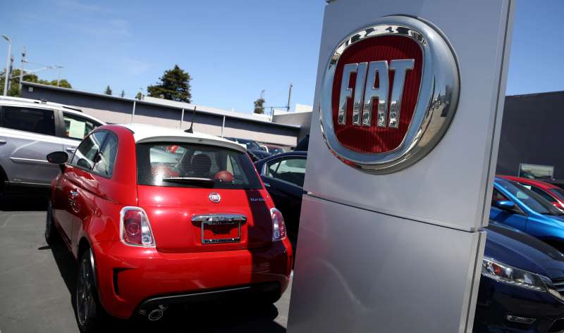
Current Red Badge (2006-Present)
- Years Active: 2006-present (refined 2020)
- Design Description: Circular red badge with chrome border and white FIAT lettering
- Color Scheme: Fiat Red, chrome silver, white
- Designer: Centro Stile Fiat with Robilant Associati consultancy
- Context: Launched alongside the new Fiat 500, connecting to the brand’s heritage
- Key Changes from Previous: Shifted from blue to red, added chrome dimensional elements
- Cultural Significance: Represents Fiat’s repositioning as a heritage-focused, lifestyle brand
What Do the Design Elements of the Fiat Logo Mean?
The circular shape represents completeness and unity.
Red conveys Italian passion and automotive energy. The chrome border adds a sense of quality and craftsmanship.
Together, these elements communicate heritage and forward momentum simultaneously.
Why Did Fiat Choose These Specific Colors?
Red dominates the current Fiat logo for good reason. It’s deeply connected to Italian national identity and racing heritage.
Understanding color psychology helps explain why this choice works so well.
- Fiat Red: Hex #C41E3A. Symbolizes passion, energy, and Italian automotive tradition. Creates excitement and draws attention on vehicle grilles.
- Chrome Silver: Hex #C0C0C0. Represents quality, precision engineering, and premium positioning. Adds dimensional depth to the flat badge.
- White: Hex #FFFFFF. Provides maximum contrast against the red background for legibility.
The color palette connects directly to Italian national colors and the tradition of red in automotive branding.
What Typography Style Is Used in the Fiat Logo?
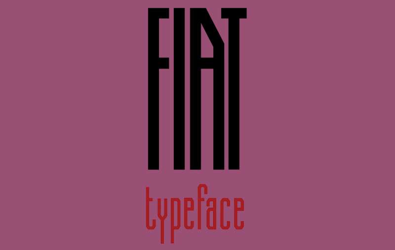
Fiat uses a custom sans-serif font for the logo.
The letterforms are bold and slightly condensed. This improves legibility at small sizes on vehicle badges.
The typography has evolved toward cleaner, more geometric forms over time.
Earlier versions used more decorative serif fonts that reflected the design trends of their eras.
What Are the Hidden Meanings in the Fiat Logo?
The circular badge echoes traditional Italian craftsmanship seals.
Some see the shape as representing a steering wheel or speedometer.
The acronym FIAT itself means “let it be done” in Latin, though the company chose it because it stood for Fabbrica Italiana Automobili Torino.
That double meaning, the Latin phrase and the company name, was probably intentional.
How Does the Fiat Logo Compare to Competitor Logos?
Among Italian automakers, Fiat takes a simpler approach than most.
The Alfa Romeo logo uses complex heraldic imagery. The Ferrari logo features its famous prancing horse. The Maserati logo incorporates the trident of Bologna.
Fiat keeps things straightforward. Just the name in a circle.
Compared to other mass-market brands, Fiat’s logo shares some similarities with competitors. The Ford logo also uses an oval badge format with script lettering. The Nissan logo recently simplified to a flat circular design.
But Fiat’s red color scheme sets it apart in a segment where blue dominates. Most economy car brands play it safe with blue. Fiat went bold.
What Are the Technical Specifications of the Fiat Logo?
Official Color Codes:
- Primary Color (Fiat Red): Hex: #C41E3A, RGB: (196, 30, 58), CMYK: (0, 85, 70, 23), Pantone: 199 C
- Secondary Color (Chrome Silver): Hex: #C0C0C0, RGB: (192, 192, 192), CMYK: (0, 0, 0, 25)
- Accent Color (White): Hex: #FFFFFF, RGB: (255, 255, 255), CMYK: (0, 0, 0, 0)
Dimensions and Proportions:
- Aspect Ratio: 1:1 (circular)
- Minimum Size: 15mm diameter for print applications
- Clear Space: Minimum clear space equal to the height of the “F” in FIAT on all sides
- File Formats: Available as vector graphics (AI, EPS, SVG) and raster formats (JPEG, PNG)
What Cultural Impact Has the Fiat Logo Had?
The Fiat logo represents more than a car company. It symbolizes Italian industrial achievement.
During the mid-20th century, Fiat practically defined Italian mobility. The logo appeared on everything from tiny city cars to tractors and aircraft engines.
The retro-styled Fiat 500, launched in 2007, turned the logo into a fashion statement. You started seeing it on handbags, watches, and clothing.
That kind of crossover appeal is rare for automotive branding.
How Does the Fiat Logo Fit Into the Overall Brand Identity?
The logo anchors a broader visual system defined in Fiat’s brand guidelines.
Red appears throughout dealership interiors, advertising, and digital platforms. The circular motif repeats in secondary graphics and icons.
Fiat’s identity connects to sister brands under Stellantis, including Jeep, Dodge, and Chrysler.
But Fiat maintains a distinct Italian character that separates it from its American siblings.
How Should the Fiat Logo Be Used?
Official Usage Guidelines:
- Do: Maintain minimum clear space, use approved color variations, scale proportionally
- Don’t: Stretch or distort, place on busy backgrounds, modify colors outside approved palette, add effects like shadows or gradients
Accessing Official Logos:
Authorized dealers and partners can access official logo files through Stellantis brand portals. Media representatives can request assets through Fiat’s press office.
Trademark Protection:
The Fiat logo and name are registered trademarks of Stellantis N.V. Unauthorized commercial use is prohibited. Fan and editorial use typically falls under fair use provisions, but commercial applications require licensing agreements.
FAQ on The Fiat Logo
What Does FIAT Stand For?
FIAT stands for Fabbrica Italiana Automobili Torino. That translates to Italian Automobile Factory of Turin.
The company was founded in 1899. Giovanni Agnelli led the group of investors who established the Italian automaker.
The acronym also means “let it be done” in Latin. Probably not a coincidence.
Who Designed the Current Fiat Logo?
Fiat’s internal design team, Centro Stile, created the current vehicle badge. They worked with Robilant Associati consultancy on the 2006 redesign.
The logo design principles focused on connecting modern audiences with Fiat’s heritage from Turin, Italy.
When Was the Fiat Logo Last Updated?
The most recent refinement happened in 2020. Stellantis, the parent company, made subtle adjustments to the chrome emblem.
The core circular logo design dates back to 2006. That version launched alongside the retro Fiat 500.
What Do the Colors in the Fiat Logo Mean?
Red represents Italian passion and automotive energy. It connects to Italy’s racing heritage.
Chrome silver suggests quality engineering. White provides visual hierarchy and legibility.
The hue selection reflects decades of brand identity refinement.
Why Is the Fiat Logo Circular?
Circles represent completeness and unity in design. The shape also echoes traditional Italian craftsmanship seals.
Some see it as a steering wheel or speedometer reference. The psychology of shapes makes circles feel approachable and trustworthy.
How Many Times Has the Fiat Logo Changed?
Fiat has used roughly 15 distinct logo versions since 1899. That’s a lot of logo evolution for any automotive brand.
Early designs featured ornate Victorian styling. Later versions embraced minimalist design trends.
Is the Fiat Logo Trademarked?
Yes. The car emblem and FIAT wordmark are registered trademarks owned by Stellantis N.V.
Unauthorized commercial use is prohibited. Media and editorial use typically falls under fair use provisions.
What Font Does the Fiat Logo Use?
Fiat uses a custom typeface designed specifically for the brand. The letterforms are bold and slightly condensed.
This improves legibility on small vehicle badges. The font has evolved toward cleaner geometric forms over time.
How Does the Fiat Logo Compare to Other Italian Car Logos?
Fiat keeps things simpler than competitors. The Lamborghini logo features a charging bull. The Bugatti logo uses elaborate detailing.
Fiat’s straightforward approach reflects its position as a mass-market brand rather than a luxury manufacturer.
Where Can I Download the Official Fiat Logo?
Authorized dealers access logo files through Stellantis brand portals. Media representatives can request assets from Fiat’s press office.
The brand style guide specifies approved formats and usage rules for the Italian automobile emblem.
Conclusion
The Fiat Logo tells the story of an Italian automobile manufacturer that has reinvented itself repeatedly since 1899.
From ornate brass plaques to the modern red badge, each version reflected its era. The Agnelli family built more than cars. They built a brand mark that represents Italian automotive heritage.
Today’s circular emblem balances tradition with contemporary design elements. It works on the Fiat 500, the Fiat Panda, and across digital platforms.
Simple. Recognizable. Unmistakably Italian.
That kind of brand recognition takes over a century to build.
Renowned for his expertise in logo design and visual branding, Bogdan has developed a multitude of logos for various clients.
His skills extend to creating posters, vector illustrations, business cards, and brochures. Additionally, Bogdan's UI kits were featured on marketplaces like Visual Hierarchy and UI8.
He also wrote in the past years on sites like Design Your Way, WebDesignerDepot, WPDean, Designmodo, Speckyboy, Slider Revolution, and more.
- The Airtable Logo History, Colors, Font, And Meaning - 12 July 2026
- How to Blur Background in Canva: A Quick Tutorial - 11 July 2026
- Typography Trends - 10 July 2026
Bogdan Sandu is a seasoned designer who has been designing websites since 2008. Renowned for his expertise in logo design and visual branding, Bogdan has developed a multitude of logos for various clients. His skills extend to creating posters, vector illustrations, business cards, and brochures. Additionally, Bogdan's UI kits were featured on marketplaces like Visual Hierarchy and UI8. He also wrote in the past years on sites like Design Your Way, WebDesignerDepot, WPDean, Designmodo, Speckyboy, Slider Revolution, and more.
You Might Also Like