The Tata Motors Logo stands as one of the most recognized automotive symbols in India and across emerging markets worldwide. It represents a company that transformed from a locomotive manufacturer into a global automotive giant.
This logo serves as the visual identity for Tata Motors Limited, a subsidiary of the Tata Group conglomerate headquartered in Mumbai.
The current version features a stylized blue “T” design, introduced in the late 1990s. The company has gone through approximately three major logo iterations since its founding in 1945 as TELCO (Tata Engineering and Locomotive Company).
What is the Tata Motors Logo?
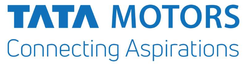
The Tata Motors Logo is a stylized blue letter “T” within an oval shape, officially introduced in 1998. Created as part of the company’s rebranding from TELCO, it symbolizes innovation, reliability, and the company’s commitment to mobility solutions across passenger and commercial vehicle segments.
Design Type: Combination mark (letterform with containing shape)
Primary Elements:
- Stylized uppercase “T” letterform
- Oval border surrounding the letter
- Clean, modern lines with minimal detail
Official Introduction Date: 1998
Designer/Agency: Internal Tata Group design team (specific designer not publicly credited)
Trademark Status: Registered trademark of Tata Motors Limited in India and internationally
Color Palette:
- Primary Blue: Approximately #005EB8
- White (for contrast applications)
Usage Context: Vehicle badges, dealership signage, marketing materials, digital platforms, corporate communications, and merchandise
How Has the Tata Motors Logo Evolved Over Time?
The logo has evolved through three distinct phases since 1945.
Each redesign reflected the company’s growth from locomotives to trucks to passenger vehicles.
The transitions marked strategic shifts in brand positioning and market expansion goals.
Original TELCO Logo (1945-1986)
Years Active: 1945-1986
Design Description: The original identity featured “TELCO” text in a straightforward industrial style. It emphasized the company’s engineering and locomotive manufacturing roots.
Color Scheme: Black and white primarily, with occasional blue applications
Context: Introduced when the company focused on locomotives and later commercial vehicles. India was building industrial infrastructure post-independence.
Cultural Significance: Represented Indian industrial self-reliance and Tata Group’s nation-building ethos.
Transitional Tata Logo (1986-1998)
Years Active: 1986-1998
Design Description: A modified wordmark incorporating “TATA” more prominently. The design began shifting toward a more automotive-focused identity.
Color Scheme: Blue and white
Key Changes from Previous: Moved away from “TELCO” branding as the company expanded into passenger vehicles with the Tata Sierra and Estate.
Context: India’s economic liberalization in 1991 opened new markets. The company needed a more consumer-friendly identity.
Current Tata Motors Logo (1998-Present)
Years Active: 1998-Present
Design Description: Stylized blue “T” within an oval frame. The letter extends beyond the oval at the top, suggesting upward movement and ambition.
Color Scheme: Tata Blue (#005EB8) on white backgrounds
Key Changes from Previous: Complete departure from text-heavy design. Abstract symbol replaced literal wordmark.
Cultural Significance: Marked Tata Motors’ ambition to compete globally. Preceded the Tata Indica launch, India’s first indigenous passenger car.
What Do the Design Elements of the Tata Motors Logo Mean?
The logo’s “T” shape represents the Tata name while suggesting forward motion.
The oval creates a sense of completeness and global reach.
Together, these elements communicate automotive excellence with Indian heritage.
Why Did Tata Motors Choose These Specific Colors?
The blue hue wasn’t chosen randomly. It connects to color psychology principles used across the automotive industry.
Tata Blue
- Hex Code: #005EB8
- Symbolic Meaning: Trust, reliability, stability
- Psychological Impact: Evokes professionalism and dependability
- Brand Connection: Aligns with Tata Group’s reputation for integrity
Many blue logos in the automotive space leverage similar psychology. It’s a safe choice, but the specific shade helps Tata stand apart.
What Typography Style Is Used in the Tata Motors Logo?
The primary logo mark doesn’t include typography in the traditional sense.
The “T” is a custom letterform, not pulled from any existing font family.
When “TATA MOTORS” text accompanies the symbol, the company uses a clean sans-serif font for readability across applications.
The typography has remained consistent since 1998, with minor refinements for digital clarity.
What Are the Hidden Meanings in the Tata Motors Logo?
The “T” extending above the oval suggests aspiration and growth beyond boundaries.
Some interpret the open top as representing openness to innovation.
The oval shape creates a sense of a wheel or motion, fitting for an automaker.
Designers intended the upward thrust to symbolize progress. Whether viewers consciously notice this is debatable, but it works subconsciously.
How Does the Tata Motors Logo Compare to Competitor Logos?
Among Indian automakers, Tata’s logo takes a more abstract approach than Mahindra Logo, which uses a bold oval with road imagery.
Global competitors show interesting contrasts.
The Hyundai Logo uses a similar oval-enclosed letter approach but with a slanted “H.”
Meanwhile, the Kia Logo recently moved toward a more stylized wordmark.
The Toyota Logo shares the oval motif but incorporates overlapping ovals for complexity.
Compared to luxury brands like the Jaguar Logo (which Tata now owns), the Tata Motors mark prioritizes accessibility over prestige signaling.
Chinese competitor BYD Logo takes a completely different approach with its letterform design.
What Are the Technical Specifications of the Tata Motors Logo?
Official Color Codes:
Primary Color: Tata Blue
Secondary Color: White
- Hex: #FFFFFF
- RGB: (255, 255, 255)
- Used for reversed applications on dark backgrounds
Dimensions and Proportions:
- Aspect Ratio: Approximately 1:1.2 (width to height)
- Minimum Size: 15mm width for print applications
- Clear Space: Minimum clear zone equal to 25% of logo width on all sides
The logo works as vector graphics for scalability. High DPI raster versions exist for specific digital applications.
What Cultural Impact Has the Tata Motors Logo Had?
In India, the Tata Motors emblem carries weight beyond commercial branding.
It represents industrial achievement and national pride in manufacturing capability.
The logo appeared on the Tata Nano, once the world’s cheapest car, making it a symbol of democratized mobility.
When Tata acquired Jaguar Land Rover in 2008, the logo gained international significance as a symbol of Indian corporate ambition.
How Does the Tata Motors Logo Fit Into the Overall Brand Identity?
The logo anchors a color palette system used across all Tata Motors communications.
It appears consistently on vehicles, from budget hatchbacks to commercial trucks.
Sub-brands like Tata.ev for electric vehicles adapt the core identity while maintaining the parent symbol.
The company’s brand guidelines specify exact usage across dealerships, advertisements, and digital platforms.
This consistency builds recognition across diverse market segments, from rural India to export markets.
How Should the Tata Motors Logo Be Used?
Official Usage Guidelines:
Do:
- Use official logo files from Tata Motors media resources
- Maintain minimum clear space requirements
- Use approved color variations (blue on white, white on blue, or monochrome)
- Scale proportionally without distortion
Don’t:
- Alter the logo proportions or orientation
- Add effects like shadows, gradients, or outlines
- Place on busy backgrounds that reduce visibility
- Use unofficial color variations
Access to Official Logos: Available through Tata Motors media center for authorized partners and press
Licensing: Unauthorized commercial use prohibited. Trademark protections enforced globally.
Trademark Details: Registered under Tata Motors Limited. Part of broader Tata Group trademark portfolio managed by Tata Sons.
FAQ on The Tata Motors Logo
What Does the Tata Motors Logo Represent?
The Tata Motors logo represents innovation, trust, and Indian automotive excellence.
The stylized “T” within a blue oval symbolizes the Tata Group’s commitment to mobility solutions.
It serves as the corporate identity for both passenger cars and commercial vehicles produced by this Mumbai-based manufacturer.
When Was the Current Tata Motors Logo Introduced?
Tata Motors introduced the current brand mark in 1998.
This coincided with the company’s transition from TELCO to Tata Motors Limited. The redesign prepared the brand for launching the Tata Indica, India’s first fully indigenous passenger car.
Who Designed the Tata Motors Logo?
The internal Tata Group design team created the logo. No individual designer has been publicly credited.
This approach differs from brands like those created by famous graphic designers with documented attribution. The Tata emblem emerged from collaborative corporate efforts.
What Colors Are Used in the Tata Motors Logo?
The logo uses Tata Blue (approximately #005EB8) as its primary color.
White provides contrast for reversed applications. This monochrome colors approach keeps the vehicle badge clean and recognizable across all applications.
Has the Tata Motors Logo Changed Over Time?
Yes. The company went through three major logo iterations.
It started with TELCO branding in 1945, transitioned during the 1980s, then adopted the current stylized “T” in 1998. Each change reflected the brand evolution and market expansion.
What Is the Meaning Behind the T Shape?
The “T” extends beyond the oval border at the top. This suggests upward movement and growth.
Following logo design principles, the shape communicates ambition while maintaining simplicity. The open design represents openness to innovation.
Is the Tata Motors Logo Trademarked?
Absolutely. Tata Motors Limited holds registered trademark protection in India and internationally.
Tata Sons manages the broader company trademark portfolio. Unauthorized commercial use faces legal enforcement across global markets.
What Font Style Appears in Tata Motors Branding?
The primary symbol contains no traditional typeface. The “T” is a custom letterform.
When text accompanies the logo, Tata uses clean sans-serif typography elements. This ensures readability across dealerships, vehicles, and digital platforms.
How Does It Compare to Other Car Logos?
The Tata emblem shares the oval motif with several car logos globally.
Compared to the Ford Logo or Nissan Logo, Tata’s design feels more abstract. It prioritizes minimalist design over ornate detail.
Can I Use the Tata Motors Logo for My Business?
No. Unauthorized commercial use is prohibited.
Only authorized dealers, partners, and press can access official logo files through Tata Motors media resources. Using the vehicle manufacturer symbol without permission violates trademark law.
Conclusion
The Tata Motors Logo tells the story of an Indian automobile brand that grew from locomotive manufacturing to global automotive prominence.
That blue oval with its upward-reaching “T” carries decades of brand recognition across passenger cars and commercial vehicles alike.
From the Tata Nexon to the Tata Punch, this corporate symbol appears on millions of vehicles.
The Jaguar Land Rover acquisition in 2008 proved that this Mumbai-based company could compete with established automakers worldwide.
Simple in form, rich in meaning. The emblem stands as proof that effective brand style guide execution builds lasting automotive identity.
Renowned for his expertise in logo design and visual branding, Bogdan has developed a multitude of logos for various clients.
His skills extend to creating posters, vector illustrations, business cards, and brochures. Additionally, Bogdan's UI kits were featured on marketplaces like Visual Hierarchy and UI8.
He also wrote in the past years on sites like Design Your Way, WebDesignerDepot, WPDean, Designmodo, Speckyboy, Slider Revolution, and more.
- The Airtable Logo History, Colors, Font, And Meaning - 12 July 2026
- How to Blur Background in Canva: A Quick Tutorial - 11 July 2026
- Typography Trends - 10 July 2026
Bogdan Sandu is a seasoned designer who has been designing websites since 2008. Renowned for his expertise in logo design and visual branding, Bogdan has developed a multitude of logos for various clients. His skills extend to creating posters, vector illustrations, business cards, and brochures. Additionally, Bogdan's UI kits were featured on marketplaces like Visual Hierarchy and UI8. He also wrote in the past years on sites like Design Your Way, WebDesignerDepot, WPDean, Designmodo, Speckyboy, Slider Revolution, and more.
You Might Also Like