The Mahindra Logo History, Colors, Font, and Meaning

Imagine resting your eyes on a symbol that captures the essence of innovation, bridging rural roots with urban aspirations like a visual handshake. You’ve just envisioned the Mahindra logo, a sign synonymous with trust and transformation in the humming corridors of industry.
It’s more than a mere emblem; it speaks to the heart of a juggernaut that fuels both farmer’s toil and urban soul with its diverse technology and rugged vehicles.
In this deep dive, we’re not just drawing a logo in the sand. You’re about to unearth the legendary tale woven into the fabric of an icon, a logo that’s a beacon for millions, shining across cities, over lush fields, and into the future.
Engage with this exploration and decode the saga sealed within the simple lines and colors.
By the close, you’ll grasp the power of imagery that propels a brand beyond borders, and the resonance of a motif that harnesses the ethos of a leading Indian multinational company, the Mahindra Group.
- The Roots: We’ll unravel the legacy, from Mahindra’s establishment to its modern-day emblem.
- The Design: The artistic nuances behind the simple yet powerful visual branding.
- The Impact: How this logo encapsulates Mahindra’s brand-wide customer loyalty and global market share.
Your perception of the symbol that stands tall on the prow of the automotive colossus is about to shift.
The Meaning Behind the Mahindra Logo
The Mahindra logo is not merely a pretty design. It embodies the core values of the company. The idea of human unity and collective growth aligns with the ethos of Mahindra – to rise by lifting others. The logo mirrors their belief in the power of connection and collaboration.
The History of the Mahindra Logo
Evolution Over Time
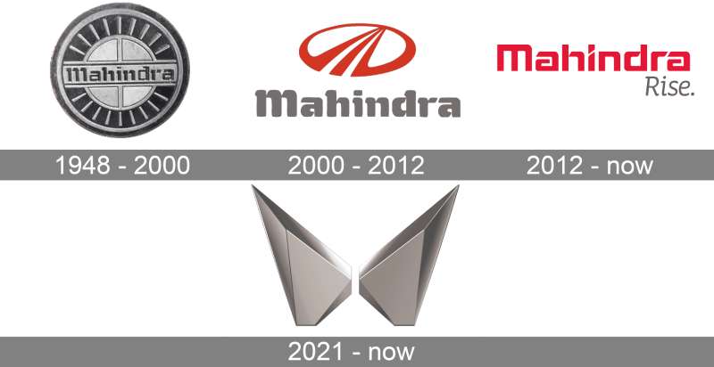
The Mahindra logo wasn’t always what it is today. The company has gone through several changes in its visual identity, mirroring its growth and evolution.
The current logo, designed by David Carson, came into existence in 2000. It was part of a rebranding effort to highlight the company’s global ambitions and its commitment to deliver quality products.
The Birth of the ‘M’
The stylized ‘M’ was a significant shift from the company’s previous logos. It was a creative leap, a bold move that made the logo not only modern but also meaningful. The design resonated with the company’s vision to move forward while staying grounded in their core values.
The Colors of the Mahindra Logo
Powerful Red
The Mahindra logo stands out with its vibrant red color. Red symbolizes passion, energy, and power. It reflects the dynamism of Mahindra as a company. It’s a color that demands attention and stands for the bold and adventurous spirit of the brand.
Contrasting Silver
The contrasting silver in the Mahindra logo adds an element of sophistication and elegance. Silver is often associated with modernity and technology. It’s a nod to Mahindra‘s commitment to innovation and quality.
The Font Used in the Mahindra Logo
A Unique Typeface
The font used in the Mahindra logo is as unique as the logo itself. It’s a custom typeface designed exclusively for the company.
The font, like the logo, combines style and substance. It’s modern, bold, and yet approachable. The font aligns with the logo’s message of unity and collective progress.
Alignment with the Brand Identity
The font used in the Mahindra logo complements the design and color scheme. It’s an integral part of the brand’s visual identity, reinforcing the company’s values and vision. The clean lines and sharp edges of the font resonate with the dynamic and modern spirit of the brand.
The Impact of the Mahindra Logo
Brand Recognition
A logo is more than just a design. It’s a symbol, a visual representation of a brand’s identity. The Mahindra logo, with its distinctive design and vibrant colors, has become an iconic image. It’s instantly recognizable, helping the brand stand out in a competitive market.
Reflection of the Company’s Evolution
The Mahindra logo reflects the company’s journey and evolution. From a local Indian company to a global giant, the logo has been a constant, evolving with the brand. It has become a symbol of the brand’s commitment to quality, innovation, and collective progress.
Influence of the Mahindra Logo on Other Brands
Inspiration for Others
The Mahindra logo’s unique design and meaningful symbolism has inspired other brands in the industry. It has shown that a logo can be more than just a stylized version of the company’s name. It can be a powerful tool for conveying the brand’s values and vision.
Setting a Trend
The Mahindra logo has set a trend in the industry. It has inspired a shift towards more meaningful and symbolic logo designs. Many brands are now looking to infuse their logos with a deeper meaning, following in the footsteps of Mahindra.
The Process of Designing the Mahindra Logo
A Collaborative Effort
The creation of the Mahindra logo was a collaborative effort. It involved a team of talented designers and brand strategists who worked together to create a logo that would embody the company’s values and vision. The process was a perfect example of the very principle the logo stands for – collective progress through collaboration.
Incorporating Feedback
Throughout the design process, the team incorporated feedback from various stakeholders, including employees, customers, and partners. This ensured that the final design was not only visually appealing but also resonated with the people who matter most to the company.
The Mahindra logo, with its distinctive design and deep symbolism, is a testament to the power of meaningful design. It’s a shining example of how a logo can capture the essence of a brand and resonate with its audience. It’s more than just an ‘M’. It’s a symbol of unity, collaboration, and collective progress.
FAQ On The Mahindra Logo
What does the Mahindra logo represent?
The emblem, friend, it’s a ripple through the automotive industry. Displays pride, mirrors the resilience and determination of a brand that has its wheels firmly on ground—rural and urban.
It’s Mahindra’s identity, heralding an era of robust vehicles and innovative technology solutions. A real beacon in the utility vehicle space, right?
Why did Mahindra change its logo?
Oh, they revamped to stay in step with time, you know? The new design reflects a modern, evolving brand. It’s all about staying relevant while cementing their global presence and market share.
It’s about shaping a brand that’s recognized, not just in India but worldwide. Signifies growth, innovation, and transformation.
Is the Mahindra logo inspired by any cultural elements?
Spot on, it is! The logo draws from the company’s Indian heritage, embodying strength and radiance akin to the Sun. India’s spirit, its zest for growth and progress, it’s all in there. Think cultural roots meeting eye-to-eye with future-ready aspirations.
What colors are used in the Mahindra logo and what do they mean?
Red’s the game here. Symbolizes energy, passion, and a will to innovate. You see that red; you’re looking at the lifeblood of Mahindra, a commitment to excellence across the company spectrum—agriculture to aerospace. They’ve kept it bold, kept it standing out.
Who designed the Mahindra logo?
Now that’s a tale wrapped in a bit of mystery. While the specific Swedish designer isn’t a household name, the design rose from a well-thought-out collaboration. The focus was to have a timeless icon that mirrors Mahindra’s brand values and robust market presence.
What product lines does the Mahindra logo appear on?
You’ll find it across a swath of products—SUVs like Mahindra Thar, tractors, electric vehicles, even on Tech Mahindra’s IT solutions.
That ubiquitous emblem’s a sign of quality, whether on an upscale Mahindra XUV500 or enhancing the latest advancements in Mahindra Electric mobility.
How often has the Mahindra logo been updated?
Not too often. It’s about legacy, see? But they’ve tweaked it over the years to keep pace with their ever-expanding business conglomerate. Each change subtly nods at the company’s evolution, its continual growth from a local heavyweight to an international entity.
Can the Mahindra logo be used freely for commercial purposes?
Heh, tread lightly there! It is a registered trademark, protected, needs the nod from Mahindra. They keep a close watch on usage; it’s tied to their brand identity and market presence, after all. Unauthorized use can lead to legal tangles. So better get that permission in writing!
What’s the significance of the Mahindra logo in the Indian market?
It’s a symbol of trust, buddy. A national pride sorta thing. In India, the logo goes beyond being a mere symbol—it’s connected to reliable farm equipment and vehicles that navigate the rugged local terrain.
It represents homegrown success, a trusty aide across varied Indian landscapes.
Does the Mahindra logo incorporate any sustainability themes?
Currently, it’s subtle, more about the brand ethos. But sustainability? It’s at Mahindra’s core, woven into their business practices.
The emblem stands as a promise of their commitment to eco-friendly advancements—a pledge mirrored in initiatives at Mahindra Electric and their approach to sustainable business.
Conclusion
So we’ve peeled back the layers, sifted through hues, curves, and context, all chasing the tale of the Mahindra logo. What a journey it’s been, right? A weave of design, steeped in heritage, driving forth on roads of innovation.
We’re looking at an emblem, that’s not just etched on automotive steel but also seared in the market’s eye. It’s a statement, an assurance of quality, a nod to the Indian multinational company’s journey from a local name to a global force.
You’ve now got the full storyboard—the chronicle of a crest that represents everything from rugged SUVs, tractors that till with trust, to futuristic electric vehicles. This shining beacon, bold in red, signals more than a logo. It summons narratives of growth, sustainability, and technological advancements under one visual roof.
In the end, it’s clear, isn’t it? A logo can carry weight way beyond its sketch. The Mahindra insignia? It’s a heavyweight, bearing stories of corporate identity and brand evolution, all twined in those alluring lines.
If you liked this article about the Mahindra logo, you should check out this article about the Fiat logo.
There are also similar articles discussing the Lotus logo, the Koenigsegg logo, the Land Rover logo, and the Opel logo.
And let’s not forget about articles on the Holden logo, the SsangYong logo, the BYD logo, and the Tata Motors logo.
- Green Color Palettes for Designers To Use - 11 May 2024
- Digital Style: What Font Does Cash App Use? - 11 May 2024
- The Coors Light Logo History, Colors, Font, And Meaning - 10 May 2024


