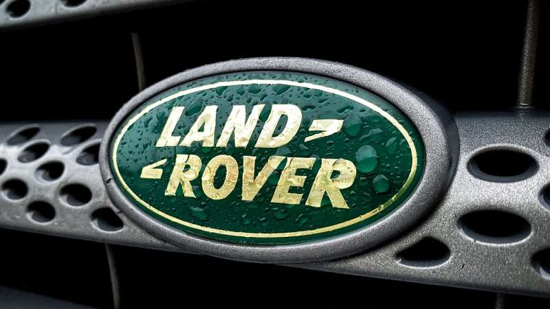
The Land Rover Logo stands as one of the most recognizable automotive emblems in the world. It represents British engineering heritage and off-road capability in a single visual mark.
A logo like this carries decades of brand identity on its shoulders. Land Rover has maintained remarkable consistency since 1948, though the badge has gone through subtle refinements.
The current green oval design was standardized in the late 1980s. Land Rover has used approximately 8-10 distinct logo variations throughout its history. The brand operates under Jaguar Land Rover, owned by Tata Motors since 2008.
What is the Land Rover Logo?
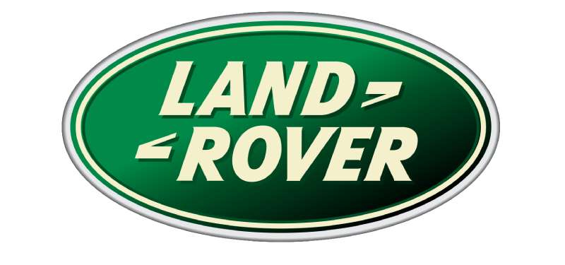
The Land Rover Logo is a green oval emblem featuring the brand name in a custom sans-serif typeface. It was formalized in its current form during the 1980s. The design emphasizes ruggedness and British heritage through its color choice and straightforward lettering.
Design Attributes
- Design Type: Combination mark (wordmark within shape)
- Primary Elements: Oval shape, capitalized “LAND ROVER” text, horizontal line divider
- Official Introduction Date: Current version standardized circa 1986-1989
- Designer/Agency: Internal Rover Group design team (specific designer unattributed)
- Trademark Status: Registered trademark of Jaguar Land Rover Limited
- Color Palette: British Racing Green (#005A2B), Silver/White (#FFFFFF)
- Usage Context: Vehicle grilles, steering wheels, key fobs, dealership signage, marketing materials, merchandise
How Has the Land Rover Logo Evolved Over Time?
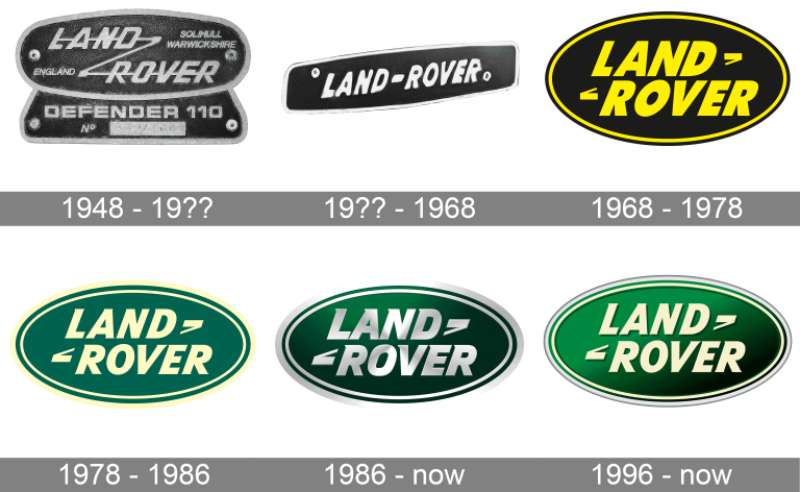
The Land Rover badge started simple and stayed that way. Most changes have been refinements rather than complete overhauls.
The oval shape appeared early in the brand’s history. Color standardization came later.
Each decade brought minor tweaks to proportions and finish treatments.
Original Land Rover Logo (1948-1968)
- Years Active: 1948-1968
- Design Description: Simple metal badge with “LAND ROVER” text, sometimes featuring the Rover Viking longship
- Color Scheme: Chrome/silver metallic finish
- Designer: Rover Company internal team
- Context: Introduced with the Series I at Amsterdam Motor Show. Post-war Britain needed a rugged utility vehicle.
- Key Changes from Previous: First logo, established brand identity
- Cultural Significance: Represented British resilience and practical engineering
Transitional Era Logo (1968-1986)
- Years Active: 1968-1986
- Design Description: Green began appearing more consistently. The oval shape became standardized.
- Color Scheme: Introduction of green backgrounds with white or silver text
- Designer: British Leyland design department
- Context: Brand ownership changed multiple times. Visual identity needed stabilization.
- Key Changes from Previous: Color introduction, shape formalization
- Cultural Significance: Transition from utility vehicle to lifestyle brand began
Modern Land Rover Logo (1986-Present)
- Years Active: 1986-Present
- Design Description: Clean oval with “LAND” above “ROVER,” separated by thin horizontal line
- Color Scheme: British Racing Green background, white/silver lettering
- Designer: Refined under various ownership (BMW, Ford, Tata Motors)
- Context: Range Rover success demanded premium brand presentation
- Key Changes from Previous: Proportions perfected, digital-ready versions created
- Cultural Significance: Now represents luxury adventure and capability
What Do the Design Elements of the Land Rover Logo Mean?
The oval shape suggests completeness and protection. It is a shape that works well on vehicle grilles.
Understanding the psychology of shapes helps explain why ovals dominate automotive branding.
The horizontal divider creates balance between the two words.
Why Did Land Rover Choose These Specific Colors?
Green connects directly to nature and exploration. British Racing Green carries national pride.
The psychology behind color choices in automotive branding runs deep. Green suggests growth, stability, and environmental connection.
White text provides maximum contrast against the dark background.
- British Racing Green: Hex #005A2B, symbolizes British heritage, outdoor adventure, and environmental awareness
- White/Silver: Hex #FFFFFF, represents clarity, premium quality, and clean design
What Typography Style Is Used in the Land Rover Logo?
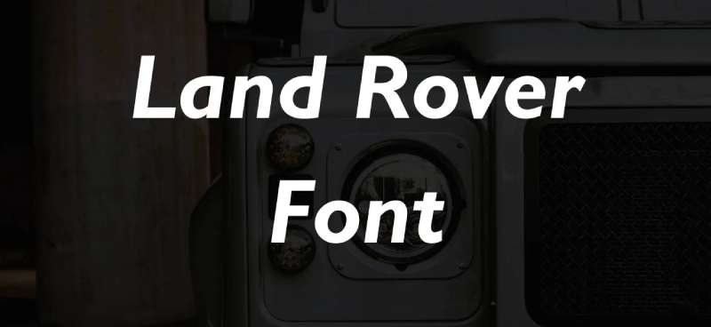
The typeface is a custom sans-serif font with subtle modifications.
Letters appear slightly condensed. This creates a sturdy, grounded feeling.
The spacing between letters remains consistent throughout.
No serifs means better readability at small sizes and on three-dimensional badges.
What Are the Hidden Meanings in the Land Rover Logo?
The split text arrangement mirrors the brand name’s origin. “Land” sits above “Rover” like land sits above the horizon.
Some see the oval as representing a compass or the globe. Others interpret it as a protective shield.
The horizontal line could represent terrain or the horizon line drivers see on expeditions.
How Does the Land Rover Logo Compare to Competitor Logos?
Most luxury SUV brands use abstract symbols or crests. Land Rover keeps things direct with a wordmark.
The Jaguar Logo (its sister brand) uses an animal mascot. Land Rover relies purely on text.
Compare this to the Jeep Logo, which also emphasizes straightforward typography.
The BMW Logo and other German competitors favor circular emblems with internal symbols.
Land Rover’s approach feels more approachable. Less pretentious, maybe. Just the name in an oval, and that’s enough.
What Are the Technical Specifications of the Land Rover Logo?
Official Color Codes
Primary Color (British Racing Green):
Secondary Color (White):
- Hex: #FFFFFF
- RGB: (255, 255, 255)
- CMYK: (0, 0, 0, 0)
Dimensions and Proportions
- Aspect Ratio: Approximately 2.5:1 (width to height)
- Minimum Size: 15mm width for print applications
- Clear Space: Minimum padding equal to the height of the “L” character
- File Formats: Available as vector graphics (SVG, EPS, AI) and raster formats
What Cultural Impact Has the Land Rover Logo Had?
The green oval appears everywhere from African safaris to London streets. It signals adventure without trying too hard.
Royal family connections boosted the brand’s prestige. Queen Elizabeth II famously drove Land Rovers.
Movies and TV shows feature the badge when directors want to suggest rugged sophistication. It’s become visual shorthand for “explorer with good taste.”
How Does the Land Rover Logo Fit Into the Overall Brand Identity?
The logo anchors everything else. Brand guidelines ensure consistent application across all touchpoints.
Sub-brands like Range Rover, Discovery, and Defender each have their own typography. But the green oval unifies them.
Marketing materials maintain the same color palette. Green dominates with earth tones as accents.
The parent company Tata Motors keeps corporate branding separate. Land Rover maintains its British identity.
How Should the Land Rover Logo Be Used?
Official Usage Guidelines
- Do: Maintain clear space around the logo
- Do: Use official color values
- Do: Download assets from official brand portals
- Don’t: Stretch or distort proportions
- Don’t: Place on busy backgrounds without proper contrast
- Don’t: Modify colors or add effects
Accessing Official Logos
Authorized dealers and partners receive logo files through Jaguar Land Rover’s brand portal. Media outlets can request assets through the press office.
Trademark Information
The Land Rover name and logo are registered trademarks of Jaguar Land Rover Limited. Unauthorized commercial use is prohibited. Personal and editorial use follows standard fair use guidelines.
FAQ on The Land Rover Logo
What does the Land Rover logo look like?
The Land Rover emblem features a green oval shape with white text.
“LAND” appears above “ROVER” with a thin horizontal line between them.
The design uses British Racing Green as its primary color. Simple, clean, and instantly recognizable on any vehicle grille.
When was the Land Rover logo first introduced?
The original badge appeared in 1948 at the Amsterdam Motor Show.
Maurice Wilks and Spencer Wilks launched the brand under the Rover Company.
Early versions used chrome finishes. The green oval we know today was standardized in the late 1980s.
What do the colors in the Land Rover logo mean?
British Racing Green connects to United Kingdom automotive heritage. It also suggests nature and outdoor adventure.
White lettering creates strong visual hierarchy against the dark background.
Together, these colors communicate luxury SUV status and off-road capability.
Who designed the Land Rover logo?
No single designer gets credit. Internal teams at the Rover Company created early versions.
British Leyland refined it during the 1970s. Later ownership by BMW, Ford, and Tata Motors brought additional refinements.
The current version evolved through decades of small adjustments.
Why is the Land Rover logo oval shaped?
Ovals work well on vehicle grilles. The shape fits naturally into automotive design language.
It suggests completeness and creates a strong focal point.
Many car logos use circular or oval forms. Land Rover followed this proven approach for their vehicle emblem.
Has the Land Rover logo changed over the years?
Yes, but changes have been subtle. The brand maintained core elements since 1948.
Early badges were chrome metal. Color came later.
The oval emblem shape and text layout remained consistent. Most updates involved finish treatments and digital optimization.
What is the difference between Land Rover and Range Rover logos?
Land Rover uses the green oval badge on all vehicles. It represents the parent brand.
Range Rover has its own wordmark in silver lettering. Same for Discovery and Defender sub-brands.
The green oval unifies everything under one British car manufacturer identity.
Can I use the Land Rover logo for my business?
No. The logo is a registered vehicle trademark of Jaguar Land Rover Limited.
Commercial use requires authorization. Unauthorized reproduction violates trademark law.
Authorized dealers receive official assets through brand portals. Media use follows standard editorial guidelines.
Where is the Land Rover logo placed on vehicles?
You will find the badge on the front grille. Also on the tailgate, steering wheel, and wheel center caps.
Key fobs display the green oval logo too.
The Solihull factory stamps it onto every vehicle before shipping worldwide.
How does the Land Rover logo compare to other luxury SUV brands?
Land Rover keeps things straightforward. Just text in an oval. No animals, no abstract symbols.
The Porsche Logo uses a detailed crest. The Bentley Logo features wings.
Land Rover’s approach prioritizes brand recognition through simplicity and consistent automotive branding.
Conclusion
The Land Rover Logo proves that automotive branding doesn’t need complexity to succeed. A green oval, white text, and decades of consistency built one of the most recognized vehicle emblems in the world.
From the Series I debut in 1948 to modern Range Rover and Defender models, the badge connects every generation.
The design follows solid logo design principles. It belongs among the best green logos in any industry.
British heritage, off-road capability, and luxury SUV status. All communicated through one simple oval. That’s effective brand identity at work.

Renowned for his expertise in logo design and visual branding, Bogdan has developed a multitude of logos for various clients.
His skills extend to creating posters, vector illustrations, business cards, and brochures. Additionally, Bogdan's UI kits were featured on marketplaces like Visual Hierarchy and UI8.
He also wrote in the past years on sites like Design Your Way, WebDesignerDepot, WPDean, Designmodo, Speckyboy, Slider Revolution, and more.
- The Windsurf Logo History, Colors, Font, And Meaning - 10 October 2026
- How to Remove Background From Product Photos (No Photoshop) - 10 October 2026
- How Designers can Build a Stronger Online Creative Identity - 9 October 2026

Bogdan Sandu is a seasoned designer who has been designing websites since 2008. Renowned for his expertise in logo design and visual branding, Bogdan has developed a multitude of logos for various clients. His skills extend to creating posters, vector illustrations, business cards, and brochures. Additionally, Bogdan's UI kits were featured on marketplaces like Visual Hierarchy and UI8. He also wrote in the past years on sites like Design Your Way, WebDesignerDepot, WPDean, Designmodo, Speckyboy, Slider Revolution, and more.
You Might Also Like