
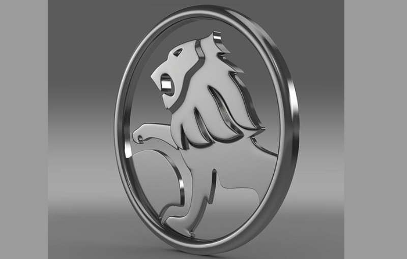
The Holden Logo stands as one of the most recognized automotive emblems in Australian history. It features a lion rolling a stone, a symbol rooted in an ancient fable about the invention of the wheel.
This badge represented more than a car company. It became a cultural marker for Australian manufacturing pride and automotive independence.
The current version was introduced in 1994. Holden went through approximately nine logo iterations since the company began producing vehicles in 1948.
James Alexander Holden founded the original business in 1856 as a saddlery in Adelaide. The company transitioned to automobile manufacturing under General Motors ownership, creating a logo that would define Australian motoring for decades.
What is the Holden Logo?
The Holden Logo is an emblem featuring a stylized lion rolling a stone, officially introduced in its modern form in 1994. The design symbolizes innovation and the mythological origin of the wheel, representing Holden’s role in Australian automotive manufacturing.
Design Attributes
- Design Type: Combination mark (emblem with integrated wordmark)
- Primary Elements: Lion figure, circular stone, “HOLDEN” wordmark
- Official Introduction Date: 1948 (first vehicle badge), 1994 (modern version)
- Designer/Agency: Internal GM-Holden design team
- Trademark Status: Registered trademark of General Motors
- Color Palette: Primary Red (#E2001A), Silver/Chrome accents, Black text
- Usage Context: Vehicle badges, dealership signage, marketing materials, merchandise, motorsport liveries
How Has the Holden Logo Evolved Over Time?
The Holden emblem underwent approximately nine major revisions between 1948 and 2020.
Early versions featured more detailed lion illustrations.
Later iterations simplified the design progressively while maintaining the core lion and stone concept throughout the brand’s history.
Original Holden Logo (1948-1959)
- Years Active: 1948-1959
- Design Description: Detailed illustration of a lion pushing a wheel-shaped stone within a circular frame
- Color Scheme: Chrome and enamel finish with red accents
- Designer: Holden design department
- Context: Introduced with the 48-215, Australia’s first mass-produced car
- Key Changes from Previous: First automotive badge for the brand
- Cultural Significance: Marked Australia’s entry into independent car manufacturing
Simplified Holden Logo (1959-1969)
- Years Active: 1959-1969
- Design Description: Streamlined lion figure with cleaner lines and reduced detail
- Color Scheme: Chrome with red enamel background
- Designer: GM-Holden internal team
- Context: Updated to match modernizing vehicle designs of the era
- Key Changes from Previous: Less ornate lion depiction, bolder outline
- Cultural Significance: Reflected post-war Australian optimism and industrial growth
Modernized Holden Logo (1969-1994)
- Years Active: 1969-1994
- Design Description: Further abstracted lion form with geometric styling
- Color Scheme: Red, black, and chrome
- Designer: GM-Holden design team
- Context: Aligned with global automotive branding trends toward simplification
- Key Changes from Previous: More stylized approach, integrated badge shape
- Cultural Significance: Era of Holden muscle cars and V8 Supercars dominance
Contemporary Holden Logo (1994-2020)
- Years Active: 1994-2020
- Design Description: Polished, three-dimensional lion emblem with refined proportions
- Color Scheme: Red (#E2001A), silver, black
- Designer: GM-Holden corporate design
- Context: Final major revision before brand discontinuation
- Key Changes from Previous: 3D rendering effects, smoother curves, updated wordmark
- Cultural Significance: Represented Holden during its final decades of Australian manufacturing
What Do the Design Elements of the Holden Logo Mean?
The lion rolling a stone references an ancient fable about human ingenuity.
According to legend, early humans observed lions rolling stones and discovered the wheel concept.
This story connects automotive innovation with primal discovery, positioning Holden as inheritors of that inventive spirit.
Why Did Holden Choose These Specific Colors?
Red dominates the Holden color palette for good reason.
It signals passion, energy, and Australian sporting culture. The hue creates instant recognition on crowded roads.
Chrome and silver accents add premium quality perception. Black grounds the design with authority.
- Primary Red (#E2001A): Energy, passion, Australian sporting identity
- Silver/Chrome: Premium quality, engineering precision
- Black: Authority, sophistication, contrast element
What Typography Style Is Used in the Holden Logo?
The Holden wordmark uses a custom sans-serif font with bold, uppercase letters.
Character spacing remains tight for compact presentation. The letterforms feature subtle curves that soften the industrial feel.
This typography choice reinforces reliability without feeling cold or mechanical.
What Are the Hidden Meanings in the Holden Logo?
The rolling motion suggests forward progress and continuous innovation.
Some interpret the lion’s posture as protective, guarding Australian automotive heritage.
The circular stone doubles as a wheel symbol, directly connecting to the product itself. Designers intended this dual meaning from early versions.
How Does the Holden Logo Compare to Competitor Logos?
Among car logos, Holden’s emblem stands unique in its narrative approach.
While Ford uses simple text and Toyota relies on overlapping ovals, Holden tells a story.
The Ford Logo prioritizes name recognition through its iconic blue oval wordmark. The Toyota Logo represents interconnected relationships through abstract geometry.
Holden’s competitor in Australia, Ford Falcon, opted for straightforward American branding. Holden differentiated itself through distinctly Australian mythology and symbolism.
Other manufacturers using animal imagery include Jaguar (leaping cat), Ferrari (prancing horse), and Lamborghini (charging bull). Holden’s lion performs an action rather than simply posing, making it narratively distinct.
What Are the Technical Specifications of the Holden Logo?
Official Color Codes
- Primary Red: Hex: #E2001A, RGB: (226, 0, 26), CMYK: (0, 100, 88, 11), Pantone: 485 C
- Silver: Hex: #C0C0C0, RGB: (192, 192, 192), CMYK: (0, 0, 0, 25)
- Black: Hex: #000000, RGB: (0, 0, 0), CMYK: (0, 0, 0, 100)
Dimensions and Proportions
- Aspect Ratio: Approximately 1:1 for emblem, variable for horizontal lockups
- Minimum Size: 25mm width for print applications
- Clear Space: Minimum padding equal to 10% of logo width on all sides
- File Formats: Available in vector graphics (AI, EPS, SVG) and raster formats
What Cultural Impact Has the Holden Logo Had?
The Holden badge became synonymous with Australian identity itself.
It appeared on everything from family sedans to V8 Supercars champions.
When General Motors announced Holden’s discontinuation in 2020, the logo’s retirement sparked national mourning. Australians viewed it as losing part of their manufacturing heritage.
How Does the Holden Logo Fit Into the Overall Brand Identity?
The lion emblem anchored every aspect of Holden’s brand guidelines.
Dealerships featured the red lion prominently. Marketing campaigns built narratives around Australian pride and the rolling stone mythology.
Holden Special Vehicles (HSV) modified the badge with additional performance cues while maintaining core recognition.
The logo unified a diverse product range from practical utes to performance sedans under one Australian identity.
How Should the Holden Logo Be Used?
Usage Guidelines
- Do: Maintain minimum clear space around the logo
- Do: Use official color values for accurate reproduction
- Do: Scale proportionally without distortion
- Don’t: Alter colors or add effects
- Don’t: Crop or partially obscure the lion figure
- Don’t: Place on busy backgrounds that reduce legibility
Access and Licensing
General Motors retains all trademark rights to the Holden logo. Since the brand’s discontinuation, official usage requires GM authorization.
Collectors and enthusiasts should verify authenticity when purchasing merchandise. Reproduction for commercial purposes remains prohibited without licensing agreements.
Historical archives and automotive museums may display the logo under educational fair use provisions.
FAQ on The Holden Logo
What Does the Holden Logo Represent?
The Holden emblem depicts a lion rolling a stone. This image references an ancient fable about discovering the wheel.
It symbolizes innovation and human ingenuity. The Australian car brand used this narrative to connect vehicle manufacturing with primal invention.
Why Is There a Lion in the Holden Logo?
The lion comes from a legend where early humans watched lions roll stones. They supposedly learned the wheel concept from this observation.
Holden adopted this storytelling approach to represent automotive progress. It distinguishes them from competitors using simpler animal mascots.
When Was the Holden Logo First Introduced?
The first Holden badge appeared in 1948. That year marked the launch of the 48-215, Australia’s first mass-produced automobile.
General Motors Holden created the lion and stone design specifically for this historic vehicle release in Melbourne.
Who Designed the Original Holden Logo?
Internal GM-Holden design teams created the original emblem. No single designer receives public credit for the iconic Australian automotive symbol.
The brand developed subsequent versions in-house as well. This approach maintained consistent brand style guide principles throughout logo iterations.
What Colors Are in the Holden Logo?
Red dominates the Holden logo colors. The primary shade is #E2001A, similar to other red logos in the automotive industry.
Silver and chrome provide accents. Black appears in the wordmark, applying solid contrast against lighter backgrounds.
How Many Times Has the Holden Logo Changed?
Holden updated their emblem approximately nine times. Each logo evolution simplified the lion illustration while keeping the rolling stone concept.
The 1994 version became the final major redesign. It featured three-dimensional rendering and refined proportions for modern applications.
What Happened to the Holden Logo After the Brand Ended?
General Motors retired the Holden brand in 2020. The company ceased Australian car manufacturing entirely.
GM retains trademark ownership of the lion emblem. Collectors now treat vintage Holden memorabilia and badges as Australian heritage items.
Is the Holden Logo Trademarked?
Yes. General Motors holds registered trademark protection for the Holden logo worldwide.
Commercial reproduction requires licensing agreements. The psychology of shapes in this emblem remains legally protected intellectual property.
What Is the Meaning of the Rolling Stone in the Holden Logo?
The stone represents the wheel’s invention. According to the fable, humans discovered circular movement by watching lions roll rocks.
This creates a direct connection to automobiles. The stone doubles as a wheel symbol, reinforcing the brand’s manufacturing purpose.
Where Can I Find Official Holden Logo Files?
Since Holden’s discontinuation, official files are harder to access. GM no longer distributes brand assets publicly.
Automotive archives and museums may have historical versions. Always verify DPI quality and authenticity before using any sourced files.
Conclusion
The Holden Logo remains a powerful example of automotive branding done right. Its lion and stone imagery told a story that resonated with Australian identity for over seven decades.
Few car marques achieved this level of cultural connection. The emblem followed solid logo design principles while maintaining emotional depth.
Understanding color psychology and symbolic design elements helps explain why this badge worked so well.
Though Holden vehicles no longer roll off production lines, the lion emblem lives on in Australian motoring heritage. It stands as proof that great brand identity outlasts the products it represents.
Renowned for his expertise in logo design and visual branding, Bogdan has developed a multitude of logos for various clients.
His skills extend to creating posters, vector illustrations, business cards, and brochures. Additionally, Bogdan's UI kits were featured on marketplaces like Visual Hierarchy and UI8.
He also wrote in the past years on sites like Design Your Way, WebDesignerDepot, WPDean, Designmodo, Speckyboy, Slider Revolution, and more.
- The Airtable Logo History, Colors, Font, And Meaning - 12 July 2026
- How to Blur Background in Canva: A Quick Tutorial - 11 July 2026
- Typography Trends - 10 July 2026
Bogdan Sandu is a seasoned designer who has been designing websites since 2008. Renowned for his expertise in logo design and visual branding, Bogdan has developed a multitude of logos for various clients. His skills extend to creating posters, vector illustrations, business cards, and brochures. Additionally, Bogdan's UI kits were featured on marketplaces like Visual Hierarchy and UI8. He also wrote in the past years on sites like Design Your Way, WebDesignerDepot, WPDean, Designmodo, Speckyboy, Slider Revolution, and more.
You Might Also Like

