The Opel logo stands as one of the most recognizable symbols in German automotive history. That lightning bolt cutting through a circle? It’s been on cars for decades now.
The emblem represents Opel Automobile GmbH, a company that started making sewing machines back in 1862. Wild, right? They didn’t even touch cars until 1899.
The current logo features a stylized lightning bolt (called the “Blitz”) inside a circular frame. Opel has gone through roughly ten logo redesigns since the company’s founding. The most recent update came in 2020 when Opel refreshed the design under Stellantis ownership.
Understanding what makes a logo work requires looking at both history and design choices. The Opel emblem delivers on both fronts.
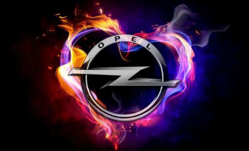
What is the Opel Logo?
![]()
The Opel logo is a circular emblem featuring a horizontal lightning bolt symbol, officially introduced in its modern form in 1963. The design represents speed, precision, and German engineering excellence through its sharp, dynamic Blitz element.
Design Type: Combination mark (symbol with wordmark)
Primary Elements:
- Horizontal lightning bolt (Blitz)
- Circular border ring
- OPEL wordmark beneath the symbol
Official Introduction Date: The lightning bolt concept first appeared in 1963. The current minimalist version launched in 2020.
Designer/Agency: The 2020 redesign was handled internally by Opel’s brand team following the Stellantis merger.
Trademark Status: Registered trademark across European Union territories and internationally under Stellantis N.V.
Color Palette:
- Primary: Opel Yellow (#F7FF14)
- Secondary: Black (#000000)
- Tertiary: White (#FFFFFF)
Usage Context: Vehicle badges, dealership signage, digital platforms, marketing materials, merchandise, and packaging design for automotive parts.
How Has the Opel Logo Evolved Over Time?
![]()
The Opel logo has transformed dramatically across more than 160 years. It started with ornate Victorian lettering and ended up as a sleek lightning bolt.
The company cycled through at least ten distinct versions. Each one reflected the design trends and business realities of its era.
Original Opel Logo (1862-1890)
Years Active: 1862-1890
Design Description: Decorative script reading “Adam Opel” with Victorian flourishes. No symbol, just elaborate lettering typical of 19th-century manufacturing brands.
Color Scheme: Black ink on product plates
Designer: Unknown, likely local engravers
Context: Adam Opel founded the company to manufacture sewing machines. The logo reflected craftsmanship and quality expected from German manufacturing.
Cultural Significance: Represented Opel’s origins as a household goods manufacturer before automobiles existed as consumer products.
The Eye Logo (1890-1909)
Years Active: 1890-1909
Design Description: An eye symbol surrounded by the text “Opel” appeared when the company expanded into bicycle manufacturing.
Color Scheme: Red and gold
Key Changes from Previous: First use of a pictorial symbol rather than pure text. The eye suggested vision, progress, and watchfulness.
Context: Bicycles were the hot technology of the 1890s. Opel needed a more dynamic identity to compete in this exciting new market.
Early Automobile Era Logo (1909-1937)
Years Active: 1909-1937
Design Description: Various iterations featuring “Opel” in bold lettering, sometimes with decorative borders or gear motifs.
Color Scheme: Black, white, and occasionally gold
Key Changes from Previous: Dropped the eye symbol. Focused on bold typography to establish automotive credibility.
Context: Opel entered car manufacturing in 1899 and needed branding that communicated mechanical expertise and reliability.
The Zeppelin Logo (1937-1947)
Years Active: 1937-1947
Design Description: A horizontal airship (zeppelin) flying through a circular ring.
Color Scheme: Silver and black
Designer: Internal Opel design team
Key Changes from Previous: First introduction of the circular frame that would become permanent. The zeppelin replaced text-focused designs.
Context: Germany was fascinated with aviation and airships during this period. The zeppelin symbolized technological advancement and speed.
Cultural Significance: Reflected the era’s obsession with air travel. Also coincided with General Motors’ acquisition of Opel in 1929.
First Lightning Bolt Logo (1963-1987)
Years Active: 1963-1987
Design Description: The zeppelin transformed into a stylized lightning bolt within the circular frame. The Blitz was born.
Color Scheme: Yellow bolt on black background with chrome accents for vehicle badges
Key Changes from Previous: Complete conceptual shift from airship to lightning. Simpler, more abstract, more modern.
Context: Post-war design moved toward simplification. The lightning bolt suggested electric speed and energy.
Cultural Significance: Established the core visual identity that Opel still uses today. The name “Blitz” stuck because it connected to German language and Opel’s Blitz truck line.
Refined Blitz Logo (1987-2002)
Years Active: 1987-2002
Design Description: Sharper, more angular lightning bolt with a three-dimensional chrome effect.
Color Scheme: Chrome silver, yellow, and black
Key Changes from Previous: Added depth and metallic sheen. The bolt became pointier and more aggressive looking.
Context: 1980s design loved chrome and 3D effects. Opel wanted to look premium and technologically advanced.
Modern Simplified Logo (2002-2020)
Years Active: 2002-2020
Design Description: Flattened design with cleaner lines. Less chrome, more matte finishes.
Color Scheme: Silver, black, and yellow variations
Key Changes from Previous: Removed excessive 3D effects. Prepared the logo for digital applications where flat design performs better.
Context: Digital-first branding became standard. Logos needed to work on screens, apps, and social media profiles.
Current Opel Logo (2020-Present)
Years Active: 2020-present
Design Description: Ultra-minimalist lightning bolt with thin circular outline. Maximum simplicity.
Color Scheme: Bold yellow (#F7FF14), pure black, clean white
Designer: Opel internal brand team under Stellantis
Key Changes from Previous: Stripped away all remaining 3D elements. Thinner lines. More white space.
Context: PSA Group (now Stellantis) acquired Opel in 2017. The rebrand signaled a fresh start under new ownership and aligned with minimalist design trends dominating automotive branding.
Cultural Significance: Represents Opel’s transition into electric vehicles and sustainable mobility. The clean aesthetic suggests forward-thinking innovation.
What Do the Design Elements of the Opel Logo Mean?
The Opel logo combines a lightning bolt with a circular frame to communicate speed, energy, and completeness.
The Blitz represents instant power. The circle suggests unity and protection.
Together, they tell a story about German engineering precision delivered with electric quickness.
Why Did Opel Choose a Lightning Bolt?
The lightning bolt evolved from the earlier zeppelin symbol. Both conveyed speed, but the bolt felt more modern and energetic.
“Blitz” means lightning in German. It also connected to Opel’s successful Blitz truck line from the 1930s.
The psychology of shapes tells us angular forms suggest action and dynamism. The pointed bolt creates visual movement even when static.
Why Did Opel Choose These Specific Colors?
Yellow (Opel Yellow #F7FF14)
- Symbolic meaning: Energy, optimism, innovation
- Psychological impact: Grabs attention instantly, creates feelings of excitement
- Brand connection: Differentiates Opel from competitors who favor blue, red, or silver
Looking at yellow logos across industries, you’ll notice they consistently communicate approachability and positivity.
Black (#000000)
- Symbolic meaning: Sophistication, power, premium quality
- Psychological impact: Creates strong contrast, easy to read
- Brand connection: Balances the brightness of yellow with grounded authority
Many black logos in the automotive industry use this color to signal luxury and seriousness.
White (#FFFFFF)
- Symbolic meaning: Purity, simplicity, clarity
- Psychological impact: Clean and modern feeling
- Brand connection: Works for reverse applications and provides breathing room
The combination creates a color palette that stands out on dealership lots and digital screens alike.
What Typography Style Is Used in the Opel Logo?
Opel uses a custom sans-serif font for its wordmark. The letterforms are geometric with clean, even stroke weights.
The current typeface prioritizes readability at small sizes. This matters for digital applications and vehicle badges where space is limited.
Previous versions used bolder, chunkier lettering. The shift toward lighter weights reflects broader design trends favoring elegance over bulk.
What Are the Hidden Meanings in the Opel Logo?
The circular frame represents completeness and unity. It’s a protective boundary around the energetic bolt.
Some see the horizontal orientation as a road stretching toward the horizon. Others interpret it as an abstract “O” for Opel.
The designers haven’t confirmed intentional hidden meanings. But the simple geometry allows viewers to find their own interpretations.
The bolt’s angle and position within the circle create natural balance. Nothing feels off-center or awkward.
How Does the Opel Logo Compare to Competitor Logos?
German automakers favor circular emblems. BMW, Mercedes-Benz, and Volkswagen all use them.
Opel stands out through color. That yellow is unmistakable when every competitor uses blue, silver, or red.
The lightning bolt also differentiates Opel from the stars, rings, and letters that dominate European car branding.
Versus BMW: Both use circles, but BMW features a quartered design with blue and white. Opel’s single central element feels simpler and more direct. The BMW Logo has stronger heritage associations.
Versus Volkswagen: VW uses interlocking letters in a circle. More corporate feeling compared to Opel’s energetic bolt.
Versus Peugeot: Both brands now live under Stellantis. Peugeot’s lion feels organic where Opel’s bolt feels technical. Different personalities for different market positions.
Versus Vauxhall: Opel’s British sibling uses a griffin symbol. Same parent company, completely different visual identity. The griffin looks traditional while the bolt reads modern.
Versus Ford: The Ford Logo relies on script typography inside an oval. Much more heritage-focused than Opel’s abstract approach.
What Are the Technical Specifications of the Opel Logo?
Official Color Codes:
Opel Yellow (Primary)
Black (Secondary)
- Hex: #000000
- RGB: (0, 0, 0)
- CMYK: (0, 0, 0, 100)
- Pantone: Black 6 C
White (Tertiary)
- Hex: #FFFFFF
- RGB: (255, 255, 255)
- CMYK: (0, 0, 0, 0)
Dimensions and Proportions:
- Aspect ratio: 1:1 (circular format)
- Minimum size: 15mm for print, 40 pixels for digital
- Clear space: Minimum of 25% of logo width on all sides
- The lightning bolt spans approximately 70% of the circle’s diameter
File Formats Available:
- Vector graphics (AI, EPS, SVG) for scalable applications
- JPEG and PNG for digital use
- High DPI versions for print design
What Cultural Impact Has the Opel Logo Had?
The Opel Blitz has become shorthand for accessible German engineering. It’s not as prestigious as Mercedes or BMW. And that’s actually the point.
Opel positioned itself as the people’s car brand. The straightforward logo reinforces this approachable identity.
In motorsport, the lightning bolt appeared on rally cars and touring car champions throughout the 1970s and 1980s. Those victories built emotional connections with driving enthusiasts.
The logo also represents German industrial resilience. Opel survived world wars, economic crises, and multiple ownership changes. Through it all, that lightning bolt kept evolving but never disappeared.
How Does the Opel Logo Fit Into the Overall Brand Identity?
The logo anchors Opel’s entire visual system. Every touchpoint connects back to that yellow bolt.
Dealerships use the colors extensively. Marketing materials feature the circle prominently. Digital platforms display the simplified version.
Opel’s brand guidelines specify exactly how the logo interacts with photography, typography, and layout. Consistency matters when you’re competing against bigger budgets.
The brand uses storytelling around German heritage and innovation. The lightning bolt supports this narrative through its clean, engineered appearance.
Vehicle design echoes the logo’s themes. Sharp character lines on Opel cars mirror the bolt’s angular energy. The yellow color appears as accent lighting and interior trim options.
How Should the Opel Logo Be Used?
Official Usage Guidelines:
Do:
- Maintain clear space around the logo
- Use approved color combinations only
- Scale proportionally without distortion
- Place on backgrounds with sufficient contrast
Don’t:
- Rotate or skew the logo
- Change the lightning bolt’s angle
- Apply unapproved colors or gradients
- Place on busy backgrounds that reduce visibility
- Modify the relationship between bolt and circle
Where to Access Official Logos:
Opel’s media portal provides downloadable assets for press and partners. Authorized dealers receive brand packages through internal channels.
Licensing Information:
The Opel logo is a registered trademark of Stellantis N.V. Unauthorized commercial use is prohibited. Editorial and informational use typically falls under fair use provisions.
Trademark Protection:
The Blitz design and Opel wordmark are protected across major global markets. Stellantis actively monitors and enforces trademark rights against counterfeiters and unauthorized users.
FAQ on The Opel Logo
What Does the Opel Logo Represent?
The Opel logo represents speed, precision, and German automotive engineering. The lightning bolt symbol (called the Blitz) communicates instant power and forward motion.
The circular frame adds completeness to the design. Together, these elements reflect Opel Automobile GmbH’s identity as an accessible yet quality-focused car manufacturer.
Why Is the Opel Logo a Lightning Bolt?
The lightning bolt evolved from an earlier zeppelin symbol used in the 1930s. Both represented speed, but the bolt felt more modern.
“Blitz” means lightning in German. It also connected to Opel’s successful Blitz truck line, making the symbol doubly meaningful for the brand’s heritage.
When Was the Current Opel Logo Introduced?
The current Opel logo launched in 2020. Stellantis (formerly PSA Group) oversaw this redesign after acquiring the German automaker in 2017.
This version strips away all 3D effects. It’s the most minimalist interpretation of the Blitz in the company’s history.
What Colors Are in the Opel Logo?
The official Opel brand colors include yellow (#F7FF14), black (#000000), and white (#FFFFFF). Yellow serves as the primary color.
This bright yellow creates strong visual hierarchy on dealership lots. It separates Opel from competitors who favor blue, silver, or red in their vehicle badges.
Who Designed the Opel Logo?
The current logo was developed internally by Opel’s brand team. No external agency received credit for the 2020 redesign.
Earlier versions had various designers. The original 1963 lightning bolt concept came from Opel’s in-house design department during the General Motors ownership era.
What Is the Meaning of the Opel Blitz?
The Blitz symbolizes electric energy and rapid movement. It connects to color psychology through its yellow rendering, which suggests optimism.
The horizontal orientation implies forward progress. Some interpret it as a road stretching toward the horizon, reinforcing automotive themes.
How Many Times Has the Opel Logo Changed?
Opel has redesigned its brand identity roughly ten times since 1862. Major shifts include the eye symbol, zeppelin era, and multiple Blitz refinements.
Each version reflected its period’s design trends. The evolution shows how graphic design principles changed across more than 160 years.
Is the Opel Logo Trademarked?
Yes. The Opel emblem is a registered trademark owned by Stellantis N.V. Protection covers European Union territories and international markets.
Unauthorized commercial use is prohibited. Stellantis actively enforces these rights against counterfeit automotive parts and merchandise.
What Font Does Opel Use in Its Logo?
Opel uses a custom geometric font for its wordmark. The letterforms feature clean lines and even stroke weights throughout.
This modern typography choice prioritizes readability at small sizes. It works well on digital platforms and physical vehicle badges alike.
Why Did Opel Change From the Zeppelin to the Lightning Bolt?
The zeppelin felt outdated by the 1960s. Airships had lost their futuristic appeal after the Hindenburg disaster and World War II.
The lightning bolt offered a fresh, abstract alternative. It captured speed without referencing specific technology that might eventually seem dated again.
Conclusion
The Opel Logo demonstrates how automotive branding evolves while keeping core identity intact. That lightning bolt has survived ownership changes, design trends, and over 160 years of company history.
Few car emblems communicate their message so directly. Speed. Energy. German precision.
The Blitz symbol follows solid logo design principles through its simplicity and memorability. The yellow hue creates instant recognition on any road.
Whether you’re examining Opel’s brand heritage or studying effective design elements, this emblem offers lasting lessons in visual identity done right.
Renowned for his expertise in logo design and visual branding, Bogdan has developed a multitude of logos for various clients.
His skills extend to creating posters, vector illustrations, business cards, and brochures. Additionally, Bogdan's UI kits were featured on marketplaces like Visual Hierarchy and UI8.
He also wrote in the past years on sites like Design Your Way, WebDesignerDepot, WPDean, Designmodo, Speckyboy, Slider Revolution, and more.
- The Airtable Logo History, Colors, Font, And Meaning - 12 July 2026
- How to Blur Background in Canva: A Quick Tutorial - 11 July 2026
- Typography Trends - 10 July 2026
Bogdan Sandu is a seasoned designer who has been designing websites since 2008. Renowned for his expertise in logo design and visual branding, Bogdan has developed a multitude of logos for various clients. His skills extend to creating posters, vector illustrations, business cards, and brochures. Additionally, Bogdan's UI kits were featured on marketplaces like Visual Hierarchy and UI8. He also wrote in the past years on sites like Design Your Way, WebDesignerDepot, WPDean, Designmodo, Speckyboy, Slider Revolution, and more.
You Might Also Like