The BYD Logo History, Colors, Font, and Meaning
Imagine this: You’re cruising the highway in your whisper-quiet electric vehicle, and there it is. The BYD logo.
A beacon of innovation, a symbol that’s more than just a badge—it’s a statement. It’s about the whispered revolution in the sustainable energy world.
In the electrifying dance of logos, where each twist and turn tells a story, the BYD insignia stands out—signaling a leap into a future where the roar of engines is replaced by the hum of progress.
For those curious souls, this isn’t just a logo. It encapsulates visions of green technology, a manifesto of a company driving the EV industry beyond borders.
Buckle up, because we’re about to unveil the story behind that iconic emblem. It’s more than just design; it’s philosophy, innovation, and a promise of a cleaner, brighter tomorrow.
By the time you reach the end, you’ll not only appreciate the genius that illuminates the BYD logo, but you’ll also grasp the essence and aspiration that symbol sparks within the electric vehicle cosmos.
The Meaning Behind the BYD Logo
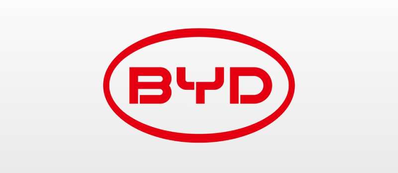
Alright, let’s dive into this. So, BYD. Sounds mysterious, right? Well, the secret is “Build Your Dreams”. Yes, bold and super cool. It’s their battle cry, screaming what they stand for, their belief in tomorrow, their professionalism, and their crazy innovative spirit. It’s unique, like a fingerprint.
A Logo’s Journey
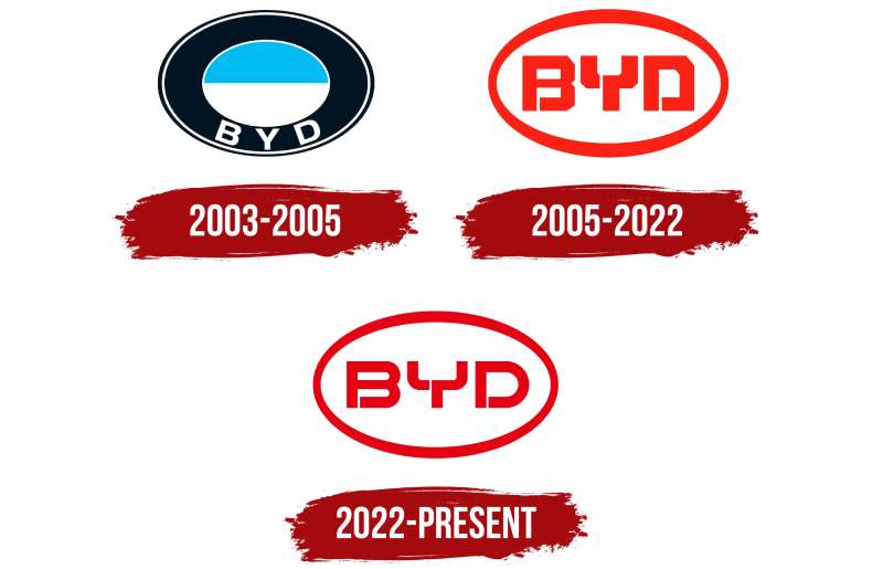
Now, the logo didn’t pop up from nowhere. It’s a story, a journey. Just once, the logo changed its skin, like a butterfly. Remember when we flipped the calendar to December 2022? Yep, that’s when it happened.
Inspiration from the Past
Alright, here’s the spicy part. You know what inspired the new look? It’s something ancient, like really ancient. Think Chinese oracle-bone inscription, but with a modern twist. You heard right, the symbol for “electricity”. Cool, isn’t it? It’s like linking the past to the present and charging into the future, all wrapped up in one logo. There you have it, the story of the BYD logo.
The History of the BYD Logo
Okay, now that we’ve uncovered the hidden message, let’s rewind the clock and go back to where it all started.
The Birth of the Logo
Way back in 1995, BYD was a battery manufacturer, not the powerhouse in automobiles and renewable energy they are today. The original logo was just the company’s name in a simple typeface. It was all about the product, the batteries, and less about the vision.
But as BYD grew, it wasn’t just about batteries anymore. The logo needed a revamp, a facelift. They needed a logo that could carry the weight of their ambitions.
The Evolution of the Logo
In 2002, the logo got its much-needed makeover. The new design was fresh, bold. It had movement. It was more than just a name. It was a statement of intent. And with this new identity, BYD made a big splash in the world of automobiles and renewable energy.
The Colors of the BYD Logo
Alright, now we’re gonna talk about colors. Colors are like the spices of a logo. They add flavor, emotion, personality.
The Blue
First up, we’ve got the blue. It’s not just any blue, it’s a deep, rich blue, like the depths of the ocean or the vastness of the night sky. It’s a color that speaks of wisdom, trust, and reliability. It’s the color of the Earth, a nod to BYD’s commitment to sustainability.
The Silver
Then there’s the silver. It’s sleek, modern, futuristic. It’s the color of technology, innovation. It’s the color that says, “Hey, we’re not just a car company. We’re a technology company.”
The Font Used in the BYD Logo
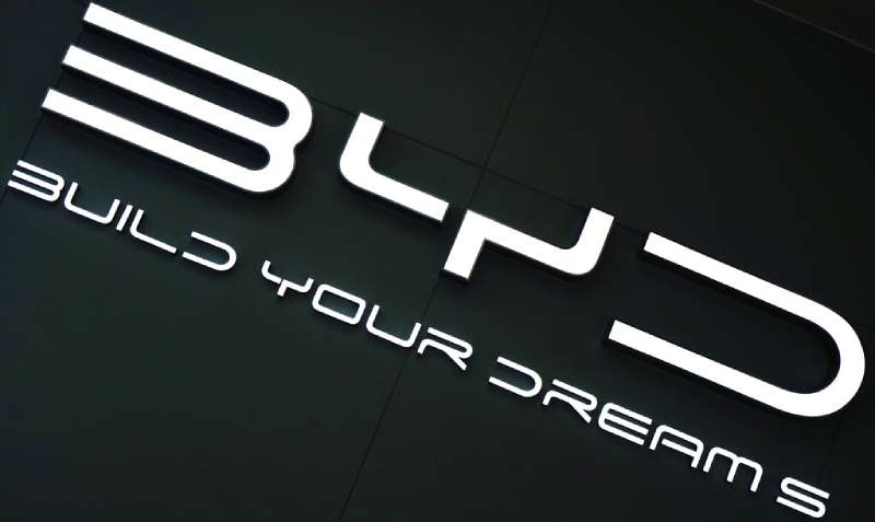
Next up, let’s dissect the font. Fonts, they’re the unsung heroes of a logo. They add character, style, attitude.
The Font Choice
The font used in the BYD logo is bold, capitalized, assertive. It’s not messing around. It’s here to make a statement. The letters are wide and evenly spaced, a testament to BYD’s transparency and fairness.
The Message in the Font
But it’s not just about looking good. The font also carries a message. It’s a font that’s easy to read, simple yet modern.
The Power of Consistency
Alright, next up – let’s talk about a little thing I like to call consistency. It’s the secret sauce, the magic ingredient that ties everything together.
Logo as a Brand Anchor
The logo is like an anchor, it grounds the brand. Wherever BYD goes, whatever new venture they dive into, that logo will always be there. It’s constant, unchanging. It’s a symbol of their commitment to their vision.
Consistency Across Platforms
Whether you’re looking at a BYD car, browsing their website, or checking out their social media, you’ll see that logo. It’s a reminder of who they are, what they stand for. It’s their signature, their fingerprint. It’s a testament to their consistency and reliability as a brand.
The Adaptability of the BYD Logo
Alright, moving on, let’s talk about how the BYD logo stands the test of time and space. Adaptability, it’s the name of the game.
Logo Versatility
See, a good logo needs to look good everywhere – on a business card, a billboard, a smartphone app, you name it. The BYD logo does just that. It’s simple, it’s clear, it scales. Whether it’s on a tiny keychain or splashed across a massive billboard, it stands out.
Logo Longevity
But that’s not all. A logo also needs to stand the test of time. Fads come and go, styles change. But the BYD logo, with its timeless design and bold colors, continues to shine. It’s a logo that’s built to last, just like the dreams it promises to build.
The Emotional Connection
Alright, last but definitely not least, let’s talk about feelings. Yep, you heard me right. Feelings.
Logo as a Storyteller
A logo isn’t just a pretty picture. It’s a storyteller. It’s a vehicle for emotion. It’s a bridge that connects the brand to the customer. The BYD logo, with its bold design and inspiring message, is all about sparking that emotional connection.
Logo as a Brand Promise
Every time you see that logo, it’s a promise. A promise of innovation, of sustainability, of dreams built. It’s not just a logo, it’s a beacon of hope in a world that’s hungry for change. And that, my friends, is the true power of a logo.
FAQ On The BYD Logo
What’s the meaning behind the BYD logo?
The emblem? Oh, it’s a beacon of dreams—and quite literally so. “Build Your Dreams” is the deal here. That chrome-silver badge reflects innovation, a future ushered by sustainable transport.
It’s about electric vehicles leading that charge, the motif almost urging us onwards, you know, to cleaner horizons.
Is there a story attached to the BYD logo’s design?
Absolutely, every curve has a tale. It was crafted to mirror BYD’s leap in battery technology and electric cars, fused elegantly with a semblance of durability. It’s not just a look—it’s their narrative, a graphical nod to green technology and that electric bus revolution.
How has the BYD logo evolved over time?
Curiously, it’s not a tale of drastic change. Since conception, BYD’s logo has kept its core. It’s maintained that sleek, forward-looking style. An evolution—sure, but more a refinement, like a sculpture in progress, parallel to their advancements in the EV industry.
Who designed the BYD logo, and when?
The “who” is a bit shrouded in corporate mystery—BYD keeps it close. The “when”—well, that aligns with the company’s public leap in 2003. Post-rebranding, it’s been all about stamping authority, like declaring, “Hey, we’re BYD Auto Co., Ltd., and we’re here to stay!”
What colors are used in the BYD logo, and do they signify anything?
They went classic—silvers and blues. The silver, sleek as their blade battery tech, speaks premium, durable. Blue touches on the eco-friendly vibe, signaling their commitment to zero-emissions and a sky free of smoke—a nod to the new energy vehicles creed.
How does the BYD logo represent the company’s business focus?
It’s straight-up electric, my friend. That logo’s an emblem of their sharp focus on electric vehicles—cars, buses, you name it. It stands as a mark of commitment to innovation, sustainable energy, and you’ve guessed it—renewable energy through solar panels and more.
Can the BYD logo be found on other products besides automobiles?
Oh, it’s like a badge of honor across different battlefronts. From their solar panel arrays to battery-powered bicycles, and even their tech-laden electric forklifts, the logo marks everything that’s touched by the brand’s wide-reaching sustainable transport aspirations.
How do global consumers perceive the BYD logo?
Picture respect, tinged with curiosity. Global consumers see that logo as a Chinese car brand stepping out, bold and assertive. There’s a growing recognition, especially as folks get savvy about green technology and the role electric car logos play in that new chapter.
In what ways has BYD’s logo been influential in the EV market?
Look around; it’s subtle but sure. BYD’s badge on the grill is more than decoration—it’s a signal fire for the EV industry mission. It’s became synonymous with affordability meets tech, influencing the market by showing that electric dreams aren’t just for the deep-pocketed.
What future changes might we expect for the BYD logo as the company grows?
If I were a betting man, I’d say: expect an evolution, not a revolution. As BYD digs deeper into green technology, fostering ideas like the BYD blade battery, changes to their logo would naturally echo these next-gen milestones in sustainable transport.
But hey, it’ll always hold its DNA—a promise of cleaner tomorrows.
Conclusion
So, we’ve zipped through the streets of design and parked right at the crossroads of symbolism and innovation—that’s the BYD logo for ya. It’s not just a shiny piece on a grille; it’s a frontline badge for the electric vehicle revolution.
Wrapping this up, think about it—every time you spot that logo, it’s not just a Chinese car brand making its mark. It’s a narrative of ambition, a green technology harbinger. This emblem telegraphs sustainable transport, whispered promises of zero-emissions, and a clean-energy New Energy Vehicle lining the horizon.
- BYD logo? Check.
- Vision of electric buses gliding silently down your street? Check.
- A nod to renewable aspirations, with BYD solar panels harnessing the sun’s mojo? Double-check.
Paving the way for tomorrow’s journeys, the BYD logo is more than branding; it’s a revolution embraced, innovation embodied, and a pledge to a greener planet we’re all hankering for. Keep your eyes peeled—its next evolution is just around the bend.
If you liked this article about the BYD logo, you should check out this article about the Fiat logo.
There are also similar articles discussing the Lotus logo, the Koenigsegg logo, the Land Rover logo, and the Opel logo.
And let’s not forget about articles on the Holden logo, the SsangYong logo, the Mahindra logo, and the Tata Motors logo.
- Green Color Palettes for Designers To Use - 11 May 2024
- Digital Style: What Font Does Cash App Use? - 11 May 2024
- The Coors Light Logo History, Colors, Font, And Meaning - 10 May 2024


