Programming Fonts: The Top Choices for Developers
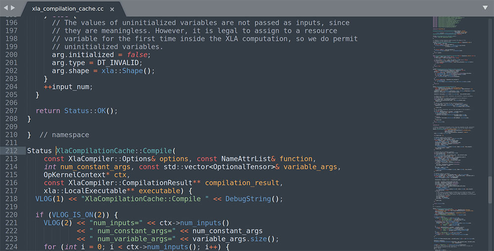
Picture this: You’re knee-deep in code, your eyes flicking across that sleek, dark-themed IDE, but something feels… off.
Feels like wearing sneakers to a marathon only to realize they were a size too small—ouch, right? Font matters, my friend, especially when you’re deciphering the hieroglyphs of programming languages for hours on end.
In the realm of monospaced muses and anti-aliased artistry, choosing the right programming fonts can be as crucial as the code itself. We don’t often sing sonnets about the unsung hero in a coder’s journey, but today, we pull back the curtain on this pivotal player.
By the end of this digital dossier, you’ll unearth the secrets to font legibility, unlocking a world where braces and semicolons bow to your clarity demands.
Prepare to dive into a curated collection of typefaces designed to make your coding sessions a visual retreat.
You can expect to learn why JetBrains Mono might make your code snippets sing, or how Fira Code facilitates a seamless dance of characters, enhancing your day-to-day coding narrative—one where eye-strain is a tale of the past.
Factors to Consider When Choosing a Programming Font
Choosing a font is not just about aesthetics. There are certain aspects to consider:
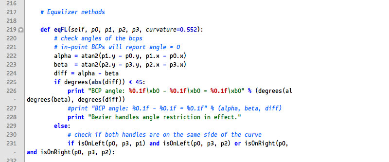
- Readability: The font must be easy to read, even at smaller sizes.
- Character Distinction: It should clearly differentiate similar-looking characters like ‘O’ and ‘0’, ‘1’ and ‘l’, etc.
- Spacing: The space between characters and lines should be sufficient to not cause strain to the eyes.
- Availability of Ligatures: Some fonts offer programming ligatures that can join multiple characters into a single symbol, which can enhance readability for some coders.
Understanding Programming Fonts
Programming fonts are not your regular fonts. They are specifically designed for coding.
Their main goal is to make the code easier to read and write. Let’s delve deeper into what makes a font a programming font.
Definition of Programming Fonts
A programming font is designed with the needs of programmers in mind.
They often include features such as a wide range of special characters, easily distinguishable glyphs for commonly confused characters, and sometimes ligatures for common programming multi-character symbols.
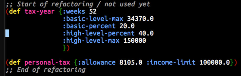
Difference Between Monospaced and Proportional Fonts
Two main types of fonts exist: monospaced and proportional. Monospaced fonts allocate the same width to each character, which means a ‘w’ takes up the same space as an ‘i’.
This type of font is most popular with coders because it aligns nicely and makes the code easier to scan.
On the other hand, proportional fonts allocate varying widths depending on the character’s size. For example, ‘w’ will take more space than ‘i’. Although these are common in most other types of writing, they are less commonly used in coding due to alignment issues.
The Role of Ligatures in Programming Fonts
Ligatures are special characters that combine two or more symbols. In programming fonts, ligatures can turn sequences of characters like ‘!=’, ‘=>’, or ‘==’ into single glyphs.
These glyphs can sometimes make the code easier to read for some developers. However, whether ligatures improve or hinder readability is a matter of personal preference.
That’s a brief overview of why programming fonts matter and what to look for in them. The ideal font depends on individual preferences, needs, and the kind of work being done.
Review of Top Programming Fonts
There are quite a few programming fonts out there, each with its unique features and style.
Here’s a review of some of my go-to fonts. We’re going to look at a handful of them and see what sets them apart. Maybe you’ll find your new favorite among them!
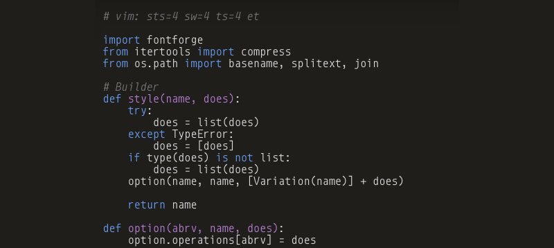
Fira Code
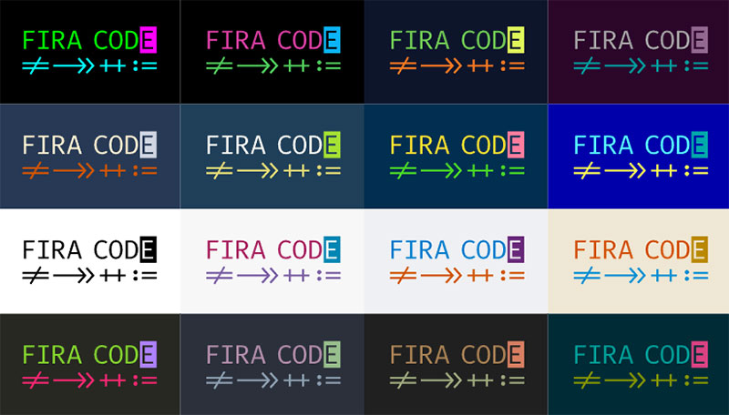
You know what’s cool about Fira Code? It’s an extension of Fira Mono, a font commissioned by Mozilla and made available for free. It’s pretty neat.
Overview
This font is pretty famous among programmers, and you might’ve already heard of it. Fira Code is designed to use programming ligatures – a feature I was talking about earlier. Remember?
Key Features
Fira Code stands out for its set of programming ligatures and its excellent balance between functionality and style. It helps me get rid of those pesky ambiguities between similar characters. Also, it’s free, so you might want to try it!
User Experience
In my experience, Fira Code offers a smooth coding ride. The font is clean, legible, and easy on the eyes, which makes the whole coding experience pretty slick.
Cascadia Code
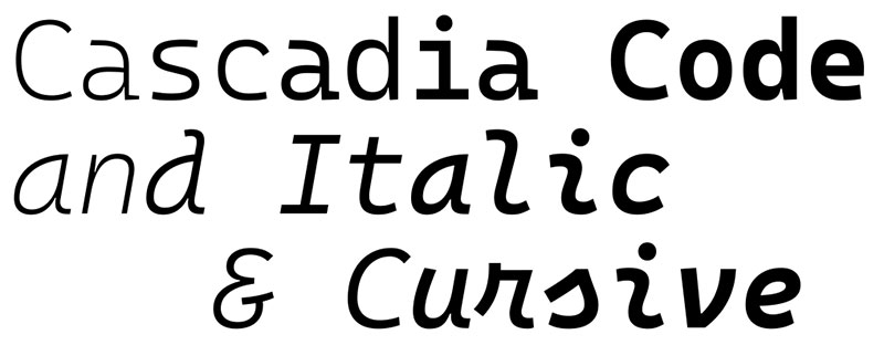
Enter the arena, Cascadia Code. A heavyweight in the world of coding fonts, Cascadia Code is a force to be reckoned with.
First Impressions
This isn’t a font that’s here to play. Cascadia Code means business, and when you see it, you’ll understand why. It’s like that black leather office chair that screams “I’m the boss.”
Under the Hood
Here’s the lowdown:
- Cascadia Code is the big kahuna, the go-to, the default for Windows Terminal and Visual Studio. It’s the proverbial big cheese.
- With a squad of different styles, it’s got versatility in spades. We’re talking default, mono (sans ligatures), italic, and even a cursive variant. Pretty rad, right?
- And let’s not forget, it’s a champ when it comes to embedding Powerline symbols.
- Sure, Cascadia Code’s got ligatures. And not just functional ones. It knows how to style ’em too. But if they’re not your cup of tea, no worries, you can opt for a package sans ligatures.
- And oh yeah, did I mention it’s open-source?
The Experience
It’s a font that may divide opinion. Some love it, others… not so much. But that’s the beauty of it. Like a good thriller, it keeps you on the edge of your seat.
Input
Input is another strong contender in the arena of programming fonts. It’s designed with flexibility in mind, and it shows.
Overview
Input is a flexible system of fonts designed specifically for code by David Jonathan Ross. It offers a ton of customization options, so you can really make it your own.
Key Features
Input lets you tweak character width, line height, and even individual letterforms. That’s like having your cake and eating it too! And guess what? It supports a whole bunch of languages.
User Experience
From my experience, Input can be a game-changer. Its customizability means you can adjust the font exactly to your liking, making coding a more comfortable experience.
Consolas
Here comes Consolas, a font that has been around for a while but still holds its ground.
Overview
Consolas is a monospaced typeface designed by Lucas de Groot. It’s been part of Windows since Vista, and it’s the default font for Microsoft Visual Studio.
Key Features
Consolas has excellent letter distinction and is clear and easy to read at various sizes. Its characters are a bit more square, and it also features subtly rounded edges.
User Experience
My time with Consolas has been nothing but pleasant. It’s a no-frills, reliable font that gets the job done. It’s particularly good if you’re working on a Windows machine or in Visual Studio.
Hack
Let’s roll out the red carpet for Hack.
This is not just another monospaced font in the crowd. No, Hack is in a league of its own when it comes to coding fonts.
First Look
Hack is the coding font equivalent of a perfectly brewed cup of coffee. It’s strong, clear, and does the job with no fuss.
Spec Sheet
Get this:
- Hack comes fully loaded. We’re talking bold, italic, and both combined. No frills, just good design.
- She’s a pro at Powerline support. Like a handy tool belt, she’s got what you need.
- Squint no more, because Hack has meticulously designed characters that make screen legibility a breeze.
- Worried about language support? Hack’s got you. With over 1500 glyphs, she’s your multilingual coding buddy.
Source Code Pro
Next up is Source Code Pro, Adobe’s first open-source typeface family Which you can get from Google Fonts.
Overview
Designed by Paul D. Hunt, Source Code Pro is a set of monospaced fonts built to be a good coding companion.
Key Features
The strength of Source Code Pro lies in its clean lines and good readability. It even has a broad range of weights, from extra light to black.
User Experience
Using Source Code Pro is a bit like having a reliable friend. It’s always there, it’s dependable, and it helps make your coding journey easier.
JetBrains Mono
JetBrains Mono is a coding font designed for devs by devs. It’s like that ergonomic chair you’ve been dreaming about — tailored to make those long coding hours feel like a breeze.
On The Surface
JetBrains Mono is the sharply dressed individual in the world of coding fonts. It’s modern, it’s clean, and boy does it know how to make your IDE look good.
Inside the Box
Here’s the 411 on what makes JetBrains Mono a total package:
- This gal’s got a whopping 140 code ligatures up her sleeve. That’s right, she’s not just another pretty face.
- She’s generous too. Offering 8 weights, each with its own italic counterpart. Variety? She’s got it.
- JetBrains Mono speaks your language. With support for 145 languages, she’s quite the linguist.
- Oh, and did I mention she’s open-source?
In Action
If you thought coding was a mundane task, wait until you experience JetBrains Mono. This monospaced font takes your code and elevates it to a whole new level of readability and elegance.
Monoid
Monoid is one of those monospaced fonts that feels like it was made for coders. And guess what? It was!
Overview
Monoid is a customizable, minimal, and legible font developed by Andreas Larsen. It is designed to be sleek and precise.
Key Features
Monoid has open apertures, which aids readability, and it’s got ligatures too. It also has semi-condensed proportions, so you can fit more code into your editor.
User Experience
Monoid offers a fresh take on what a coding font can be. It’s been great to code with Monoid, with its ligatures and open apertures boosting readability.
Ubuntu Mono
We’re moving on to Ubuntu Mono, the default font for the Ubuntu operating system that you can get from Google Fonts.
Overview
Created for the Ubuntu operating system, Ubuntu Mono is a clean and modern monospace font. It’s designed to look good at small sizes and in long texts of code.
Key Features
Ubuntu Mono stands out with its clear, easily distinguishable characters, and it supports a broad range of languages.
User Experience
Ubuntu Mono has served me well whenever I’ve used it. It’s simple, clear, and has excellent legibility, which makes for a pleasant coding experience.
Sudo
Let’s talk about Sudo, a quirky but impressive monospace font. It’s pretty much the hipster of programming fonts.
Overview
Sudo is a font that doesn’t take itself too seriously. It’s got a bit of an unconventional look, but that doesn’t mean it isn’t suitable for coding.
Key Features
Sudo comes with unique character designs, and it’s open-source. Plus, it supports ligatures!
User Experience
Using Sudo is like adding a dash of fun to coding. It’s got a unique style, and despite its quirkiness, it does not compromise on readability.
Anonymous Pro
This gem stands tall in the world of monospaced typefaces and has been standing its ground since 2009. It’s a font with a clear mission — to make your code beautiful.
At a Glance
Anonymous Pro keeps it straight and simple. It’s the monochrome suit in a sea of casual tees. It says, “Let’s cut the frills and get down to business”. With its roots in an older font, Anonymous™ (2001), this font oozes a classic, no-nonsense style.
Big On Features
- A key fact you need to know? Anonymous Pro is open-source. Oh yes, baby.
- It’s got a lot more going on under the hood too. It boasts a Unicode-based character set, which means it’s got you covered for most Western and Central European Latin-based languages, and even throws Greek and Cyrillic into the mix.
- Anonymous Pro has a split personality. You’ve got two versions: Anonymous Pro and Anonymous Pro Minus. The difference? The former’s got embedded bitmaps for smaller sizes, while the latter says “no, thank you” to that.
What’s It Like to Use?
It might not be the font that throws a party in your code editor, but it’s the one that makes sure the dishes are done, and everything’s clean and organized. It’s the font that keeps your code looking smart, crisp, and professional.
Droid Sans
Say hello to Droid Sans! Fun fact: this font was originally designed for Android mobile devices.
Overview
Droid Sans is a humanist sans-serif typeface. The “humanist” part means it was designed with the natural flow of handwriting in mind. Nice, huh?
Key Features
What sets Droid Sans apart is its taller x-height, which makes it more legible at small sizes. It’s got clean, simple shapes, and it works great on screens.
User Experience
Droid Sans is a cool companion for coding. It’s clear, comfortable to read, and it feels modern and minimalistic. Quite the crowd-pleaser, I’d say!
Roboto Mono
Next on our list is Roboto Mono, the monospaced version of Roboto. You might’ve seen this font before – it’s sister font is a popular choice for a lot of apps and websites.
Overview
Roboto Mono is an open-source, monospaced font also developed by Google. It is specifically designed for coding, terminal tasks, and displaying data in tables and graphs.
Key Features
Roboto Mono maintains the geometric structure of its predecessor Roboto, while adjusting for monospaced functionality, making it ideal for coding environments. It boasts a diverse range of weights and supports multiple languages, just like its non-monospaced counterpart.
User Experience
Roboto Mono provides a clear and clutter-free coding experience, thanks to its monospaced nature and clean, geometric design. Its character consistency and readability make it a reliable choice for prolonged periods of programming or data analysis.
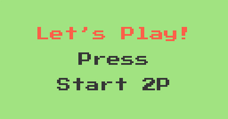
Press Start 2P
Moving on, let’s check out Press Start 2P. This one’s a bit of a nostalgia trip!
Overview
Press Start 2P is a bitmap font that’ll transport you straight back to the 1980s. It’s inspired by the classic 8-bit console games we all know and love.
Key Features
The thing with Press Start 2P is, it’s chunky and pixelated. It doesn’t just look cool – it can also help you spot any coding typos from a mile away.
User Experience
Coding with Press Start 2P is like a blast from the past. It’s quirky, it’s fun, and it can give a touch of personality to your code. All in all, it’s a solid choice for anyone looking for something a bit different.
Andalé Mono
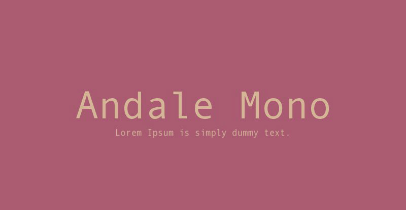
Time to get a bit more international with Andalé Mono.
Overview
Andalé Mono is a monospaced font that comes with support for a wide range of languages – hence the name. It’s a font that means business.
Key Features
This font excels at clarity and readability, especially at small sizes. It’s got a robust set of characters, and its uniform width helps keep your code nice and tidy.
User Experience
Andalé Mono Paneuropean is like the strong, silent type of programming fonts. It’s reliable, straightforward, and it gets the job done without any fuss.
MonoLisa
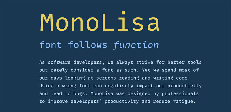
Let’s move on to MonoLisa, a font that’s designed with coders in mind.
Overview
MonoLisa is a monospaced font created by software developers. The idea behind it is to improve developers’ productivity by reducing reading errors.
Key Features
MonoLisa is packed with features that cater to the needs of coders, like distinguishable glyphs, optimized punctuation sizes, and symmetrical brackets.
User Experience
This font was made by developers for developers, and it shows. It’s like having an extra set of eyes, catching small typos and making the code more readable. It’s the kind of coding font that you don’t know you need until you try it. Once you do, you just might never look back.
How to Choose the Best Programming Font for You
So, you’ve seen the best programming fonts now, right? But you might be wondering – how do I choose the best one for me? Don’t worry, I’ve got your back. Let’s break this down together.
Assessing Your Needs and Preferences
First things first, you need to understand what you want from a programming font. Are you looking for something clean and minimalistic? Or are you more into coding fonts with a bit of personality? Do you need support for a wide range of languages? How about ligatures?
It’s crucial to get a clear idea of your needs and preferences when looking for the best programming font. Only then can you start narrowing down your options. Remember, there’s no such thing as the best coding font – only the one that’s best for you.
Trying Out Different Fonts
Once you’ve got a better understanding of what you’re looking for, it’s time to get your hands dirty. Try out different fonts. Play around with them. See how they feel when you’re coding.
Most modern code editors let you easily switch between fonts, so give that a try. It might take a bit of time to find the perfect fit, but trust me, it’s worth it.
Adjusting Font Size and Color for Optimal Comfort
Finally, don’t forget to tweak the font size and color. Your comfort is key. The right size will reduce eye strain, and the right color scheme can help you differentiate between different parts of your code.
That’s it. Follow these steps, and you’ll find your ideal coding font in no time.
FAQ On Programming Fonts
Why Is Monospaced Typeface Preferred for Programming?
Monospaced typeface, eh? It’s like grid paper for an architect—every character gets the same real estate, making patterns in code stand out. Visual consistency is key.
Helps you spot bugs like a hawk. No jumbled letters either, which is easy on those peepers during a marathon coding session.
How Do Programming Fonts Affect Readability?
Readability’s the big cheese here. Fonts like Source Code Pro or Consolas are crafted to reduce eye fatigue, super important for devs.
Crisp lines, well-differentiated characters—think ‘1’, ‘l’, ‘I’—all work together, so you don’t misread code. It’s like having high-definition for your text editor.
Can Font Ligatures Improve Coding Productivity?
Font ligatures, they’re like typographic shortcuts—combine common code symbols into single glyphs. Some swear by them, say they clear clutter, streamline the reading process.
Found in fonts like Fira Code, they could give your coding speed a nitro boost by reducing visual noise. But it’s a personal preference thing.
Are There Fonts Designed Specifically for Developers?
You bet. Take JetBrains Mono; it’s practically engineered for devs. Designers focus on stuff like character distinction, space optimization, even includes those nifty font ligatures.
They tailor these fonts to be clear, utilitarian without skimping on aesthetics. It’s a thoughtful blend of form meets function.
What’s the Deal with Font Pairings in Development Tools?
Font pairings in development tools? That’s the art of matching. Say, you’ve got your sleek code-friendly font for the editor, and you want your headers, comments, or docs to complement it.
Pair wisely, and it’s a harmonious workspace. You’ll want a balance—readability with a side of personality.
How Important Is Font Size When Coding?
Font size, now that’s a game of precision. Too small, and you’re squinting. Too big, and you’re scrolling like it’s an endless social feed. Find that sweet spot where text’s large enough to read comfortably but compact enough to fit ample code on your screen.
What Are the Benefits of Using High-Resolution Coding Fonts?
High-resolution coding fonts are like the retina display of text—sharp, crisp, and clean. Less strain on the eyes translates to longer focus sessions without the headaches. It’s all about reducing blur and keeping those glyphs perfectly defined, no matter the pixel density.
Why Might a Developer Prefer a Proportional Font Over Monospaced?
A rebel’s choice, proportional fonts are not your typical pick, but they can sometimes make for a breezier read. They treat each character like it’s special, different widths and all. Some argue it feels more natural, akin to reading a book. Still, it’s a rare breed who venture here.
What Impact Does Anti-Aliasing Have on Fonts Used in IDEs?
Anti-aliasing is like the font’s best friend in smoothness. In an IDE, it softens sharp edges, makes text blend comfortably with the background.
It’s that technology that banishes pixelated distractions, ensuring that marathon coding doesn’t become a gritty 8-bit adventure—unless that’s your jam, of course.
Does the Choice of Programming Font Have an Impact on Syntax Highlighting?
Crucial! The right programming font can make syntax highlighting pop, not to mention the brainy bit—easier pattern recognition.
Clear distinction of keywords, strings, and functions, thanks to both the font’s design and the highlighting. It’s a tag-team of readability and style working in your favor.
Conclusion
So, we’ve twirled through the digital aisles of programming fonts—that quiet powerhouse behind every keystroke you dance over the keyboard. It’s been a journey, hasn’t it? A mosaic of monospaced wonders and anti-aliased beauties, each promising a little less squint at the screen, a little more harmony in the lines of code.
And now, as we bring down the curtain on our typographic tour, keep this tucked in your mind: Your choice of typeface isn’t just about the characters on the screen; it’s about how those characters make you feel over the long haul. Whether it’s the pragmatism of JetBrains Mono or the precision of Source Code Pro, the right font fits like a glove, a silent partner in your digital creations.
May your code be clean, your eyes fresh, and your work, a testament to the craft—bit by byte. Remember, the font you rock, it’s your visual voice, the silent echo of your coding soul. Choose well. Choose wisely. Dance on, brave coder. Dance on.
If you liked this article about programming fonts, you should check out this article about funny fonts.
There are also similar articles discussing fantasy fonts, summer fonts, beach fonts, and romantic fonts.
And let’s not forget about articles on masculine fonts, tropical fonts, Bohemian fonts, and trippy fonts.
Bogdan Sandu, a seasoned designer with 15 years of diverse experience, has been designing websites since 2008.
Renowned for his expertise in logo design and visual branding, Bogdan has developed a multitude of logos for various clients.
His skills extend to creating posters, vector illustrations, business cards, and brochures. Additionally, Bogdan's UI kits were featured on marketplaces like Visual Hierarchy and UI8.
Latest posts by Bogdan Sandu (see all)
- The Bungie Logo History, Colors, Font, And Meaning - 27 April 2024
- After Dark: Night Color Palettes for Mysterious Designs - 27 April 2024
- The Capcom Logo History, Colors, Font, And Meaning - 26 April 2024