Classic fonts that you should know of
Helvetica
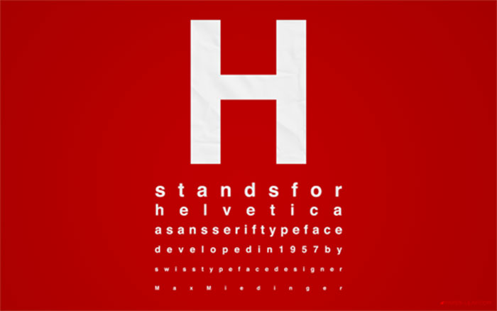
Image source: Jeff Archibald
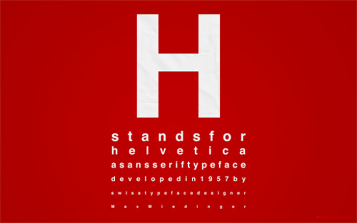
Helvetica is one of the most familiar and frequently used classic fonts in the world. It is so popular because it fulfills the most important purpose of typography, which is essentially to be simple to decipher.
Garamond
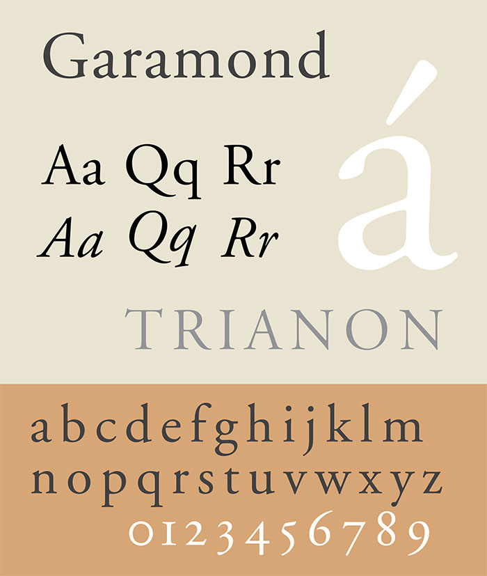
Based on Claude Garamond‘s work that dates back as far as the 16th century, this family of serif fonts has excellent readability while retaining an elegance and sense of character. For this reason, this classic font is frequently used for printing novels and pamphlets due to its appeal among authors and publishers.
Frutiger
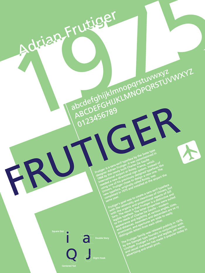
Image source: Andrew Ash
The story behind the Frutiger typeface is an interesting one that goes back to 1968 when Adrian Frutiger was hired to design the signage for the Paris Charles de Gaulle airport.
Despite having already designed a successful font, the Univers family of typefaces, he instead made the decision to create a new sans serif font which would be specifically adapted to meet the needs of airport signage, being easy to read from the road and pavement.
Bodoni
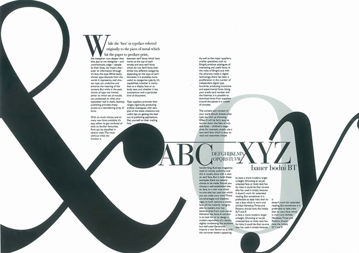
Bodoni is an example of a classic 19th century typeface that has been adapted and revived for modern use by Morris Fuller Benton. Complete with a sturdy and mechanical appearance, it is now found in regular use.
Futura
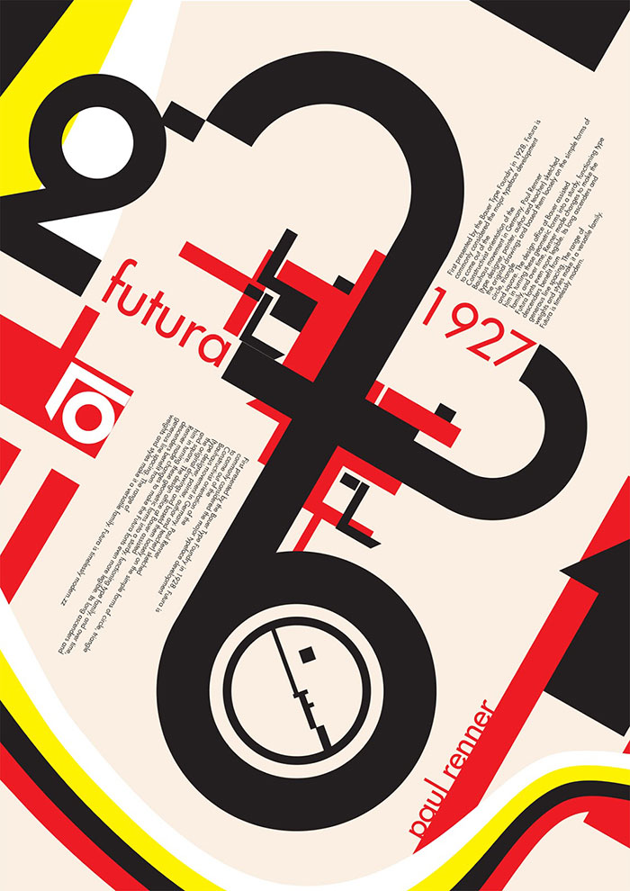
The Futura font was designed in 1927 and was themed on the Bauhaus geometric pattern design trend that was in vogue between 1919 and 1933. Created by Paul Renner, this classic font was intended to be a contribution on the New Frankfurt project.
Akzidenz-Grotesk
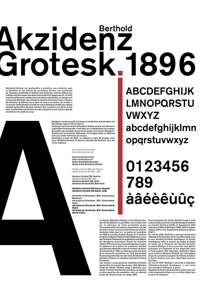
This classic font has a very old heritage that goes back as far as the 1880s.
Possibly derivative of the Walbaum or Didot serif fonts, this typeface brings together several grotesque typefaces which come from a range of designers into a family collection.
Gill Sans
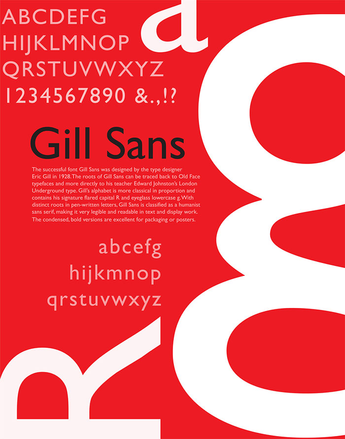
Wrongly determined to be quintessentially British, in fact the Gill Sans font has been found in use throughout the world and for a huge range of applications. Although it is decidedly distinctive, it nevertheless is perfect for a wide choice of purposes. It’s one of my top choices of classic fonts from this article.
Univers
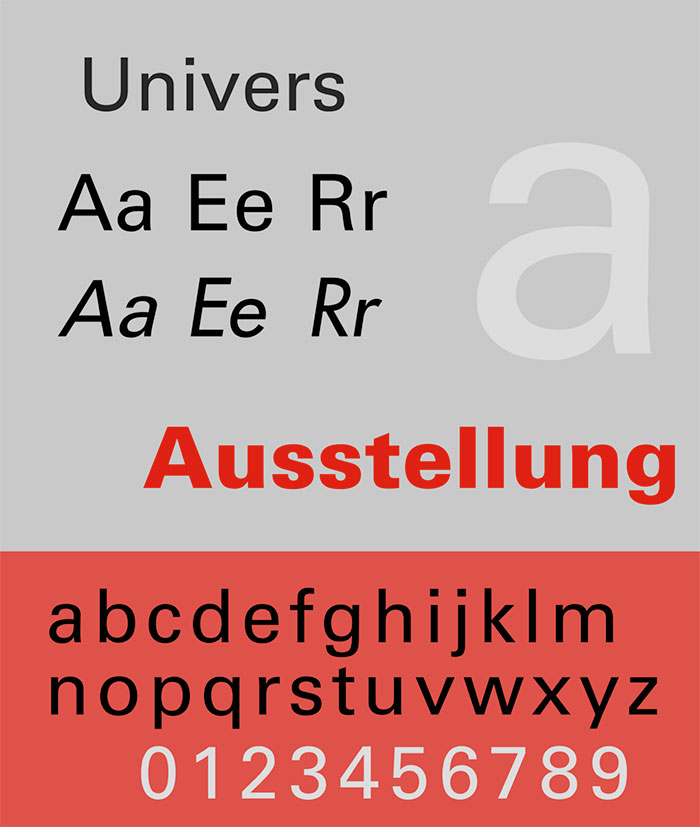
Designed by the same Adrian Frutiger as created the font for Charles de Gaulle Airport, this classic typeface was created specifically for Charles Peignot and imposes a strict discipline from light to dark and from extra-condensed to extended.
Optima
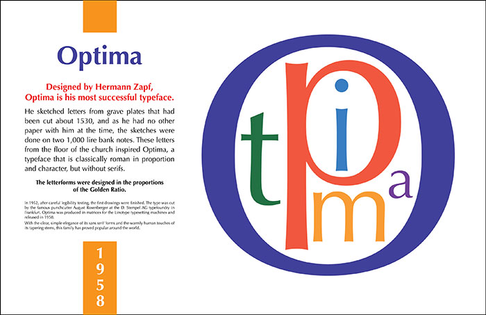
The Optima is a particularly elegant and classical typeface, based on Roman lettering with its iconic flared terminals. Designed for Hermann Zapf, it varies the thicknesses of its lines to create a graceful and easy to read text appearance.
Franklin Gothic
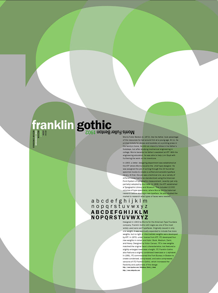
Image source: girlonthem00n
Franklin Gothic was one of the classic fonts created by Morris Fuller Benton in 1902. Still incredibly popular after all these years, this classic font is most commonly found in use in newspaper headlines and on billboard advertising.
Bembo
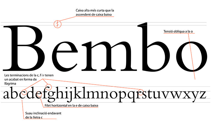
Based on a 15th century Francesco Griffo typeface, Bembo was revived in 1929 by Stanley Morison.
Interstate
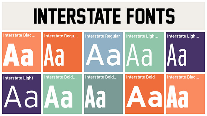
Interstate, as its name implies, is perfect for road signage and display purposes. First emerging in popularity in the 1990s, it was developed by Frere Jones and can also be adapted for use in print.
Rockwell
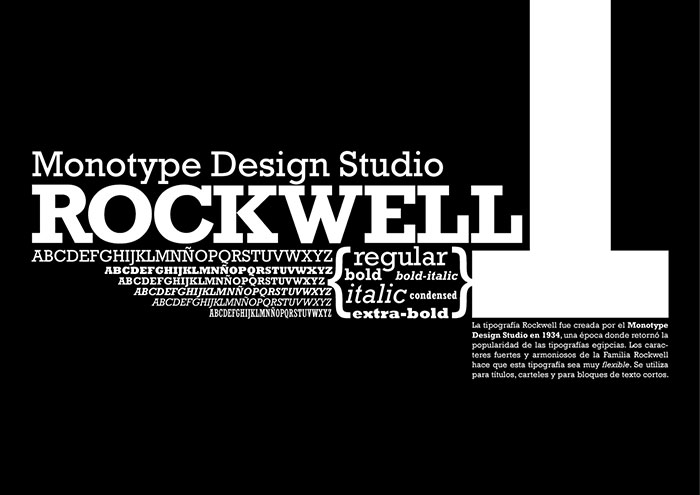
Image source: Ignacio Ricci
Rockwell was first designed as a competitor to Memphis by F.H Pierpont and is based on an early American geometric slab serif called Litho Antique.
Avenir
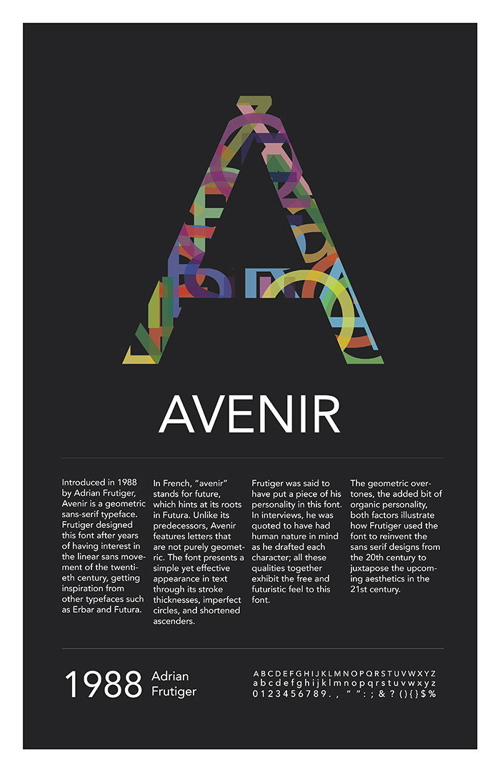
Another one of the classic fonts designed by Adrian Frutiger, the Avenir typeface was released in 1988 by Linotype-Hell AG and is based on the Erbar and Futura sans serif fonts. It uses two weights that, although similar, are required for differing purposes.
Baskerville
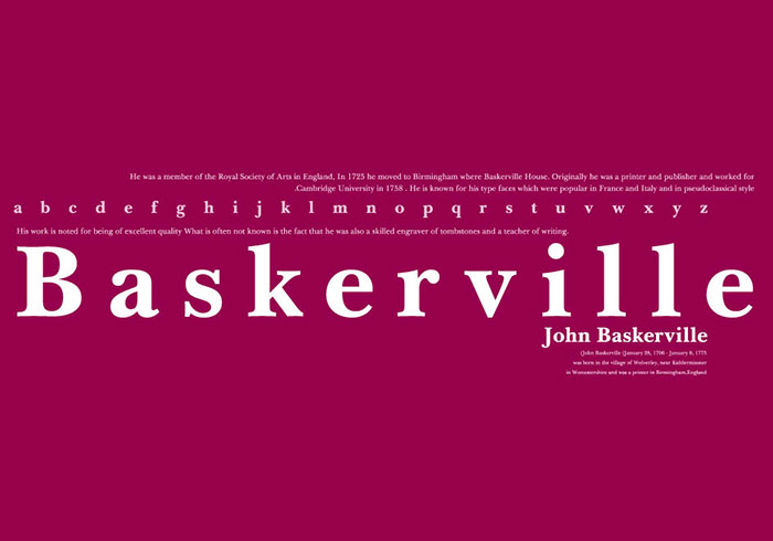
This 18th century typeface family is important because it signaled the move away from old style typefaces and a move towards the modern. Elegant and simple, it remains easy to read and therefore is still popular for use.
John Baskerville from Birmingham spawned this typeface family in 1724 and it remains a foreteller of the modernist styles that would take over typeface design in the period shortly after.
Caslon
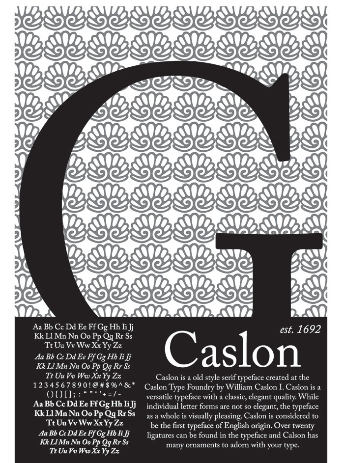
Another classic 18th century typeface, the Caslon font was first created in 1722 and was popular throughout the century across the entire British Empire. In fact, this was the very font that was used for the American Declaration of Independence!
Since that time, it has been revived several times, each time with subtle changes. Its most notable revival period was during the Arts and Crafts movement, when it achieved a brief resurgence of popularity.
Lucida Sans
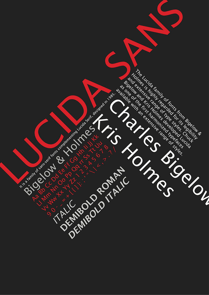
Romanesque in style, this wide spaced, easy to read classic font was one of the first typeface super families and is extremely popular today. A truly timeless font.
Myriad
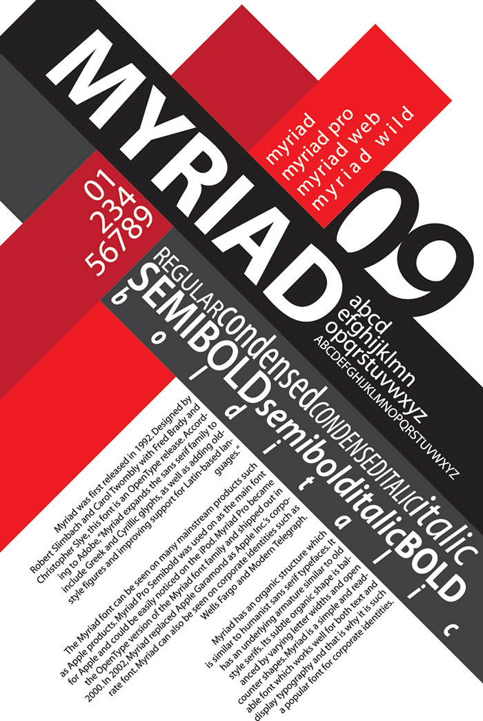
A relatively recent addition to the classic typefaces, the Myriad was developed in 1992 and has now been released in the OpenType format with a Pro character set as well as with Cyrillic and Greek glyphs. This typeface has multiple uses in both display and text compositions.
Minion
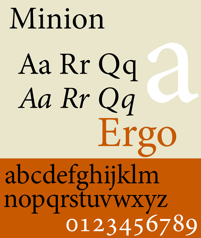
Another one of these classic fonts, released in the 1990s, the Minion font was developed by Robert Slimbach and is ideal for on screen usages. This timeless font captures the elegance and simplicity of fonts from the Renaissance era.
Palatino
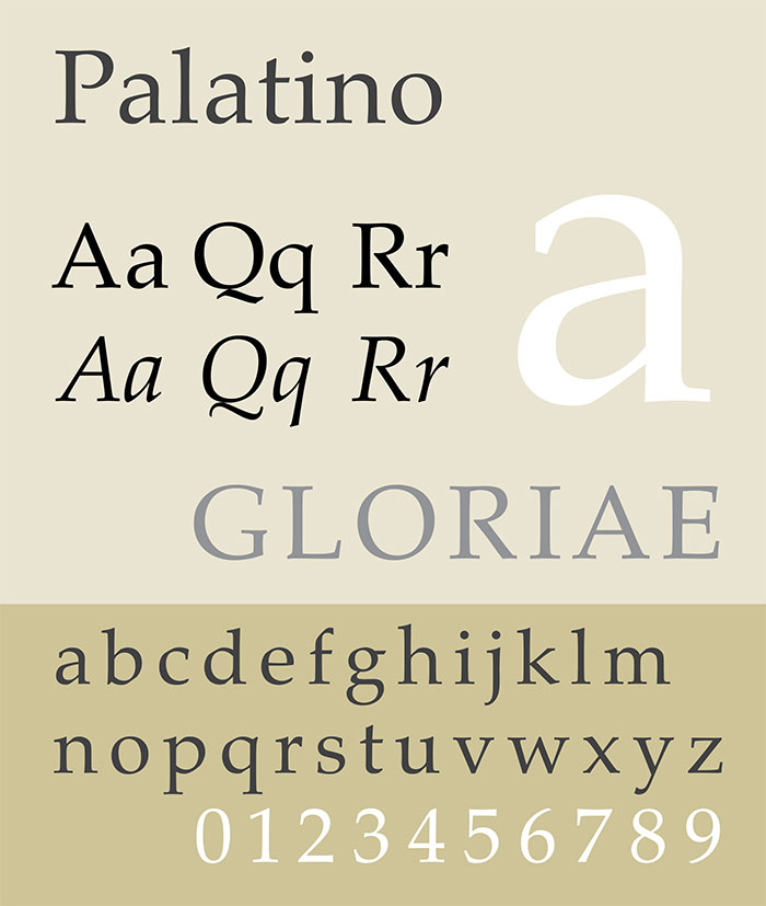
One of top ten most widely used typefaces in the world today, the Palatino font dates all the way back to the end of the Second World War.
Many other classic fonts have tried to copy its style because it is so attractive and yet easy to read. This traditional font has achieved massive popularity and features a style that is open and strong in appearance.
Times New Roman
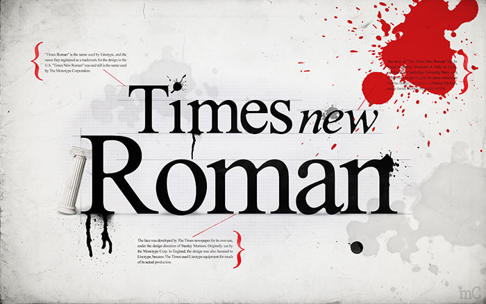
Times New Roman is one of the most commonly used fonts as it is found on all computers. As you would expect from its name, this classic typeface was developed for use by The Times newspaper in London. The purpose of requiring this newly designed font was to make this newspaper stand out above the others available at the time.
Created by the Monotype Corporation in 1931, this strong and appealing font ticked all the boxes for the required criteria, supplying The Times with a new and unique typeface rather than relying on a traditional trade type. This included possessing firm contours, strongly defined lines and an economical use of space.
Sabon
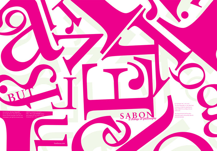
Image source: Charlie Scott
The Sabon font was three years in the making and was designed and developed by Jan Tschichold. Finally achieving its release date in 1967, it was a joint venture between three foundries – Monotype, Stempel and Linotype.
This classic typeface was actually inspired by and based on an early Garamond font that had been used in 1592 and was seen by Tschicholdon having been used on a specimen sheet.
FAQ On Classic And Popular Fonts For Designers
What makes a font “classic”?
A font is deemed classic when it withstands the test of time and maintains relevance across various design trends. Think of Helvetica, Times New Roman, and Garamond-they’re versatile, well-crafted, and have a long history of usage in typography and graphic design.
Why are certain fonts considered popular among designers?
Popular fonts often balance aesthetic appeal with readability and versatility. Fonts like Futura, Arial, and Calibri have become staples because they work well in diverse contexts, from web design to print.
Designers love fonts that enhance user experience and communicate effectively.
How do I pair fonts effectively?
Effective font pairing involves combining fonts that complement each other. Start with a serif for headlines and a sans-serif for body text.
For example, pairing Baskerville with Gill Sans can create a harmonious and professional look, enhancing both readability and visual interest.
What are some go-to classic fonts for professional design?
For professional design, some go-to classics include Bodoni for its elegant serifs, Franklin Gothic for its bold presence, and Palatino for its refined readability. These fonts have been used in various contexts, making them reliable choices for any design project.
Where can I find free popular fonts?
Free fonts can be found on websites like Google Fonts, Font Squirrel, and DaFont. These platforms offer a vast selection of professional fonts, from vintage fonts to modern fonts, allowing designers to experiment without breaking the bank.
How do I choose the right font for a web design project?
When choosing a font for web design, prioritize readability and compatibility across devices. Fonts like Verdana and Tahoma are designed for screen use and maintain clarity at various sizes. Consider font libraries that offer web-safe fonts to ensure a consistent user experience.
Are there fonts specifically for branding purposes?
Yes, certain fonts are perfect for branding. Rockwell with its strong, geometric lines, Didot for luxury brands, and Optima for a modern yet timeless look. These fonts can convey the right message and personality, making them ideal for creating memorable brands.
What are some common mistakes to avoid in font selection?
Common mistakes include using too many fonts, not considering readability, and neglecting the emotional tone of the font.
Avoid Comic Sans for professional work and ensure your font choices align with the project’s goals. Simplicity and consistency are key in font styles.
How do fonts affect user experience and engagement?
Fonts significantly impact user experience by affecting readability, mood, and overall aesthetic. Well-chosen fonts like Georgia for its legibility or Avant Garde for its uniqueness can make content more engaging and easier to consume, leading to better user retention.
Can custom fonts be worth the investment?
Custom fonts can be a valuable investment for creating a unique brand identity. They offer exclusivity and can be tailored to match your brand’s voice. While they may be pricier than off-the-shelf options, the distinctive touch they add can set your designs apart.
Conclusion
Classic and popular fonts for designers are more than just typefaces; they are the backbone of compelling visual communication. In this journey through typography, we’ve explored the timeless appeal of fonts like Helvetica, Garamond, and Futura, each offering unique qualities that can elevate any design project.
Embracing these fonts, you unlock a palette of possibilities. Whether you’re aiming for the elegance of Bodoni, the modernity of Calibri, or the versatility of Arial, the right font can transform your work from ordinary to extraordinary.
Remember, effective font selection isn’t just about aesthetics. It’s about readability, user experience, and conveying the right tone. Pairing the perfect fonts, avoiding common pitfalls, and leveraging professional fonts from reputable sources can make all the difference.
Dive into font libraries, experiment with font pairings, and let your creativity flow. The right font not only supports your design but also communicates your message with clarity and impact. Elevate your designs with these classic and popular choices, and watch your work resonate with your audience.
If you liked this selection of classic fonts for designers, you should check out these articles as well:
- Signature Font Examples: Pick The Best Autograph Font
- Typewriter Fonts You Need To Create Classic Designs
- Typography posters: Tips, Best Practices, And 108 Examples
- Typography Books From Which You Can Learn About This Beautiful Art

Renowned for his expertise in logo design and visual branding, Bogdan has developed a multitude of logos for various clients.
His skills extend to creating posters, vector illustrations, business cards, and brochures. Additionally, Bogdan's UI kits were featured on marketplaces like Visual Hierarchy and UI8.
He also wrote in the past years on sites like Design Your Way, WebDesignerDepot, WPDean, Designmodo, Speckyboy, Slider Revolution, and more.
- The Windsurf Logo History, Colors, Font, And Meaning - 10 October 2026
- How to Remove Background From Product Photos (No Photoshop) - 10 October 2026
- How Designers can Build a Stronger Online Creative Identity - 9 October 2026

Bogdan Sandu is a seasoned designer who has been designing websites since 2008. Renowned for his expertise in logo design and visual branding, Bogdan has developed a multitude of logos for various clients. His skills extend to creating posters, vector illustrations, business cards, and brochures. Additionally, Bogdan's UI kits were featured on marketplaces like Visual Hierarchy and UI8. He also wrote in the past years on sites like Design Your Way, WebDesignerDepot, WPDean, Designmodo, Speckyboy, Slider Revolution, and more.
You Might Also Like