The Lotus logo stands as one of the most recognizable emblems in British automotive history. Founded in 1948 by Colin Chapman, the brand built its reputation on lightweight sports cars and Formula One dominance.
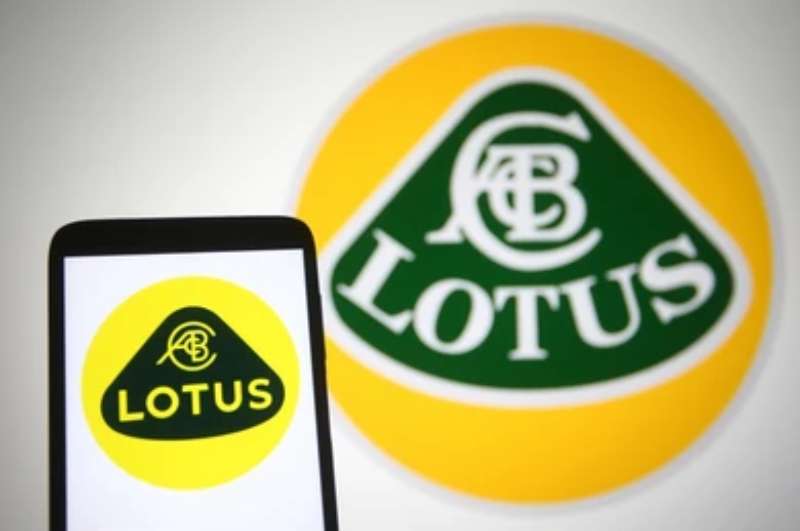
The current logo features the founder’s initials within a circular badge. Yellow and British racing green create instant recognition. The design has gone through several iterations since its creation, with the most recent update arriving in 2019.
Chapman’s vision for performance and innovation remains embedded in every curve of this iconic mark. Few car logos carry such direct connection to their creator.
What is the Lotus Logo?
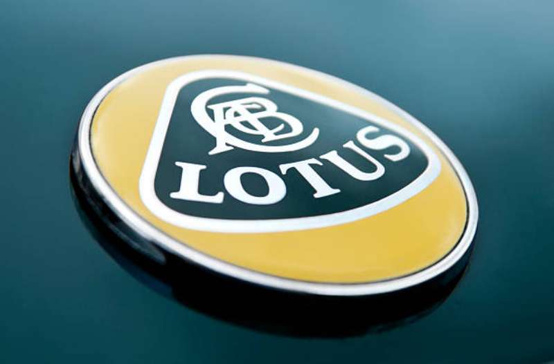
The Lotus logo is a circular emblem featuring the initials “ACBC” (Anthony Colin Bruce Chapman) set against a green and yellow triangular design. Introduced in 1952, it was created by the company founder himself. The mark represents speed, lightness, and British motorsport heritage.
Design Type: Combination mark (emblem with integrated typography)
Primary Elements:
- Circular outer badge
- ACBC monogram at center
- LOTUS wordmark
- Triangular geometric background
Official Introduction Date: 1952
Designer: Colin Chapman (founder)
Trademark Status: Registered trademark owned by Lotus Cars Limited, now under Geely Automobile Holdings
Color Palette:
- British Racing Green (#044D29)
- Lotus Yellow (#FFD700)
Usage Context: Vehicle badges, marketing materials, racing liveries, merchandise, dealership signage, digital platforms
How Has the Lotus Logo Evolved Over Time?
The Lotus logo has maintained its core identity across seven decades while adapting to changing design trends.
The circular format and founder’s initials remained constant. Colors shifted slightly between versions.
The 2019 redesign marked the most significant modernization, simplifying details for digital applications.
Original Lotus Logo (1948-1952)
Years Active: 1948-1952
Design Description: The earliest Lotus vehicles used simple hand-painted lettering. No standardized logo existed yet.
Color Scheme: Varied by application
Designer: Colin Chapman (informal designs)
Context: Chapman was building cars in a London stable. The company was still finding its identity.
Cultural Significance: Represents the garage-startup origins of a future racing giant.
Classic Badge Era (1952-1984)
Years Active: 1952-1984
Design Description: The iconic circular badge debuts. ACBC initials appear intertwined at center. The LOTUS name curves along the top.
Color Scheme: Green background with yellow elements
Designer: Colin Chapman
Context: Lotus entered Formula One in 1958. The badge needed to work on racing cars and road vehicles alike.
Key Changes: First standardized identity for the brand
Cultural Significance: Became synonymous with British motorsport excellence during the Jim Clark era.
Refined Classic (1984-2010)
Years Active: 1984-2010
Design Description: Sharper rendering of existing elements. Cleaner lines throughout. Better reproduction at various sizes.
Color Scheme: Consistent green and yellow maintained
Context: Following Chapman’s death in 1982, the company went through ownership changes. The logo provided continuity.
Key Changes from Previous: Technical improvements for modern printing. Proportions refined.
Modern Lotus Logo (2019-Present)
Years Active: 2019-present
Design Description: Streamlined circular badge. Simplified geometric forms. Optimized for digital display and small-scale reproduction.
Color Scheme: Updated green and gold tones
Designer: Lotus Design Team under Geely ownership
Context: Chinese automaker Geely acquired Lotus. The refresh signaled new investment and electric vehicle ambitions.
Key Changes from Previous: Flattened design removing gradients. Cleaner typography. Works better on screens and app icons.
What Do the Design Elements of the Lotus Logo Mean?
Every element in the Lotus logo traces back to founder Colin Chapman and his racing philosophy.
The intertwined initials honor the man who built the company from nothing.
The triangular forms suggest speed and forward motion. Green and yellow reflect British racing tradition.
Why Did Lotus Choose These Specific Colors?
The green and yellow combination wasn’t random. Understanding color theory helps explain this choice.
British Racing Green
- Hex: #044D29
- Pantone: 3435 C
- Symbolic meaning: National racing identity, tradition, prestige
- Psychological impact: Trust, heritage, exclusivity
Lotus Yellow/Gold
- Hex: #FFD700
- Symbolic meaning: Excellence, innovation, energy
- Psychological impact: Optimism, visibility, premium quality
The color psychology at play creates an interesting tension. Green says tradition. Yellow says innovation. Together they capture what Lotus has always been about.
What Typography Style Is Used in the Lotus Logo?
The LOTUS wordmark uses a custom sans-serif font with distinctive characteristics.
Clean letterforms ensure readability at small sizes. The O features perfect circular geometry.
Spacing between letters follows careful kerning standards. Each character maintains consistent stroke width.
The typography evolved in 2019, becoming slightly more condensed. This improves legibility on digital interfaces.
What Are the Hidden Meanings in the Lotus Logo?
The ACBC monogram contains layers of meaning beyond simple initials.
Some see the intertwined letters as representing Chapman’s engineering philosophy. Everything connected. Nothing wasted.
The triangular background suggests the lotus flower, with petals pointing outward. Colin Chapman chose the name because it sounded exotic and memorable.
The circular format represents perfection and completeness. Racing is about completing laps, after all.
How Does the Lotus Logo Compare to Competitor Logos?
British sports car brands share certain visual traits. Lotus differs through its personal founder connection.
The Aston Martin Logo uses wings and typography to suggest elegance. More formal, less personal.
The McLaren Logo opts for abstract speed marks. Completely modern, no heritage symbolism.
The Jaguar Logo features the leaping cat mascot. Animal imagery versus Lotus’s geometric approach.
Italian rivals take different approaches. The Ferrari Logo uses the prancing horse, full of energy and movement. The Lamborghini Logo features a charging bull.
Among luxury performance brands, only Lotus puts the founder’s actual initials front and center. That personal touch remains distinctive.
What Are the Technical Specifications of the Lotus Logo?
Official Color Codes:
Primary Color: British Racing Green
Secondary Color: Lotus Yellow
- Hex: #FFD700
- RGB: (255, 215, 0)
- CMYK: (0, 16, 100, 0)
- Pantone: 116 C
Dimensions and Proportions:
- Aspect ratio: 1:1 (circular format)
- Minimum size: 15mm diameter for print, 50px for digital
- Clear space: Equal to the height of the “L” in LOTUS on all sides
The logo works as vector graphics for infinite scaling. DPI requirements specify 300 for print applications.
What Cultural Impact Has the Lotus Logo Had?
The Lotus badge carries weight beyond automotive circles. It appeared on Formula One cars that won seven constructors’ championships.
James Bond drove a Lotus Esprit in “The Spy Who Loved Me.” That submarine car made the logo globally famous.
Chapman’s initials remind the industry that one person’s vision can change motorsport forever.
The logo represents an era when British engineering led the world in racing innovation.
How Does the Lotus Logo Fit Into the Overall Brand Identity?
The logo anchors everything Lotus communicates visually. It connects modern electric hypercars to 1960s Formula One glory.
Dealership architecture uses the green and yellow palette consistently. Marketing materials follow strict brand guidelines.
The Evija electric hypercar wears the badge proudly. Same emblem that graced the Esprit and the Elise.
New ownership under Geely maintained the identity intentionally. The logo provides continuity during transformation.
How Should the Lotus Logo Be Used?
Official Usage Guidelines:
Do:
- Use official logo files from Lotus media portal
- Maintain minimum clear space requirements
- Use approved color variations only
- Scale proportionally without distortion
Don’t:
- Alter colors outside approved palette
- Add effects like shadows or gradients
- Rotate or skew the logo
- Place on busy backgrounds without proper contrast
Accessing Official Logos: Available through Lotus Cars media site for authorized press and partners.
Licensing: Commercial use requires written permission from Lotus Cars Limited.
Trademark Protection: Registered in major markets worldwide. Unauthorized reproduction may result in legal action.
FAQ on The Lotus Logo
What Does the Lotus Logo Represent?
The Lotus Cars emblem displays founder Colin Chapman’s initials (ACBC) within a circular badge.
Green and yellow colors reflect British racing heritage. The lotus symbol meaning connects to purity and rebirth in Eastern traditions.
Chapman chose the name for its exotic sound.
Who Designed the Original Lotus Logo?
Colin Chapman created the original lotus emblem design himself in 1952.
No external agency was involved. He intertwined his initials as the central focal point.
This personal touch makes the badge unique among automotive brands.
Why Are Lotus Logo Colors Green and Yellow?
British Racing Green represents national motorsport tradition. Yellow adds visibility and energy to the lotus logo colors.
The combination creates strong contrast. These hue choices date back to 1950s racing regulations.
Has Lotus Changed Its Logo Recently?
Yes. Lotus updated its badge in 2019 under new Geely ownership.
The modern lotus logo features simplified geometry. Gradients were removed for better digital display.
Core elements remained intact, preserving brand identity continuity.
What Do the Letters ACBC Mean in the Lotus Badge?
ACBC stands for Anthony Colin Bruce Chapman. These were the founder’s full initials.
The lotus monogram intertwines all four letters at the badge center. Few car manufacturers honor founders so directly in their visual branding.
Can I Use the Lotus Logo for My Business?
No. The lotus emblem is a registered trademark owned by Lotus Cars Limited.
Unauthorized commercial use violates copyright law. You need written permission for any business application involving their corporate identity assets.
What File Formats Are Available for the Lotus Logo?
Official lotus logo vector files come in SVG and EPS formats. These scale infinitely without quality loss.
Pixel-based versions exist as lotus logo PNG files for web use. Press materials are available through Lotus media portals.
How Does the Lotus Logo Compare to Other British Car Badges?
Most British sports car brands use wings or animal mascots. Lotus stands apart with its founder-focused lotus badge design.
The circular format differs from the Bentley Logo wings and Land Rover Logo oval.
What Makes the Lotus Logo Design Effective?
Strong symmetry creates visual balance. The circular shape works at any size.
Limited colors ensure recognition. The professional lotus logo succeeds through simplicity and meaningful symbolism rooted in company history.
Where Can I Find Lotus Logo Inspiration for My Own Designs?
Study the lotus flower brand approach for lessons in founder integration. The psychology of shapes explains why circles feel complete.
Create a mood board collecting elegant flower designs. Tools like Adobe Illustrator or Figma help with custom lotus logo creation.
Conclusion
The Lotus Logo carries seven decades of British motorsport history within its circular badge. Colin Chapman’s initials remain at the center, connecting every modern Evija to those early garage-built racers.
Few automotive brands maintain such direct founder ties in their visual identity.
The green and yellow color palette still commands recognition on race circuits worldwide. Simple lotus petal design elements and strong alignment keep the emblem effective at any scale.
Whether you’re studying lotus logo inspiration for your own brand or appreciating automotive design heritage, this badge proves that personal meaning outlasts passing trends.
Renowned for his expertise in logo design and visual branding, Bogdan has developed a multitude of logos for various clients.
His skills extend to creating posters, vector illustrations, business cards, and brochures. Additionally, Bogdan's UI kits were featured on marketplaces like Visual Hierarchy and UI8.
He also wrote in the past years on sites like Design Your Way, WebDesignerDepot, WPDean, Designmodo, Speckyboy, Slider Revolution, and more.
- The Airtable Logo History, Colors, Font, And Meaning - 12 July 2026
- How to Blur Background in Canva: A Quick Tutorial - 11 July 2026
- Typography Trends - 10 July 2026
Bogdan Sandu is a seasoned designer who has been designing websites since 2008. Renowned for his expertise in logo design and visual branding, Bogdan has developed a multitude of logos for various clients. His skills extend to creating posters, vector illustrations, business cards, and brochures. Additionally, Bogdan's UI kits were featured on marketplaces like Visual Hierarchy and UI8. He also wrote in the past years on sites like Design Your Way, WebDesignerDepot, WPDean, Designmodo, Speckyboy, Slider Revolution, and more.
You Might Also Like