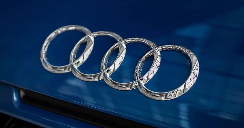
The Audi Logo is one of the most recognized car emblems in the world. Four interlocking rings. Simple, yet loaded with meaning.
This emblem represents more than one car maker. It tells the story of four separate companies merging into one in 1932.
The current version is a flat, two-dimensional design in black and white, which Audi rolled out to its cars in late 2022. Audi AG, headquartered in Ingolstadt, Germany, has refined the symbol many times since the Auto Union merger.
Within the broader landscape of car logos, few achieve this level of instant recognition. The four rings have become shorthand for German engineering.
What is the Audi Logo?
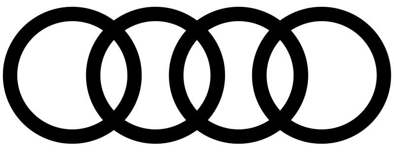
The Audi logo is four interlocking rings in a horizontal row, one for each company in the 1932 Auto Union merger: Audi, DKW, Horch, and Wanderer. No designer of the original rings has been publicly credited. Audi’s design team introduced the current flat black-and-white rings for its cars in November 2022.
| Symbol | Four interlocking rings for Audi, DKW, Horch, and Wanderer |
| Designer/agency | Original 1932 rings not publicly credited; 2022 flat rings by Audi’s in-house design team |
| Current version since | 2016 flat rings in corporate design; on cars from November 2022 |
| Colors (hex) | Black #000000 and white #FFFFFF; Audi Red #CC0033 (Pantone 186) as the brand accent; Audi Aluminium Silver, Pantone 877 |
| Typeface | Audi Type (Bold Monday, 2009), custom and not for public sale |
| Previous major version | 3D chrome rings (from the 1990s to 2022) |
How Has the Audi Logo Evolved Over Time?
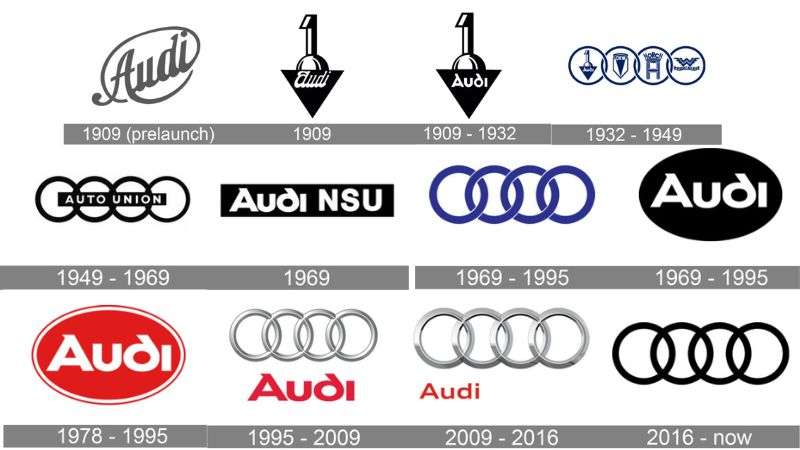
The Audi emblem has changed a lot since 1909. It went from August Horch’s Audi badges to the four-ring symbol of Auto Union, and each redesign reflected a change in the business.
The logo became flatter and more digital-friendly in the 2010s, and the cars followed in 2022. Each redesign reflected the graphic design movements of its era.
Original Audi Logos (1909–1932)
August Horch founded Audi in Zwickau in 1909 after leaving his first company, A. Horch & Cie., and losing the right to use his own name. “Horch” means “listen!” in German, and “Audi” is the Latin version. The often-told story is that the son of Horch’s business partner Franz Fikentscher, who was studying Latin, suggested it.
The early logos were wordmarks. Logo histories show a flowing “Audi” script, followed by a badge with a large numeral “1” standing on an inverted triangle that holds the Audi name. That “1” badge is the old Audi logo many people find when they search the brand’s early history.
Auto Union Four Rings (1932–1949)
On June 29, 1932, Audi, DKW, Horch, and Wanderer merged in Saxony to form Auto Union AG. The new company adopted four interlinked rings, one per founding brand.
In early versions, each ring held the emblem of its company. Audi built mid-size luxury cars, DKW made motorcycles and small cars, Horch was the top luxury brand, and Wanderer sold mid-size cars.
Post-War Auto Union Rings (1949–1969)
After World War II, Auto Union GmbH was founded in Ingolstadt in 1949 to carry on the tradition. Its logo kept the four rings, with “AUTO UNION” written across them. Volkswagen took over the company in the mid-1960s, and the Audi name returned on a new car in 1965.
Audi NSU and the Black Oval (1969–1995)
In 1969, Auto Union merged with NSU to form Audi NSU Auto Union AG, and the four rings remained the company’s identifying symbol. Logo histories show the rings in blue during this period.
From 1978, the brand also used a black oval with white “Audi” lettering, and logo histories show a red version of the oval too. In 1985, the company was renamed AUDI AG and moved its head office to Ingolstadt.
Three-Dimensional Chrome Era (1995–2016)
In the 1990s the rings returned as the main logo with a three-dimensional, metallic look and the red “Audi” wordmark below. For Audi’s 100th anniversary in 2009, the rings were refined and enlarged, and the wordmark was set in the new Audi Type.
Flat Modern Design (2016–Present)
Logo histories date the flat, two-dimensional rings in Audi’s corporate design to 2016. In November 2022, Audi announced that the cars would follow: the rings became flat, chrome-free, and black and white, with a thin black border so they look the same on any paint or grille color.
Audi’s head of design, André Georgi, called it a “significantly more modern and even more graphic makeover.” The proportions of the rings stayed almost the same, but the result is a clearly minimalist design.
What Do the Design Elements of the Audi Logo Mean?
The four rings directly represent the 1932 merger of Audi, DKW, Horch, and Wanderer.
These companies formed Auto Union during the Great Depression.
The interlocking design suggests unity and cooperation. Each ring is the same size, so no single brand looks dominant.
What Are the Audi Logo Colors?
The current rings use a monochrome black-and-white scheme. On light backgrounds they appear black; on dark backgrounds they appear white with a thin black border. On cars, the badge now follows the same flat black-and-white look instead of chrome.
Audi’s corporate design also has its own named color palette. A 2014 AUDI AG branding guide for Audi clubs lists:
- Audi Red: Pantone 186, CMYK 0/100/80/5, RGB 204/0/51 (#CC0033)
- Dark Audi Red for very large lettering: Pantone 187, CMYK 0/100/80/20, RGB 170/20/45 (#AA142D)
- Audi Aluminium Silver: Pantone 877 (metallic), RAL 9006 for paint
- Black (#000000) and white (#FFFFFF)
Silver also fits the brand’s racing past. Auto Union’s 1930s Grand Prix cars were among the famous “Silver Arrows.” Files in vector graphics format are the safest way to reproduce the flat rings.
What Font Is Used in the Audi Logo?
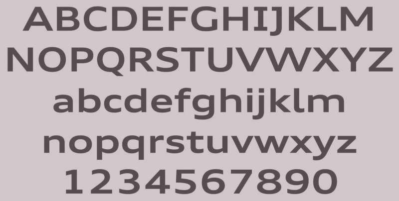
Audi uses a custom typeface called Audi Type. Dutch type studio Bold Monday designed it after an international competition, with art direction by MetaDesign, and it was introduced in 2009 for Audi’s 100th anniversary. It replaced the older Audi Sans.
The Audi wordmark is set in Audi Type Extended Bold. The font is a wide, clean sans-serif font, and it isn’t sold to the public: it’s licensed for Audi’s own use.
Its typography elements are built for range: the family covers more than 5,300 glyphs, including Cyrillic and Greek, so the typography works across Audi’s markets, from small screens to large signs.
What Are the Hidden Meanings in the Audi Logo?
Some people see a resemblance to the Olympic rings. There is no connection: the Audi rings come from a business merger, not sport.
Audi has never published a hidden message in the design. The meaning is the plain one: four companies, linked together.
The rings are not in order of founding date, either. Wanderer started in 1885, Horch in 1899, Audi in 1909, and DKW in 1916.
How Does the Audi Logo Compare to Competitor Logos?
German luxury car makers take different approaches. The BMW Logo uses a circular roundel with blue and white quarters.
Mercedes-Benz relies on its three-pointed star. Audi stands apart with linked geometric shapes rather than a single enclosed symbol.
Among competitors, the Porsche Logo includes heraldic elements from Stuttgart.
The Ferrari Logo features the prancing horse. These use figurative imagery while Audi stays purely abstract.
This abstraction helps. The four rings scale better across digital platforms and tiny app icons, where detailed crests lose clarity.
What Cultural Impact Has the Audi Logo Had?

The four rings became shorthand for German engineering. Motorsport success, including 13 Le Mans wins between 2000 and 2014, cemented that reputation.
The Audi Quattro, with permanent all-wheel drive, was a big success in rallying in the 1980s and proved that all-wheel-drive race cars could win.
Today, people recognize those rings instantly. Even without the Audi name, the symbol communicates premium status and technical competence.
How Does the Audi Logo Fit Into the Overall Brand Identity?

The rings anchor everything Audi does. Marketing materials, dealership architecture, and digital interfaces all reference this central symbol.
The 2022 update was explicitly about consistency: Audi wanted the rings to look the same on screens, in print, and on the car. The brand guidelines handle the details, such as how the rings sit next to the wordmark.
Sub-brands like Audi Sport and e-tron adapt the rings while keeping them recognizable. This visual hierarchy keeps the parent brand visible across product lines.
How Should the Audi Logo Be Used?
This is general advice, not Audi’s own rulebook.
- Editorial use, such as news, reviews, and educational articles, can usually show the rings to identify the brand.
- Commercial use on products or ads that suggests a connection with Audi needs permission from AUDI AG.
- Don’t stretch, recolor, or redraw the rings, and don’t add effects to the flat version.
FAQ on the Audi Logo
What Do the Four Rings in the Audi Logo Mean?
Each ring represents one of the four companies that merged to form Auto Union on June 29, 1932: Audi, DKW, Horch, and Wanderer. The interlocking design shows their union.
Who Designed the Audi Logo?
No designer of the original 1932 rings has been publicly credited. The current flat rings were developed by Audi’s in-house design team and introduced on cars in November 2022.
What Was the Old Audi Logo?
Before the rings, Audi used wordmarks, including a badge with a large numeral “1” on an inverted triangle holding the Audi name. Later old logos include the Auto Union rings, the black Audi oval from 1978, and the 3D chrome rings.
When Did the Audi Logo Change to Flat Rings?
Audi moved its corporate design to flat, two-dimensional rings in 2016, and announced flat black-and-white rings for its cars in November 2022, replacing the chrome 3D badge.
Why Does Audi Use Four Rings Instead of One Symbol?
Four separate companies needed representation. The linked circles honor each brand equally, and this symmetry communicates partnership and balance between the founding members.
What Is Auto Union and How Does It Relate to Audi?
Auto Union AG was the 1932 merger of Audi, DKW, Horch, and Wanderer. After the war it restarted in Ingolstadt, merged with NSU in 1969, and was renamed AUDI AG in 1985. It is part of the Volkswagen Group.
What Colors Are Used in the Audi Logo?
The current rings are black and white. Audi’s corporate colors also include Audi Red (Pantone 186, #CC0033) and Audi Aluminium Silver (Pantone 877).
What Font Does Audi Use?
Audi uses Audi Type, a custom sans-serif designed by Bold Monday with MetaDesign and introduced in 2009. The Audi wordmark is set in Audi Type Extended Bold. It replaced the older Audi Sans.
Is There an Audi Logo Keyboard Symbol?
No. There is no Unicode character or keyboard shortcut for the Audi rings. People sometimes imitate them in text with linked letters, but the real logo is only available as an image.
What Does the Name “Audi” Mean?
Audi is Latin for “listen!” It translates the founder’s surname Horch, which means “listen!” in German. August Horch couldn’t use his own name after leaving his first company.
Conclusion
The Audi Logo shows that a great brand identity outlasts trends. Four interlocking rings, simple as they are, have carried meaning for over nine decades.
From the Auto Union merger through Volkswagen Group ownership, this emblem adapted without losing its core identity.
The psychology of shapes plays a role here. Circles suggest continuity and connection.
Good logo design principles demand simplicity and scalability. The Audi rings deliver both.
Whether on a Quattro grille or a phone screen, the symbol remains instantly recognizable. That is the mark of lasting design.
Sources
- AUDI AG, History of the Four Rings – https://www.audi.com/en/press-releases/history-of-the-four-rings-4093
- Dezeen, Audi rebrands with “significantly more modern” flat logo – https://www.dezeen.com/?p=1868061
- Autoblog, Audi rings new logo – https://www.autoblog.com/2022/11/14/audi-rings-new-logo/
- Bold Monday, Audi Type – https://boldmonday.com/custom/audi/
- AUDI AG, Corporate Branding: Audi Club International (05/2014) – https://www.audi-club-international.de/pdf/allgemein/audi_rl_audiclubinternational.pdf
- Wikipedia, Audi – https://en.wikipedia.org/wiki/Audi

Renowned for his expertise in logo design and visual branding, Bogdan has developed a multitude of logos for various clients.
His skills extend to creating posters, vector illustrations, business cards, and brochures. Additionally, Bogdan's UI kits were featured on marketplaces like Visual Hierarchy and UI8.
He also wrote in the past years on sites like Design Your Way, WebDesignerDepot, WPDean, Designmodo, Speckyboy, Slider Revolution, and more.
- The YouTube Logo History, Colors, Font, and Meaning - 10 November 2026
- Monthly Retainer Billing for Freelance Designers: How to Get Paid on Time, Every Month - 10 November 2026
- How Design Studios Lose New Clients Between the First Email and the Signed Proposal - 10 November 2026

Bogdan Sandu is a seasoned designer who has been designing websites since 2008. Renowned for his expertise in logo design and visual branding, Bogdan has developed a multitude of logos for various clients. His skills extend to creating posters, vector illustrations, business cards, and brochures. Additionally, Bogdan's UI kits were featured on marketplaces like Visual Hierarchy and UI8. He also wrote in the past years on sites like Design Your Way, WebDesignerDepot, WPDean, Designmodo, Speckyboy, Slider Revolution, and more.
You Might Also Like