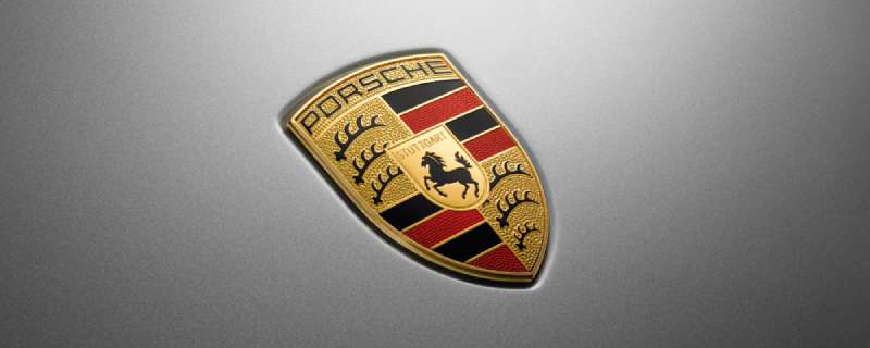
The Porsche logo stands as one of the most recognized emblems in automotive history. It combines the Stuttgart city coat of arms with the Free People’s State of Wurttemberg crest. This isn’t just a badge slapped on a hood. It tells the story of German engineering heritage and regional pride.
Within the luxury car industry, the Porsche crest holds a unique position. Most automakers went minimal over time. Porsche kept its detailed heraldic design largely intact since 1952.
The current version features a prancing black horse centered on a gold shield, surrounded by red and black stripes with antler motifs. Franz Xaver Reimspiess designed the original. The logo has seen only minor refinements across four main iterations since the company’s founding in 1931.
What is the Porsche Logo?

The Porsche logo is a combination mark featuring a central horse emblem from Stuttgart’s coat of arms, surrounded by the Wurttemberg state crest with antlers and red-black stripes. Introduced in 1952, it was designed by Franz Xaver Reimspiess to represent the brand’s German heritage and performance identity.
Design Type: Combination mark (emblem with wordmark)
Primary Elements:
- Prancing horse (Stuttgart symbol)
- Antlers (Wurttemberg coat of arms)
- Red and black stripes
- Gold shield background
- “PORSCHE” wordmark at top
- “STUTTGART” text beneath horse
Official Introduction Date: 1952 (first appeared on Porsche 356 steering wheel)
Designer: Franz Xaver Reimspiess
Trademark Status: Registered trademark of Dr. Ing. h.c. F. Porsche AG
Color Palette:
- Porsche Red: #C00000
- Porsche Gold: #CDA647
- Black: #000000
Usage Context: Vehicle badges, steering wheels, key fobs, marketing materials, dealership signage, merchandise, digital platforms, and motorsport liveries
How Has the Porsche Logo Evolved Over Time?
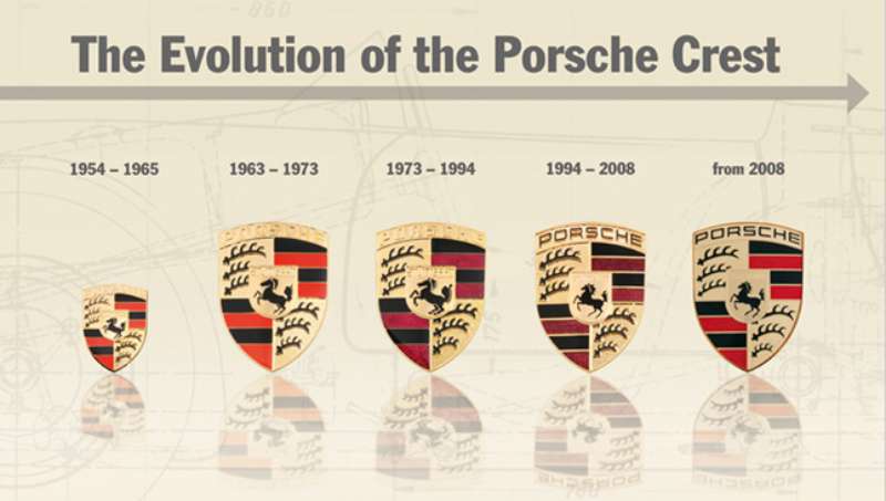
The Porsche logo has remained remarkably consistent since 1952.
Unlike many automakers that completely reinvented their badges, Porsche made subtle refinements while keeping the core heraldic design intact.
The evolution focused mainly on color adjustments and detail refinements rather than structural changes.
Pre-Logo Era (1931-1952)
Years Active: 1931-1952
Design Description: Porsche operated without a formal crest during its early years. The company used simple wordmarks on documents and early vehicles like the Porsche 356.
Color Scheme: Basic black text on light backgrounds
Designer: N/A
Context: Ferdinand Porsche founded the company as a design consultancy. A distinctive badge wasn’t a priority during wartime and immediate post-war production.
Cultural Significance: This period established Porsche’s engineering reputation before visual branding became important.
Original Porsche Logo (1952-1973)
Years Active: 1952-1973
Design Description: The first official crest featured the Stuttgart horse, Wurttemberg antlers, and red-black stripes. All elements were rendered with high detail and slightly muted colors.
Color Scheme: Darker gold, burgundy red, black
Designer: Franz Xaver Reimspiess
Context: Ferry Porsche reportedly sketched the concept on a napkin during a meeting with U.S. distributor Max Hoffman in 1951. Hoffman wanted something to differentiate Porsche in the American market.
Cultural Significance: Established Porsche’s visual identity during its rise as a sports car manufacturer.
Refined Porsche Logo (1973-1994)
Years Active: 1973-1994
Design Description: Colors became more vibrant. The gold turned brighter, and red elements gained more intensity. Line work was cleaned up for better reproduction.
Color Scheme: Brighter gold, true red, crisp black
Key Changes from Previous: Increased color saturation, sharper outlines, improved printing quality
Context: Coincided with Porsche’s expansion and the need for better logo reproduction across marketing materials.
Modern Porsche Logo (1994-2008)
Years Active: 1994-2008
Design Description: Three-dimensional shading was added. The crest gained depth with metallic effects and subtle gradients.
Color Scheme: Metallic gold, rich red, glossy black
Key Changes from Previous: Added dimensional quality, metallic finishes, enhanced detail in antlers and horse
Context: The 3D trend in automotive branding influenced this update. Digital applications also demanded higher-fidelity graphics.
Current Porsche Logo (2008-Present)
Years Active: 2008-present
Design Description: Further refined 3D rendering with contemporary metallic effects. The horse and antlers show enhanced detail while maintaining classic proportions.
Color Scheme: Premium metallic gold (#CDA647), Porsche Red (#C00000), deep black (#000000)
Key Changes from Previous: Modernized metallic finishes, subtle shadow adjustments, optimized for digital and physical applications
Context: Designed to work across web platforms, mobile apps, and increasingly sophisticated vehicle displays while retaining heritage appeal.
What Do the Design Elements of the Porsche Logo Mean?
Every element in the Porsche crest connects directly to Stuttgart and the surrounding Wurttemberg region.
The prancing horse comes from Stuttgart’s city seal. The antlers and stripes represent the former Free People’s State of Wurttemberg.
Together, they create a badge that roots Porsche firmly in its homeland.
What Does the Horse Symbol Represent?
The black horse is Stuttgart’s heraldic symbol. The city’s name comes from “Stuotgarten,” meaning stud farm.
Horses were bred there during medieval times.
Using this symbol ties Porsche to its manufacturing home. It also connects performance cars to the power and speed of horses, which feels pretty fitting for a sports car brand.
What Do the Antlers and Stripes Mean?
The antlers come from the Wurttemberg coat of arms. They represent the region’s hunting traditions and noble heritage.
Red and black stripes also derive from Wurttemberg’s official colors.
These elements surround the Stuttgart horse, creating a layered regional identity. The combination shows how the logo functions as a badge of geographic pride.
Why Did Porsche Choose These Specific Colors?
Gold (#CDA647)
- Symbolic meaning: Excellence, prestige, premium quality
- Psychological impact: Conveys luxury and success
- Brand connection: Positions Porsche in the high-end automotive segment
Red (#C00000)
- Symbolic meaning: Passion, speed, energy
- Psychological impact: Creates excitement and urgency
- Brand connection: Reflects motorsport heritage and performance focus
Black (#000000)
- Symbolic meaning: Power, sophistication, elegance
- Psychological impact: Suggests authority and timelessness
- Brand connection: Grounds the design with classic refinement
The color palette works together to signal both heritage and high performance. Gold and red draw attention. Black keeps everything grounded.
What Typography Style Is Used in the Porsche Logo?
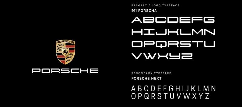
The “PORSCHE” wordmark uses a custom serif font with distinctive characteristics.
Letters are bold with slight flaring at the terminals. The tracking is generous, giving each letter breathing room.
“STUTTGART” appears smaller beneath the horse in a similar but lighter weight. Both maintain excellent readability even at small badge sizes.
The typography has remained consistent since 1952.
What Are the Hidden Meanings in the Porsche Logo?
The layered composition creates a shield within a shield. This suggests protection and strength, values any luxury buyer appreciates.
The horse faces right, traditionally symbolizing forward movement.
Some see the antlers as a crown, elevating the Stuttgart horse to royal status. Franz Xaver Reimspiess stated he wanted to capture regional heritage, though the protective shield interpretation was likely intentional.
How Does the Porsche Logo Compare to Competitor Logos?
Porsche kept its detailed heraldic design while competitors simplified.
The Ferrari logo uses a prancing horse too, but presents it as a standalone symbol with minimal framing.
The Lamborghini logo features a charging bull in a shield, sharing the animal-in-crest approach but with a more aggressive stance.
German rivals took different paths. The BMW logo went abstract with its roundel. Audi’s logo became four interlocking rings.
Meanwhile, Mercedes-Benz centered on its three-pointed star.
Porsche stands out by maintaining complexity. Where others stripped down, Porsche doubled down on heraldic tradition. The Bentley logo and Aston Martin logo share this detailed approach in the luxury segment.
What Are the Technical Specifications of the Porsche Logo?
Official Color Codes:
Primary Color (Gold):
Secondary Color (Red):
- Hex: #C00000
- RGB: (192, 0, 0)
- CMYK: (0, 100, 100, 25)
- Pantone: PMS 485 C
Accent Color (Black):
- Hex: #000000
- RGB: (0, 0, 0)
- CMYK: (0, 0, 0, 100)
Dimensions and Proportions:
- Aspect ratio: Approximately 1:1 (square format)
- Minimum size: 12mm height for print, 40px for digital
- Clear space: Minimum padding equal to the height of the “P” in PORSCHE on all sides
- The logo should never be stretched, rotated, or displayed with altered colors
What Cultural Impact Has the Porsche Logo Had?
The Porsche crest became shorthand for German engineering excellence worldwide.
It appears in films, fashion collaborations, and countless pieces of automotive memorabilia.
The badge transcended cars. You’ll find it on watches, clothing, and accessories through Porsche Design.
For enthusiasts, wearing or displaying the crest signals membership in a particular club. The logo became a status symbol separate from the vehicles themselves.
How Does the Porsche Logo Fit Into the Overall Brand Identity?
The crest sits at the center of everything Porsche does.
It connects the 911 sports car to the Cayenne SUV to the Taycan electric vehicle. Same badge, same promise.
Porsche’s brand guidelines treat the logo as sacred. Every dealership, advertisement, and product must display it according to strict specifications.
The logo ties into broader color psychology strategies across marketing materials. Gold and red dominate showrooms and promotional content.
How Should the Porsche Logo Be Used?
Official Usage Guidelines:
- Always use official logo files from Porsche’s press database
- Maintain clear space requirements around the crest
- Never alter colors, proportions, or elements
- Use approved backgrounds only (white, black, or transparent)
- Do not add effects, shadows, or outlines beyond official versions
Where to Access Official Logos:
- Porsche Newsroom press portal
- Authorized dealer resources
- Official licensing partners
Licensing Information:
- Commercial use requires written permission from Porsche AG
- Merchandise licensing handled through Porsche Lizenz- und Handelsgesellschaft
- Editorial use typically permitted with proper attribution
Trademark Protection:
- The Porsche name, crest, and design elements are registered trademarks
- Protected in virtually all major markets worldwide
- Porsche actively pursues trademark infringement cases
FAQ on The Porsche Logo
What Does the Porsche Logo Mean?
The Porsche crest represents the brand’s Stuttgart origins and Wurttemberg heritage.
The prancing horse comes from Stuttgart’s coat of arms. Antlers and red-black stripes derive from the Free People’s State of Wurttemberg.
Together, these elements celebrate German regional identity.
Why Is There a Horse on the Porsche Logo?
Stuttgart’s name translates to “stud farm” in old German. Horses were bred there for centuries.
The city adopted the horse as its official symbol. Porsche AG, headquartered in Stuttgart-Zuffenhausen, incorporated this shape to honor its hometown.
When Was the Porsche Logo Created?
The Porsche emblem first appeared in 1952. It debuted on the Porsche 356 steering wheel.
Ferry Porsche reportedly sketched the initial concept in 1951 during a meeting with American distributor Max Hoffman. The design took shape quickly after that conversation.
Who Designed the Porsche Logo?
Franz Xaver Reimspiess created the official Porsche badge design. He was a Porsche engineer, not a trained graphic artist.
Reimspiess combined heraldic design elements from Stuttgart and Wurttemberg into one cohesive crest that still defines the brand today.
Why Does the Porsche Logo Look Similar to Ferrari’s?
Both feature a prancing horse. Pure coincidence, actually.
Ferrari’s cavallino rampante honors Italian WWI pilot Francesco Baracca. Porsche’s horse comes from Stuttgart’s medieval heritage. Different origins, similar visual outcome. The contrast lies in their framing and context.
What Are the Official Colors of the Porsche Logo?
The crest uses gold, red, and black.
Gold represents excellence and premium quality. Red signals passion and motorsport energy. Black adds sophistication.
These colors follow color theory principles that communicate luxury and performance.
Has the Porsche Logo Changed Over Time?
Barely. The core design remained intact since 1952.
Porsche made minor refinements to color vibrancy and added dimensional shading over the decades. The 2008 update introduced modern metallic effects. But the shield shape, horse, and antlers never changed structurally.
What Do the Antlers on the Porsche Logo Represent?
The antlers come from the Wurttemberg coat of arms. They symbolize the region’s hunting traditions and noble heritage.
Baden-Wurttemberg surrounds Stuttgart. Including these elements roots Porsche in its broader German homeland beyond just the city.
Where Is the Porsche Logo Placed on Vehicles?
You’ll find the crest on the hood, steering wheel center, wheel caps, and key fobs.
The Porsche 911, Cayenne, Macan, Panamera, and Taycan all display it prominently. Placement follows strict logo design principles for visual hierarchy.
Is the Porsche Logo Trademarked?
Yes. Dr. Ing. h.c. F. Porsche AG holds registered trademarks on the crest worldwide.
The company protects its brand identity aggressively. Unauthorized commercial use faces legal action. Even the specific hue combinations are protected intellectual property.
Conclusion
The Porsche Logo remains one of the most iconic car emblems in automotive history. It hasn’t chased trends or stripped down for minimalism.
The crest tells a story. Stuttgart’s horse, Wurttemberg’s antlers, that distinctive shield shape. All of it connects back to Zuffenhausen and German sports car heritage.
From the Porsche Museum walls to 24 Hours of Le Mans victories, this badge carries meaning beyond vector graphics and color codes.
Few luxury vehicle brands maintain such visual storytelling consistency. The Porsche crest earned its status through decades of racing heritage and engineering excellence.

Renowned for his expertise in logo design and visual branding, Bogdan has developed a multitude of logos for various clients.
His skills extend to creating posters, vector illustrations, business cards, and brochures. Additionally, Bogdan's UI kits were featured on marketplaces like Visual Hierarchy and UI8.
He also wrote in the past years on sites like Design Your Way, WebDesignerDepot, WPDean, Designmodo, Speckyboy, Slider Revolution, and more.
- Canva vs PowerPoint: Which Is Better for Presentations? - 22 September 2026
- How to Install Fonts on Mac (Step-by-Step Guide) - 20 September 2026
- From Mockup to Code: How AI-Augmented Development Speeds Up the Design Handoff - 19 September 2026

Bogdan Sandu is a seasoned designer who has been designing websites since 2008. Renowned for his expertise in logo design and visual branding, Bogdan has developed a multitude of logos for various clients. His skills extend to creating posters, vector illustrations, business cards, and brochures. Additionally, Bogdan's UI kits were featured on marketplaces like Visual Hierarchy and UI8. He also wrote in the past years on sites like Design Your Way, WebDesignerDepot, WPDean, Designmodo, Speckyboy, Slider Revolution, and more.
You Might Also Like