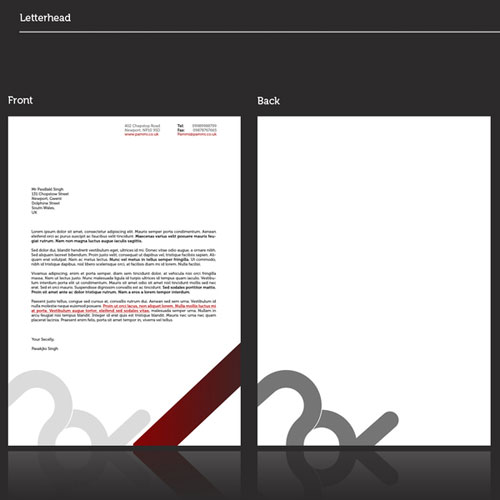
Letterhead Examples and Samples: 77 Letterhead Designs
Imagine your business as a book—its letterhead design is the cover. Often, it’s the first encounter people have with your story. Within just a few seconds, it whispers volumes about who you are.
This isn’t just about slapping a logo atop a page. It’s a dance of branding elements, the interplay of typography and color palette, each letterhead example serving as a visual cue to your company’s identity. Envelopes and business cards might join the tango, but the letterhead leads, catching eyes with the grace of a brand’s silent ambassador.
Here, you’re in for a visual symphony. From eye-catching watermark designs to sleek vector graphics, this curated selection showcases the power of first impressions. We’ll delve into the finesse of professional letterhead creation, unraveling its ties to corporate identity.
Waltz through this gallery of letterhead examples and depart with the blueprint to craft a letterhead that doesn’t just speak—but sings your brand’s ethos.
The importance of letterhead design is what makes it such a challenging experience.
More often than rare, our business letterhead design ideas will be the first thing customers get to know about our brand, and their initial and genuine impression.
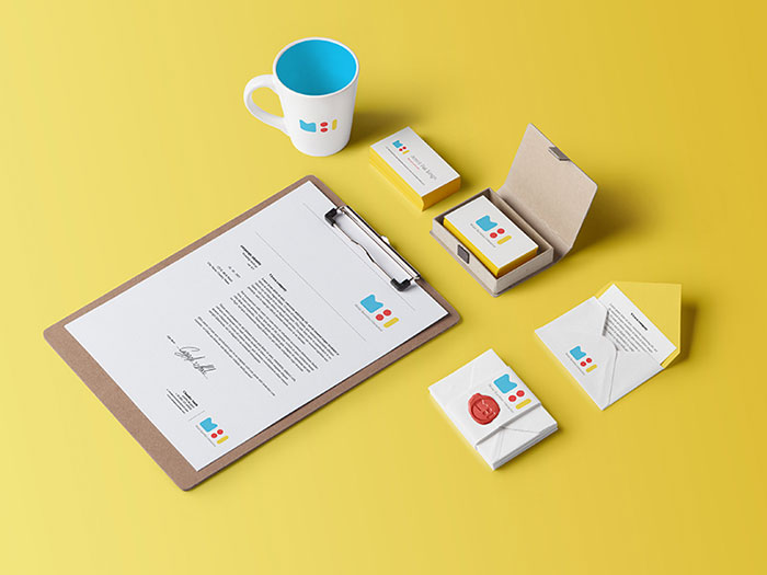
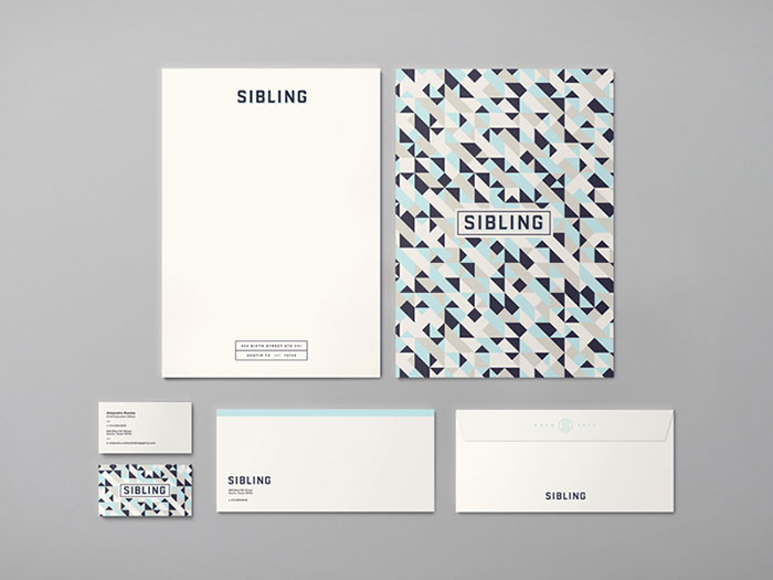
Business letterhead example by Muhammad Ali Effendy
Due to this reason, letters can make or break interactions, and we need to find a way to make them more effective and personalized.
The two essential criteria to consider when designing a company letterhead are the informative details, and the memorable, eye-catchy design.
The rule of simplicity in letterhead examples
Letterhead example by The rule of simplicity
The rule of simplicity applies to every type of design, and matters particularly to delivery mechanisms, and this is available for these letterhead examples as well.
Remember: the content of the letter is an entirely different task. Your first important duty is to design the appropriate structure that can support it.
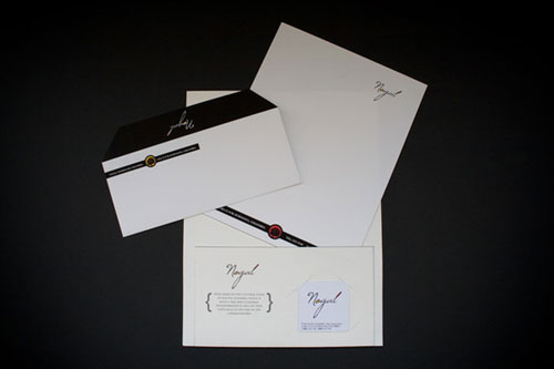
Letterhead example by Jennifer Lucey-Brzoza
Most of the time, you’ll read that you need a cool letterhead.
But what does that actually mean?
Explained the easiest way, letterhead designs need to be beautiful and practical at the same time, and remind of the content that is going to be displayed below them.
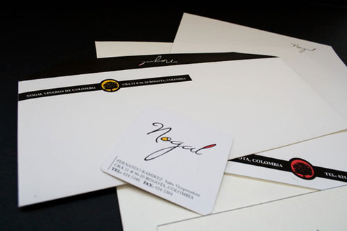
Letterhead example by Steve Wolf
Still, don’t go over the edge trying to win your reader’s attention, because he can feel overwhelmed by it, and miss what is really important about your letter.
Include your brand in a smart way
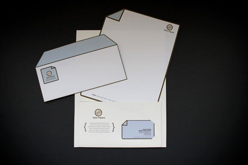
Letterhead example by Simeon
The logo is compulsory for business stationery in general, and matters even more on the letterhead. Still, that’s not the only tool to do branding on your letters, and there are many other creative ideas you could employ for the purpose.
It doesn’t even have to be the entire logo – you can cut portions of it, and apply them on your letterhead the same as your business stationary and envelopes.
There are two reasons why you should do this: The colors will be the focus of the design element, and will therefore be remembered by your customers, while the brand image will be ‘pushed true’ in a less obstructive and pushy manner.
Work with the best available software
Photoshop is almighty when it comes to graphic design, and it is perfectly suitable for drafting personalized stationery.
There are tools that were specifically developed for the purpose, and offer a variety of interesting options that can make your letterhead examples unique.
Our suggestions are InDesign and Illustrator, as both of them are vector-based, and offer a variety of typography controls for drawing and repositioning elements in your letterhead design.
Any love for Corel? If you’re a Corel user, than there’s no need to switch to PS or AI just for letterhead design.
If you have no choice but to use Photoshop, remember to consult the print supplier in advance, as artwork designed in Photoshop must be produced at 300dpi to meet the letterhead requirements.
Make the most of your space
The reason why letterheads are called like this is that they are most often placed on the top of the page, but this is far from a rule.
You’re perfectly allowed to use any of the four sides, or to display information in more than a single location. You choose!
Typography matters in letterhead design
Letterhead example by Jakub Ptačin
If you want an elegant and classic solution for your official letterhead, typography will be the main element to work with.
With the appropriate knowledge, you can mix typefaces and create an interesting contrast between bold and shadowed, or modern serifs with vintage-like scripts.
Letterhead example by Mark Gerlach
The more beautiful your information looks, the more likely people are to read it.
Organize elements in a hierarchical order

Letterhead example by Mister Bumbles Interactive
More than beautiful, letterhead design has to be practical, and convey information in a readable and effective manner.
Sometimes, it will even be the most critical part of the letter where you need to share your own details, or indicate the purpose of communication.
Letterhead example by Ryan Brinkerhoff
For the reader, a professional letterhead will be a source of information on how to contact you, so make sure you include all telephone numbers, addresses, emails, and faxes.
Still, don’t forget that these details on your corporate letterhead are not as important as the name of your company is!
Before you start, think of the most important details to be conveyed with the letterhead design, and apply the same hierarchical order on the company letterhead. Make them as visible and accessible as possible, and tuck extra information away where they may or may not notice it.
Relate the style of your official letterhead to your industry
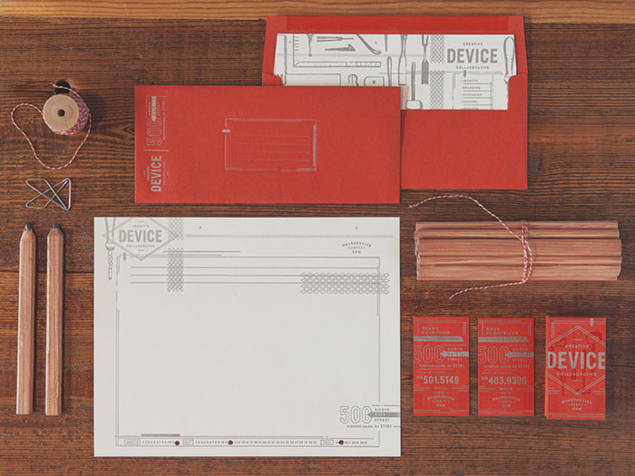
Letterhead example by Device
When you work in a creative agency, the only letterhead design rule is that there is no rule at all. Tips were, in fact, developed for people who don’t have the will or the design experience and need a scheme to follow, but your creative team should definitely ignore them if they know what they’re doing.
Creative agencies and retailers are in need of the most impressive design which will entertain their customers when sharing promotional information.
It is exactly in these cases that designers need to pay the most attention to attract readers and deliver unique artwork. If you’re designing for a business like that, that’s your perfect chance to balance the letterhead template between brand-centered and trendy design.
Consider the medium for your corporate letterhead
Letterhead example by Damian Hernandez
It was easier to design letterheads in the past, as they were exclusively printed and delivered to the office to be typed over. Still, this type of communication is rarely used nowadays, and letters are printed directly from Word or from another similar letterhead template.
Before you design a company or personal letterhead, try to understand how people are going to use it, as even the most beautiful letterhead examples won’t work with inappropriate dimensions.
For instance, if your intention is to design for a self-printed option, leave the margins larger at the edges, and choose tints you’re absolutely sure would be neatly reproduced on office stationary.
Pay attention to the paper of your company letterhead
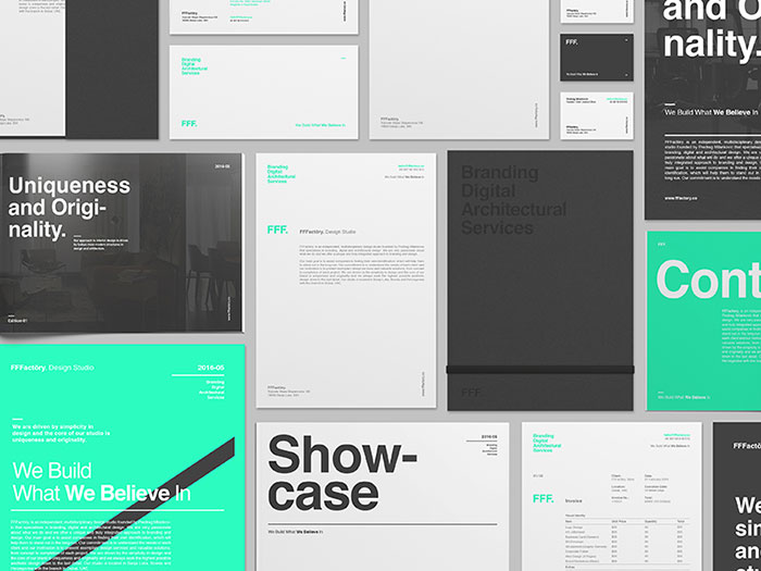
Letterhead example by FFFactōry.
The impression your letterhead design is going to cause will not depend as much on its beauty, as the quality of the paper on which it will be delivered.
Thick and luxurious pieces with a specific texture are perfect for corporate correspondence, as they highlight the fact that you’re running an artisan brand and a serious business.
Ending thoughts on business letterhead examples
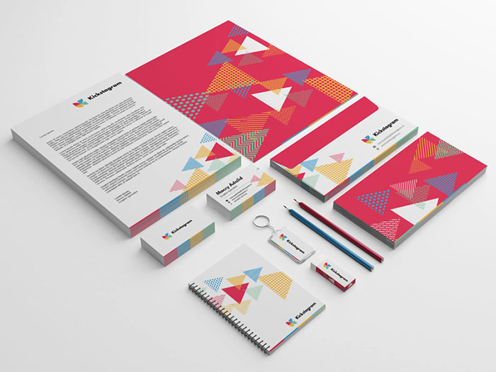
Letterhead example by Maccy Adalid
When you design your letterhead format with attention and planning, it can turn into your most effective asset to boost brand awareness, and to impress people before they’ve even read what you have to tell them.
More than anything else, your letterhead designs should be the product of your imagination, and there is only a handful of technical tips you have to follow to get the letterhead design right.
The letterhead format should contain brand-specific elements presented in a creative way, be it the logo, slogan, icons, or simply colors. These letterhead design elements should be coordinated with the ones used on other printed elements (the envelope in particular), or even be absolutely the same.
Before you start designing the letterhead, take a look at good letterhead examples, and use them as your source of inspiration. Even when the letterhead is supposed to entertain readers, stay professional, and include all the vital corporate information in a hierarchical order.
Letterhead example by Andrew Littmann
The letterhead design provides an important addition to a brand’s image, with a simple and careful placement of its logo and corporate design.
Its important to not underestimate when working on a company’s identity and stationery.
Finding letterhead designs for your inspiration is pretty hard, especially when you need something top-notch to see in order to have some guidelines for your project.
In this article, you have over 77 cool letterhead examples which should help you get an idea of how other designers have worked on the identity and stationery of various brands.
More letterhead examples to check out
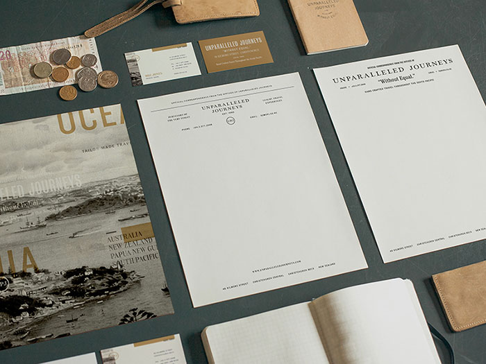
Trifekta letterhead example
![]()
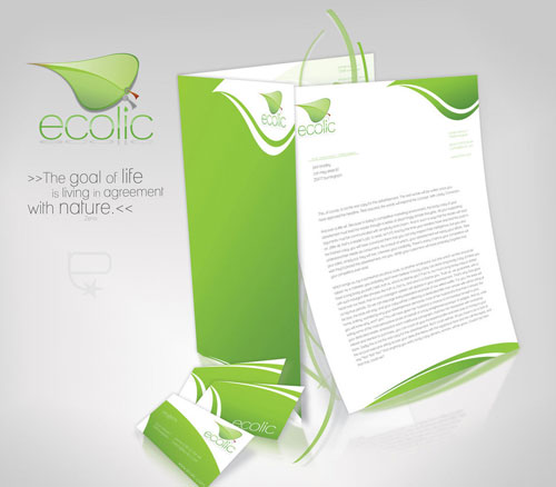
Ecolic corporate identity
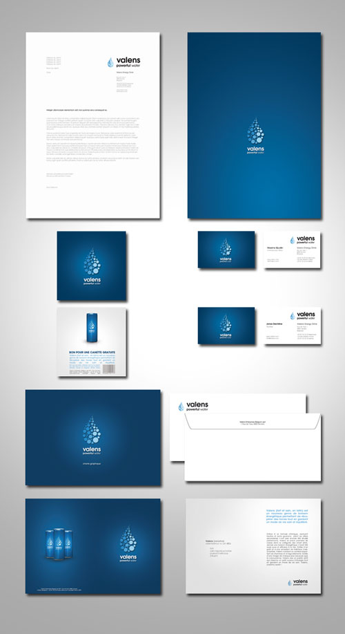
Valens Energy Drink – Identity
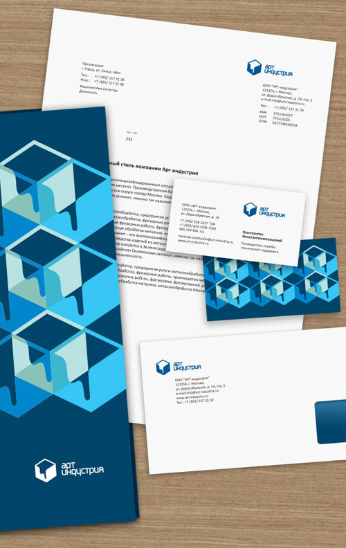
Artindustria Identity Guidelines
Exider Logo and Stationery
![]()
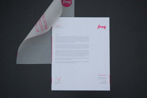
Freq Nightclub letterhead example
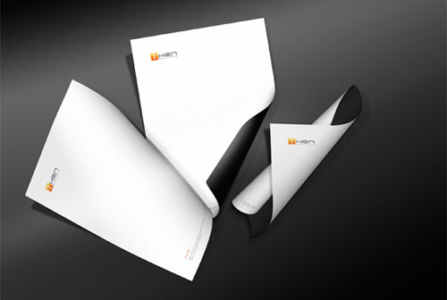
Then Corporate Brand Identity
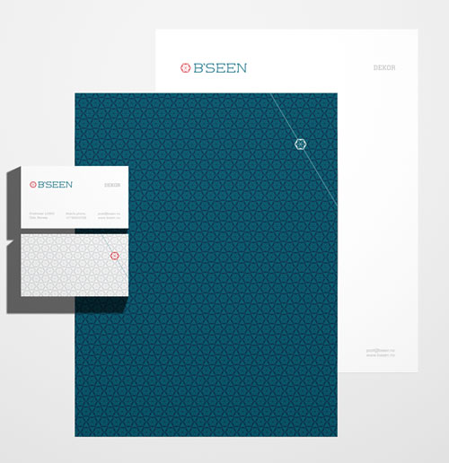
B’seen Visual Identity
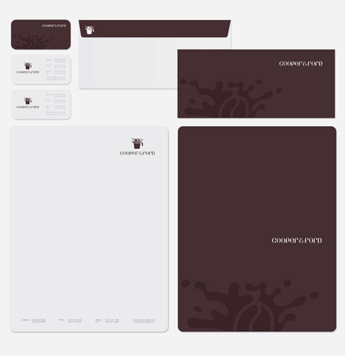
Cooper & Ford
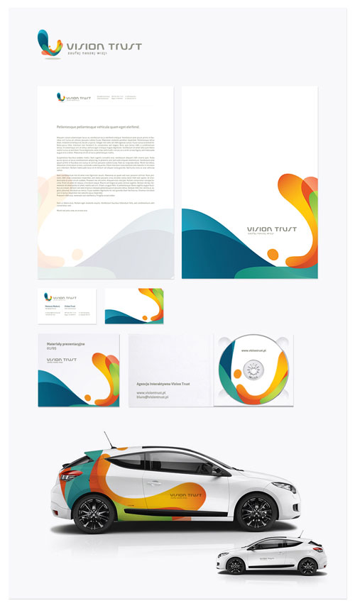
Vision Trust letterhead example
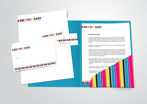
PrintEasy Stationery Set
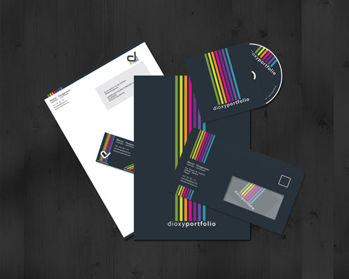
Dioxyportfolio Corporate – CRI
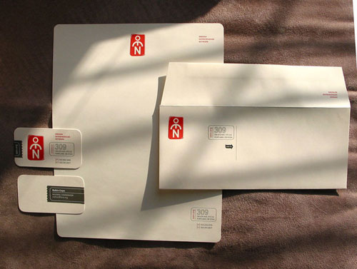
OEN Identity
Stepcase logo + stationery
![]()
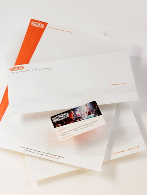
Dynasonic Identity Suite
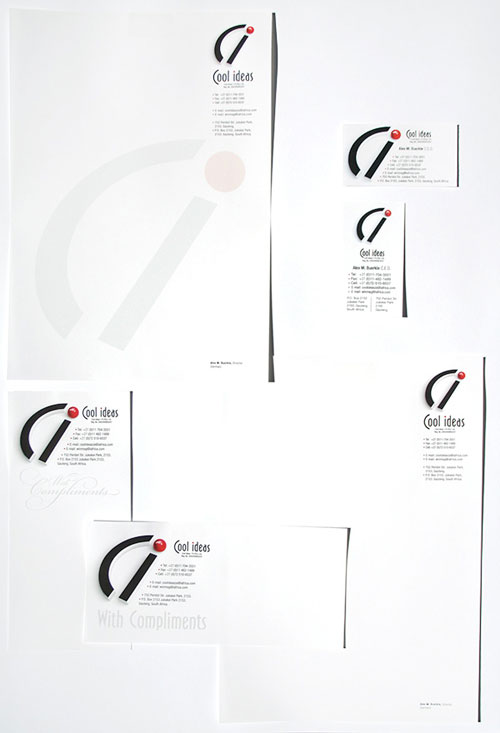
Corporate identity – Cool ideas
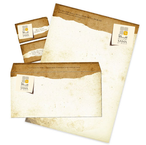
Sama letterhead design
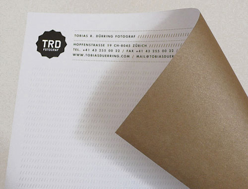
Tobias R. Duerring Identity
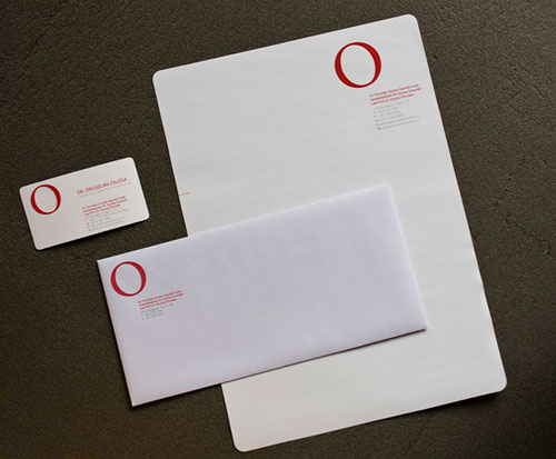
Law firm corporate identity
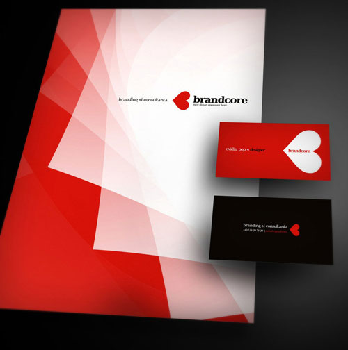
Brandcore corporate letterhead design
More letterhead examples, you say?
Scroll some more.
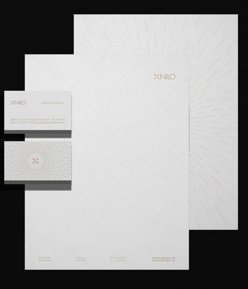
Xnilo Design Studio Visual Id
BlueBells logo and products
![]()
Typography Stationery by Moshik Nadav
Sartorom logo + business stationery
![]()
PDESIGNS letterhead example
FIM – Financial Solutions
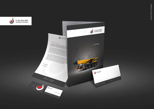
CRANES stationery
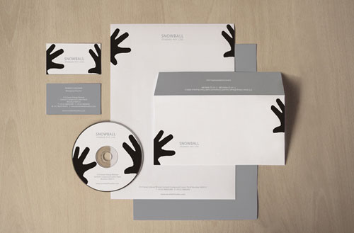
Snowball Studios letterhead design
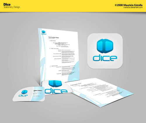
Dice – Stationery Design
Wockbar – logo & business card
![]()
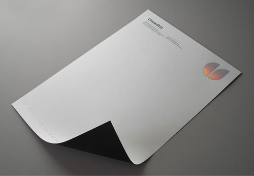
CloserStill Identity
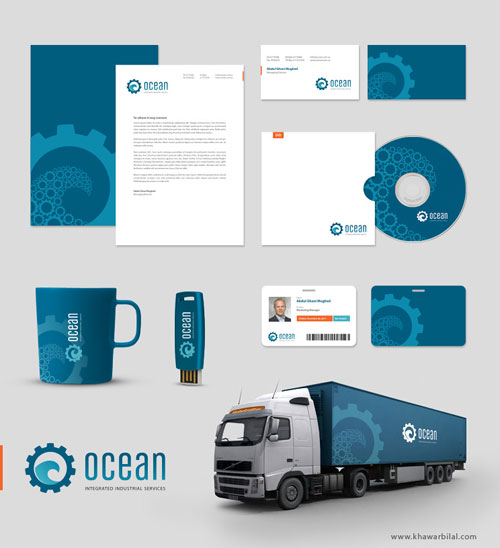
OCEAN Corporate identity
AISI letterhead sample
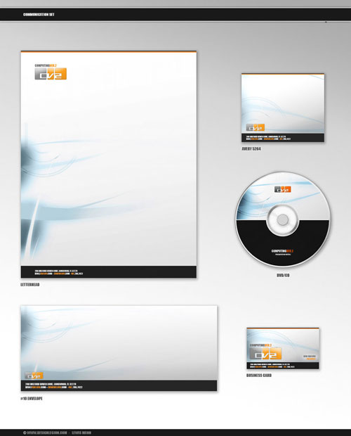
Computing Ver.2 CommSet
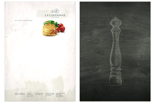
La Castagnas letterhead sample
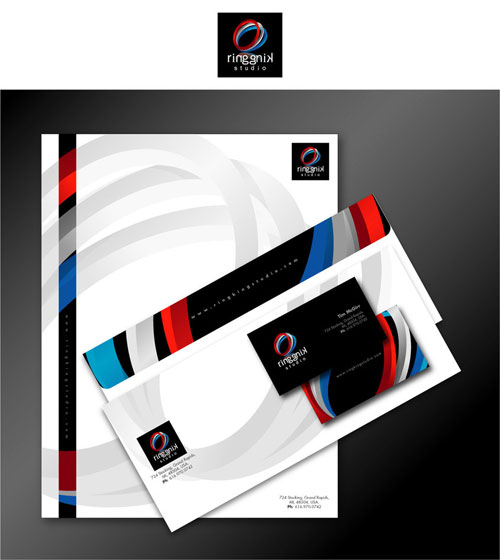
Ring King Studio business letterhead
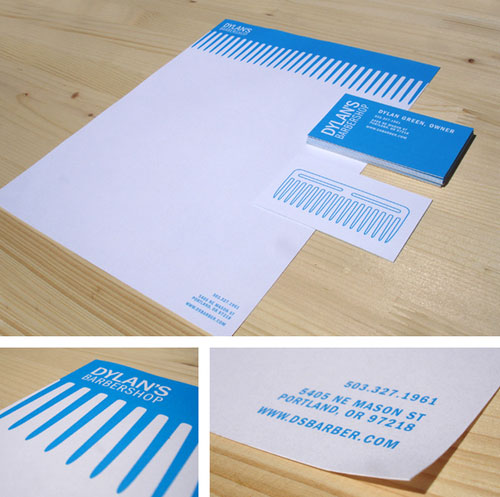
Dylan’s Barbershop Identity
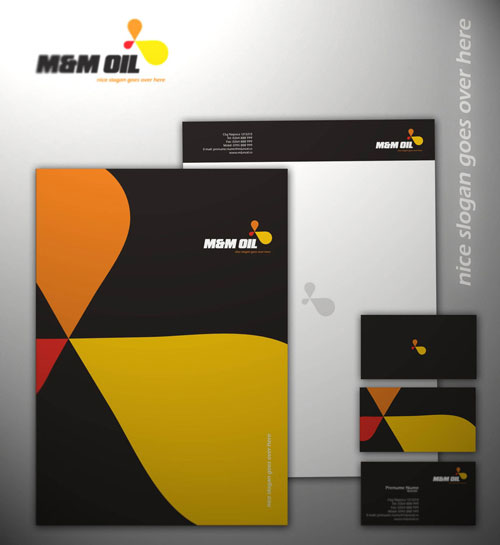
MM Oil Corporate
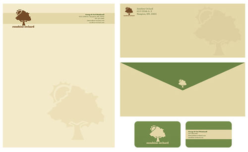
Sunshine Orchard business letterhead
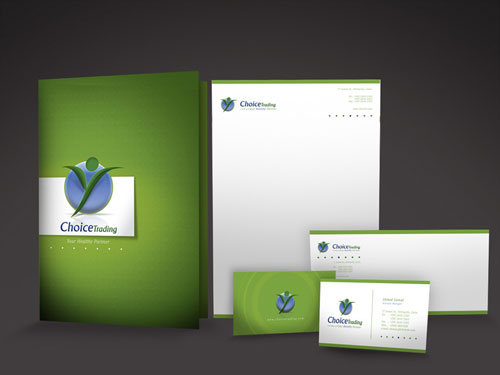
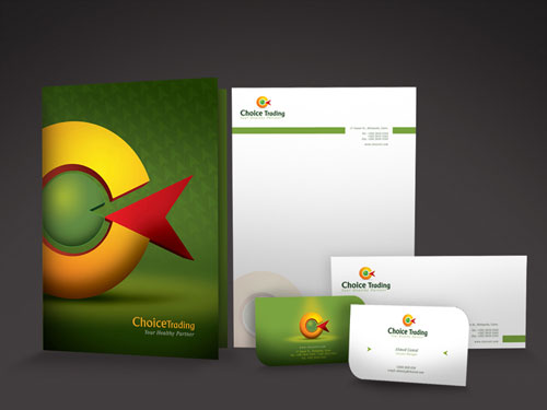
Choice Stationary 01 letterhead design
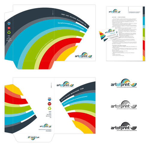
ArtOfPrint letterhead sample
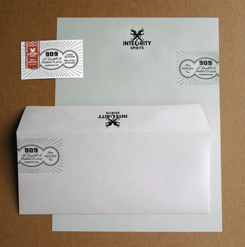
Integrity Spirits Identity
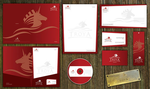
Troya letterhead sample
ID collection by David Garcia
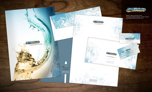
Mahdis – Water purification
H2R business letterhead
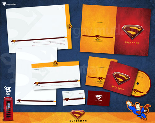
Superman corporate identity
Letterhead Designs by Jordon Mazziotti

Choice Stationary 02
The Pixel Cup – stationary
![]()
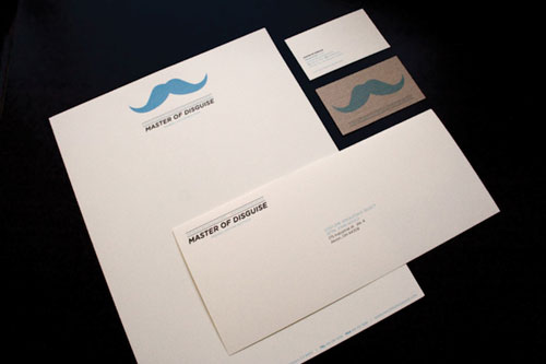
Master of Disguise
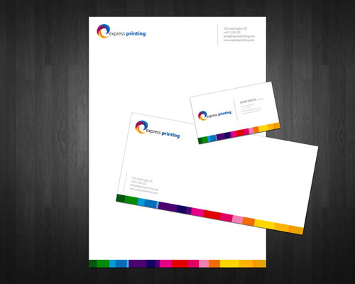
Express Printing letterhead design
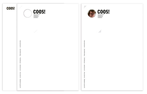
Coos! – corporate identity
CRESO letterhead design
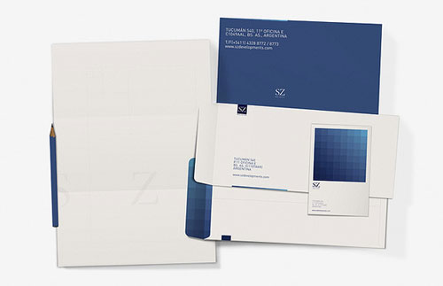
SZ Developments corporate letterhead
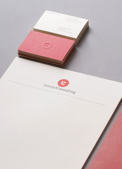
Lewin Consulting letterhead design
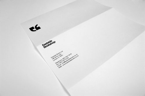
Eastside Bookshop identity
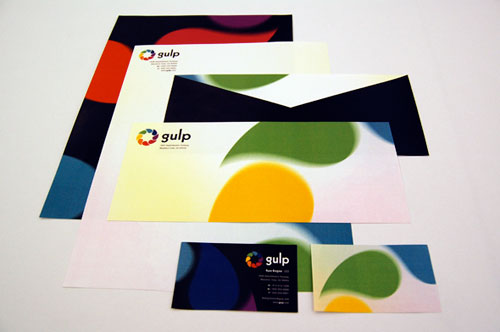
Gulp: Explore Your Thirst
FAQ on Letterhead Design
Why is a good letterhead design important for my business?
A letterhead is more than just a means to print letters. It embodies your brand’s identity, serves as an integral part of your corporate stationery, and sets you apart from competitors. Think of it as your business’s signature outfit, crafted to impress and build trust at a glance.
What should be included on a professional letterhead?
The fundamentals—a logo, company name, and contact details. But that’s just for starters. Integrate your brand’s colors and typography for a cohesive look. Don’t forget legal info like registration numbers if needed. It’s about blending branding elements to convey credibility seamlessly.
Can I design a letterhead myself, or should I hire a designer?
Sure you can, especially with tools like Canva or Adobe Illustrator at your fingertips. But a designer’s touch comes with an understanding of color palettes, graphic design, and brand consistency. If it’s within means, a professional designer can elevate your business stationery to new heights.
How do I choose the right paper for my letterhead design?
The feel of the paper in your client’s hands matters. Opt for high-quality printer-friendly stationery. Balance between paper quality and budget, considering factors like weight, texture, and finish. A tangible feel of quality can subtly enhance your brand perception.
What colors work best for letterhead designs?
Stick to your brand’s color scheme—it’s vital for recognition. However, veer towards lighter shades for the background to ensure any printed text is readable. Be mindful of how colors behave in print (CMYK) versus on screen (RGB).
How can I make my letterhead design stand out?
Be bold with your graphic elements, but don’t overdo it. Employ a unique watermark design or a striking yet subtle border. Even a clever use of space can speak volumes. The key is to marry originality with the essence of your brand.
Is it important to include social media information on a letterhead?
In today’s digital age, absolutely. Including your social handles suggests a modern and accessible brand. Still, prioritize according to relevance—if you’re more B2B, maybe you lean on LinkedIn over Instagram.
Can letterhead designs be used electronically?
Digital letterheads in PDF format are a yes, bringing consistency to both print and digital communications. They’re eco-friendly, cost-efficient, and can be easily integrated into email templates or document headers.
What are common mistakes to avoid in letterhead design?
Avoid clutter. Overcrowding with too much text or extravagant graphic design elements screams amateur. Likewise, using off-brands colors or inconsistent typography can dilute brand messaging. Keep it professional, cohesive, and simple.
How often should I update my letterhead design?
It’s not like updating social media; don’t fix what isn’t broken. But if your brand undergoes a significant change—like a logo design update or a shift in branding strategy—your letterhead should reflect that. It keeps your business’s face fresh and in sync with your brand identity.
Conclusion
So, you’ve scrolled past all those letterhead examples, huh? From sleek monograms etching their presence on the corner, to bold headers crowning the page – it’s a mixtape of that professional vibe you’re aiming for. And I bet there’s that one design that just clicked; you know, the one that made you go, “Yep, that’s the one.”
Before you dash off to brandish your letters with the new look, remember: the right letterhead should feel like a handshake – firm, confident, and unmistakably you. It should blend the best of brand identity with the practicalities of everyday use.
Now armed with a world of inspiration and the lowdown on executive letterhead finesse, go forth. Design one that tells your tale, that sings your brand’s song when words just aren’t enough. Make that first impression not just any note—it’s the note.
If you like this article with letterhead examples, you’ll like these too:
- Brochure Design Inspiration (64 Modern Brochure Examples)
- How to make an album cover – 46 artwork examples
- How to design an effective letterhead
- Showcase on Pinterest
Bogdan Sandu, a seasoned designer with 15 years of diverse experience, has been designing websites since 2008.
Renowned for his expertise in logo design and visual branding, Bogdan has developed a multitude of logos for various clients.
His skills extend to creating posters, vector illustrations, business cards, and brochures. Additionally, Bogdan's UI kits were featured on marketplaces like Visual Hierarchy and UI8.
Latest posts by Bogdan Sandu (see all)
- Out of This World: Space Color Palettes for Cosmic Designs - 28 April 2024
- The Bungie Logo History, Colors, Font, And Meaning - 27 April 2024
- After Dark: Night Color Palettes for Mysterious Designs - 27 April 2024