The Cleveland Browns logo stands as one of the most unusual visual identities in professional football. Unlike every other NFL franchise, the Browns use no actual logo symbol on their helmets.
Just the helmet itself. Orange, simple, unmistakable.
This approach makes the Browns instantly recognizable among NFL logos. The franchise was founded in 1946 as part of the All-America Football Conference. Since then, the team has maintained remarkable visual consistency.
The current orange helmet design has been in use since 1961. Only minor refinements have occurred over six decades. That kind of restraint is rare in sports branding, where teams constantly chase modern looks.
What is the Cleveland Browns Logo?
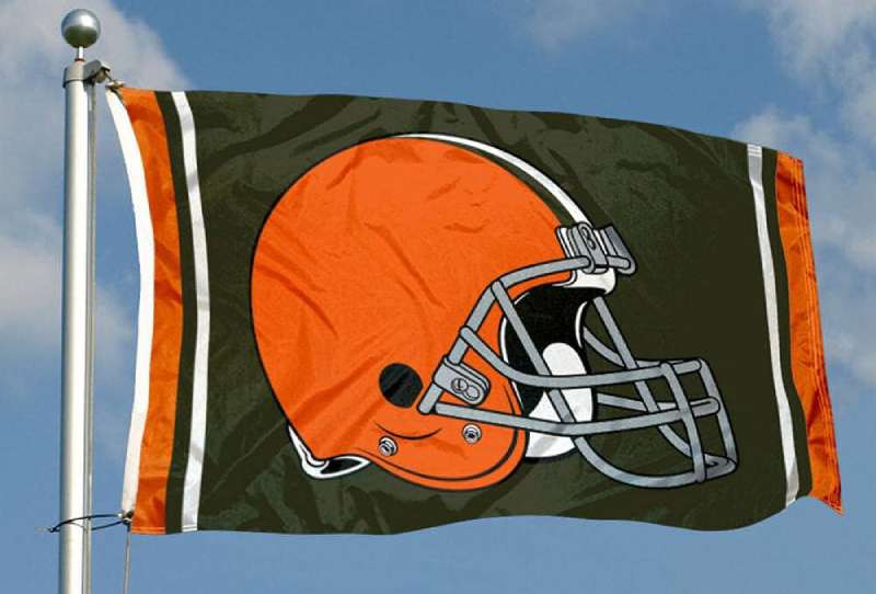
The Cleveland Browns logo is technically the team’s iconic orange helmet with a brown face mask and central brown-white-brown stripe. Officially standardized in 1961, the design represents one of minimalist design’s greatest successes in professional sports branding.
Design Attributes:
- Design Type: Helmet-based identity (no traditional logo mark)
- Primary Elements: Orange helmet shell, brown facemask, brown-white-brown center stripe
- Official Introduction Date: 1961 (current iteration)
- Designer/Agency: Not formally credited to a specific designer
- Trademark Status: Registered trademark of the Cleveland Browns Football Company LLC
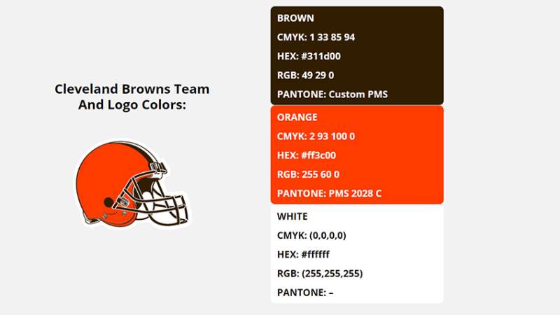
- Color Palette: Browns Orange (Hex: #FF3C00), Seal Brown (Hex: #311D00), White (Hex: #FFFFFF)
- Usage Context: Helmets, merchandise, stadium signage, digital platforms, promotional materials
How Has the Cleveland Browns Logo Evolved Over Time?
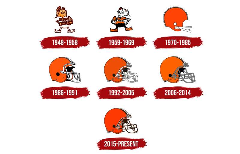
The Browns have used remarkably few logo variations since 1946. The original designs featured a brownie elf mascot.
That changed in 1961 when the team shifted to helmet-only branding.
Minor updates occurred in 2006 and 2015. But the core identity has remained stable for over 60 years.
Original Cleveland Browns Logo (1946-1959)
- Years Active: 1946-1959
- Design Description: Brownie the Elf mascot, a cartoon character in a brown and orange uniform holding a football
- Color Scheme: Brown, orange, white, flesh tones
- Designer: Unknown
- Context: Created when the team joined the AAFC, the mascot reflected the team name’s connection to coach Paul Brown
- Key Changes from Previous: Original design, no predecessor
- Cultural Significance: Established the Browns’ identity and connected the team to Cleveland’s working-class fanbase
Transition Era Cleveland Browns Logo (1959-1961)
- Years Active: 1959-1961
- Design Description: White helmet with orange stripe, transitional period before the iconic orange helmet
- Color Scheme: White, orange, brown
- Designer: Unknown
- Context: Brief period of experimentation before settling on the now-famous look
- Key Changes from Previous: Moved away from mascot imagery toward helmet-centric branding
- Cultural Significance: Represented the team’s shift toward a more streamlined visual identity
Modern Cleveland Browns Logo (1961-Present)
- Years Active: 1961-present
- Design Description: Solid orange helmet with brown facemask, brown-white-brown center stripe
- Color Scheme: Browns Orange, Seal Brown, White
- Designer: Not formally attributed
- Context: Introduced during the team’s competitive peak under coach Paul Brown
- Key Changes from Previous: Inverted the color scheme from white to orange as the primary helmet color
- Cultural Significance: Became one of the most recognizable helmets in football, spawning the “Dawg Pound” fan culture
2015 Refinement
- Years Active: 2015-present
- Design Description: Slightly updated shade of orange, new wordmarks and secondary logos introduced
- Color Scheme: Updated Browns Orange, Seal Brown, White
- Designer: Nike in collaboration with the Browns organization
- Context: Part of a broader uniform refresh across the NFL
- Key Changes from Previous: Brighter orange shade, modernized secondary wordmark featuring “BROWNS” text
- Cultural Significance: Attempted to energize the brand while respecting tradition
What Do the Design Elements of the Cleveland Browns Logo Mean?
The orange helmet communicates strength and tradition. It represents Cleveland’s industrial heritage and blue-collar identity.
The absence of a symbol is itself a statement. It says the team needs no mascot or fancy graphic to be recognized.
Brown and orange together signal toughness. These aren’t flashy colors. They’re grounded, working-class colors that reflect the city.
Why Did Cleveland Browns Choose These Specific Colors?
The team’s colors connect directly to color psychology principles used in sports branding.
Orange communicates energy and enthusiasm. It’s a warm, aggressive color that stands out on the field. Among orange logos in sports, the Browns’ shade is distinctively burnt and earthy.
Brown represents stability and reliability. It’s unusual in professional sports, making the team distinctive. Brown logos are rare precisely because the color lacks flash, but the Browns embrace that quality.
Official Color Specifications:
- Browns Orange: Pantone 1665 C, Hex #FF3C00
- Seal Brown: Pantone 4625 C, Hex #311D00
- White: Standard White, Hex #FFFFFF
What Typography Style Is Used in the Cleveland Browns Logo?
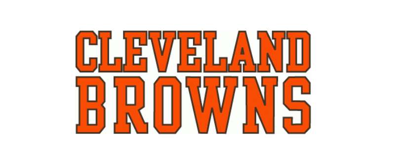
The Browns wordmark uses a custom sans-serif font with strong, blocky letterforms.
It’s bold and masculine. The letters have minimal decoration, which fits the team’s no-nonsense identity.
The typography has evolved slightly over time. Recent versions feature sharper edges and tighter kerning.
Readability was clearly a priority. The wordmark works well on everything from jerseys to stadium signage.
What Are the Hidden Meanings in the Cleveland Browns Logo?
The helmet stripe pattern deserves attention. Three stripes running down the center mirror traditional leather helmet designs from football’s early days.
This connects the modern team to football history. It’s a subtle nod to the sport’s origins.
The facemask color matching the brown stripe creates visual hierarchy. Your eye moves naturally from the brown elements to the orange shell.
Some fans see the blank helmet as a canvas. It represents potential, a team that lets its play do the talking.
How Does the Cleveland Browns Logo Compare to Competitor Logos?
In the AFC North, the Browns take the most restrained approach. Their rivals all use distinct graphic marks.
The Pittsburgh Steelers logo features the famous Steelmark. It’s corporate, industrial, and widely recognized.
The Baltimore Ravens logo showcases an aggressive bird head. Dark purple and black create a menacing look.
The Cincinnati Bengals logo displays tiger stripes integrated into the helmet design. It’s bold and animalistic.
Cleveland’s approach is the opposite. No animal, no symbol, no graphic mark at all. Just color and form.
This makes the Browns paradoxically more distinctive. They’re the team without a logo, which itself becomes unforgettable branding.
What Are the Technical Specifications of the Cleveland Browns Logo?
Official Color Codes:
- Browns Orange (Primary)
- Hex: #FF3C00
- RGB: (255, 60, 0)
- CMYK: (0, 76, 100, 0)
- Pantone: 1665 C
- Seal Brown (Secondary)
- Hex: #311D00
- RGB: (49, 29, 0)
- CMYK: (0, 41, 100, 81)
- Pantone: 4625 C
- White (Accent)
- Hex: #FFFFFF
- RGB: (255, 255, 255)
- CMYK: (0, 0, 0, 0)
Dimensions and Proportions:
- Helmet Stripe Width: Proportional to helmet size, approximately 1.5 inches per stripe on game helmets
- Wordmark Aspect Ratio: Approximately 5:1 (width to height)
- Minimum Size Requirements: Wordmark should not be reproduced smaller than 0.5 inches in height
- Clear Space: Minimum clear space equal to the height of the “B” in BROWNS around all sides
What Cultural Impact Has the Cleveland Browns Logo Had?
The Browns helmet transcends football. It represents Cleveland itself, a city known for resilience and authenticity.
The Dawg Pound emerged partly because of the blank canvas the helmet provides. Fans created their own mascot culture around it.
Brownie the Elf has experienced a nostalgia-driven revival. The original mascot now appears on alternate merchandise, connecting generations of fans.
The logo’s simplicity influenced other sports brands. It proved that restraint can be more powerful than complexity.
How Does the Cleveland Browns Logo Fit Into the Overall Brand Identity?
The helmet anchors a broader visual system. Wordmarks, secondary marks, and the Brownie elf all orbit around that central orange helmet.
According to the team’s brand guidelines, consistency matters above all. The orange must be exact. The brown must match.
Stadium design incorporates the color scheme throughout. FirstEnergy Stadium features orange and brown prominently in seating and signage.
Merchandise ranges from traditional to modern. But every piece connects back to that iconic helmet.
How Should the Cleveland Browns Logo Be Used?
Official Usage Guidelines:
- Do: Use official color values exactly as specified
- Do: Maintain minimum clear space around wordmarks
- Do: Use approved logo files from official sources
- Don’t: Alter the colors or proportions
- Don’t: Add effects like shadows or gradients to the wordmark
- Don’t: Place the logo on busy backgrounds that reduce legibility
Where to Access Official Logos:
The Cleveland Browns media relations department provides official assets to credentialed media. Licensed vendors receive approved artwork through NFL Properties.
Licensing Information:
Commercial use requires licensing through NFL Properties. Fan art and personal use fall under different guidelines. The team actively protects its trademarks against unauthorized commercial reproduction.
Trademark Protection:
The Cleveland Browns name, helmet design, and associated marks are registered trademarks. The team and NFL monitor usage and enforce intellectual property rights consistently.
FAQ on The Cleveland Browns Logo
Why Don’t the Cleveland Browns Have a Logo on Their Helmet?
The Browns deliberately chose helmet-only branding in 1961. It’s a focal point strategy that works.
The orange helmet itself became the identifier. No graphic needed.
This decision made Cleveland unique among all NFL franchises. Every other team uses a symbol. The Browns let color do the talking.
What Are the Official Cleveland Browns Team Colors?
The official color palette includes Browns Orange, Seal Brown, and white.
Orange uses hex code #FF3C00. Brown is #311D00.
These colors reflect Cleveland’s industrial roots. The hue choices communicate toughness and authenticity. Nothing flashy about this franchise identity.
Who Designed the Cleveland Browns Logo?
No single designer receives credit for the iconic helmet design. It evolved organically during the early 1960s.
The team’s equipment staff and front office collaborated on the look.
Unlike work from famous graphic designers, this wasn’t a formal branding project. It just happened through practical decisions about helmet colors and stripes.
What Happened to Brownie the Elf Mascot?
Brownie the Elf served as the original team mascot from 1946 to 1959. The cartoon character appeared on merchandise and promotional materials.
The team phased him out when adopting the orange helmet identity.
He’s back now. Sort of. The elf appears on throwback gear and alternate merchandise, connecting modern fans to Browns football history.
When Did the Browns Last Change Their Logo?
The most recent update came in 2015. Nike worked with the organization on a broader uniform refresh.
Changes were subtle. The orange shade got slightly brighter.
The wordmark received sharper edges and improved typeface details. Core elements stayed the same because logo design principles favor consistency.
What Does the Cleveland Browns Logo Represent?
The helmet represents Cleveland’s working-class identity. No frills. No pretense.
Brown and orange symbolize the city’s steel and industrial heritage. The psychology of shapes matters here too.
The rounded helmet form conveys strength and protection. It’s a visual statement about what this franchise values.
Why Is the Browns Helmet Orange Instead of Brown?
Orange provides better visibility on the field. Brown helmets existed briefly in the late 1950s.
The switch to orange created stronger contrast against most backgrounds.
From a color theory perspective, orange pops on television. It photographs well. Brown became the accent color supporting the primary orange.
Can I Use the Cleveland Browns Logo for My Business?
No. Commercial use requires licensing through NFL Properties. The trademark protections are strict.
Personal fan use follows different rules.
Creating merchandise, using the helmet image in advertising, or incorporating team branding into products without authorization violates intellectual property law. The NFL actively enforces these protections.
What Font Does the Cleveland Browns Wordmark Use?
The Browns use a custom font for their wordmark. It’s a bold, blocky sans-serif design.
The letterforms feature tight spacing and strong verticals.
Understanding font psychology explains the choice. These heavy, masculine letters communicate power and stability. Nothing delicate about this team’s visual identity.
How Many Logo Versions Have the Browns Used?
The franchise has used roughly four distinct visual identities since 1946. Brownie the Elf came first.
Then a brief white helmet era. The orange helmet arrived in 1961.
Minor refinements followed in 2006 and 2015. But the core design elements have remained remarkably consistent for over sixty years of Dawg Pound history.
Conclusion
The Cleveland Browns logo proves that restraint works. In a league full of aggressive mascots and complex graphics, an orange helmet stands alone.
This franchise identity embraces white space thinking. Less becomes more.
The team’s visual unity connects generations of Dawg Pound fans. From Paul Brown’s era to today, the helmet remains unchanged in spirit.
Good graphic design principles favor timeless choices over trendy ones. Cleveland understood this decades ago.
Sometimes the boldest statement is making no statement at all.

Renowned for his expertise in logo design and visual branding, Bogdan has developed a multitude of logos for various clients.
His skills extend to creating posters, vector illustrations, business cards, and brochures. Additionally, Bogdan's UI kits were featured on marketplaces like Visual Hierarchy and UI8.
He also wrote in the past years on sites like Design Your Way, WebDesignerDepot, WPDean, Designmodo, Speckyboy, Slider Revolution, and more.
- Minecraft Font Generator - 8 October 2026
- How Top Meta Ad Creative Is Designed for E-commerce Brands - 8 October 2026
- How photo recovery software works and when to use it - 7 October 2026

Bogdan Sandu is a seasoned designer who has been designing websites since 2008. Renowned for his expertise in logo design and visual branding, Bogdan has developed a multitude of logos for various clients. His skills extend to creating posters, vector illustrations, business cards, and brochures. Additionally, Bogdan's UI kits were featured on marketplaces like Visual Hierarchy and UI8. He also wrote in the past years on sites like Design Your Way, WebDesignerDepot, WPDean, Designmodo, Speckyboy, Slider Revolution, and more.
You Might Also Like