The Kansas City Chiefs Logo History, Colors, Font, and Meaning
An emblem doesn’t merely signal allegiance; it encapsulates an ethos. The Kansas City Chiefs logo—a stark arrowhead emblazoned with interlocking initials—stands as an iconic testament to resilience in the gridiron realm.
It’s more than a design; it’s heritage and heartbeat synchronized with every chant in the Chiefs Kingdom.
Woven within its contours are tales of triumph, the roar of Arrowhead Stadium, and the legacy of legends like Lamar Hunt.
It’s stitched on jerseys, waved on banners, and etched in the very spirit of the AFC West titans. Branded across generations, this emblem is a totem of pigskin lore.
Today, we dissect the threads binding this potent symbol to its fervent admirers. From the Chiefs emblem’s origin to its evolution in the cauldron of NFL sports apparel, we’ll explore what makes this insignia an unwavering beacon in sports branding.
By this article’s end, the astute intricacies of the Chiefs’ visual identifier will stand fully revealed—a cherished coat of arms in the league of titans.
The Meaning Behind the Kansas City Chiefs Logo
![]()
Dude, when you look at the Kansas City Chiefs logo, it’s not just some random design someone doodled on a paper. It tells a story. Let’s dive into that ocean of meaning.
Deep Roots in Native American Imagery
It’s no secret the name “Chiefs” has its roots in Native American imagery. The arrowhead shape of the logo itself is a nod to this, reminding fans of the tools and weapons crafted by the indigenous peoples of the region.
Power and Precision
When you throw an arrowhead, it’s all about precision and strength, right? Just like the team’s performance on the field. That arrowhead represents a keen focus, sharp tactics, and power.
The History of the Kansas City Chiefs Logo
![]()
Now, let’s step into our time machines and rewind a bit.
From Dallas to Kansas City
Before they became the Chiefs, they were the Dallas Texans. Say whaaat? Yep! But when they moved to Kansas City in 1963, a new identity was born. With it came the iconic arrowhead logo we know and love.
Evolution, Not Revolution
Over the years, the logo has seen tweaks and refinements, but the core arrowhead shape has remained consistent. Why fix what ain’t broke, right?
The Colors of the Kansas City Chiefs Logo
![]()
The palette, man. It’s not just about looking rad. The colors tell a story too.
Red – Passion and Energy
Red is the color of fire, of love, and of passion. When you see those players rocking the red, you’re seeing their burning desire to win.
White and Gold – Purity and Excellence
The white and gold in the logo? That’s about purity of performance and the gold standard of play. Pretty cool, huh?
The Font Used in the Kansas City Chiefs Logo
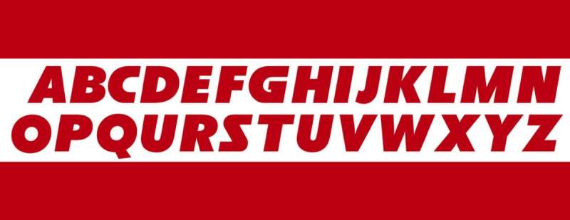
Ever wonder why designers go bananas over fonts? They give vibes!
Bold and Impactful
That font in the Chiefs’ logo? It screams boldness and impact. It’s not whimsical or flighty. It’s about being grounded, solid, and unshakeable.
The Impact of the Logo on Fans
Let’s get real. Logos aren’t just logos. They’re symbols fans rally behind.
Unity and Belonging
You see someone with that Chiefs logo, and instantly there’s a connection. It’s like an unspoken high-five. The logo binds the fans, creating a sea of unity in the stadium.
A Badge of Honor
Wearing that logo? It’s not just about supporting a team. It’s a badge, a statement. It’s about being part of a legacy.
How the Kansas City Chiefs Logo Stands Out from the Rest
In a sea of NFL teams, the Chiefs logo has its own vibe.
Simplicity is Key
It’s not cluttered or chaotic. It’s clean, simple, and easily recognizable. That’s the beauty of it.
Timelessness
While trends come and go, the Chiefs logo remains evergreen. It’s like that classic tee you can’t part with. It has, and will continue to, stand the test of time.
FAQ On The Kansas City Chiefs Logo
Who designed the Kansas City Chiefs logo?
It sprung from the creative well of sports symbolism. The Chiefs logo, a deft stroke of marketing and identity, was crafted by Lamar Hunt, the original owner.
His vision was to create a logo that resonated with power, reflective of Native American heritage, grounded in the heart of Kansas City.
What does the Kansas City Chiefs logo represent?
Symbolism rich with intent, the logo—a crisp arrowhead—embodies strength and honor. It mirrors the fighting spirit of a Chief, signifying unity amongst players and fans.
A rallying cry in red and gold, it’s an enduring emblem of the team’s storied past and ambitious present.
When was the Kansas City Chiefs logo first introduced?
History marked its debut in the 1960s, a time of establishment and legacy. The Chiefs logo, since its inception, has remained a steadfast beacon.
Its unchanged form is a testament to the time-honored traditions of the franchise and its unwavering commitment to the original design.
Has the Kansas City Chiefs logo ever changed?
Constancy is its hallmark. The Chiefs logo has stood the test of time, remaining remarkably unaltered. Since the moment it adorned helmets and hearts, it’s been a perennial symbol.
Minor tweaks aside, the fundamental design has been preserved, a durable legacy in the fluid world of sports branding.
What do the colors in the Kansas City Chiefs logo mean?
The Chiefs’ colors, an arresting spectacle. Red—symbolizing zeal and courage—and gold, echoing triumphs and trophies.
Together, they weave a visual narrative that champions the tenacity of the team. These are colors that don’t merely adorn; they announce the unyielding ethos of the Chiefs Kingdom.
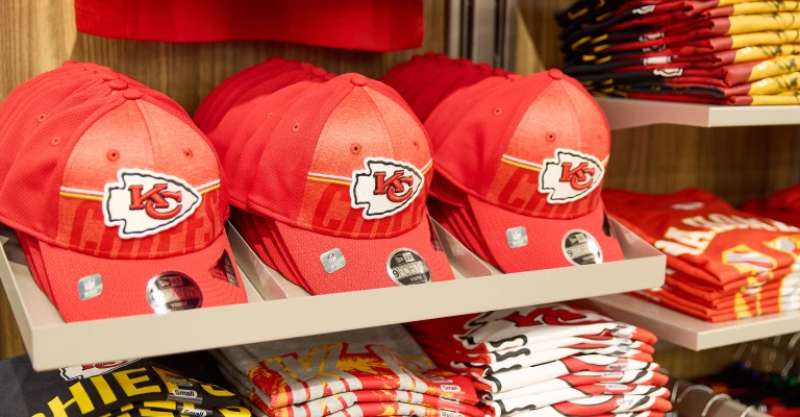
Where can I buy official Kansas City Chiefs logo merchandise?
Authenticity calls for discernment. Official Chiefs gear is available at the NFL’s online store, Arrowhead Stadium’s pro shops, and authorized retailers. Whether seeking jerseys, hats, or flag-waving memorabilia, turn to sanctioned outlets to secure a piece of the franchise’s soul.
Can I use the Kansas City Chiefs logo for my personal project?
Legal labyrinths mandate respect. The Chiefs logo, safeguarded by copyright and licensing agreements, is not freely usable.
For personal projects not intended for public distribution or commercial use, certain leniencies exist. Still, when in doubt, seek permission from the franchise—uphold the emblem’s integrity.
What are the rules regarding the use of the Kansas City Chiefs logo?
Rules, set in the stone of trademark law. Any commercial use of the Chiefs logo requires direct authorization. The franchise strictly controls its mark to prevent misuse.
Compliance is non-negotiable; respecting these guidelines ensures the logo’s esteem and the club’s legal sanctity are maintained.
How does the Kansas City Chiefs logo compare to other NFL team logos?
In the league of heraldry, each logo stands unique—a narrative frozen in design. The Chiefs logo, with its minimalist arrowhead and interlocking initials, compares in history and recognizability.
It eschews complexity for iconic clarity, distinguishing itself in the pantheon of NFL insignias.
What is the impact of the Kansas City Chiefs logo on the team’s brand?
Logos ignite imaginations and solidify loyalties. The Chiefs logo is a cornerstone of the team’s brand, a silent envoy and a visual anchor.
It affects not just merchandise sales but the very identity of Chiefs Nation, echoing through marketing, fan experience, and the global sporting lexicon.
Conclusion
Diving deep into the vortex of color and shape, we’ve unraveled the narrative threads bound in the Kansas City Chiefs logo. Arrowheads and letters interlocked, a visual chant to the rhythm of football and fervor—each stitch a tale of endurance and audacity.
We’ve ventured across the digital marketplace, flags planted at the NFL store, an odyssey through the Kansas City Chiefs’ sacred marketplaces. Our path—illuminated by licensing covenants; guardians of emblem and commerce.
As the final whistle echoes, bear in mind the emblem’s more than a mark. It’s the heart of the Chiefs Kingdom, pulsing in red and gold, vibrating through Arrowhead Stadium and the breadth of the American Football Conference.
Armed with newfound insight, one exits not merely informed, but transformed—an initiate into the storied dynasty of the Chiefs. What remains now is to carry this beacon forth, upholding its legacy, bound by unity, and echoing the cry of the undaunted.
If you liked this article about the Kansas City Chiefs logo, you should check out this article about the Dallas Cowboys logo.
There are also similar articles discussing the Denver Broncos logo, the Green Bay Packers logo, the Buffalo Bills logo, and the New England Patriots logo.
And let’s not forget about articles on the Philadelphia Eagles logo, the Carolina Panthers logo, the Arizona Cardinals logo, and the Atlanta Falcons logo.
Bogdan Sandu, a seasoned designer with 15 years of diverse experience, has been designing websites since 2008.
Renowned for his expertise in logo design and visual branding, Bogdan has developed a multitude of logos for various clients.
His skills extend to creating posters, vector illustrations, business cards, and brochures. Additionally, Bogdan's UI kits were featured on marketplaces like Visual Hierarchy and UI8.
Latest posts by Bogdan Sandu (see all)
- After Dark: Night Color Palettes for Mysterious Designs - 27 April 2024
- The Capcom Logo History, Colors, Font, And Meaning - 26 April 2024
- Earth Color Palettes Grounded in Nature: 40 Examples - 26 April 2024