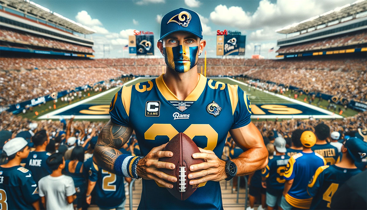
The Los Angeles Rams logo stands as one of the most recognized symbols in professional football. It represents a franchise with deep roots stretching back to 1936.
Within the broader landscape of NFL logos, the Rams emblem holds a unique position. The team pioneered helmet graphics in professional football, making their mark on sports branding history.
The current logo version launched in 2020, coinciding with the team’s move to SoFi Stadium. This marked the seventh major design iteration since the franchise began.
The Rams organization was founded in Cleveland before relocating to Los Angeles in 1946. That move sparked a design revolution that changed how football teams present themselves visually.
What is the Los Angeles Rams Logo?
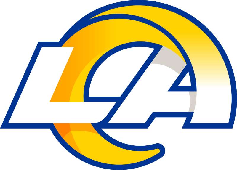
The Los Angeles Rams logo features a stylized ram head with curved horns in royal blue and yellow. Officially introduced on March 23, 2020, this design was created in collaboration with the team’s internal creative department. The horns symbolize strength, determination, and the aggressive nature of the animal.
Design Type: Combination mark featuring both a mascot element and wordmark
Primary Elements: Ram head silhouette with spiraling horn, custom “LA” letterform integration, gradient color application
Official Introduction Date: March 23, 2020
Designer/Agency: Los Angeles Rams internal creative team
Trademark Status: Registered trademark of the Los Angeles Rams, LLC and NFL Properties
Color Palette:
- Rams Royal Blue (Hex: #003594)
- Sol Yellow (Hex: #FFD100)
- White (Hex: #FFFFFF)
Usage Context: Helmets, uniforms, stadium signage, merchandise, digital platforms, broadcast graphics, and official team communications
How Has the Los Angeles Rams Logo Evolved Over Time?
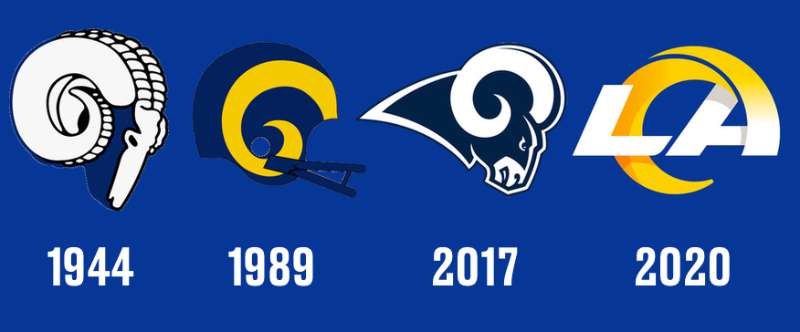
The Rams logo has gone through seven major redesigns since 1941.
Each version reflected the team’s location and era.
From hand-painted helmet horns to digital gradients, the evolution tells the story of both the franchise and sports design itself.
Original Rams Logo (1941-1945)
Years Active: 1941-1945
Design Description: Fred Gehrke, a player and artist, hand-painted ram horns directly onto the team’s leather helmets. This was the first helmet decoration in NFL history. The horns curved from front to back in a simple yellow design.
Color Scheme: Yellow horns on blue helmets
Designer: Fred Gehrke (halfback and commercial artist)
Context: Gehrke painted each helmet individually during the off-season. The team was still based in Cleveland at this time. Owner Dan Reeves paid Gehrke one dollar per helmet.
Key Changes from Previous: First helmet design in league history. Before this, all NFL helmets were plain.
Cultural Significance: This innovation started a league-wide trend. Every NFL team eventually adopted helmet graphics because of what Gehrke started.
Classic LA Rams Logo (1946-1972)
Years Active: 1946-1972
Design Description: When the team moved to Los Angeles, the horn design became more refined. The curling ram horns wrapped around the helmet in a bolder, more stylized fashion. A separate ram head logo appeared on merchandise and media materials.
Color Scheme: Royal blue and gold (later changed to royal blue and white in 1964)
Designer: Team staff, evolving from Gehrke’s original concept
Context: The Rams became the first major professional sports franchise on the West Coast. The logo needed to establish the team’s identity in a new market.
Key Changes from Previous: Professional standardization of the horn curve, formal color specifications, introduction of standalone ram head mark
Cultural Significance: Established the Rams as a Hollywood-adjacent brand. Celebrity fans and the LA lifestyle became intertwined with the team’s image.
St. Louis Rams Logo (1995-2015)
Years Active: 1995-2015
Design Description: A modernized ram head facing right with a more aggressive expression. The design incorporated a navy blue and gold color scheme distinct from the LA years. The helmet horns remained but with updated proportions.
Color Scheme: Millennium Blue (dark navy) and New Century Gold
Designer: NFL Properties design team
Context: The franchise relocated to St. Louis and needed a fresh start. The team won Super Bowl XXXIV during this era, cementing this logo in championship history.
Key Changes from Previous: Darker blue replaced royal blue, gold became more muted, ram head took on a fiercer appearance
Cultural Significance: The “Greatest Show on Turf” era made this logo iconic for a generation of fans. It represented the team’s rebirth in a new city.
Return to LA Logo (2016-2019)
Years Active: 2016-2019
Design Description: A transitional design that brought back classic LA colors while maintaining some St. Louis elements. The team used a modified version of the classic ram head with updated proportions and the return of royal blue and gold.
Color Scheme: Royal Blue and Gold (returned to classic LA palette)
Designer: Los Angeles Rams creative team with NFL Properties
Context: The team returned to Los Angeles and needed to reconnect with the city’s football history while maintaining brand continuity for St. Louis-era fans.
Key Changes from Previous: Lighter blue, brighter gold, subtle refinements to ram head proportions
Cultural Significance: This transitional logo bridged two eras. It honored the past while signaling changes to come.
Current Rams Logo (2020-Present)
Years Active: 2020-present
Design Description: A completely reimagined design featuring a stylized ram head with an integrated “LA” letterform within the horn curl. The logo uses gradients and a modern aesthetic unlike any previous version.
Color Scheme: Rams Royal and Sol (a brighter, more vibrant yellow)
Designer: Los Angeles Rams internal creative department
Context: Launched to coincide with the opening of SoFi Stadium. The team wanted a forward-looking design that represented LA’s creative culture.
Key Changes from Previous: First use of gradients in team branding, “LA” integration, complete departure from traditional ram head illustration style
Cultural Significance: The redesign sparked intense debate among fans. Some loved the modern approach. Others felt it abandoned too much history. The team won Super Bowl LVI with this logo, giving it championship legitimacy.
What Do the Design Elements of the Los Angeles Rams Logo Mean?
The ram symbolizes strength, determination, and fearlessness.
These animals charge forward without hesitation.
That characteristic mirrors the aggressive style of play the franchise has historically embraced.
The curving horns represent both the literal anatomy of a ram and forward momentum.
Why Did the Los Angeles Rams Choose These Specific Colors?
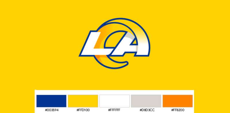
Rams Royal Blue
- Hex Code: #003594
- Pantone: PMS 286
- Symbolic Meaning: Loyalty, trust, and stability
- Psychological Impact: Blue creates feelings of confidence and dependability. It calms while still projecting authority.
- Brand Connection: The royal designation elevates the standard blue, suggesting prestige and championship aspirations
Sol Yellow
- Hex Code: #FFD100
- Pantone: PMS 116
- Symbolic Meaning: Named “Sol” after the Spanish word for sun, referencing Southern California’s sunshine
- Psychological Impact: Yellow energizes and attracts attention. It conveys optimism and warmth.
- Brand Connection: Ties directly to LA’s identity as a sun-drenched city. The brightness also references the entertainment industry’s spotlight culture.
Understanding color psychology helps explain why these choices resonate so strongly with fans and create such memorable branding.
What Typography Style Is Used in the Los Angeles Rams Logo?
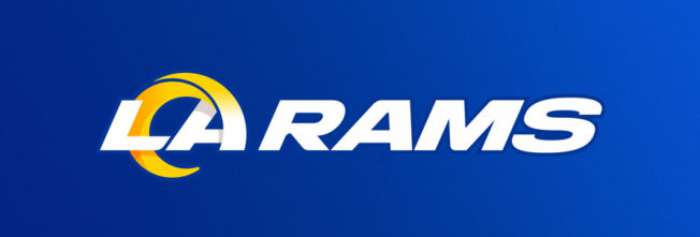
The current wordmark uses a custom sans-serif font designed specifically for the team.
It features clean lines with slightly rounded corners.
The letters have consistent stroke widths throughout, giving them a modern, uniform appearance.
Previous versions used more traditional block lettering.
The evolution toward custom typography reflects the team’s desire for a unique visual identity that cannot be replicated.
What Are the Hidden Meanings in the Los Angeles Rams Logo?
Look closely at the horn spiral.
The letters “LA” are integrated into the curve itself. This was intentional.
The designers wanted to literally embed the city into the team’s identity.
The gradient effect on the horn suggests motion and speed.
Some fans see additional shapes within the negative space, though these appear unintentional.
How Does the Los Angeles Rams Logo Compare to Competitor Logos?
The Rams logo takes a distinctly different approach than most NFL teams.
Where the Philadelphia Eagles logo uses detailed illustration and the Chicago Bears logo stays simple with letterforms, the Rams blend both approaches.
The Denver Broncos logo also features a horse head in profile, making it a direct stylistic comparison.
Among NFC West rivals, the Rams sit on the modern end of the design spectrum.
The San Francisco 49ers logo relies heavily on its classic oval shape.
Meanwhile, the Seattle Seahawks logo embraces Native American artistic influences.
The Arizona Cardinals logo uses a straightforward bird head illustration.
The Rams’ use of gradients and integrated letterforms sets them apart from nearly every team in the league. Only a handful of franchises have attempted such modern design approaches.
What Are the Technical Specifications of the Los Angeles Rams Logo?
Official Color Codes:
Primary Color: Rams Royal
- Hex: #003594
- RGB: (0, 53, 148)
- CMYK: (100, 85, 5, 10)
- Pantone: PMS 286 C
Secondary Color: Sol
- Hex: #FFD100
- RGB: (255, 209, 0)
- CMYK: (0, 15, 100, 0)
- Pantone: PMS 116 C
Accent Color: White
- Hex: #FFFFFF
- RGB: (255, 255, 255)
- CMYK: (0, 0, 0, 0)
Dimensions and Proportions:
- Aspect Ratio: The primary logo maintains a roughly 1:1 ratio within its bounding box
- Minimum Size: 0.5 inches (print), 50 pixels (digital) for legibility
- Clear Space: Minimum clear space equal to the height of the “L” in the wordmark on all sides
- The logo must never be stretched, rotated, or altered in color outside official variations
What Cultural Impact Has the Los Angeles Rams Logo Had?
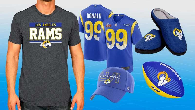
The Rams logo influence extends well beyond football.
Fred Gehrke’s original helmet horns started a design revolution. Every NFL team now decorates their helmets because of that 1941 innovation.
The 2020 redesign sparked massive online debate.
Some fans created parody versions. Others defended the modern direction.
The controversy itself generated millions in free publicity.
When the team won Super Bowl LVI, the logo appeared everywhere from Times Square billboards to international news coverage.
How Does the Los Angeles Rams Logo Fit Into the Overall Brand Identity?
The logo sits at the center of a complete visual system.
Uniforms, stadium signage, merchandise, and digital content all draw from the same color palette and design language.
SoFi Stadium’s architecture even incorporates the curved horn motif into its structural elements.
The team’s brand guidelines specify exactly how every visual element must appear.
This consistency creates recognition.
Whether you see the logo on a jersey, a billboard, or a social media post, the connection is immediate.
How Should the Los Angeles Rams Logo Be Used?
Official Usage Guidelines:
- Always use official logo files from the team or NFL Properties
- Never alter colors, proportions, or orientation
- Maintain required clear space around the logo
- Do not place the logo on busy backgrounds that reduce visibility
- The gradient version should only appear on approved backgrounds
Where to Access Official Logos:
- Media members can request files through the team’s communications department
- Licensed vendors receive assets through NFL Properties
- Fan use is generally permitted for personal, non-commercial purposes
Licensing Information:
- Commercial use requires licensing through NFL Properties
- Merchandise must be produced by officially licensed manufacturers
- Broadcasting rights include logo usage specifications
Trademark Protection:
- The logo is protected under federal trademark law
- Unauthorized commercial use may result in legal action
- The NFL actively monitors and enforces trademark violations
- Counterfeit merchandise featuring the logo is illegal
FAQ on The Los Angeles Rams Logo
What Do the Colors in the Los Angeles Rams Logo Mean?
The Rams Royal blue represents loyalty and trust. Sol yellow symbolizes Southern California sunshine.
These colors connect directly to LA’s identity. The combination creates strong contrast that stands out on helmets and merchandise.
Teams with blue logos often project stability and confidence.
Who Designed the Current Los Angeles Rams Logo?
The team’s internal creative department designed the 2020 logo. No outside agency was credited.
This differs from many NFL franchises that hire specialized sports branding firms.
The in-house approach gave the Rams complete control over their new visual identity and brand direction.
When Did the Rams Change Their Logo Most Recently?
March 23, 2020. The franchise unveiled a complete rebrand before moving into SoFi Stadium.
This marked the seventh major logo redesign in team history.
The timing aligned with their return to Inglewood and a fresh chapter for the organization.
Why Did the Rams Rebrand in 2020?
The new stadium demanded a modern identity. Owner Stan Kroenke wanted something forward-looking.
The old logo felt tied to St. Louis. LA needed its own mark.
Understanding logo design principles helps explain why complete overhauls sometimes beat minor updates.
What Font Does the Los Angeles Rams Logo Use?
A custom typeface created specifically for the team. You cannot download it anywhere.
The letters feature clean lines with slightly rounded edges. Good typographic hierarchy keeps the wordmark readable at any size.
Previous versions used standard block lettering.
Is There a Hidden Meaning in the Rams Logo?
Yes. The horn spiral contains an integrated “LA” letterform. Look at the curl closely.
Designers embedded the city directly into the ram head itself.
This technique creates a focal point that rewards closer inspection.
What Are the Official Rams Color Codes?
Rams Royal uses hex code #003594. Sol yellow is #FFD100.
The official Pantone values are PMS 286 C and PMS 116 C respectively.
For digital work, you will also need RGB and CMYK conversions.
Who Painted the First Rams Helmet Logo?
Fred Gehrke did it in 1941. He was a halfback and commercial artist for the Cleveland Rams.
He painted each leather helmet by hand. The owner paid him one dollar per helmet.
This innovation started NFL helmet decoration entirely.
Why Do Some Fans Dislike the New Rams Logo?
The gradient effect bothers traditionalists. Many feel it abandoned too much history.
The “LA” integration looks forced to some eyes. Classic ram head designs had more aggressive character.
Still, Super Bowl LVI victory gave this logo championship legitimacy among the NFC West.
Can I Use the Rams Logo for Personal Projects?
Personal, non-commercial use is generally tolerated. Selling anything with the logo requires NFL licensing.
The trademark belongs to the Los Angeles Rams, LLC and NFL Properties.
Counterfeit merchandise is illegal. The league actively monitors violations and protects its team branding.
Conclusion
The Los Angeles Rams logo carries more weight than most NFL team emblems. It started a league-wide revolution in helmet design back in 1941.
Fred Gehrke’s hand-painted ram horns changed professional football forever.
Today’s version blends modern vector graphics with that same horn motif. The blue and yellow scheme ties directly to Southern California’s sunshine and spirit.
Whether you love or hate the 2020 rebrand, one thing is certain. This team identity won Super Bowl LVI.
That championship validates the design for a new generation of fans across the NFC West and beyond.

Renowned for his expertise in logo design and visual branding, Bogdan has developed a multitude of logos for various clients.
His skills extend to creating posters, vector illustrations, business cards, and brochures. Additionally, Bogdan's UI kits were featured on marketplaces like Visual Hierarchy and UI8.
He also wrote in the past years on sites like Design Your Way, WebDesignerDepot, WPDean, Designmodo, Speckyboy, Slider Revolution, and more.
- Canva vs PowerPoint: Which Is Better for Presentations? - 22 September 2026
- How to Install Fonts on Mac (Step-by-Step Guide) - 20 September 2026
- From Mockup to Code: How AI-Augmented Development Speeds Up the Design Handoff - 19 September 2026

Bogdan Sandu is a seasoned designer who has been designing websites since 2008. Renowned for his expertise in logo design and visual branding, Bogdan has developed a multitude of logos for various clients. His skills extend to creating posters, vector illustrations, business cards, and brochures. Additionally, Bogdan's UI kits were featured on marketplaces like Visual Hierarchy and UI8. He also wrote in the past years on sites like Design Your Way, WebDesignerDepot, WPDean, Designmodo, Speckyboy, Slider Revolution, and more.
You Might Also Like