The New York Giants logo stands as one of the most recognizable marks in professional football. It represents a franchise with over 95 years of history and four Super Bowl championships.
Within the broader context of NFL logos, the Giants emblem takes a different approach than most teams. No mascot. No aggressive imagery. Just clean lettering that says “we don’t need gimmicks.”
The current version debuted in 2000. The team has gone through roughly five major logo iterations since their founding in 1925. That’s actually pretty restrained for a franchise this old.
What is the New York Giants Logo?
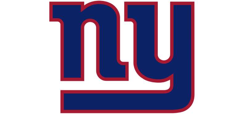
The New York Giants logo is a lowercase “ny” wordmark rendered in blue with a red outline. It was officially introduced in 2000 and represents a modernized take on the classic New York baseball script. The design emphasizes tradition and regional pride over flashy mascot imagery.
Design Type: Wordmark (text-based logo)
Primary Elements: Interlocking lowercase letters “n” and “y” in italicized script
Official Introduction Date: 2000
Designer/Agency: NFL Properties in collaboration with the Giants organization
Trademark Status: Registered trademark of New York Football Giants, Inc.
Color Palette: Giants Blue (#0B2265), Giants Red (#A71930), White (#FFFFFF)
Usage Context: Helmets, uniforms, merchandise, MetLife Stadium signage, digital platforms, marketing materials
How Has the New York Giants Logo Evolved Over Time?
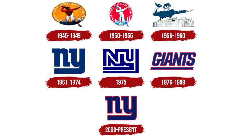
The Giants have maintained a surprisingly conservative approach to their visual identity.
Five major versions exist. Each change has been gradual rather than dramatic.
The franchise clearly values continuity over trendy redesigns.
Original New York Giants Logo (1925-1955)
Years Active: 1925-1955
Design Description: Simple block lettering spelling “GIANTS” without any geographic identifier. Plain and functional.
Color Scheme: Blue and white
Designer: Unknown (team internal)
Context: The NFL was young. Teams didn’t invest heavily in branding. This was purely utilitarian.
Key Changes from Previous: N/A (original design)
Cultural Significance: Represented the early days of professional football when the sport was still gaining legitimacy.
New York Giants Logo (1956-1960)
Years Active: 1956-1960
Design Description: Introduction of “NY GIANTS” text with a more stylized approach.
Color Scheme: Blue and red introduced
Designer: Unknown
Context: Television was changing sports. Teams needed more distinctive marks that read well on screen.
Key Changes from Previous: Added geographic identifier, introduced red accent color
Cultural Significance: Marked the transition into football’s television era.
New York Giants Logo (1961-1974)
Years Active: 1961-1974
Design Description: “GIANTS” in bold italics with stronger visual presence.
Color Scheme: Blue, red, white
Designer: Unknown
Context: The NFL was competing with the AFL. Bolder branding became necessary.
Key Changes from Previous: More aggressive italic angle, bolder letterforms
Cultural Significance: Reflected the increasing professionalization of sports marketing.
New York Giants Logo (1975-1999)
Years Active: 1975-1999
Design Description: The “GIANTS” wordmark with refined proportions and a cleaner overall look.
Color Scheme: Giants Blue, Giants Red, White
Designer: NFL Properties
Context: The Super Bowl era. This logo appeared during two championship victories (XXI and XXV).
Key Changes from Previous: Tightened letter spacing, refined stroke weights
Cultural Significance: The logo most associated with the Parcells/Simms/Taylor championship years.
Current New York Giants Logo (2000-Present)
Years Active: 2000-present
Design Description: Lowercase “ny” in italicized script with interlocking letters. Blue fill with red outline.
Color Scheme: Giants Blue (#0B2265), Giants Red (#A71930), White
Designer: NFL Properties
Context: New stadium plans and a desire to strengthen the New York connection prompted the change.
Key Changes from Previous: Complete shift from “GIANTS” wordmark to “ny” monogram approach
Cultural Significance: Emphasizes New York identity. This version won two Super Bowls (XLII and XLVI).
What Do the Design Elements of the New York Giants Logo Mean?
The lowercase “ny” carries significant weight. It connects directly to New York’s baseball heritage.
The interlocking letters create unity between the two characters. There’s an intentional echo of the New York Yankees’ famous monogram here.
The italic angle suggests forward motion and athletic energy.
Why Did the New York Giants Choose These Specific Colors?
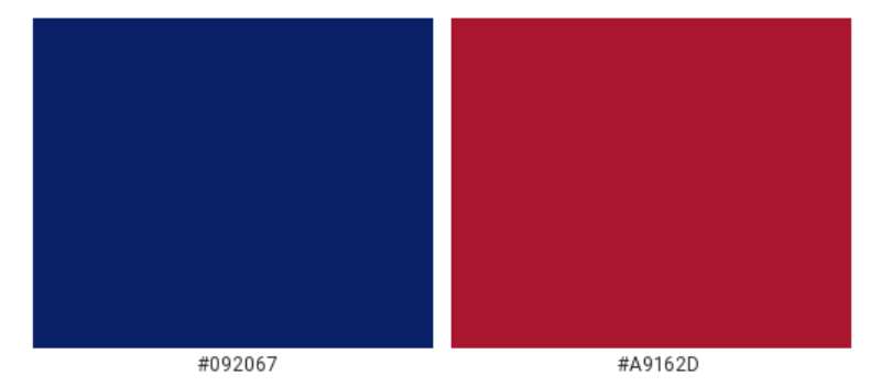
Giants Blue (#0B2265)
This deep navy blue communicates authority and tradition. It reads as serious and professional.
The Pantone equivalent is PMS 289. In RGB values, that’s 11, 34, 101.
Blue connects to trust and stability. It’s why so many brands choose blue for their primary color.
Giants Red (#A71930)
The red provides energy and aggression. It’s used sparingly as an accent.
CMYK values run approximately 0, 85, 70, 35.
Red signals passion and intensity. Perfect for a contact sport.
White (#FFFFFF)
White creates breathing room. It separates the blue and red, preventing visual muddiness.
What Typography Style Is Used in the New York Giants Logo?
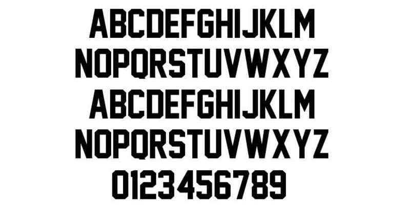
The “ny” uses a custom script typeface. It’s not based on any commercial font.
The letterforms feature rounded terminals and consistent stroke width. Very smooth.
Readability works at multiple sizes, though small applications can get tricky with the interlocking design.
The typography has remained unchanged since 2000. No tweaks.
What Are the Hidden Meanings in the New York Giants Logo?
The “ny” format directly references the New York Yankees logo. That’s intentional.
By borrowing this visual language, the Giants tap into decades of New York sports heritage.
Some fans see the interlocking letters as representing the team’s unity philosophy. The organization has never confirmed this interpretation.
The lowercase treatment is unusual for sports. It reads as confident rather than aggressive. We don’t need to shout.
How Does the New York Giants Logo Compare to Competitor Logos?
Within the NFC East, the Giants take the most understated approach.
The Dallas Cowboys logo uses a bold star. Simple but iconic.
The Philadelphia Eagles logo features an aggressive eagle head with sharp angles.
Washington’s Commanders use a bold “W” with military-inspired styling.
The Giants stand apart by avoiding mascot imagery entirely. It’s actually pretty rare in the NFL. Most teams want that fierce animal or warrior symbol. The Giants say no thanks.
This restraint works. It communicates that the franchise’s reputation speaks for itself.
What Are the Technical Specifications of the New York Giants Logo?
Official Color Codes:
- Primary Color: Giants Blue – Hex: #0B2265, RGB: (11, 34, 101), CMYK: (100, 85, 30, 20), Pantone: PMS 289
- Secondary Color: Giants Red – Hex: #A71930, RGB: (167, 25, 48), CMYK: (0, 100, 80, 25), Pantone: PMS 187
- Accent Color: White – Hex: #FFFFFF, RGB: (255, 255, 255), CMYK: (0, 0, 0, 0)
Dimensions and Proportions:
- Aspect ratio: Approximately 1:1 (slightly wider than tall)
- Minimum size requirements: 0.5 inches for print, 50 pixels for digital
- Clear space: Minimum padding equal to the height of the “n” on all sides
- The interlocking area must remain intact. Never separate the letters.
What Cultural Impact Has the New York Giants Logo Had?
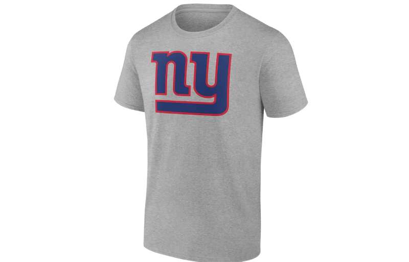
The logo appears throughout the New York metropolitan area. You see it on caps, jerseys, car decals, and tattoos.
It’s become shorthand for New York football pride. Not just the team, but the city itself.
The design influenced other sports teams considering text-based approaches over mascot imagery.
Four Super Bowl wins attached to this franchise give the logo serious weight. That history matters.
How Does the New York Giants Logo Fit Into the Overall Brand Identity?
The logo anchors everything. Uniforms, stadium signage, merchandise, digital presence.
It works alongside the “GIANTS” wordmark, which still appears on jerseys and promotional materials.
The color palette extends throughout the brand ecosystem. Same blue and red everywhere.
MetLife Stadium uses these colors extensively in wayfinding and architectural lighting. The brand stays consistent.
How Should the New York Giants Logo Be Used?
Official Usage Guidelines:
- Never stretch, distort, or rotate the logo
- Maintain minimum clear space around the mark
- Use only approved color variations (full color, white, blue)
- Never place on busy backgrounds that reduce legibility
- Never modify the interlocking letter relationship
Where to Access Official Logos:
The Giants media relations department provides assets to approved partners. NFL Properties handles licensing for commercial use.
Licensing Information:
Commercial use requires an NFL license. Unofficial merchandise gets shut down quickly. The league is aggressive about enforcement.
Trademark Protection:
The “ny” mark and “GIANTS” wordmark are registered trademarks. Protected under U.S. trademark law. The team actively monitors for infringement.
For reference, official brand guidelines can be requested through NFL Properties for legitimate business purposes.
FAQ on The New York Giants Logo
What Does the NY Giants Logo Represent?
The New York Giants logo represents the franchise’s connection to New York City and its football heritage.
The interlocking “ny” pays tribute to classic New York sports branding. It signals tradition over trendy mascot imagery.
Four Super Bowl championships give this mark serious weight.
When Was the Current New York Giants Logo Introduced?
The current logo debuted in 2000. The team wanted stronger ties to their New York identity.
This version replaced the previous “GIANTS” wordmark that had been used since 1975.
It’s now been active for over two decades. No changes planned.
Who Designed the New York Giants Logo?
NFL Properties created the design in collaboration with the Giants organization.
No individual designer has been publicly credited. That’s common with professional sports team logos. Corporate collaboration tends to blur individual attribution.
What Are the Official Colors of the New York Giants Logo?
The official colors are Giants Blue (#0B2265) and Giants Red (#A71930). White serves as an accent.
These colors follow color theory principles. Blue builds trust. Red adds energy.
The combination creates strong contrast for visibility on helmets and merchandise.
Why Did the Giants Choose a Lowercase “ny” for Their Logo?
The lowercase approach echoes the New York Yankees’ famous monogram.
It reads as confident without being aggressive. The psychology behind this font choice suggests sophistication and established authority.
Most NFL teams shout. The Giants whisper.
Has the New York Giants Logo Changed Over Time?
Yes. The franchise has used approximately five major versions since 1925.
Early designs featured simple “GIANTS” text. The team gradually refined their visual identity through each era.
The 2000 redesign marked the biggest shift. Moving to “ny” was bold.
What Font Is Used in the New York Giants Logo?
The logo uses a custom script font designed specifically for the team. It’s not commercially available.
The letterforms feature smooth curves and consistent stroke weights. Very clean execution.
You can’t just download it somewhere.
Can I Use the New York Giants Logo for My Business?
No. Not without proper licensing from NFL Properties.
The mark is a registered trademark of New York Football Giants, Inc. Unauthorized commercial use leads to legal action. The league protects its intellectual property aggressively.
Fan art exists in a gray area.
Where Can I Download the Official New York Giants Logo?
Official vector graphics files are available through NFL media relations for approved partners only.
The team website offers some assets for personal use. Commercial applications require formal licensing agreements through NFL Properties.
Why Doesn’t the New York Giants Logo Have a Mascot?
The Giants rely on their name and regional identity instead. “Giants” refers to the New York skyscrapers, not a creature.
This minimalist design approach sets them apart from mascot-heavy competitors.
The franchise believes their reputation needs no cartoon character.
Conclusion
The New York Giants logo proves that restraint works in sports branding. No mascot needed.
That lowercase “ny” connects Big Blue to decades of New York athletic tradition. It works on helmets at MetLife Stadium and on merchandise worldwide.
Four Super Bowl victories back up the understated confidence this emblem projects.
Within the NFC East division, the Giants stand apart from competitors who rely on aggressive imagery. Their brand style guide keeps everything consistent.
The mark has earned its place among the most respected NFL team logos in professional football history.

Renowned for his expertise in logo design and visual branding, Bogdan has developed a multitude of logos for various clients.
His skills extend to creating posters, vector illustrations, business cards, and brochures. Additionally, Bogdan's UI kits were featured on marketplaces like Visual Hierarchy and UI8.
He also wrote in the past years on sites like Design Your Way, WebDesignerDepot, WPDean, Designmodo, Speckyboy, Slider Revolution, and more.
- Canva vs PowerPoint: Which Is Better for Presentations? - 22 September 2026
- How to Install Fonts on Mac (Step-by-Step Guide) - 20 September 2026
- From Mockup to Code: How AI-Augmented Development Speeds Up the Design Handoff - 19 September 2026

Bogdan Sandu is a seasoned designer who has been designing websites since 2008. Renowned for his expertise in logo design and visual branding, Bogdan has developed a multitude of logos for various clients. His skills extend to creating posters, vector illustrations, business cards, and brochures. Additionally, Bogdan's UI kits were featured on marketplaces like Visual Hierarchy and UI8. He also wrote in the past years on sites like Design Your Way, WebDesignerDepot, WPDean, Designmodo, Speckyboy, Slider Revolution, and more.
You Might Also Like