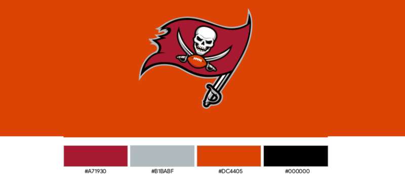
The Tampa Bay Buccaneers Logo History, Colors, Font, and Meaning

Imagine the heart-pumping thrill of a packed stadium, a sea of red and black, and amidst that, the unmistakable Tampa Bay Buccaneers logo emblazoned proudly.
This beacon of identity captures the essence of a team steeped in history, a visual narrative woven into the very fabric of the NFL. With each bold stroke and fearsome imagery, it speaks to fans and foes alike.
This article unfurls the sail on a graphic voyage through time and design, charting the logo’s evolution. As we hoist the Jolly Roger high, readers are set to discover the story behind the Buccaneers’ emblem—a symbol that’s more than meets the eye.
Delve into a world where sports, artistry, and fan legacy intersect, exploring how the illustrious franchise’s branding has become synonymous with the National Football League’s spirited combat.
Sail with me, and by the journey’s end, you’ll glimpse the intricate details and subtle nuances that contribute to the power and allure of the Buccaneers’ visual identity, from the emblem’s conception to the iconic pirate ship synonymous with Buccaneer Cove.
The Meaning Behind the Tampa Bay Buccaneers Logo
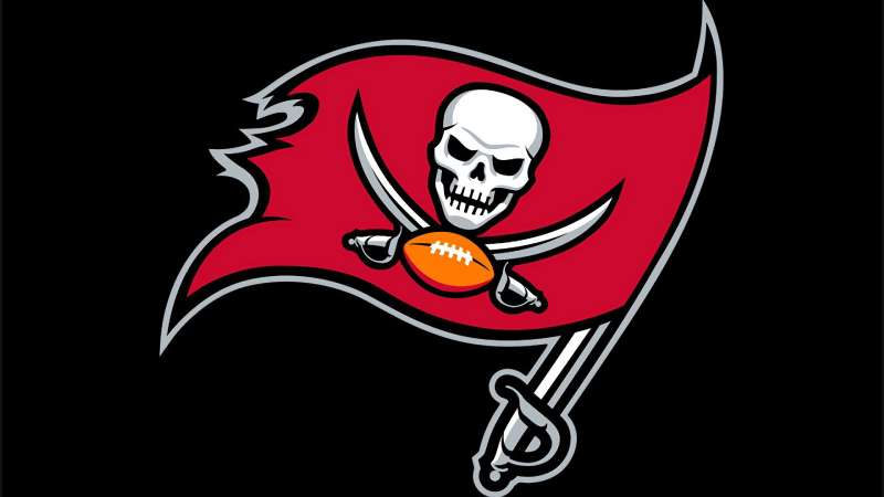
Alright, pals! Let’s dive deep into the symbolism of this iconic sports emblem.
Skull and Crossed Swords
If there’s one thing that shouts “buccaneer” (you know, besides an actual buccaneer shouting), it’s that iconic skull. The skull and crossed swords? That’s straight-up pirate lore.
They’re the symbols of adventure, danger, and the open sea. In the context of football? These represent aggression, strength, and a warning to opponents: Beware! Challenges ahead!
The Football
For the not-so-eagle-eyed amongst us, there’s a football tucked right there in the logo. This gives the nod to the sport itself, grounding the whole pirate theme back to American football.
The Waving Flag
Flags are often used to represent conquest and territory. The Bucs’ logo has this flag waving proudly, telling a tale of victories and challenges overcome.
The History of the Tampa Bay Buccaneers Logo
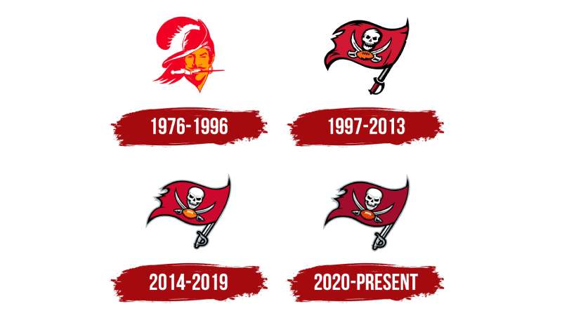
Let’s hop in our time machines and take a little trip.
From Creamsicle to Pewter Power
Once upon a time, the Bucs rocked a creamsicle-orange dude named “Bucco Bruce”. Cute? Maybe. Intimidating? Not so much. But as the years rolled on, and fashion sense evolved, the team switched it up to the fierce, modern pirate flag we know and love.
Modern Evolution
As graphics and sports branding took a leap in the 2000s, the Bucs’ logo became more detailed and crisp. Think of it as going from a doodle in your school notebook to a full-blown artwork.
The Colors of the Tampa Bay Buccaneers Logo
Pewter and Red
The primary colors, peeps! Pewter is that metallic gray that speaks of strength, durability, and resilience. Then there’s the vibrant red, a color that’s all about energy, passion, and drive.
Touch of Orange
This hue is a subtle nod to the team’s history. It whispers (or maybe shouts if you’re really into color theory) of the Bucs’ original creamsicle days.
The Font Used in the Tampa Bay Buccaneers Logo
Bold and Slashed
The font in the logo? Oh boy, it’s a statement piece. Bold, with slash marks, it reminds us of carvings on a pirate ship or maybe a treasure map. It embodies the team’s fearless spirit and their readiness to take on any battle, on or off the field.
Evolution of Brand Merchandise
Alright, who here hasn’t wanted some cool Bucs’ merch?
From Jerseys to Caps
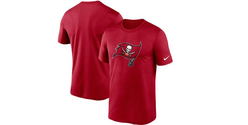
Over time, the logo has found its place on various merchandise, from jerseys to caps to even quirky stuff like car decals. Each item tells a tale of fan loyalty and the team’s ever-growing brand presence.
Collectibles
For the hardcore fans, there’s a plethora of collectible items. Think mugs, pins, posters. All with the famed logo, adding to its legacy and lore.
Logo Influence in Popular Culture
Video Games and Virtual Reality
Ever played Madden? The logo’s digital avatar, with its vivid colors and bold design, pops out, making it a favorite amongst gamers.
Tattoos and Street Art
The truest testament to its pop culture influence? When folks get it inked permanently on their bodies or when street artists use it as a muse. The Bucs’ logo, with its distinctive look, has indeed left an indelible mark on the streets and skins of many.
FAQ On The Tampa Bay Buccaneers Logo
What’s the significance behind the Tampa Bay Buccaneers logo?
The Tampa Bay Buccaneers logo, steeped in swashbuckling lore, symbolizes adventure and tenacity.
The iconic skull and crossed sabers resonate with the area’s pirate history, embodying the fearless spirit of NFL battlegrounds. It’s not just a logo; it’s an emblem of team identity.
How has the Buccaneers logo evolved over the years?
From its inception in 1976, the logo has undergone sophistication while honoring its heritage.
The initial Buccaneers emblem featured a winking pirate, which later transformed into a more menacing skull and swords—a visual cue of the team’s evolution and ever-growing legacy within the sports arena.
Does the design of the Buccaneers logo have a hidden meaning?
Certainly, the Buccaneers logo is rich in symbolism: the flag mimics a Jolly Roger rallying the sports community, the football signifies the essence of the NFL, and the red color exemplifies energy.
This concoction of imagery isn’t happenstance; it represents strength and unity.
Who created the Tampa Bay Buccaneers original logo?
The original logo, known affectionately as “Bucco Bruce,” was the creation of an artist as a part of the franchise’s birth. It captured the adventurous and playful side of the team’s persona, anchoring it as an icon in the National Football League’s vibrant history.
What do the colors of the Buccaneers logo represent?
The Buccaneers’ colors—red, black, pewter, and orange—carry deep significance. Red signals danger and power, a nod to the team’s combative prowess.
Black anchors strength and determination, while pewter adds a unique touch, and the historical orange pays homage to the team’s origins.
When did the Tampa Bay Buccaneers update their logo last?
The Buccaneers insignia saw its latest update in 2014. This refurbishment maintained its fierce demeanor while introducing cleaner lines and refreshed hues. It refined the aesthetics to align with modern tastes, melding tradition with a contemporary sports logo design.
What do fans think of the Buccaneers logo?
Fan opinions vary, but there’s an overwhelming affection for the emblem. Enthusiasts don their team brand identity with pride, often boasting an array of fan merchandise.
The logo, a sports team crest for many, resonates with the Buccaneers’ passionate fanbase, creating a tangible sense of belonging.
Has the Buccaneers logo received any design awards?
Its iconic standing within the sports logo history has drawn admiration, but specific award accolades rarely spotlight NFL logos. Nonetheless, the Buccaneers branding is celebrated for its distinctive look and the successful conveyance of a football team identity.
How is the Buccaneers logo used in marketing materials?
Efficient logo marketing is critical, and the Buccaneers understand that. Their logo anchors all merchandise, boldly adorning gear, digital platforms, and advertisements.
It’s a beacon that unifies all facets of their digital marketing, from social media campaigns to in-stadium promotions.
Can I use the Tampa Bay Buccaneers logo for personal projects?
Usage for personal, non-commercial projects often requires careful navigation of laws concerning trademarks. The logo, a registered trademark owned by the team, is protected.
While sports merchandise DIY might be personal, respecting intellectual property rights is still paramount. Always seek permission for logo use.
Conclusion
Understanding the Tampa Bay Buccaneers logo has been akin to sailing through a storied passage, bridging raw energy with elegant artistry. This emblem is more than a mere sports team crest; it embodies the NFL’s theatricality, echoing roars from Raymond James Stadium and beyond.
- It’s a beacon for fans
- Unmistakably Buccaneer
- A rallying symbol for the team’s spirit
- Tied inseparably to the franchise’s DNA
The journey has woven through changes, from the playful “Bucco Bruce” to the current flag, a testament to the team’s grit and their place in the league’s annals. Its colors blaze uniquely, marrying legacy with a modern beat that courses in the veins of its fervent enthusiasts. Each thread of history, from the inception to the modern digital marketing era, encapsulates a piece of the Buccaneers’ soul: vibrant, timeless, and indomitable. Carry this knowledge like a hidden treasure, a deeper appreciation for the Buccaneers’ visual saga.
If you liked this article about the Tampa Bay Buccaneers logo, you should check out this article about the Cleveland Browns logo.
There are also similar articles discussing the Jacksonville Jaguars logo, the New York Giants logo, the Cincinnati Bengals logo, and the Los Angeles Rams logo.
And let’s not forget about articles on the Miami Dolphins logo, the Las Vegas Raiders logo, the Baltimore Ravens logo, and the Detroit Lions logo.
- The Bungie Logo History, Colors, Font, And Meaning - 27 April 2024
- After Dark: Night Color Palettes for Mysterious Designs - 27 April 2024
- The Capcom Logo History, Colors, Font, And Meaning - 26 April 2024


