

The New York Jets logo stands as one of the most recognizable marks in professional football. It represents a franchise with deep roots in NFL history, dating back to 1960 when the team started as the Titans of New York.
The current design features a green football shape with the word “Jets” in bold white letters. This version arrived in 2019, marking the fifth major redesign in the team’s history.
Green and white have defined the Jets brand for decades. The combination creates instant recognition among NFL logos and ties directly to the “Gang Green” nickname fans use.
What Is the New York Jets Logo?
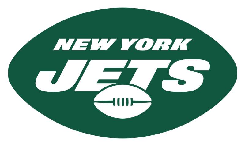
The New York Jets logo is an oval football-shaped emblem featuring the word “Jets” in custom white typography against a Gotham Green background. Introduced in 2019, this design was created in partnership with Nike. It symbolizes speed, flight, and the team’s connection to New York City’s aviation history.
Design Specifications
- Design Type: Combination mark (wordmark within shape)
- Primary Elements: Football oval shape, custom “Jets” wordmark, angular styling
- Official Introduction Date: April 4, 2019
- Designer/Agency: Nike in collaboration with the New York Jets organization
- Trademark Status: Registered trademark of the New York Jets LLC
- Color Palette: Gotham Green (#125740), Spotlight White (#FFFFFF), Stealth Black (#000000)
- Usage Context: Helmets, jerseys, merchandise, MetLife Stadium signage, digital platforms, broadcast graphics
How Has the New York Jets Logo Evolved Over Time?
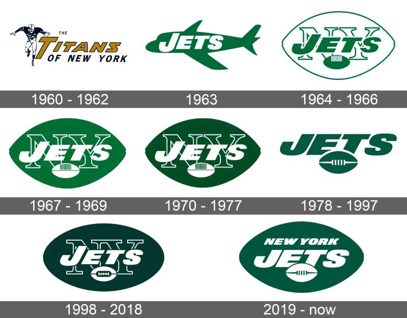
The Jets have used five distinct logo designs since 1960. Each version reflects the design trends of its era while maintaining green as the core color.
The franchise started with a simple approach and gradually moved toward bolder, more modern designs.
Original Titans of New York Logo (1960-1962)
- Years Active: 1960-1962
- Design Description: Blue and gold color scheme with “Titans” text, no jet imagery
- Color Scheme: Navy blue and gold
- Designer: Unknown
- Context: The team began as the Titans in the American Football League. Financial troubles led to new ownership.
- Key Changes from Previous: First logo in franchise history
- Cultural Significance: Represented New York’s second professional football team during the AFL-NFL rivalry
First Jets Logo (1963-1977)
- Years Active: 1963-1977
- Design Description: Simple green jet airplane graphic flying diagonally
- Color Scheme: Kelly green and white
- Designer: Unknown
- Context: New owner Sonny Werblin rebranded the team as the Jets. The name referenced nearby airports and the Jet Age excitement of the 1960s.
- Key Changes from Previous: Complete rebrand with new name, colors, and imagery
- Cultural Significance: This logo was worn during Super Bowl III when Joe Namath delivered his famous guarantee and upset the Baltimore Colts
Helmet Jet Era (1978-1997)
- Years Active: 1978-1997
- Design Description: White football helmet with green “JETS” text, featuring a small jet graphic crossing through the lettering
- Color Scheme: Kelly green, white
- Designer: Unknown
- Context: The NFL was standardizing team branding. This design offered a cleaner, more merchandise-friendly look.
- Key Changes from Previous: Shifted from standalone airplane to integrated helmet design
- Cultural Significance: Represented the franchise through difficult years and the emergence of the “New York Sack Exchange” defensive line
Oval Wordmark Era (1998-2018)
- Years Active: 1998-2018
- Design Description: Green oval with white “JETS” in capital letters, football shape suggesting speed
- Color Scheme: Hunter green (#0C371D), white
- Designer: NFL Properties
- Context: Part of a league-wide push for modernization. The Jets wanted a cleaner, more contemporary mark.
- Key Changes from Previous: Removed the helmet element entirely, simplified to wordmark in oval
- Cultural Significance: Used during two AFC Championship appearances and became the most recognized Jets logo for a generation of fans
Current Logo (2019-Present)
- Years Active: 2019-present
- Design Description: Modernized oval with angular “Jets” wordmark, sharper edges, updated color
- Color Scheme: Gotham Green (#125740), Spotlight White, Stealth Black
- Designer: Nike
- Context: Complete brand refresh coinciding with new uniforms. The team wanted to honor tradition while looking forward.
- Key Changes from Previous: Brighter green, italic styling, more aggressive angles
- Cultural Significance: Represents a franchise reset and renewed hope for championship contention
What Do the Design Elements of the New York Jets Logo Mean?
The oval football shape creates immediate sports context. It tells you this is a football team before you even read the text.
The italic slant of the wordmark suggests forward motion. Speed matters in this sport, and the logo reflects that.
Green connects to aviation history. Early jets used green in military applications, and the color became synonymous with the team’s identity.
Why Did the New York Jets Choose These Specific Colors?
Gotham Green serves as the primary brand color. The hex code is #125740.
This hue was selected to differentiate from the original kelly green while maintaining tradition. It reads as more sophisticated on modern screens and merchandise.
According to color psychology, green signals growth, energy, and freshness. For a sports franchise, these associations work perfectly.
Spotlight White (#FFFFFF) provides maximum contrast against the green. It makes the wordmark pop on helmets and screens alike.
Stealth Black (#000000) adds depth in secondary applications. It creates a three-color system that works across all media.
What Typography Style Is Used in the New York Jets Logo?
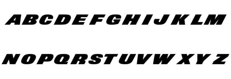
The current logo uses a custom typeface designed specifically for the franchise.
It falls into the sans-serif font category with bold weight and italic styling.
The letters feature sharp angles at their terminals. This gives the typography an aggressive, athletic feel.
Readability stays high even at small sizes. The bold strokes and open letterforms work on everything from tiny social media icons to stadium signage.
What Are the Hidden Meanings in the New York Jets Logo?
The football shape does double duty. Look at it as an aerial view of a jet engine intake.
The italic angle matches typical flight trajectories. Jets take off at angles, and the logo subtly references this.
Some fans see the pointed ends as representing the two New York area airports. The team has never confirmed this interpretation, but it persists in fan communities.
The designers stated they wanted “speed and flight” to come through in every element. Whether you catch these details consciously or not, they shape perception.
How Does the New York Jets Logo Compare to Competitor Logos?
The Jets logo sits in the wordmark category among NFL teams. It shares this approach with the New York Giants logo and Cincinnati Bengals logo.
Within the AFC East division, the Jets face teams with very different design approaches.
The Buffalo Bills logo uses a charging buffalo. The Miami Dolphins logo features their mascot. The New England Patriots logo shows a stylized patriot head.
The Jets stand alone in their division with a text-based primary mark. This creates distinction but sacrifices the mascot recognition other teams enjoy.
Compared to other green logos in the NFL, the Jets use a darker, more sophisticated shade than teams like the Green Bay Packers logo or Philadelphia Eagles logo.
What Are the Technical Specifications of the New York Jets Logo?
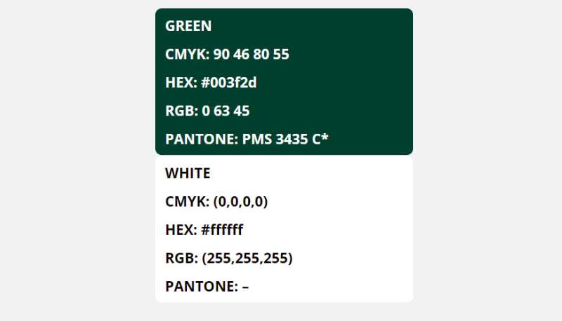
Official Color Codes
- Primary Color: Gotham Green
- Hex: #125740
- RGB: (18, 87, 64)
- CMYK: (95, 32, 75, 26)
- Pantone: PMS 3425
- Secondary Color: Spotlight White
- Hex: #FFFFFF
- RGB: (255, 255, 255)
- CMYK: (0, 0, 0, 0)
- Accent Color: Stealth Black
- Hex: #000000
- RGB: (0, 0, 0)
- CMYK: (0, 0, 0, 100)
Dimensions and Proportions
- Aspect Ratio: Approximately 2:1 (width to height)
- Minimum Size: 0.5 inches wide for print, 50 pixels wide for digital
- Clear Space: Minimum padding equal to the height of the “J” in Jets on all sides
- File Formats Available: Vector graphics (AI, EPS, SVG), JPEG, PNG with transparency
- Resolution Requirements: Minimum 300 DPI for print applications
What Cultural Impact Has the New York Jets Logo Had?

The Jets logo carries weight far beyond the field. Super Bowl III made it iconic.
When Joe Namath guaranteed victory in 1969, he wore that original jet airplane mark. That moment changed football history and cemented the logo in American sports memory.
New York fashion has adopted Jets gear as streetwear. The green stands out in a city dominated by blue (Giants, Yankees, Rangers) and orange (Mets, Knicks).
The logo appears in countless films and TV shows set in New York. It signals local authenticity and blue-collar fandom.
How Does the New York Jets Logo Fit Into the Overall Brand Identity?
The logo serves as the hub of a larger brand system. Everything connects back to it.
Uniform designs pull from the same Gotham Green. The helmet stripe matches the logo’s angular styling.
MetLife Stadium signage uses the logo as its foundation. Every touchpoint reinforces the same visual language.
Merchandise follows strict brand guidelines. The Jets control how their mark appears on everything from caps to phone cases.
Digital presence maintains consistency too. Social media avatars, website headers, and app icons all derive from the primary logo.
How Should the New York Jets Logo Be Used?
Official Usage Guidelines
- Do: Maintain minimum clear space around the logo
- Do: Use only official color versions (full color, white, black)
- Do: Scale proportionally without distortion
- Don’t: Rotate or skew the logo
- Don’t: Add effects like shadows, gradients, or outlines
- Don’t: Place on busy backgrounds that reduce legibility
- Don’t: Alter the colors outside approved variations
Where to Access Official Logos
The NFL provides official assets through their media portal for credentialed press and partners.
Licensed manufacturers receive logo files directly from Jets brand management.
Fans can find approved imagery on the official Jets website and NFL Shop.
Licensing and Trademark Information
The New York Jets logo is a registered trademark of New York Jets LLC.
Commercial use requires licensing through NFL Properties.
Fan art and personal use fall into gray areas. The team generally tolerates non-commercial fan creations but reserves enforcement rights.
Counterfeit merchandise faces aggressive legal action. The NFL actively monitors marketplaces for trademark violations.
FAQ on The New York Jets Logo
What Do the Colors in the New York Jets Logo Mean?
The Jets use Gotham Green as their primary color. It represents energy, growth, and the team’s connection to Gang Green.
White provides contrast and readability. Black adds depth for secondary applications.
This color palette ties directly to aviation heritage and New York identity.
When Was the Current New York Jets Logo Introduced?
The current logo debuted on April 4, 2019. Nike designed it as part of a complete brand refresh.
New uniforms launched alongside the updated mark.
The redesign came after 21 years with the previous oval wordmark version.
Who Designed the New York Jets Logo?
Nike created the current Jets logo in collaboration with the franchise. The NFL Properties group oversaw the 1998 version.
Earlier designs lack documented attribution.
Most NBA logos and NFL team marks follow similar corporate design processes today.
What Font Is Used in the New York Jets Logo?
The Jets use a custom typeface designed specifically for the 2019 rebrand. It features bold weight with italic styling.
Sharp angles at the terminals give it an athletic feel.
Understanding font psychology explains why this aggressive style works for sports branding.
How Many Times Has the New York Jets Logo Changed?
The franchise has used five distinct logos since 1960. The original Titans mark came first.
Four Jets-era designs followed after the 1963 rebrand.
Each version reflected the graphic design movements of its time.
Can I Use the New York Jets Logo for Personal Projects?
Personal, non-commercial use typically goes unenforced. But the logo remains a registered trademark of New York Jets LLC.
Commercial use requires licensing through NFL Properties.
Counterfeit merchandise faces legal action from the league.
What Is Gotham Green in the Jets Logo?
Gotham Green is the official name for the Jets’ primary color. The hex code is #125740.
It replaced the older hunter green in 2019.
The name references New York City’s famous nickname while boosting saturation for modern screens.
Why Do the Jets Not Have a Mascot in Their Logo?
The Jets chose a wordmark approach over mascot imagery. This differs from teams like the Dolphins or Bills.
A jet airplane appeared in early versions but was removed in 1978.
The text-based design prioritizes clean visual hierarchy over character illustration.
Where Can I Download the Official New York Jets Logo?
Official assets live on the NFL media portal for credentialed users. The Jets website offers fan-quality images.
Licensed partners receive files directly from brand management.
High-resolution versions for print design require proper authorization.
What Does the Oval Shape in the Jets Logo Represent?
The oval mimics a football silhouette. It creates instant sports context before you read the text.
Some see it as a jet engine intake from above.
This shape applies core logo design principles by combining symbolism with simplicity.
Conclusion
The New York Jets logo tells a story of reinvention. Five versions since 1960. Each one captured its era while keeping green and white at the core.
From the Titans of New York to today’s Gotham Green wordmark, the Jets brand identity has matured alongside the NFL itself.
Super Bowl III made that original jet airplane mark legendary. Broadway Joe saw to that.
The current design balances symmetry with forward motion. It works on helmets at MetLife Stadium and tiny app icons alike.
Good sports branding does exactly this. It stays recognizable across every logo application while honoring team history.

Renowned for his expertise in logo design and visual branding, Bogdan has developed a multitude of logos for various clients.
His skills extend to creating posters, vector illustrations, business cards, and brochures. Additionally, Bogdan's UI kits were featured on marketplaces like Visual Hierarchy and UI8.
He also wrote in the past years on sites like Design Your Way, WebDesignerDepot, WPDean, Designmodo, Speckyboy, Slider Revolution, and more.
- Minecraft Font Generator - 8 October 2026
- How Top Meta Ad Creative Is Designed for E-commerce Brands - 8 October 2026
- How photo recovery software works and when to use it - 7 October 2026

Bogdan Sandu is a seasoned designer who has been designing websites since 2008. Renowned for his expertise in logo design and visual branding, Bogdan has developed a multitude of logos for various clients. His skills extend to creating posters, vector illustrations, business cards, and brochures. Additionally, Bogdan's UI kits were featured on marketplaces like Visual Hierarchy and UI8. He also wrote in the past years on sites like Design Your Way, WebDesignerDepot, WPDean, Designmodo, Speckyboy, Slider Revolution, and more.
You Might Also Like


